How to Create a Resource Center For Your SaaS Product: Steps and Best Practices
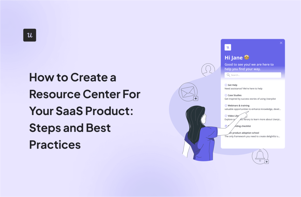
Wondering how to create a resource center for your SaaS product? Then, you’ve come to the right place!
A resource center is a central hub of resources that helps your customers solve problems and learn more about your product. It reduces the load on your support team and improves customer satisfaction by providing self-service support.
In this article, we’ll explore the core elements of a resource center, go over the steps of building one, and share some design examples to inspire you!
What is a resource center?
A resource center is a hub on your product where your user can find various informative content tailored to support learning and problem-solving.
It’s structured for easy access, helping users efficiently find information and resources to meet their goals.
Why do you need a resource center?
Resource centers are a powerful tool for your customers, acting as a one-stop hub for all your inbound marketing efforts.
They offer various benefits, like improvements in search engine optimization for your customers and your business.
- Provide self-service support: Offering resource centers empowers customers by giving them the tools to solve problems independently. Self-service is what most customers prefer, according to research by Zendesk.
- Reduce customer support workload: Since customers can find answers to their basic questions, the number of inquiries your support team needs to handle decreases, which allows them to focus on more important matters.
- Improve customer satisfaction: Resource centers enable customers to get quick help instead of waiting in lines for hours to talk to an agent, boosting customer satisfaction.
- Drive customer retention: Customers who consistently find valuable information through your resource center and adopt your product are more likely to stick around.
What should resource centers include?
Well-equipped resource centers are essential for providing comprehensive support and information to users. Here’s what it should include:
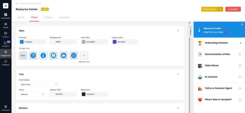
- User documentation: Detailed articles and manuals that explain how to use your product or service.
- Video tutorials: Short, engaging videos demonstrating performing specific tasks or using certain features.
- FAQs: A collection of answers to the most frequently asked questions.
- Search function: A search bar that allows users to quickly find specific information across your resource center or on external knowledge bases.
- Feedback widget: A tool for collecting in-app feedback, allowing users to report issues or suggest improvements.
- An option to contact a support agent: While self-service is the goal, having a direct line to human support is necessary for more complex issues.
- Product Updates: Keeping users informed with up-to-date information on new features, enhancements, and fixes.
- AI Productivity Tools: Integrating AI assistants can offer personalized guidance, answer questions, and even troubleshoot problems.
How to create a helpful resource center in 7 steps
Creating a useful resource center involves strategic planning and execution to ensure it effectively meets the needs of your users.
Follow these seven steps to build a resource center that provides valuable support and enhances user experience.
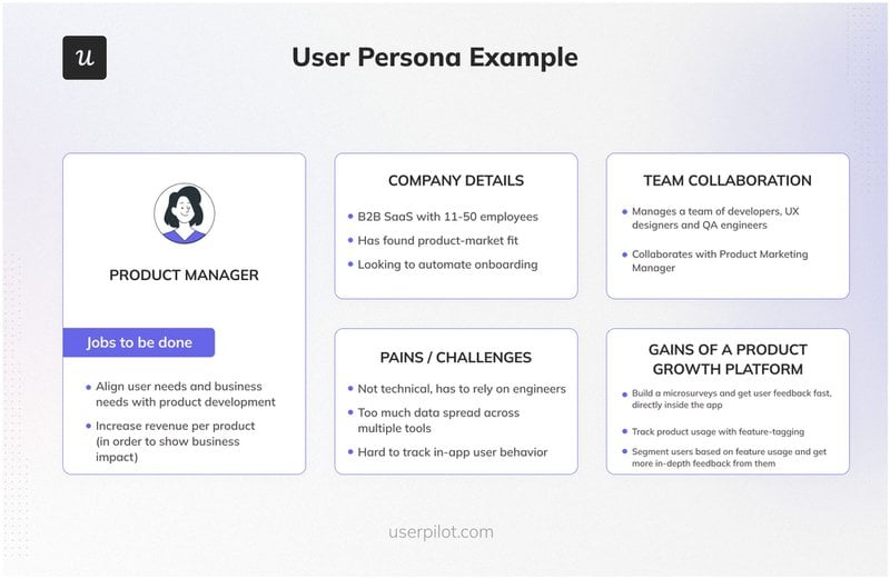
1. Define user personas
Begin by identifying your ideal users and crafting detailed personas that represent them. These personas should encompass their motivations, challenges, and “jobs to be done.”
Understanding these aspects is crucial in tailoring your resource center to meet the diverse needs of your audience, ensuring the educational content is genuinely useful.
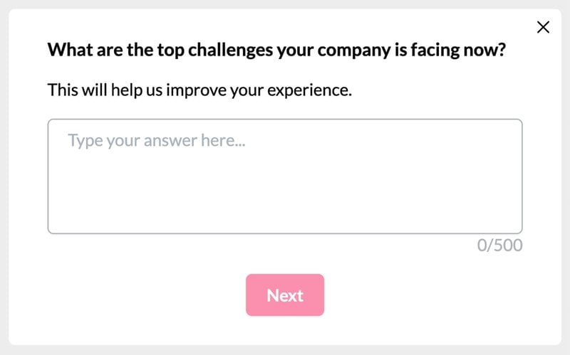
2. Collect customer data to understand customer pain points
To create a resource center that truly resonates with your users, gathering data on their pain points is crucial. This involves analyzing interactions and feedback from various sources to pinpoint where users face difficulties. Those sources include:
- Support Tickets: Reviewing support tickets can reveal common issues customers complain about, guiding you to create resources that address these problems.
- 3rd Party Reviews: External reviews on platforms like software directories or forums can highlight what users appreciate about your product and where they struggle.
- Product Data Analytics: Product data analytics allows you to identify underused features or areas where users seem stuck, indicating a need for clearer guidance.
- Direct User Feedback: Encouraging and collecting feedback directly from users through surveys or in-app feedback tools provides insights into their desired improvements.
3. Create different formats of help resources
Recognizing that people absorb information differently is key to creating a resource center that serves everyone effectively.
To cater to diverse learning needs, it’s essential to develop various types of help resources. Some of the most common you can use are:
- Blog posts.
- Case studies.
- Webinars.
- Video tutorials.
- Checklists.
- Interactive walkthroughs.
4. Organize resources
For your resource center to be accommodating, it’s crucial that users can easily find what they’re looking for. This means logically organizing your resources.
You might choose to group them by format—like separating blog posts, video tutorials, and webinars—or by product functionality, where each section is dedicated to a different aspect of your product or service.
Effective organization enhances the navigation of your knowledge base, making it straightforward for users to locate the information they need without unnecessary hassle.
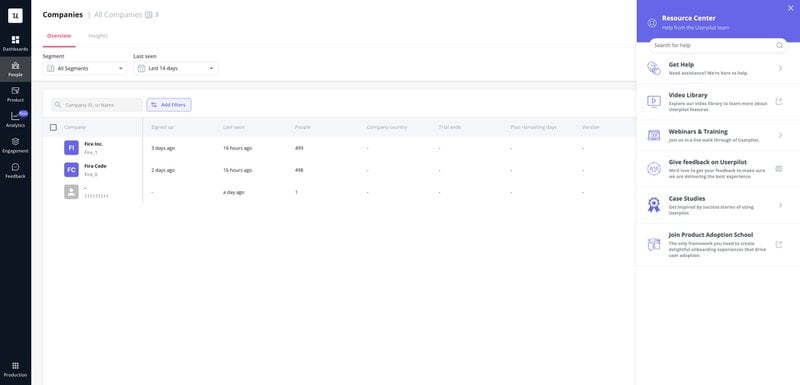
5. Publish your knowledge base
Once your resource center is organized and filled with valuable content, it’s time to go live.
Making your knowledge base available to users is pivotal, as it marks the beginning of enhanced self-service support.
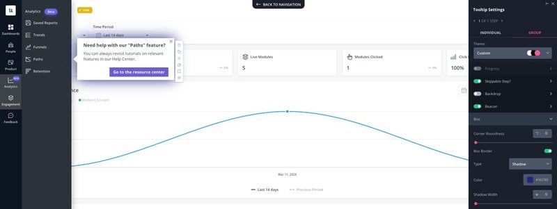
To ensure users are aware of this powerful tool, consider triggering a tooltip on your website or application that points them towards the resource center.
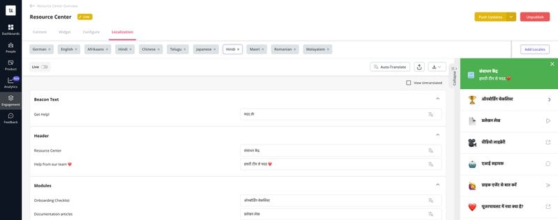
6. Localize your content
To truly resonate with a global audience, it’s important to adapt your resource center’s content to meet each target audience’s cultural and linguistic needs.
Content localization goes beyond mere translation; it involves tailoring your materials to reflect local nuances, cultural references, and specific idioms that make the content feel homegrown and relevant.
Content localization is a crucial step in expanding the reach and impact of your resource center, making it a truly global tool for customer support and engagement.
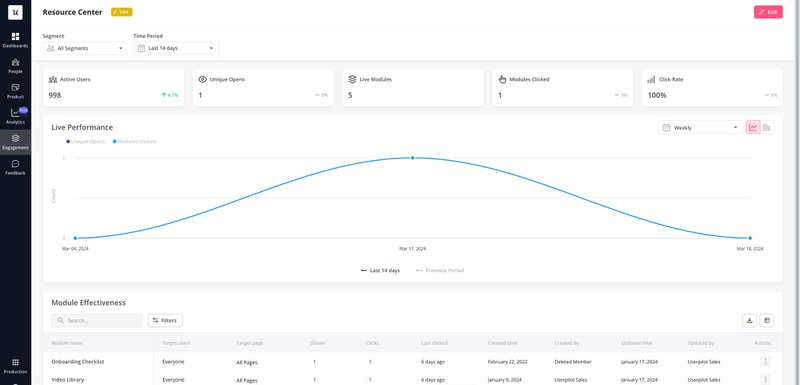
7. Analyze the performance of your resource center
To ensure your resource center continues to meet the needs of your users effectively, it’s crucial to analyze its performance regularly.
This involves monitoring how users engage with different resource pages or landing pages, which can provide valuable insights into what works well and what doesn’t.
You can identify user engagement patterns by tracking metrics such as page views, time spent on each resource page, and the most frequently accessed resources.
This data helps pinpoint gaps in your content and opportunities for improvement, whether it’s adding new resources, updating existing ones, or reorganizing relevant content for better accessibility.
5 Great resource center examples to inspire your own
Exploring successful examples can inspire and provide valuable insights for creating an effective resource center. Here are five great resource center examples to inspire your own.
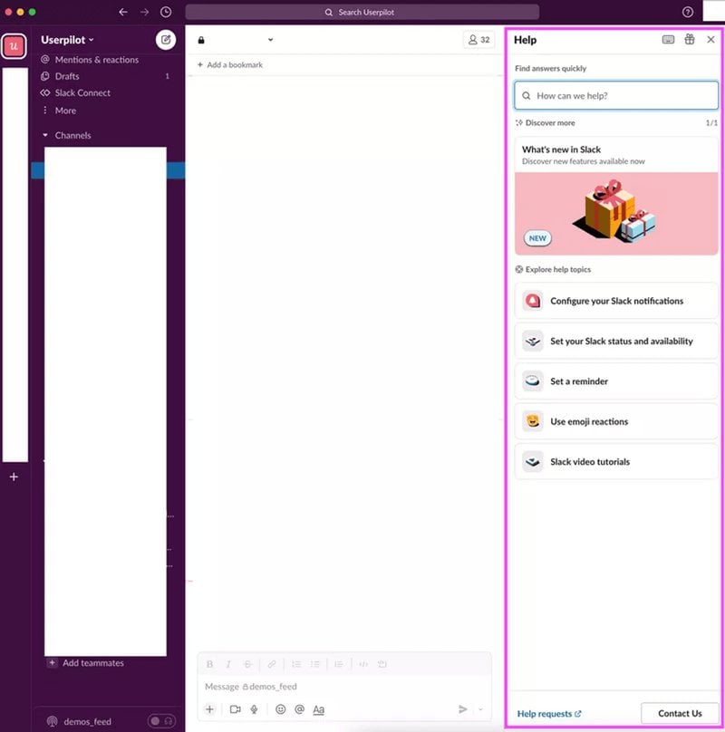
Slack
Slack’s resource center stands out for its simplicity, user-friendliness, and intuitive design. Its strength lies in good organization, making it effortless for users to navigate a wealth of resources.
The center is structured to guide users directly to the information they need without overwhelming them with too much-featured content at once.
Additionally, including a robust search function enhances the user experience by allowing for quick and easy access to specific topics or solutions.
Jira
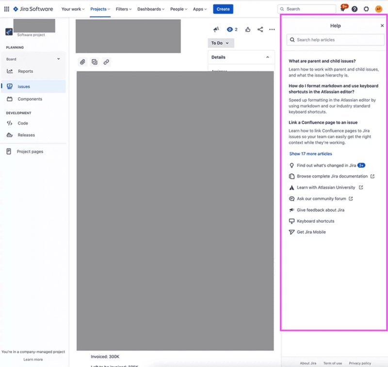
Jira’s resource center is notably effective because it addresses common customer issues at the top of the resource page.
This strategic placement means users can quickly find solutions to frequent questions without sifting through less relevant information.
By prioritizing these solutions, Jira significantly reduces the time it takes for users to get the help they need, enhancing overall user satisfaction.
Miro
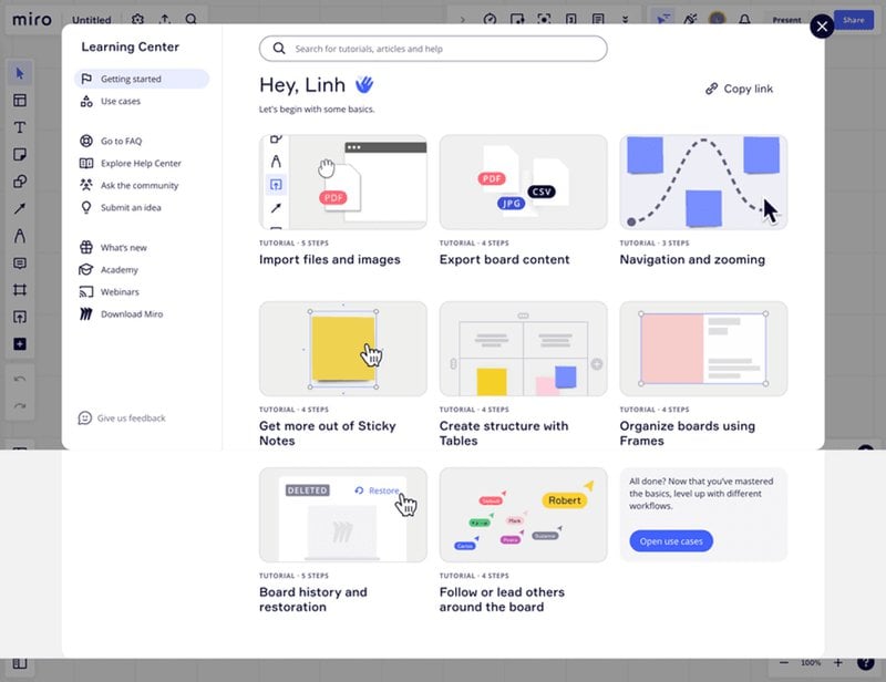
Miro’s dedicated resource page sets itself apart with its various interactive guides. These guides engage users by actively walking them through various features and functionalities, offering a hands-on learning experience.
This interactive approach makes it easier for users to understand how to use Miro effectively and helps drive user adoption.
Monday
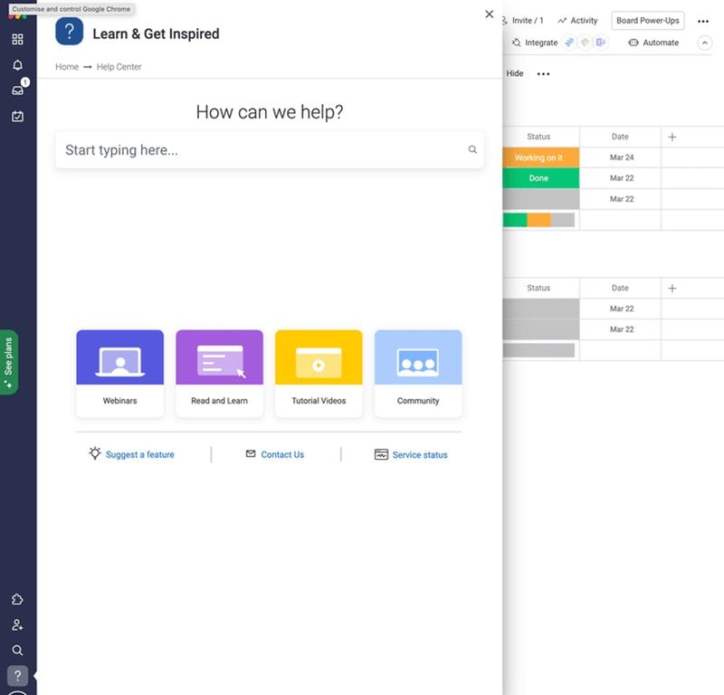
Monday resource center stands out for its practicality, allowing users to check service status and add feature requests directly within the platform.
This functionality empowers users by giving them a transparent view of the service’s reliability and a voice in the product’s development.
By incorporating these features, Monday fosters a sense of community and co-creation and builds trust through transparency.
Surfer
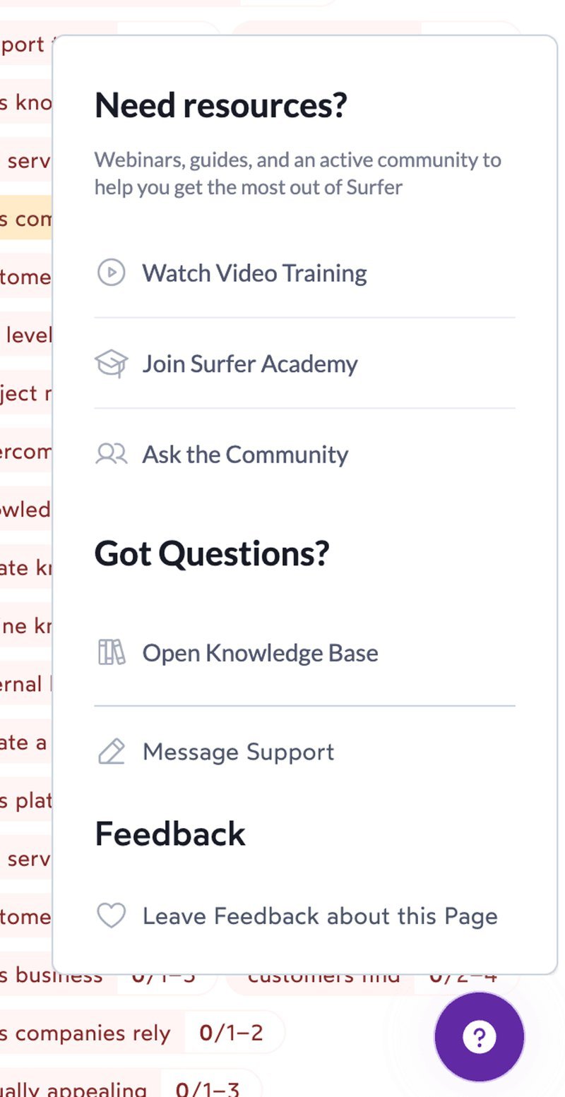
Surfer’s resource center distinguishes itself with an innovative “ask the community” option among other things.
This feature encourages users to engage with and learn from each other, creating a vibrant, collaborative environment.
By facilitating peer-to-peer support and knowledge exchange, SurferSEO enhances the depth and breadth of its content library and fosters a strong sense of community among its users.
Conclusion
Sure, resource centers may take an initial burst of work to get up and running, but you can likely repurpose content from your customer service team.
And once created, you have that content helping people going forward.

