[CASE STUDY] How Stripo Strategically Used the Aha! Moment to Improve Signups and Conversions
We’ve always said that the key to successful onboarding is to guide your users to your product’s Aha! Moment as soon as possible.
It’s something we encourage all of our customers to do. Why? Because of that Aha! Moment is when everything clicks into place. It’s when your users realize how much value they can get from your product.
One of our customers, Stripo Email, has used this to great effect. Stripo provides users with the Aha! Moment before they’ve even signed up. In other words, the Aha! Moment is used as a marketing tool!
We love Stripo’s onboarding flow, so we thought we’d share it with you here…
How Stripo onboards new users
When you head over to Stripo’s home page, you have a choice of two CTAs. We’re going to focus on the right-hand one.
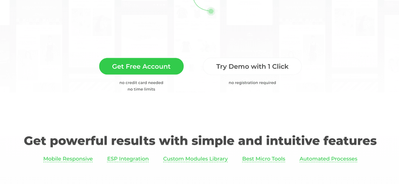
Notice that you can try out a demo of Stripo with 1 click, and without having to register. That’s pretty much as frictionless as you can get.
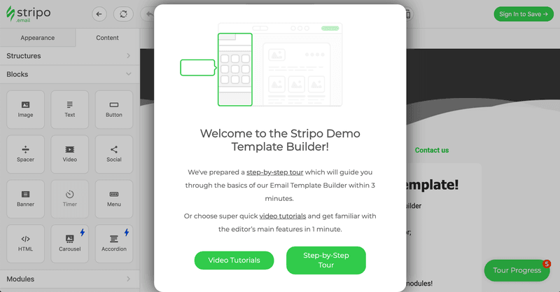
When you click to access the demo, you’re greeted with this welcome screen. It sets expectations (it’ll take 3 minutes) and explains that you can choose between an interactive tour or videos.
Providing users with a choice means that they can opt for whichever approach suits them best.
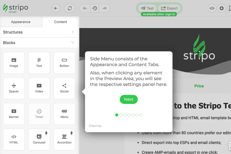
Stripo’s onboarding flow starts with a brief product tour. It’s designed to show you around the product, so you can start familiarizing yourself with the UI.
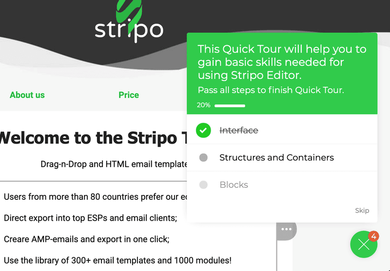
Once you complete that first tour, you’re presented with a checklist. If you’re thinking of adding a checklist to your product, then this is the perfect example.
It doesn’t have too many tasks on it, as that would overwhelm new users. It also provides a progress bar so you can see how close you are to finishing. Finally, it uses something called the “Endowed Progress Effect”. This is where the user has already ticked an item on the list, so they see themselves as making quick progress.
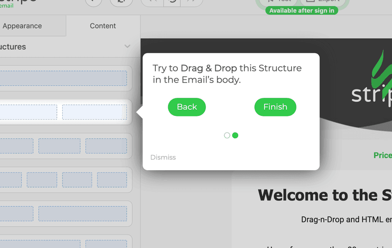
The next step in Stripo’s onboarding is to show you how the product works. It does this by guiding you through an interactive tour.
Rather than simply showing you how the product works, it asks you to use it to complete various tasks.
This way users learn by doing, and can experience the value first-hand.
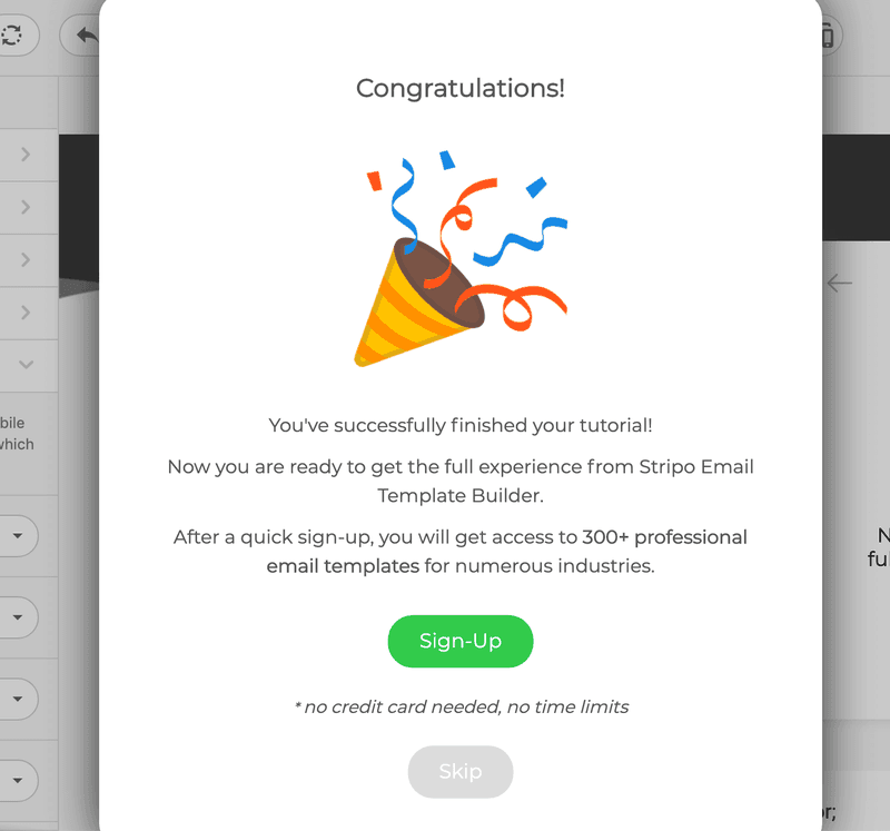
Once you’ve completed everything on the checklist, you’re shown a final modal. It congratulates you on completing the tutorial, and thus makes you feel good about yourself. It then asks you to sign up to the full product.
Why does it work?
The reason this approach works so well is simple:
By showing users value from the start, and by letting them experience the product’s Aha! Moment, Stripo can convince people that the product is a good one.
Imagine if Stripo didn’t offer this tutorial. Instead, users would have to read through the site, and then decide whether they wanted to sign up or not.
But this way, Stripo provides a completely frictionless approach to onboarding. There’s no sign-up form and no email verification. Just pure value from the start.
What do the numbers say?
Stripo has managed to turn the Aha! Moment into an actual marketing tool, and in doing so have managed to drastically improve signups and conversions.
Out of over 31,000 visitors to the site, 32% of them were engaged by the prospect of a 1-click demo. 5% of them went on to complete the tutorial.
Most importantly, 1500 users completed the whole tutorial before they signed up. They were effectively activated right from the start. On average, 38% of users completed the final interactive tour (out of all 6), giving them a thorough understanding of Stripo’s product.
Check out their full flow 👉here
How to use Userpilot to improve user onboarding
User onboarding is a crucial part of the customer journey as it speeds up the adoption process and increases retention rates. Onboarding is one of Userpilot’s core use cases along with product growth analytics and user feedback, so it has plenty of features that you can utilize.
Here are some Userpilot features you can use when onboarding new users:
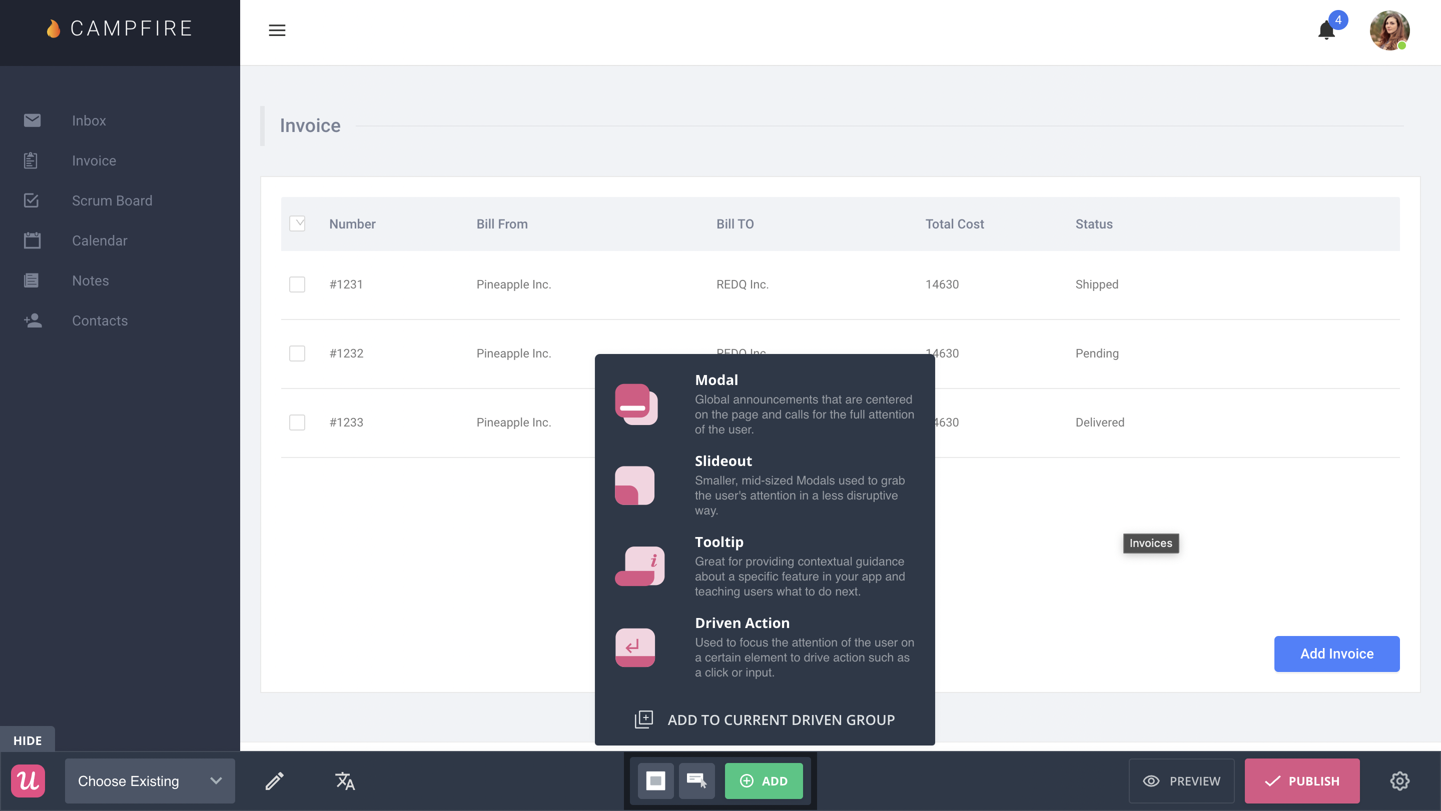
- No-code builder: Creating flows with Userpilot is as simple as installing the Chrome extension, selecting the UI patterns you’d like to use, and then editing the content/settings to suit your use case. You can also use templates to create modals, slideouts, tooltips, and driven actions.
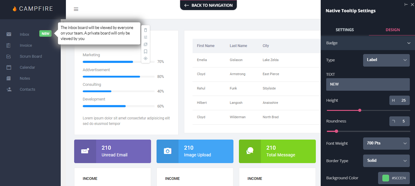
- Native tooltips: Userpilot lets you create native tooltips that show up when users hover over an element or click on an information badge. Since these native tooltips attach to the element itself, they aren’t page-dependent and will show up on any screen where that element is visible.
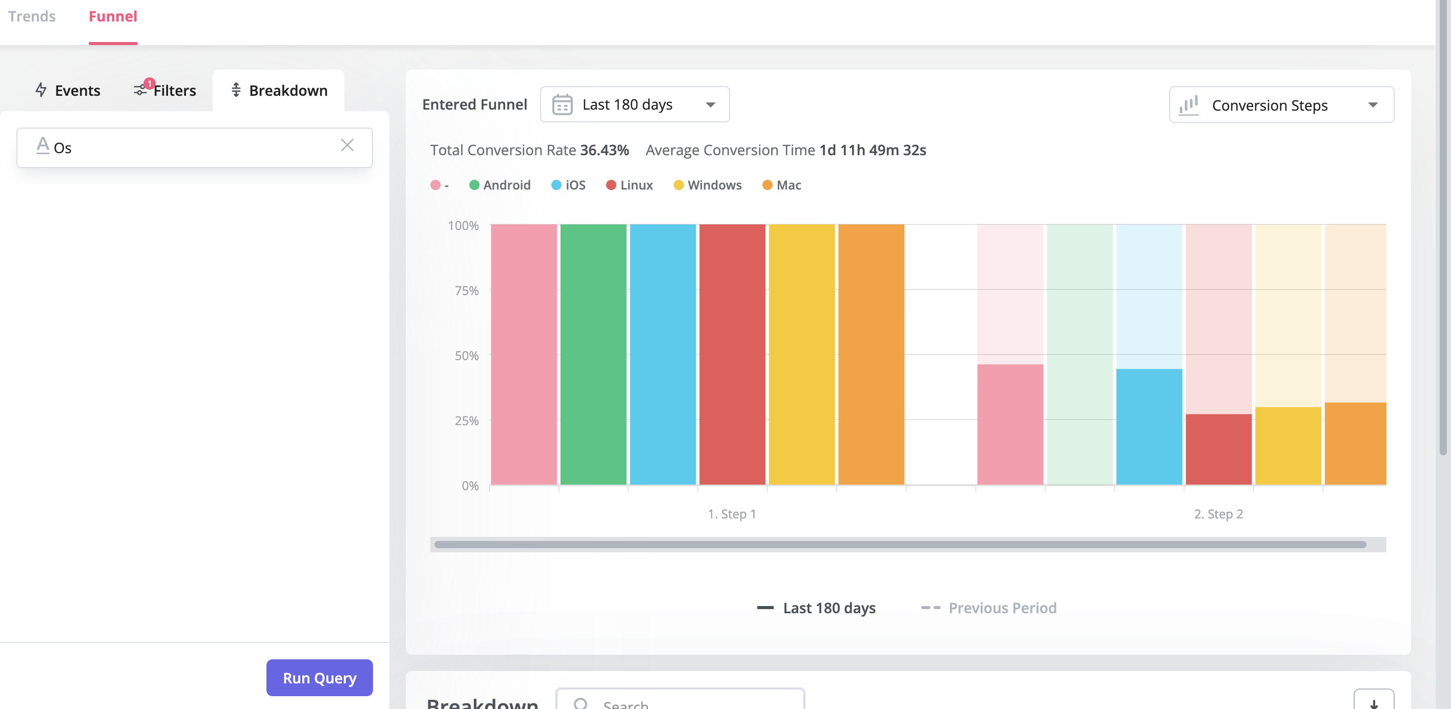
- Funnel analytics: Userpilot’s advanced analytics lets you create funnel reports that track the onboarding journey. You can also add filters (like name, user ID, signup date, operating system, country, etc.) and monitor the total conversion rate from the first step of the funnel to the last.
- User segmentation: Userpilot lets you segment users based on the device they’re using, where they’re located, their engagement data, or which NPS rating they selected on the latest survey. You can then filter your analytics dashboards to see which segments struggle with onboarding.

