User Adoption Metrics in 2026: Why You Need to Track Humans and AI Agents Separately


The user adoption metrics dashboard said the account was healthy. Daily sessions, three features consistently used, week-over-week growth in activity. When my CS team called that account in early Q1, they found out no human had logged in since January; every session was an AI agent automating a reporting workflow through the API.
I’m James Mitchinson, Head of Customer Success at Userpilot, and I’ve been seeing that pattern more and more in 2026. Tracking user adoption used to mean tracking people: how quickly they completed onboarding, whether they came back the following week, and which features they actually used. That assumption held fine when the only things using software were humans.
Gartner estimates that 40% of enterprise applications will have embedded task-specific AI agents by the end of 2026, up from less than 5% in 2025. That agent traffic is already showing up in B2B SaaS dashboards as active user sessions. Your metric stack probably treats it as human engagement.
This article lays out two stacks: human adoption metrics tracked at the account level, and four agent adoption metrics to run alongside them. The human-to-agent usage ratio ties them together and tells you which CS conversation to prepare for.

Your adoption metrics still assume all users are human
User adoption metrics are quantifiable data points that track how and how often users interact with your product.
The part that needs updating in 2026 is the word “users,” because the things generating activity in your B2B accounts now include both humans and AI agents, and measuring them with the same signals produces an account health read that is accurate about volume but misleading about the nature of that volume.
An account that is 90% human-driven needs engagement conversations, training programs, and adoption coaching focused on the specific users who are lagging. One that is 90% agent-driven needs a completely different conversation: is the integration stable, are tasks completing reliably, and are there API rate limits approaching that the team hasn’t planned for. Both can show identical activity signals in a standard adoption dashboard.
Neither profile is worse than the other. Running a standard human-adoption playbook on an agent-driven account wastes everyone’s time and misses the actual risk. Splitting your metric stack is about preparing the right conversation, not judging account quality.
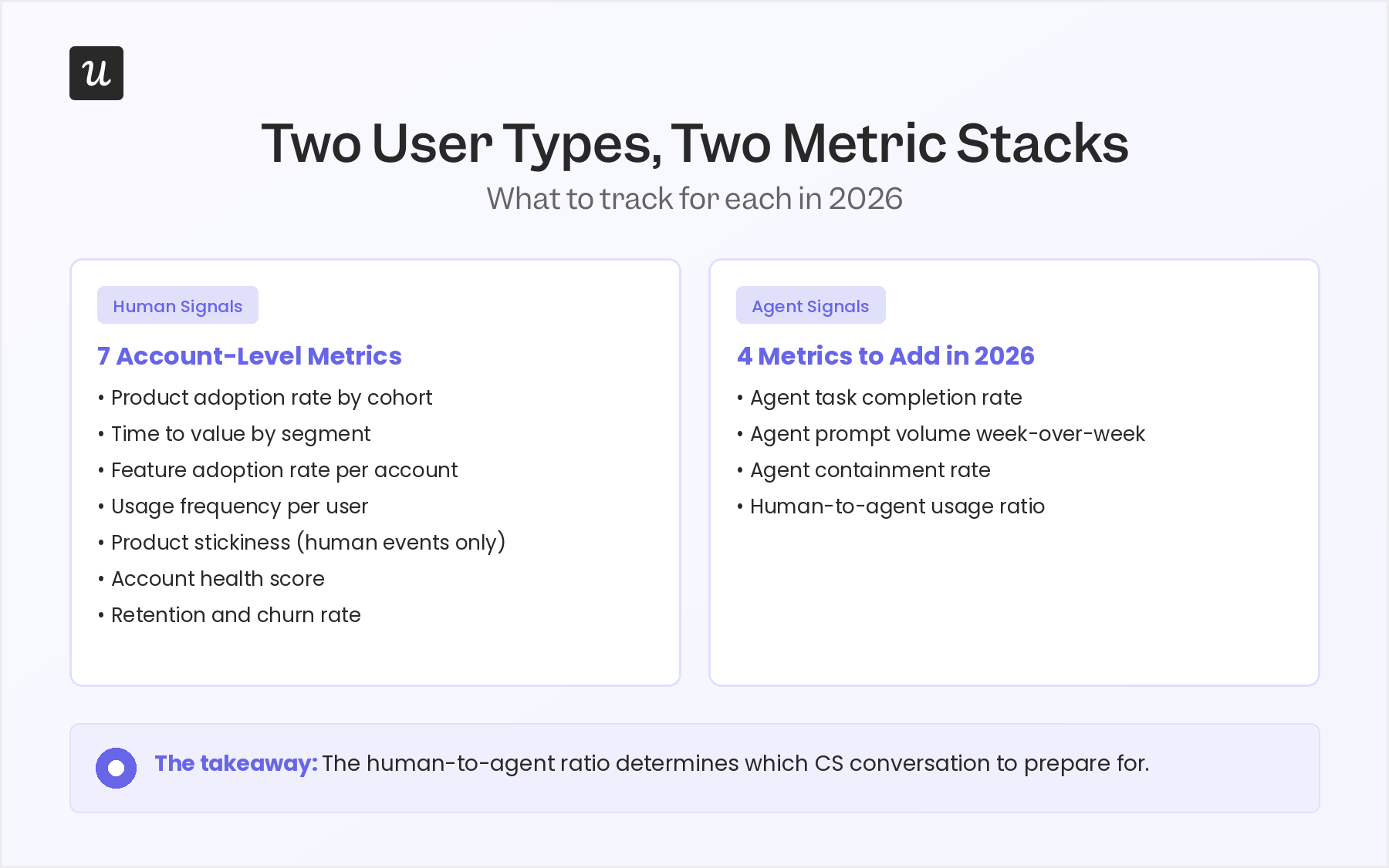
Human adoption metrics: Seven signals CS teams should track at the account level
Most treatments of user adoption metrics present these as product-wide averages. For a CS team, that is the wrong unit of analysis. The question is which accounts adopted a given feature, which haven’t, and what that gap says about renewal risk.
I have ordered these seven metrics from leading indicator to lagging output. The goal is to catch issues early, before a renewal conversation starts rather than during one. Qualitative feedback from interviews, surveys, and support sentiment adds the “why” behind these numbers, but the signals below are what tell you which accounts to call first.
1. Product adoption rate by cohort
The product adoption rate measures the percentage of new users who engage meaningfully with your product over a specific period.
For CS, the useful version of this metric is segmented by persona and measured at the account level, not rolled up into a single product-wide number that hides the variance between accounts.
An enterprise account that onboarded 50 seats and has 35 genuinely active users has a 70% adoption rate within that account. A mid-market account that onboarded 10 seats and has 3 active users has a 30% adoption rate. Both can produce the same product-level average and both require completely different conversations.
Cohort analysis groups users by their signup date or behavior to track how adoption rates evolve over time. Track this per cohort (users who joined in the same 30-day window), segmented by role or persona, and set a clear threshold: users who reach your activation milestone within 30 days are adopted, those who don’t are at risk from week one.
2. Time to value by segment, not as a single average
Time-to-value (TTV) measures how long it takes a user to complete the activation milestone that signals they have experienced your product’s core value. Most analytics platforms report this as a product-wide average, but a CS team needs it broken down by account size, persona, and use case. A legitimate enterprise implementation might take 21 days; a self-serve SMB onboarding process should complete in under a week.
Strong onboarding guides users toward their first key action as quickly as possible. When TTV is fast but activation rate is also low, there is a drop-off somewhere between signup and the aha moment; users reach that first action quickly but bounce before they understand the value. High TTV and high activation together tell a different story: the product takes time to learn, but users who commit stay.
Knowing which TTV range applies to which segment is how you calibrate proactive outreach. An enterprise account 18 days into onboarding with no activation milestone hit needs a different call than the same account at 7 days. Segment the average and you know which one is actually urgent.
3. Feature adoption rate at the account level
Feature adoption rate at the account level tracks which accounts are actively using which features, not only the overall percentage of your user base engaging with each one. The calculation: users in the account actively using the feature, divided by total account users, multiplied by 100. This matters for CS because feature usage maps directly to the use cases an account bought your product to solve.
An account that licensed your product for automated reporting but hasn’t touched the reporting module in 45 days is a churn signal. One that bought for user onboarding and is now using three adjacent features beyond what they initially licensed is an expansion signal. Neither reads shows up in a product-level feature adoption number.
Feature usage depth (how many distinct features a user or account interacts with in a given period) is a useful companion metric here. Shallow depth (one or two features) often means the account found a narrow use case but hasn’t discovered broader product value yet. Wide depth with high frequency is your clearest signal of a well-adopted account.
4. Usage frequency per user within the account
Usage frequency measures how often individual users log in and engage with your product over a given period. The account-level version that matters for CS is the per-user pattern inside each specific account, not the product-wide average. Two accounts can both show 1,000 sessions per month; in one, that is 50 users logging in daily, and in the other, it is five power users logging in multiple times a day while 45 seats sit unused.
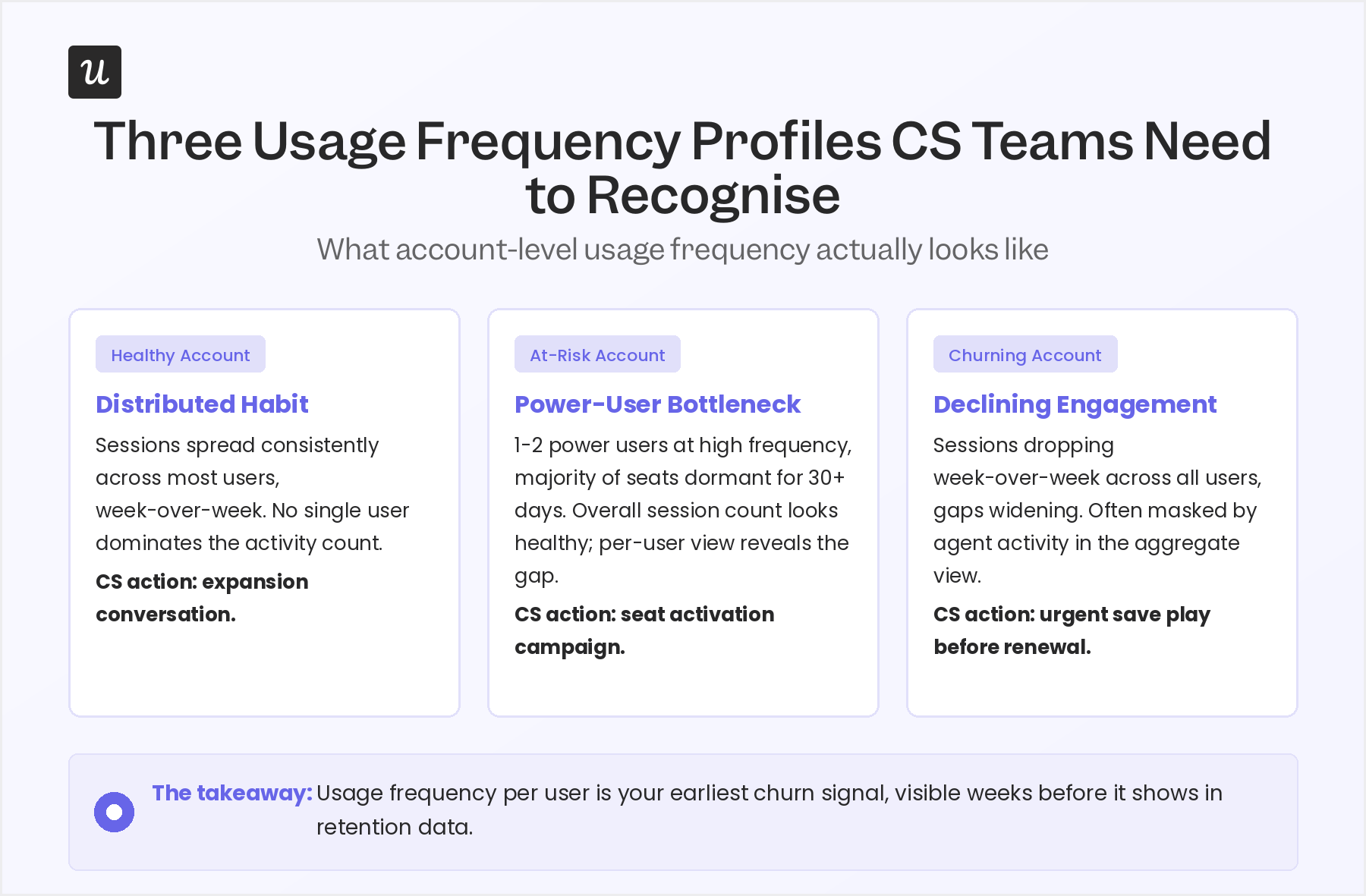
Track usage frequency per user within each account, then roll it up to see the account’s overall pattern. You are looking for habit formation: whether the humans in this account are returning to your product as a regular part of their work routine. A user averaging three to four sessions per week is building a habit; one who spikes once and disappears for two weeks is not, and that pattern usually predicts a churned seat at renewal.
Usage frequency at the account level is also how you identify expansion candidates and churn risks before the same renewal conversation. Power users with high frequency are your champions. Seats with near-zero usage over 60 days are the names that will push back on the invoice.
5. Product stickiness, calculated per account and filtered to human events only
Product stickiness is the ratio of daily active users to monthly active users (DAU/MAU). Daily active users (DAU), monthly active users (MAU), and weekly active users (WAU) are the building blocks of this metric, and a stickiness ratio of 0.4 means that users who were active during a given month came back on 40% of the days in that month, which is a strong signal of habitual use. In 2026, this is a reliable metric for human adoption with one condition: strip agent-generated sessions from the calculation before you interpret it.
An AI agent calling your API 200 times a day will inflate DAU dramatically, producing a stickiness ratio that reflects automation volume rather than human engagement. What looks like a sticky account might be 95% automated, with the three humans inside it logging in once a week. Filter agent sessions out using your event tagging, then calculate stickiness per account on the clean human-only dataset.
Use whichever frequency makes sense for your product’s natural cadence. A tool used in daily standups should show high DAU, whereas a quarterly reporting product might show strong MAU with low DAU, and that is entirely expected. The stickiness ratio means something different depending on how the product is designed to be used.
6. Account health score
No single user adoption metric tells you whether an account is healthy. The account health score is a composite of the leading indicators above, weighted and combined into a single number or tier that CS teams can act on without pulling five separate reports before every call. Common inputs include feature adoption rate, usage frequency, time-to-value achievement, support ticket volume, and whether at least one human user has logged in recently.
The right weighting depends on how your product is designed to be used. For tools where daily usage is the norm, usage frequency should carry significant weight. When the product is used weekly for reporting or analysis, feature breadth and depth matter more than session count.
One input I would flag as consistently missing from most health scores: a separate indicator for agent-driven accounts. An account where the AI integration is reliable and growing deserves a different health tier than one where agents are generating high volume but completing tasks at a 40% failure rate. Both show as active in a standard dashboard; only one is actually in a good state.
7. Retention and churn rate (lagging outputs to confirm, not lead with)
User retention measures the percentage of users or accounts that remain active after a defined period. Churn rate is the inverse. Both matter as output metrics, but they are the result of everything tracked above, not something you can fix by watching them directly.
By the time an account shows up as churned in your retention data, the leading indicators above had been warning you for weeks. An account that went dark in April showed declining usage frequency in February, a drop in feature adoption breadth in March, and zero new user activations in the 30 days before renewal. Retention rate confirmed what the leading signals had already told you.
Understanding your retention rate provides a clear view of overall adoption health across your portfolio. To improve retention and reduce churn, address the leading indicators first, not the lagging number itself. When retention data surprises you, it usually means a leading indicator broke down or wasn’t being watched at the account level.
AI agent adoption metrics: Four signals to add alongside your human stack
These are the metrics most CS teams are not tracking yet. They do not replace the seven above; they run in parallel. The goal is to give you a separate read on what is happening in accounts where a meaningful share of activity is automated, so you stop interpreting agent signals as human engagement.
Before you can track any of these, one instrumentation step is non-negotiable: agent-generated events must be tagged differently from human events at the point of data collection, before they reach your analytics layer. Tag agent events with a property like session_type: agent or a specific user ID pattern for API integrations, and keep that tagging consistent across every event type your product fires.
1. Agent task completion rate
Agent task completion rate measures the percentage of tasks an AI agent attempts in your product that it successfully completes without failing or requiring manual intervention. Calculate it as: successful agent task completions divided by total agent task attempts, multiplied by 100. This is your primary signal for whether an agent integration is actually delivering value in the account.
A completion rate below 70% means the integration is unreliable in practice, even if prompt volume looks healthy from the outside. High volume with low completion signals a broken connection, not a healthy integration; the frustration builds on the account side without the team necessarily knowing why. Pendo’s research on AI agent analytics identifies completion rate as one of the clearest leading indicators of whether an agent-driven account will expand or contract over the following quarter.
Track this weekly at the account level and flag any account where completion rate drops more than 10 percentage points in a single week. That kind of drop almost always signals an integration issue rather than a product issue, but it needs a CS touchpoint before it turns into a support ticket or a churned integration.
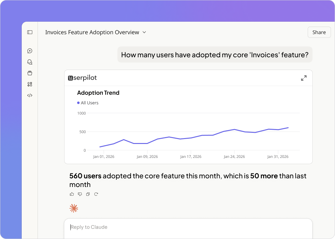
2. Agent prompt volume week-over-week
Agent prompt volume week-over-week tracks how many requests an AI agent sends to your product in a given week compared to the week before. Growing week-over-week volume means the account is expanding its automation, having found the integration useful and doing more with it. Four or more consecutive weeks of flat volume usually means they have hit a ceiling; declining volume is a churn signal for the integration even if the account itself is not visibly at risk.
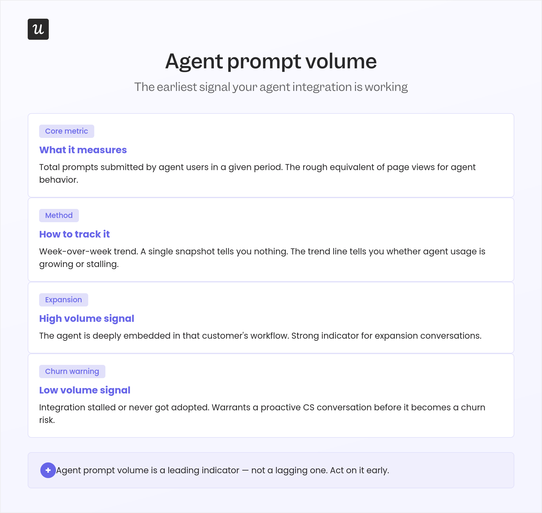
Break prompt volume down by task type where your instrumentation allows. An account that started with 100 reporting requests per week and is now running 400 is expanding its use case in a way that warrants a proactive conversation about API limits, pricing tiers, or the next feature set available to them.
Track prompt volume alongside task completion rate, not separately. A volume-completion read tells you the full picture: growing volume and high completion means the integration is healthy and scaling; high volume with falling completion means the connection is broken and generating noise; low volume across both means the account has the integration but hasn’t found a core workflow that relies on it yet.
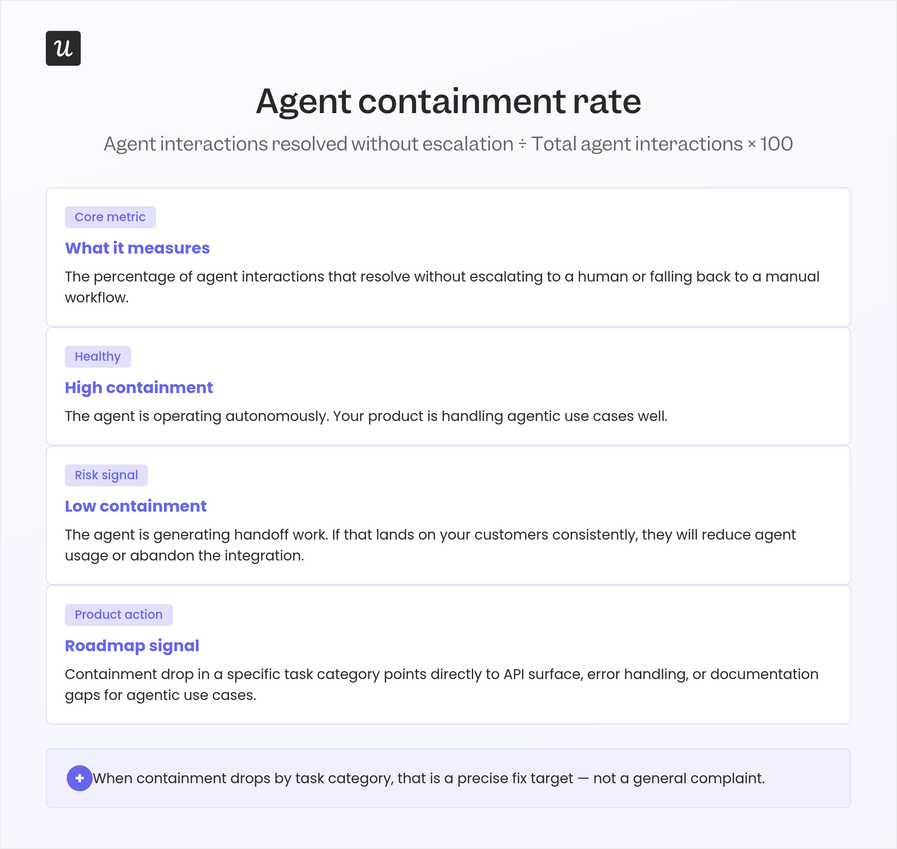
3. Agent containment rate
Containment rate measures how often an AI agent resolves a task completely without escalating to a human. Calculate it as: tasks resolved by the agent without human intervention divided by total agent task attempts, multiplied by 100. High containment means the agent is covering the account’s actual workflows; low containment means the integration handles the simple cases but routes the complex ones back to people, which limits the value it was supposed to deliver.
The right benchmark varies by use case. A reporting automation agent should have a containment rate above 85%, while a workflow agent handling complex edge cases might reasonably land at 60% to 70%, particularly in early adoption.
Watch for trends more than absolute numbers. A declining containment rate week-over-week signals that the account’s use case has grown beyond what the current integration can handle.
For CS, a declining containment rate is an expansion conversation if you get there first, and a frustration spiral if you don’t.
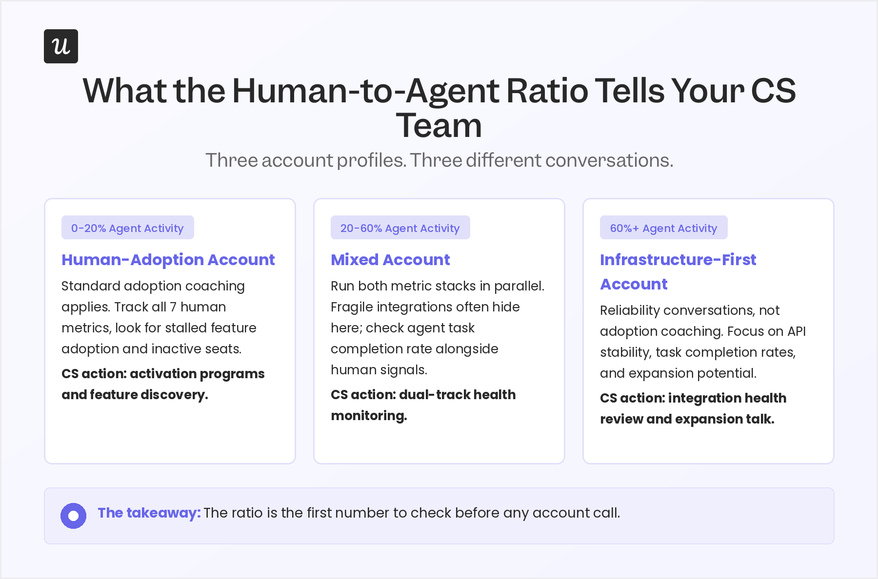
4. Human-to-agent usage ratio
The human-to-agent usage ratio measures what share of total account activity is human-generated versus automated. Calculate it as: human sessions and events divided by the total of human-plus-agent events, multiplied by 100. The ratio is the number that determines which CS conversation you need to prepare for, not as a judgment about account health but as a practical signal about what kind of attention this account needs.
An account at 15% agent activity needs a standard human-adoption playbook: who is using what, who has not logged in, which features have not been discovered yet. For an account at 80% agent activity, the conversation shifts entirely to infrastructure: is the integration stable, are task completion rates healthy, are there API constraints approaching. The same adoption coaching that works well in the first scenario rarely lands well in the second.
This is the metric I look at first when preparing for any account call now. It frames everything else in the conversation before I dial in.
What the human-to-agent ratio tells you to do next
Once you have the ratio for each account, you have three general profiles to work with. The thresholds below are not universal; your product’s natural use cadence matters, but they reflect what holds across most B2B SaaS accounts where agent activity is measurable and tracked.
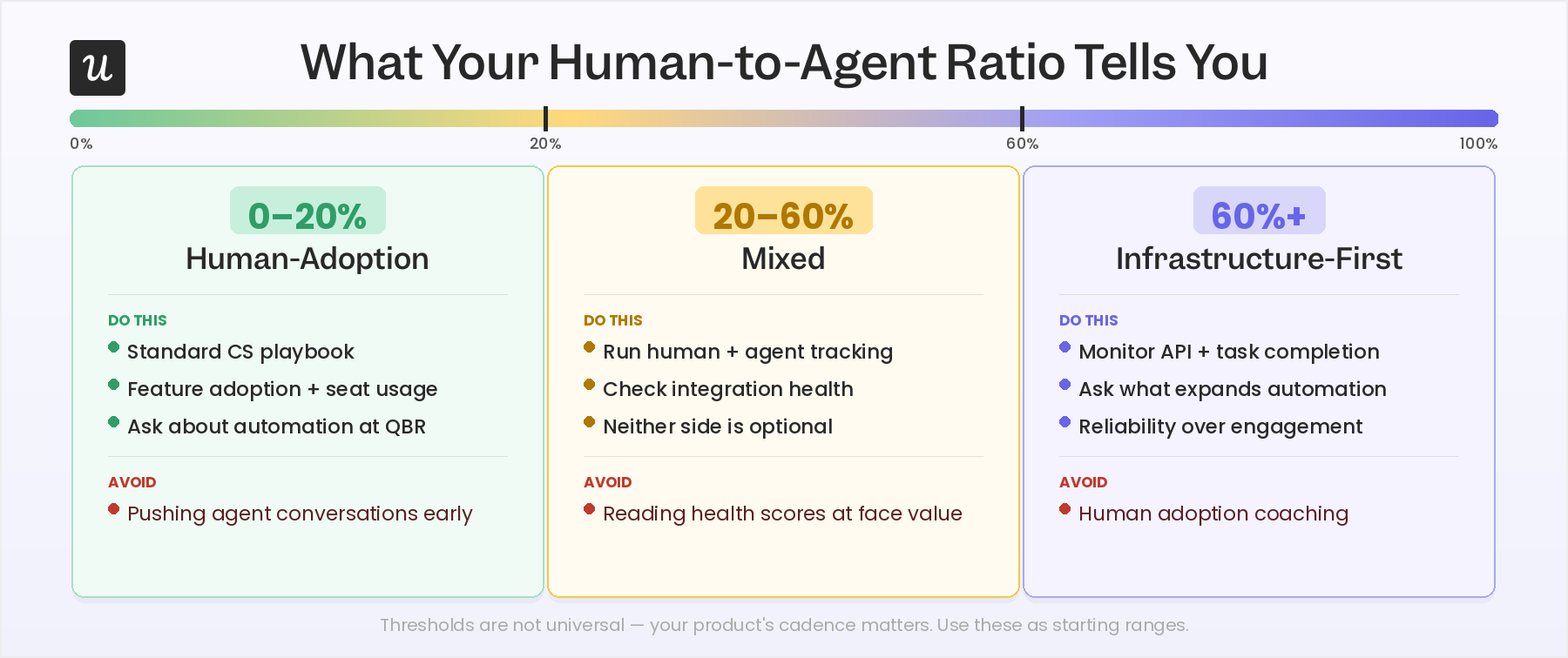
- 0-20% agent activity: Human-adoption accounts: Your standard playbook applies here. Track the seven human metrics above, look for stalled feature adoption and inactive seats, and run your normal activation and engagement programs. Agent adoption is not a priority conversation yet for these accounts. It is worth asking during QBR whether automation is on their roadmap, but it should not drive the prep.
- 20-60% agent activity: mixed accounts: These are often the most underserved. Standard health scores tend to read them as fine, but there is frequently a fragile integration running in parallel that nobody is actively monitoring. For mixed accounts, run human adoption tracking and agent adoption tracking side by side before every touch. Both sides need attention; neither is optional.
- 60%+ agent activity: infrastructure-first accounts: The majority of value delivery is automated, and the question for CS shifts from whether users are engaged to whether the integration is reliable and growing. Human adoption coaching does not land well here and can actively frustrate champions who have deliberately built away from manual workflows. Primary conversations for these accounts are API stability, task completion rates, and what the account would need to expand the automation further.
How to track human and agent signals separately in Userpilot
The moment AI agents start taking actions inside your product — completing flows, clicking features, submitting forms — your adoption metrics stop telling you what you think they do. A feature with 80% adoption might be getting most of its usage from an automated agent, not from a person who learned something. That distinction matters, because the interventions are completely different.
The fix is to pass a user property when agents authenticate — something like user_type: "agent" or is_human: false — and use Userpilot’s segmentation to split your analytics views from the start. Create two segments: one scoped to human users, one scoped to agent users. Every adoption report, feature usage chart, and goal funnel you build should be filtered through one of those two segments, not the combined population.
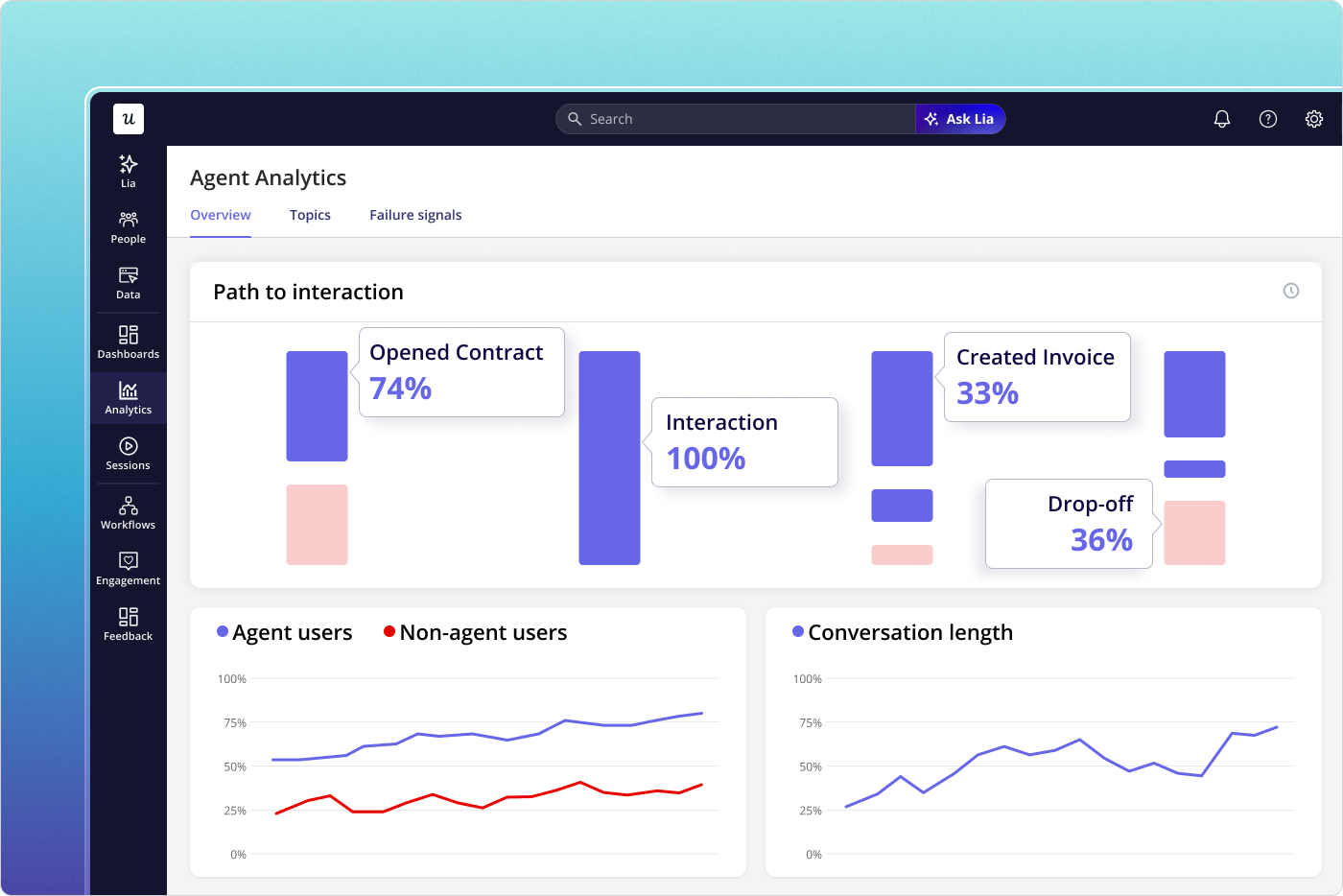
Once you have those two segments locked in, Agent Analytics in Userpilot does the heavy lifting. The dashboard logs every agent session separately: what tasks were attempted, which features the agent touched, where errors occurred, and how long each interaction took. None of that noise bleeds into your human-user funnels because it never shared the same segment to begin with.
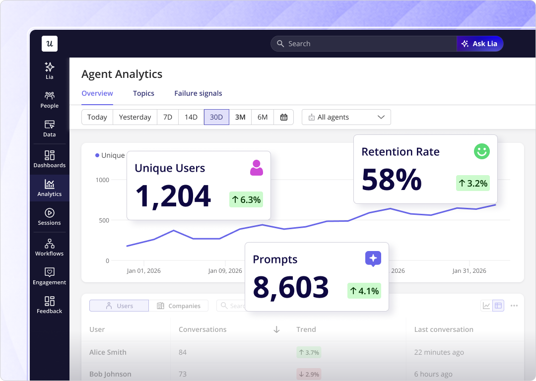
For human users, the signals you care about are session depth, return frequency, and where people stop in a flow — anything that tells you whether the feature is understood and valued. For agents, it’s task completion rate, error rate, and whether the integration is actually working. Userpilot’s custom events let you name both types of actions differently so they never land in the same report.
This is also where Lia earns its place. Yazan Sehwail, Userpilot’s CEO, describes how Lia works when you set it a goal: “You start that as a project. Lia goes, gets all the data, builds all the reports around this goal… analyzes it by segments, how long it takes, where the drop-off is, builds all the dashboard for you, and then comes up with actionable insights.” When your two segments are set up correctly, Lia reads each one on its own terms — surfacing activation drop-offs in the human segment, flagging error spikes in the agent segment — without you having to manually build separate views for both.
The segmentation also protects your activation data. If your activation milestone includes a feature that agents trigger automatically, you’ll report inflated activation rates every time a new integration goes live. Locking human-only segments into your activation funnel keeps the number honest and gives you a cleaner signal when you actually change something in onboarding.
About the author