In-App Survey Design: Tips, Best Practices and Great Examples From SaaS

Looking for inspiration to design a great in-app survey?
We’ve compiled the best in-app survey design practices from Asana, LinkedIn, Slack, and more, which gently prompt users to provide feedback.
Read the article and learn how to build simple but awesome in-app surveys to collect relevant user feedback with no friction.
What is an in-app survey?
An in-app survey is a short questionnaire triggered contextually and used to collect specific customer feedback about the user experience or the product.
You can use custom event triggers to target your surveys to specific user segments at a specific moment in their user journey.
Benefits of using in-app surveys for gathering feedback in SaaS
Truth be told, there are many options to gauge customer satisfaction — in-app surveys, email surveys, phone calls, you name it.
Product and marketing managers choose in-app surveys to get clear-cut user feedback fast. It works because you can trigger short, relevant surveys right inside your product when a specific group of users engages with a particular feature.
Other methods simply are not intended for that task.
In a nutshell, implementing in-app surveys will help you:
- Increase response rate (aka get more responses).
- Get more specific and targeted feedback.
- Get user feedback faster.
- Easier to analyze data and automate responses.
- Identify friction points in the customer journey and fix them.
Increase response rate (aka get more responses)
If you target active users of specific features and ask them to give feedback, they’re likely to say “yes.” It completely makes sense as they’ve been using your product for some time and have formed their opinions.
Let me exemplify.
Asking passers-by about the efficiency of using some drugs for sore throat treatment is a bad idea. The streets are crowded but with the wrong audience. If you want to collect feedback on something medical-related, you had better go to a hospital and ask doctors.
This is a simple illustration of how the right question in the right place increases the response rate.
More specific and targeted feedback
Use microsurveys to reach the customer segment you want with the targeting settings in-app.
Meaning you can ask for product feedback from a group of users interacting with a particular feature at the moment.
It helps accumulate very accurate data and define what product changes should be made in the first place to reduce churn or increase product stickiness.
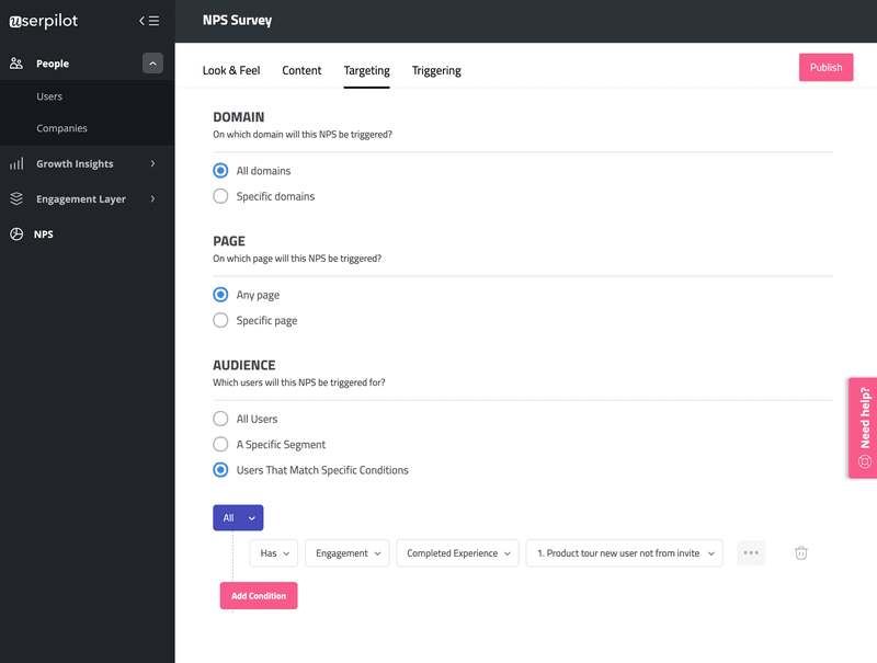
In the screenshot below, you’ll see some options of NPS survey targeting, helping collect more specific feedback:
- User landed on a specific page of your website — for collecting in-the-moment feedback.
- Users that match particular conditions (NPS score, engagement, subscription plan) — for gathering highly relevant feedback.
Get user feedback faster
Was your feature update smooth? Are customers satisfied with the last update? Are they willing to buy extra credits?
Don’t just hope for the best.
Create an in-app survey as soon as the new feature is live and start collecting feedback as users engage with it. The faster you start receiving positive or negative feedback, the sooner you act on it.
Win the time and begin accumulating detailed feedback right after the product update to transform it into tasks for the following sprints.
Easier to analyze data and automate responses
Once you have created a constant flow of getting feedback, go to the next phase — implement auto-replies to seize the moment and ask users for an extra favor.
For instance, when someone gives you a high Net promoter score (NPS), putting them in the Promoters category, thank customers right away and ask them for a more in-depth review on G2 or Capterra. Loyal users are more likely to say “yes” to this request.
The sweet spot is that you can automate responses based on users’ answers.
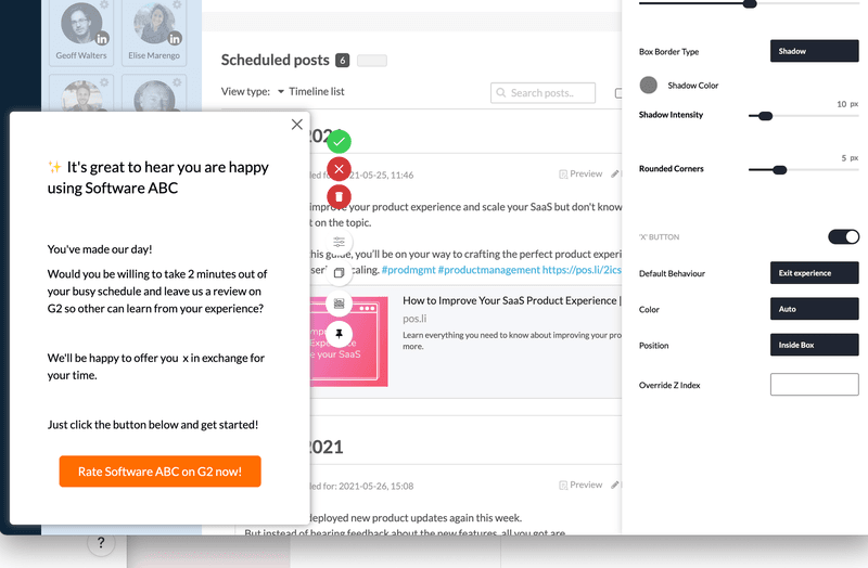
Plus, a product management team can start analyzing responses as they come in, whether it’s a net promoter score survey or precise feedback on a recent feature.
There is no need to wait for everyone to send in data or process it manually. In-app survey tools show you the analytics side in real-time.
Frequent use cases for in-app surveys
Now you should be fully aware of the main benefits of in-app surveys, let’s jump to the most intriguing part — how you can utilize the in-app survey data you collected:
- Identify pain points in product adoption with customer effort score (CES) surveys.
- Collect feedback on new features and product updates.
- Measure customer satisfaction (CSAT surveys) to find out frictions users deal with.
- Measure customer loyalty (NPS surveys) and get actionable insights on how to make a majority of customers happy with your product.
- Understand user needs and personalize onboarding with welcome screen microsurveys.
- Automate responses and data analysis to save your time on processing.
In-app survey design best practices
A well-designed survey is of paramount importance to get all the benefits we’ve just walked through. Below I’ve prepared a decent list of in-app survey design best practices you have to stick to.
Grab the next mug of tea because we’re about to examine every corner of microsurveys.
Use segmentation and target your surveys towards specific users
The right question in the proper context will make the difference in your data while keeping users happy (no friction).
That’s when in-depth user behavioral segmentation comes in handy.
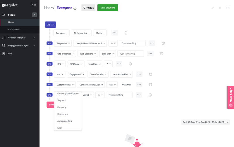
You can run a microsurvey with dozens of variables to interact with users of a certain feature.
For instance, trigger a one-question survey (CSAT) right after they engaged with a targeted URL for the first time. Ask them: “How easy it was to build your first in-app survey?” or whatever is relevant for you.
After several sessions, show users an NPS survey or a feature feedback survey. Try to assess how users feel having worked with a product for a while.
By implementing such flow, you’ll recognize product flaws at a specific moment of the user journey.
Keep user surveys short and on point
Don’t sabotage user experience by showing long-form or irrelevant questionnaires.
Keep it concise and on point. Also, pay attention to the number of ongoing surveys. Customers shouldn’t feel annoyed by endless pop-ups.
Match your brand look and feel
An in-app survey should be a part of your UI — in harmony with the brand look and feel. As we want to build a frictionless user experience while engaging with both a product and surveys.
Upload your logo and font style as well as the primary color for a survey’s background and buttons from your brand book.
Leave enough white space around the text to make it floating and appealing.
Use an in-app feedback widget to continuously collect feedback
Take a glance at an “always-on” widget. In most cases, it’s a button placed in the up-right corner to make a user give feedback whenever they want.
It can be linked with any points in the user’s workflow so that you might receive even more insights.
Here’s a great example of Jira’s “feedback button.”

After clicking on that, a personalized survey pops up based on which part of the app you were using when you engaged with the feedback widget.
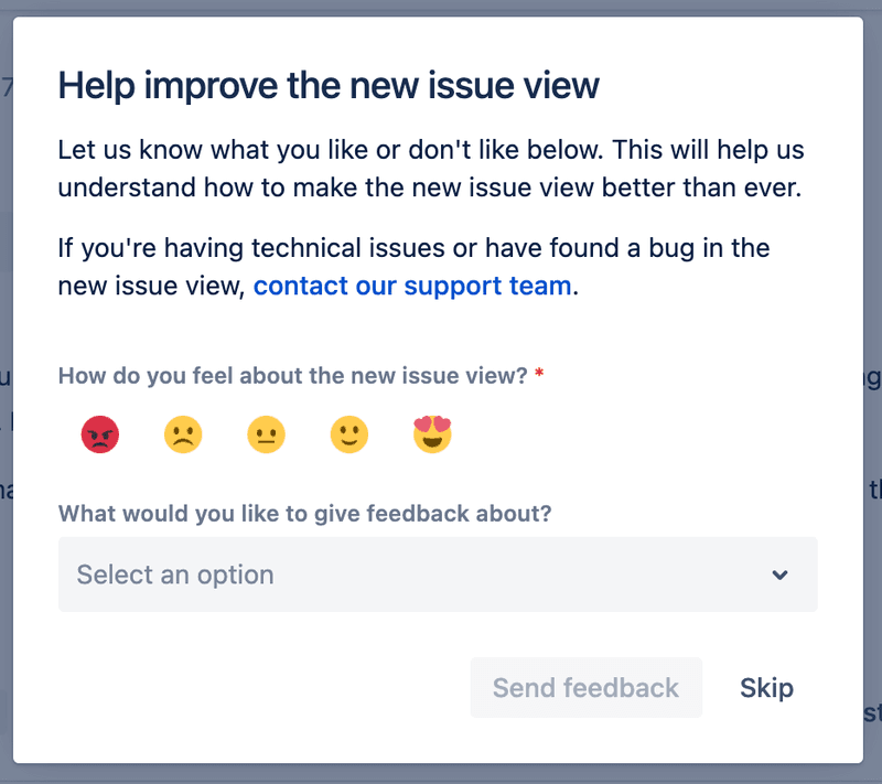
This tiny built-in element lets us keep our fingers on the pulse and collect contextual feedback 24/7. Otherwise, we’re risking losing valuable feedback because we cannot predict all kinds of scenarios when users have strong feelings to share opinions.
Avoid bias in your survey questions
It’s very important how you write your survey questions. From time to time, the way we phrase the questions allows bias. It happens unintentionally and unconsciously.
Look at the most common mistakes that lead to survey bias:
- vague or loaded questions
- complicated language
- leading questions (e.g. How happy were you with your experience?)
- double-barrelled question
They confuse customers and cause irrelevant data. Also, difficult questions lower the survey completion rate. Try to avoid that types of mental traps and double-check your writing before publishing a survey.
Add a progress bar or incentives
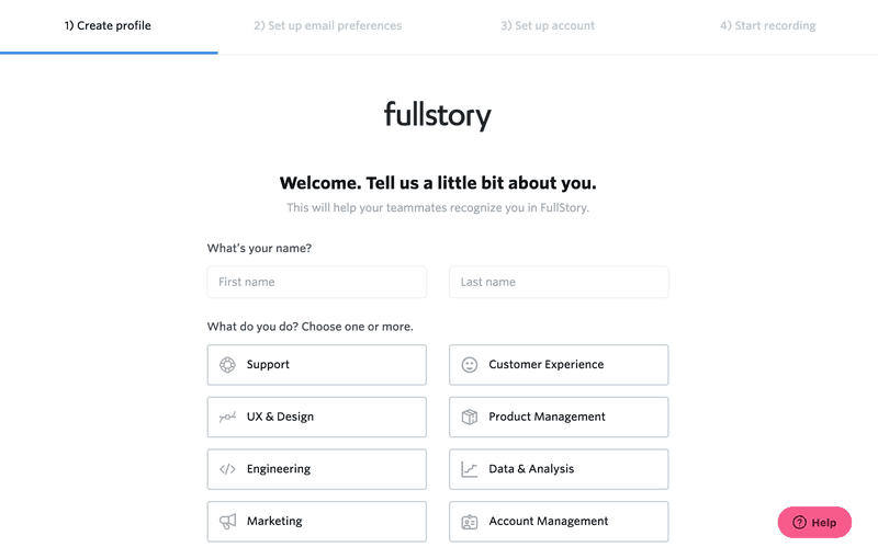
Speaking of SaaS products, we can meet a progress bar in a signup-flow survey with multiple screens. The progress bar is a gamification element (as well as incentives) that helps users finish a survey once they started, by seeing they are closer to the finish line.
Try to put yourself in the shoes of a Fullstory user.
There’re only four steps to set up my account, and it’s pretty doable. If I didn’t know in advance what it takes to start using this platform, I would probably have been annoyed by making extra efforts just to sign up.
Best in-app survey examples to inspire you
Let’s get down to practice!
I’ve compiled some fantastic examples of in-app surveys for SaaS so that you can utilize these ideas and unlock product growth opportunities.
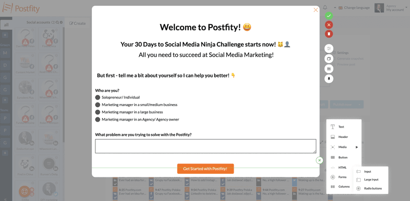
Postfity — Welcome screen micro survey
Postfity’s welcome screen microsurvey is a perfect example of how to collect data about your users in order to build personalized onboarding for each persona.
Consequently, it speeds up customer adoption and boosts their stickiness to a product.
Adjust this survey for signups and get a clear picture of your user persona even before showing users other onboarding experiences that might not be relevant for them.
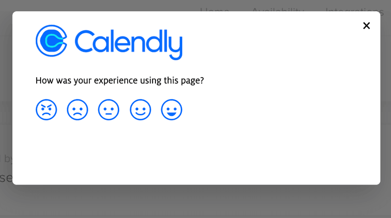
Calendly — In-app customer experience score using emoji
Using emoji score makes it easier to relate and give a fast answer because it’s simple and accurately reflects our emotional condition.
Calendly applies this type of survey to gauge user satisfaction after they engaged with certain features.
Also, pay attention to the question — how short and on point it is.
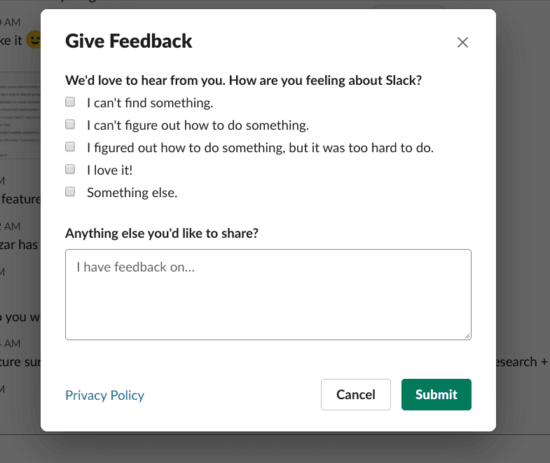
Slack — both quantitative and qualitative feedback
Slack uses both quantitative and qualitative feedback to analyze user sentiment from different aspects.
The great wording and open-ended questions are smart strategies for collecting more opinions, while the placeholder text prompts a user to start writing.
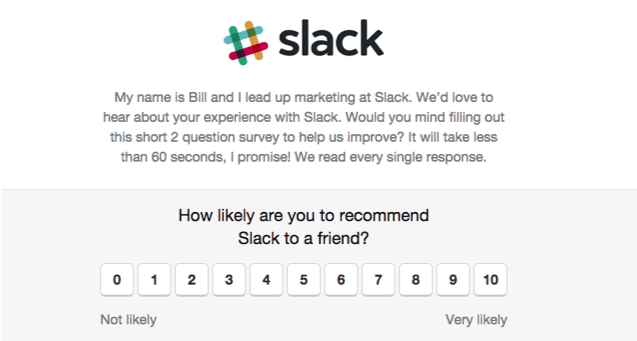
Slack — Net Promoter Score (NPS) in-app survey
NPS surveys are not about trite phrases “Please, rate us!”. Use given space for a creative and personal touch to make customers feel connected and special.
Look what an awesome and engaging description Slack applied to the regular NPS survey. They introduced the Slack marketing manager and promised to read your feedback. As a nice gesture, they also invited you to participate in the survey and even estimated your precious time spent on filling out 2 questions.
As a bonus, I’ll share one more method to receive detailed answers without compromising the completion rate of the NPS survey.
First, ask customers how they feel about your product (like Slack did). Then create a non-mandatory follow-up instead of placing an extra form on the same screen.
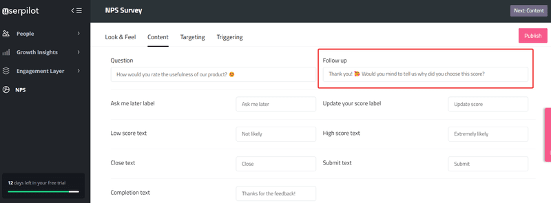
Whether dealing with detractors or promoters, you will be piling up valuable insights for product updates. Plus, you can set notifications when a low score to get in touch with detractors with lightning speed.
Want to learn more about how NPS is more than a vanity metric and how to take advantage of this? Check out this webinar on how to measure user sentiment.
H3 Convertkit — personalizing the customer journey from the start
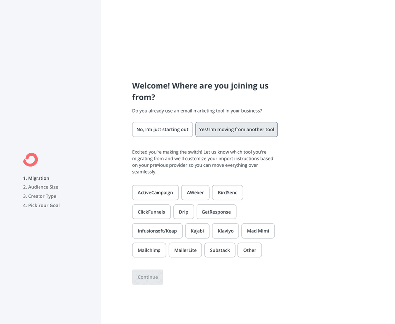
Ready to see a comprehensive welcome survey? Convertkit implemented a branched flow that changes next steps as users select answers, creating a personalized adventure for each customer.
This is a great use of in-app surveys as it helps customers skip unnecessary steps and get to experience value faster.
Asana — reducing churn with exit surveys
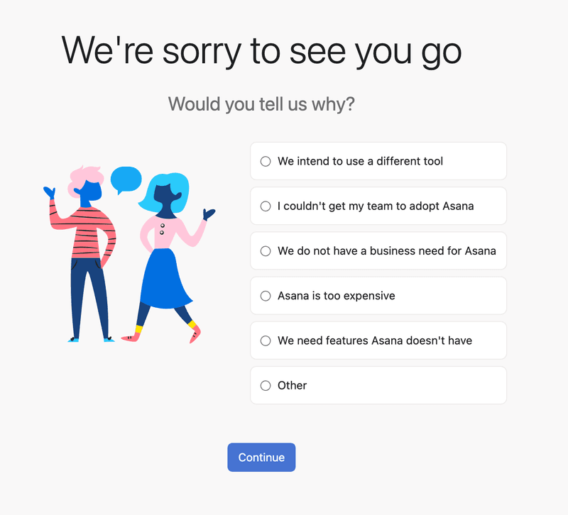
Don’t leave money on the table and always build exit surveys offering users alternatives — follow suit of Asana to retain customers and collect feedback on why users churn.
First, find out what has triggered the decision to leave with a proper user offboarding survey. For this purpose, Asana added predefined reasons based on why most of their users go.
Next, they embed a follow-up screen offering a sweet personal discount instead of canceling a subscription. It triggers if mentioned it’s expensive.
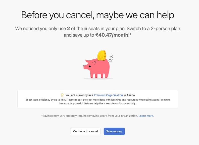
You can also go an extra mile and alter the user’s intention to say goodbye by providing exclusive offers like:
- A personal discount
- A dedicated customer manager to solve the issue
- Schedule a meeting with execs or the product team
- Prolong a trial (this method used by LinkedIn as users click on “is too expensive”)
Keep in mind why your customers are one step away from churning, and develop personalized offers.
Conclusion
Let’s summarize our learnings.
- In-app survey design goes above and beyond its look: including wording, placeholder text, button layout, triggering events, targeting, etc.
- User segmentation allows you to receive detailed or general feedback and spot issues in the product adoption curve.
- Operate numbers, not assumptions, when optimizing a product. Rely on collected stats such as NPS, CES, and more to accelerate your growth goals.
- Use the “always-on” widget to track customer loyalty and deliver world-class experiences.
- Increase MRR by mitigating the risk of churn thanks to ongoing in-app exit surveys.
Want to get started with in-app surveys? Get a Userpilot Demo and see how you can boost your product’s growth.

