For SaaS businesses, poor user experience doesn’t just irritate—it drives churn and kills revenue. Meanwhile, an intuitive experience can boost adoption, nurture loyalty, and power long-term growth.
So, how do you create that “can’t-live-without-it” product experience?
In other words, what makes the difference between products people love and interfaces that make users rage-quit? The 10 core principles we’ll cover separate engaging user experiences that feel magical from those that end up as product failures.
But first, a refresher.
Get The Insights!
The fastest way to learn about Product Growth, Management & Trends.
What are design principles in UX?
UX design principles are a set of guidelines that help product teams create user experiences that are intuitive, efficient, and enjoyable. UX design focuses on understanding user needs, behaviors, and motivations to create valuable and usable products.
They’re not hard rules—but they do provide a reliable framework for decision-making when you’re designing flows, interfaces, or in-app experiences.
Basically, these principles help you make smarter design choices, so users don’t get stuck, frustrated, or lost.
The three pillars of great UX design
Before we get into the individual UX design principles, it’s worth anchoring everything in three universal UX values: clarity, simplicity, and usability. These pillars turn design theory into real-world product outcomes.
“At Userpilot, we focus on usability, clarity, and simplicity. Our goal is to make sure users can easily navigate the product and get value as quickly as possible.” — Amal AlKhatib, Senior Product Designer at Userpilot
1. Clarity
Users should never have to guess what something means or how it works. Clear interfaces communicate purpose, function, and next steps without requiring explanation.
Creating products that feel intuitive hinges on understanding the user’s mental model—their internal representation of how things should work.
Great UX answers questions before users need to ask them:
- What is this?
- What can I do here?
- What happens next?
2. Simplicity
The best digital experiences feel effortless, reducing cognitive load by showing only what’s necessary at each step. The goal is to avoid situations that overwhelm users with too much information or too many options.
As Steve Krug famously writes in his influential book: “If you want to make sure your site or app is easy to use, the most important thing you can do is: Don’t make me think!“
3. Usability
Usability means designing for how people actually behave, accounting for limitations in attention, memory, and patience.
You’ll find many definitions of usability, often breaking it down into attributes like:
- Useful: Does it do something people need done?
- Learnable: Can people figure out how to use it?
- Memorable: Do they have to relearn it each time they use it?
- Effective: Does it get the job done?
- Efficient: Does it do it with a reasonable amount of time and effort?
- Desirable: Do people want it?
- Delightful: Is using it enjoyable, or even fun?
But Krug’s definition cuts to the heart of it:
“A person of average (or even below average) ability and experience can figure out how to use the thing to accomplish something without it being more trouble than it’s worth.”
Here’s why everyone has a different UX design principles list
If you’ve Googled “UX design principles” before, you’ve probably seen different versions of the list—some with seven, some with 15, some focused on visual design, others on cognitive psychology.
That’s not a mistake. UX is a broad field that spans multiple disciplines—design, psychology, product management, accessibility, and more. Depending on the context or stage of the UX process, different sources highlight different principles. For example:
- Designers might emphasize aesthetics, spacing, and visual hierarchy.
- Researchers might focus on usability testing and error prevention.
- Product teams care more about flows, feature adoption, and retention.
So, what’s the right list?
There isn’t one universal answer. But some patterns show up again and again.
Why we chose these 10 UX design principles
For this guide, we’re focusing on 10 time-tested UX principles drawn from trusted frameworks—like Nielsen Norman Group’s heuristics, human-centered design, and modern SaaS onboarding best practices.
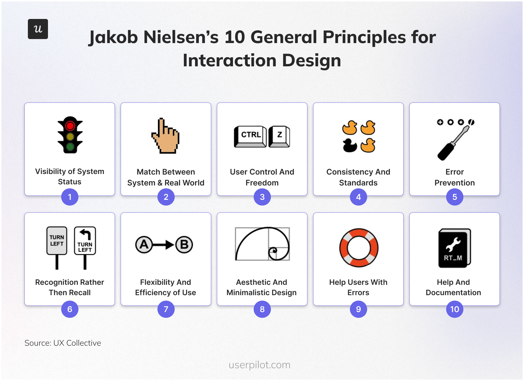
We’ve chosen them because:
✅ They’re practical and actionable for product and UX designers.
✅ They can be directly applied to SaaS onboarding and in-app experiences.
✅ They help product teams reduce friction and increase adoption.
This isn’t a theoretical list. It’s a field guide for building better product experiences.
10 Core UX design principles in SaaS [+ Real-world examples]
Theory is nice. Application is better. Let’s see how these principles actually work in the field.
1: Keep users informed (Visibility of system status)
Users should always know what’s happening in your product. This means providing clear feedback about:
- Where are they in the user flow?
- What actions have they taken?
- What’s happening behind the scenes?
- What will happen next?
All of this helps users navigate with confidence.
Without clear status indicators, users get confused, hesitate, and often leave.
What Slack gets right
Slack shows when someone is typing with animated dots, displays message delivery status, and uses presence indicators (green dot for active users). This keeps users informed about what’s happening and creates confidence in the system.
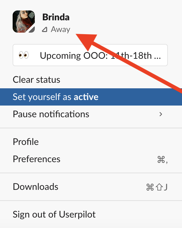
A well-timed tooltip or confirmation message can do more than just inform—it can reassure, encourage, and guide users through unfamiliar territory. Even a few words of clear, helpful copy can prevent confusion and keep users moving forward.
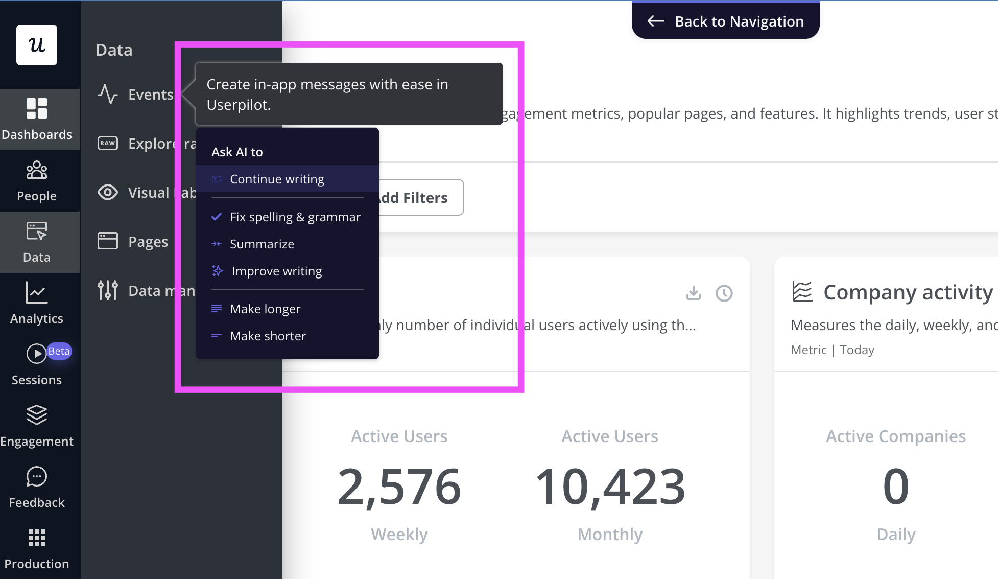
How Userpilot can help: Userpilot lets you write and refine in-app microcopy using AI. You can start from scratch or repurpose content from product docs—then adjust for tone, clarity, or length. The AI assistant helps you generate helpful tooltips, summaries, and prompts that speak directly to the user, right when they need it.
2: Design for real-world intuition (Match between system and real world)
Design should feel familiar. When your user interface mirrors the language, logic, and expectations users have developed from using all the other sites—including their existing knowledge of real life—you dramatically lower the cognitive load it takes to get started.
The more your design reflects how people already think and talk, the more intuitive it feels.
Avoid internal jargon, abstract labels, or overly clever metaphors that make users think “too” much before taking an action.
How Userpilot can help: One way to validate assumptions is through in-app surveys. When run regularly, they can help you pinpoint customer pain points and identify opportunities to deliver a smoother experience.
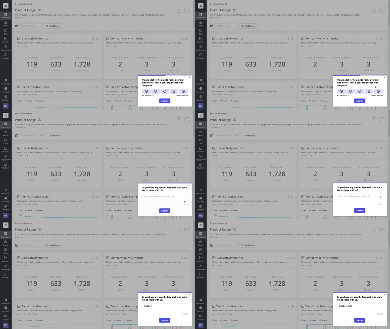
Userpilot also supports other forms of user research—like behavior tracking, A/B testing, segmentation, and personalized flows—so you’re always learning from what users actually do, not what you think they want.
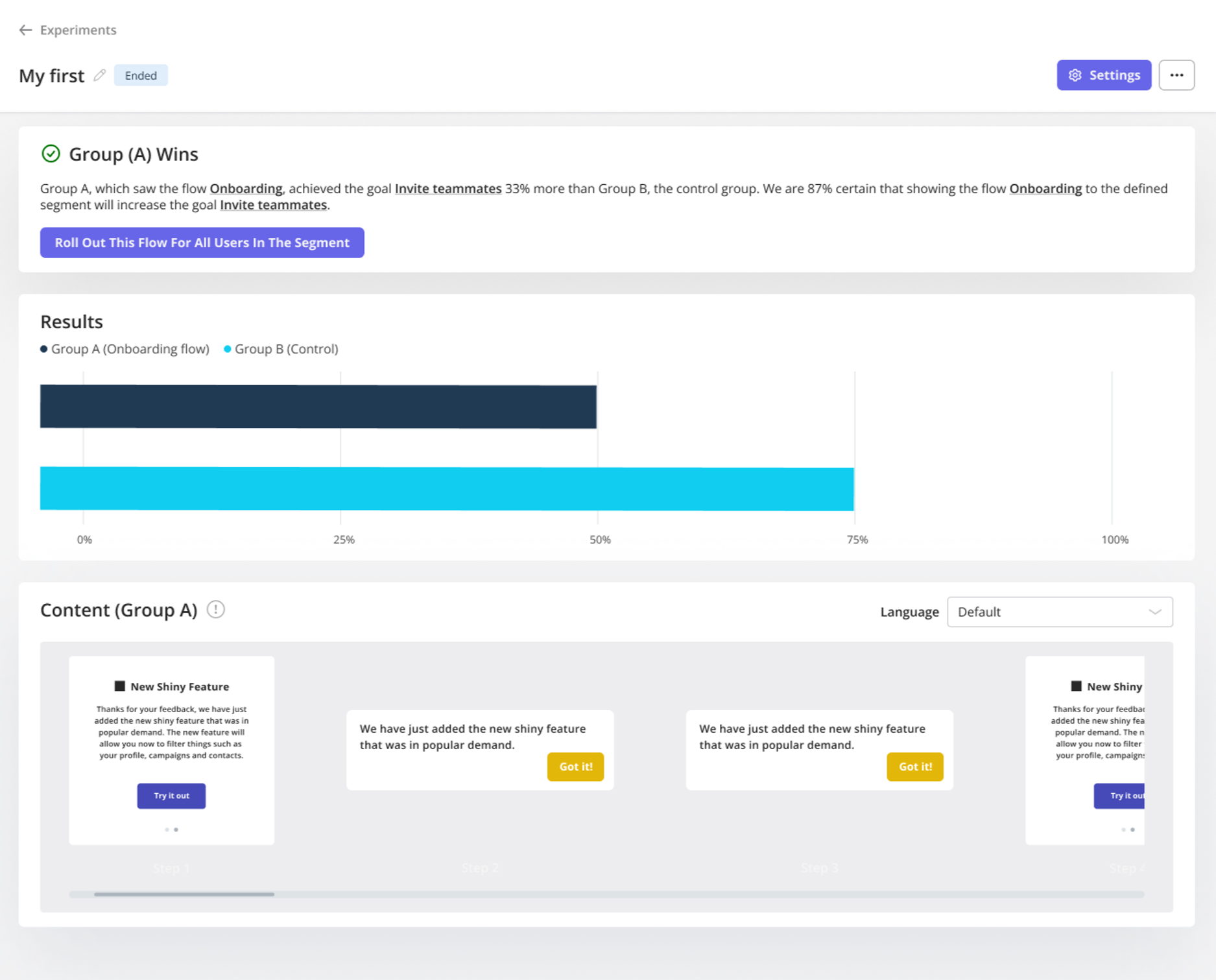
A/B testing, in particular, lets you test variations of in-app messages, tooltips, or onboarding flows to see what resonates best—removing guesswork from UX decisions.. When run regularly, they can help you pinpoint customer pain points and identify opportunities to deliver a smoother experience.
What Notion gets right
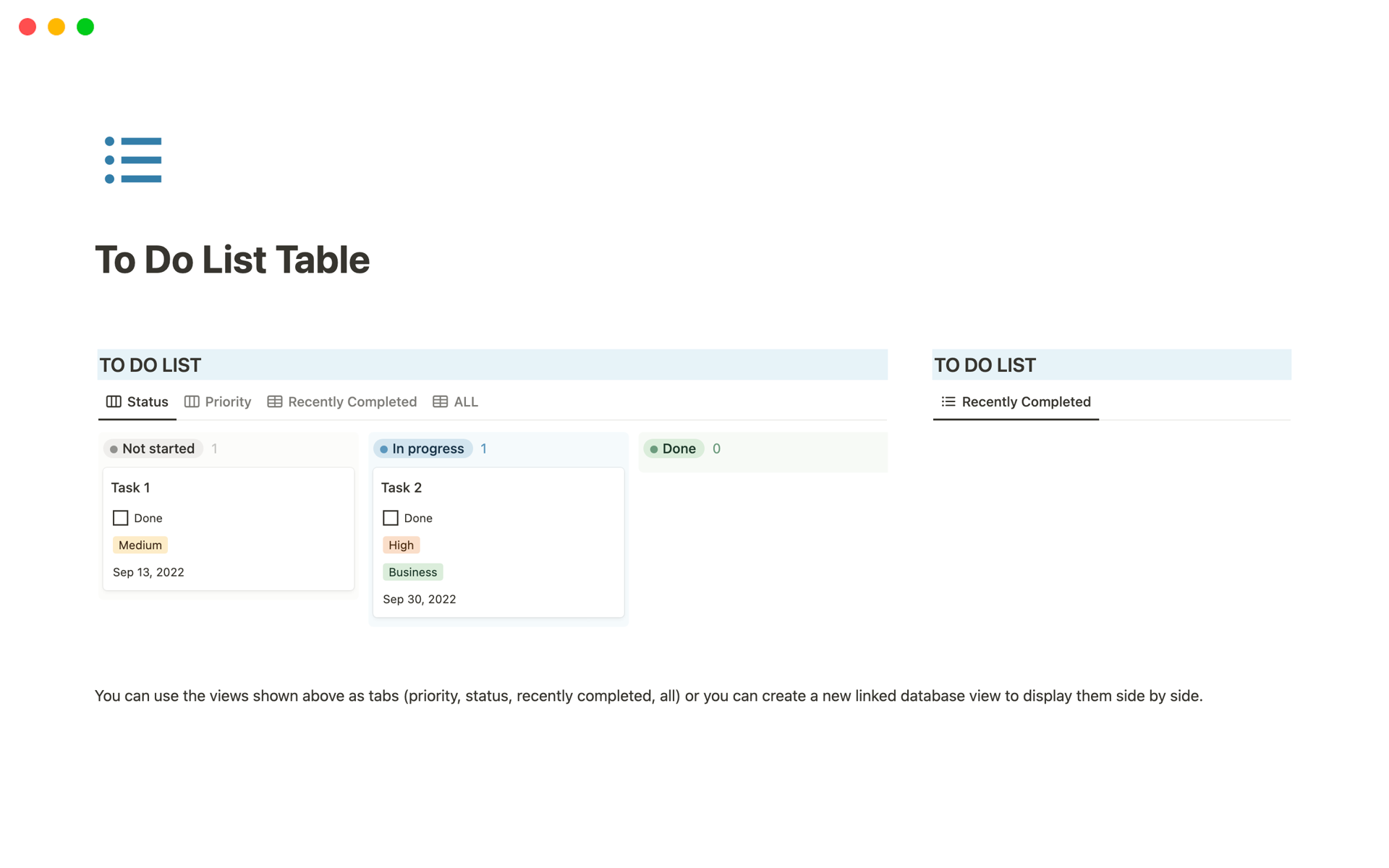
Notion uses familiar metaphors like pages, tables, and folders that mimic real-world organization systems. Their drag-and-drop interface for rearranging content mimics how we physically organize documents, making the experience intuitive even for new users.
3: Empower users (User control and freedom)
Users need to feel in control of the experience. This means:
- Making it easy to undo actions.
- Providing clear exit points from processes.
- Not forcing users into situations with no way out.
- Supporting both forward and backward navigation.
A good user interface design gives users the ability to exit, backtrack, or change direction.
What Canva gets right
Mistakes are part of the process, and Canva makes it safe to try, fail, and try again.
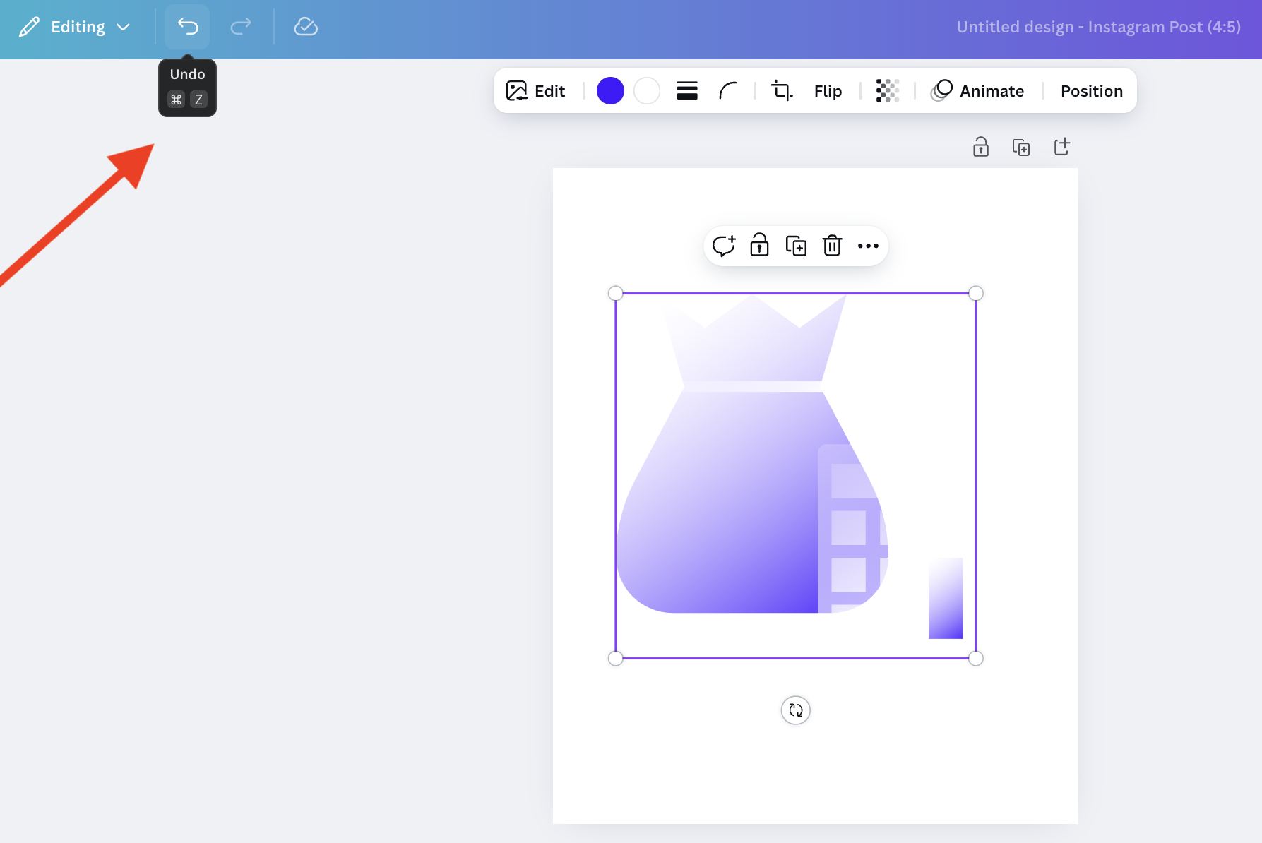
By making “undo” immediate and effortless, it empowers users to move quickly and confidently without the fear of getting stuck or messing something up permanently. It’s a small feature that makes a big difference in keeping users in flow.
4: Stay consistent (Consistency and standards)
Users expect visual design, interaction patterns, language, and navigation to behave uniformly across the product. Maintain consistency to create predictability, making your product easier to learn and use.
This applies to:
- Visual design (colors, typography, spacing).
- Interaction patterns (how buttons behave).
- Language and terminology.
- Layout and navigation structures.
Users form expectations quickly. When an element behaves differently in different contexts, it creates confusion. So, stick to familiar patterns. Because when your UI behaves the same way across pages, users learn faster and feel more confident.
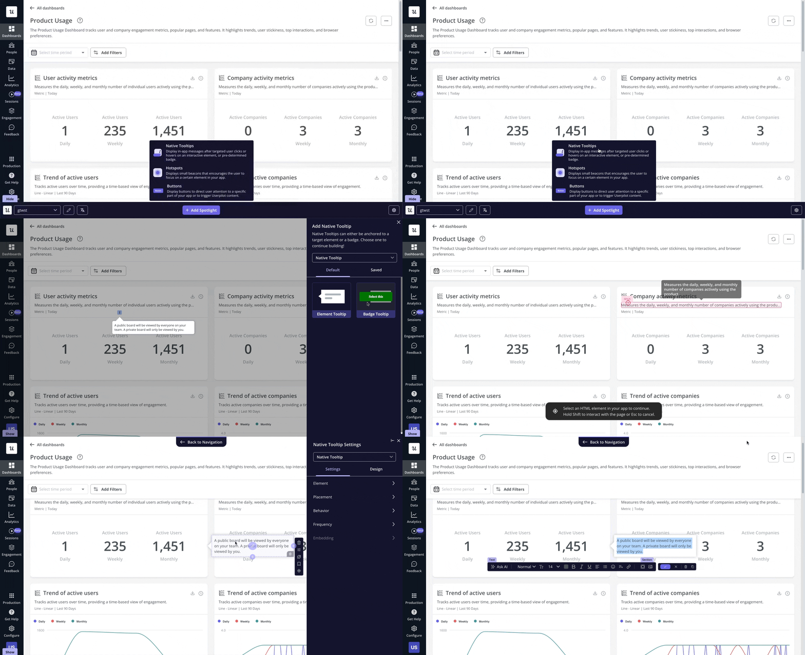
What Userpilot gets right
Userpilot’s own UI maintains consistent button styles, color coding, and terminology across all features. It maintains consistent styling across all in-app elements—from tooltips and modals to checklists and banners. Whether you’re onboarding a new user or launching a feature update, the look, tone, and interaction patterns stay the same—so users don’t have to re-learn anything.
5: Prevent errors
Good UX anticipates problems before they happen. This means:
- Eliminating error-prone conditions.
- Asking for confirmation on significant actions.
- Providing constraints that prevent mistakes.
- Offering helpful defaults.
It’s always better to prevent errors than to design great error messages.
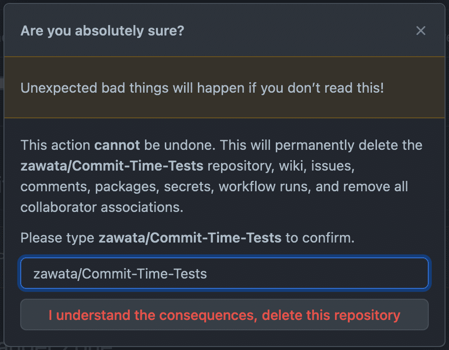
What GitHub gets right
GitHub makes it hard to accidentally delete your code repositories. Here’s how:
- When you try to delete a repository, GitHub shows a clear warning in red text. It tells you exactly what you’ll lose: your code, wiki, issues, comments, and more.
- Then, GitHub makes you type the exact repository name before you can delete it. The delete button stays grayed out until you get it right.
- For popular repositories with lots of stars or forks, GitHub adds extra warnings. They’ll suggest other options, like giving the repository to someone else instead.
- If you do make a mistake, GitHub keeps deleted repositories for 90 days. Organization admins can easily restore them.
6: Minimize memory load (Recognition over recall)
Don’t make users remember steps, labels, or how a feature worked last time. Keep actions visible and predictable.
Minimize the user’s memory load by making objects, actions, and options visible. Users shouldn’t have to remember information from one part of the interface to another. This means:
- Making options visible and discoverable.
- Using recognition-based interfaces over recall-based ones.
- Providing visual cues and contextual information.
- Keeping related information together.
The human brain is much better at recognizing things than recalling them from memory.
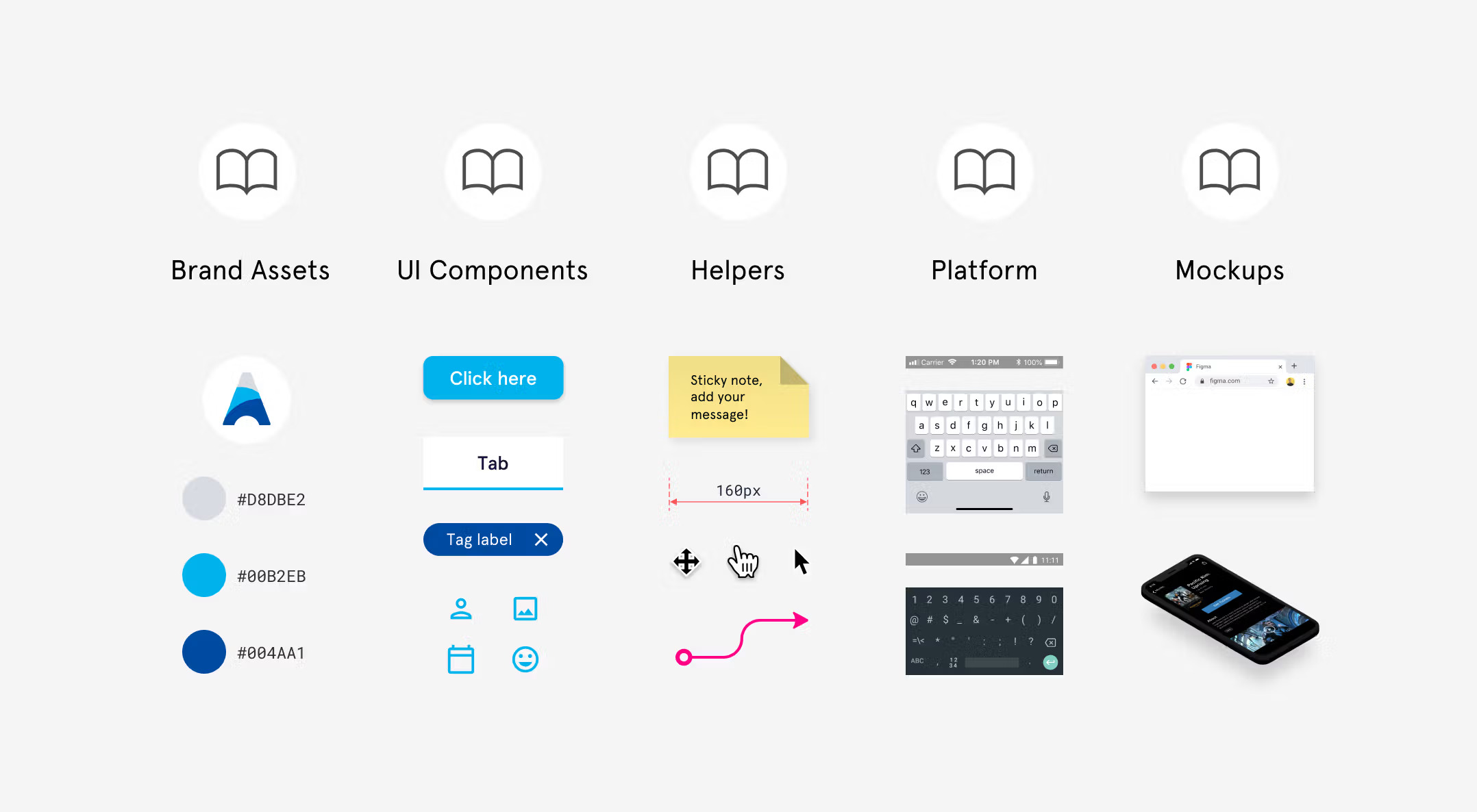
What Figma gets right
Figma’s design process shows this principle perfectly. Their component library organizes elements visually by category (Brand Assets, UI Components, Helpers, Platform, Mockups) with consistent book icons for easy navigation.
Instead of forcing designers to remember exact color codes, Figma displays color swatches with the hex values (#D8DBE2, #00B2EB, #004AA1) right next to them. UI components like buttons, tabs, and tags appear as visual previews exactly as they’ll look in the final design.
7: Cater to different skill levels (Flexibility and efficiency)
Different users have different needs. First-timers want hand-holding. Power users prefer shortcuts. Great UX accommodates both.
That’s what progressive disclosure is all about—only showing advanced options once users are ready for them. It keeps the UI clean without limiting functionality.
This means creating a user interface that:
- Is easy for beginners to learn.
- Offers shortcuts and advanced features for power users.
- Adapts to different user contexts and needs.
- Allows for personalization and customization.
Here’s an example from Userpilot’s survey builder: there’s a lot to configure before launching a survey, so the experience is broken into four clear steps. Each step is grouped logically and presented via tabs. This lets users focus on one task at a time without getting lost in the details.
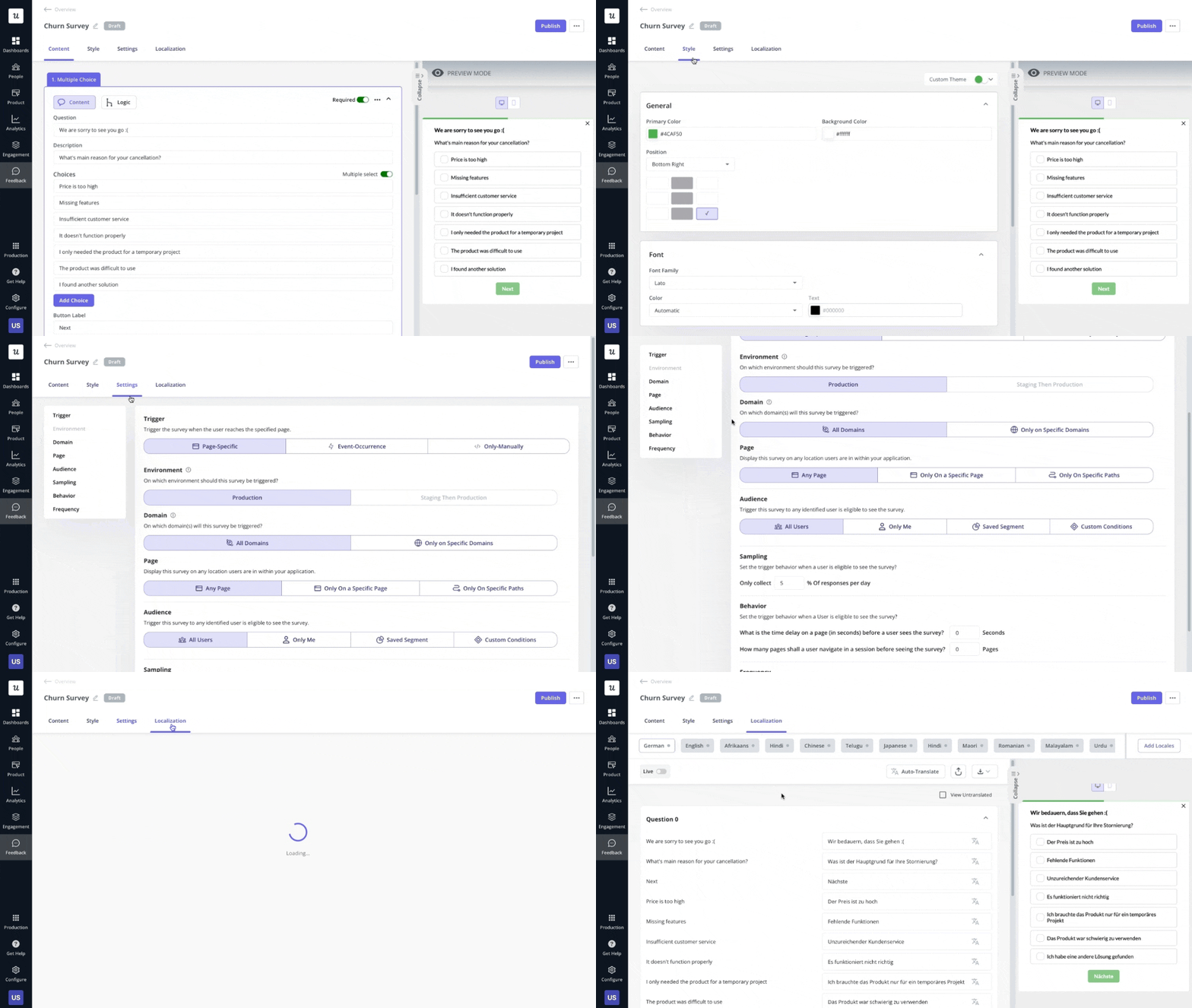
As users gain experience, they should be able to work more efficiently.
What Asana gets right
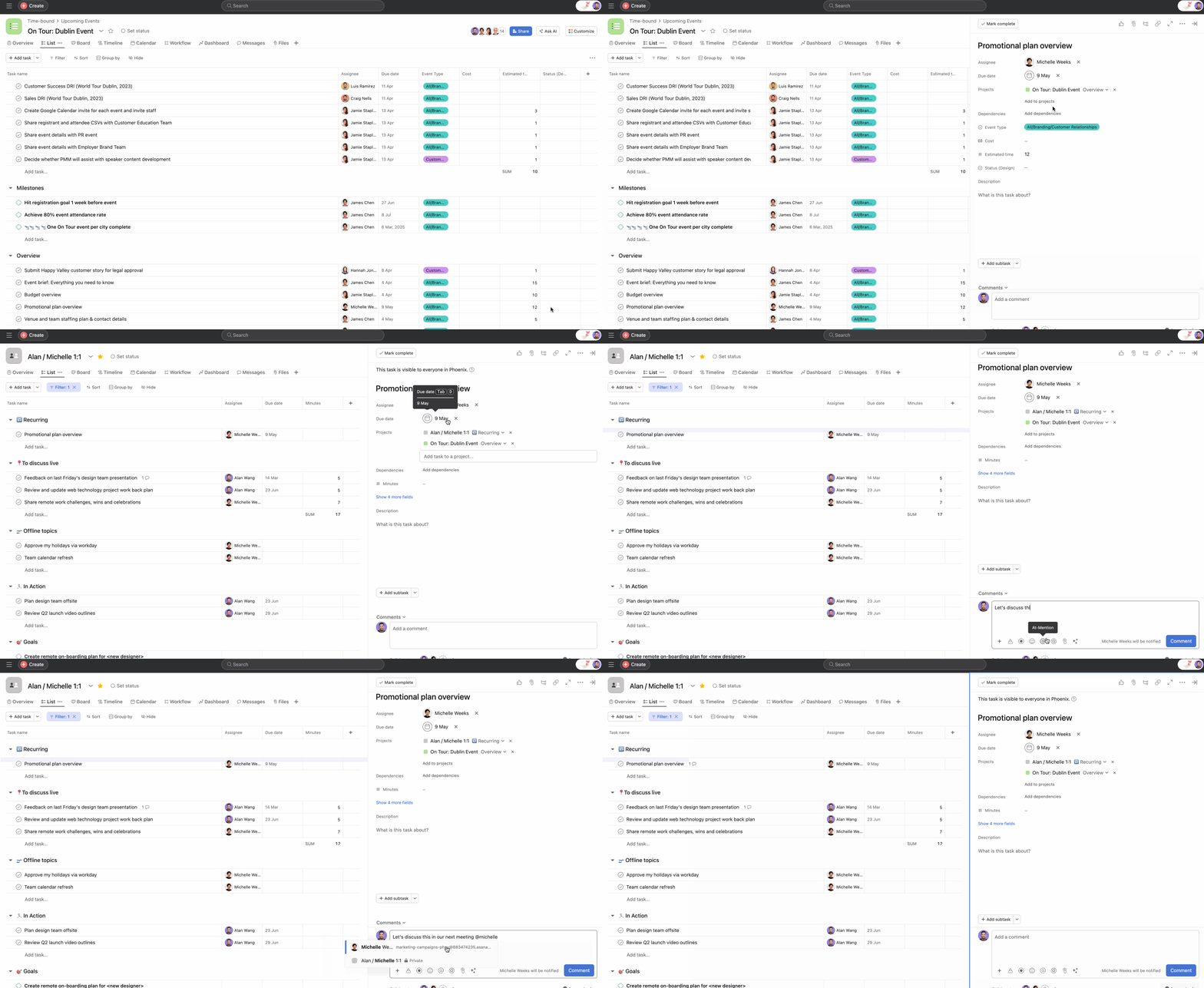
Asana offers multiple ways to create tasks: quick-add buttons, keyboard shortcuts (Tab+N), natural language processing for dates (“tomorrow”), and bulk creation options. New users can use the visual interface, while power users can work more efficiently with shortcuts.
Their interface also adapts to usage patterns, bringing frequently used features to the forefront and allowing workspace customization based on team needs.
How Userpilot can help: Implement progressive disclosure by segmenting users based on milestones completed in the app. Then, trigger different in-app experience flows for each user segment. In other words, the experience you design and expose users to should depend on where they are in their journey.
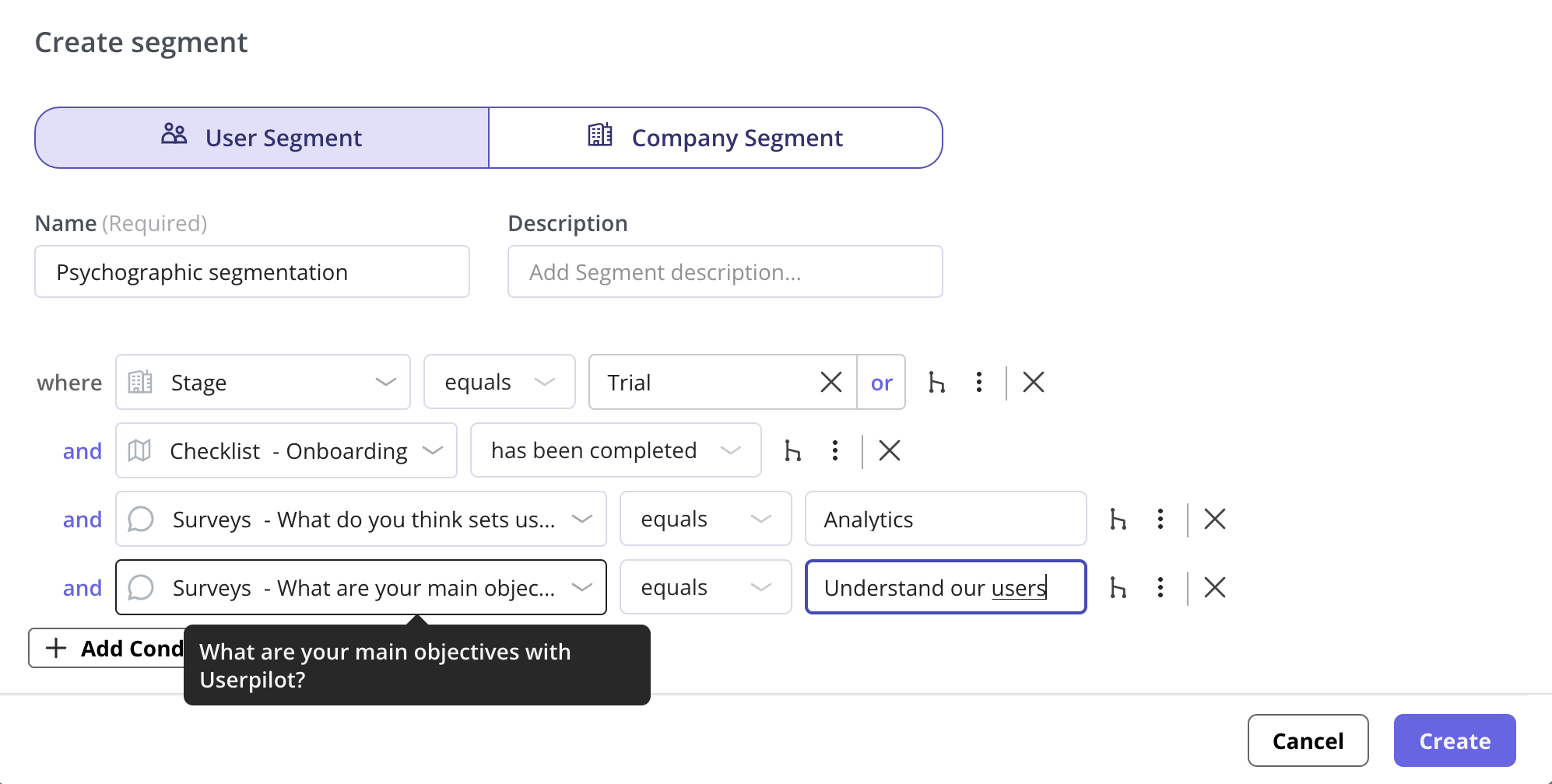
With Userpilot, that means delivering just the right guidance at the right time—nothing more, nothing less.
8: Keep it clean (Aesthetic and minimalist design)
Less is more—if what remains is clear and functional. Every extra element in an interface competes for the user’s limited attention. A good user experience focuses on:
- Including only what’s necessary.
- Creating a visual hierarchy that guides attention.
- Using space effectively to create focus.
- Eliminating distractions and clutter.
Aesthetic designs aren’t just prettier—they’re actually more usable because they help users focus on what matters.
What Linear gets right
Linear’s project management interface uses a 24px baseline grid with 16px margins between elements and 32px padding around major content areas. This consistent spacing creates a rhythm that helps users scan information quickly. They limit their color palette to just seven core colors plus four accent colors for status indicators, making the interface feel cohesive.
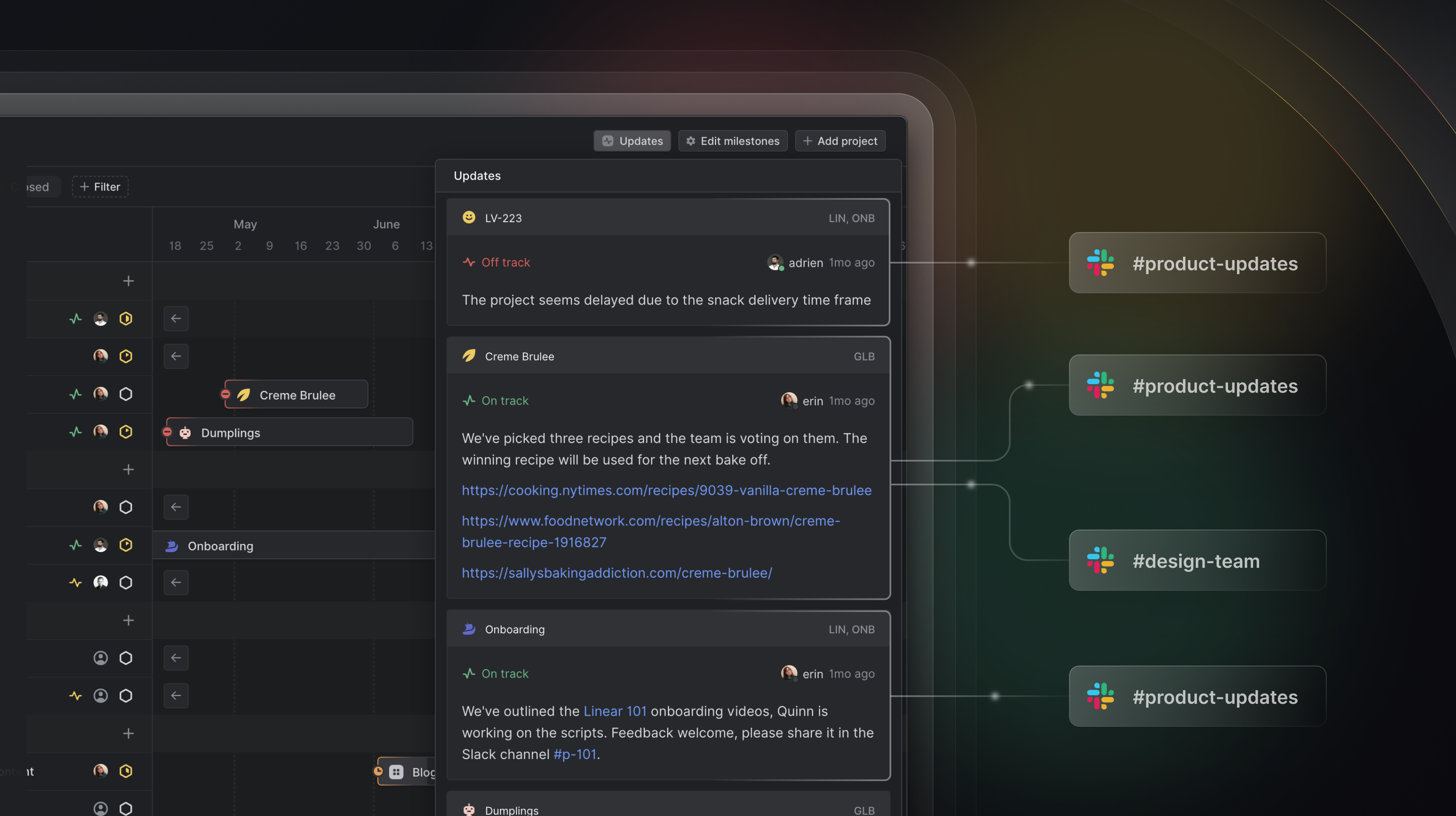
Project cards (like “LV-223” and “Creme Brulee”) display just essential information: project name, status, assignee, and last update time.
Linear uses color with purpose—notice how “Off track” appears in red while “On track” shows in green, providing instant status recognition. Subtle connecting lines show relationships between projects and teams without cluttering the view.
How Userpilot can help: Userpilot’s in-app experiences support accessibility best practices—including proper contrast, keyboard navigation, and screen reader compatibility. For example, when a modal is triggered, it automatically takes focus, and users can interact with every element using just the keyboard (Tab, Enter, Esc). Interactive elements are structured so that screen readers can clearly interpret and announce content.
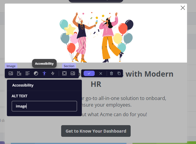
This makes sure that tooltips, modals, and checklists work for all users—not just the “average” user.
9: Handle errors gracefully (Recognize, diagnose, recover)
When things go wrong, help users understand what happened—and how to fix it. No one wants to see a vague red alert with no guidance.
When errors do occur, they should be:
- Expressed in plain language (not code or jargon).
- Be precise about what happened.
- Constructive in suggesting a solution.
- Visually distinct but not alarming.
Error states are opportunities to build trust by being helpful and transparent.
What Gmail gets right
Gmail’s “Undo Send” feature brilliantly implements this principle. After clicking send, Gmail displays a simple “Message sent” confirmation with an “Undo” button that remains visible for 5-30 seconds (user configurable).

This design acknowledges a common user error—realizing you’ve made a mistake immediately after sending an email. Instead of making this error permanent, Gmail provides a recovery path that feels natural and helpful.
What makes this feature particularly effective is its simplicity. There’s no complicated process or explanation needed; users intuitively understand what “Undo” means in this context. The temporary nature of the option also creates the right balance between error recovery and moving forward.
10: Offer on-demand help (Help and documentation)
Users will have questions. Make answers easy to find—without pulling them out of the product experience.
Even the most intuitive interfaces sometimes require assistance. Good help and documentation:
- Is easy to search and navigate.
- Focuses on users’ actual tasks.
- Lists concrete steps to follow.
- Is accessible within the flow of work.
- Includes visual examples and guides.
The goal is to provide help without interrupting the user’s workflow.
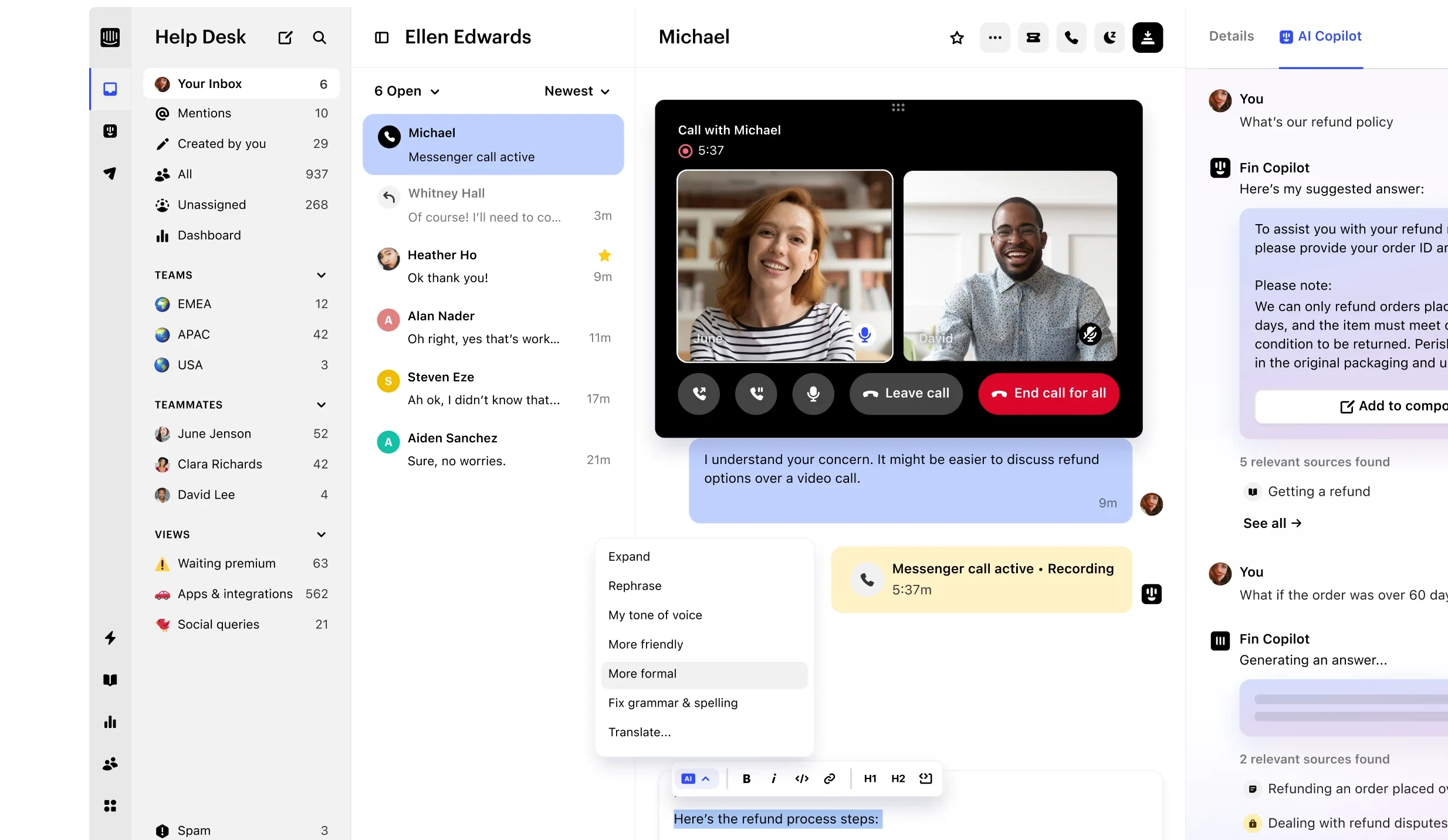
What Intercom gets right
Intercom integrates contextual help through its Resource Center, providing relevant guides based on where you are in the product. They also use tooltips on complex features that explain functionality without requiring users to leave the current screen.
Their documentation includes GIFs and short videos showing exactly how to accomplish specific tasks, rather than just describing them.
Want to go deeper? UX design principle resources worth bookmarking
These resources cut through the noise with substance that actually improves your work:
- UX Collective: Raw case studies from designers in the trenches. Learn from their mistakes so you don’t have to make them.
- Laws of UX: Psychological principles that explain why users do what they do, presented without the academic bloat. Immediately applicable.
- Nielsen Norman Group: Research-based articles and reports on usability from established experts in the field.
- Userpilot’s UX blog: Real-world UX tips, in-app experience strategies, and examples curated for product-led teams.
Make UX a growth lever
Users don’t care about your tech stack or how many sprints it took to build your product. They care if it helps them.
Good UX feels invisible. Great UX creates loyalty. And the right tools make exceptional UX achievable for every product team.
Want to see these 10 UX design principles in action? Userpilot’s product experience platform was built on these exact principles—and helps you apply them to your product without writing a single line of code.
Book a demo with us to get started!
FAQ
What UX design principles do you consider most important?
For SaaS products, three stand out:
- Clarity: If users don’t know what to do next, nothing else matters.
- Progressive disclosure: Show only what’s relevant at the right time—especially in onboarding.
- Error prevention: Help users avoid mistakes before they happen and recover quickly if they do.
Bonus: Recognition over recall—don’t make users remember things. Keep actions visible and obvious.
What is POV in UX design?
POV in UX design stands for “point of view.” It’s a statement or perspective that defines the specific user need you’re addressing, why it matters, and the insights guiding your approach. By framing a clear POV, you make sure your team stays focused on genuine user problems and designs solutions that truly meet user needs.
What is the golden rule of UX?
There’s no single universally agreed-upon “golden rule” of UX, but one phrase often cited is “Don’t make me think,” from Steve Krug’s book of the same name. It underscores the idea that great UX should let users accomplish tasks without confusion or unnecessary effort. Interfaces should be straightforward, intuitive, and free of friction—so the user never stops to wonder, “What do I do next?”

