What is a User Interface Design? Key UI Principles
What is a user interface design?
User interface design (UI design) is a discipline within UX design. It’s about crafting the visual and interactive aspects of a digital product. It focuses on optimizing the look and feel of software interfaces to ensure they are intuitive and engaging for users.
UI design encompasses everything from the layout and typography to the color schemes and interactive elements—aiming to create a seamless and enjoyable user experience.
UI design vs. UX design
UI and UX design, while closely related, are distinct disciplines that work together to create a cohesive and enjoyable product experience.
In a nutshell, a UI designer focuses on the visual aspects of the interface, ensuring that the design is visually appealing and intuitive. On the other hand, UX design covers the overall experience, from the moment a user interacts with the product until they achieve their goal.
When compared, here’s how they differ:
- Focus: UI design focuses on the visual aspects of the interface, while UX design focuses on the overall experience.
- Goal: UI aims to create aesthetically pleasing and easy-to-navigate interfaces, while UX aims to provide a seamless and satisfying product experience.
- Scope: UI deals with visual and interactive aspects of a product, while UX encompasses the entire user journey and customer success.
- Tools: UI designers use tools like Sketch, Figma, and Adobe XD to create UIs. In contrast, UX designers use tools for data analysis, whiteboards, and product management tools.
- Output: UI design produces visual components. But UX design results in frameworks, user journey maps, and in-app flows.
In the end, however, UI and UX designers ensure that a product is not only beautiful but also functional and user-friendly.
What’s your biggest challenge with user interface design right now?
A great user interface design solves specific problems. Are you struggling with keeping designs consistent, making them intuitive for new users, or something else?
How do you currently gather feedback on your user interface design?
Feedback is crucial for iterative improvement. Many teams rely on indirect feedback, missing out on valuable in-context insights from their users.
What’s your main goal for improving your user interface design?
A better UI directly impacts business goals. A strong user interface design can drive higher adoption, satisfaction, and ultimately, revenue.
You’re ready to build a better user experience.
Based on your answers, a proactive and user-centric approach to your user interface design is the next step. See how Userpilot can help you build beautiful, context-aware user experiences without writing any code.
Types of UI design
General types of UI design include:
- Graphical User Interfaces (GUI): Visual elements that allow users to interact through graphical icons, buttons, and visual indicators. GUIs are most common in software products for end users, as well as a touch user interface.
- Command-Line Interface (CLI): Text-based interfaces where the user input commands a prompt. CLIs are powerful for advanced users who need to execute complex tasks quickly, often used in programming and operating systems administration.
- Natural Language Interface (NLI): Interfaces that allow users to interact through spoken (a voice user interface) or written natural language (a chat). NLIs are used in virtual assistants like Siri, Alexa, and even ChatGPT.
- Menu-Driven User Interface: Interfaces that present a list of options or menus for users to choose from. These are commonly found in ATMs and simple digital interfaces, guiding users step-by-step through a process.
Key UI elements
User interfaces are built from graphical elements that ensure functionality, usability, and an engaging experience.
These elements can be broadly categorized into three types:
- Input elements: Components that allow users to provide data or commands. These include buttons, text fields, switches, dropdowns, checkboxes, and radio buttons. They are essential for enabling user interaction and input.
- Output elements: Components that provide feedback or information to users. Examples include error messages, alerts, notifications, and progress bars. These elements help users understand the system’s state and receive important information.
- Helper elements: Components that assist users in navigation and comprehension. Icons, tooltips, breadcrumbs, and status indicators fall into this category. They enhance usability by guiding users and providing additional context or information.
Key principles for creating a well-designed user interface
Creating a good user interface involves following key principles that ensure the design is both functional and aesthetically pleasing.
Let’s go over these principles and a step-by-step process for implementing each in SaaS:
Identify the purpose of your design process
First, understand the primary goal of your UI. As it will set the direction and focus for the entire design process, ensuring that every decision made meets the user’s needs.
For this:
- Conduct User Research: Engage with your target audience through surveys, interviews, and usability testing to understand their needs, preferences, and pain points.
- Create User Personas: Develop detailed user personas that illustrate how different users will interact with your UI to achieve their goals.
- Define Clear Objectives: Based on the insights gathered, define specific, measurable objectives for your UI.
For instance, for a project management tool, your goal might be to create UIs for different frameworks such as Kanban, agile, scrum, and so on.
Map out a vision for your user interfaces
Developing a clear vision helps in visualizing the end product and ensures that all design efforts are aligned with this vision.
This involves the following:
- Creating a style guide that includes colors, typography, and design elements.
- Ensuring consistency across all screens and interactions.
- Creating mood boards or design mockups to visualize the end product.
For instance, a vision might include a clean checkout process that minimizes user effort and maximizes conversion rates.
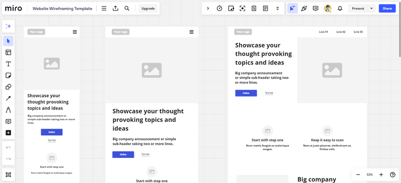
Create a wireframe
Wireframes are skeletal outlines of the UI. They only represent the layout and structure without detailed design elements.
That said, they serve as a blueprint for the interface and allow you to get a clear visual representation of how you want your UI to look.
To create a wireframe:
- Sketch Rough Layouts: Begin with hand-drawn sketches to quickly explore different layout ideas.
- Use Wireframing Tools: Transition to digital wireframing tools like Balsamiq, Sketch, or Figma to create more detailed wireframes.
- Iterate Based on Feedback: Share wireframes with stakeholders and users to gather feedback. Use this feedback to refine and improve the wireframes.
Add UI components
Once you have a solid wireframe, start integrating various UI elements such as buttons, text fields, and menus to build the interface.
These components are the building blocks of your UI. Their design and placement significantly impact usability—so be mindful of what you’re adding here.
For this:
- Choose UI components that align with the overall design vision and purpose.
- Use consistent design patterns for UI components across the application to create a cohesive and intuitive user experience.
- Ensure your components follow accessibility guidelines such as WCAG (Web Content Accessibility Guidelines).
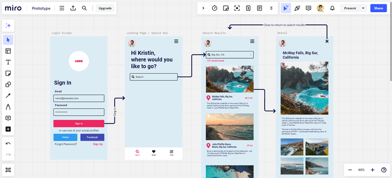
Build the prototype
In UI design, a prototype is a working model of the UI to test its functionality and usability.
It’s an essential part of the process since it allows you to explore how users will interact with your design and identify any issues before full-scale development.
To do this:
- Use prototyping tools like InVision, Adobe XD, or Figma to create UIs, simulate user interactions, and test the flow of the interface.
- Perform usability testing with real users to gather feedback. Observe how users interact with the prototype and note any issues or areas of confusion.
- Use the feedback from usability testing to refine the design and improve user experience.
Implement and troubleshoot
Once you deploy the final product, it’s essential to remain proactive in identifying and resolving any usability or performance issues.
This involves continuously monitoring and fixing any issues to enhance performance and user satisfaction.
Here are some tips for a successful implementation:
- Launch the UI in a staging environment to conduct final testing and ensure all components work together seamlessly.
- Use analytics and user feedback tools to monitor how users interact with the UI post-launch. Look for patterns that indicate usability issues or areas for improvement.
- Implement a system for users to report bugs and issues. Prioritize and address these issues promptly to maintain a high-quality user experience.
Examples of good user interfaces
Now let’s explore some notable examples of well-designed user interfaces and what makes them effective:
Dropbox
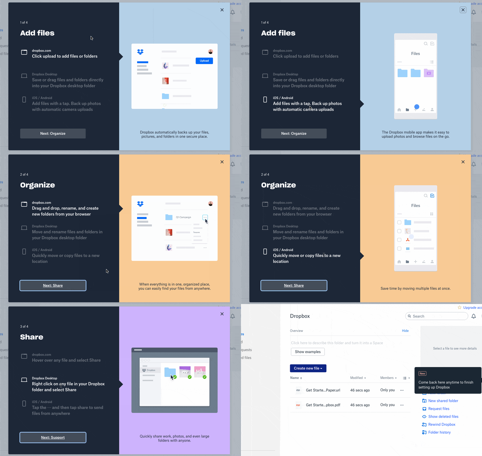
Dropbox follows a minimalist design approach. It uses a clean, uncluttered interface that focuses on essential functions (reducing cognitive load for users).
As a result, it becomes easy for users to manage their files and folders effortlessly.
Not only that, Dropbox’s responsive design ensures that the UI adjusts seamlessly across devices, providing a consistent experience on desktops, tablets, and smartphones.
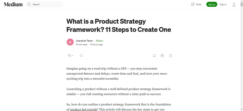
Medium
Medium’s UI allows content to take center stage. The design prioritizes the content, using ample white space and large, readable fonts to enhance the reading experience.
The UI also adapts to different screen sizes, maintaining readability and usability across devices and ensuring a consistent user experience. Plus, interactive design elements like claps and comments are subtly integrated, encouraging the reader to engage without overwhelming the user.
This makes Medium’s navigation straightforward, allowing users to explore and discover new content with ease—no matter where they are.
Headspace
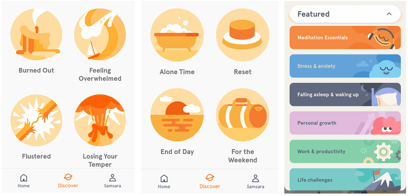
Headspace uses calming colors and straightforward navigation to create a serene user experience for meditation and mindfulness.
The UI is designed to guide users through their meditation journey effortlessly. The use of soft colors and playful illustrations creates a soothing atmosphere, aligning with the app’s purpose.
Also, Headspace has engaging animations and interactive elements that make the user experience more enjoyable and immersive—further promoting relaxation and mindfulness.
Slack
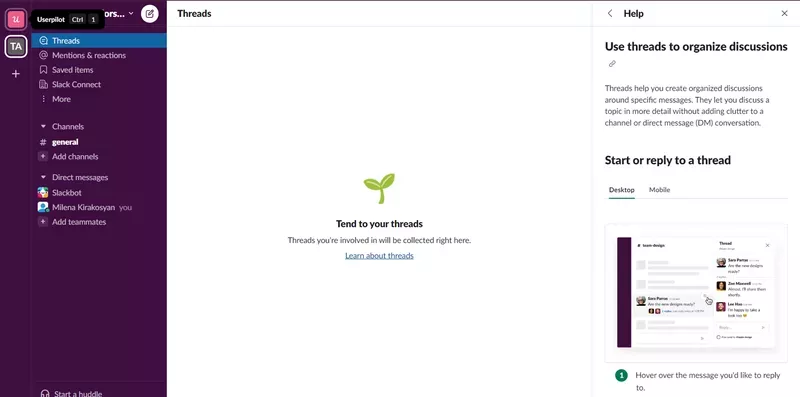
Slack’s interface combines functionality with a playful design. It offers an intuitive layout and interactive elements that allow more efficient communication and collaboration.
The sidebar and channels are organized logically. It allows users to customize their interface (such as changing themes and adjusting notification settings). Also, it introduces interactive elements like emojis, reactions, and threaded conversations that make communication more engaging and fun.
The design also maintains consistency across different platforms, ensuring a seamless user experience, whether on desktop or mobile apps.
As a result, Slack’s UI is capable of satisfying the needs of modern teams—making it easy to communicate and work productively.
Conclusion
User interface design is an essential part of creating products that are both functional and enjoyable to use.
By understanding and applying the key principles and elements of UI design, you can enhance user satisfaction and engagement.
That said, Userpilot can complement your product’s UI with engaging in-app flows that elevate the user experience. Book a Userpilot demo to see how you can do it without coding!


