12 Onboarding Emails You Can Learn From + Practical Tips
Let’s be honest, onboarding in SaaS can feel like navigating a labyrinth. As product managers and onboarding specialists, you’re juggling a million priorities: feature adoption, activation milestones, reducing churn… And crafting the perfect email sequence that guides users to success? That often falls to the bottom of the to-do list.
But it doesn’t have to be this way. Want to crack the user onboarding code?
We’ve analyzed 12 onboarding emails, the common types, and the best practices highlighting the good, the bad, and the ugly so you can go from there.
Get The Insights!
The fastest way to learn about Product Growth, Management & Trends.
Should you use emails for the onboarding process?
Now, you might be thinking, “Do I really need to use emails for onboarding? Isn’t everything moving in-app these days?” And it’s a fair question! The truth is, there’s no one-size-fits-all answer. It depends on how well you understand your users.
First, think about where your users are most engaged. Is it in their inbox, or are they spending most of their time inside your app? Don’t just guess! Dive into your historical data like email open rates, click-through rates, in-app engagement metrics, etc. This will give you a solid benchmark to understand which channels are most effective for reaching your audience.
But what if you don’t have a ton of historical data to lean on? That’s okay! You can start by looking at some industry benchmarks to get a general idea. For example, according to a study by GetResponse, the average open rate for welcome emails is around 63.91%. Meanwhile, Reckless’s research found the click-through rate for in-app push notifications is 28%. These stats can give you a starting point for deciding where to focus your initial onboarding efforts. From there, it’s all about testing and iterating to see what works best for your specific audience.
But honestly, in my experience, I haven’t come across a single SaaS company that doesn’t send at least a few welcome and onboarding emails.
The real key here isn’t just about sending emails, it’s about how you build the entire sequence and personalize the content to resonate with each user. And that’s where many companies fall short. They blast out generic emails that fail to capture attention or provide real value. But don’t worry, we’ll dissect what works and what doesn’t in the upcoming examples so you can avoid that trap.
What are common onboarding email types?
An entire email onboarding sequence is not built off one email, so there will be different types of onboarding emails that you’ll need to send. What are they?
Here are the three most common types of onboarding emails based on my observations:
- The warm welcome email (with a side of onboarding guidance): I like to think of this email as a warm hug for new users. It’s a chance to say “Welcome to the family!” and offer some basic guidance to get them started. Think of it as a mini-tour of your product, highlighting key features and benefits. You can even include links to helpful resources or videos to make the onboarding experience even smoother.
- The “nudge” email (with social proof): Sometimes, users need a little nudge in the right direction. That’s where this email comes in. It’s all about gently encouraging users to take the next step in their journey, whether it’s completing their profile, inviting team members, or exploring a specific feature. To make it persuasive, I love to include some social proof, like testimonials or case studies, to show users how others are benefiting from your product.
- The “re-engagement” email (before they ghost you): Let’s be real, sometimes users get distracted or forget about your product (especially during those free trials!). That’s why re-engagement emails are so crucial. These emails are designed to bring users back into the fold and extend their customer lifecycle. You can send a friendly reminder about their expiring trial, offer an extended trial period, or even highlight new features they might have missed.

What does an onboarding email sequence look like?
Onboarding isn’t a “one and done” deal; it’s not about sending a single email and hoping everything falls into place. Instead, it’s an ongoing, continuous effort to nurture the customer relationship. Therefore, you should send a sequence of value-focused onboarding emails with each building upon the last.
Here’s a quick look at how to send a series of well-structured automated onboarding emails to keep new users engaged and educated.
- Soon after registration, send a welcome email with a thank you note and support resources.
- Set up a trigger-based email that includes tips and tricks when users use a product feature for the first time.
- On day 3 or 4 of registration, send a check-in email while encouraging them to explore the platform further.
- By day 7, send an email asking for user feedback or offer a discount code as a token of appreciation.
- On day 10, send an email introducing users to features they haven’t discovered yet. Include a clear CTA for upgrading to a premium plan or exploring advanced features.
12 Onboarding email examples to learn from
Need some inspiration? Check the user onboarding email examples below to understand what’s good, what went wrong, and how to improve your onboarding email marketing strategy.
ClickUp
Adopted a comprehensive approach to introduce ClickUp’s key features.
What’s good?
This onboarding email example gives you a complete picture of ClickUp’s work. From product overviews, demo content, and visual guides to a help section, the learning resources cater to every type of user. Besides, the email’s engaging visuals make the content more digestible.
What can be improved?
- The message needs to offer a personalized experience based on why a user signed up.
- Information overload in the email makes it overwhelming and hard to know where to start.
- Similarly, too many CTAs compete for attention. Well, which one should I click first?

Airtable
Airtable’s first onboarding email campaign is more of a general motivational nudge.
What’s good?
The onboarding welcome email is clean and simple, but that’s it. However, it’s just a general “you got this” kind of email without much substance.
What can be improved?
- This user onboarding email needs personalization elements and tailored resources to make it more relatable for new signees. Better show me how to create a content calendar or track projects.
- CTA “keep going” is vague. Instead, a specific CTA explaining “why” I should use Airtable will encourage me to take further steps.

Monday
The user onboarding email example by Monday has a balanced approach with an uncluttered layout and clear next steps.
What’s good?
It’s a straightforward welcome email with clear instructions, a focused CTA, and some basic resources to help you get started. It’s not trying to do everything, yet it covers the basics well.
What can be improved?
- Adding real-time personalization, like using a recipient’s name or specific tasks, would make the email feel more user-focused.

Grammarly
A visually appealing welcome email that makes it easy to skim through. But there are also some hiccups.
What’s good about it?
Images, icons, highlights of their writing assistance tools, and a subscription nudge keep you engaged and informed.
What can be improved?
- Focusing on just 2-3 key features that match my needs would be better.
- The information hierarchy is messy. As a new user, I’m left thinking, “What am I supposed to do next?”
- Tailoring the content based on what I said I’d use Grammarly for during the signup flow was essential. For example, a use case for a student, professional writer, or business user.

UXPressia
UXPressia’s onboarding email example is all about visual appeal and personalization with a specific use case to provide guidance content.
What’s good about it?
The email pays attention to why a user signed up. As you can see in the image below, I signed up to create customer journey maps. The email offers help resources and guides just on that and nothing else. Great personalization tactic, right?
What can be improved?
- They could better show how their tool will make a user’s life easier. Don’t just tell, but show me how it’ll solve my problems.

Loom
Loom’s doing something quite clever here. The onboarding email encourages you to use the free product trial and eventually upgrade.
What’s good about it?
This onboarding email clearly outlines what they want you to do through actionable steps. That said, use the trial and see the value. Loom’s video addition is a unique approach I rarely saw in any welcome email. It’s a nice break from text-heavy emails and gives you a quick overview.
What can be improved?
- The video tutorial is a cool idea, but it misses a chance to sell the value of their business plan and content focused on the “Why upgrade?” question.
- Instead of a feature dump, more visual cues like quick screenshots of each feature to demonstrate how things work would step up their personalization game.

Miro
Miro’s user onboarding email example tailored content that caters to different learning preferences.
What’s good about it?
Firstly, I like how the onboarding email’s design matches Miro’s branding. Plus, the multiple starting points give users a choice of how they want to learn more about the product’s features.
Want visual-appealing diagrams? Click Get Started. Need quick help? Learn how to generate flowcharts with Miro AI. Want to kickstart your project? Explore template ideas. There’s something for everyone.
What can be improved?
- It feels impersonal. I mean, the onboarding email could at least use my name.

Mixpanel
Mixpanel uses a conceptual approach. Instead of listing every feature, they focus on their overall philosophy and vision in the onboarding email.
What’s good about it?
The onboarding email example includes helpful resources and links to guides, customer stories, and support teams to introduce the product.
What can be improved?
- I have to say it: a lot! The welcome email’s abstract concepts and general CTA make it feel vague.
- “Get Started” doesn’t tell me much. A clear, specific call-to-action like “Create Your First Data Analysis Report” or “Connect Your Data Source” will make it more relevant.
- Mixpanel should also mention its well-known online community forum to engage new users.
- Since it’s a complex product, I would benefit from more concrete examples or resources.
Check Platformly’s use case for improving the onboarding process for their complex product.

Baremetrics
Now, this onboarding email template is interesting! Baremetrics doesn’t throw features at you. Instead, it focuses on building a relationship.
What’s good about it?
Firstly, the email strongly focuses on support. It also sets clear expectations for a new user by outlining the onboarding process, including an initial meeting with the account manager and a mid-trial check-in. Moreover, highlighting the role of the dedicated account manager shows they value and care for you.
What can be improved?
- Undoubtedly, this complex product requires an account manager to get users activated. But, I believe that not everyone will be comfortable with this approach.
- It would be great if the email offered users more flexibility to explore the product features first. Personally, I would like to try the platform using specific examples or resources before jumping on calls with an account manager.

Qualtrics
If I have to give a title of perfection to any onboarding email example on this list, it will be Qualtrics. Let me tell you why!
What’s good about it?
A simple yet value-focused welcome email with easy-to-follow steps that provides value to new users. It’s like they’re saying, “Here’s what we do, here’s how it works, now let’s get started.” They even personalized the email, adding the recipient’s name.
What can be improved?
- Nothing! They get straight to the point! No fancy bells and whistles, just pure value and clear direction that drive users toward activation.

Zapier
Zapier’s onboarding email focuses on a “learn by doing” approach. It provides a 14-day course challenge and gives users a choice to explore the key solutions.
What’s good about it?
First, their structured 14-day challenge guide will help new users learn by doing. They’re also smart about including social proof of an existing customer in this instruction material.
As we all learn differently, the email also caters to different learning styles so you can explore the product as per your business goals and pace.
What can be improved?
- Yes, the welcome message has a user name. But I would like to see more personalization to level up. For example, why not show me relevant Zaps and solutions if I signed up for a marketing automation landing page?

Calendly
Calendly knows what problem they’re solving, and they show you exactly how to fix it.
What’s good about it?
It’s a crystal clear, straight-to-the-point email focusing on Calendly’s value proposition. The actionable guidance solves users’ core problem of scheduling meetings.
What can be improved?
- If I’ve to nitpick, adding some visuals like a GIF or a short demo video would make the onboarding process more appealing. But honestly, the simplicity works well for them.

What are the best practices for sending onboarding emails?
Now that we’ve covered all the onboarding email examples, let’s talk about some best practices to keep in mind. These tips will help you make sure your emails are actually hitting the mark and driving those all-important user actions.
- Personalization is key: I can’t stress this enough! While most welcome emails at least get the greeting right, true personalization goes way deeper. Think about it: you probably collected some valuable info about your users when they signed up, right? Maybe they answered a welcome survey or told you about their job title. Use that data! Send them relevant materials based on their specific needs and goals.
- Don’t rush the upgrade: It’s tempting to push for that upgrade as soon as possible, but trust me, patience is a virtue here. Don’t just send an upgrade nudge because a certain number of days have passed or the trial is about to expire. Instead, focus on activation first. Make sure users have experienced the core value of your product and achieved those “Aha!” moments before you ask them to commit.
- A/B test everything (especially subject lines): This is a golden rule of email marketing, and it applies to onboarding too! Don’t just assume you know what works best. You should A/B test different subject line formats, email lengths, and calls to action to see what drives the most clicks and engagement.
Also interested in in-app onboarding for customer retention?
Email is a great starting point for onboarding, but it’s only one piece of the puzzle. To increase your chances of retaining users, you need to pair your emails with a strong in-app experience.
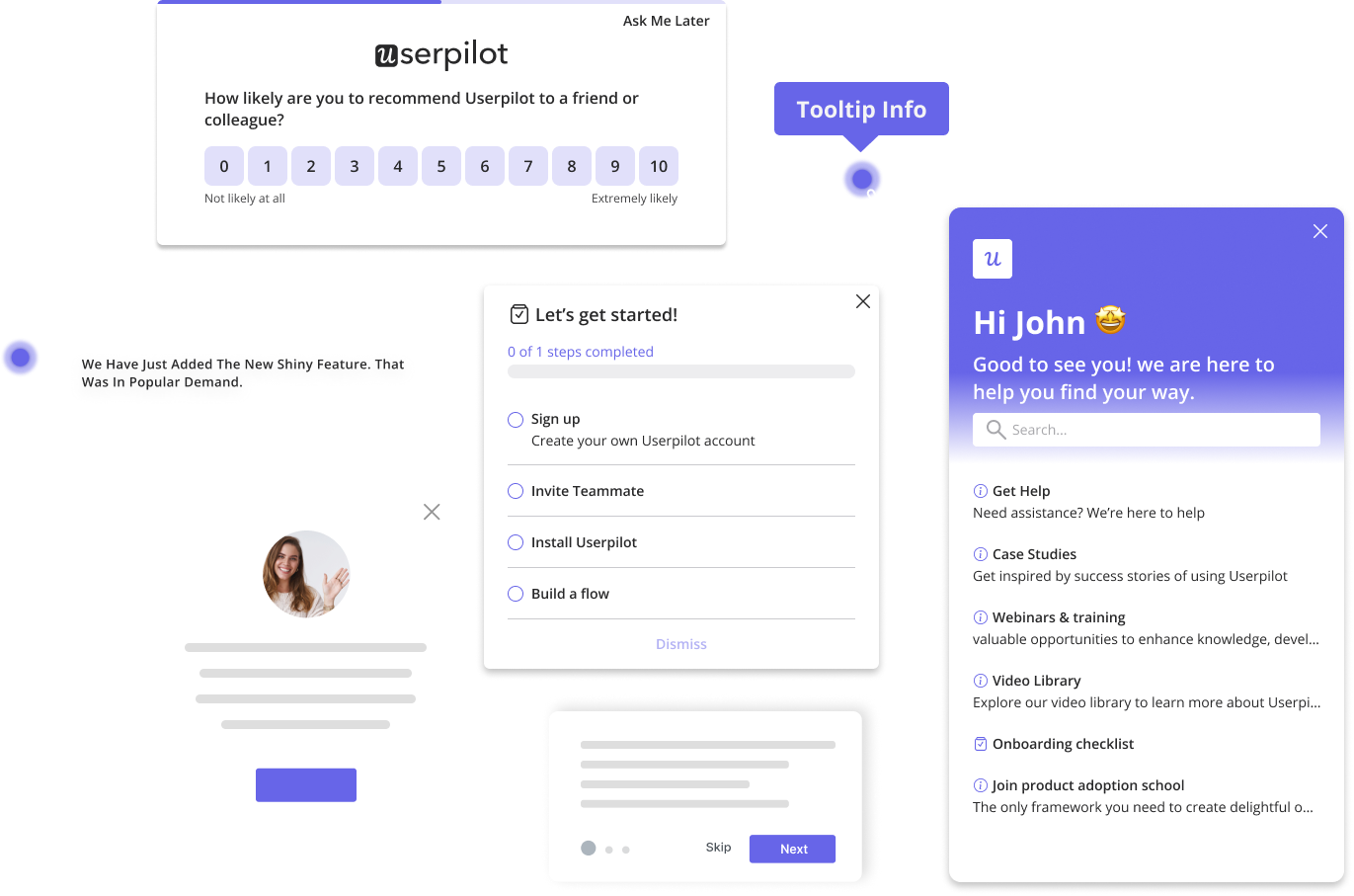
Think of it this way: your emails get users into your app, but in-app guidance keeps them there. Interactive walkthroughs, tooltips, and checklists can help users navigate your product, discover key features, and experience those “Aha!” moments faster.
If you’re looking for a powerful tool to help you build incredible in-app experiences, book a demo to see how we can help!
FAQ
How do you write an onboarding email?
Focus on providing a concise guide on how to get started with your product or service. Your email should include:
- A warm, personalized welcome message
- Highlight of key features
- Step-by-step instructions
- Access to support
- Clear CTA
What is the difference between a welcome email and an onboarding email?
A welcome email is a general, warm greeting thanking the user for signing up. On the other hand, onboarding emails are more detailed messages that guide users through the product and its features.
What is the onboarding journey of emails?
The onboarding journey of emails is a strategic automated onboarding email sequence sent to new users to drive user activation and customer retention. It typically includes
- Welcome email
- Getting Started or feature tutorial email
- Resource or community invitation email
- Upgrade email
What is the open rate for onboarding emails?
Onboarding emails usually have higher open rates, ranging from 50% to 80% based on message type, industry, and audience.


