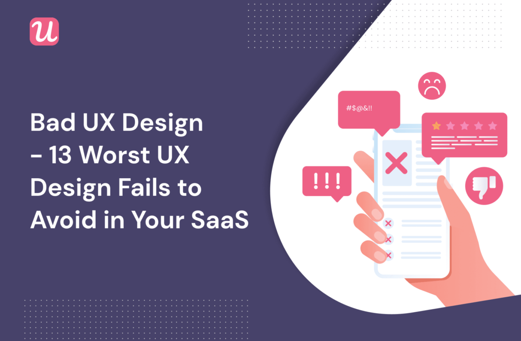
Bad UX Design – 13 Worst UX Design Fails to Avoid in Your SaaS


From Amazon’s navigation bar to Whatsapp’s deleted messages: bad UX design is something that we’re all familiar with as consumers.
From a SaaS point of view, a poor user experience can sometimes mean the loss of a paying customer, or perhaps hundreds of them.
So it’s crucial to know what design pitfalls to watch out for. That way you can eliminate them from your product, or, better still, not design in that way in the first place.
In this article, we’ve listed 13 of the worst design mistakes that we’ve seen to date.
Let’s get into it.
Bad UX Design #1: New feature, new tab
Imagine the scene: you’re browsing through your project management software like you do every work day, and suddenly you come across a new time tracking feature.
Curious, you click on it to see how it works, and a new tab opens.
From the user’s perspective, this is annoying, since you’re taken away from what you were doing before.
From a SaaS company’s perspective, this is a disaster, especially if you are using onboarding software such as Userpilot.
More often than not, a page change isn’t registered if your user opens a page in a new tab. So if you’ve set up your automated onboarding system to prompt the user with a tooltip once they’ve clicked on the new feature, they won’t see the tooltip!
That means that all your hard work in building that onboarding system was for nothing. Definitely, something you want to avoid as a UX designer.
Bad UX Design #2: Long dropdowns
Have you ever clicked on a dropdown menu and had this happen?

A massive wall of text appears, and the thing you’re looking for is right at the bottom of the list. It’s not exactly something that inspires customer loyalty.
This problem is especially common on websites that ask you to insert your nationality. If you’re from the USA, and the app in question decided to insert a dropdown, then happy scrolling!
Sometimes, usability issues like this can be alleviated by allowing users to type the first letter of their country, and then having the dropdown skip to those countries that start with that letter.
But more often than not, it’s better to skip the dropdown completely and let users write what they need to. If you want to add automation, autocomplete might be a better choice.
Yes, we know that you’re trying to make your signup flow frictionless, but in this case, you should ask yourself how much new friction your dropdown is adding.
Bad UX Design #3: Massive checklists
In an ideal world, an onboarding checklist is something you use to give your customers 3-4 activation tasks. Nothing too overwhelming; just enough to show them the basics of how to use your product.
Then you have checklists like this:

Do you really think that your customer is going to get through all of that without churning on Day 1?
All we’ll say is that they’re going to have to really want to use your product if this is the first experience they have on your app.
Not exactly good UX, is it?
Try not to overwhelm users and give them short task checklists that will help them reach a specific point in their journey fast. Here’s a great example of good Ux when it comes to checklists.
Short and simple, Backlinkmanager’s checklist drives users towards adopting one feature.

Bad UX Design #4: No X on a modal
As we’ve written before on this blog, many modern websites use modals to interrupt the user and get their attention.
The reason that this works so well is that modals are so big. It’s literally impossible not to get distracted from what you were doing previously.
But this strength of modals can rapidly turn into a weakness if there’s no way out of the modal.
Trying to push users to take an action just because they have no other option is one of the dark patterns used in dark UX design.
Imagine that you’re in the middle of doing something important, like a financial audit, and then a modal pops up:

Although the system of the product you’re using thinks this is really important right now, you’ve got other priorities.
So you look for the X button to quit the modal… only to find that it’s not there.
PSA to all UX designers: we know that you really want your user to click your CTA on your modal. But do spare a thought for your customer’s autonomy and give them a way out of the modal if they need one. Please?
Staying away from these dark UX patterns should be considered common sense.
Bad UX Design #5: Tooltips that obscure the UI
In an ideal world, tooltips should offer brief, context-specific guidance to one UI element only.
They’re one of the smallest UI patterns for a reason. They should be so subtle that they’re almost integrated into the native UI.
They shouldn’t be placed in such a way that they obscure the rest of the UI:

Worse still, imagine a tooltip that’s obscuring the very UI it’s supposed to be explaining!

This is directly counter-productive to the existence of the tooltip in the first place and is bound to make your customer want to churn.
Bad UX design #6: Low discoverability
If you agree a slow loading page is a problem (who doesn’t?) thank top that up with low discoverability and you have a recipe for a bad user experience.
We live in an era of instant gratification where we want to find what we want immediately.
So if your UI looks like this, it’s going to be challenging for most users to find what they need:

Just imagine if you were looking for the analytics feature in this situation. It would be like looking for a needle in a haystack!
This is the opposite of good UX.
As a general rule, it’s better to build fewer product features and make them all easily discoverable, as opposed to having too many features and users not seeing the forest for the trees.
If your product is designed for massive enterprise teams and absolutely must have every feature in the book, then you should at least include a search bar so that users can find what they need.
You can apply this logic to help centers as well.
If your help center is hard to find, then it’s not going to be of much value to your users. This means lots of annoyed customers — and lots of inquiries for your customer service team.
Bad UX design #7: Complex password requirements
We get it. You want your customers to create secure passwords so that no one can hack their user data.
So a 6-letter password or something like “password123” isn’t going to cut it.
A certain amount of caution here is reasonable. But hopefully, you’d agree with us that this goes too far:

Consider that your average user probably has a lot of passwords to remember already. If you place this many requirements on password creation, you’re just going to stress them out. Plus, they might not remember their new 16-letter password with 6 special characters after a day or two!
There’s a middle line to be found here between security and ease of use.
Bad UX design #8: Linear product tours
Have you ever signed up for a new product, taken their tour, and then thought to yourself: “This wasn’t relevant to me at all?”
We asked some SaaS junkies what they thought of linear tours, and this is what they told us:

That’s exactly what happens when SaaS businesses haven’t done any user research, don’t segment their customers, and end up giving all users the same interactive walkthrough.
You can think of a linear product tour as going through…
- the same product features
- in the same order
- in the same way
- for every user
In other words, it’s a bit like your old college lecturer who used to drone on and on, and has probably given lectures in the exact same fashion to 30 years of students.
It’s just a bad user experience all around. Don’t be this company!
Especially when it’s so easy to replace them with short interactive walkthroughs that walk users through a specific feature of your product and how to use it, using a short series of tooltips meant for guiding.

Bad UX design #9: Permanent demo content
Demo content is fantastic for showing customers what your platform could look like after they’ve entered some of their data:

When used correctly, demo content will vanish after you’ve replaced it with your real user data. At that point, it’s served its purpose, and it’s over to you to use the app however you please.
But, alas, sometimes the demo content just won’t disappear, no matter what you do! Not great when you want a personalized product experience.
From the user’s perspective, this can be both confusing and frustrating. Neither reaction is a sign of quality design.
Bad UX design #10: Industry jargon
There are numerous times in SaaS businesses where it pays to be concise. Think modals, tooltips, microsurveys, and more.
You don’t have much time to explain to your user what you mean, so you need to get to the point, and quickly.
So when a customer sees copy like this, they’re unlikely to be impressed:

“Click to enable multi-way stakeholder alignment and synergies via Application Programming Interface.”
Wouldn’t it have been easier to say “Sync up with third-party software?”
Bad UX design #11: Overusing system-initiated modals
As we mentioned earlier, modals are disruptive by nature.
They’re large, covered in eye-catching graphics, and have a CTA that’s asking to be clicked on. So the user can’t help but take notice.
This is all well and good when your modal is user-initiated.
In other words, a customer is not especially likely to be surprised by a modal that appears when they themselves click on “Start product tour.”
But there’s another category of modal: one that appears automatically because your system was programmed that way, without any conscious input from the user.
Take Surfer, for example, that ”shouts” at me right after logging in. Is that new feature so important that it had to take over my entire screen before I could even blink?

Given how disruptive modals are by nature, and given that users as a whole tend to like their autonomy, overusing system-generated modals like this is bound to get annoying.
They’re best used sparingly in urgent situations, like when you want to double-check with your customer that they really do want to cancel their account.
A bad example of a system-initiated modal would be repeated attempts to upsell an irrelevant new feature. Although your desire to increase Lifetime Customer Value is a fair one, from your user’s perspective it’s not urgent, and it’s not relevant.
Bad UX design #12: Autoplay videos
By nature, video content is incredibly engaging, which is probably why more and more tools are cropping up to allow SaaS companies to add microvideos to their onboarding.

That level of engagement can be a strength when it draws your customer in towards something that genuinely interests them. But it can also be a problem if you manipulatively use the engaging nature of video to direct users towards something irrelevant.
The best example of this is when companies think it’s ok to have videos autoplay, regardless of what the user is doing.
Yes, sometimes you’ll get lucky and hit a user who is interested in what you’re showing them, but more often the lack of autonomy will irritate your customer into clicking the X button.
Not recommended.
Bad UX design #13: Empty states
When you sign up to a new platform, you want to see it teeming with other users with who you could interact. At the very least, you’ll be curious to see demo content showing you what the platform could look like once you’ve input more of your data.
What you don’t want to see is a ghost town like this:
In UX design, this is called an “empty state.”
Empty states are depressing because they require more activation energy to fill than if there were already existing content from other people.
It’s a bit like an art exam in school where you’re asked to start drawing on a blank piece of paper. Starting from scratch is hard, psychologically speaking.
This is why Shiv Patel, co-founder of Autopilot, cautioned in his recent Product Drive talk that empty states should always be replaced with demo content.
The whole talk is well worth watching in full, so we’ll leave it here:
Conclusion
Now you know some of the worst design fails to avoid when you’re designing your SaaS product!
If you’re looking to emulate some design best practices, while also saving time by not coding, you might consider checking out Userpilot.
Our templates are set up in such a way that they make it harder to commit design sins like the ones in this article.
About the author