Provide Contextual Help with These 8 UX Patterns

Ever wondered how you can implement contextual help that meets customers right at their point of need?
Beyond the sprawling knowledge bases and ever-occupied support agents, UX patterns and in-app communication channels help you meet customers’ needs on demand.
This article examines what contextual help is, why it’s necessary for SaaS companies, and how you can implement it in your product.
What is contextual help?
Contextual help is the assistance you provide to users in the context where it’s needed. Such context-sensitive help is often integrated directly into the interface in a subtle way.
It provides the precise information within a specific context or state of your software, without the user having to actively seek it.
What are the common types of contextual help?
Contextual help is often implemented through various UX patterns such as tooltips, inline help, guided tours, interactive walkthroughs, and embedded help.
These patterns allow users to access relevant information, instructions, or explanations directly within the interface, eliminating the need for users to search for help elsewhere or interrupt their workflow.
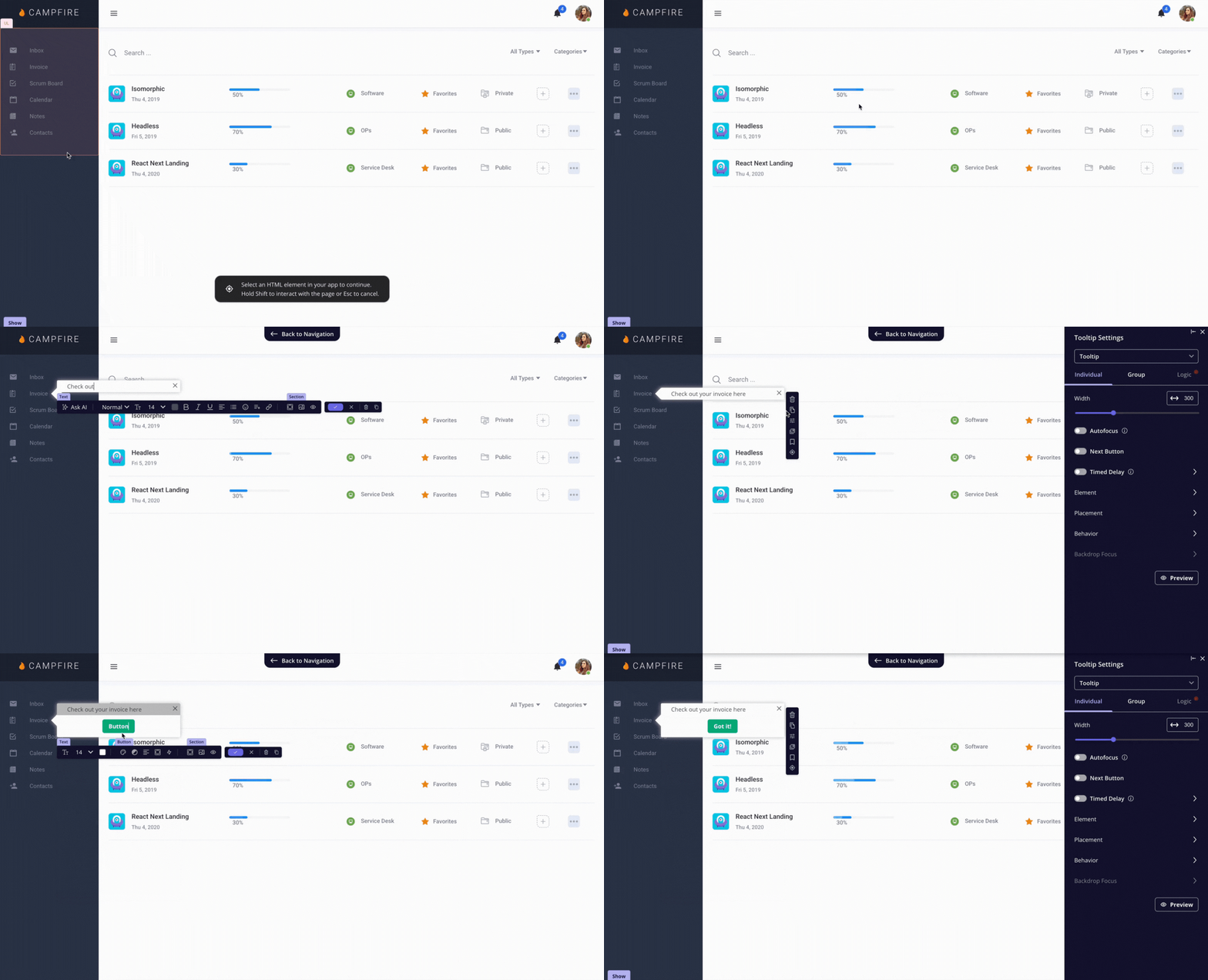
You can either self-code these patterns or use contextual help tools like Userpilot to add them to your product without coding.
And with our upcoming AI agent, you don’t even have to build them yourself. All you have to do is just write a prompt and let our agent handle it. Want early access? Join our beta!
Why is it important to provide contextual help to your users?
Contextual help serves as an on-demand user manual. It provides users with the assistance they need, where they need it. But why is this so important?
For one thing, the help provided within a fixed context doesn’t disrupt the workflow. It is provided within the software and on the exact page or line the user is working on, keeping them within their work area.
To provide valuable contextual help to users, you should identify points of confusion and proactively create helpful content to guide them through.
Thus, contextual help minimizes the number of customer support tickets and frees up your support team to handle more complex issues.
Improved clarity also leads to improved user activation. It helps new users quickly derive value from your software, web app, or digital product in general.
Ultimately, contextual help leads to higher customer satisfaction and better customer experience, thus increasing the average customer’s lifetime value.
Golden rules of contextual help UX
There are a few golden rules to follow to ensure the support you provide hits the right chord with your users. Good contextual help should be:
- Useful: The support you provide should speak to your different user personas and their needs.
- Relevant: The help you provide should address potential friction points within the product experience. Thus, contextual help should be meaningful and helpful within the user’s context.
- Unintrusive: Good contextual help doesn’t disrupt the user experience or risk overwhelming users with too much information at once. Instead, any type of user support should be subtle, blending into the existing user flow with minimal disruption.
- Specific and understandable: Your contextual help should be specific to a product feature, pain point, or job to be done (JTBD). Therefore, use plain language to help users understand your tips without confusion.
Best practices when providing contextual help through UX patterns
It’s important to note that the overriding theme of any contextual help is convenience. Consider these UX patterns that help you provide important information to the user and also simplify your product.
Give context-sensitive help with inline instructions
Inline instructions are the simplest and most common form of contextual help. They appear alongside a UI component and provide short, specific pointers to guide the user.
In practice, they don’t just explain what to do, they prevent errors before they happen, such as entering data in the wrong format or missing a required step.
You’ll usually see inline instructions taking one of these forms:
- It may appear as embedded helper text inside a form field. This can include format hints, examples, or constraints (e.g., “Use YYYY-MM-DD” or “Minimum 8 characters”).
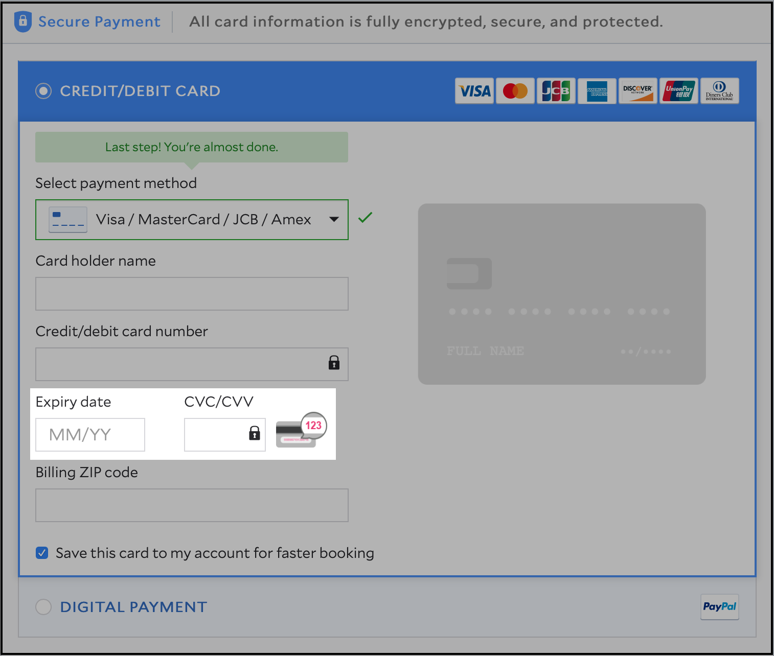
- Another common pattern is a question mark alongside the UI component. When a user clicks the link, they’re transferred to a separate page or modal with information that provides more context.
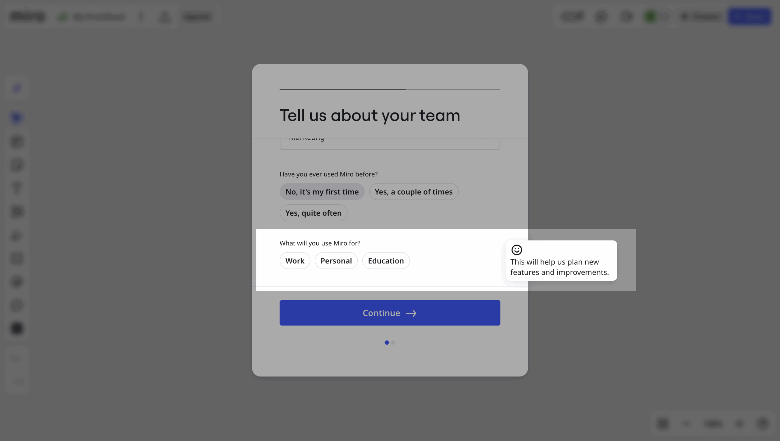
- Finally, inline instructions may also appear in the form of callout dialog boxes with extra information within the context. For example, when you click to answer a specific question in Miro’s signup flow, you’ll see a tooltip that explains why they’re collecting certain information.
Use tooltips to provide important information about features
Tooltips enable you to add more context to a feature without cluttering the user interface. They’re often used to define ambiguous terms or educate users about product features.
These bite-sized tips are mouseover popups that appear in the form of a dialog box when users hover over an icon. They give users quick guidance on what a feature does and how to use it.
When teams use tooltips this way, the impact is often bigger than they expect. We’ve seen this repeatedly with our own customers.
For example, at Amplemarket, the team adds small in-app nudges whenever they introduce a new feature.
According to their team, even these lightweight nudges can dramatically change adoption:
“Whenever I add a nudge to a new feature, it boosts adoption by 5x, even 10x.”
— Awni Shamah, Staff Product Manager at Amplemarket
You can also create trigger-based tooltips or interactive tooltips that appear when a user takes a defined action.
Make important announcements within the software with banners
Banners are great tools for announcing new updates and sharing crucial information with users. It is a way to reach all (or selected segments) of your users with important announcements or reminders within the software.
A good banner conveys a short message in one or two lines. It also appears at the top of the product interface or web app and is used to notify the user of crucial information they may have missed.
For instance, you can use a banner to remind users to upgrade their free trial, renew their subscription, or update their payment information.

Trigger an interactive walkthrough when users interact with specific features
Sometimes, especially when explaining complex processes, you need to provide more than a short line of text to explain what a feature does. This is where you use interactive walkthroughs.
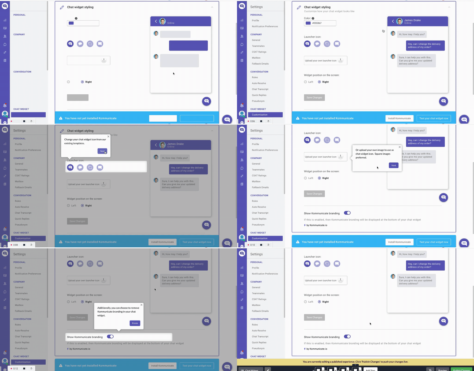
An interactive walkthrough is a sequence of tooltips that introduce new users to how a feature or product operates.
Used as part of a contextual onboarding experience, it helps you explain the different parts of a feature when a user first interacts with it.
Demonstrate how a feature works with an interactive walkthrough.
I’ve found walkthroughs work best when you use them to nudge users towards experiencing a single “first value” action.
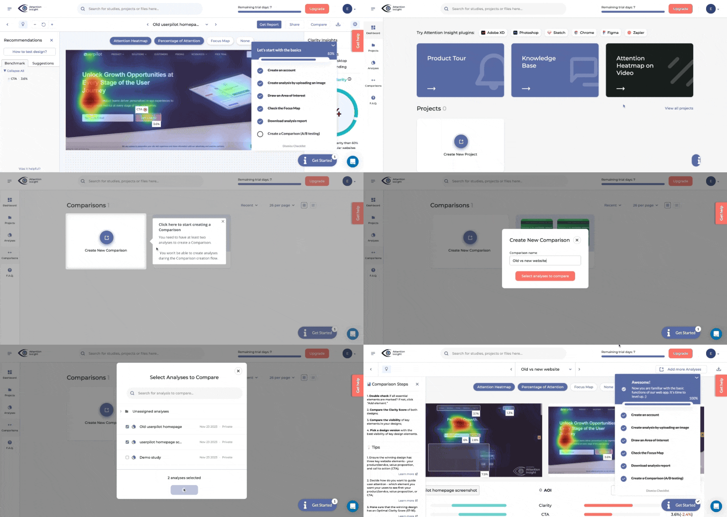
That’s exactly what happened with our customer, Attention Insight. They added a walkthrough that guided trial users through creating their first heatmap, and activation jumped from 47% to 69%.
You can also feature progress bars or add micro interactions to improve task completion rates.
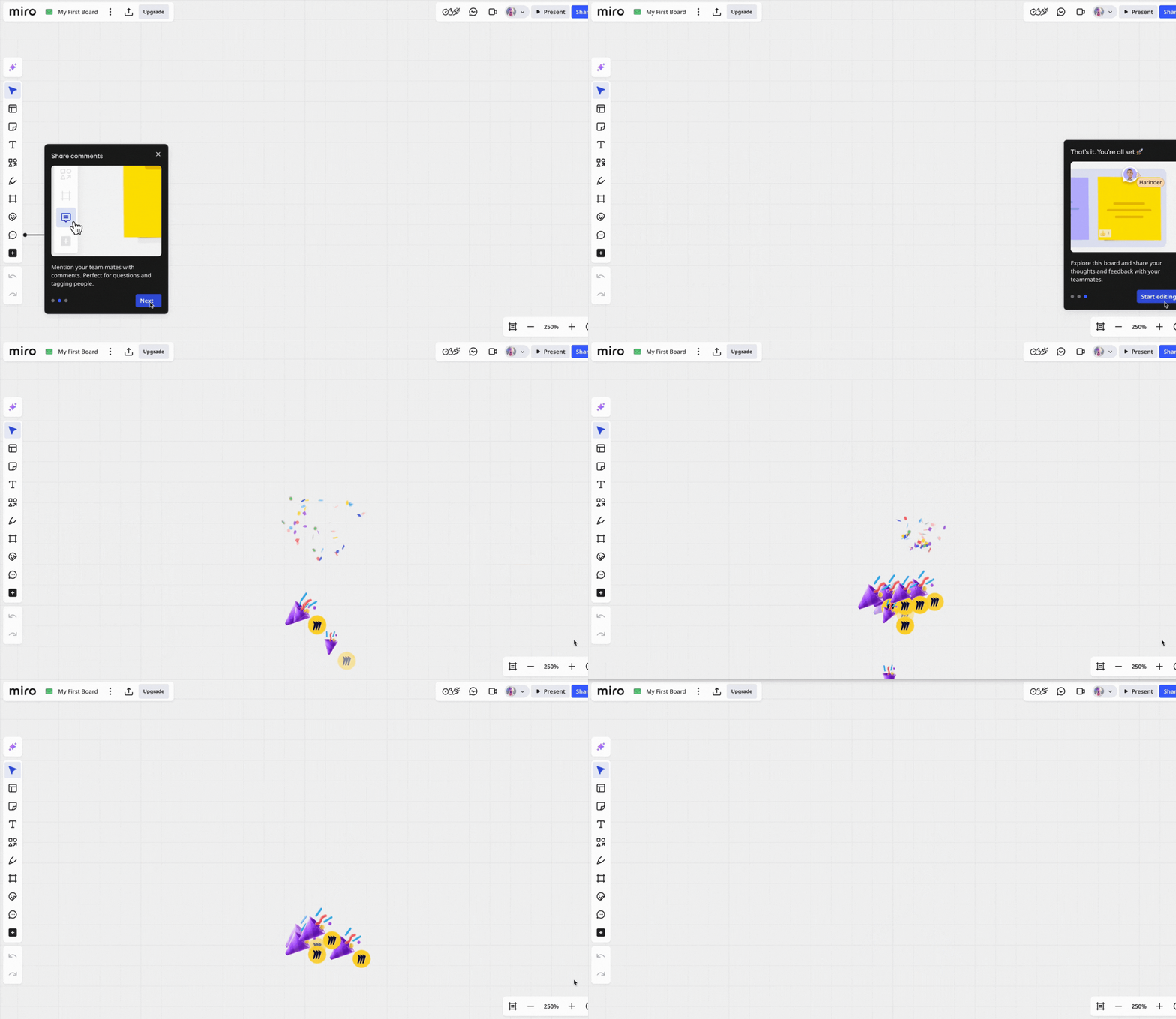
Take a cue from Miro.
As you complete an onboarding task, you’ll see playful “Yeah!” messages pop up with simple animations. It even goes as far as sending you confetti when you finish learning all of the touchpad movements.
Nevertheless, when implementing walkthroughs, always provide the option for experienced users to skip it mid-way. This is important for users who do not want to complete the walkthrough for any reason.
Proactively assist and guide users with onboarding checklists
The period after a user signs up can be very confusing. What do they do first? Where do they start to derive value from the product? These are the questions that can be answered with a checklist.
Onboarding checklists contain a list of action items that new users need to complete. As they tick off each item, they complete their account setup, adopt your core product features, and reach activation.
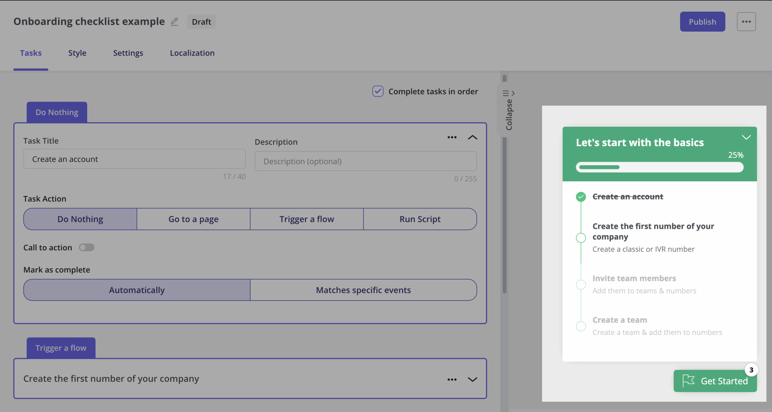
You can always make your checklists more contextual by matching the actions on the list to the JTBDs of different user personas. This will ensure each user receives a personalized checklist for their needs.
Drive self-service with an embedded help desk
In a world of competing attention and limited time, self-service support is a must. Self-service support empowers users to find the information or solution they need on their own.
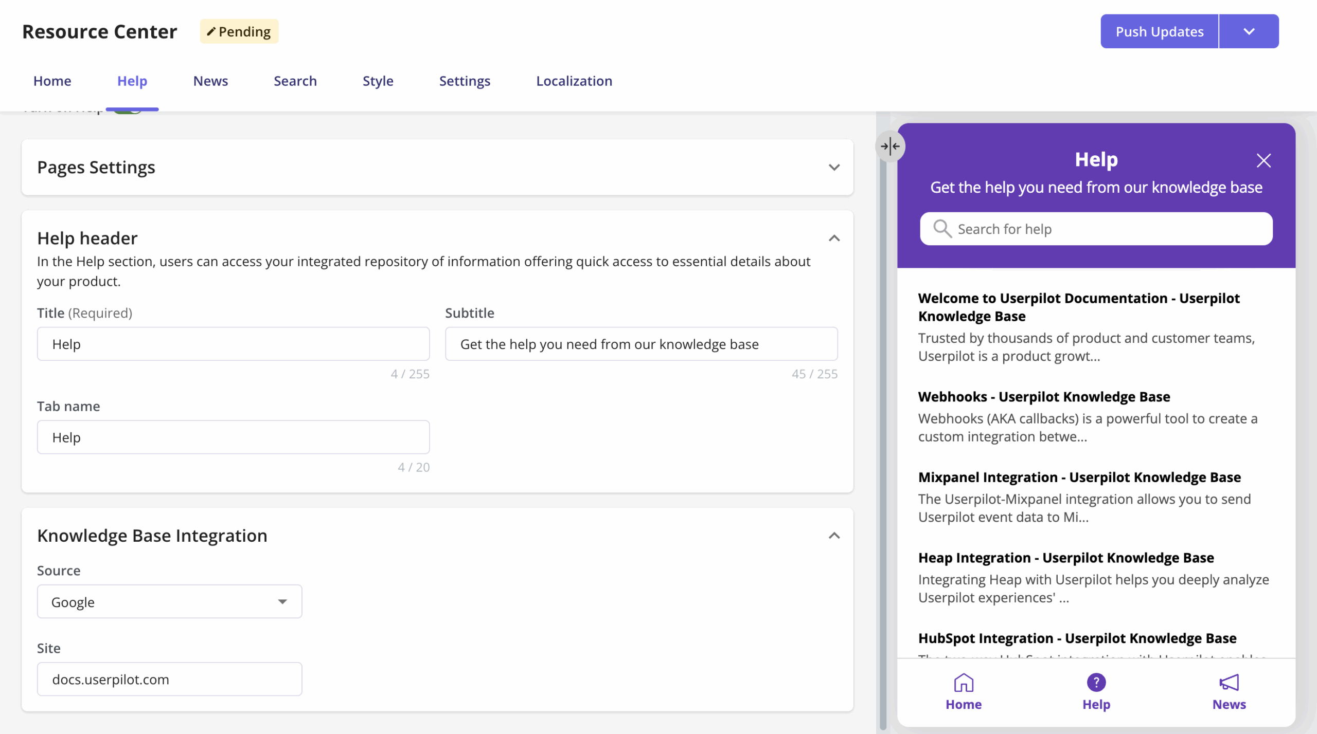
You can provide self-service support to users via an embedded help desk. You can add as much information as you want through embedding different types of help resources like articles, video tutorials, or even buttons to trigger interactive walkthroughs.
Click here to see how Osano reduced churn with a knowledge base
A good embedded help desk, however, is more than just a library of knowledge base articles. It provides contextual help, tailoring its content recommendations to match the user’s context.
Ultimately, it helps users solve their queries without leaving the app or filing a support ticket. It also saves users a lot of time as they no longer have to wait for support agents.
Announce new features with pop-ups
Yet another way to offer contextual help, pop-up banners are a great tool for introducing new features.
After taking the time to develop a feature, you can use pop-up banners to announce the feature.
Tell them what to expect from the feature and, if possible, include rich content like a video demonstrating how the feature works.
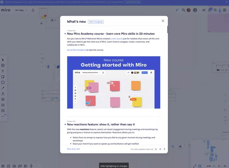
This will ultimately catch users’ attention and provide additional value to their experience.
Offer proactive help with modals
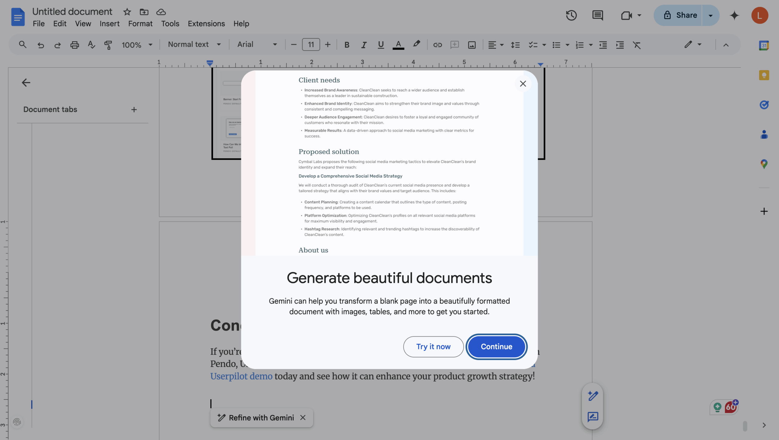
Finally, you can take contextual help up a notch by offering user-specific support. This form of support is provided to users who meet very specific criteria.
For example, a user may fail to adopt a feature because they find the UI design confusing. In this case, you can trigger a modal (also known as a window overlay) to appear on their screen with help content that guides them to use the feature.
How to create contextual help with Userpilot
Thankfully, providing contextual help doesn’t have to be a herculean task. A no-code user onboarding tool, Userpilot helps you create and deliver the ideal contextual help for your clients.
Userpilot extends these powerful contextual help capabilities to your mobile applications. With its native mobile SDK, you can create targeted onboarding flows, slideouts, carousels, and push notifications without writing extra code.
Amongst other things, it helps you to:
Guide users with different UI/UX patterns
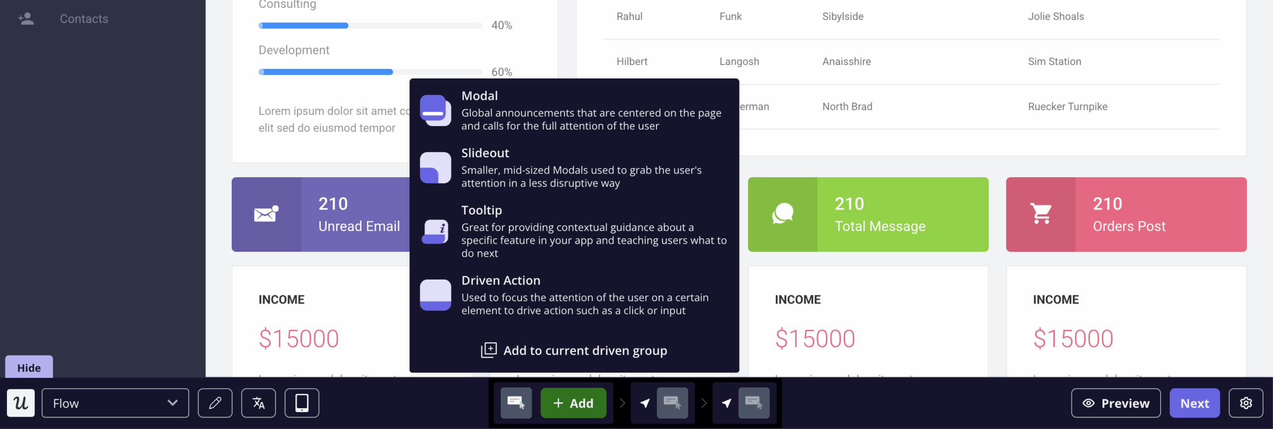
Userpilot comes with various UI patterns to help you deliver contextual information to your users.
This includes banners, tooltips, modals, etc., that provide extra information to users without disrupting the user flow.
Trigger help content contextually
More importantly, Userpilot enables you to choose where and when a UI pattern appears. It arms you with extensive controls over the events that trigger a pattern.
For example, you can set up a tooltip or walkthrough to appear when a user first interacts with a feature.
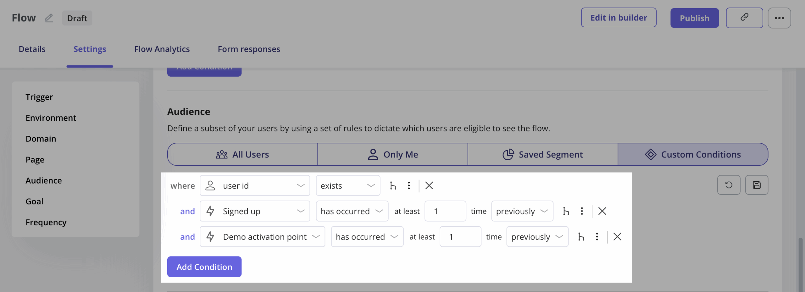
Or, your trigger can be a combination of a series of events/actions completed by the user.
Segment customers to provide contextual help
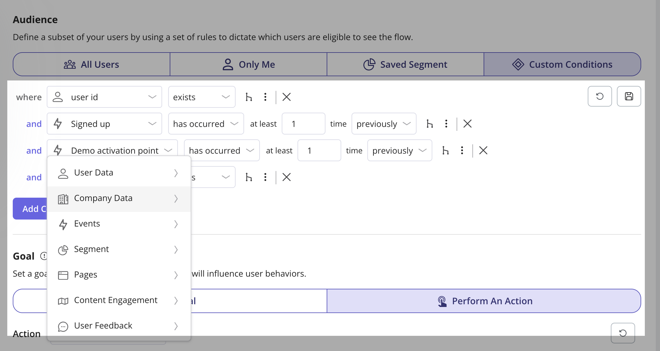
Lastly, you can offer help to users based on their segment. This is important, for example, existing users and new users have different goals, pain points, and issues with your product.
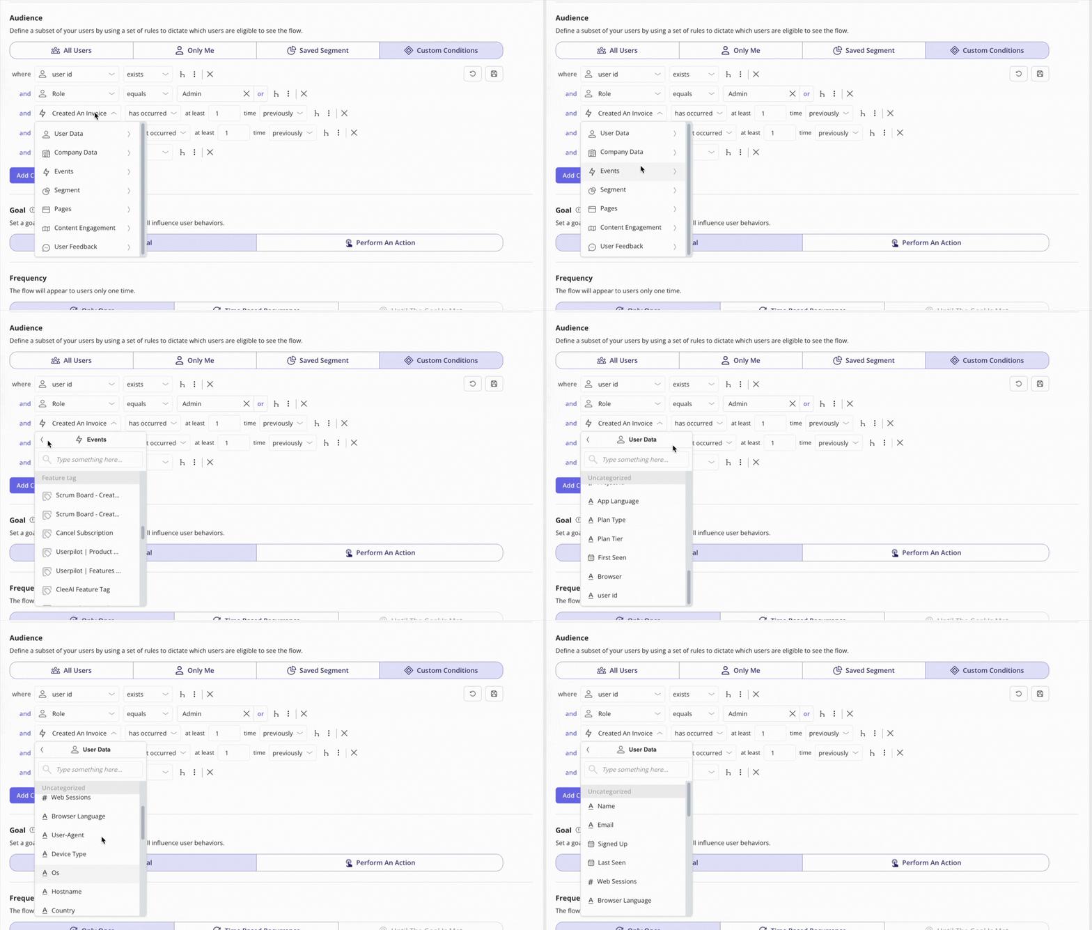
Thanks to Userpilot’s advanced segmentation feature, you can build complex segments and deliver contextual help to them.
Depending on your needs, you can use different criteria like user behavior, product usage, pages, content engagement, etc., helping you narrow down your contexts.
For more advanced filtering, you can also leverage logic groups or OR conditions, which allow you to add up to 5,000 inputs within a single condition.
Leverage Userpilot’s contextual help tools for higher engagement!
The goal of the contextual help you provide should be to furnish customers with answers, doing that before they even think to ask a question.
Thanks to its segmentation and targeting features, Userpilot helps you deliver the needed help to users within their on-page context. To learn more about how this works, book a demo today.


