A customer sentiment dashboard is a great way to visualize customer feedback and see what users love (or hate) about your product.
But how do you collect the right data for your analysis? This article shows you a step-by-step process and some of the best tools to use.
Summary of customer sentiment dashboard
- A sentiment analysis dashboard typically integrates information from multiple data sources, such as social media posts, customer reviews, survey responses, and customer service chats.
Customer sentiment dashboards help you generate the following:
- Sentiment trends over time.
- Sentiment distribution.
- Text response analysis.
- Sentiment by channel.
- Comparison with internal and industry benchmarks.
- The benefits of having a customer insights dashboard include improved understanding of customer behavior, significant time savings, and enhanced cross-team collaboration.
How to gather data for customer sentiment analysis
- Send in-app surveys to collect quick feedback.
- Track customer behavior for experience insights.
- Monitor customer opinions on review sites.
Examples of customer sentiment dashboards
- Track changes in sentiment scores over time.
- Analyze NPS responses to find causes of negative sentiment.
- Study answer distribution to understand trends.
- Monitor individual sentiment changes over time.
- Identify friction points with path and funnel reports.
- When selecting a sentiment analysis tool, prioritize robust visualization options and strong data security.
Best tools for real-time sentiment analysis:
- Userpilot — Best for in-depth analysis and data visualization.
- Brand24 — Best for tracking social media mentions.
- SentiSum — Best for tracking feedback across multiple channels.
Ready to start tracking user opinions and feelings about your brand? Book a Userpilot demo now to get started.
What is a sentiment dashboard?
A sentiment (or customer insights) dashboard is a visual tool that gathers and displays customer feedback data. It reveals customers’ overall emotional tone toward your brand, product, or service.
Customer insights dashboards typically integrate data from multiple sources, such as social media, customer reviews, survey responses, and customer support interactions. However, a single data source (e.g., surveys) can be enough to provide the customer insights you need.
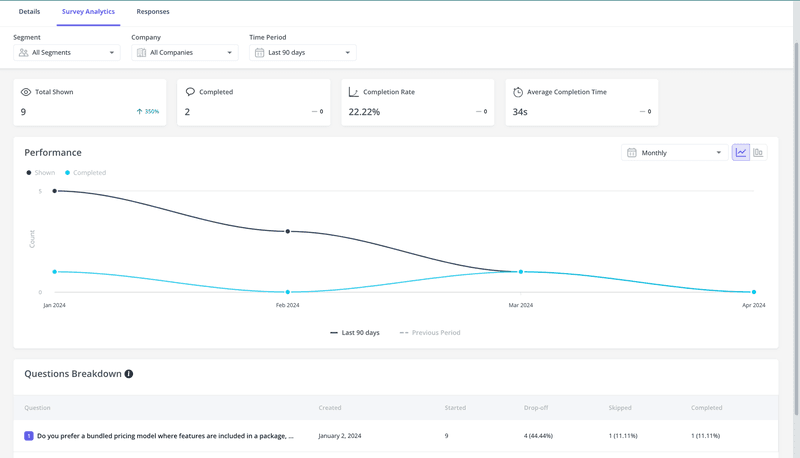
Survey analytics performed with Userpilot.
What insights does a sentiment analysis dashboard provide?
Sentiment dashboards come in various forms, and most tools allow you to customize what you see. Here are some examples of the common insights you can extract:
- Sentiment trends over time: Track sentiment on a weekly, monthly, or annual timeline and see how customer emotions about your brand are changing.
- Sentiment distribution: Monitor the percentage breakdown of positive, negative, and neutral feedback, giving you a snapshot of overall user sentiment.
- Text response analysis: Dive deeper into the emotions and themes expressed in open-ended survey responses or online reviews.
- Sentiment by channel: Compare customer sentiment across platforms such as social media, review sites, or support channels. This insight is useful for building a brand reputation that appeals to your target audience.
- Comparison with benchmarks: Benchmark customer sentiment against industry standards or competitors, showing where your business stands regarding customer satisfaction within its market.
Why should you visualize customer sentiment data?
There are tons of benefits, but let’s boil it down to the three most important ones:
- Better understanding: Visualizations like charts, graphs, and word clouds transform complex sentiment patterns into easily understandable insights, helping you understand the bigger picture about customer perceptions.
- Save time: A sentiment analysis dashboard cuts through the noise. Rather than manually reading continuously accumulating data, your team can immediately focus on trends and areas needing attention.
- Foster cross-team collaboration: Engaging visualizations makes insights accessible to everyone, not just data analysts. Marketing, sales, product development, and the customer service team can align on user needs, leading to more focused strategies.
How to collect customer data for sentiment analysis?
Now that you’re convinced of the importance of visualizing customer sentiment, it’s time to start collecting raw data for your analysis. Follow these strategies:
Send in-app surveys to collect customer feedback
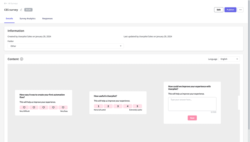
Create concise, relevant questions that help you collect data about users’ feelings and satisfaction levels.
Once your questions are ready, use feedback tools like Userpilot to set contextual triggers. For example, triggering an in-app survey immediately after a user interacts with support provides better insights than waiting to ask them about the experience at a random time.
Track customer behavior for experience insights
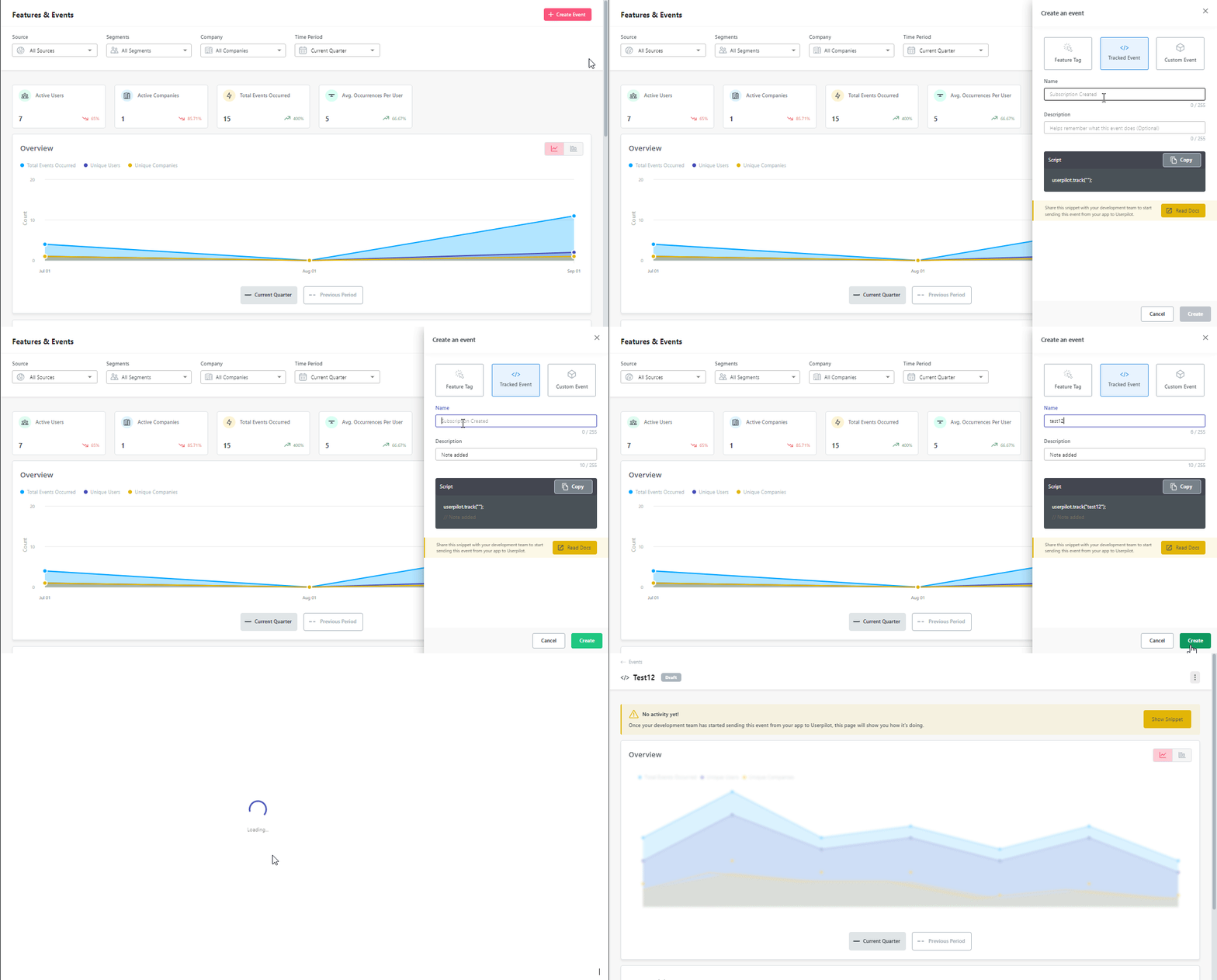
Use event tracking and reports from trends, funnel, and path analysis to capture user behavior data.
Aim to find how customers use certain features, the duration of their visits, and their navigation paths through your tool.
Monitor customer opinions on review sites
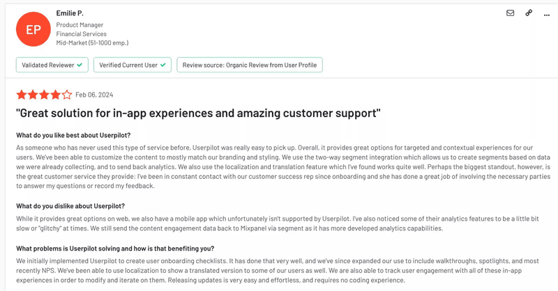
Use platforms like G2 and Capterra to stay abreast of customer feedback and candid opinions about your brand.
Sentiment analysis of opinions from review sites can reveal common user pain points and show you areas of your tool customers are misunderstanding. The insights are also useful for uncovering broader trends affecting your industry.
Examples of customer sentiment dashboards
From NPS dashboards to funnels and user behavior trends, there are many ways to visualize customer sentiment. This section shows you some examples and the data they help you measure.
Track changes in NPS over time
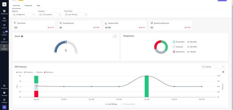
Net Promoter Score (NPS) is a customer loyalty and sentiment metric calculated based on responses to a single question: “On a scale of 0-10, how likely are you to recommend our company/product/service to a friend or colleague?”
Based on their sentiment scores, respondents are classified into three categories:
- Promoters (score 9-10): Loyal enthusiasts who will keep using your tool and refer others.
- Passives (score 7-8): Satisfied but unenthusiastic customers who are vulnerable to competitive offerings.
- Detractors (score 0-6): Unhappy customers who can damage the brand and impede growth through negative word-of-mouth.
An NPS dashboard gathers all the responses to your survey and displays them in various charts for easy visualization. With a tool like Userpilot, you can visualize NPS responses in a bar chart, pie chart, and so on, depending on your needs. Here’s an example of using a bar chart to understand NPS trends:
Analyze NPS responses to find negative sentiment causes
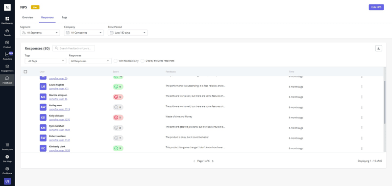
The right NPS dashboard will have a built-in response tagging feature that allows you to categorize common themes and act on negative sentiments.
For example, you can use themes like “poor customer support,” “missing features,” or “difficult to use” to understand recurring user feedback better.
Study answer distribution to understand trends
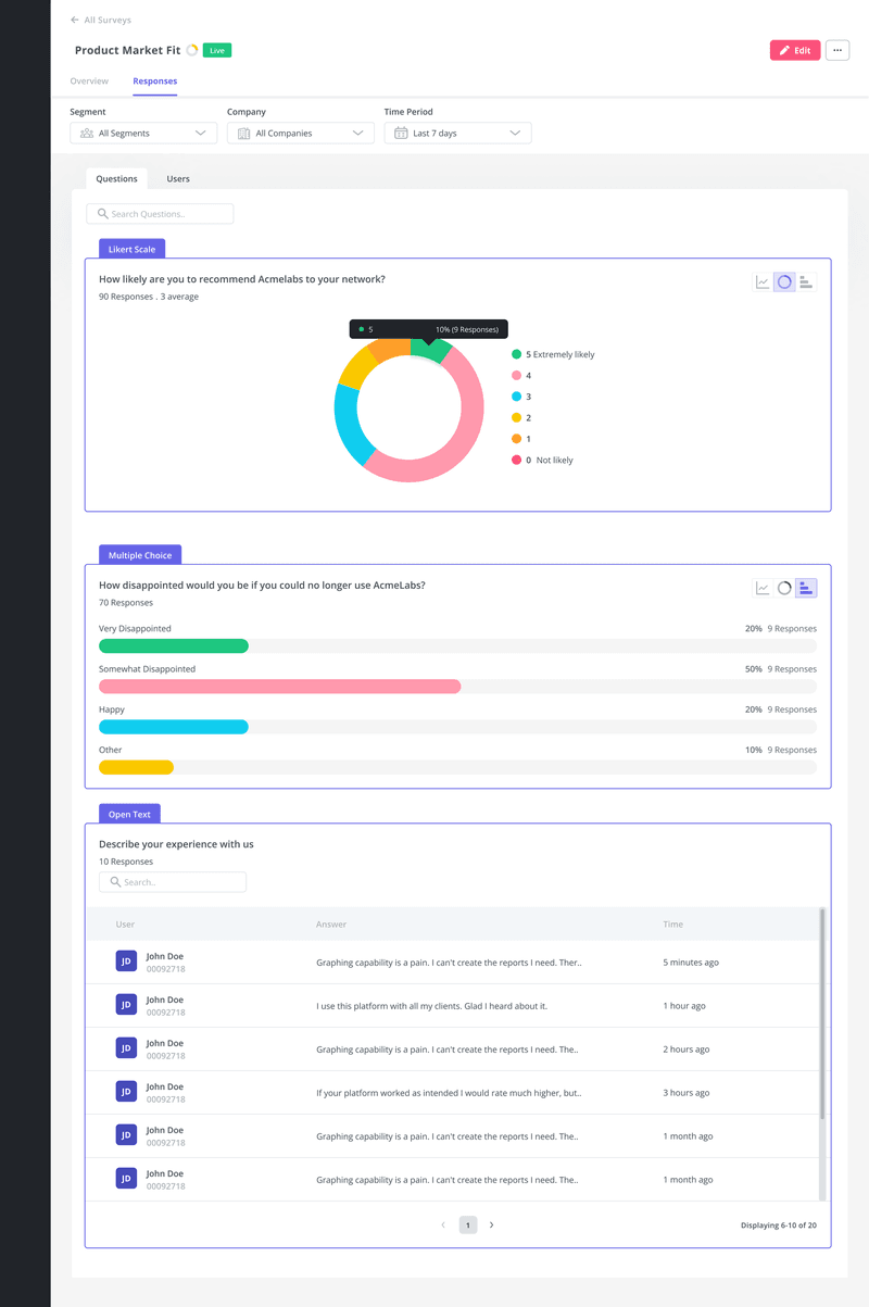
By observing the distribution of user responses, you can pick up valuable insights that will help you improve customer satisfaction. You’d be able to see a breakdown of your user’s opinions.
For example, consider the PMF survey analytics below.
If 20% of respondents said they’ll be very disappointed if they can no longer use the platform and 50% say they’d be somewhat disappointed, this could indicate that about 70% of your user base feels positive about your product. But considering that the “Somewhat disappointed” category is much larger than “Very disappointed”, there’s still work to do.
Monitor individual sentiment changes over time
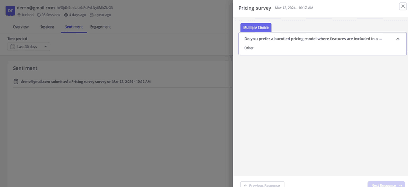
Individual sentiment dashboards allow you to get granular with user or company data and observe how their feelings about your business change over time.
For instance, with Userpilot’s user and company profile feature, you can track each user’s feedback across all your in-app surveys. This allows you to decide how best to deliver personalized support and marketing.
This kind of sentiment analysis is especially useful for high-profile customers. When you notice a usually positive power user suddenly starts showing negative sentiment, you can quickly reach out, address their problems, and prevent potential churn.
Identify friction points with path and funnel reports
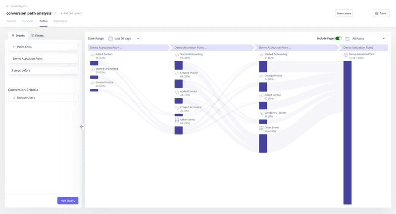
Path analysis tracks the different routes users take to accomplish tasks (e.g., sign up, complete your onboarding flow, or renew their accounts). It lets you note unexpected deviations from the standard paths and find ways to deliver better in-app guidance.
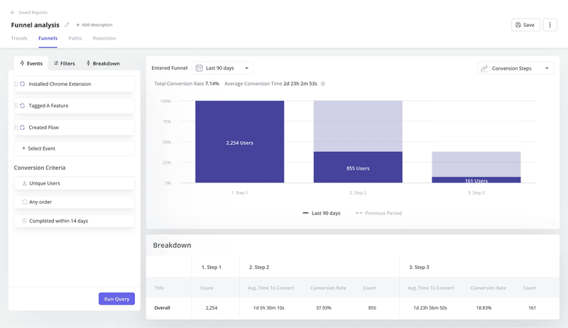
Unlike path analysis, funnel reports provide linear visualizations of the predefined steps your customers are expected to take. You can track drop-offs and quantify conversion rates between each step, then decide how best to boost funnel conversions.
Best customer sentiment analysis tools
When selecting a sentiment analysis tool, prioritize robust visualization options and strong data security. Here are tools that do the same.
Userpilot
Userpilot is a product growth platform with features to help you understand your users and create engaging in-app experiences.
Here’s how Userpilot can help:
- NPS analysis: The platform allows you to conduct NPS score and text analysis to extract actionable insights.
- Sentiment analysis: You can analyze overall sentiment data for each survey or conduct profile-to-profile analysis to understand users’ opinions and feelings.
- Data visualization: Access multiple options for visualizing sentiment analysis data. You can use tables, lines, bar graphs, pie charts, and so on.
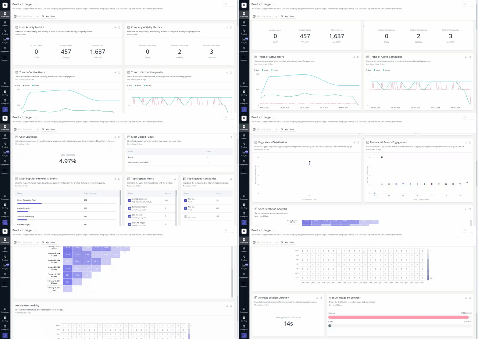
- In-depth user analytics: Besides sentiment analysis, Userpilot has other analytics dashboards and reports to help you analyze various key performance indicators. For example, you can track product usage, core feature engagement, user activation, and user retention, among others.
Brand24
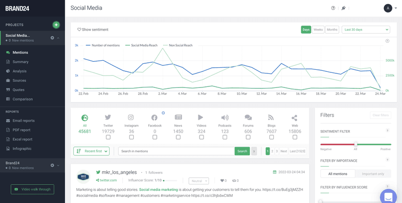
Brand24 is a real-time social media monitoring tool that allows businesses to engage in conversations about their brand online.
Some of its key features:
- Real-time monitoring: Track mentions of your company across social media, blogs, forums, and other online sources. This business intelligence feature makes it easy to spot negative comments and maintain a positive brand reputation.
- Sentiment analysis: The platform automatically categorizes mentions as positive, negative, or neutral for easy evaluation.
- Influencer identification: Find prominent voices in your industry who are already talking about your brand across different social media channels.
SentiSum
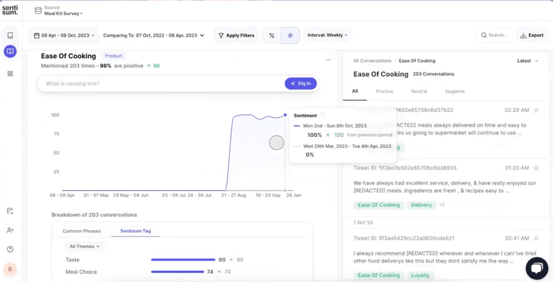
SentiSum is an AI-powered sentiment analysis and visualization tool designed to provide deep insights into various customer feedback types.
Here’s where this platform excels:
- Comprehensive customer insights dashboard: Use a centralized platform for tracking all customer feedback and sentiment analysis, making it easy to view trends and insights.
- Emotion detection: Detect actionable data insights tied to emotions like anger, surprise, joy, etc., enhancing understanding.
- Aspect-based sentiment analysis: Identify specific topics or features within customer feedback that evoke positive or negative responses. This makes it easy to note UX improvement areas.
Conclusion
It’s impractical to expect 100% customer satisfaction. However, regularly tracking sentiments and addressing negative feedback will help you significantly improve the overall user experience.
And the right tool can make this process much easier. Userpilot helps you collect customer data and visualize it in a real-time customer sentiment dashboard for easy analysis. Book a demo today to start turning customer insights into action.

