Tracking User Activity in Web Applications: What the Standard Playbook Misses in 2026


One AI agent calling your product’s API 200 times a day looks exactly like a highly engaged user inside your analytics dashboard, which is fine until you realize the signal has nothing to do with whether a human is getting value from your product.
According to Gartner, 40% of enterprise applications will embed task-specific AI agents by end of 2026, up from less than 5% in 2025. Those agents don’t hesitate at domain verification, scroll erratically through a new feature, or rage-click an unresponsive button. When their sessions mix with human sessions in your activity data, the activation rates, retention curves, and feature adoption numbers you’re acting on may be measuring the wrong thing.
Autocapture, session replay, heatmaps, funnel analysis, and path reports are all still sound methods for tracking user activity in web applications. What most analytics setups haven’t built is the filter between human behavior and agent activity. This article covers how to use each method well and what happens to your data when that filter is missing.

The tracking methods that still work
The core toolkit for user activity tracking in web applications hasn’t been replaced by anything better. What’s changing is the context around what the data means, particularly once agent sessions start appearing alongside human sessions in the same reports. Before getting to that problem, here’s how I’d use each method and what makes the difference between doing it well and doing it fast.
Use autocapture to cover what you can’t predict
Autocapture solves a specific problem: you can’t label what you haven’t thought to track. Every SaaS product has workflows that matter to users but weren’t on the original event spec, and without autocapture, those behaviors go unmeasured or require an engineering ticket to add retroactively. The real value isn’t just coverage; it’s retroactive coverage.
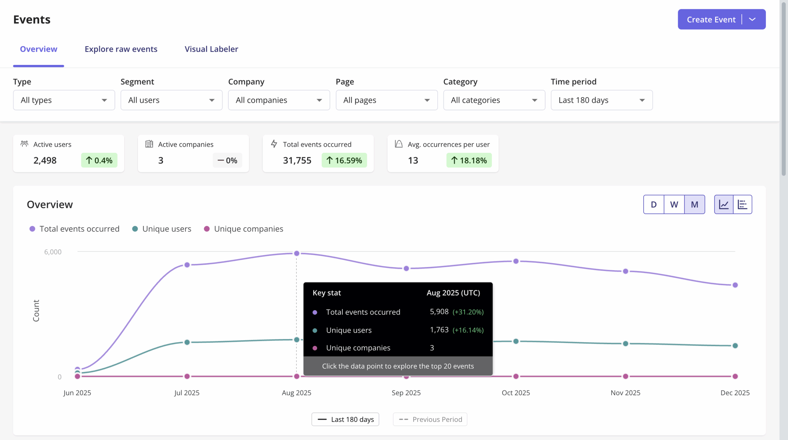
When I spoke to Kevin O’Sullivan, head of product design at Userpilot, he pointed to the moment Userpilot shipped autocapture as one of the more clarifying design feedback loops his team had been through: the first release included only a raw events table, with no visual labeler, just CSS selectors for identifying events. Within two weeks of watching behavioral data, they could see that non-technical users weren’t labeling anything at all. Kevin’s team moved fast: “It went from an experience where no events were being labeled to seeing a huge increase in labeling, once we got the visual labeler in.”
The autocapture behavior that drove that fix wasn’t something anyone had anticipated needing to track at launch. That’s the point. Build your tracking setup on the assumption that you’ll need to go back and look at behaviors you didn’t know mattered yet.
Use session replay before you assume you know why
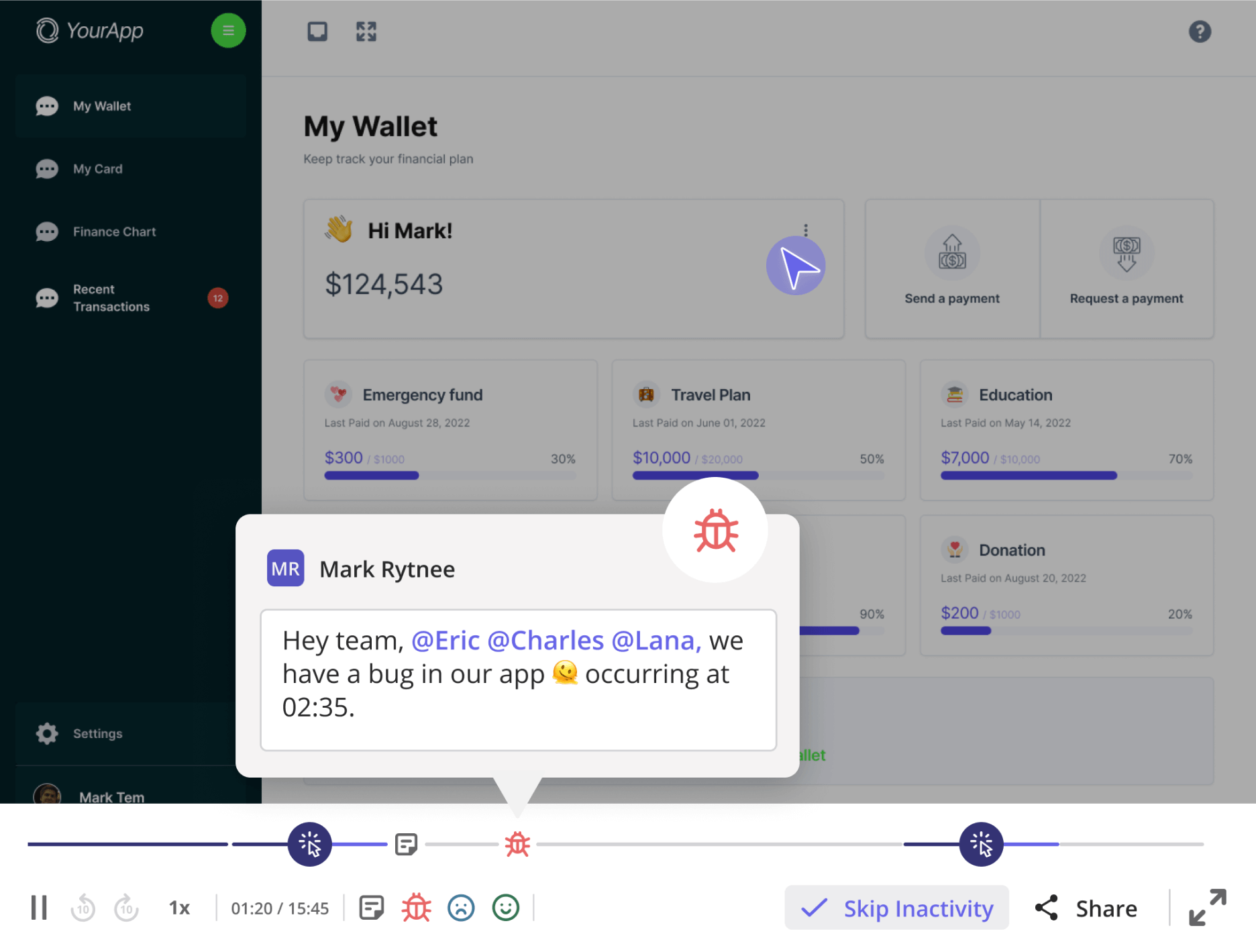
Funnel drop-off tells you where users stop. Understanding why is what session replay is built for, and it’s the most underused diagnostic tool in the standard toolkit, not because teams aren’t watching sessions, but because they usually watch too few before committing to a conclusion.
Kevin’s design team ran into this directly with a specific element in Userpilot’s analytics interface: an event occurrence distribution chart they suspected was low-value, which they tested by watching around 30 sessions. Most users scrolled straight past the chart to the data table, but roughly 10% were hovering on it and actually examining it. Kevin described the shift: “If we scale that up, 10% is actually quite a lot. We were nearly going to ax the distribution chart entirely. Then we pulled back and said, if 10% get any sort of value even on hover, there’s probably something there. We made it collapsible instead.”
The redesign they’d been considering would have removed something a meaningful minority of users were relying on, with no substitute. Session replay gave them a specific number to anchor a better decision. That’s the pattern: go wide on sessions before you commit to the conclusion, and don’t let your prior assumption determine how many sessions count as enough.
Use heatmaps when you’re surprised, not when you’re confirming
Heatmaps are most useful when you’re prepared to be wrong about what users are doing on a specific page. The two most diagnostic formats are scroll depth maps, which show how far users get before abandoning a page, and click heatmaps, which reveal dead clicks: spots where users tap expecting interaction and nothing happens. Dead clicks are the heatmap equivalent of a rage click: clear evidence that something on the page is communicating affordance it doesn’t actually have.
For onboarding or feature tour pages, a scroll depth benchmark worth tracking: if more than 40% of sessions end in the top half of the page, that’s a lead problem, not a content problem. Users aren’t getting far enough into the page to encounter whatever you want them to see. The fix lives in the first screen, not further down.
For SaaS products specifically, the most valuable click heatmap is usually not on your homepage or pricing page. It’s on the first screen a new user sees after signing up. Dead clicks on that screen tell you directly where users expect interaction that the product isn’t providing. If those dead clicks cluster around a label or icon, you have a labeling problem. If they cluster around a button that isn’t styled as clickable, you have a hierarchy problem. The heatmap gives you the location before you spend time watching sessions to find it.
Heatmaps are not a replacement for session replay in most diagnostic contexts. They answer “where on this page” before session replay answers “what were they actually trying to do.” Use them in sequence, not as substitutes for each other.
Use funnel analysis to find the drop-off, then go deeper
Conversion funnel analysis tells you where users stop completing a sequence, but the number alone rarely tells you why. Treat it as a starting point rather than a finding: the output of a funnel report is a question, not an answer, and the question is “why are users not getting from step A to step B?”
Abrar Abutouq, a product manager at Userpilot, ran into this directly when the email feature launched. Funnel data showed a sharp drop-off at domain verification: the time between “domain added” and “email address added” stretched to 60 days for some accounts because the setup required technical steps that users weren’t connecting to the end state. Abrar didn’t need an engineering ticket to respond: “Within a few hours, I just created a targeting tooltip and showed it to users, highlighted the correct steps for them, to make it clear what to do next. That helped a lot on reducing friction and supporting users in real time without involving our dev team.”
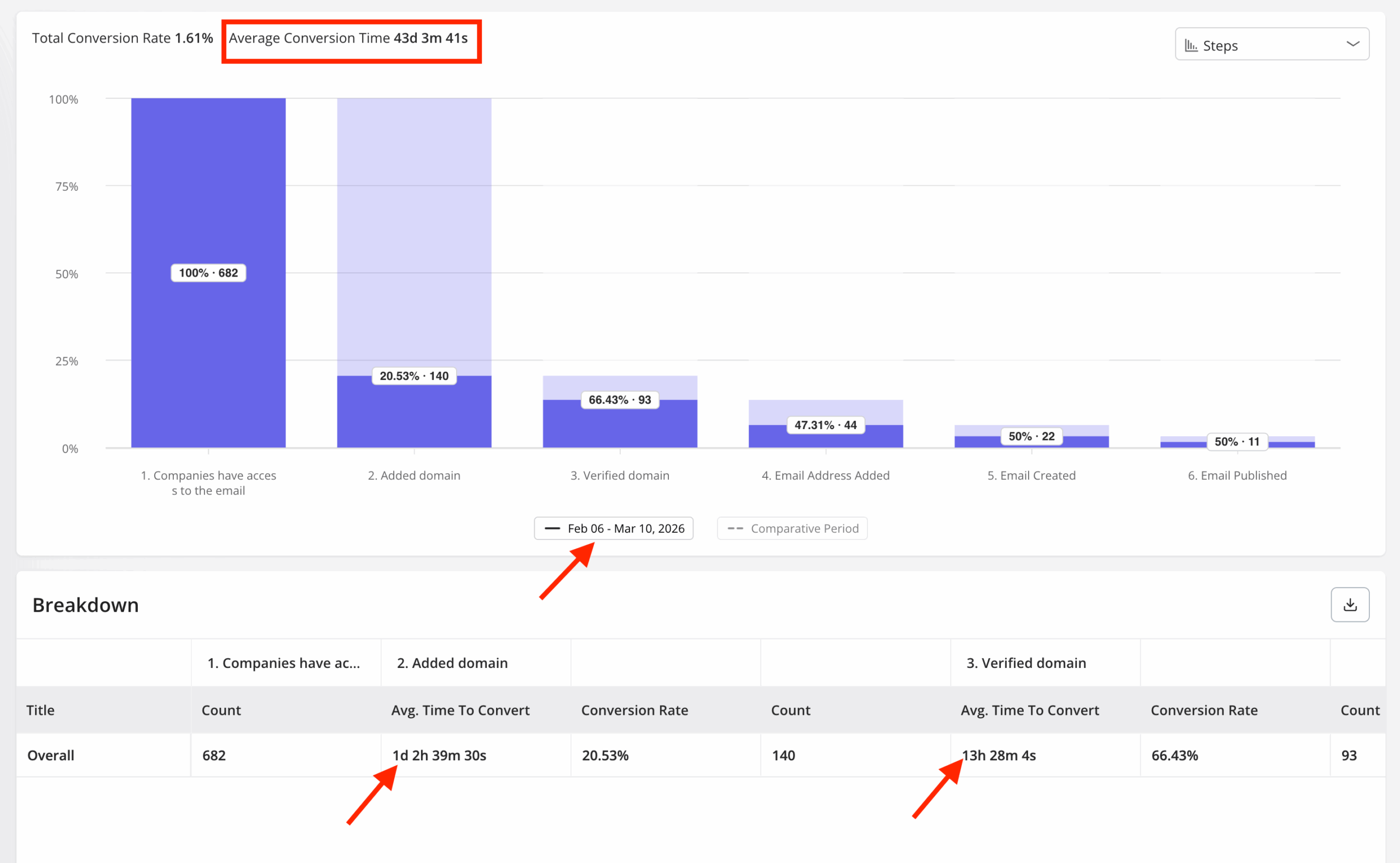
The funnel identified the problem. The fix took hours, not a sprint. That loop from funnel to diagnosis to in-app guidance, without touching the codebase, is what makes user behavioral analytics useful rather than just interesting.
Use path reports to find the routes you didn’t design
Funnel analysis maps the user journey you designed. User path analysis reveals the routes users actually chose, and the gap between those two often explains more about activation friction than any individual step in your intended flow.
The setup is simple: pick an event (like “completed onboarding” or “published first flow”) and run the path backward to see what actions preceded it and how many different sequences got users there. When you find that 30% of users who successfully activated went through a sequence you never designed for, that’s not an edge case: it’s a signal about which part of your product is actually doing the work.
Path analysis is also useful for locating where users diverge before converting. If users consistently navigate away from a specific step and return later, the step is either confusing or requires something external that the product isn’t providing. That’s usually an onboarding problem, not a product problem, and the fix belongs in your in-app guidance layer, not the feature itself.
When you find multiple successful routes to the same activation event, the follow-up worth running is a cohort retention comparison between users who took the designed path and users who found an undesigned one. Users who arrive at activation through an emergent path often show stronger long-term retention, because they engaged more actively with the product to find it. If the user retention gap is meaningful, the emergent path is worth studying as a model for improving the designed one, not dismissing as an edge case.
The AI agent problem in your activity data
The problem with AI agent sessions contaminating your user activity data is that they don’t look wrong; they look like very efficient users. Agent sessions generate feature interactions and completions at high frequency, without the hesitation, backtracking, or UI confusion that human sessions produce. Without a way to separate them from human sessions, your behavioral analytics will surface agent behavior as the “happy path,” and you’ll build toward it.
James Mitchinson, who leads customer success at Userpilot, described one account his team flagged recently, where every surface metric looked healthy: daily sessions, three features consistently used, week-over-week growth in activity. No human had logged in since January. Every session was an AI agent automating a reporting workflow through the API.
“An AI agent calling an API 200 times a day will inflate DAU dramatically, producing a stickiness ratio that reflects automation volume rather than human engagement. What looks like a sticky account might be 95% automated, with the three humans inside it logging in once a week.”
— James Mitchinson, Head of Customer Success, Userpilot
This is the high-logins-zero-outcomes pattern that surfaces in customer success data before it shows up anywhere else. High session frequency alongside low user engagement on the features that actually matter is the combination that often precedes silent churn. When agents are generating most of those sessions, the signal gets inverted: the account looks healthy until the humans stop logging in entirely.
The practical risk spans every user activity monitoring metric built on the assumption that a “user” is a human. According to data cited by Wes Bush, founder of ProductLed, from Netlify’s pivot to Agent Experience, 80% of new signups to that platform are now AI agents. Netlify’s product strategy intentionally targets agent traffic, making it an outlier, but as more SaaS products gain MCP integrations and agent-facing APIs, the human-to-agent ratio in your analytics will shift, and no existing dashboard will tell you when it happens.
The metrics most exposed are the ones most teams rely on: DAU, user session length, feature interaction rates, and trial-to-paid conversion rates built on activation criteria that agents can trigger without a human ever understanding the product. Before acting on any engagement spike, it’s worth verifying the human-to-agent composition first.
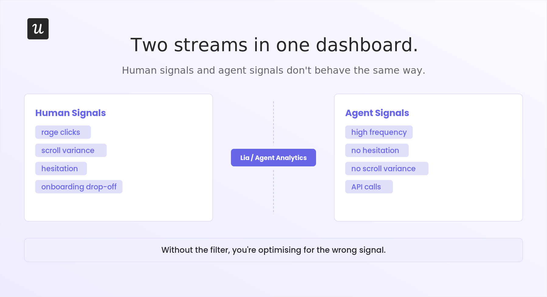
Without a dedicated separation layer, there are behavioral signals in raw session data that point to agent traffic. Agent sessions generate high event counts per minute with no scroll events, since agents interact through API calls or DOM manipulation rather than reading a page. They also complete funnel steps at regular intervals, without the timing variance that comes from a human reading instructions or deciding between options. If your session replay tool lets you filter by sessions with no scroll events alongside feature completion events, that filter is a practical starting point for isolating agent traffic before you have native tooling to do it automatically.
What Lia changes about this
The standard response to agent contamination in your activity data is manual segmentation: build a filter that excludes API-only sessions, adjust for session length and interaction patterns, and re-run your reports. It works, but it needs to be rebuilt every time your agent traffic patterns change, and for teams tracking seven or eight features in parallel, that’s not a sustainable workflow.
Yazan Sehwail, Userpilot’s CEO, described the shift in how he thinks about where this is heading. His framing of the operator-to-monitor transition is the clearest version I’ve heard:
“You’re no longer operating. The AI is operating. You’re just basically evaluating and monitoring the agent workflow.”
— Yazan Sehwail, CEO, Userpilot
For Lia, Userpilot’s AI agent, that means the Agent Analytics layer handles the separation of human and agent sessions natively, surfacing them as two distinct streams rather than requiring users to filter one out manually. The practical implication: when you want to know why a cohort of human users isn’t completing onboarding, you can ask that question specifically, without first building a segment that removes agent sessions from the query.
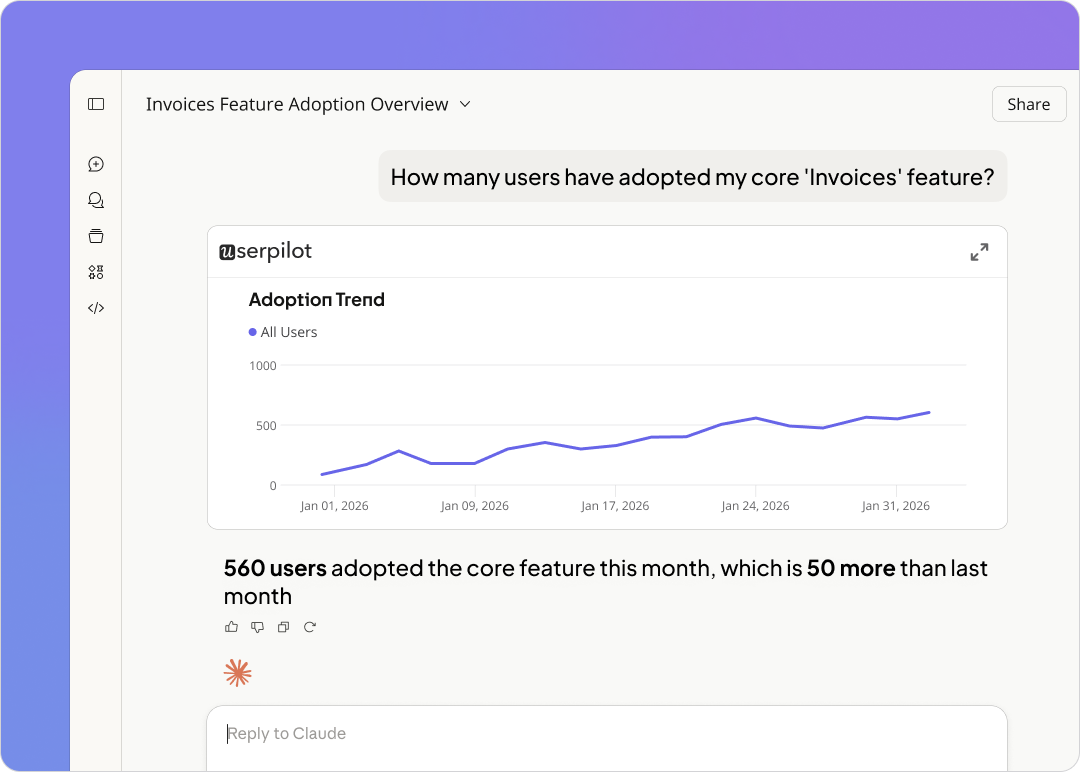
Lia pulls from behavioral data, session replay, and survey responses simultaneously, which matters because agent analytics and human analytics answer different questions. Yazan made this point about why the MCP layer matters as much as Lia itself: “If you as a marketer wanted to see, using session replay, NPS data, survey data, and product usage data, you’re able to get your answer without having to go to Userpilot, without having to pull data and upload it to someone. That’s why MCP is going to be a game changer.”
There’s also a compounding problem Yazan flagged that makes the two-stream separation more necessary over time. As AI-assisted development makes it cheaper and faster to ship, teams release seven, eight, or nine features per quarter instead of one or two, making manual per-feature tracking unsustainable. As Yazan put it: “It becomes even harder for product teams to manually track each one and understand usage for each one. You need to automate a lot of this.”
Userpilot’s Agent Analytics is built for that volume: you define the outcome you’re optimizing for, and it runs the correlation analysis, separating the human signal from agent noise in the process.
What the human-only data layer makes answerable are questions product teams ask constantly but rarely get clean responses to. Which features are humans discovering without guided prompting, versus features they only interact with because an agent automates the workflow? What’s the actual human retention curves inside accounts where agent sessions make up the majority of activity? Which specific users inside a high-session-count account stopped logging in, and when? Those questions aren’t new. The difficulty has been that the data needed to answer them was contaminated by agent traffic in ways that weren’t visible in the standard analytics view.
FAQ
How to track user activity on web app?
Tracking user activity on a web app typically starts with using user activity tracking tools that capture key behavioral data. These tools record in-app actions such as clicks, form submissions, navigation paths, and more. Advanced platforms also support features like session replays, autocapture, and custom events to provide deeper insights into user behavior. Teams can also generate reports that visualize trends, identify drop-offs, and highlight user engagement patterns across the product.
Is it legal to track user activity on website?
Yes, tracking user activity on websites is legal, provided it’s done in compliance with data privacy regulations like GDPR, CCPA, or PECR. These laws require clear communication about what data is being collected and why, especially when tracking sensitive data. Many modern user tracking tools offer consent management, data anonymization, and clear opt-in flows to ensure ethical data practices while collecting user behavior data and qualitative user feedback.
What is the process of keeping track of a user's activity?
User activity tracking involves defining key interactions to monitor, setting up event tracking, and using analytics tools to interpret the data. The process includes capturing events like button clicks, form completions, and page visits, then organizing that data into funnels, paths, or dashboards for analysis. Tools like Userpilot, Google Tag Manager, or Hotjar help collect both quantitative and qualitative user data, making it easier to track progress through the user journey and uncover friction points.
Can you track web activity?
Yes, web activity can be tracked using tools that monitor both website traffic data and in-app behavior. Platforms like Google Analytics offer insights into where users come from and what pages they visit, while tools like Userpilot and Hotjar help track user session activity, click patterns, and in-app engagement. Together, these tools provide a complete picture of user behavior across both marketing sites and product experiences.
Should I use Google Analytics or a product analytics tool?
Google Analytics is built for website traffic data: page views, referral sources, session duration on marketing pages. Product analytics tools like Userpilot are built for what happens inside the product: feature interactions, onboarding funnel progression, in-app behavior, and qualitative feedback from surveys. Both answer legitimate questions but they’re not interchangeable, and if you’re tracking user activity in a web app rather than a marketing site, forcing GA to do the product analytics job will leave you without the session-level data that makes behavioral diagnosis possible.
How many sessions should I watch before I trust the pattern?
There’s no universal number, but 30 sessions across a specific user segment is generally enough to distinguish signal from noise for most product decisions. Kevin O’Sullivan’s team at Userpilot uses this informally as a benchmark: in the distribution chart example above, three users out of 30 hovering on an element was enough to reconsider a major UI removal. The approach I use: watch until you stop seeing new behaviors rather than until you hit a round number, since if the fifteenth session looks identical to the tenth, you have enough.
One caveat that matters more in 2026 than it did two years ago: make sure you’re filtering your session sample to human-generated sessions before you start watching. If agent traffic has entered your product, a random sample of 30 sessions may include a meaningful number of agent sessions that look like confident, frictionless completions. Watching those will give you a misleading picture of where humans actually struggle.
If you’re running a single-stream analytics setup right now, the data you’re acting on is worth auditing. Get a demo of Userpilot to see what the human-only signal looks like against your current engagement numbers. The gap is often larger than teams expect.
About the author