Feedback UI: How to Humanize the SaaS User Interface? (+Examples)

Does UI feedback affect the in-app experience for end users?
Short answer, yes.
UI design is one of the most valuable ways you can enhance users’ experience and drive product adoption. And you can do that using feedback that engages and explains how your product works.
This article will show how you can offer valuable user feedback and improve usability testing using visual feedback.
What is user interface (UI) feedback?
User interface (UI) feedback refers to how your product UI is designed to respond, and the type of output it generates based on how users interact with it.
This is not the same as asking users for feedback about the system’s look and feel.
When users navigate the UI, a good UI system is meant to engage and explain, making the overall user experience less confusing.
For example, when a user clicks on a button and nothing happens, it causes friction. But when an error message shows, this is how the system offers feedback.
Why is feedback important in UI and UX design?
Your product aims to help users achieve their goals easily while providing a good UX. Good usability helps with that, but feedback is what makes the difference.
UI feedback improves user experience
Feedback is how you create a connection with your users and communicate contextually, setting the right expectations from the product.
When you tell users what they’ll get and when they’ll get it, you automatically improve their experience.
And since UI feedback comes in many forms, for example, the change of button color, a small tooltip, an embedded message, etc., there are many ways you can offer meaningful interactions that improve user experience.
A simple example here is a pre-loader.
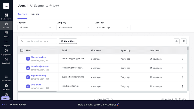
Pre-loaders are generally the first thing your users see when waiting for your app to load. Keep them staring at an empty screen and they’ll think something is wrong, reload the page and at some point, abandon the page.
A simple animation, spinning wheel, or message displayed while the app is loading will greatly improve their experience.
UI feedback removes friction
UI feedback minimizes user confusion by providing immediate confirmation of their action to help them stay on track.
Without it, users may feel lost or unsure if their actions were successful, which may result in frustration or drop-offs.
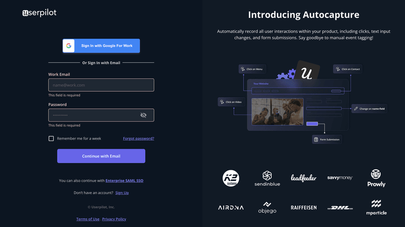
Take the example of a user who is trying to sign in to your tool. However, they miss the email and password fields and continuously click on the login button. If no feedback is given to them, they might think your tool is experiencing a technical difficulty.
However, a simple error message or change of color to signify missing information is enough to make them realize they’ve forgotten to add their credentials.
UI feedback improves engagement and product stickiness
Users churn when they fail to experience the promised value, often due to poor user experience or bad UI product design that leaves them unsure of where to start or how to proceed.
The opposite happens when you actively reduce friction points. To drive engagement, go beyond simple error messages or minor tweaks like button color changes.
In-app prompts like native tooltips and action-driven messages offer users clarity precisely when they need it. For instance, replacing empty states with actionable guidance motivates users to explore features and complete tasks.
This not only enhances their experience but also strengthens product stickiness. Users who quickly realize value are far more likely to return and make your product an essential part of their daily routine.
Feedback types: Methods to provide UI design feedback
As mentioned above, there are multiple ways to provide feedback through the UI to engage, set expectations, and guide users through performing multiple tasks.
Here are the most important types good UX/UI designers should consider.
Feedback loading progress
This is the type of meaningful feedback you should provide while the user is waiting for an action to be performed. Preloaders, loading pages, and skeleton pages are the UI designs to consider here.
The purpose of these tools is to inform users that the system is performing an action and that there aren’t any errors.
You can create interactive design (animations/spinners), or add messages that reinforce your brand and positioning. As a best practice, designers generally reinforce the brand along with a few tips that can help users further in the process.

Feedback progress bar
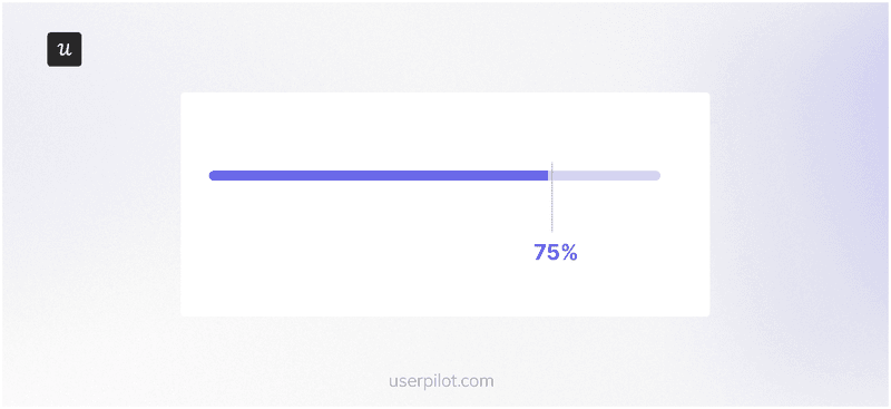
Progress bars are used to communicate, you guessed it- progress. But there’s more.
When the user has to perform an action that involves them engaging with more than just one web page, a progress bar can keep them engaged. Seeing how far along they are in the journey, or how close they are to the finish line helps them finish the task.
The most common use case for progress bars is during signup and onboarding flows, but they can also be used to showcase any type of progress when you want to prompt the user to complete a task.
Empty states feedback
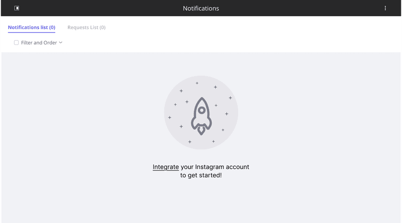
An empty state is a blank screen that users see when they log in to your platform for the first time. And it’s usually blank because there is no data to be displayed since the user is just starting out.
Often overlooked, this is a critical point in helping users get started with your app.
You want better UI designs in a way that prompts users to quickly find their way around, take specific actions, and get to experience value, fast. If your app is a bit more complex, you can add demo data to replace an empty dashboard or leave instructions regarding how to proceed, like in the image below.
Auditory feedback
Auditory feedback uses sound to signal that an action has been completed.
For example, a short chime might play in music production software when a new track is successfully added. On mobile devices, it’s often paired with vibrations for a richer experience.
You should use auditory cues sparingly to avoid overwhelming users and always provide accessible alternatives for those who may not hear them.
Contextual guidance feedback
This type of feedback provides users with real-time guidance or prompts based on their current actions.
It helps users navigate tasks smoothly by delivering relevant cues like tooltips, notifications, or color changes exactly when and where they’re needed.
For example, hovering over the menu bar shows users a short tooltip explaining what each web page is about.

The best UI feedback examples for inspiration
Now that you’ve seen different types of UI feedback, let’s check how other SaaS products are using these in context.
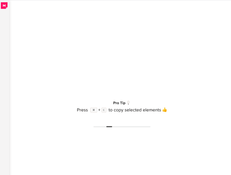
1. Mural’s progress bar
Mural uses a progress bar to show the current status of the app loading. Notice the clever use of the white space on the loading screen that they filled with useful tips on how to use the app.
2. Notion’s blank state
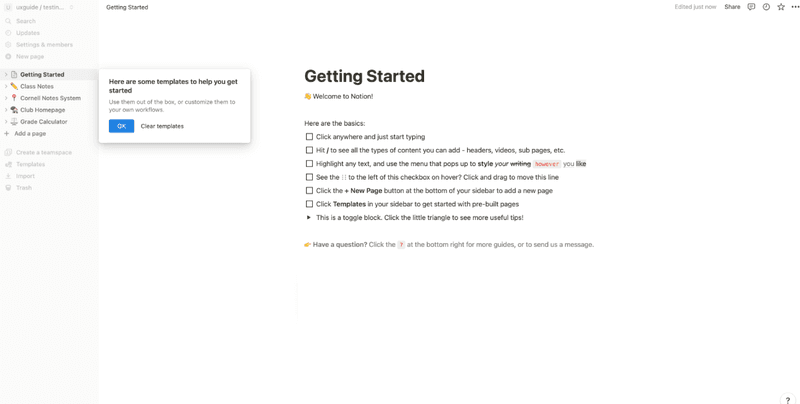
Notion displays a populated blank state by showcasing a helpful checklist. The checklist provides useful tips along with giving users a glimpse of what they can create with the tool.
For example, Notion explains different ways users can style their writing by actually showing bold, italic, highlighted, and underlined text.
3. Impala’s welcome message
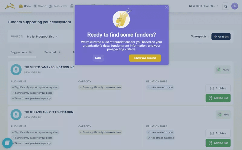
Impala greets new users with a personalized welcome message and sets them up for success. But they didn’t stop there.
By implementing Userpilot, Impala created a no-code onboarding flow that walks users through its different features. What makes Impala’s onboarding flow stand out is the striking color palette against the white background.
In fact, adding this onboarding flow increased Impala’s activation rate by 100%.
4. Userpilot’s feature tooltip
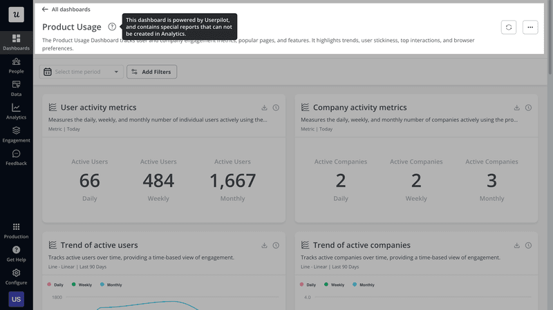
Userpilot is a product growth tool that consistently adds new features to help its users achieve their goals. But when there are too many features, there is always a risk that users don’t understand them and worse, never use them.
To avoid this, Userpilot added a question mark icon on a noticeable part of the UI. Once a user hovers over it, they are shown a tooltip that elaborates on the feature.
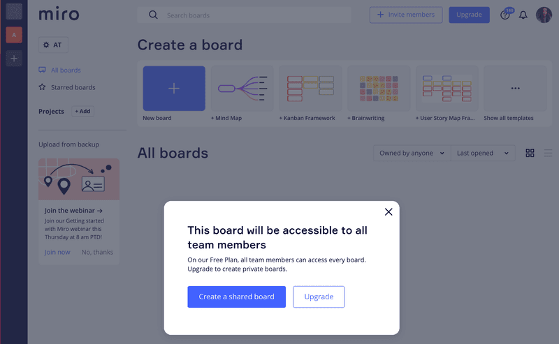
5. Miro’s confirmation message
Miro shows a confirmation message before an action is performed. This is a good practice, especially when dealing with important actions that involve privacy or user interaction data.
This simple message sets the right expectation and is also an upsell opportunity as it leverages FOMO for the premium feature.
6. Attention Insight’s celebratory slideout
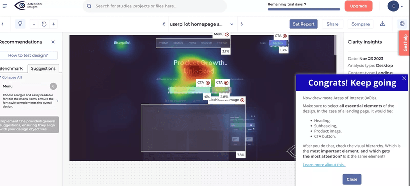
Attention Insight uses a celebratory slideout to acknowledge the work their users have done and motivate them to keep going ahead. This is an effort to strengthen relationships with customers and humanize the brand.
They also share a helpful tip to ensure users make the most of their platform and achieve their goals: a win-win situation!
7. Simplenote’s error message
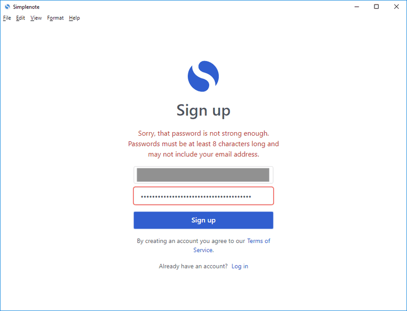
Displaying an error message when the user inputs the wrong data is a classic example of good UI feedback. Simplenote’s sign-up error message highlights the UI elements that require the user’s attention and displays a message with instructions.
UI feedback best practices for a great user experience
Follow these best practices to get the most out of UI feedback and consistently provide a satisfactory user experience:
- Provide timely feedback, or else the purpose behind why you’re investing in UI feedback will fail. There is no point in showing an error message 5 minutes after the error was realized; the user would have exited the platform by then!
- Ensure consistency across UI feedback as inconsistency can confuse users and increase the likelihood of errors. This helps users quickly adapt to the interface as well. Whether it’s progress bars, tooltips, or error messages, maintaining uniformity in style, tone, and placement ensures an uninterrupted experience.
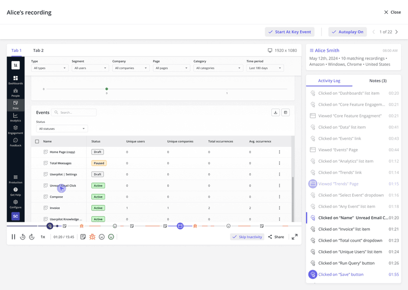
- Use session recordings to get valuable insights into how users interact with UI feedback and design elements. Watching sessions helps you identify points of frustration, troubleshoot bugs, and tune up the user experience.Let’s say, if users start rage-clicking on a loading progress bar, it’s a sign that something isn’t working. You might need to redesign the element or add explanatory text to reassure users and manage their expectations.
How Userpilot can help you provide effective UI feedback?
Userpilot offers robust engagement and analytics features that help you implement UI feedback strategies to keep users on track, reduce confusion, and encourage deeper interaction with your product.
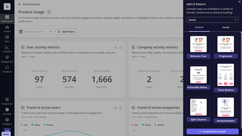
- Userpilot’s no-code WYSIWYG editor lets you design up to six different UI patterns, including modals, hotspots, tooltips, banners, slideouts, and driven actions. You can start with ready-made templates for quick implementation or build fully custom designs from scratch, without having to write a single line of code.
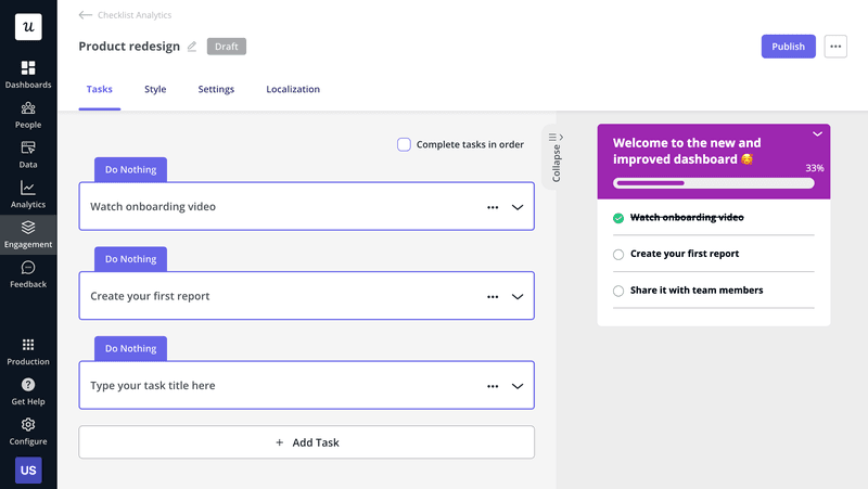
- You can easily add progress bars to checklists with Userpilot’s drag-and-drop interface to motivate users to complete a flow.
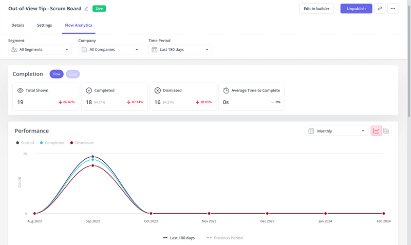
- Track how users interact with your contextual UI feedback elements using Userpilot’s analytics features. Understand what’s working, identify areas for improvement, and optimize your design to deliver even better user experiences.
Conclusion
UI feedback elements are essential as they help your users get the most out of your platform. This should be a part of your product design decisions and needs to be implemented, if not already.
If you want to enhance your in-app experience with feedback UI, book a demo with Userpilot today!


