
What is a heat map?
A heat map is a graphical representation of data that simplifies numeric data sets through visualization. The colors are usually scaled so that the hottest (or coldest) values are represented by the darkest (or lightest) colors. Heat maps can visualize data in many different ways, but they mostly show how users interact with a website or product.
Why are heat maps important?
Heatmaps are a valuable tool for product managers and marketers, as they provide insight into how customers interact with their products, allowing for more targeted product design and marketing decisions.
The pros of heat maps are:
- Helps identify areas of improvement or optimization within a website and product.
- Tracks user behavior in-app and helps improve user experience by analyzing user paths.
- Helps find friction points and reduce customer churn by analyzing the dead click map.
- Optimize page design and conversion rates by implementing heat maps in A/B tests.
You can also pair heat maps with different types of product analytics and mobile analytics to understand the whys behind user behavior and unusual product use cases.
Types of website heat maps
There are four common types of heat maps that you can utilize for different purposes — from analyzing friction points in the sign-up flow to uncovering the best areas in website layout for placing important content.
- Scroll maps aim to understand how far down people scroll a web page by visually representing the percentage of users that have scrolled to the footer.
- Feature click maps analyze which features and buttons are being used, enabling product managers to determine which features are driving engagement and which are not.
- Mouse tracking maps are a visual representation of mouse cursor movements and visitors’ clicks, allowing product teams to see trends in user navigation.
- Eye-tracking heat maps provide information regarding which parts of web pages the user pays attention to, like images or text.
Which heat map to use depends on the purposes and data points you want to collect. Let’s discuss this in the next chapter.
Heat map examples every product manager should use
We’ve put together 11 heat map use cases for SaaS companies, so you can easily understand which heat map type to use for a particular purpose. However, the examples are not limited to the ones mentioned here. Let’s dive right in!
New users sign-up page heat map
When creating a sign-up page for new users, you want to ensure the process is as optimized as possible. A scroll map can help identify where potential customers get stuck and at what point they drop off. You’ll also see what steps are skipped in the registration form and how users navigate through the process in general.
This will provide insight into improving the user experience to increase conversion rates.
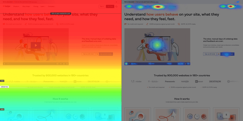
Demo sign-up page scroll map
This heat map is designed to track user engagement within the demo sign-up page. By understanding how far down users scroll, marketing teams can identify what information resonates with visitors and what content gets lost because users stop scrolling.
This helps adjust the page layout accordingly, improving the user experience and increasing free trial conversions.
Different colors signify scroll depth. As such, high interest is coded in red and orange, while screens in green and blue translate into low visitors’ attention.
Upgrade page click map
For SaaS companies, knowing which features are driving users to upgrade from a basic plan to one of the higher tiers is key.
A feature click map enables product teams to identify which features or buttons are being clicked on the upgrade page, providing insight into what motivates customers to take action.
You can also find out how many users visit the page vs. how many upgrades.
Pair an upgrade page click map with session recordings to understand if there’s friction.
Make use of track rage clicks, too, to identify confusing buttons, CTAs, and non-clickable buggy page elements.
AI-generated attention heat maps
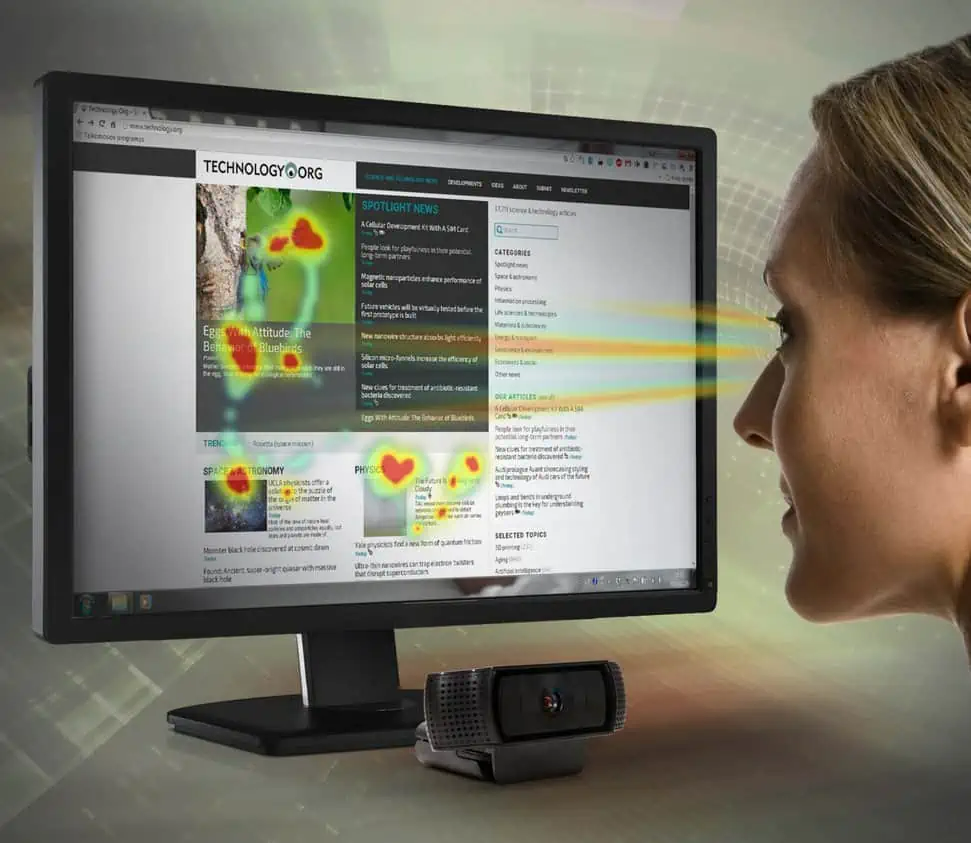
These heat maps also are called predictive eye-tracking heat maps, and just like regular eye-tracking heat maps, they show which parts of any design material grab the most attention.
The difference is that they don’t require any data collection. It is done by training AI algorithms on pre-collected eye-tracking data and teaching them how human visual attention works. Such AI algorithms can simulate eye-tracking heat maps in seconds on any uploaded image.
AI attention heat maps are a perfect choice to find the best design concept for your product from many in an early design process, quickly test the usability of high-fidelity wireframes, easier prove your design choices to stakeholders, A/B test your website and product design without traffic or secretly test your competitor’s assets.
Page churn heat maps
Such heat maps can help you to understand where customers are dropping out of the primary user flows and provide insights into why they may be doing so.
Heatmaps are also useful for tracking user engagement with specific features, allowing you to identify if customers are missing out on certain features that could improve their experience.
For example, if a feature has a higher percentage of churn, you can look into the cause and address it. You can even catch page abandonment just in action with session recordings.
Bug heat maps
Want to locate areas of friction in the sign-up flow or in the app? Utilize rage-clicking heat maps. Graphical data analysis of all clicks within a page highlights areas with the most attention from the negative side.
Remember frantically clicking on a button, field, or filter that was supposed to work but didn’t? Bug heat maps show you such issues and their frequency within your application. Use such UI feedback to create frictionless user experiences.
Particular page ‘dead clicks’ click maps
Click maps can help identify where customers are clicking, but nothing is happening. Oftentimes, this could be for various reasons, such as broken links, incorrect configurations, or button lookalikes.
Click maps can help you quickly identify these issues, allowing you to correct them in a timely manner. For instance, move or color that button differently, add a message, an in-app tour, etc.
You can also use Userpilot’s tagging feature to locate such friction by tagging a particular UI element you want to measure engagement with.
Powerful tools for building and analyzing heat maps for your product
We’ve compiled a list of three powerful tools that provide in-app and website heat maps. Let’s learn their benefits and other features you’ll find useful for product analytics.
FullStory – Best for identifying website bugs
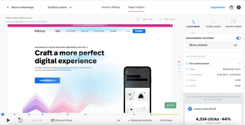
FullStory provides access to heat maps that are imperative for a comprehensive user behavior analysis.
For example, FullStory’s Rage Click heat map can help you track when users are rapidly clicking on a page, or repeatedly trying to click on elements that don’t exist.
Apart from that, FullStory provides a range of other features, including session replay, detailed analytics, and automated user segmentation.
Hotjar – Best for visualizing user behavior
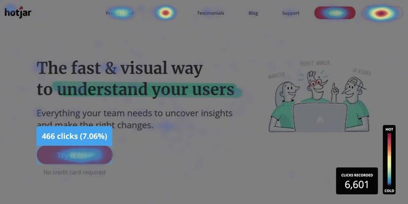
Heatmaps from Hotjar allow you to track clicks, taps, and mouse movements to understand how users interact with your website.
Hotjar also provides session recording, which allows you to watch user interactions with your website in real-time. This can help you pinpoint any issues that users may face and provide insight into how you can improve their experience.
Conclusion
Heatmaps are essential for understanding customer behavior and gaining insights into their interactions with your website. Different types of heat maps can help you track various metrics, such as page churn, bugs, and dead clicks.
Couple heat maps with user segmentation to understand how different customer groups respond to your website and inform your product roadmap.
Want to get started with heat map analysis? Book a Userpilot Demo and see how you can improve customer experience and retention with powerful product analytics and heat maps.


