6 Heatmap Alternatives And Why You Need to Use Them
Heatmaps revolutionized product analytics when they first came to the scene. But product teams have much more advanced analytics at their disposal. Now, heatmap alternatives offer greater insight into user behavior and preferences.
And the best part is, you can use these independently or pair them up with heatmaps to extract more meaningful data. This article shows you six of the best tools to use.
What is a heatmap?
A heatmap is a visual representation of how users interact with a specific page on your website or within your app. The values are depicted by color intensity and numerical data to depict areas of high and low interest.
Product teams use heatmaps to measure user clicks, scrolls, and hovers. This data helps understand user engagement so you can make data-driven decisions to boost positive user interactions.

Why do SaaS companies use heatmapping tools?
Heatmaps help webmasters and product teams create user-centric experiences based on feedback loops. Here’s how this helps:
- Improve feature discovery. Understand how users navigate the platform by visualizing where users click, scroll, or spend the most time. This data helps align the UX with user preferences, such as where a feature should be placed.
- Remove distractions and shorten time to value. Heatmaps can expose UX distractions that cause friction and add delays in task completion. This helps reduce time to value, resulting in better adoption rates.
- Improve user experience and deliver more value. By identifying usage patterns, product teams can optimize content placement, calls to action, and user flows. This leads to an improved overall user experience.
What are the limitations of heatmap tools?
While heatmap tools offer valuable insights into user behavior, they come with certain limitations that marketers and product managers should know.
Understanding these limitations is crucial for interpreting data accurately and making informed decisions to enhance growth.
Heatmaps show limited insights into user behavior and user interactions
Heatmaps only give you data per page instead of info about entire user sessions. This information can only help with making slight UI changes and improving navigation.
You’ll need more sophisticated analytics for insightful user behavior analysis, such as charting the customer journey.
In addition to this, heatmap tools don’t reveal actual user intent. For example, a click heatmap can show which areas receive the most clicks, but it doesn’t explain why users click on those elements.
They provide inaccurate data regarding customer engagement
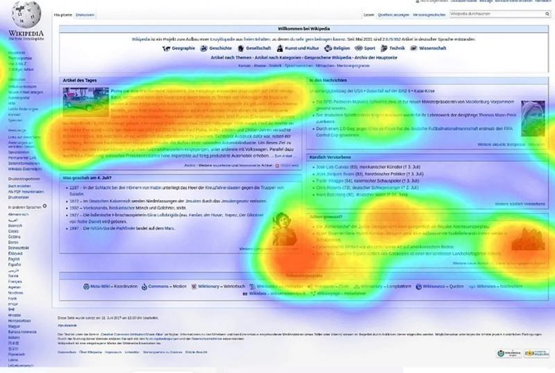
Heatmaps can sometimes provide inaccurate behavioral data, particularly when dealing with dynamic content or platforms with interactive elements.
For instance, if a user interacts with an element that dynamically changes or disappears based on user input, the heatmap may not accurately capture the interaction. This limitation impacts the tool’s ability to provide a comprehensive view of user engagement.
Another factor is the failure of heatmap tools to account for device responsiveness. As users access products on various devices with different screen sizes and resolutions, the aspect ratio can vary significantly. Heatmaps generated without considering these variations may provide skewed results.
A heatmap tool can’t accurately track mobile users
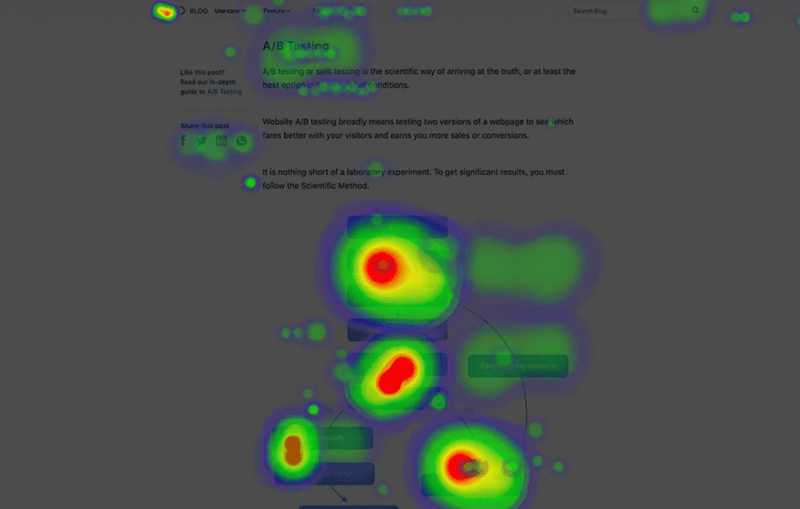
Web page and mobile users interact differently.
Mobile interactions involve gestures like zooming, scrolling, and tapping on the screen. These are harder to measure compared to cursor-based interactions common on desktops.
The lack of a cursor on mobile devices makes it harder to accurately determine specific interaction points. Most heatmap tools don’t account for this difference, leading to unreliable reporting.
Data from heatmapping tools is not actionable enough
Heatmap data, when considered in isolation, often lacks the depth needed to make insightful and actionable decisions.
While you can identify areas of high and low engagement, the data itself doesn’t provide clear guidance on how to address the underlying issues.
To uncover actionable insights, you’ll need to look at other analytics reports or consult user feedback.
6 Heatmap alternatives for better analytics
Let’s go over the best heatmap alternatives and learn how they can help you generate more actionable user insights.
Funnel analysis
Funnel analysis lets you track how users move from one app or web page to another. It provides a sequential view of user interactions, tracking their journey through predefined steps.
Unlike heatmaps, funnels focus on specific conversion paths, allowing you to identify drop-off points and optimize the user journey. This approach offers a more targeted understanding of the conversion process—making it effective for analyzing and improving specific user flows, such as onboarding or account renewal processes.
For example, after designing your onboarding flows, you can use funnels to examine how users adopt a new feature. From the analysis, you can spot and address friction to improve the user experience and boost adoption.
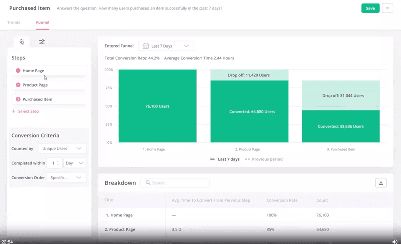
The advantages of funnel analysis over heatmaps
With funnels, you can perform the following effectively:
- Track the complete user journey: Get the full picture of what’s happening in your tool and make UX changes based on the data.
- Track the time it takes to complete an action: Lower time to value by identifying areas where users spend too much time.
- Monitor how many users complete an action: Understand the conversion rates and effectiveness of key actions or new features. Heatmaps can’t measure conversion success.
- Analyze drop-off points: Identify where users abandon a flow and step in to improve the experience.
Trend analysis
Trends analysis is best for measuring product usage patterns. You can use it to track day-to-day changes in how customers interact with your product. This gives product teams a starting point to investigate issues that arise in the user journey.
Additionally, you can use insights from this analysis to duplicate positive trends. For example, through trends analysis, you can discover features used by active users regularly. You could dig further to find user segments with similar jobs to be done (JTBDs) that aren’t engaging with those features/pages and send in-app messages motivating them to explore more.
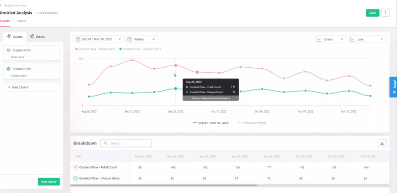
The advantages of trend analysis over heatmaps
What sets trend analysis apart from heatmaps is that it enables you to:
- Track product adoption and usage trends: Unlike heatmaps that offer snapshots of user interactions, trend analysis lets you see how users engage with your product over time so you can improve product adoption, identify growth trends, and make informed decisions to optimize user experiences.
- Monitor day-to-day changes in user behavior: You can react quickly to fluctuations in user engagement and sudden shifts in preferences.
- Track events data: Trend analysis tracks events data so product teams can learn what actions matter most to users. This goes beyond the scope of heatmaps.
- Make predictions based on historical data: By extrapolating patterns from past trends, you can predict user behavior and product performance. This sort of insight is useful in making decisions regarding product development and driving high adoption rates for new releases.
Path analysis
Path analysis helps you identify happy paths—the most satisfying user journeys through your product. It does so by identifying the sequence of actions that lead to positive outcomes – something you can’t achieve with heatmaps.
You can use data from your happy path UX flow to encourage more users down the same routes, thereby enhancing the overall user experience and optimizing conversion funnels.
If a significant number of users drop off at a particular step, path analysis can highlight this friction point, allowing you to refine the onboarding flow for a smoother and more successful user experience.
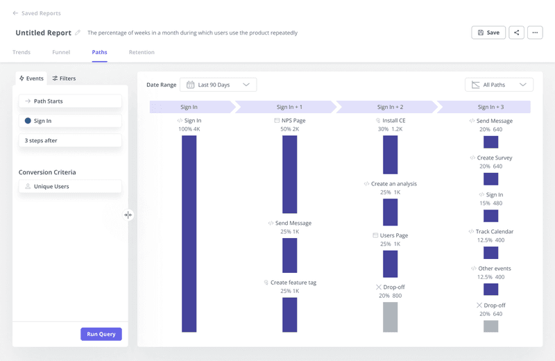
The advantages of path analysis over heatmaps
Path analysis is one of the best heatmap alternatives because it lets you:
- Dive deeper into user journeys to key actions: Go beyond the surface-level view of clicks to capture the entire user flow. This depth allows you to understand how users navigate through your app, interact with various features, and achieve specific goals.
- Guide users to happy paths: Better optimize the user flow and guide users toward a more seamless experience as they complete their tasks.
- Find pages where users drop off: Pinpoint the exact pages where users drop off so you know which product areas to focus on.
Event tracking
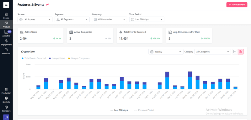
Event tracking lets you record and analyze user interactions with your product across different touchpoints in the user journey.
You can choose to track individual features or entire events. For example, you can track events related to user onboarding, such as completing tutorial steps, watching introduction videos, or simply tracking how customers interact with a primary feature in your onboarding process.
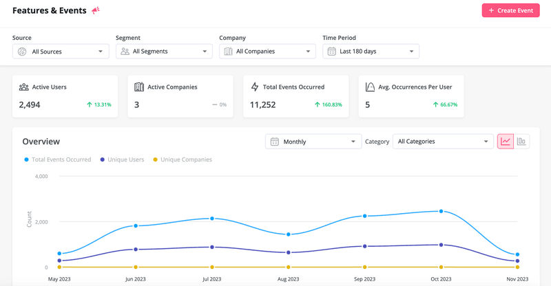
The advantages of event tracking over heatmaps
Event tracking helps you:
- Identify features that bring value: This information helps prioritize development efforts to ensure your product meets user needs.
- Track how active users interact with your app: Heatmaps may not always capture the behavior of your most engaged users. Event tracking, on the other hand, allows you to single out your power users and tap into their preferences, usage patterns, and pain points.
- Monitor new feature success: Monitor usage, identify adoption challenges, and make adjustments as needed.
- Monitor feature engagement over time and between different segments: This data lets you address changing user needs and ensure consistent engagement across diverse user segments.
Session recordings
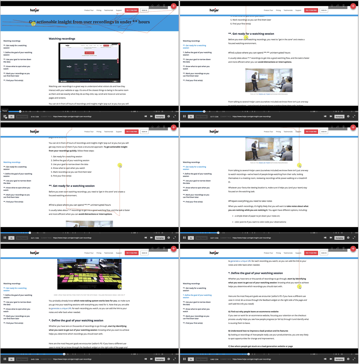
Session recordings provide a dynamic, real-time playback of how users engage with your app in a session.
This ability provides a deeper understanding of actual user behavior and the flow of their experience. You can’t track micro-interactions and spot subtle cues with heatmaps the way session recordings arm you to achieve. This is why many heatmap software also have features for capturing user sessions.
The advantages of session recordings over heatmaps
Session recordings let you:
- Overcome challenges with device responsiveness: Learn how users navigate a website across various screen sizes and orientations.
- Easily identify dead-clicking or confusing UI elements: Distinguish intentional interactions from dead-clicking with video playbacks.
- Conduct accurate data tracking for dynamic content: Session recordings adapt to different devices, accurately capturing how users scroll, zoom, click, and navigate the app.
- Accurately track mobile user behavior: Session recordings allow you to observe how users tap, swipe, and scroll on mobile devices so you can improve the mobile experience.
Cross-platform analytics
Cross-platform analytics lets you track user behavior across different data points, platforms, and devices, offering a more comprehensive analysis.
There are two ways to perform cross-platform analytics:
- Use a tool that lets you collect data from different platforms—web apps, mobile apps, or your mobile site into one platform.
- Use an integration to seamlessly move data across different analytics tools.
The advantages of cross-platform analysis over heatmaps
Implementing cross-platform analysis helps you:
- Gain a full picture of the user’s journey: Access behavioral data across various devices and platforms, from initial acquisition to retention and growth.
- Understand user needs on different platforms: User expectations and needs can vary significantly across different platforms and devices, but cross-platform analysis lets you identify platform-specific trends and patterns so you can tailor your product to meet unique user needs.
- Use data to offer a consistent omnichannel experience: Today’s users expect a consistent experience across all touchpoints. Cross-platform analysis provides the insights required to meet these needs and create a unified omnichannel experience.


