Pendo vs Stonly: Which is Best for Your SaaS?18 min read
Get The Insights!
The fastest way to learn about Product Growth, Management & Trends.
Pendo vs Stonly: Comparison summary
- Let’s explore how Pendo, and Stonly compare when it comes to user onboarding and other common use cases.
-
- Pendo is a product adoption platform that lets teams monitor product usage, analyze user behavior, and publish in-app guides. The no-code solution focuses on increasing user engagement and driving feature discovery.
- Stonly positions itself as a cheaper alternative to some of the pricier product adoption solutions on the market. In reality, it’s more of a customer service tool that can be used to build knowledge bases rather than an actual onboarding or analytics platform.
-
- If you’re looking for a better option for user onboarding, Userpilot exceeds both functionality and value for money compared to other tools on the list.
- Userpilot is a product growth platform that drives user activation, feature adoption, and expansion revenue. It also helps product teams collect user feedback, streamline onboarding, and gather actionable insights from analytics. Get a Userpilot demo for user onboarding and drive your product growth code-free.
What is Pendo?
Pendo is a product adoption platform that lets teams monitor product usage, analyze user behavior, and publish in-app guides. The no-code solution focuses on increasing user engagement and driving feature discovery.
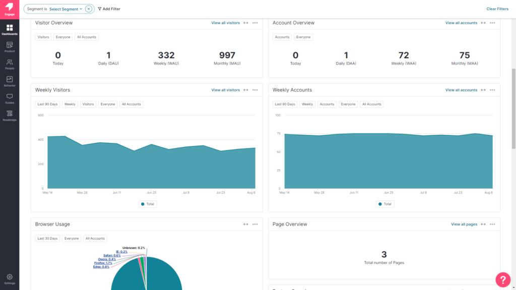
Additionally, Pendo also lets you survey users, segment customers, and see how many site visitors or MAUs your web app is getting. Certain features like product areas, data explorer, product engagement score, and resource centers are locked to the Starter plan or higher.
What is Stonly?
Stonly positions itself as a cheaper alternative to some of the pricier product adoption solutions on the market. In reality, it’s more of a customer service tool that can be used to build knowledge bases rather than an actual onboarding or adoption platform.
As a result, the tour builder on Stonly feels more like an add-on to its knowledge base functionality rather than a product of its own.
This also means that its in-app engagement features will be rather limited (especially in the no-code regard) compared to alternatives like Userpilot or Appcues.
Pendo vs Stonly for user onboarding
In this section of the article, we’re really going to compare Pendo vs Stonly in terms of user onboarding. That way, we’ll be able to figure out which tool – Pendo or Stonly – is the best option depending on your use case.
Pendo for user onboarding
Pendo is a product adoption platform that has the usual onboarding features that are commonly included with similar solutions. However, those using Pendo Free will need to note that they’ll need to find a new onboarding solution once they cross 500 MAUs or upgrade to the paid version.
There are a few ways you can use Pendo to improve your new user onboarding flows:
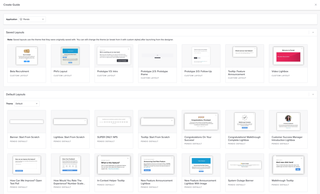
- Guide Layouts: Pendo has layout templates for lightboxes, banners, and tooltips that you can use to build onboarding flows for new users.
- Flow Triggers: Pendo’s guide activation options let you trigger an onboarding flow when new users land on a particular URL, use a specific device type, interact with a tagged element, or match the target segment.
- Localization Settings: Localization settings can stop an onboarding flow from triggering if it hasn’t been translated into the user’s chosen language. Because Pendo has no AI-powered localization features, you’ll need to upload language CSVs manually for this to work.
- Onboarding Module: You can add the onboarding module to your in-app resource center in two clicks then change the color, text style, and progress icon to align it with your product’s brand palette.
Stonly for user onboarding
Seeing as Stonly is a knowledge base builder first and onboarding/adoption solution second, it has quite a few features that are missing, too basic, or difficult to use for user onboarding.
Some workarounds like interface triggers, guides that help you personalize content, and flow reports that show you which stage of the journey customers are getting stuck on could still be used:
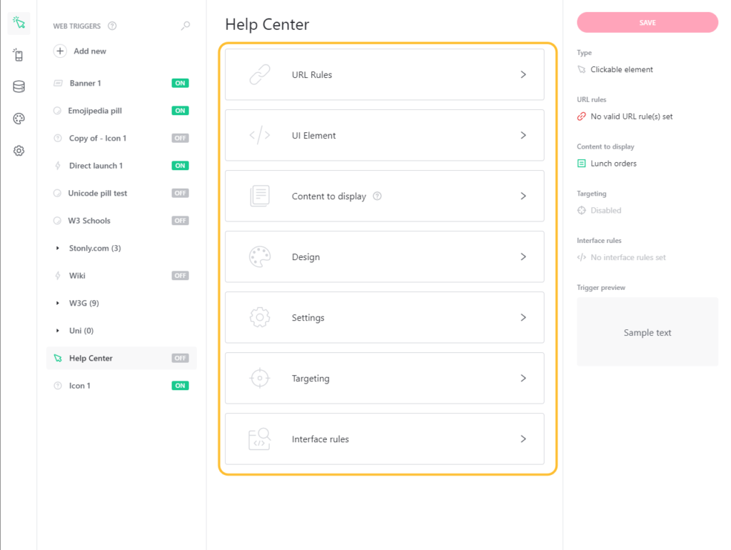
- UI Triggers: Stonly lets you add triggers like pills (icons at the bottom of your screen), banners (bars on the top of your page), hotspots, icons next to an element, or hidden conditions. Note that triggers are only available on paid plans, so Basic users won’t have access to them.
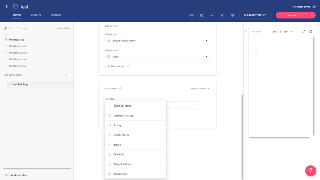
- Guides: Stonly lets you build in-app guides through its visual editor. You’ll be able to add steps, links, surveys, contact forms, checklists, automation, and live chat embeds into these guides with little to no coding. Features like UI triggers or guide variables are limited to paid plans.
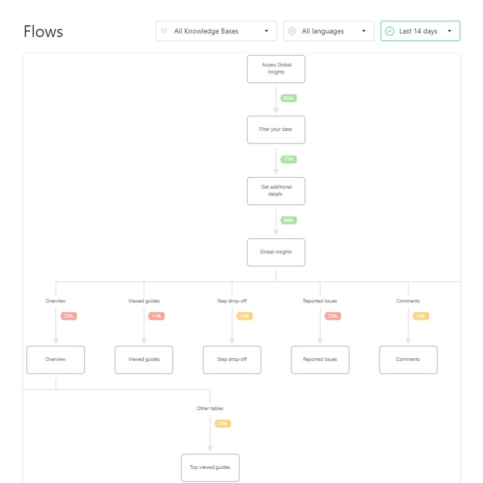
- Flow Reports: Stonly’s flow reports can help you identify which stages or steps of the onboarding journey most of your users are getting stuck on. However, this data is only updated every 15 minutes so you won’t be able to view real-time user path metrics with Stonly.
Pendo vs Stonly for product adoption
In this section of the article, we’re really going to compare Pendo vs Stonly in terms of product adoption. That way, we’ll be able to figure out which tool – Pendo or Stonly – is the best option depending on your use case.
Pendo for product adoption
Because product adoption is the primary use case for the Pendo platform, most of its features contribute towards onboarding users, tracking adoption analytics, monitoring usage patterns, or measuring churn rates.
Pendo’s product adoption features include:
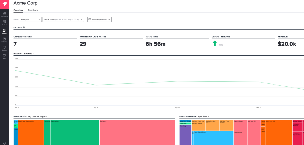
- Product Analytics: Pendo analytics can show you patterns in user behavior, underutilized areas of your product, and other usage data. Pendo divides its analytics into funnels, paths, and retention — the latter of which is capable of tracking cohort churn over time (months or weeks).
- Feature Engagement: Pendo’s dashboard widgets let you see feature engagement from multiple lenses to ensure you get the full picture. You’ll be able to view the features that generate the majority of click volume and track features used by accounts/visitors.
- Build guides to drive engagement: Pendo has layout templates for lightboxes, banners, and tooltips that you can use to build onboarding flows for new users.
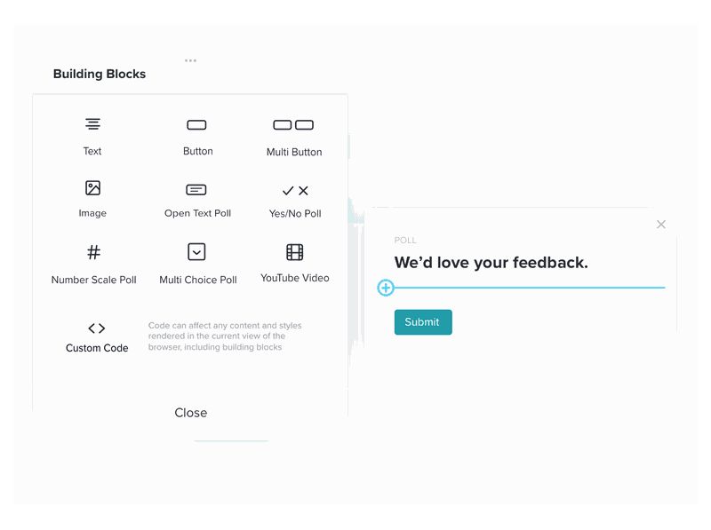
- Feedback Collection: Pendo can gather user feedback through polls, input fields, and NPS surveys. Its NPS surveys can be delivered both in-app and via email while giving the option to include follow-up questions that provide qualitative feedback.
Note: Pendo in-app resource centers can only be created if you’re on the Growth or Portfolio plan.
Stonly for product adoption
Seeing as Stonly is a knowledge base builder first and onboarding/adoption solution second, it has quite a few features that are missing, too basic, or difficult to use for user onboarding.
Some workarounds like interface triggers, guides that help you personalize content, and flow reports that show you which stage of the journey customers are getting stuck on could still be used:
- UI Triggers: Stonly lets you add triggers like pills (icons at the bottom of your screen), banners (bars on the top of your page), hotspots, icons next to an element, or hidden conditions. Note that triggers are only available on paid plans, so Basic users won’t have access to them.
- Guides: Stonly lets you build in-app guides through its visual editor. You’ll be able to add steps, links, surveys, contact forms, checklists, automation, and live chat embeds into these guides with little to no coding. Features like UI triggers or guide variables are limited to paid plans.
- Flow Reports: Stonly’s flow reports can help you identify which stages or steps of the onboarding journey most of your users are getting stuck on. However, this data is only updated every 15 minutes so you won’t be able to view real-time user path metrics with Stonly.
Pendo vs Stonly for customer experience
In this section of the article, we’re really going to compare Pendo vs Stonly in terms of customer experience. That way, we’ll be able to figure out which tool – Pendo or Stonly – is the best option depending on your use case.
Pendo for customer experience
Customer experience is the sum of touchpoints across your customer support, customer success, marketing, and sales teams but the product experience also plays a key role. Pendo lets you survey, poll, and collect feedback from users on the customer experience through multiple features.
Here are the Pendo features that can be used to gather customer experience insights:
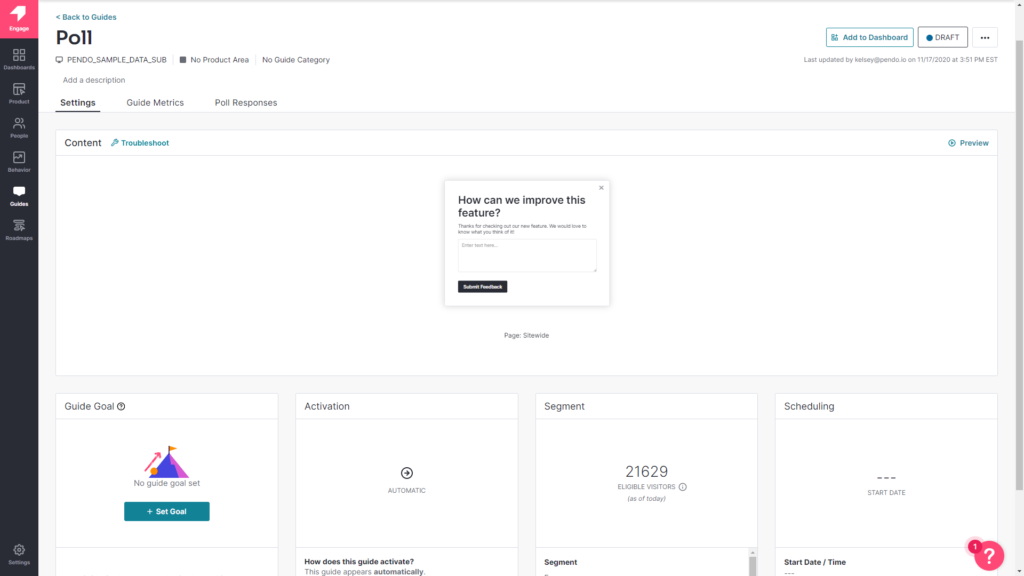
- Polling Features: Using Pendo to poll specific segments can guide your customer experience optimization (CXO) efforts. You’ll also be able to add polling widgets to your home dashboard so you can view responses, response rates, and other poll-related data points.
- NPS Surveys: Pendo NPS surveys can collect both quantitative and qualitative data by combining rating scales with follow-up (open-ended) questions. You can view all NPS survey analytics from the NPS section on your sidebar or the NPS widget on your home dashboard. Note: All NPS surveys have Pendo branding on them unless you upgrade to the Starter plan, which costs $7,000/year.
- Segmentation: Pendo segmentation settings like you create different flows, guides, and onboarding journeys for each user. You can segment users based on the type of device they’re on, what operating system it’s running on, which browser they’re using, or when they joined.
- Path Analytics: Pendo’s path analytics dashboard shows you the paths users take to get to a specific page or when coming from a specific page. These insights help you identify the areas where you need to reduce friction and add contextual UI patterns.
- Feedback Module: You can add a feedback module to your in-app resource center in two clicks to get direct insights from users on how to improve the customer experience.
Stonly for customer experience
Stonly’s features are better equipped to build self-support knowledge bases but the platform does have some features for improving the customer experience. These include guides, surveys, and analytics:
- Guides: The Stonly editor lets you build in-app guides and add steps without writing any code. You can add steps, choices, and special steps such as surveys or checklists to your guides. Note that advanced features like user variables or UI triggers are locked to Stonly’s paid plans.
- Surveys: Stonly’s survey steps are a great way to collect qualitative feedback or quantitative data such as NPS ratings. Unfortunately, surveys need to be created as steps within a guide rather than standalone, and you’ll need to open guides individually to see NPS data.
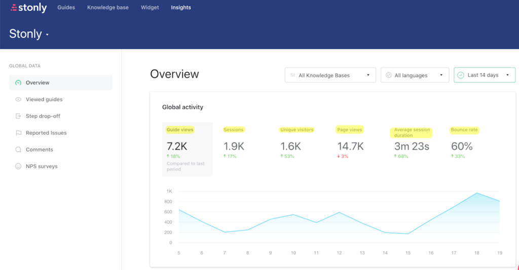
- Analytics: Stonly’s Insights dashboard helps you view global analytics on how users engage. Note that these are limited to guide views, sessions, page views, session duration, and bounce rate.
Pendo vs Stonly for user feedback
In this section of the article, we’re really going to compare Pendo vs Stonly in terms of user feedback. That way, we’ll be able to figure out which tool – Pendo or Stonly – is the best option depending on your use case.
Pendo for user feedback
Product feedback can provide targeted data on the product as a whole or specific features. These will offer insight into which features are easiest/hardest to use, which ones make your product sticky, and which changes to make to keep your largest customers satisfied.
Here are the Pendo features that you can utilize to collect product feedback:
- Customer Effort Score (CES) Polls: CES polls created with Pendo can provide insights on which areas of your product are easiest to use. These CES polls can also target specific segments to see if new users are struggling with a feature that power users have no problem with.
- Mobile Reviews: Those using Pendo for mobile apps can also use its product feedback features to collect reviews for the iOS App Store or Google Play Store. In addition to offering insights, these reviews could also boost user acquisition (provided they’re mostly positive).
- Pendo Feedback: Pendo offers a separate product called Pendo Feedback that can be used to centralize feedback and integrate that data with tools like Salesforce or Jira. Pendo Feedback uses custom pricing and is charged by the seat.
- Segmented Feedback: Pendo feedback lets you see what segment respondents are in, how much they spend, and other relevant user tags so you can highlight responses from your most valuable customers.
Stonly for user feedback
Product feedback surveys are incredibly insightful for gauging the usability, accessibility, and stickiness of certain features or areas within your solution. Stonly is not a dedicated feedback collection platform but it does let you add surveys to your in-app guides.
Here’s an overview of how you can use Stonly’s surveys to collect customer feedback on your product:
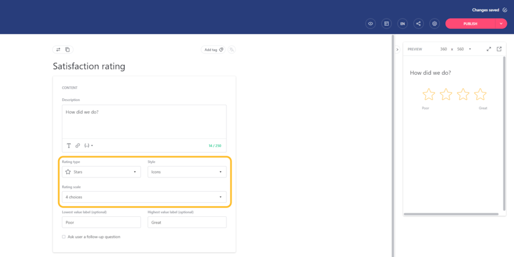
- Survey Types: Stonly lets you add special steps to in-app guides that could consist of various survey types. These include scalar surveys that use stars, numbers, emojis, or thumbs-up/down ratings to collect quantitative data or open-ended questions for qualitative responses.
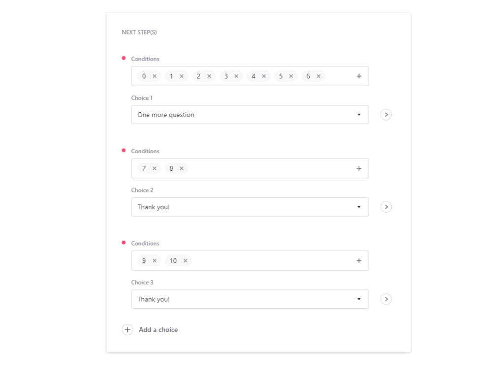
- Personalized Messages: Stonly makes it possible to prepare a different response based on which survey option a user chooses. For instance, you could pose follow-up questions to users who gave a particular product area or feature a rating of six or lower to learn more.
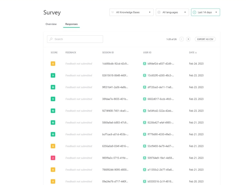
- Response Dashboard: The survey section of Stonly’s Insights page can help you track, sort, and analyze responses to your surveys. These include quantitative scores, qualitative feedback, user/session IDs, and the date they were submitted. You can also export this data as a CSV file.
Pendo vs Stonly: Which one you should choose?
To further simplify this selection process, let’s break down the strengths and limitations of each tool. Understanding the distinct advantages and potential drawbacks of Pendo and Stonly will provide you with a detailed roadmap for making a well-informed decision!
Pros and cons of Pendo
Pros of Pendo
Let’s take a look at some of the benefits of using Pendo:
- No-Code: Pendo lets you create surveys, in-app guides, and track metrics without needing to write your own code, which saves a lot of time (while making product experiments or split-testing a lot easier).
- Custom Themes: Pendo’s themes let you create multiple palettes and ensure that any in-app materials published align with your existing brand palette (however, you can only create/customize themes after you’ve installed the Pendo snippet).
- Flexible Dashboards: Pendo has plenty of widgets that you can add to your dashboard, including feature adoption, net promoter score, poll results, guide engagement, product stickiness, and MAUs — so you always have your most important metrics within reach.
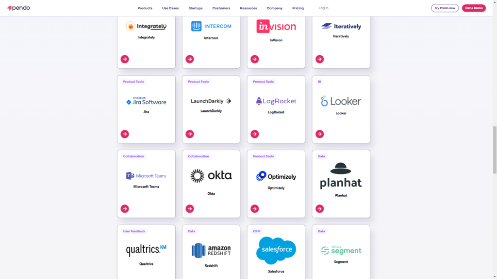
- Integrations: Pendo has 50 different integrations to choose from including popular tools like Intercom, Jira, Okta, and HubSpot. Unfortunately, only four of these — Salesforce, Segment, Workato, and Zendesk — are two-way integrations that can share data both ways.
- Multi-Platform Analytics: Because Pendo is compatible with mobile applications, you’ll be able to track product analytics for both web apps and mobile apps. This gives you a more holistic view of how users (or specific segments) use your product on different platforms. Note: You’ll need to upgrade to Pendo Portfolio to add more than one product to your account.
Cons of Pendo
While Pendo certainly has quite a few benefits that make it an appealing solution, there are also a few notable drawbacks that you should be aware of before you choose the platform as your product adoption tool:
- Pricing Jumps: While Pendo does offer a free version, it has a limit of 500 MAUs. Upon reaching the MAU limit, you’ll need to upgrade to continue using most of Pendo’s features (and paid plans tend to cost thousands of dollars per month).
- Locked Features: Key features like the data explorer, resource center, and product engagement score are locked behind the Growth or Portfolio plan.
- Data Lag: Pendo’s analytics dashboards only update once per hour. In some cases, this data lag could lead product teams to make the wrong decisions or draw false conclusions from outdated insights.
Pros and cons of Stonly
Pros of Stonly
While Stonly isn’t as capable as full-on digital adoption solutions like Userpilot, Pendo, or Appcues, it does have a few benefits:
- Self-Service Support: Because building knowledge bases is the primary use case for Stonly (and arguably its core product), it has advanced self-service support features that could outperform other adoption solutions, such as abundant live chat integrations.
- Analytics Dashboard: Stonly has a unified analytics dashboard that can show you global insights across all your guides. This makes it easier to track content engagement and monitor your key performance indicators (KPIs).
- Guide Builder: While other Stonly features such as event tracking, user targeting, data streaming, and styling require coding, the guide builder uses an intuitively designed visual interface to let you add, edit, or delete steps.
Cons of Stonly
Unfortunately, there are quite a few drawbacks to using Stonly that stem from its lopsided features, no-code capabilities (or lack thereof), and view-based pricing model:
- Feature Set: Seeing as Stonly is a knowledge base builder first and onboarding/adoption solution second, it has quite a few features that are missing, too basic, or difficult to use. If user onboarding and product adoption are your main use cases, consider alternatives.
- Coding Requirements: Unlike most of its competitors, Stonly doesn’t advertise itself as a no-code onboarding/adoption platform. This means you’ll need coding knowledge to track events, target users, stream data, and style your content.
- Pay-as-You-Go Pricing: Stonly’s pricing charges additional fees based on the number of views that guides get. Customers who don’t exceed 4,000 guide views per month won’t be charged extra, but those who do will pay an additional $250 to $500 monthly depending on volume.
Userpilot – A better alternative for your SaaS
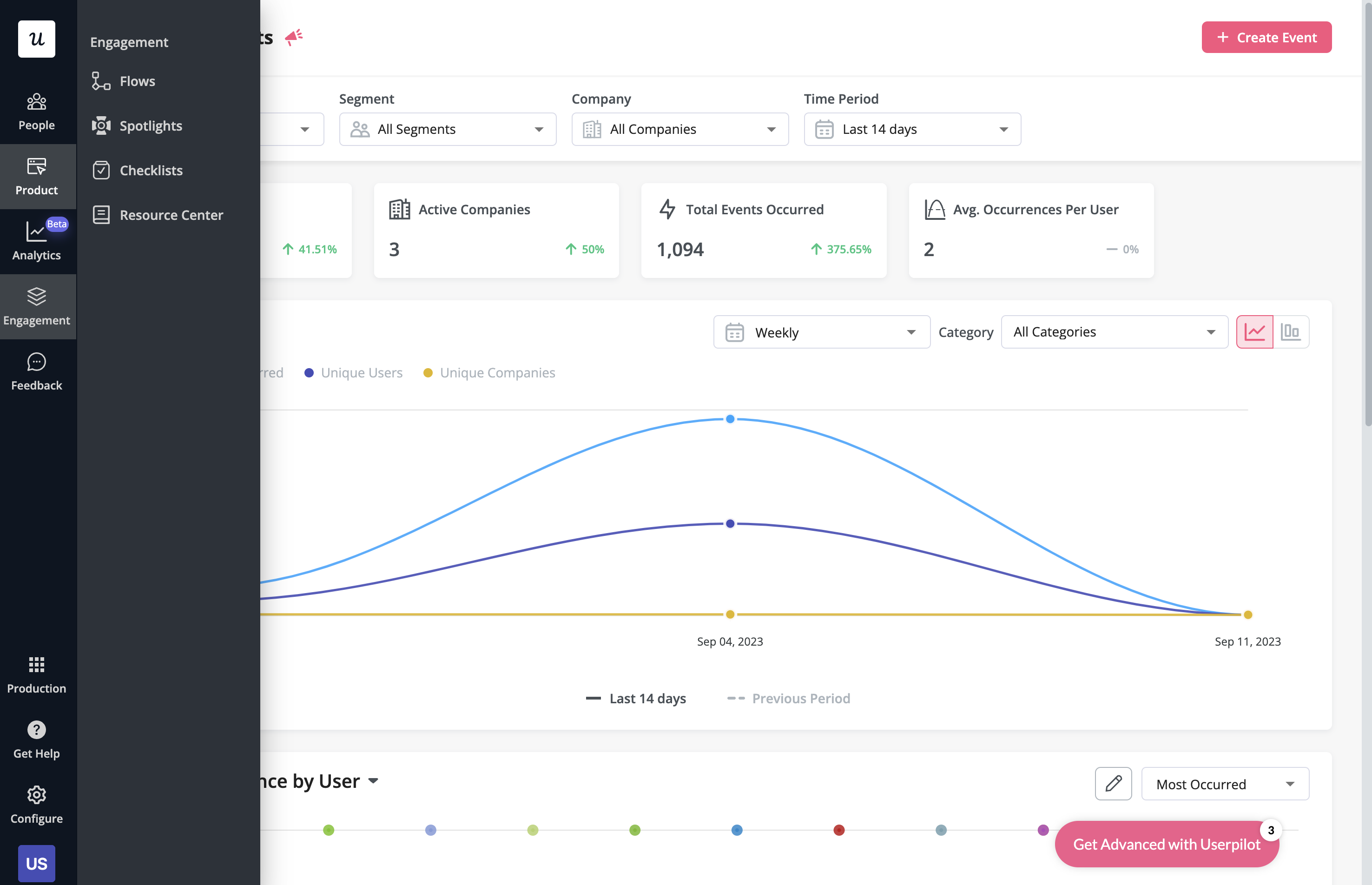
With Userpilot, you’ll be able to track both product usage and user behavior to get a holistic view of how customers use your product — which will guide future development, improve the user experience, and inform your growth efforts.
Pros of Userpilot
As a full-suite digital adoption platform, Userpilot has all the features you need to onboard users, track analytics, and gather feedback from customers without writing a single line of code. Here are a few pros of using Userpilot as your product growth solution:
- No-code builder: Userpilot’s Chrome extension lets you build flows, add UI elements, and tag features without writing a single line of code.
- UI patterns: There are plenty of UI patterns to choose from when using Userpilot, such as hotspots, tooltips, banners, slideouts, modals, and more!
- Startup-friendly: Userpilot’s entry-level plan gives you access to all available UI patterns so you can hit the ground running.
- Walkthroughs and flows: Build engaging interactive walkthroughs and personalized onboarding flows that target specific segments of your user base.
- Self-service support: Build an in-app resource center to help users solve problems, customize its appearance to align it with your brand, and insert various types of content (videos, flows, or chatbots) to keep your customers satisfied.
- A/B testing: Userpilot’s built-in A/B testing capabilities will help you split-test flows, iterate on the best-performing variants, and continually optimize based on user behavior.
- Feedback collection: Userpilot has built-in NPS surveys with its own unified analytics dashboard and response tagging to help you retarget users. There are other survey types to choose from and you can even create your own custom survey.
- Survey templates: There are 14 survey templates to choose from so you can gather feedback on specific features or run customer satisfaction benchmarking surveys like CSAT and CES.
- Advanced analytics: Userpilot lets you analyze product usage data, monitor engagement on all in-app flows, and use the data to create user segments that are based on behaviors instead of demographics.
- Event tracking: Userpilot’s no-code event tracking lets you tag UI interactions (hovers, clicks, or form fills) and group them into a custom event that reflects feature usage.
- Third-party integrations: Userpilot has built-in integrations with tools like Amplitude, Mixpanel, Kissmetrics, Segment, Heap, HubSpot, Intercom, Google Analytics, and Google Tag Manager so you can share data between all the solutions in your tech stack.
Cons of Userpilot
Of course, no tool is perfect and there are a few cons to consider before choosing Userpilot as your user onboarding or product growth solution:
- Employee onboarding: Currently, Userpilot only supports in-app customer onboarding.
- Mobile apps: Userpilot doesn’t have any mobile compatibility which could make it difficult for developers with cross-platform applications to create a consistent user experience for both versions of their product.
- Freemium plan: There’s no freemium Userpilot plan so those bootstrapping their startup and need sub-$100 solutions should consider more affordable onboarding platforms like UserGuiding or Product Fruits.
Conclusion
Hopefully, this post helped you decide whether Pendo or Stonly is more appropriate for your company. As you can see – both have many upsides and downsides.
Undeniably, Userpilot provides a better value for money and is a better choice for a mid-market SaaS, especially when it comes to user onboarding and user feedback.
If you’re interested in finding more, book a demo with our team here!
Try Userpilot – the Best User Onboarding Solution for SaaS
