What are Pendo Product Tours Like?10 min read
Pendo’s Product Tours promise to help you drive user engagement and feature adoption with in-app guides, walkthroughs, and tooltips.
While these tours are touted as an easy, no-code solution, they come with limitations that may not meet every business need.
In this article, I’ll take a closer look at Pendo’s product tours and where they fall short, so you can make a more informed decision.
Get The Insights!
The fastest way to learn about Product Growth, Management & Trends.
First impressions of Pendo’s product tours
When you first sign up for a Pendo trial account, the interface asks you whether you initially want to explore Guides, Behavior Analytics, or Dashboards.

Pendo can be a bit jargon-y at times, so it’s worth quickly noting what these options mean:
- Guides are what Pendo calls experience flows. In other words, you can build a product tour by combining multiple guide elements.
- Behavior analytics allows you to track actions taken by users before or after a specific event, see how many people completed a pre-determined funnel, and the percentage of users retained over time.
- Dashboards are set up similarly to Google Analytics and show browsing data, such as weekly visitors and unique visitors per hour.
As you may have guessed, this article will focus on the Guides feature first and foremost.
Getting meta: Pendo’s internal product tour
Each of the three options listed above has its dedicated product tour.
Depending on which of the three choices you select when you first sign up for Pendo, you’ll see a product tour of that particular area of the product.
Although the product tours do successfully illustrate what Pendo’s app does, it’s worth noting that they’re not especially interactive or engaging for new users.
They’re actually quite linear, which is the sort of product tour that we’ve advised readers of this blog to stay away from numerous times in the past. That’s because users hate linear product tours:

Pendo’s internal product tours really just consist of purple tooltip after purple tooltip.

How easy is it to build a product tour on Pendo?
If you’re familiar with Divi, Elementor, or even WordPress’ own blocks system, the building blocks approach that Pendo uses for building Guides will be extremely intuitive.
You can drag and drop various elements, and match the colors and styling to your brand.

In terms of ease of use, this aspect of building Guides is similar to building Flows on Userpilot.
Just like Userpilot, Pendo’s Visual Design Studio supports a WYSIWYG editor, so you can see instantly what the guide looks like in real time.

What UX patterns do Pendo’s Guides include?
One thing Pendo has done pretty well is to create a comprehensive resource center to help people get the most out of its app.
Their resource page on creating a Guide explains the main types of UX pattern that can be created as part of a product tour, as follows:
Lightbox
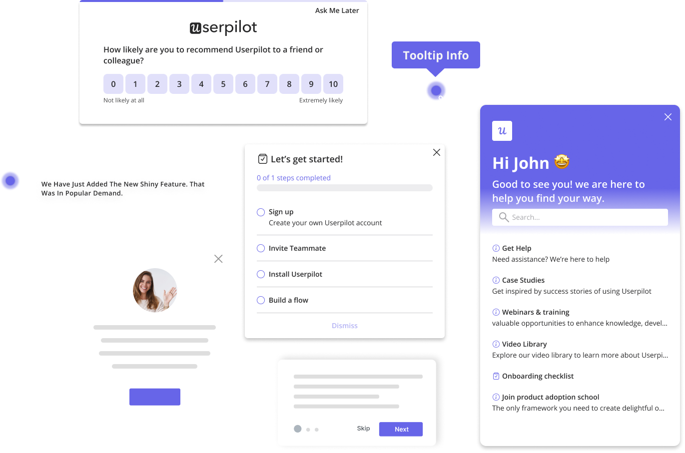
There’s a lightbox, which is a bit like Userpilot’s modals. It can be centered on the customer’s screen or positioned on the side of the screen, like Userpilot’s slideouts.

Banner
Next, there’s a banner, a narrow ribbon-like pattern at the top of the screen.

Tooltip
Like Userpilot, Pendo also allows you to create tooltips. In my personal view, this is the UX element that Pendo does best.

Tooltips trigger in response to so-called “Badges”, which are small icons placed next to an element on your page. When visitors click that element, the Guide for that tooltip will be displayed.
This is very similar to Userpilot’s tooltip feature, which can also be placed wherever the user desires and is often attached to elements that are not immediately intuitive.
Polls
Polls are mini-surveys you can embed in your product tours to collect customer feedback, check their understanding, or segment them.
These include open-ended and closed-ended questions, for example, multiple-choice ones.

Layout Library
You don’t have to create your UX patterns or tours from scratch. Once created, the layouts get saved in the Layout Library, so you can reuse them whenever necessary.

Task List
Guide Pro subscribers can also create Task Lists, which are the equivalent of Userpilot’s checklists.
Their job? To guide users through key onboarding tasks necessary for activation.

❌ What’s missing?
Coming from working with Userpilot, when one looks at the list of UX patterns Pendo offers, the options match Userpilot’s offerings.
The only pattern that’s missing, and you can find it in Userpilot, is hotspots, small flashing beacons that encourage the user to focus on a certain element.

Plus, we have a Checklist that’s accessible directly from the menu bar without going through Guides or Resource Centers like Pendo.
⚠️ What’s confusing: Surveys under Guides?
One potential counter-argument to the idea that Pendo’s product tours lack interactivity is their microsurveys called Polls.
With this feature, you can build quantitative or qualitative microsurveys onto lightboxes and banners, which are both part of Pendo’s product tours.

While the interactivity is appreciated, it’s confusing for the user to include microsurveys under Guides. Surveys like multiple-choice questions can be useful, for instance, asking new signups about their job roles. But open-ended questions? Not so much.
That’s because what a product tour really should be is an interactive walkthrough, where users follow along multiple breadcrumbs left by your product marketers until they reach an objective that’s significant to their use case.
A microsurvey is more of a one-off communication tool for sharing in-app messages than part of a longer, multi-step walkthrough like this.
In itself, a microsurvey doesn’t “guide” the user to do anything, apart from fill out the survey.
How easy is it to segment product tours on Pendo?
Pendo allows you to segment by multiple factors:
Pendo offers flexible segmentation options for targeting in-app guides. You can segment users based on:
- Product Usage: Segment users based on their interactions with specific features, pages, or track events.
- Visitor Metadata: Use attributes like account ID, device type, language, or custom fields to define segments.
- Account Metadata: Target users based on account-level data such as time on site, number of events, or the account’s subscription plan.
These rules can be combined using AND/OR logic to create complex segment conditions, providing flexibility in defining user groups for targeted guidance.

However, here are some cons you need to know:
⚠️ Complexity in segmentation logic
Let’s be honest—managing segments in Pendo can quickly turn into a headache. The platform limits you to five nested segments, which is restrictive when you’re trying to build out more complex user groups.
And the kicker?
These segments are visible to everyone in the subscription, making it harder to keep things organized and secure across teams. It’s a small touch that makes managing large sets of segments unnecessarily complicated.
⚠️ Inconsistent visitor eligibility across multiple applications
Here’s where things start to get a little messy. In Pendo’s multi-app setup, a segment that spans all applications might not behave consistently when applied to a specific guide.
If a user hasn’t interacted with the targeted app, they won’t be eligible for its guides, even if they match the segment. This creates a disconnect that complicates cross-product messaging and requires workarounds to ensure consistency.
⚠️ Limitations with aggregated metrics
Another issue? Using aggregated metrics (e.g., total page views) in guide targeting can introduce delays depending on the complexity of the condition. This can occasionally affect guide responsiveness, especially in data-heavy applications.
It’s one of those things that feels like it could have been handled more efficiently, especially in a platform that’s supposed to help you streamline product adoption.
So Pendo or a better alternative?
We hope that you’ve got something valuable out of this exploration of Pendo’s product tour system.
We would also like to hope you can see that Userpilot’s product tours are just better.
Compared to Pendo, Userpilot’s product tours:
- Are more interactive.
- Are less linear.
- Contain a greater variety of UI elements.
- Userpilot’s segmentation is easier to manage and more focused on behavioral and persona-based targeting, without requiring a complex technical setup.
- Use checklists that are easier for end-users to view.
- And can be built in a Chrome app, rather than a cumbersome tool like VDS.
And if that’s not enough of an argument for you to give Userpilot a spin, it also comes with a free trial.
So you literally have nothing to lose by trying it today. Click here to get started!
Userpilot strives to provide accurate information to help businesses determine the best solution for their particular needs. Due to the dynamic nature of the industry, the features offered by Userpilot and others often change over time. The statements made in this article are accurate to the best of Userpilot’s knowledge as of its publication/most recent update on May 9, 2025.


