Guide to Self-Serve Analytics For SaaS

What is self-serve analytics?
Self-serve analytics is an approach to business intelligence (BI) that empowers non-technical people to access, analyze, and interpret data without relying on IT or BI professionals.
It typically involves utilizing intuitive analytics tools and platforms to interact with data directly.
What are the benefits of self-service analytics?
There are many benefits of using self-service BI, including:
- Increased efficiency: Self-service analytics eliminates delays because users can analyze data on their own rather than wait for data teams. As a result, tasks that once took days or weeks can now be completed in hours or even minutes, significantly speeding up workflows.
- Greater data accuracy: The fact that business users can access data themselves minimizes the risk of misinterpretations or errors that can arise from relying on intermediaries.
- Improved decision-making: Data democratization ensures business users across departments can base their decisions on real-time, data-driven insights rather than relying on outdated reports. This leads to more informed, agile, and strategic decision-making.
Challenges for self-service analytics
While self-service data analytics offers numerous benefits, it also comes with its own set of challenges. Here are some of the main ones:
- Low levels of data literacy: Self-service analytics relies on users having a basic understanding of data concepts, analysis techniques, and interpretation. However, many employees may lack these skills, leading to incorrect data analysis, misinterpretations, and, ultimately, poor decision-making.
- Data governance issues: With more users accessing and manipulating data, ensuring data quality, consistency, and security becomes more challenging. There is also a risk of data silos, duplication, and unauthorized access to sensitive information.
- Difficulties with user adoption: Getting employees to adopt new tools can be difficult. Resistance to change, lack of trust in new technologies, and comfort with traditional methods can hinder their willingness to learn and master self-service analytics tools.
How to set up a self-service analytics system
Follow these simple steps to implement an effective self-service analytics system and create a data-driven culture for your company:
Define what success looks like
Before diving in, it’s crucial to outline your objectives and determine what constitutes success for your self-serve analytics initiative.
What specific business problems are you trying to solve? Which metrics will you track to measure progress?
For instance, if your goal is to improve customer satisfaction, you might track metrics like Net Promoter Score (NPS), customer retention rates, and time to resolution.
Invest in a good business intelligence tool
After deciding on your core objectives, it’s time to select the right analytics tool to help you collect and visualize data.
There are many self-service analytics platforms to choose from, so ensure you select one that aligns with your organization’s specific needs, budget, and technical capabilities (more on this shortly).
Build the first few key reports
When starting out, it’s important not to overwhelm yourself by trying to create every possible report at once. Instead, focus on building the first few key reports that are most critical to your organization.
Begin with the most basic or essential KPI reports that align with the goals you defined earlier. For instance, if tracking customer acquisition is a priority, start with reports that show new signups, free-to-paid conversion rates, and the number of new paying customers per time.
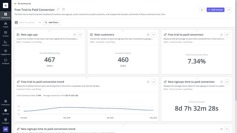
Once these foundational reports are in place and users are comfortable with them, you can gradually expand to more complex analyses.
Collect feedback and iterate on self-service analytics programs
Continuous improvement is key to the success of any self-service analytics system. After rolling out your initial reports, actively seek feedback from team members on their experiences.
Ask if they encountered any difficulties, and what additional features or data sources they would find valuable.
Use this feedback to make improvements, such as refining report designs, adding new data integrations, and enhancing user training. Iterating on your self-service analytics programs based on user input will ensure they remain effective and relevant.
What to look for in a self-service analytics platform?
To make an informed choice, consider the following key features when evaluating potential platforms:
- Ease of use: Look for self-service analytics platforms that offer intuitive drag-and-drop functionality and a minimal learning curve. Remember, the goal is to provide data access and equip employees to generate insights without requiring extensive training.
- Scalability: Your chosen self-service analytics tool should be able to grow with your organization’s data needs. Ensure it can handle increasing volumes of data, accommodate more users, and integrate with new data sources as your business expands.
- Security: Data security is non-negotiable. Look for platforms that offer robust security features like role-based access controls, data encryption, and compliance with industry regulations.
- Customization options: Go for a tool that allows you to easily create custom dashboards, reports, and visualizations. This flexibility ensures that your analytics tool aligns with your business goals and provides the insights you need.
- Integrations: A good self-service analytics platform should integrate seamlessly with various data sources and existing business systems, such as databases, CRM software, and cloud services.
Best self-service analytics tools
Now that you know what to look for in the right tool, let’s go over some of the best options:
Userpilot
Userpilot is a no-code product growth platform with robust analytics capabilities.
It gives product teams insights into user behavior, enabling them to improve in-app experiences.
Some of Userpilot’s key features include:
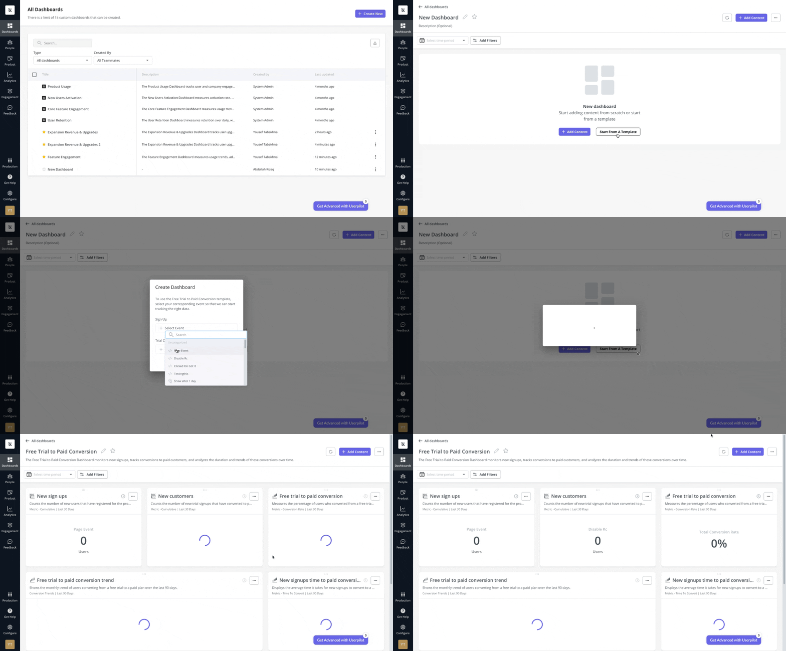
- Analytics dashboards: Create custom dashboards to track core metrics related to user engagement, product usage, conversion, and so on. You can use templates or build from scratch if you don’t find a template that suits your needs.
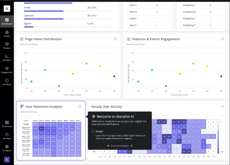
- AI analytics: This feature gives you AI-powered summaries from your data, making it easier for non-technical teams to interpret the results and derive actionable insights for product improvement.
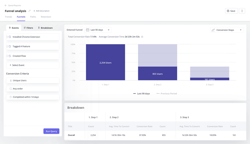
- Analytics reports: You can generate different visualizations such as funnels, user paths, retention, and trends analysis reports to get deeper insights into the customer experience. For example, using funnel reports, you can monitor data such as average conversion time and average conversion rate, and use filters to compare the data among different user segments.
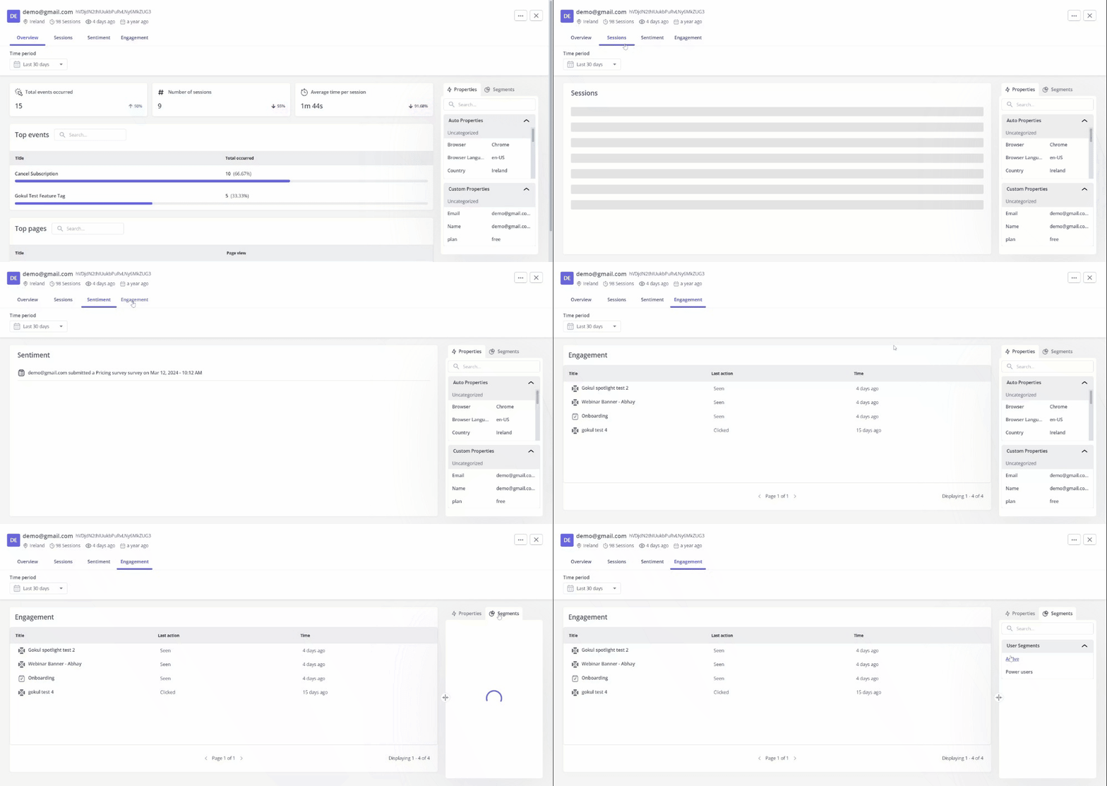
- User/company profiles: Get granular and analyze customer data at individual levels. You can see what in-app messages each customer interacted with, their most used features, responses to in-app surveys, etc.
Tableau
Tableau is a leading self-serve analytics and business intelligence platform known for its powerful data visualization capabilities.
Key features include:
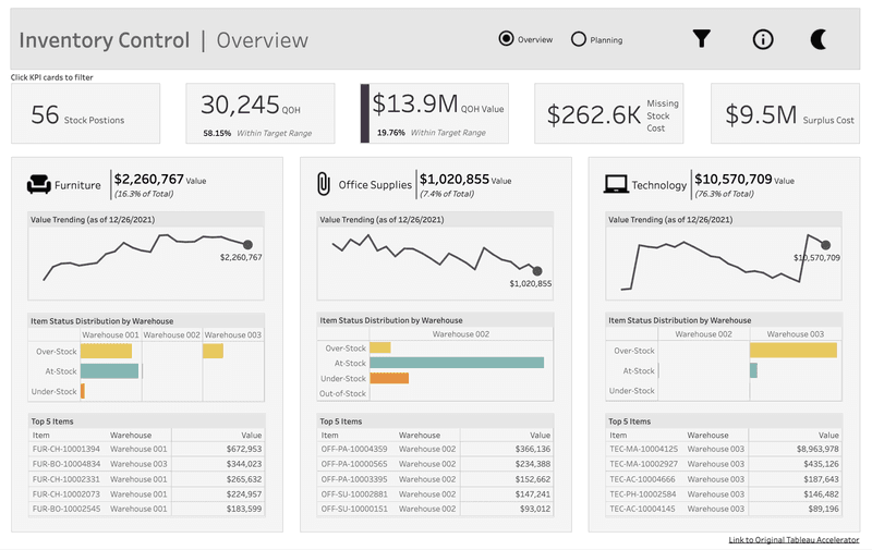
- Sophisticated data visualization: Tableau offers a wide range of chart types, from standard bar and pie charts to advanced options like treemaps and motion charts.
- Interactive dashboards: Tableau lets users create visually stunning and highly interactive dashboards that make data exploration easy—you can filter, drill down, and highlight specific points to uncover hidden patterns.
- Advanced analytics: The platform goes beyond basic data visualization by offering advanced analytics capabilities. You can perform calculations, apply statistical models, and create predictions directly within the platform.
- Mobile-friendly design: Tableau’s dashboards and visualizations are optimized for mobile devices, allowing you to access and interact with your data on the go.
Microsoft Power BI
Power BI is a comprehensive business analytics service by Microsoft that offers a suite of tools for data preparation, visualization, and sharing.
Key features include:
- Data modeling: Transform and structure your data in a way that makes sense for effective data analysis. You can create relationships between tables, define hierarchies, and add calculated columns.
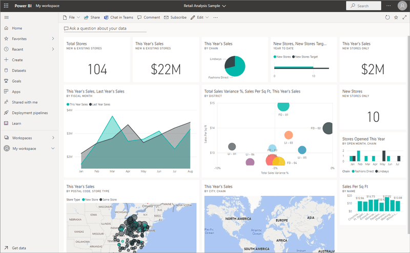
- Natural language query: The platform’s natural language query feature allows you to ask questions about your data in plain English. Power BI will then generate relevant data visualizations and insights based on your query. This eliminates the need for complex query languages and makes data exploration more accessible to non-technical users.
- AI-powered data insights: Power BI leverages artificial intelligence to automatically analyze your data and surface key insights. It can identify trends, anomalies, and outliers, and provide explanations for those findings.
- Custom visuals: The platform offers a vast library of custom visuals created by the community. You can also develop your own visuals using Power BI’s developer tools.
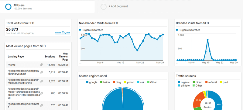
Google Data Studio
Google Data Studio, now rebranded as Looker Studio, is a free, cloud-based self-service analytics and data visualization tool from Google.
It empowers every business user to create shareable reports and dashboards, seamlessly integrating with other Google services and a variety of data sources.
Key features include:
- Data blending: The tool allows users to combine data from multiple sources into a single view, similar to performing SQL joins. This feature, although somewhat limited compared to advanced BI tools, helps in creating a comprehensive analysis from different data sets.
- Interactive dashboards: Looker Studio enables business users to create dynamic and visually appealing dashboards. You can customize your layouts by dragging and dropping elements like charts, graphs, tables, and text onto a canvas.
- Custom visualizations: Like Power BI, the Looker Studio community has developed a wide range of custom visualizations and components that you can add to your reports. These include advanced charts, maps, gauges, and more.
Alteryx
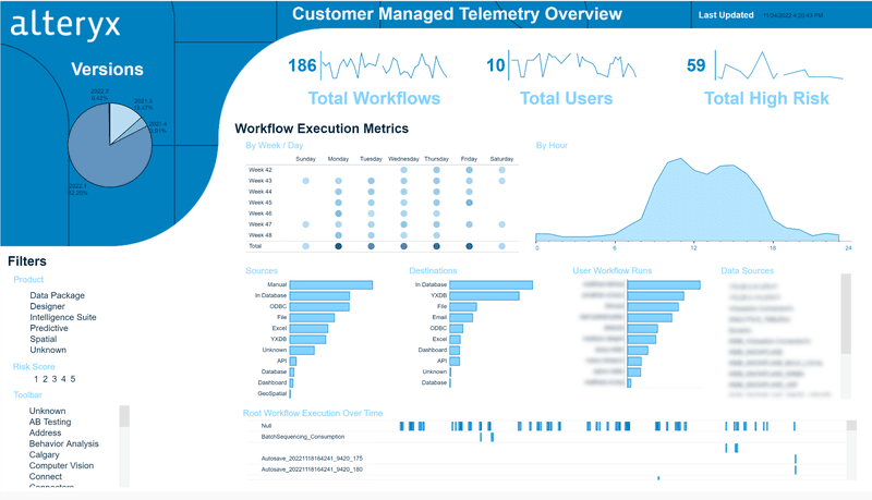
Alteryx is a data analytics platform that combines data preparation, blending, and advanced analytics capabilities.
Key features include:
- Drag-and-drop interface: Alteryx’s intuitive drag-and-drop interface makes it easy to design and build complex data workflows. You can visually connect tools and configure them with just a few clicks, eliminating the need for coding.
- Workflow automation: Users can automate repetitive tasks and workflows, streamlining the data processing and analysis process. This automation helps reduce manual effort and increase efficiency.
- Predictive analytics: The platform includes advanced predictive analytics capabilities, enabling business users to perform complex data modeling and forecasting.
Conclusion
Empowering your teams to analyze data, uncover insights, and make data-driven decisions is the key to unlocking your company’s full potential.

