What is a tooltip design?
A tooltip is an in‐app message that appears when users interact with an element on a web or mobile app. The purpose of tooltips is to provide contextual information to the user without interrupting their workflows or disrupting the product experience.
How to design tooltips in two ways
There are two main approaches you can take when creating tooltips within your SaaS product: code it in from scratch or use no‐code tools. We’ll take a look at both approaches in the sections below so you can determine which path is right for you.
Build from scratch with code
Creating a tooltip from scratch will require assistance from your development team. If your team members are proficient coders, then they can utilize open-source applications like jQuery or Bootstrap.
Here’s what that process would look like:
- Install jQuery or Bootstrap onto your project.
- Write the HTML code for whichever element is supposed to trigger the tooltip.
- Initialize the tooltip with your preferred options using JavaScript.
- Customize the tooltip size, text, and any other properties.
- Test your tooltips to see if they display correctly and ensure they don’t obstruct anything important.
Build code-free with a no-code tool
If you’re not a proficient coder or don’t want to rely too heavily on developer support, it’s possible to create no-code tooltips using no-code tools such as Userpilot.
These platforms will allow you to rapidly iterate on your user onboarding flow without waiting around for programmers to assist you.
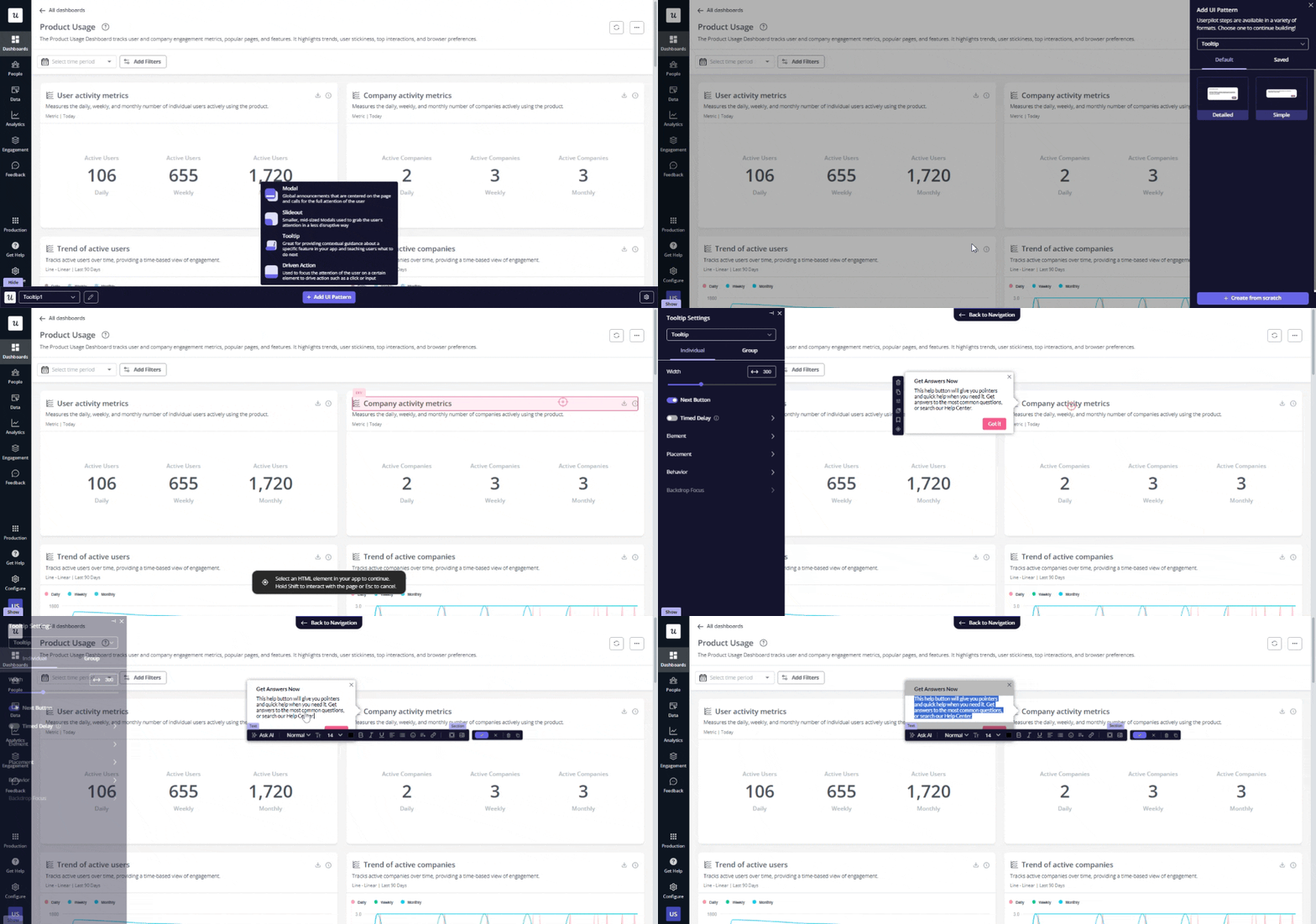
To create a tooltip, follow this simple process:
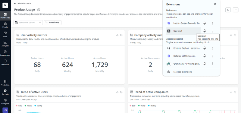
- Set up an account and install the Chrome extension from the Web Store.
- Go to the page you want to create the tooltip and click on the “Start Here” button at the bottom right of the page.
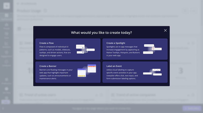
- On the newly opened window, choose the “Create a Flow” option.
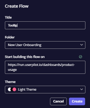
- Create a memorable title for your tooltip project, select a folder and a theme, then confirm these by clicking “Create”.
- Choose ‘Tooltip” from the bottom menu, then select whether you want to use a template or build from scratch. Then, tag the user interface element you want to attach your tooltip to.
- Customize the tooltip to your liking. You can edit the placement of the tooltip, toggle the trigger between hover or click, and set it to either display as an overlay or appear inline.
Top tooltip use cases
Now that you know how to build tooltips, it’s time to talk about when you should be using them. We’ll give you three tooltip examples to help you get started and figure out which use cases to pay attention to.
User onboarding tooltips
Tooltips are often used in the onboarding process to introduce users to core features and provide guidance on using them, bringing users one step closer to the activation point.
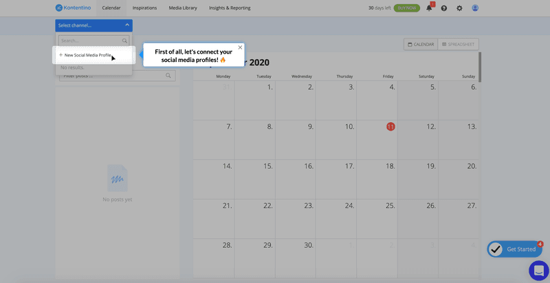
For example, the social media management platform Kontentino uses strategic tooltips to nudge users to engage with key features such as social media integrations, one of the product’s primary value propositions.
New feature announcement tooltips
Tooltips can also be used to announce product updates, help users overcome feature blindness, and maximize their use of the platform. It’s especially wise to use tooltips if you have minor rollouts or enhancements and don’t necessarily want to interrupt the user’s workflow to inform them about it.
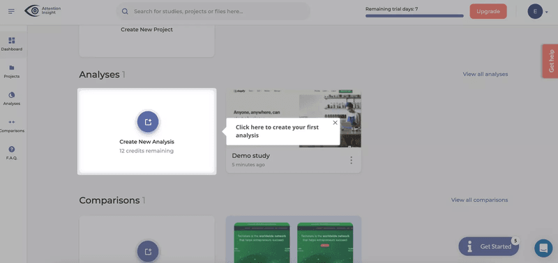
A prime example of this is leveraging a subtle tooltip to provide contextual explanations of what the Single Input question addition does in a concise, non-intrusive manner. You can even use images and GIFs to preview how the feature is supposed to work.

Interactive walkthrough tooltips
Lastly, instead of using standalone tooltips, you can combine a series of multiple tooltips to create a step-by-step guide. Such action-driven tooltips move forward or disappear when the user engages with another element.
The example below shows sequential tooltips that help users learn by doing and holding their hands throughout every click of the process. This makes the in-app guidance feel more digestible while still covering everything they need to learn to repeat similar workflows in the future.
Best practices for tooltip design
Before you start embedding tooltips across your product, it’s crucial that we go over a few tooltip best practices first. Following these tenets of tooltip design will help you create tooltips that are highly informative but minimally distracting.
Include additional, not essential information in your tooltip content
Each tooltip has limited “real estate” which is why you should only provide additional information that’s genuinely important. Avoid including information that’s necessary for completing subsequent user tasks in case the tooltip disappears before the next step.
Create a brief and helpful tooltip copy
When writing your tooltip microcopy — either the title attribute or description — it should be as concise as possible. The shorter your copy is, the higher the odds that users will read it all the way through. It will also keep the UI from cluttering and avoid obstructing interactive elements.
While there’s no one-size-fits-all character limit, UX writing best practices dictate that tooltip copy should be as short as possible. A few ways to shorten your tooltips while still providing contextual guidance include:
- Using shorter synonyms such as “quicker” instead of “a lot faster” or “boost” rather than “optimization” to compress sentences.
- Don’t restate obvious information that users already know. Instead, focus your writing on new information and concrete instructions.
- Link to product documentation so that users can learn more about the feature if needed (without having to jam all the information into a single tooltip).
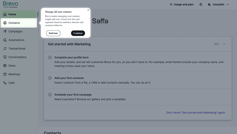
The below tooltip from Brevo is an example of how concise your tooltip microcopy should be:
That said, the tooltip could have been better (or worse) if the microcopy had been written differently:
- Better: Create new lists and segments based on audience interests/customer behavior to simplify contact management.
- Worse: You can access your contacts at any time by clicking on the sidebar. Brevo makes managing your contacts simple and easy. Create as many lists as you want while defining segments based on either the audience interests, customer behavior, or a combination of the two.
Position your tooltip so as not to block other elements
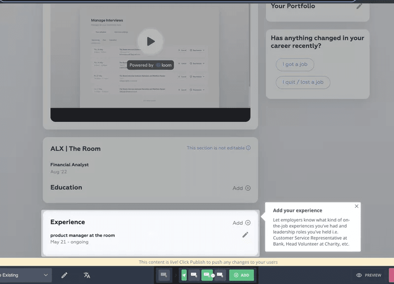
Speaking of space, you should be positioning tooltips in such a way that they don’t obstruct other interactive elements on the underlying UI. The best way to avoid covering critical information would be to position the tooltip container above, below, or beside the target element.
Trigger tooltips contextually
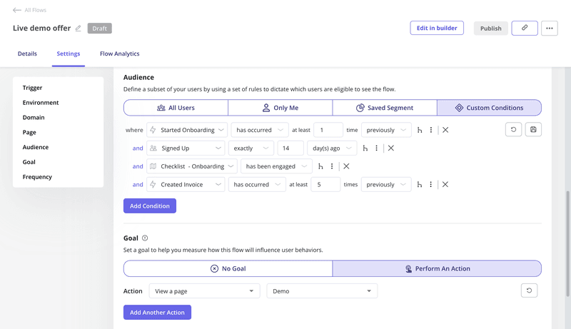
Contextual tooltip timing ensures that users only see information that’s most relevant to whichever point of the customer journey they’re in. This prevents information overload in new users while still letting you provide more advanced tips to product veterans.
There are two main ways to trigger tooltips contextually:
- Event-based triggering. Triggering tooltips based on event data will help you display in-app guidance in response to specific actions that users perform.
- User segmentation. Alternatively, you could display certain tooltips based on which segment a user is in. Segment users based on either behavioral or demographic data which makes it easy to surface the information that’s most important for their jobs-to-be-done (JTBD).
Regardless of which approach you take, contextual triggers will help make your tooltip design more strategic. For instance, if your upsell tooltip appears to users beyond a specific product usage threshold or above a certain NPS score, then you’ll get a higher upsell conversion rate.
Use progress indicators with your tooltips
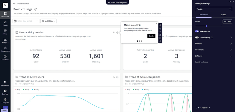
Adding progress indicators at the bottom of your tooltip labels will inform users of how far along they are in the flow. This increases the odds that a user interacts with the following steps and never leaves them guessing about how close they are to completing the flow.
Embed rich media elements into your tooltips
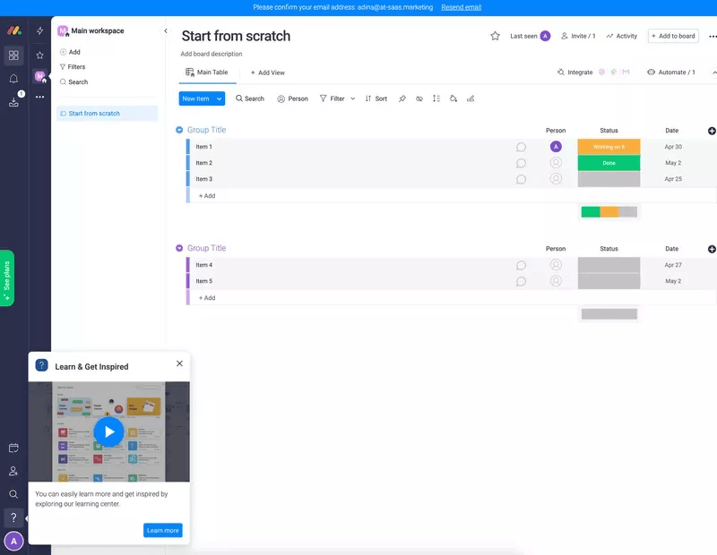
Tooltips don’t need to be exclusively comprised of text. You can embed media like videos, images, or even audio recordings to make the contextual guidance more engaging. This will boost engagement and make learning about the product feel like a truly interactive experience for users.
Design with accessibility in mind
When attempting to streamline user onboarding, it’s crucial that your tooltips (and other UI patterns) are accessible to all users. To maximize your tooltip accessibility, you should ensure that all your tooltips are:
- Keyboard-navigable
- Mobile-responsive
- Clearly legible
Beyond basic changes like using an easily legible font, more advanced optimizations include adding accessibility features for those with auditory or visual impairments and enabling multilingual support to eliminate any language barriers.
Make the tooltip stand out by incorporating contrasting colors
Part of the product design process is ensuring that there’s enough contrast between the background UI and the tooltip text overlaid on top of it. High contrast will make the tooltip text stand out more and increase the odds that users actually read it before it disappears.
Stay consistent with your user interface
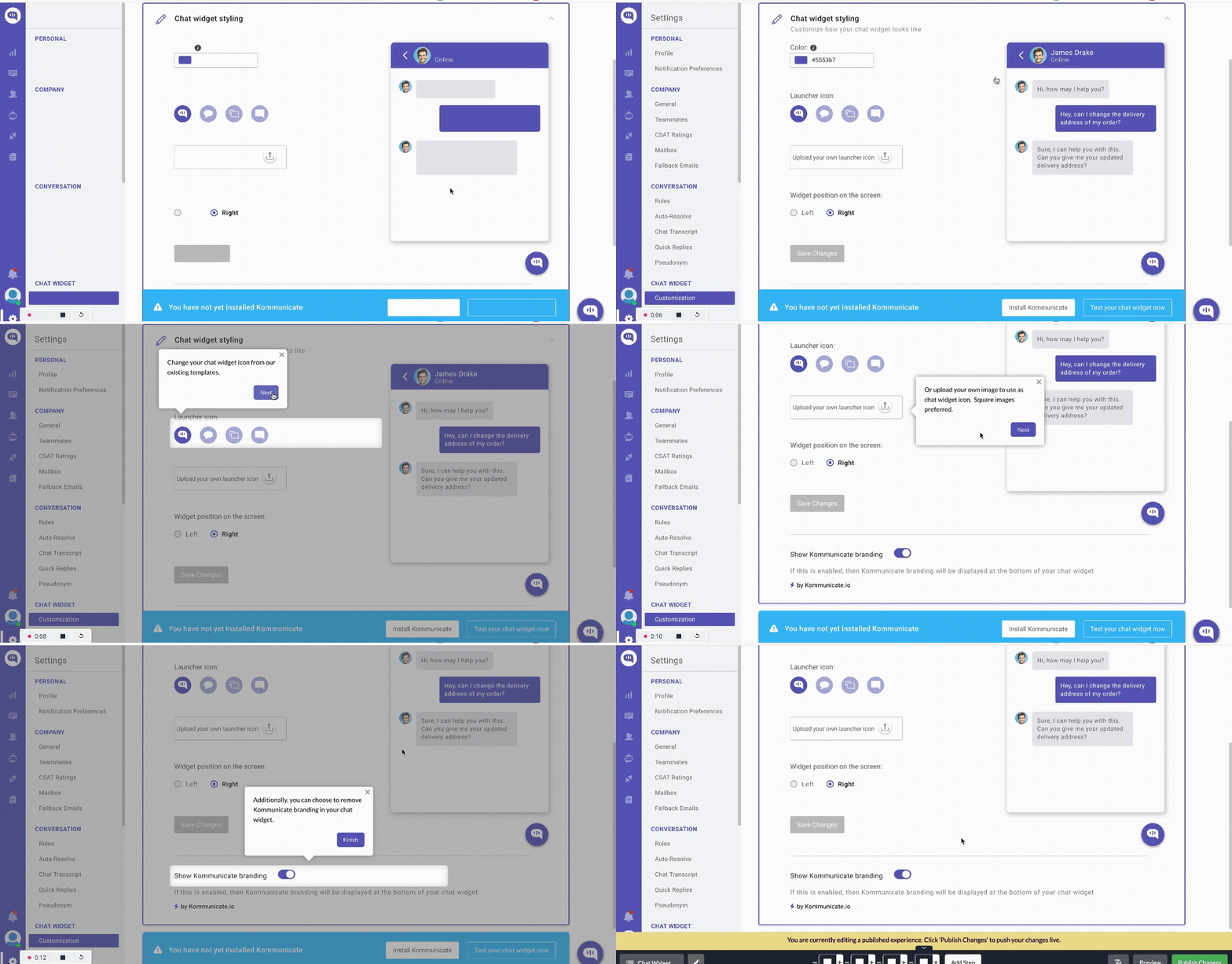
When building a consistent brand experience, it’s paramount that your tooltips use the appropriate colors, fonts, and shapes. Failing to do this will make the tooltip feel less congruent with the rest of the UI and may lead users to dismiss the information as in-app marketing.
Allow users to exit a tooltip easily
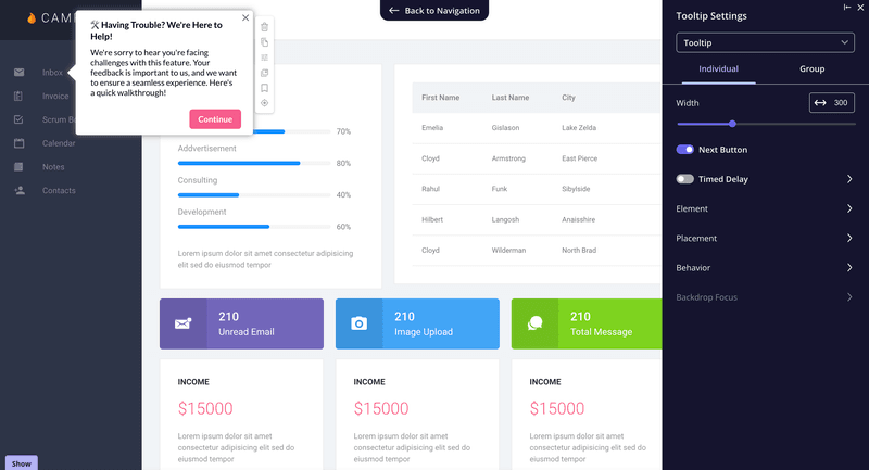
You must give users a straightforward way to dismiss the tooltip component if it’s interrupting their work. Not having an X or Continue button will lead to user frustration that could’ve otherwise been easily avoided.
Analyze tooltip interactions and optimize
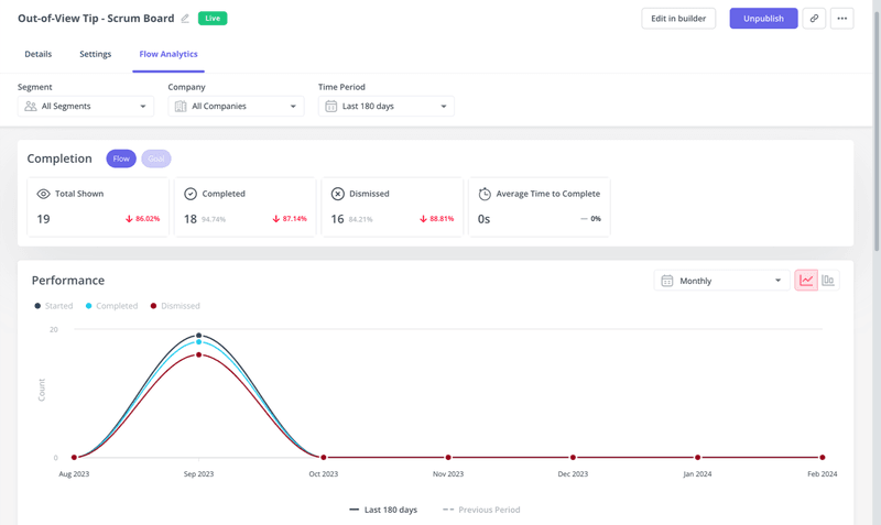
Product analytics tools help you A/B test different tooltip versions and see which variation yields the best results. You’ll be able to track clicks, views, and dismissals and even watch actual session recordings to see how users behave around your tooltips.
Conclusion
As you can see, tooltips are a great way to surface contextual guidance to the right user segments without interrupting key workflows. Just remember to follow the best practices outlined above to get the best results. After all, careful execution is paramount to avoid annoying users with popups.
Keeping these tooltip design tips in mind is a good start but won’t be enough in itself to take your user activation rates to the next level. Ensure your users get to their Aha moment as soon as possible.
FAQ
How do I make my own tooltip?
You can make your own tooltip by coding the HTML manually or using no-code tools and their drag-and-drop editors.
What is the difference between a tooltip and a pop-up?
The difference between a tooltip and a pop-up is that a pop-up is triggered when certain conditions are met, whereas a tooltip only appears when its target element is clicked on or hovered over.
What can I use instead of tooltips?
Instead of tooltips, you can use other types of in-app guidance, such as modals, slideouts, or hotspots. However, tooltips are the least intrusive type of UI pattern and can thus be used more often.

