11 User Experience Interaction Guidelines for Enhanced Engagement [+ Examples]

![11 User Experience Interaction Guidelines for Enhanced Engagement [+ Examples] cover](https://blog-static.userpilot.com/blog/wp-content/uploads/2024/07/11-user-experience-interaction-guidelines-for-enhanced-engagement_c1053407559f9288e9ad862dbb4b2b19_2000-1024x672.jpg)

Alongside usability testing, user experience interface guidelines allow you to build more intuitive and user-friendly solutions. You could say these guidelines are a catalyst as they help you get to the final design much faster.
In this blog, we explain eleven user experience and interaction design guidelines supported by real-life examples to improve product engagement.
TL;DR
- User experience interaction guidelines (also known as usability heuristics or user interface guidelines) are principles that evaluate a product’s usability. Having a notion of these principles allows you to build more user-friendly applications.
- The 11 user interface guidelines for enhanced engagement include:
1. System status visibility. Users should always know what’s happening based on their actions, e.g., loading indicators.
2. System design matching real-world experience. Mimic real-world interactions for intuitive use, e.g., clicking the “X” to close a page.
3. Control and freedom for users. Allow users to undo or cancel actions to encourage exploration.
4. UX/UI consistency and standards. Consistent design patterns and industry standards for familiarity, i.e., specific icons always have the same meaning.
5. Recognition instead of recall. Make options and actions easily recognizable by adding cues and context, e.g., auto-complete options for users to recognize the right choice.
6. Flexibility and efficiency of use. Cater to both beginners and experts with multiple ways to achieve tasks, e.g., support keyboard shortcuts.
7. Error prevention. Proactively prevent mistakes with clear instructions and confirmations, e.g., ask the user to complete a puzzle to confirm a cancelation.
8. Aesthetic and minimalist design. Focus on essential elements for a visually appealing interface.
9. Easy error recognition, diagnosis, and recovery. Help users quickly identify and fix mistakes by highlighting the error.
10. Help and documentation. Provide resources like tooltips, guides, FAQs, and tutorials in a help desk.
11. Auto personalization. Tailor the user interface design, copy, and content based on user preferences and behavior, e.g., quick access to most viewed websites on Chrome. - Want to track user behavior and make data-driven decisions to improve your interface? Discover how Userpilot’s analytics and reporting features can give you the insights you need. Book a demo now.
What are user experience interaction guidelines?
User experience interaction guidelines, also known as usability heuristics or user interface guidelines, are a set of principles used to assess the usability of your visual design. Jakob Nielsen introduced these in the early 90s to standardize what a good UI/UX meant.
Usability heuristics include concepts such as consistency, recognition over recall, and user control and freedom. Let’s explore them in detail.
11 user interface guidelines for enhanced engagement
Build designs with a high usability score by including aspects of these eleven principles in your user interface. Here are user interface guidelines to keep in mind:
1. System status visibility
Offer visibility of what’s happening in the system to spare the user’s frustration. This can be as simple as adding loading indicators, progress bars, or website notification banners after certain actions. For instance, notifying that a page is loading after the customer clicks an icon.
When a user knows the current status, they understand that their actions determine further behavior. This helps users know where they stand and allows them to complete predictable interactions, leading to higher brand trust.
You can build banners, alerts, and in-app messages with Userpilot to offer system status visibility. Launch messages and trigger product announcements to keep the user up to date.
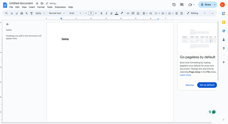
Example of system status visibility from Google Docs
When users are writing on Google Docs and are connected to the Internet, a small “Saving…” indicator appears at the top. This prompt changes to “Saved to Drive” once it’s completed.
2. System design matching real-world experience
User interfaces need to talk like your customers. This doesn’t necessarily mean that you have to use slang but mimic interactions and metaphors from the real world. However, it’s always recommended to avoid marketing jargon and use plain language.
This guideline invites you to replicate the user mental models in UX to make your software more intuitive and predictable. For example, allow iPhone users to swipe right to get back to the previous tab.
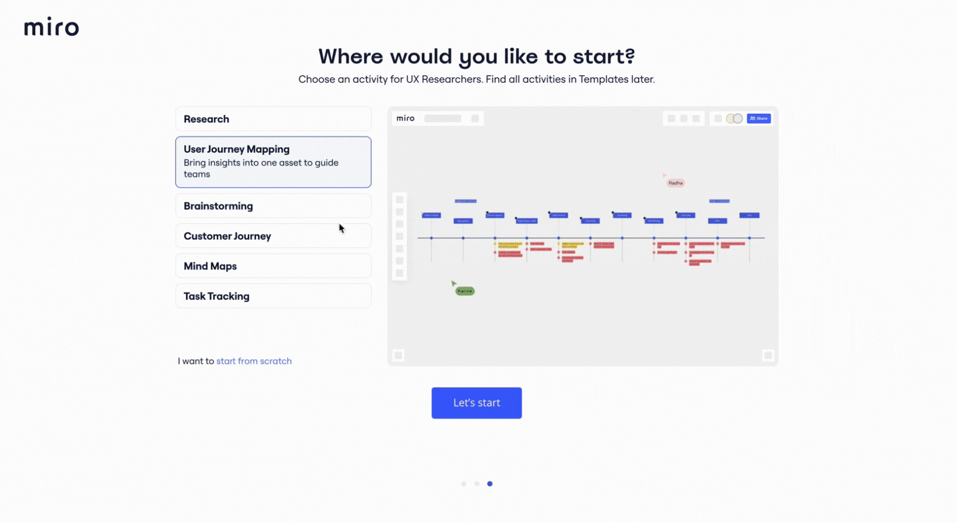
Example of system design matching real-world experience from Miro
Miro uses touch gestures to zoom in and out of the canvas. This follows the same logic as zooming in and out of posts on social media, pictures on phone galleries, or documents online.
Users are likely to discover this functionality with or without the tutorial as these gestures match their current world experience. However, you need a deep understanding of your users’ language and their context to find the right experiences.
For example, if Miro targeted non-tech-savvy users, this gesture wouldn’t match their real-world knowledge as technology didn’t play a big part in it. That’s why it’s important to conduct user research before working on the design.
3. Control and freedom for users
Give users an emergency exit by allowing them to undo or cancel actions. When you delegate control over actions, users recognize that they’re free to explore options without fearing negative consequences.
Imagine if the undo button didn’t exist. You’d need to operate with much more caution as every action would be definite. Putting users in control gives them the freedom to discover your tool and customize their experience.
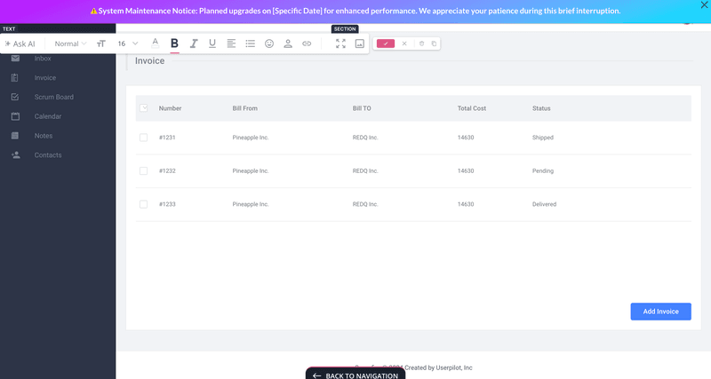
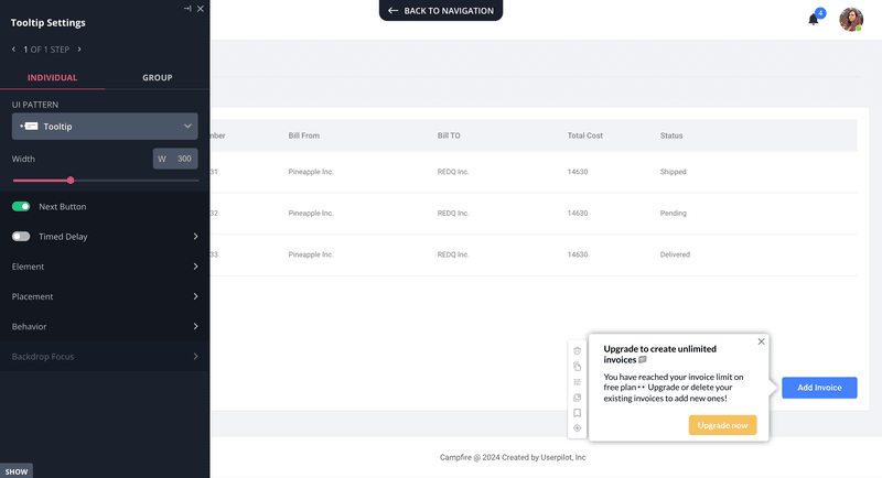
Example of user control and freedom from Userpilot
In this example, a user is creating a customizable dashboard. They can choose from templates to build predefined data analysis reports, follow analytics dashboard examples, or build their own.
As you can see, all of the actions include an exit or cancel button for the user to stop at any time and course-correct.
4. UX/UI consistency and standards
This UX best practice talks about building consistent designs, interaction patterns, and layouts. UI elements need to follow a natural and logical order that’s consistent and predictable. There are two types of consistency: Internal and external.
Internal consistency refers to the logic within the platform. All the visual elements need to behave the same way within your app. For example, if you use a light bulb icon for expandable tips, users will expect to get a tip every time they click on a light bulb.
External consistency, on the other hand, refers to industry conventions. Jakob’s Law of UX says: “Users spend most of their time on other sites.” This means users have expectations about your UX design based on what they see elsewhere. For instance, e-commerce sites usually have the checkout cart icon at the upper right side of the screen. Placing it in a different location could confuse the customer.
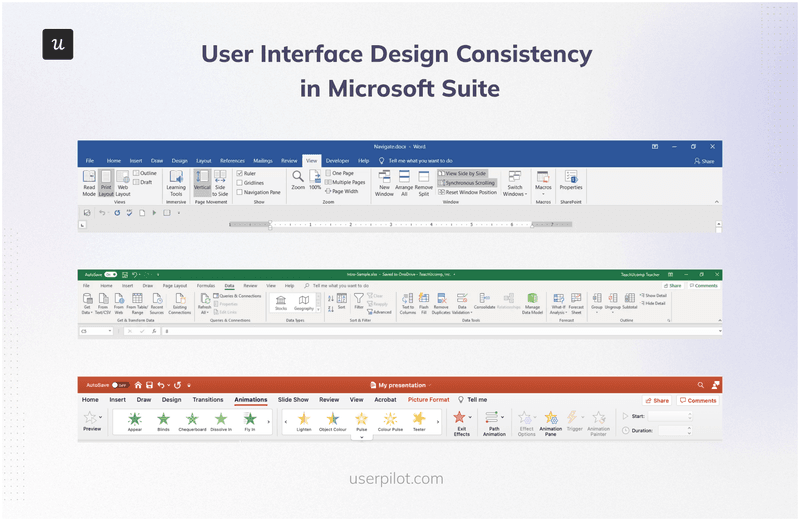
Example of user interface design consistency from Microsoft products
Microsoft Office is the king of consistency. The placement of the navigation bar and core functions remains consistent across the Office product suite. Whether you’re using Excel, PowerPoint, or Word, you’ll know your way around the product and will easily find the options you’re looking for.
You can even find similar patterns and logic in other Microsoft products like Power BI.
5. Recognition instead of recall
Limit the amount of information users need to remember by adding cues and making the options easily decipherable. Use recognition over recall.
For instance, if someone asks you if Paul McCartney was part of The Beatles, you can easily recognize if this is true or false. However, if they ask you who constituted The Beatles, you’d need to recall the names of all the band members.
In both cases, you’d need to use your memory to answer the question, but it’s more simple when you have context and cues. The more cues you include, the easier it will be to retrieve this information.
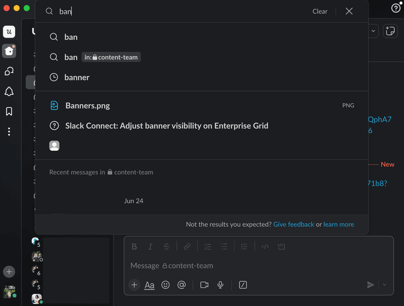
Example of recognition instead of recall from Slack
Slack’s autocomplete feature helps you find the right information in the message bar. Simply by typing the first three letters of what you’re looking for, you’ll see names, channels, messages, and even emoji suggestions.
This is an example of recognition instead of recall because you don’t need to remember the exact name, spelling, or even location of your search. Instead, you can simply recognize the right answer from the given options.
6. Flexibility and efficiency of use
Applications should be flexible enough for both beginners and experts to use and enjoy the experience. Hence, you should provide multiple ways of achieving the same results.
This can either happen by following a set of steps, using a keyboard command, or an automated shortcut. You could even allow users to build their own touch gestures to perform actions.
For example, new Excel users might insert a function from the navigation bar, while experts might simply type it directly on the cell.
Example of flexibility and efficiency of use from Figma
Figma allows users to conduct actions by clicking on the options or through keyboard shortcuts. This allows experienced designers to go much faster as they get familiarized with the shortcuts with time.

7. Error prevention
If a user makes a big mistake that was preventable is often due to the visual design, not the customer. This usability heuristic stands for proactive issue prevention by adding design precautions that prevent mistakes from occurring.
Provide clear instructions, add constraints on input fields, or trigger confirmation dialogs before critical actions. Think of double confirmations on critical tasks or error messages.
For example, a UX notification that says: “You’re about to cancel this request, click to confirm,” or other forms of microcopy.
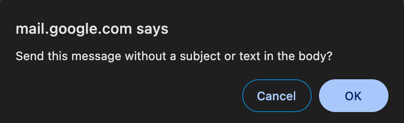
Example of error prevention from Gmail
A common error when sending emails is to send an empty or incomplete message. Gmail alerts users whenever they’re about to send an email without a subject line or text. Senders need to confirm the prompt before sending it.
Gmail also allows you to undo the action within the first 5-30 seconds in case you send an email by mistake.
8. Aesthetic and minimalist design
Keeping a minimalistic and aesthetic visual design doesn’t necessarily mean sticking to a two-color palette and one-point lines. Instead, it refers to building visually appealing interfaces with a responsive design that focuses on essential elements and is uncluttered.
Every single element in your user interface either informs or distracts, so keep the signal-to-noise ratio high. Meaning, having more elements that signal action rather than add noise.
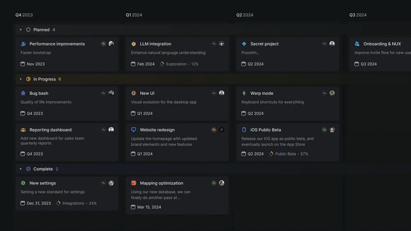
Example of aesthetic and minimalist user interfaces from Linear
Linear allows the user to view pending, in progress, and completed work across the four quarters. This happens due to the app’s muted color palette, spacious layout, and sans-serif typography to prioritize readability and focus.
The information on the screen is clear for each of the categories. And, there aren’t any unnecessary icons or graphics.
9. Easy error recognition, diagnosis, and recovery
Help your customers identify and fix mistakes without frustration. Do so by highlighting errors, adding pop-up messages with an explanation, and guiding customers to the solution.
Meet this heuristic by adding a quick resolution guide on the same screen. For instance, if the user skipped a field on a form, highlight it but also, bring the user back to the right row so they can fill it out right away.
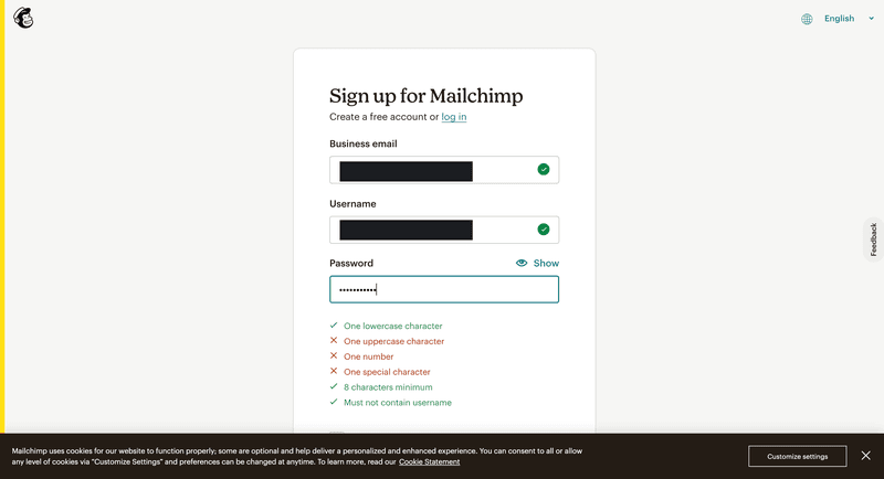
Example of easy error recognition, diagnosis, and recovery from Mailchimp
A very common error when signing up to a new platform is finding a password that meets all of the website’s criteria.
Mailchimp does a great job of explaining exactly what went wrong with this user’s password.
This page also tells users if the email address and username have the right format. It also clearly describes what’s missing from the password by highlighting the fields in red and providing an error message. The words turn green when the password meets the criteria.
10. Help and documentation
Even platforms with the most intuitive design, there comes a time when users may need extra help. This is especially true for applications with multiple or complex functionality.
This principle talks about making resources available to your users in the form of tooltips, user guides, FAQs, and tutorials to support users. You can host all of these in an in-app resource center or a knowledge base.
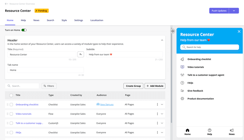
Example of help and documentation from Userpilot
Resource centers are the perfect example for making this principle come to life. Here, you can include all the relevant documents to answer frequent questions, guide users to complete core actions and offer further help.
This example shows how to build an in-app resource center or help desk with Userpilot. This help desk lives within the app and users can access it at all times.
11. Auto personalization
This wasn’t in Jakob Nielsen’s 10 heuristics but it’s become a key usability principle in modern UX design.
Auto personalization stands for tailoring the user interface or content based on user preferences, behavior, and demographics to make the experience more relevant.
Think of Google Chrome’s homepage view showing you your most frequent sites in the middle of the screen.
Personalization also allows you to find upselling opportunities, prevent churn, offer proactive help, and provide shortcuts. For example, trigger a message when a user is about to reach the product usage limit.
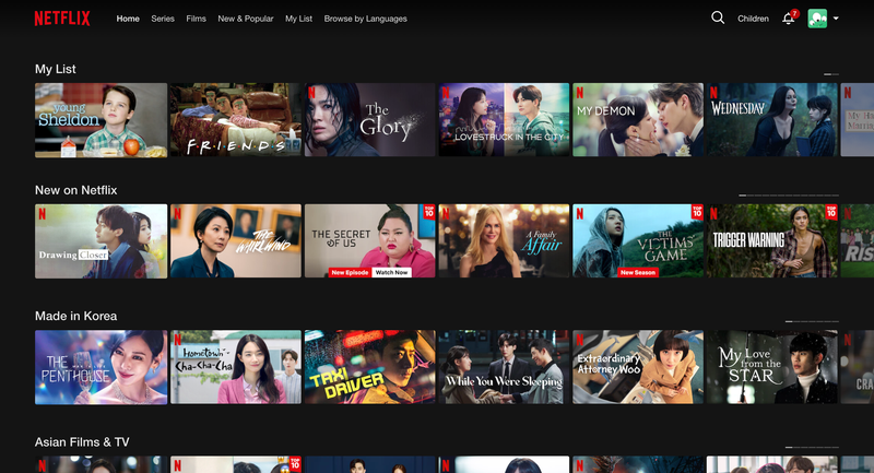
Example of auto personalization from Netflix
Netflix uses an algorithm to recommend movies and TV shows based on the customer’s viewing history. This is a perfect example of auto personalization, as no two users have the same Netflix home page. This is purely organized based on your views.
The genre, language, and length also change based on your preferences, offering a personalized user experience.
Conclusion
Designing intuitive and usable interfaces isn’t only about choosing the right colors and fonts. UX/UI design needs to reflect the user’s mental models and follow user interface guidelines.
Essentially, usability heuristics exist to make the user experience more amenable to customers. However, you don’t need to redesign your tool to improve usability.
Instead, you can use Userpilot to build in-app product interventions without writing any code. Show system visibility status, prevent errors, build a help desk, and more. Boost product engagement and offer a better experience with Userpilot. Get a demo.
About the author