Building User Trust with UX Design: 15 Effective Strategies

Cultivating user trust is critical to the success of any long-term product strategy. It is also one of the central goals of the user experience design process.
But, trust is a difficult concept to define or quantify. It is a feeling – like when you first set eyes on your date and feel relaxed and at home. So, how can you build trust with UX design?
This article examines the concept of trust in UX design and its importance. It also explores 15 strategies that help UX designers build trust in potential users.
Summary of user trust in UX design
- User trust is a form of faith users have that your product or service will match their needs without compromise.
- When users trust your product, they’re more likely to stick around and become loyal customers who attract other customers.
Some effective strategies for building user trust include:
- Mapping the customer journey to understand the difficulties users face as they progress through your app.
- Sticking to existing mental models to make your product more intuitive and easy to navigate.
- Performing usability tests at different phases of your design process to help you identify and fix design problems.
- Creating a positive first impression with a warm welcome message and data-backed onboarding.
- Obtaining (and acting on) users’ opinions of your product through user feedback and interviews and more.
What is user trust?
User trust in UX refers to the feeling of security and satisfaction users experience when using your product. It is a feeling of confidence that your product will meet their needs and protect their data.
Why is user trust important in UX?
When it comes to user trust, the first impression matters the most. Good UX designers foster trust by incorporating the user’s needs, preferences, and emotions into their design.
Once you establish trust between your product and its customers, you improve how users interact with the product, leading to a better customer experience and higher customer satisfaction.
By improving the user experience, user trust encourages customer loyalty. Satisfied customers are loyal customers who will stick to your brand and continue doing business with you.
More importantly, loyal customers are eager to speak about your brand to others. So, in addition to improving your customer retention rates, these customers help grow your customer base and drive revenue growth.
15 Ways to build user trust using UX Design
Thankfully, building trust in UX is an art that can be mastered. It’s about designing your product to meet your customer’s needs and appeal to their emotions.
Consider 15 ways you can do that.
Map out the customer journey to audit the whole UX
Customer journey mapping is the tracking of a customer’s progression through your product.
Here, you want to understand the user experience from a user’s first interaction with the product through the various customer touchpoints.
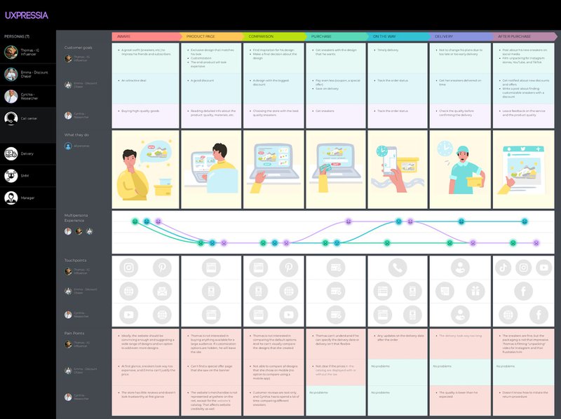
Are there any points of friction? Is the UI cluttered and confusing? How about areas where users may need more guidance?
As you map out the customer journey, you need to identify areas for improvement and fix them. This may involve including built-in guidance in areas where users need more information, changing the UI to reduce confusion, etc.
Use mental models to create an intuitive design
Mental models are patterns that shape how we make sense of the world. When users first encounter a product, these pre-existing models determine how they interact with the product.
As UX designers, understanding the mental models that shape how users navigate your product will help you to create intuitive product interfaces.
Indeed, most users today have some preconceived notions of how to use a product, thanks to certain expected UX conventions. For example, users expect that:
- Links will be underlined or written in a different text color
- Buttons will appear in a colored box
- Search boxes will appear in the upper right-hand corner of a website
- Logos will appear in the upper left-hand corner of a website
- Site-wide navigation will appear at the top or left-hand side of a website
- The navigation menu will appear on the left and the input menu on the right
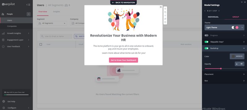
Sticking to these expected mental models will improve your product’s intuitiveness, making it easier to navigate.
Perform early usability testing to adapt to customer needs
Usability testing is another tool that helps UX designers understand customer actions and needs. It is a UX research method that measures how easy it is for users to use your product.
As part of your design process, testing your product’s usability is a great way to identify and fix design problems before launch. The test provides you with valuable user feedback that helps you improve the product experience.
Note that there are different types of usability tests, with differing strengths and purposes. This includes the:
- 5-Second Test: Here, you expose users to parts of your product for five seconds each. Then, you interview them to identify what they learned in that time about your product’s purpose, trustworthiness, and usability.
- First-click Test: This test evaluates how easily users can identify how to complete a given task with your product. It is a measure of your product’s intuitiveness and ease of use.
- Guerilla testing: Widely acknowledged as the simplest form of usability testing, it involves randomly selecting people in public places to provide feedback on your prototype.
- Lab usability testing: This test is suitable when seeking deep feedback from small user groups. It involves segmenting users and offering them incentives to use your product and provide feedback.
- Unmoderated remote usability testing: Unlike the lab test, this test is performed in unsupervised remote locations. It provides fast, robust, and inexpensive results.
Ultimately, your choice of testing method will depend on your goals, product development stage, and more.
Provide testimonials to build user trust
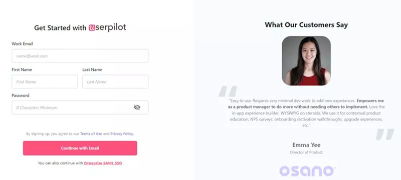
People trust other people. Therefore, the quickest way to build trust is to show that others also find you trustworthy. This is why testimonials are so important on landing pages.
They put potential customers at ease by informing them that you’ve been trusted by others in the past who were satisfied with your product or service.
Create a positive first impression to gain users’ trust
Imagine you were conducting a job interview, and a candidate walked in with dirty, skimpy clothing. Regardless of how qualified they turn out to be, you’ll likely never trust them with the role.
This is the power of the first impression. The impression you make when a user first launches your product will forever impact how they judge your product.
What the user sees first will shape their first impression of you, so it’s always best to start with a warm, personalized welcome message.
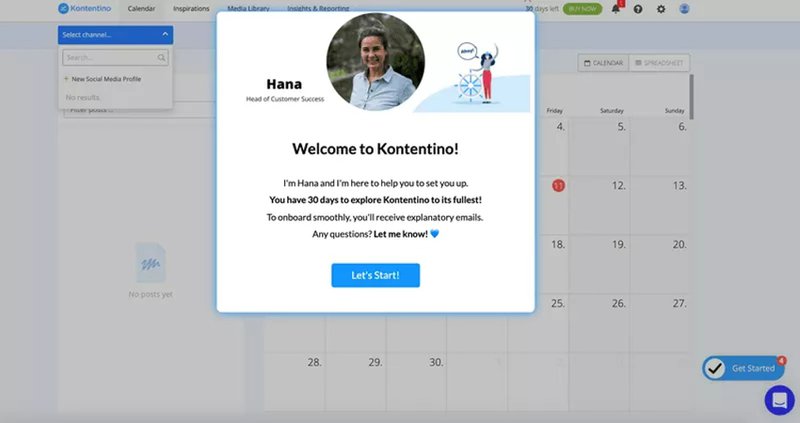
Next, you need to understand what the user expects of your product and help them achieve their goals. You can do this by incorporating welcome surveys into your sign-up flow.
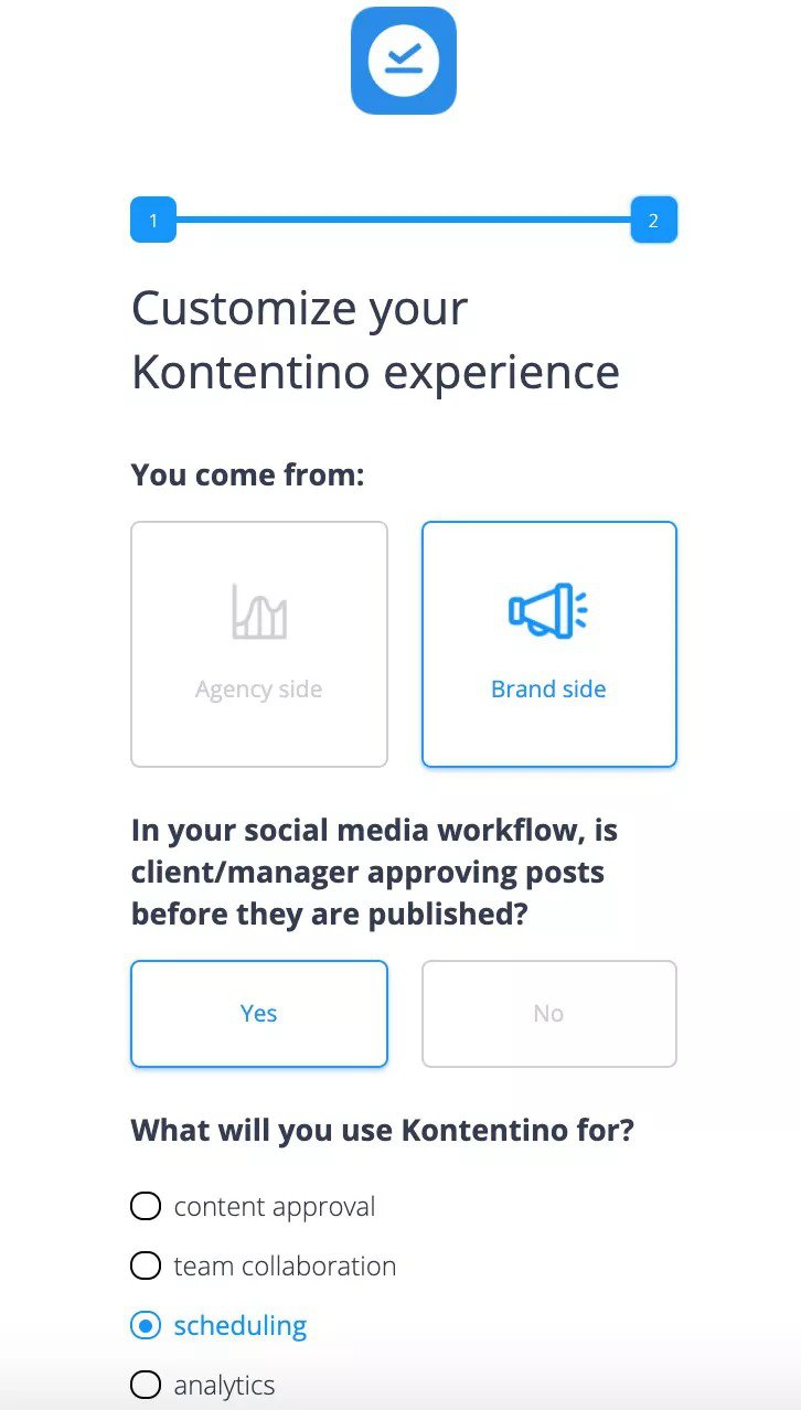
Knowing their goals early on will enable you to steer them in the right direction. It will empower you to set the right expectations and answer questions the user will have later.
Replace empty states with personalized content
An empty state is a screen inside your product that is practically blank. These screens are common when users newly sign up to a platform as they’re yet to fill in any data.
However, most UX designers will tell you that empty states are an example of poor UX. Left alone, they may make users freeze, confused about where to start or how to proceed.
Rather than leave screens blank, you can take advantage of them to educate the user. Replace (or fill) them with demo content or instructions that illustrate their purpose.
You can also use empty states to prompt users to action and help them get started with the product. Ultimately, your goal should be to reduce the user’s overall time to value.
Minimize data collection to essential information and maintain transparency
In a world of increased skepticism around data handling practices, increased caution is required when requesting sensitive data from users.
Users must trust that the data you collect is essential to your service. To that end, you need to maintain transparency around your data collection practices.
Like Airtable, you want to clearly state why you need any user data, even on your user persona surveys. You must also avoid requesting more data than is necessary.

Fix mental model mismatches with UI feedback
Unfortunately, your product interface may not always produce the expected results. If not properly handled, this mismatch between the user’s expectation and the real-life result may lead to confusion.
When a mismatch happens, you need to guide the user until it is fixed. For instance, when users click a link, they expect a new page to load immediately.
When that doesn’t happen, it presents a mismatch that can be both frustrating and disappointing. You can fix this by using a simple message to keep the user engaged until the page loads.

Replace confusing user flows with personalized onboarding
Avoid dumping too much information on users with product tours. The key to successful onboarding isn’t how much information users get, but how well the information guides them to success.
For instance, a video-sharing platform will be used differently by video creators and viewers. To help each user achieve their job to be done (JTBD), you must provide them with guidance that matches their goals on the platform.
You can do this by identifying a user’s goal early on and segmenting the user with others who share similar characteristics. Finally, you can create a personalized onboarding for each user group.

Make information digestible with checklists
Good onboarding also recognizes the need for digestible information. Providing clear step-by-step instructions is especially important when the user is just getting started.
This is what makes onboarding checklists so important. They’re clear to-do lists that provide the user with point-by-point guidance, only moving from one task to another after the former is completed.
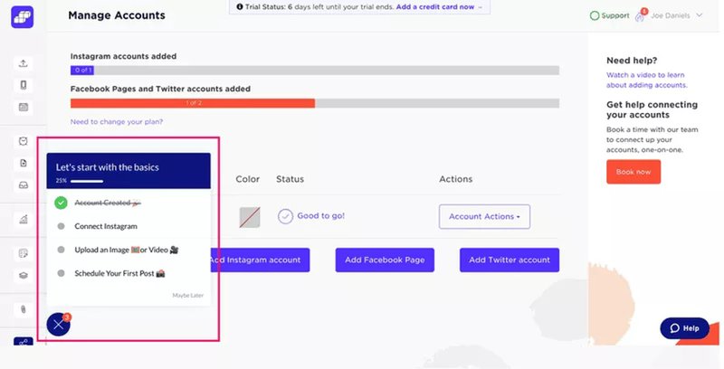
The clarity provided by onboarding checklists makes it easy for new users to know exactly what’s needed to get started with your product. This, in turn, reduces the user’s time to value and speeds up activation.
Collect feedback regarding UX and improve
At the end of the day, the product user is best placed to tell you how good (or bad) your design is.
Do they experience any issues while navigating your product or service? What concerns keep them from success? Collecting customer feedback enables you to hear those concerns directly.
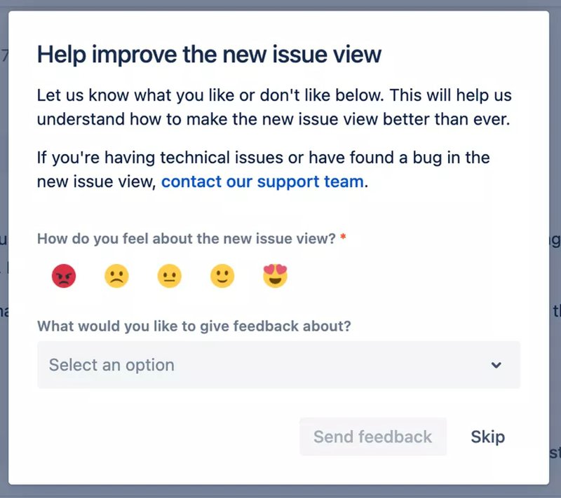
As feedback from different users rolls in, ensure you track down concerns and address them. If several users experience the same issue, be sure to fix it quickly.
Conduct user interviews to gain insights into the user’s perspective
Sometimes, you need more than simple user feedback to get a clear understanding of your user’s perspective and begin making intelligent business decisions.
User interviews provide an opportunity to go into detail with a user. What do they think of your design? Do they find the product useful? How do they rate the ease of using the product or specific features? How has it helped them?
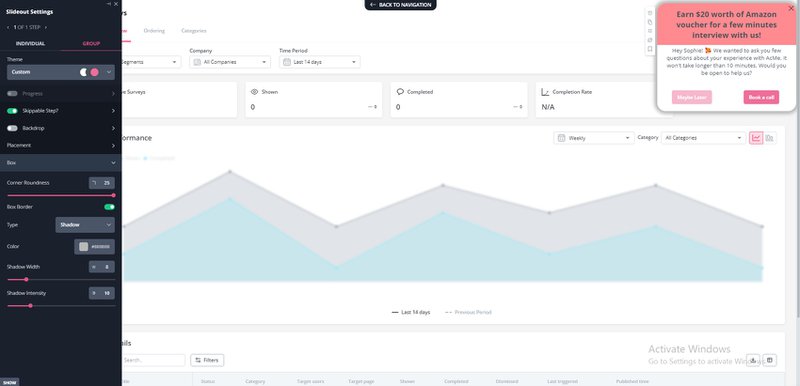
This is your chance to learn about the user’s perspective, experience, and more. It’s also a chance to further your goal of building user trust by creating human connections and giving your brand a personal feel.
For instance, if you find an important feature with very low engagement levels, it may be a sign of cluttered UI or other UI-related issues. Dig deeper to find the source of the issue and fix it.
Optimize your payment page to exclude any hidden fees
The fastest way to destroy user trust is to hide sensitive information, such as payment details.
Users should not expect to pay $20 for a package only to find out last minute that it doesn’t cover everything or that there were other fees not originally mentioned.
Building trust requires complete transparency on your payment page. Users should know exactly what each package covers, how much it costs, whether there are potential add-ons, etc.
Likewise, you should provide multiple payment methods to enable ease of payment for different users.
Best practices for building user trust
Clearly, user trust must be carefully sought out and nurtured. Consider a few best practices that can make building trust in UX a more straightforward affair.
Research your target audience
The fastest way to acquire your users’ trust is to put them at the center of your design process. Good product design is user-centered design. It considers the user’s needs in each phase of the design process.
To fully understand your audience and their needs, you must properly research them. This research is crucial to understanding contexts, building strategies, and making important product decisions.
Make design central to the product
To develop a fully customer-centric product, design shouldn’t be an afterthought that begins only after product managers have developed a plan for the product’s features and functionality.
Incorporating the design team (product designers and UX designers) from the beginning enables you to optimize the product experience, making it a key product element.
Be consistent in everything you do
Consistency should also be a key feature of your product design. Users who use your product or service across web, mobile, or desktop, should all get the same experience.
Of course, this all starts with your color scheme which should be the same across all products and pages. But it doesn’t stop there!
- Use the same voice tone across all forms of content.
- Maintain the same logo and brand identity across all platforms.
- Create congruency between your websites, landing pages, and marketing materials/content.
- Harmonize third-party elements with your native style.
- Keep your messages clear, simple, and smart.
Implement progressive disclosure to avoid friction and enhance product usability
The concept of progressive disclosure can be applied to every part of your product design – and even onboarding. It involves the sequencing of information flow to keep users from becoming overwhelmed.
For instance, users want a product that’s powerful and flexible enough to handle all of their requests. But they don’t want to spend so much time mastering this product.
Thus, progressive disclosure can be used in onboarding to show users only the most important features first. The idea is to encourage users to take the next step by keeping each step simple.
Examples of famous brands building user trust in their UX
Thankfully, you don’t have to look too far for examples of companies building trust with UX design. Two SaaS brands leading the charge include:
Airbnb
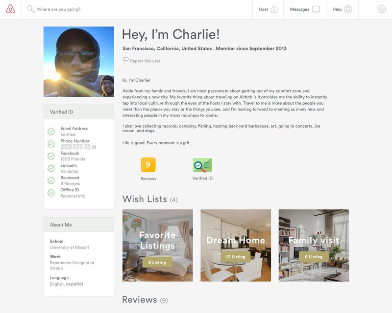
Airbnb conducted studies that revealed that people trust strangers with whom they share certain similarities (age, geography, etc.). So, they incorporated this into their design, matching users to homeowners like them.
Lemlist
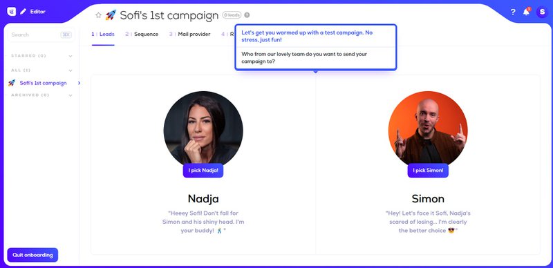
For the email management tool, Lemlist, building trust is about addressing the user’s needs and driving engagement with fun, exciting elements.
Conclusion
Cultivating users’ trust is a careful, conscious process. This is even more important in the brutally competitive SaaS arena where each product has a long list of competitors.
Userpilot equips you with the tools to understand your users and design products they can trust. To learn more about how Userpilot provides insight into user behavior, book a demo today!


