UserGuiding vs WalkMe: Which is Better for Interactive User Guides?18 min read
Get The Insights!
The fastest way to learn about Product Growth, Management & Trends.
UserGuiding vs WalkMe – quick summary
- Let’s explore how UserGuiding and WalkMe compare when it comes to creating interactive user guides.
- UserGuiding is a no-code product adoption tool that lets users create in-app walkthroughs, guides, and checklists. The solution makes it possible for teams to onboard, engage, and retain users without needing coding skills to create these in-app experiences.
- WalkMe offers various features to help you design and implement interactive user guides. These include Smart Walk-Thrus, SmartTips and ShoutOuts, WalkMe Menu, and User segmentation.
- If you’re looking for a better option for creating interactive user guides, Userpilot exceeds both functionality and value for money compared to other tools on the list.
- Userpilot is a product growth platform that drives user activation, feature adoption, and expansion revenue. It also helps product teams collect user feedback, streamline onboarding, and gather actionable insights from analytics. Get a Userpilot demo and drive your product growth code-free.
What is an interactive user guide?
An interactive user guide is a set of UI patterns designed to work together and help customers understand how to use your product.
There are two main types of user guides: full product tours (which tend to be more detailed and time-consuming), and interactive manuals (using tooltips and real-time guidance to provide more contextual help to your customers).
Interactive user manuals are an excellent way of engaging and educating your users, helping them to get the most out of your product, and improving user onboarding and feature adoption.
Must have features for interactive user guide tools
Not all tools are built the same. Some offer different advantages over others while some will simply get you basic functionality but at a low price. It depends on your budget and needs which will be the best tool to build interactive user guides.
Here’s what to look for as the main functionalities when picking a tool to build in-app guides:
- Good range of UI patterns to use for building your guides.
- Ability to customize each interactive guide to fit your brand and style.
- Segmentation so you could trigger the guides to the right audience at the right time. A one-size-fits-all approach won’t bring you the desired results.
- The ability to trigger the user guides when specific in-app events happen is nice to have and will help you build more contextual in-app experiences.
- Minimum product usage analytics, to be able to track how users engage with the product, and where they get stuck so you can build relevant user guides to help them.
The above list is not exhaustive but it’s a starting point. Depending on your product, you might also need automated localization, A/B testing capabilities, advanced analytics or security, and more.
UserGuiding for creating interactive user guides
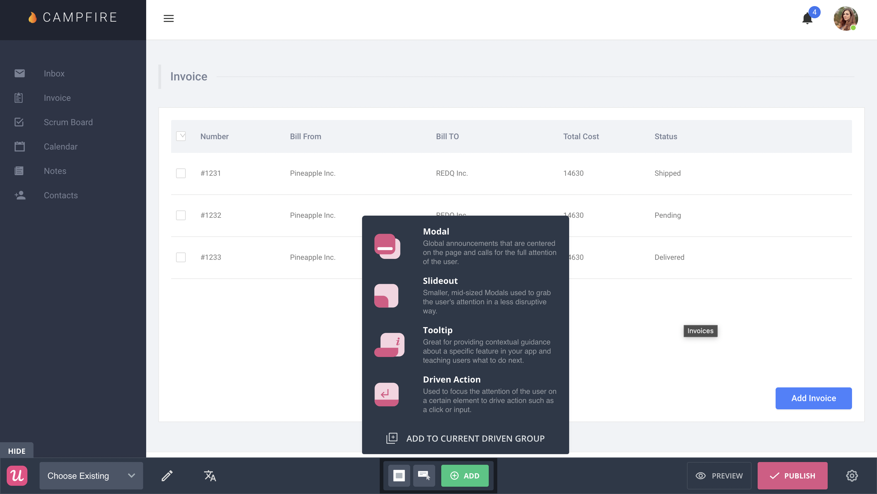
UserGuiding lets you create interactive user guides by adding steps (either modals, tooltips, or input fields).
Here are the elements you can add:
- Modals: You can add modals to your interactive walkthroughs by starting from scratch or choosing one of the available modal templates in the walkthrough builder. There are templates for discounts, announcements, welcome screens, and hero modals.
- Tooltips: Much like the modals, tooltips can also be created from scratch or added using one of the templates. Templates include single-tip tooltips, visual tooltips, and tooltips that only show up when you click an element.
- Input Fields: Input fields aren’t as common in onboarding flows but could be used during the account creation process or during welcome surveys. When adding the step to your walkthrough, you can decide which input fields are mandatory versus optional for users to fill in.
- Copying: You can copy existing guides and then make minor changes to see if they perform better than the original. Unfortunately, you’ll need to interpret the resulting analytics manually, as UserGuiding has no native A/B testing capabilities.
- Triggers: Select between automatic or custom triggers, then decide whether an interactive user guide should only appear once versus whenever the targeting conditions are met.
No-code product tours in UserGuiding
UserGuiding does have the features necessary for creating basic product tours, but the no-code implementation will depend on how complex you need these onboarding flows to be. Full integration of the UserGuiding solution does require some updates to your coding.
Here are a few UserGuiding features you can use in your product tours:
- Guides: The UserGuiding Chrome extension lets you add multi-step guides to any page of your website with elements like modals, tooltips, and input fields, then preview the flow before publishing.
- Checklists: Onboarding checklists give users a sense of progress as they move through your product tours (but UserGuiding only lets you have two active at a time unless you upgrade to the Professional plan or higher).
- Hotspots: A more subtle way to highlight specific features, buttons, or elements during product tours would be to use UserGuiding’s hotspot UI pattern.
In-app messaging in UserGuiding
An effective in-app messaging strategy can streamline onboarding, drive adoption, improve satisfaction, and generate expansion revenue. UserGuiding can help you localize in-app messages, target specific segments, and adjust frequency to avoid irritating users.
Here are the UserGuiding features that will be most useful for your in-app messaging efforts:
- Localization: UserGuiding lets you upload CSV files to localize in-app messages to the native language of your users. Unfortunately, there’s no AI-powered localization, so you’ll need to manually upload the CSVs for every language or dialect used in your in-app messaging.
- Segmentation: UserGuiding makes it possible to target specific segments with your in-app messaging to maximize relevancy and only show the most contextual messages. This avoids common issues like new users seeing upsells or power users seeing onboarding tips.
- Frequency: UserGuiding has appearance frequency customization settings that let you decide how often to show in-app messages when optimizing for engagement. This can help you moderate the pace of your in-app messaging so users don’t get burnt out or annoyed.
WalkMe for creating interactive user guides
User guides are crucial to maximizing feature adoption and product usage. They can also empower users with self-service support and reduce ticket volume.
WalkMe offers various features to help you design and implement interactive user guides. These include:
- Smart Walk-Thrus – You can use these to provide users with step-by-step instructions on how to navigate your product or use a particular feature.
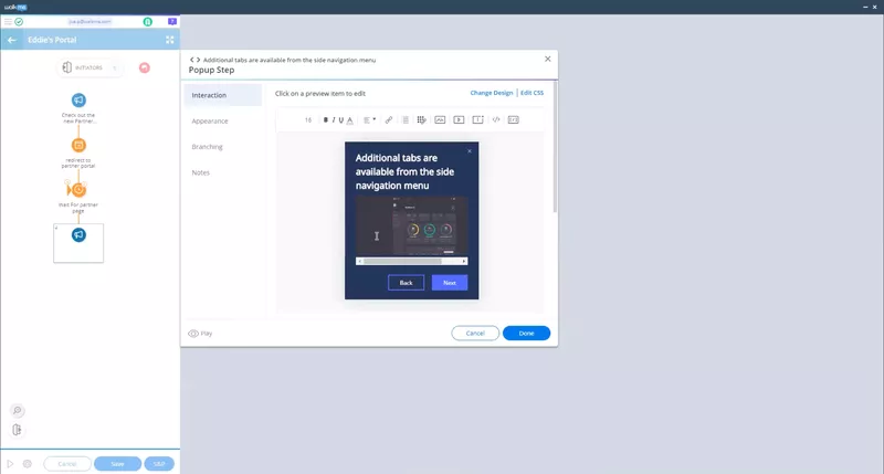
- SmartTips and ShoutOuts – These UI patterns come in handy when you want to provide more detailed on-screen guidance.
- WalkMe Menu – You can use this widget to give users one-click access to various guides. You can also create a checklist of steps they have to complete for a particular task.
- User segmentation – With this feature, you can segment users into different groups based on their behavior and preferences. Then, you can create personalized user guides for each segment.
No-code product tours in WalkMe
Product tours are one of the most common functionalities you’d expect from a digital adoption platform. WalkMe lets you build interactive and personalized product walkthroughs with the Smart Walk-Thrus feature.
Here’s how you can build remarkable product tours with Smart Walk-Thrus:
- Provide step-by-step instructions to guide new users as they navigate your product. Each step uses tip balloons to highlight specific features or UI elements and explain how to use them or the next steps a user should take.
- Create personalized journeys by controlling the flow of product tours based on user behavior and action.
- Use ShoutOuts to communicate crucial information about different features or highlight CTAs within a product tour.
However, you’ll need some coding knowledge to create and implement Smart Walk-Thrus. If you’re looking for a platform that delivers on the promise of a no-code builder, Userpilot would be a better choice.
In-app messaging in WalkMe
Besides product tours and user guides, WalkMe lets you create a wide array of in-app messages to educate, inform, and delight users. You can even compel them to take the desired action and follow a series of steps with such messages. The feature that facilitates in-app messaging is ShoutOuts.
Here are the various applications for in-app messages with ShoutOuts:
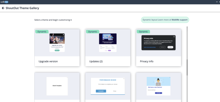
- Make important announcements about layout changes, new features, scheduled maintenance, and membership updates. Pre-designed templates in the ShoutOut Theme Gallery can be particularly helpful here.
- Define events (user actions) that trigger specific ShoutOuts, and set the frequency of each announcement to avoid overwhelming users.
- Add CTA buttons and links to videos, knowledge base articles, blog posts, etc., to prompt users to take action.
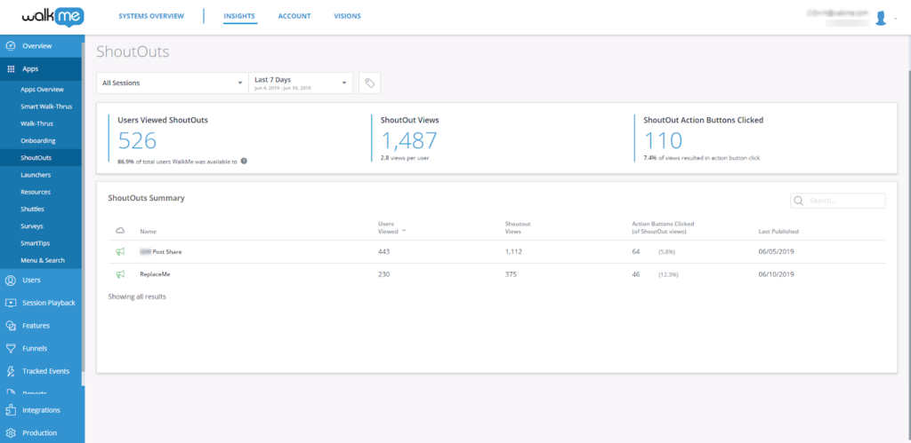
- Monitor the ShoutOut dashboard to track various metrics, such as how many times a ShoutOut was played or how often users clicked the CTA button. These insights can help you understand how users interact with different in-app messages. The analytics are fairly basic, though.
Pros and cons of UserGuiding
You might need an alternative solution to UserGuiding if you fall into any of the following use cases:
- Advanced analytics: If you’re looking for a product adoption platform with full-suite native analytics then you’ll likely need to look at platforms like Userpilot or Appcues that are better suited to your needs.
- Create fully interactive product tours: While UserGuiding excels in creating in-app experiences and user guides, it may not offer the breadth of tools needed to fully support a comprehensive product adoption strategy.
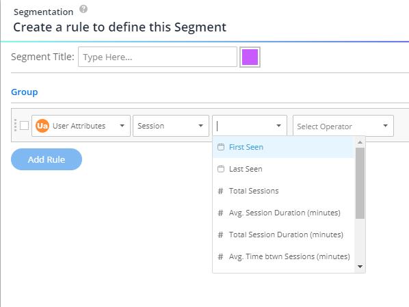
- Build segments completely code-free: As segmentation features aren’t very intuitive and may require additional help from a developer.
Pros of UserGuiding
UserGuiding has quite a few benefits as a product adoption solution, particularly for early-stage SaaS companies that need an easy-to-use starter tool for their small (but growing) team of product developers or marketers. Let’s look at some of the pros that UserGuiding has to offer:
- Chrome extension – UserGuiding utilizes a no-code Chrome extension.
- Survey template gallery – UserGuiding lets you choose from six survey templates or create your own survey from scratch.
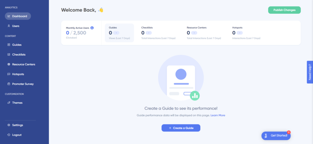
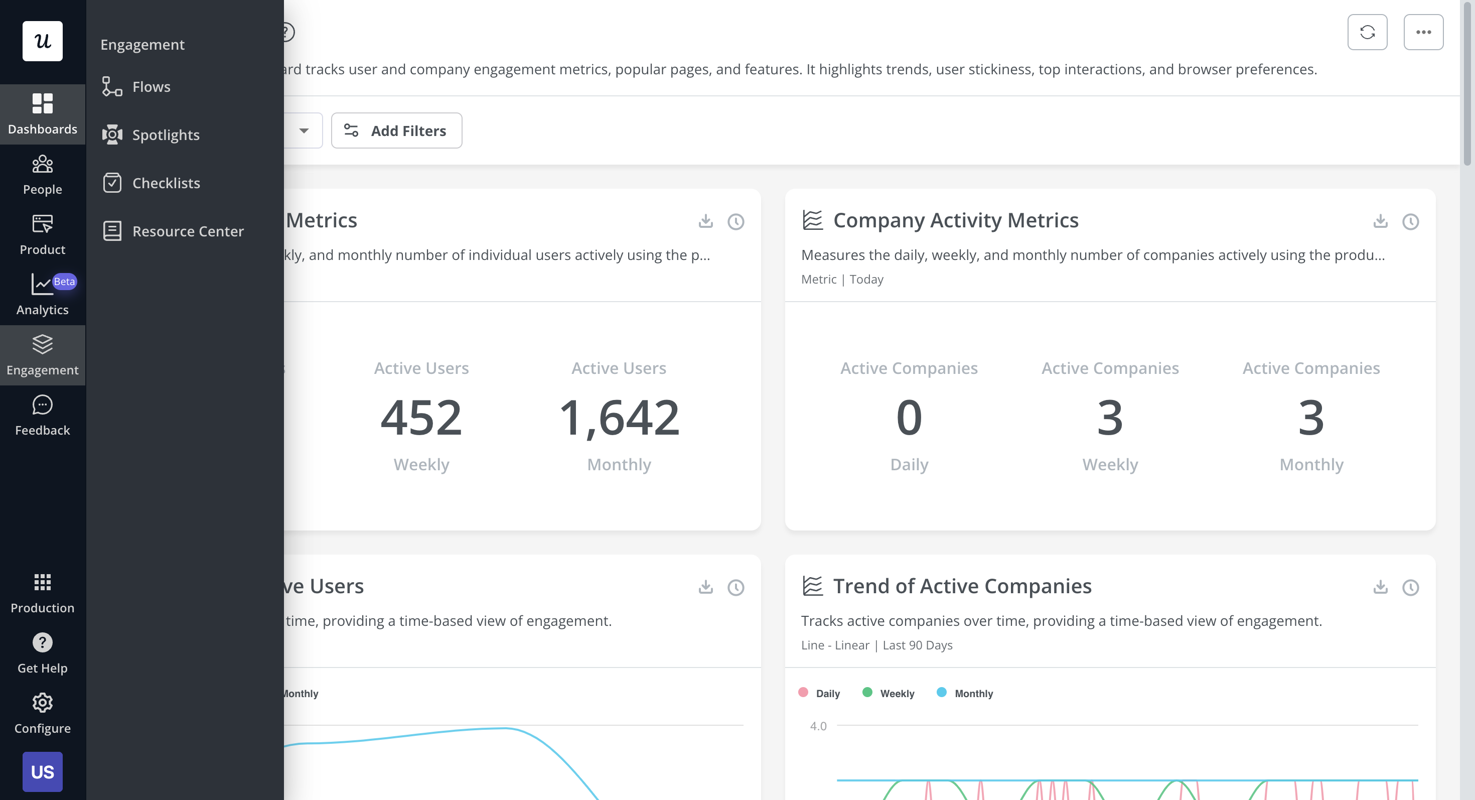
- Analytics dashboard – users can see their monthly active users (MAUs) for the month, monitor the number of views their guides are getting, and see how many interactions checklists or resource centers have had in the past week from the UserGuiding homepage.
- Custom themes – granular theme customization and color selection.
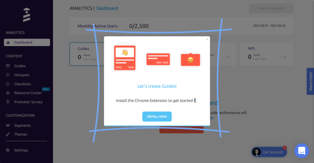
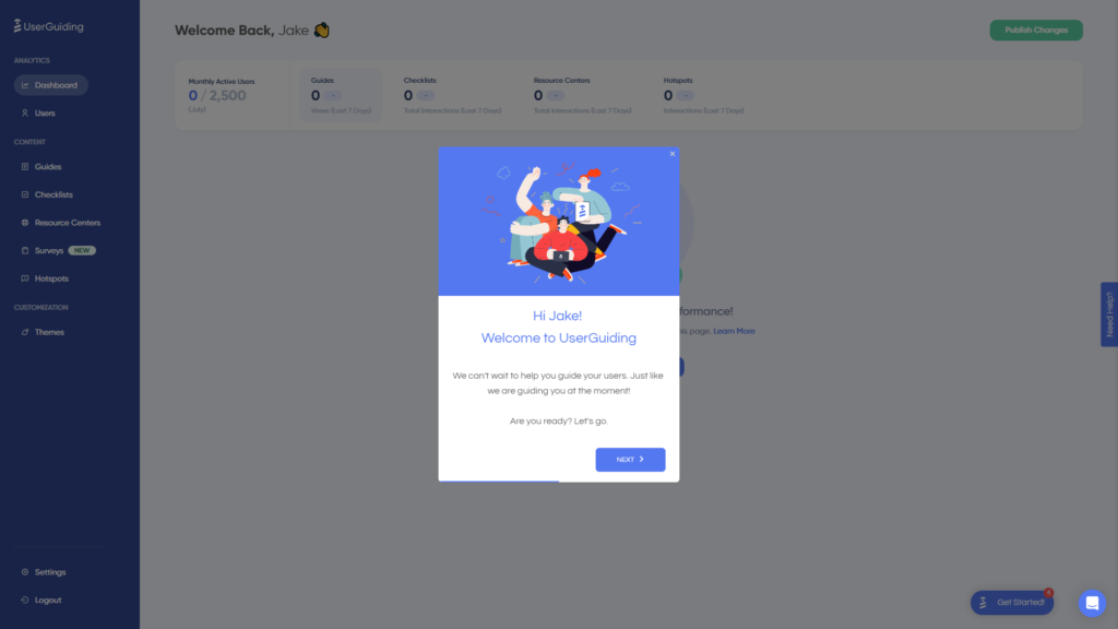
- Easy onboarding – onboarding checklist walks you through key steps, such as how to get the UserGuiding Chrome extension and create your first guide.
Cons of UserGuiding
While there are quite a few benefits to using UserGuiding, there are three significant drawbacks to note:
- Dashboard customization – you can’t edit your home dashboard or choose which analytics you want to see.
- Pricing jumps – upgrading from Basic (2,500 MAUs) to Professional (20,000 MAUs) increases your subscription cost by more than 4x.
- Manual localization – UserGuiding doesn’t have AI-powered localization, so you’ll need to manually download, translate, and upload every CSV when attempting to localize content for your product.
- HubSpot integration – the UserGuiding-HubSpot integration is only a one-way integration which limits its functionality and prevents you from setting up two-way data synchronization between both platforms.
- Limited analytics – the analytics dashboard only shows you data for onboarding materials created with UserGuiding and even those analytics are quite limited as surveys only show you total responses rather than letting you select a date range.
- Survey limit – you can only have one active survey on the Basic plan which is disappointing considering UserGuiding costs over $1,000 annually (whereas Userpilot lets you create unlimited surveys and collect up to 250 responses per month on the cheapest plan).
Pros and cons of WalkMe
WalkMe ticks a lot of the right boxes if you’re looking for a digital adoption platform that’s intuitive and scalable. However, business requirements can vary and that could mean that WalkMe might not be the right fit for you. Here are three reasons why you may need to opt for a WalkMe alternative:
- You have a low budget: WalkMe is purpose-built for enterprises and it shows in its pricing. You can expect the cost to go into thousands of dollars annually. If your business doesn’t have a huge budget, it might be better to opt for another platform.
- You want to get started quickly: If you want a platform that offers near-plug-and-play functionality, you’re better off choosing another digital adoption platform as WalkMe has a moderate learning curve.
- You don’t want to work with CSS/HTML: Even though WalkMe is marketed as a no-code/low-code platform, there are some aspects where you’ll need CSS/HTML knowledge for customizations. If you want a fully no-code solution, you’re better off opting for an alternative.
Pros of WalkMe
WalkMe is among the most popular platforms out there for digital adoption, especially for enterprises. It’s got a range of useful features that businesses can leverage to create in-app engagements, track user behavior, and retain customers, among other things. Here are the pros of using WalkMe:
- Multiple in-app engagements: Offers a bunch of in-app engagement options, including product tours, tooltips, help widgets, onboarding checklists, and more. Using them well can help you engage your customers.
- User-friendliness: The platform is quite user-friendly in terms of creating in-app engagements. And while it does have a moderate learning curve as a whole, it becomes easy to use once you get the hang of it.
- Lots of analytics: WalkMe provides in-depth analytics on a range of things like in-app engagements and forms to help you understand the impact that they’re creating. This helps you optimize your strategies for better results.
- Workflow automation: Workflow automation features like onboarding automation stand out as they enable you to automate a series of steps and processes like clicking buttons to make your customer experience better.
- Community: WalkMe offers a strong community of experts and partners who can help you whenever you get stuck.
Cons of WalkMe
While WalkMe has a bunch of good things to offer that make it one of the leading digital adoption platforms out there, it does have a few drawbacks that prevent you from unlocking its full potential. Let’s take a look at some of the cons of this platform:
- Coding knowledge: Even though WalkMe is no-code/low-code for most of its functions, you’ll need to know HTML or CSS to make the most out of the platform.
- Challenging on complex sites: The process of implementing WalkMe on your website depends on the complexity of your site. You might find it challenging to ensure that your content behaves the way it should if you’ve got a complicated website.
- Focused on employees: WalkMe’s primary use case lies in digital adoption for employees, even though it has a specific plan for customers. However, this makes it slightly weaker compared to other platforms that have been dedicatedly built for customers.
UserGuiding vs WalkMe: Which one fits your budget?
Understanding the cost implications is paramount when selecting the right solution for creating interactive user guides, so here’s a detailed pricing comparison of UserGuiding and WalkMe.
Pricing of UserGuiding
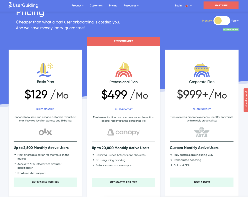
UserGuiding has three plans to choose from, targeted towards a range of business sizes from startup to enterprise.
Here are UserGuiding’s specific pricing details:
- Basic: Costing $129/month, the Basic plan is targeted towards startups and SMBs. The Basic plan is quite limited as it caps your account at one active survey, two active checklists, and no more than 2,500 MAUs. Features include:
- Access to user identification features.
- Integrations with Google Analytics, HubSpot, Intercom, and more.
- Email and chat support.
- Customizable theme (only one).
- Professional: The Professional plan costs almost 4x as much as the Basic tier at $499/month. That said, it significantly increases capacity to 20,000 MAUs and improves the quality of customer support you’ll receive. Features include:
- Removal of UserGuiding branding.
- Language localization.
- Full customer support access.
- Five team member seats.
- Five customizable themes.
- Unlimited guides and checklists.
- Corporate: Subscriptions on the Corporate plan start at $999/month. Of course, this higher price does come with its fair share of enterprise perks. Features include:
- Service Level Agreement (SLA) + Data Processing Agreement (DPA).
- Up to 10 active surveys.
- Custom MAU capacity based on your needs.
- Unlimited team member seats.
- Unlimited customizable themes.
All monthly plans are marked down by 30% when customers choose to bill annually.
Pricing of WalkMe
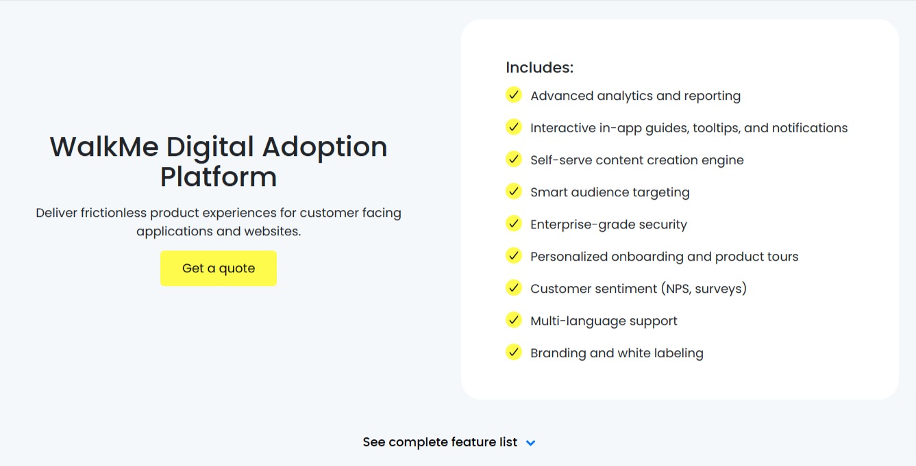
WalkMe’s pricing isn’t transparent, but it’s fully customizable based on your requirements. It offers a bunch of useful features like analytics, a self-serve content creation engine, in-app engagement creation, and more.
However, you need to get in touch with their team to find pricing details for both the customer and employee versions. Considering the platform is specifically built for enterprises, you can expect the cost to be on the higher end. You could end up spending anywhere between $9000 to $50,000 per year if you choose to use WalkMe.
Userpilot – A better alternative for building interactive user guides
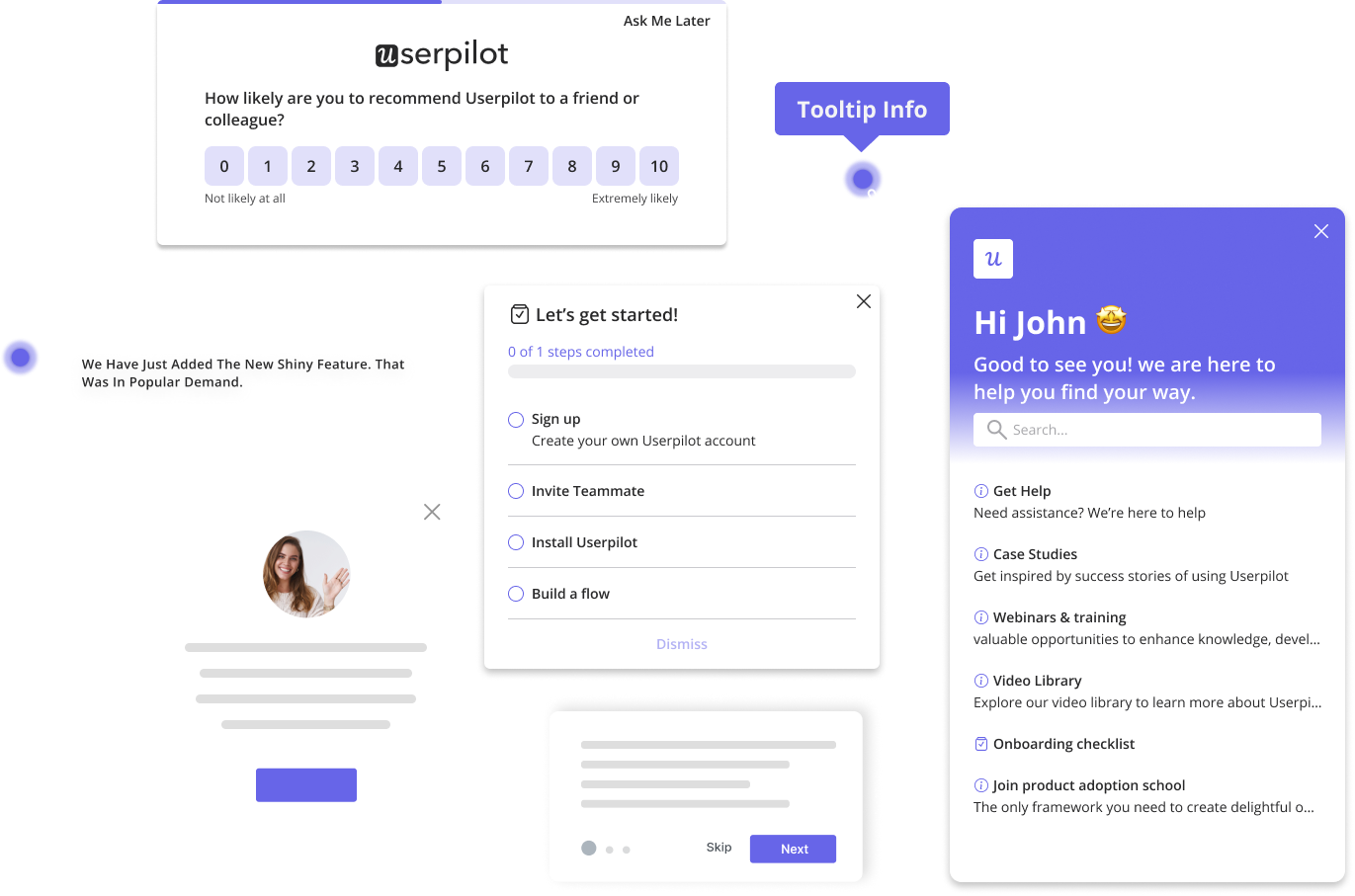
Userpilot is a product growth platform that drives user activation, feature adoption, and expansion revenue. It also helps product teams collect user feedback, streamline onboarding, and gather actionable insights from analytics.
With Userpilot, you’ll be able to track both product usage and user behavior to get a holistic view of how customers use your product — which will guide future development, improve the user experience, and inform your growth efforts.
No-code product tours in Userpilot
Product tours are an effective way to show new users what a product can do and reduce the time-to-value (TTV) for them. Userpilot lets you build advanced product tours, set contextual triggers, and target specific audiences, all without writing a single line of code.
Here are the Userpilot features that you can use to build a product tour for your users:
- Flow builder: Userpilot’s no-code flow builder has a variety of UI patterns to choose from, such as modals, slideouts, tooltips, and driven actions. All UI patterns are available for use regardless of which Userpilot plan you’re on. All you need to do is install the Chrome extension.
- Contextual triggers: Userpilot lets you set triggers for your flows to ensure that they appear at the most contextual moments. Flows could be triggered when users land on a specific page or when a tracked event occurs. There are also manual triggering options that you can tinker with.
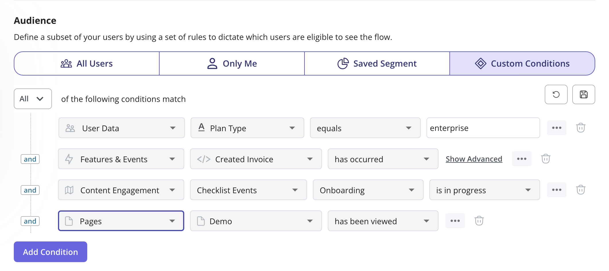
- Audience targeting: Userpilot’s audience targeting setting lets you set the conditions needed for a flow to show up for a specific user. You can use these settings to create flows that target a specific segment or exclude certain users from seeing a flow if certain conditions are met.
In-app messaging in Userpilot
In-app messaging enables communication within your product to onboard new users or drive feature adoption among existing customers.
Here are a few ways you can send in-app messages using Userpilot:
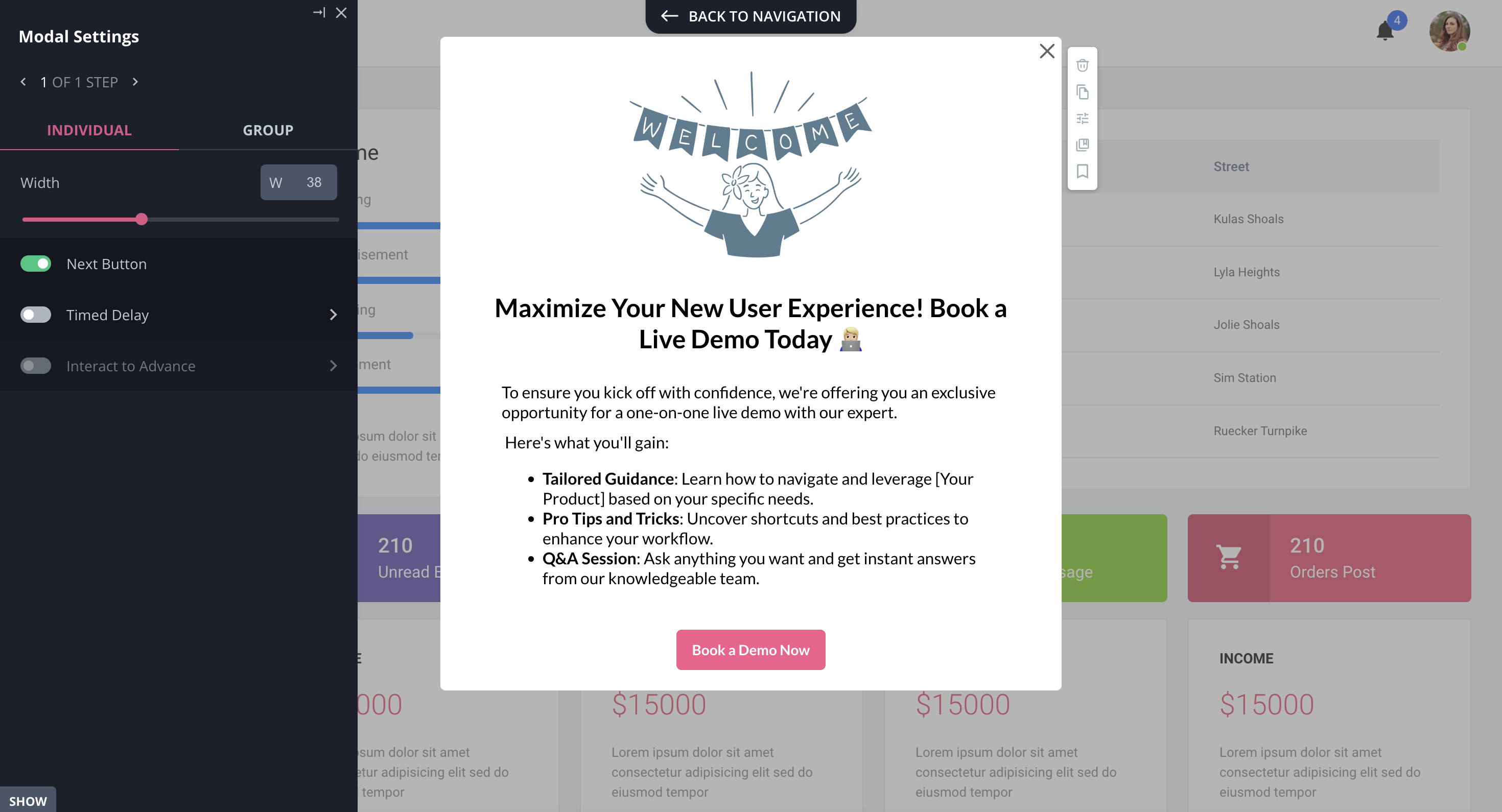
- Modals: Userpilot lets you use modals to send unmissable in-app messages to your users. Simply choose from one of the six templates or create a new modal from scratch. You’ll be able to use text, emojis, images, and videos to help your modals get the message across to users.
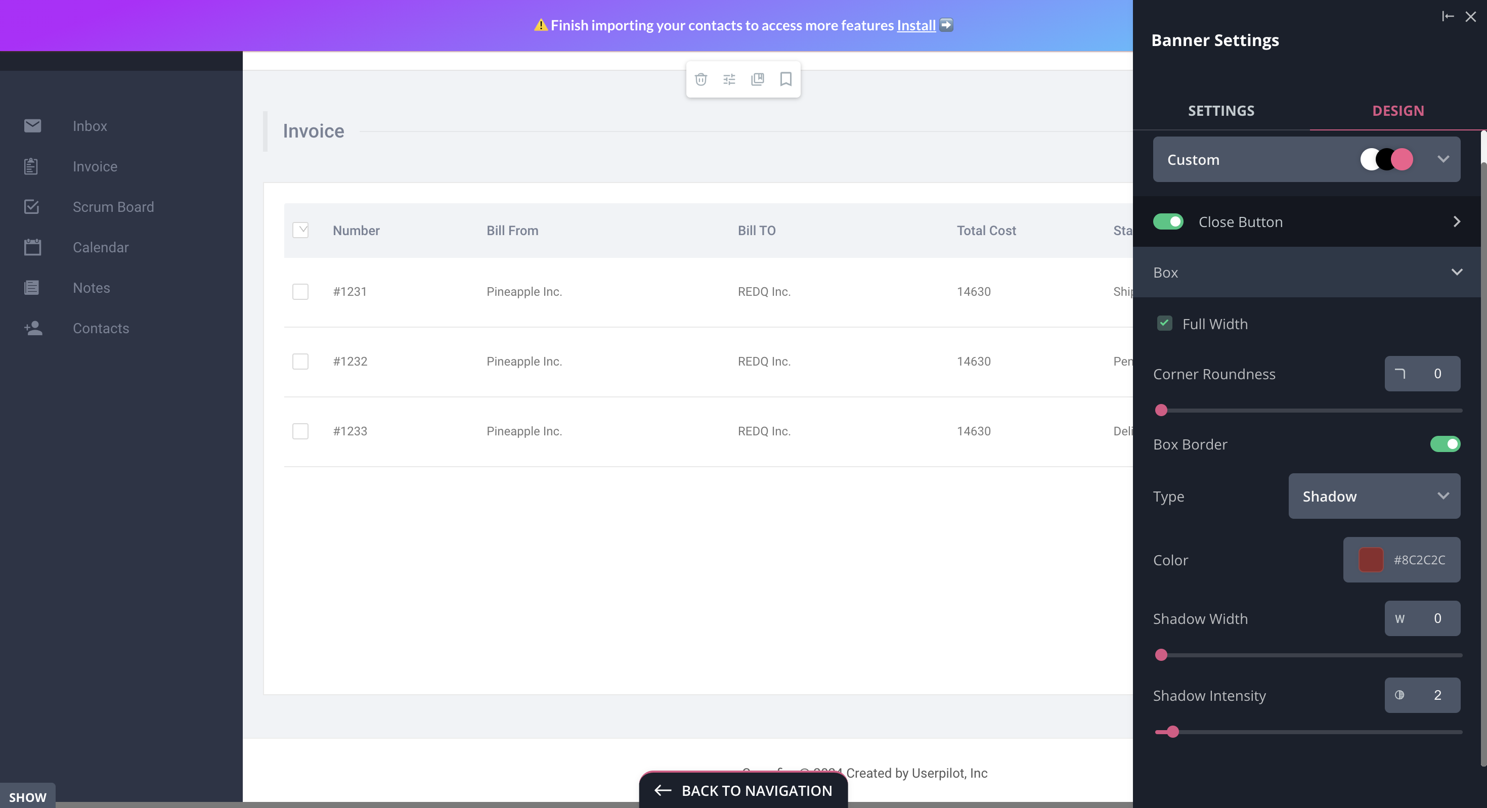
- Banners: Userpilot banners can be used to send in-app messages that are urgent but don’t need to take up the entire screen. You can also add blocks with text, emojis, images, videos, forms, custom JavaScript functions, and more to style banners to your liking.
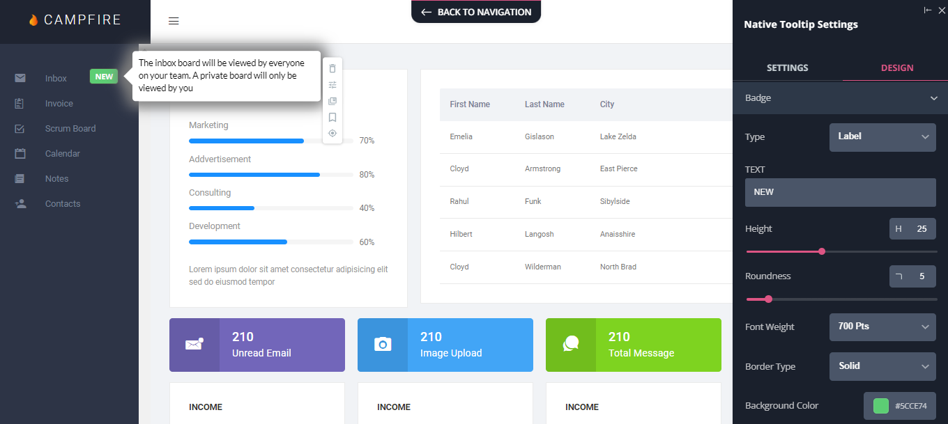
- Tooltips: They are the least intrusive form of in-app messaging as they only show up when users hover over an element or click on an info icon. You’ll be able to adjust the height, shape, color, and placement of tooltips to make them native-like.
Pricing of Userpilot
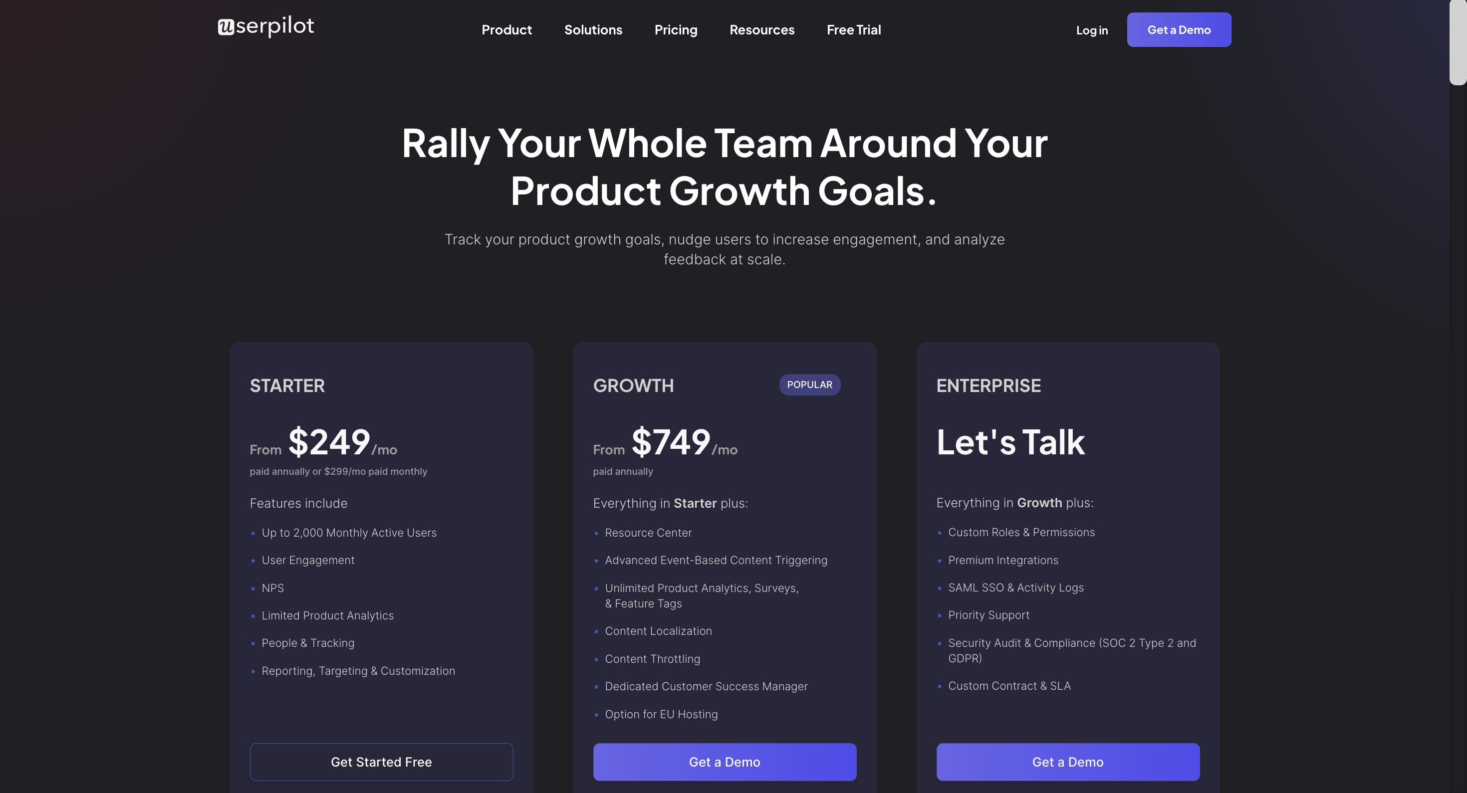
Userpilot’s transparent pricing ranges from $249/month on the entry-level end to an Enterprise tier for larger companies.
Furthermore, Userpilot’s entry-level plan includes access to all UI patterns and should include everything that most mid-market SaaS businesses need to get started.
Userpilot has three paid plans to choose from:
- Starter: The entry-level Starter plan starts at $249/month and includes features like segmentation, product analytics, reporting, user engagement, NPS feedback, and customization.
- Growth: The Growth plan starts at $749/month and includes features like resource centers, advanced event-based triggers, unlimited feature tagging, AI-powered content localization, EU hosting options, and a dedicated customer success manager.
- Enterprise: The Enterprise plan uses custom pricing and includes all the features from Starter + Growth plus custom roles/permissions, access to premium integrations, priority support, custom contract, SLA, SAML SSO, activity logs, security audit, and compliance (SOC 2/GDPR).
What do users say about Userpilot?
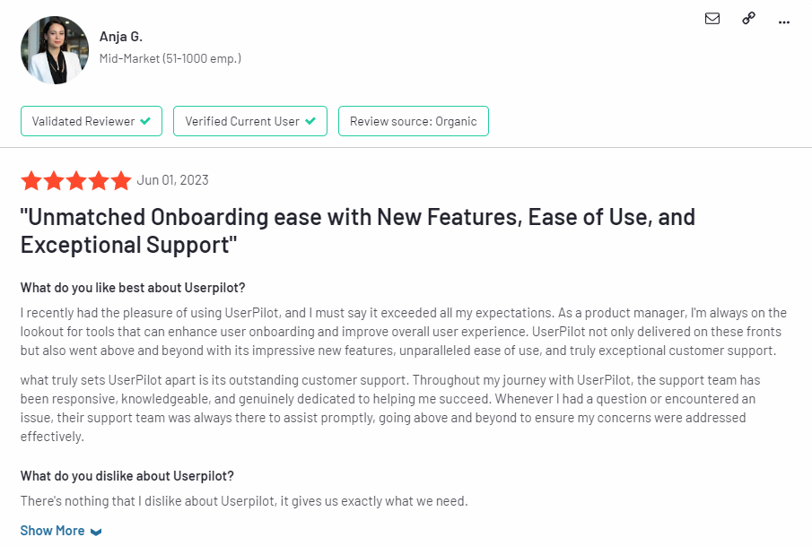
Most users laud Userpilot for its versatile feature set, ease of use, and responsive support team:
I recently had the pleasure of using Userpilot, and I must say it exceeded all my expectations. As a product manager, I’m always on the lookout for tools that can enhance user onboarding and improve overall user experience. Userpilot not only delivered on these fronts but also went above and beyond with its impressive new features, unparalleled ease of use, and truly exceptional customer support.
What truly sets Userpilot apart is its outstanding customer support. Throughout my journey with Userpilot, the support team has been responsive, knowledgeable, and genuinely dedicated to helping me succeed. Whenever I had a question or encountered an issue, their support team was always there to assist promptly, going above and beyond to ensure my concerns were addressed effectively.
Source: G2.
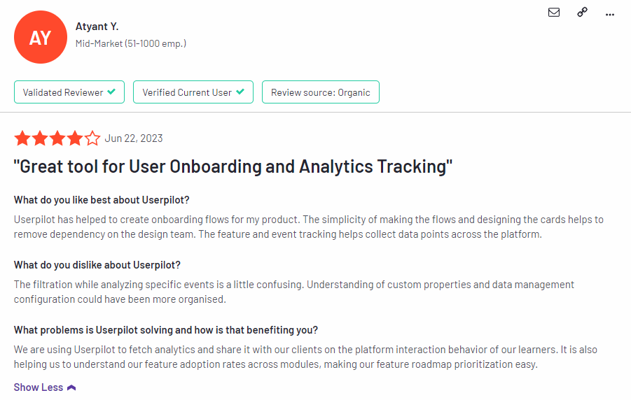
Of course, other users are also kind enough to share constructive criticism regarding specific features like event tracking filters:
“The filtration while analyzing specific events is a little confusing. Understanding of custom properties and data management configuration could have been more organised.”
Source: G2.
Conclusion
This is the end of our thorough comparison between UserGuiding and WalkMe. You should be able to make a confident decision by now. If you’re looking for a solid tool for building interactive user guides that promises great value for money, give Userpilot a go. Book a demo today.

