Welcome Surveys for SaaS: Best Practice & Examples

Welcome surveys are a great tool to avoid losing potential customers during onboarding.
You see, users are less likely to stick around if they don’t feel heard or understood.
Simply imagine you’re at a party, and you meet someone new. You introduce yourself, and they immediately start talking about themselves without asking you any questions. How would that make you feel?
Chances are, you wouldn’t want to talk to that person again.
So let’s explore the best practices for creating welcome surveys and provide examples of how they can help improve user sentiment.
Welcome survey summary
- Welcome surveys are sent to brand-new users after they signup for your product or service.
- Welcome surveys improve the first-time user experience and customer retention. Collecting data with welcome surveys allows you to personalize user onboarding, create an engaging welcome page, and learn about your customer’s needs and goals.
- Five best practices for building welcome surveys:
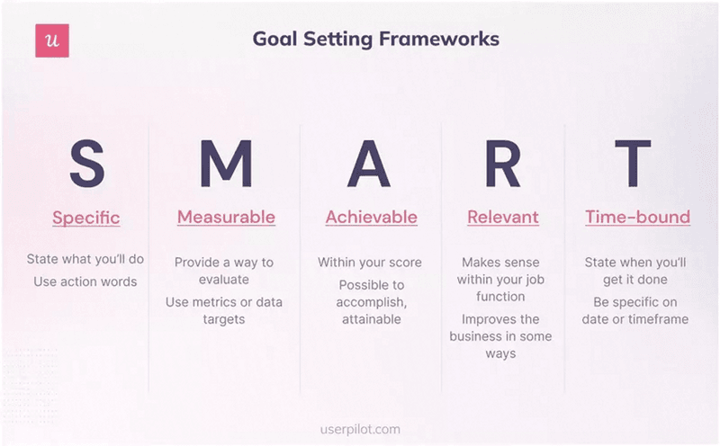
- Use the SMART goal framework to determine the purpose of your survey.
- Ask questions to segment your user base by role, industry, goals, experience, and company size.
- Keep your welcome page simple and concise by limiting it to less than ten questions and making them skippable.
- Make sure the microcopy of your survey is limited to questions, answers, and contextual information for each question.
- Implement gamification to make long surveys more bearable.
- There’re seven examples of welcome surveys from successful SaaS companies, including:
- Asana, with skippable surveys.
- Miro, with frictionless and simple surveys.
- Airtable, who knows how to add contextual microcopy.
- Canva, with upfront segmentation surveys.
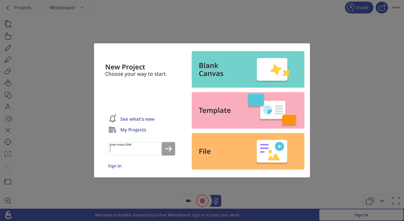
- Whiteboard, which has a one-question survey.
- ClickUp, overcoming survey fatigue with a one-page scrolling survey.
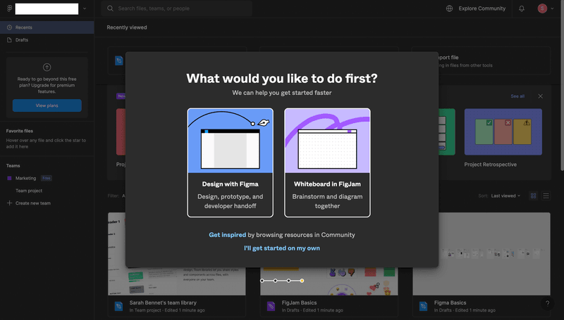
- Figman extends the welcome survey into two parts.
- With Userpilot, you can quickly build personalized, flexible, contextually relevant in-app experiences targeted to different user segments—without writing a line of code. Customize and launch in–app surveys of different types with Userpilot to gain insights into the mobile app experience. So why not try a demo to see how quickly you can gather feedback from brand-new customers?
What is a welcome survey?
Welcome surveys are sent to brand-new users after they signup for your product or service. With the purpose of gathering additional user information such as goals, needs, and jobs-to-be-done (JTBDs), allowing you to personalize the product experience and introduce users to important and relevant features.
In SaaS, welcome surveys are often triggered right after the customer logs in for the first time and before they get to access your product’s dashboard.
The benefits of collecting data with a welcome survey
Are welcome surveys necessary?
They might not, but we know welcome surveys can help improve the first-time user experience and customer retention. Plus, by collecting data with welcome surveys, you can:
- Personalize customer onboarding. Since user information such as goals, needs, and JTBDs can be used to create customized onboarding flows (such as checklists, tooltips, and walkthroughs) relevant to the customer’s use case.
- Create an engaging welcome page. Welcome surveys can make more engaging welcome pages that help new users get started with the product, improving user engagement and minimizing churn rates.
- Learn about customer needs and goals. You can identify areas for improvement and make changes to your product that better meet your customers’ needs.
Knowing this, there are little to no reasons not to implement welcome surveys in your app.
5 Best practices for building welcome surveys
Although building welcome surveys sounds simple, there are some best practices you should learn if you want to make the most out of them, including:
- Having a clear goal
- Asking segmentation questions
- Keeping your welcome page simple
- Use concise and direct microcopy
- Embrace gamification for longer surveys
Have a goal in mind
There’s no reason to send any type of survey if you don’t know what you’re looking for.
So, when setting up your welcome surveys, stop for a moment to outline your purpose, as it will help you frame the survey questions in the right and helpful way if you ask yourself these questions:
- What is the goal of your welcome survey?
- Which type of insight are you trying to find, and what will you do with what you learn?
- What outcome you’re hoping to get from the collected data?
If you don’t know how to set up goals for your surveys, you can follow the SMART framework to build a tangible goal. This framework stands for Specific, Measurable, Achievable, Relevant, and Time-bound:
Ask questions to segment survey participants
If you don’t want to ask bad survey questions, ask questions that can help you segment your users according to user personas. For example, you can segment users by:
- Role. The profession your product is designed for (E.G., product manager, marketing operations, lead designer, etc.).
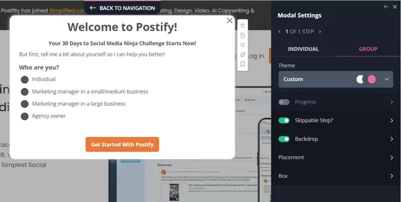
- Goals. To get an insight on what motivates users forward and what features or content they find most valuable.
- Experience. Identify the user’s level of expertise with products similar to yours so you can tailor the onboarding process accordingly without showing irrelevant information.
- Company size. To understand your customers’ needs and design your pricing plans to fit them (adding more seats, collaboration features, and so on).
Keep your welcome page simple & concise
New users might get annoyed and lose interest if you immediately bombard them with a long questionnaire. That’s why you must keep welcome surveys balanced.
In our experience, your survey shouldn’t surpass 10-15 questions, and you always need to make it skippable—unless the information is required for the product to work properly.
Remember that your welcome page sets the first impression with your product, so don’t make it more bitter than it should be, and keep it as simple as possible.
Use clear and actionable microcopy to collect helpful information
Microcopy is the small bits of text that appear across your product’s UI—including your onboarding surveys.
So instead of explaining everything in your onboarding screen, try to make your microcopy as clean and concise as possible for the user.
For this, avoid explaining information your user doesn’t need to know at that moment while keeping your vocabulary clear of technical jargon or complex terminology.
All the text your welcome page needs is the questions, answers, and contextual background information on why you’re asking such questions. Just like this example from Loom:
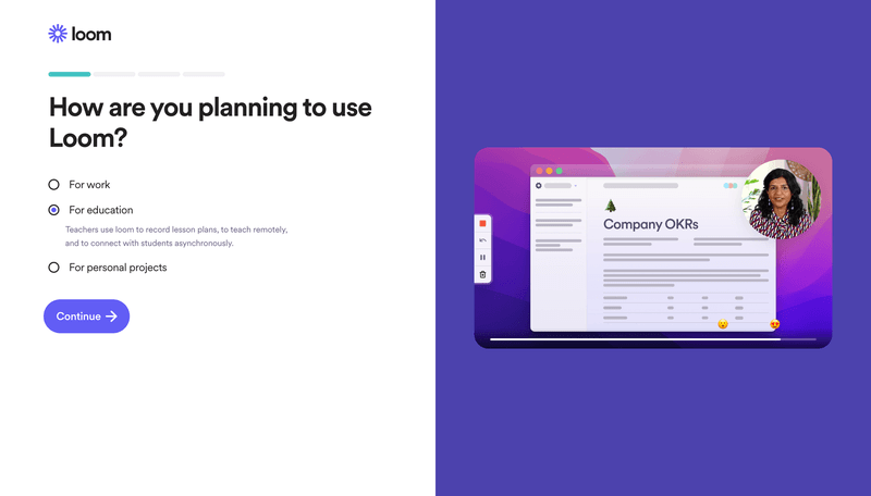
Additionally, it helps to add a sense of optimism and encouragement to your microcopy. For example, phrases like “Great job!” or “You’re almost there!” can make your language more positive and motivate respondents to continue.
Use gamification for long surveys
Gamification elements such as badges, points, and levels create a more fun experience. They are a great opportunity to add personality to your app and drive engagement.
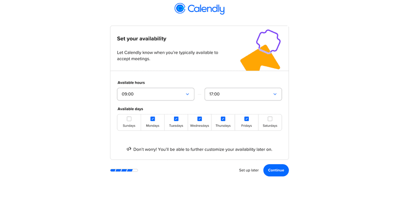
When it comes to in-app surveys, you can add a progress bar to indicate users how far they’ve progressed and how many questions are left (either with a percentage, a number, or just a visual separation). This way, you can avoid confusion when navigating through the survey.
Calendly’s onboarding setup is a subtle but great example of how to keep gamification simple and effective:
7 SaaS welcome surveys to learn from
Now that you know the theory behind welcome surveys, let’s take a look at how these seven successful SaaS companies set up their onboarding screens:
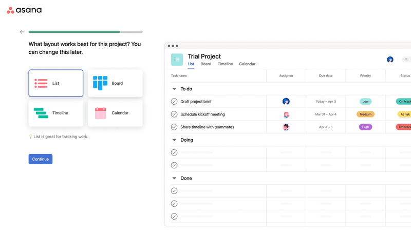
Asana – Welcome survey with skippable steps
Asana already knows their audience. They know exactly what questions are worth asking on their welcome screen to get as much information from users as possible while leaving options to opt-out.
First, they ask you immediately what your role and industry are so they can tailor the product for you and your team.
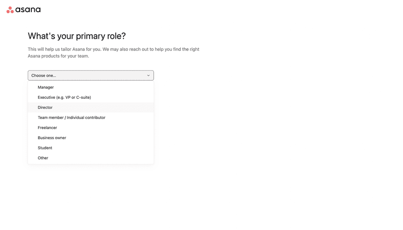
After knowing your role and title, it asks you about your main goal with Asana so they can provide you with good templates right away (and allows you to skip this step).

And finally, it lets you customize the experience and choose what layouts work best for your JTBD.
Miro – Gamified welcome survey
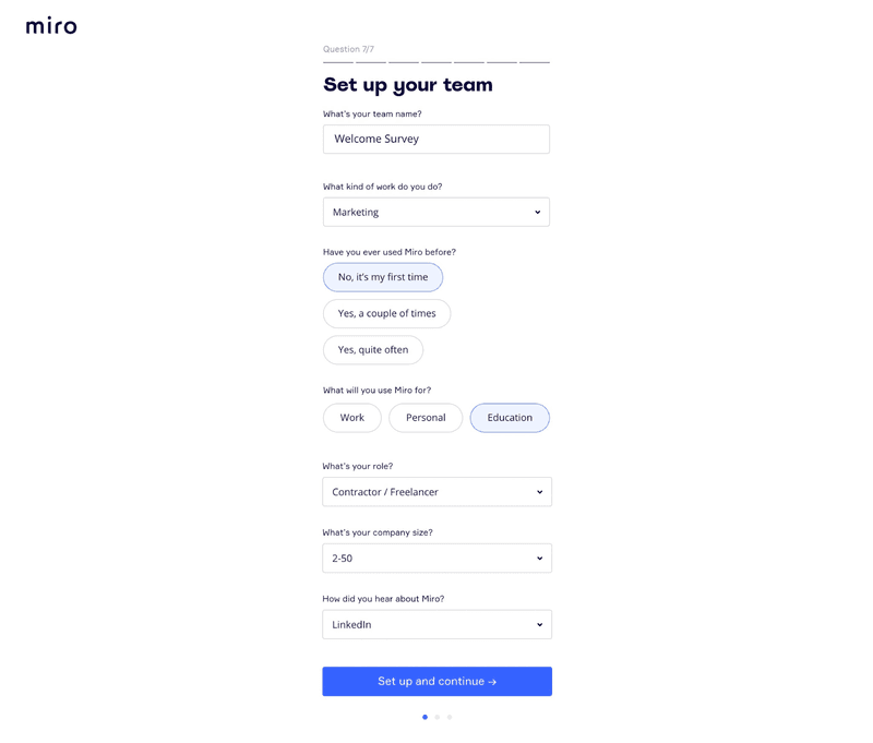
Miro’s welcome survey is able to focus the user’s attention in a way that minimizes effort to the lowest—increasing response rates.
How? It asks questions that only require one click or two to answer and in varied formats, plus the page design is so clean that every single work can be easily understood.
Airtable – Welcome survey with contextual microcopy
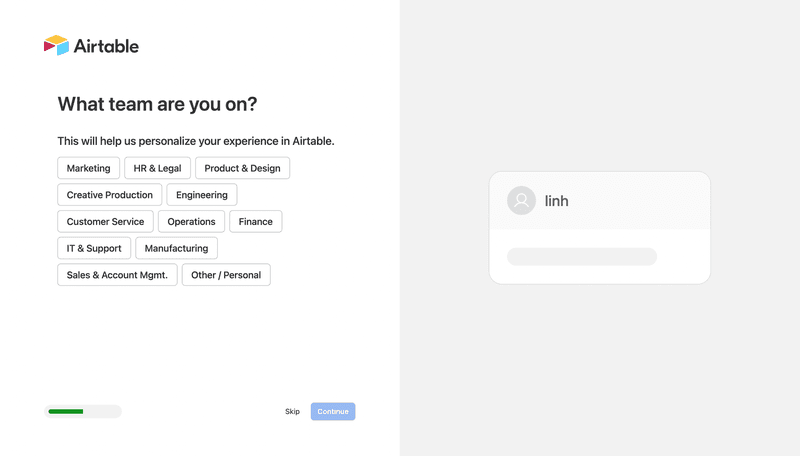
Airtable’s welcome screen is easy to respond to. But it also explains the purpose for each question so you can understand why certain information is being requested.
When users are aware and aligned with the purpose of taking your survey, they’re more likely to engage and get motivated to fill out the forms.
In the case of their onboarding survey, the fact that users are aware that their choices will affect their personalized experience makes them more likely to provide accurate and thoughtful responses.
Canva – Engaging welcome survey
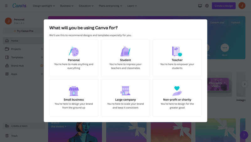
A tool like Canva can’t have a one-size-fits-all onboarding process for all users. It has a wide range of user personas, from professional designers to teachers, to corporations, etc.
Thus, in order to personalize their onboarding process, Canva segments users based on skill levels and goals by asking them about their roles and use cases. So they can, for example, offer relevant templates for your use case to play with and trigger contextual tooltips to guide new users.
Whiteboard – One-question welcome survey
Sometimes, users just want to get started as soon as possible, so you can only ask for the most relevant input to make the onboarding as frictionless as possible.
Whiteboard, for example, only asks you to choose whether you want to start with a blank canvas, select a template, or submit your own file—nothing else is needed.
ClickUp – One-page scrolling welcome survey
On the other hand, if you need to collect more information so your SaaS can work properly, you must find ways to decrease the friction so users are less likely to experience survey fatigue.
ClickUp is a great example of this, as their welcome survey allows you to scroll through all the questions on one page and know what questions you need to answer upfront. You can also skip questions as you go.

This way, it doesn’t feel like you need to go through a lot of pages to complete it, and at the same time, it doesn’t look cluttered because the screen will only show one question at a time.
Figma – Extended welcome survey after signing up
To reduce the friction your welcome survey might cause, you can divide them into parts.
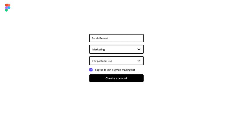
For example, Figma starts its onboarding by asking three simple questions: your name, team, and use case.
However, right after logging in, Figma asks users about their preferences to gather additional information while creating a more interactive onboarding experience. So it’s a win-win for both the user and the company.
How to create a welcome survey with Userpilot?
You can surely create a welcome survey by yourself, but how much time, money, and frustration would that get you?
With Userpilot, you can quickly build personalized, flexible, contextually relevant in-app experiences targeted to different user segments—without writing a line of code.
Here’s how:
- Create a new flow and navigate the page where users signup, then add the link to build the onboarding flow on it.
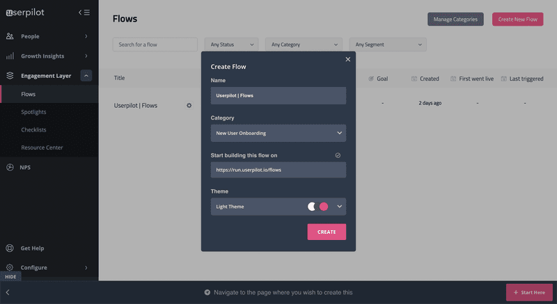
- Choose the UI pattern you wish to trigger, whether slides or modals.
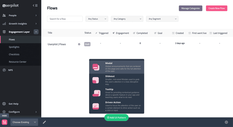
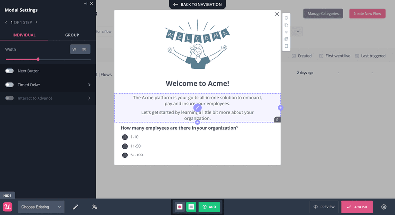
- Select a template or create the survey from scratch. Customize the design, add questions, and choose if you want to build the welcome survey as a standalone modal or as part of a progressive onboarding process.
Conclusion
Welcome surveys can make a healthy difference in your SaaS business. And with the knowledge to add surveys inside your app, you only need to take action.
So set up your goals, design your surveys, and start gathering customer information to provide a top-notch product experience that engages users.
And given that you’ll need software for this, why not try a Userpilot demo to see how quickly you can gather feedback from brand-new customers?

