
Every SaaS company faces problems—product performance issues, low NPS, churn. The real question isn’t if issues will happen, but how quickly and effectively you solve them.
That’s where root cause analysis (RCA) comes in. Instead of firefighting the same problems over and over, RCA helps you dig deeper, find the real cause, and fix it permanently.
This guide breaks down a simple, step-by-step RCA process designed for SaaS teams. If you’re ready to move beyond quick fixes and build a sustainable product management framework, this is exactly what we’ll show you from our first-hand experience!
How to carry out root cause analysis in 7 steps
Look, RCA isn’t some globally normalized process that must be followed to the teeth. On the contrary, there are too many ways to conduct a root cause analysis depending on your industry, business model, and even company size (think of Six Sigma in manufacturing, total quality management, DMAIC, etc.).
So keep in mind our process is what works for us. After all, we designed it for product management in SaaS based on core principles.
Now let’s go through the steps:
1. Make the problem more actionable
One thing is to know that there’s a problem, and another is to know the problem.
Sounds obvious, but it’s very easy to try to fix a problem with just superficial information.
Let’s say there’s an increase in churn of 9%. That sounds like a problem to solve, but how can you act on it? When is it happening? Where? And how?
That’s why you need to clearly describe the problem—so you can readily act on it.
There are many ways to approach this, but my favorite is how Duolingo created a Markov model around their main business KPI (DAUs) to grow it. In the same way, you can start from your business KPI and then break it down into sensitive metrics you can act on.
For example, if your main KPI is customer retention, some sensitive metrics can include:
- Active users
- Dormant users
- Churn rate
- New user retention rate
- At-risk users
- Resurrected users
- Product stickiness
- Usage frequency
These metrics add nuance to user behaviors, make the data more actionable, and most importantly, give you hints about where to investigate next. So if you find that most of the drop comes from the new user retention rate, you now know the problem might come from the primary onboarding process.
2. Gather and analyze data
Once you have a clear notion of the problem or performance gap, you can start investigating it.
There are two goals of this stage:
- Find empirical evidence that the problem exists.
- Examine potential contributing factors that help form a hypothesis.
The former is mostly about checking out multiple data sources to confirm that there isn’t a tracking issue (plus making sure that the whole data platform is working as intended). The latter is where you need to start collecting behavioral data you can manipulate (e.g. you can use a product analytics platform that auto-captures events like Userpilot).
This step is essential, because if the churn rate has been abnormally high in the last two months, then you can use some data analysis tools like:
- Retention cohort analysis. To segment the retention rates of different user groups and find if there’s a cohort with abnormally low retention.
- Path analysis. For tracking the journey of users who churned during this period and compare it with the path of active users.
- Funnel analysis. To map out the process where users are churning and spot a specific stage in the funnel where users are dropping off more frequently.

- Reviewing customer support activity. To identify recurring problems in support tickets, chat logs, and email threads.
Now let’s say there is, indeed, evidence that formerly active users are churning more frequently after the last update, and it correlates with the usage of a revamped core feature. This gives a direct indication that the problem lies in that updated feature.
3. Brainstorm data-driven hypotheses
The next step after locating the problem is to brainstorm hypotheses that might explain its cause.
Keep in mind these hypotheses are not just assumptions. They must be validated with data in order to have some weight in the decision-making process.
So to dig into the cause of your problem, it’s best to follow at least one of the following methods:
5 Whys
As the name suggests, the “5 Whys” method involves questioning the problem by asking yourself “why” 5 times.
Sounds simple, but the results will provide way more clarity over the problem. For example, if we continue with the high churn problem:
- Users churn after the core feature was overhauled. Why?
- They no longer experience value from it. Why?
- It’s worse at fulfilling its JTBD successfully. Why?
- It’s harder to use than the old version. Why?
- Although the new version streamlines the basic process, it’s problematic that the customization options are too deep and require a new learning curve. Why?
- Turns out a lot of users need to customize their workflow and were already used to the legacy version—and now they dislike the new version.
Fishbone diagram
The fishbone diagram is a classic method for brainstorming hypotheses. It starts with the problem as the “head” and then divides its potential cause into different categories (these are the “spines” that hold the corresponding hypotheses).
In the case of a high churn problem, for instance, it could look like this:

Fault-tree analysis
Fault-Tree Analysis (FTA) is a deductive failure analysis method used mostly in engineering (e.g. software development) to identify causal factors of a specific problem. It maps out all possible causes in a tree-like diagram and uses logical relationships (AND/OR gates) to show how multiple root causes can affect the problem.
In product management, it can help you map out how different events can cause a problem, mitigate risks, and prevent problems before they happen.
For instance, to investigate the churn increase after the update, here’s what a basic fault tree could look like:

![]()
Looking for a Platform to Help You with Root Cause Analysis? Try Userpilot

4. Conduct additional research to test the hypotheses
After generating solid hypotheses, the next process is to test and gather evidence that supports them.
The question you must ask yourself here constantly is: “Is this hypothesis true?”
For this, there are many qualitative analysis methods for testing the validity of a hypothesis. Here are some of our favorite methods:
- Usability tests. They help you test how intuitive your product is for users and identify friction.
- A/B testing. It’s perfect for validating a hypothesis based on statistically significant data.
- User interviews. You can ask your users about a specific problem and receive direct qualitative feedback about it.
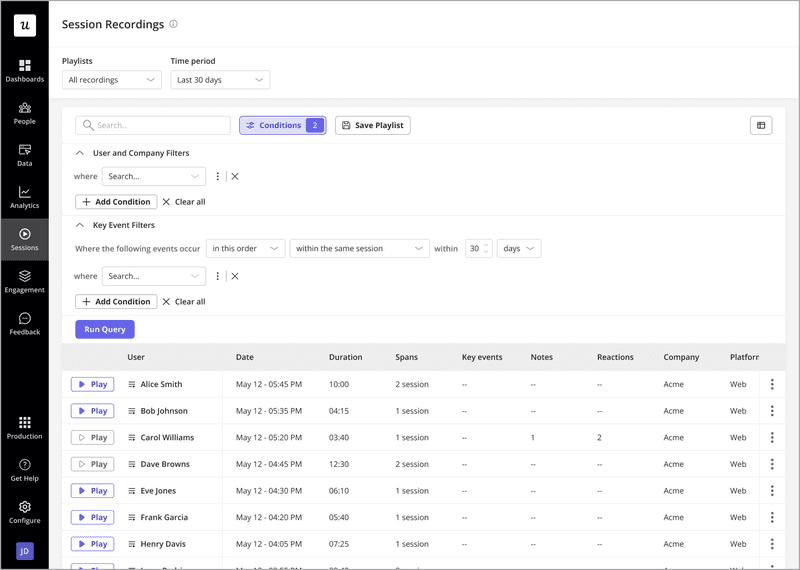
- Session replays. It lets you watch how users interact with your product and spot specific sources of friction.
For instance, now let’s say your hypothesis is that there’s a usability issue with the revamped feature (causing the increased churn rates since the update). You can segment churned users to watch their sessions and check for rage/dead clicks that might indicate a usability problem.
5. Create a root cause analysis report and set up your action plan
Now that you’ve tested your hypotheses and have solid evidence in hand, it’s time to pull everything together into a report.
This report shouldn’t just include a summary of the data you found, but also your recommended solutions.
Here’s what it should include:
- A brief explanation of the problem. E.g. active users are churning 12% more since the update.
- Priority. How much you should prioritize a problem based on its business impact (you can look for frameworks like RICE or Value vs. Effort to measure their impact). E.g. “MRR will decrease by 18% in three months if the churn problem isn’t fixed.”
- A brief explanation of the cause. Describe the cause and the risk of the problem according to your hypotheses. E.g. “There’s a high chance that the new customization options are unnecessarily complex for our user base and ruin the experience they used to have.”
- Suggested solutions. Describe what the best solution is, its risks, and the metric you’re going to use to measure success. “Make a legacy version available for former users while reworking the new UI again.”
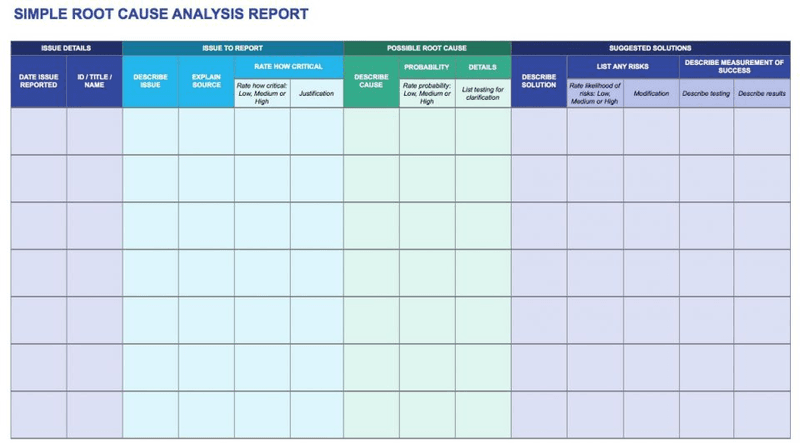
A report like this won’t only make it easier to get buy-in from leadership if you need it. It also helps you prioritize problems better and work in a more organized way.
6. Implement solutions to resolve the root cause
With your action plan in place, it’s time to roll out the solutions.
Start by addressing the highest-priority fixes first—those with the biggest impact and least effort.
For bugs, deploy the fix and thoroughly test it before releasing it to all users. For UX issues, use the data you collected to implement design changes that align with user expectations.
Communication is key here. Let your users know about the updates, especially if the issue directly impacted their experience. A simple in-app message or email update can rebuild trust with users.

For instance, if the solution to high churn is to offer a legacy version for power users. Make sure to send personalized emails to churned users to communicate the changes and invite them to come back.
7. Evaluate your solutions and iterate
Once your solutions are live, it’s time to see if they worked.
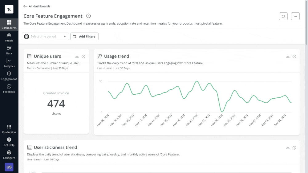
Start by measuring the key metrics tied to the original problem. So if you’re tracking churn rate, you should also keep an eye on feature engagement, new user retention, product stickiness, etc. And finally, create a dashboard to visualize these metrics and share it with relevant stakeholders to keep everyone aligned on progress.
However, some solutions require qualitative feedback to 100% assess their effectiveness.
In the case of fixing a core feature update, for example, you’d benefit from sending CSAT surveys or conducting interviews to hear directly from users if the new changes are good (rather than relying on pure data). Also, session replays will show you how users are interacting with your product after the fix—which can serve as evidence that the solution worked.
If the solution doesn’t fix the problem, though, all you need to do is to iterate another solution and repeat the process until the problem is fixed for good.
After that, move to another problem! Just remember to schedule regular reviews (quarterly or annually) to revisit past analyses and ensure that problems stay solved (without ever arising again).
![]()
Try Userpilot to Help You with Root Cause Analysis
Examples of root cause analysis in SaaS
Although I’ve been explaining the RCA process using the same churn example, it’s not the same as looking at it in a more organized fashion.
So let’s go over three examples to better illustrate the process:
Identifying reasons behind churn
I’ll pick a similar example here: investigating churn reasons.
Here’s how you can apply our process to find out why you’re experiencing more churn:
- Redefine the problem: There’s been a 20% increase in customer churn rate over the past three months, primarily among SMB clients.
- Explore the data: You take a look at usage patterns, support ticket histories, user feedback, and recent product updates. Turns out there’s a correlation between churn rates and a recently updated feature.
- Brainstorm hypotheses: High churn could be a result of recent software updates that introduced bugs or worsened the product experience. It could also be due to a price increase that was announced three months ago.
- Find evidence: After reviewing data and testing for bugs, you find that the last updates made the product experience worse due to unreported bugs on the client side. This, plus the price increase, made many SMB clients churn and look for another solution.
- Report possible solutions and deploy them: Your suggestion is to not only fix the bugs but also consider offering a lower pricing tier that fits SMB’s needs.
- Monitor results: Once implemented, you track customer churn rate and collect feedback with CSAT surveys to ensure that the problem is effectively resolved.
Investigating drop in daily active users
Now let’s change the problem to a significant drop in DAUs.
Here’s how you can trace the problem to its roots:
- Redefine the problem: Daily sessions with more than 15 minutes of activity dropped by 17% last month.
- Explore the data: You compare other data sources to discard tracking issues. Then look for user activity trends across multiple user segments to find a correlation.
- Brainstorm hypotheses: It turns out user activity dropped on new users. Maybe users feel overwhelmed with the onboarding process or trying out a new competitor in the market.
- Find evidence: You check session replays to see how new users interact with your product tour and it seems most of them ignore it.
- Report possible solutions and deploy them: If you don’t fix the post-onboarding churn, DAUs will drop by 38% in the next three months. So you propose to revamp the onboarding process replacing product tours with interactive walkthroughs.
- Monitor results: You keep tracking the activity of new users and also start triggering CSAT surveys after onboarding to confirm users find value in your product.
Uncovering reasons behind low feature adoption – Cyberbiz case study
A real-world example of a successful root cause analysis is actually one of our clients, CYBERBIZ.
They wanted to make their admin panel more user-friendly and intuitive so customers could complete their tasks more efficiently. Thus, they ended up using Userpilot to introduce new features and highlight their benefits.
This is how their analysis worked:
- Redefine the problem: Core feature adoption rates were lower than the business expected.
- Brainstorm hypotheses: Multiple reasons for low adoption might include bad usability, inefficient onboarding, or unreported technical issues.
- Find evidence: Users were struggling to understand core features and use them correctly, indicating a usability problem.
- Report possible solutions and deploy them: To solve usability, the team decided to redesign main pages and use Userpilot to add interactive walkthroughs, show in-app announcements, and send CSAT surveys to collect feedback.
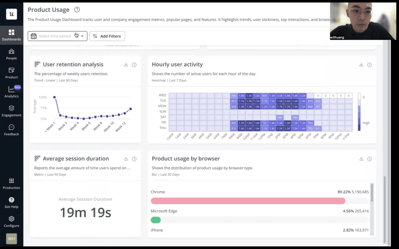
- Monitor results: To track success, they analyzed average session durations. They figured that for their features, shorter sessions meant less friction in the user experience.
Best practices for conducting root cause analysis
That said—whether you’re following our RCA process or refining your current approach—there are best practices to keep in mind before starting to solve problems.
These include:
- Don’t confuse root causes with symptoms. It’s easy to fix what’s visible, but unless you dig deeper, the same issues will resurface. Look beyond the immediate problem to find the underlying cause.
- Avoid having a bias for the first hypothesis that comes up. Use methods like the 5 Whys or Fishbone diagrams to explore all possible causes before jumping to conclusions.
- Use data to prove assumptions (not vice versa). You should only consider a hypothesis with evidence that supports it. No exceptions.
- Involve cross-functional teams. Invite people from engineering, product, customer success, and support to give their perspectives. Especially when it’s a problem that affects them.
- Promote a blame-free culture. Just don’t take your company’s problems so personally.
- Treat RCA as an ongoing process. Regularly review your RCAs, look for patterns, and proactively address risks before they escalate.
Ready to perform root cause analysis?
Putting out fires is part of product management. But with effective root cause analysis (RCA), you can at least stop them from reigniting.
By following the process we explained above, you’ll break the cycle and keep your product moving forward.
So if you’re looking for a platform that can help you with your RCA process, consider booking a Userpilot demo to solve product-related problems.
![]()
Looking for a Platform to Help You with Root Cause Analysis? Try Userpilot
FAQ
What is root cause analysis?
Root cause analysis (RCA) is a method used to identify the underlying cause of a problem, allowing teams to address the issue at its source rather than just treating symptoms.
What are KPIs in root cause analysis?
Key Performance Indicators (KPIs) are metrics that help measure the impact of a problem and the effectiveness of solutions. In RCA, KPIs like churn rate, NPS, or feature adoption guide the investigation and track progress.
About the author