Really Good Onboarding UX Examples to Learn From

Most drop-offs happen during the first session. In our SaaS Product Metrics research, we found that with the average time-to-value just over a day, even small friction in the onboarding process can push users away quickly.
I’ve seen this play out with customers like Kommunicate. Most users engaged with only a few core features, while support kept getting questions about features that already existed. The issue wasn’t missing functionality but how the onboarding flow guided users.
That’s why good onboarding focuses on helping users take the next step, not showing everything at once. The best user onboarding examples reduce friction, guide users inside the product, and help them reach value early.
To see what actually works, I tested the onboarding flow of 30+ SaaS tools. Only 11 stood out.
In this article, I’ll break down the best user onboarding examples and show how you can build a better onboarding experience.
11 Onboarding UX examples to inspire your own
To put this list together, I signed up for each tool and went through the interactive onboarding flow step by step. The examples below come from that hands-on app experience and show how different products make the next step obvious and help users get to value without friction.
1. Slack helps users familiarize features through empty states
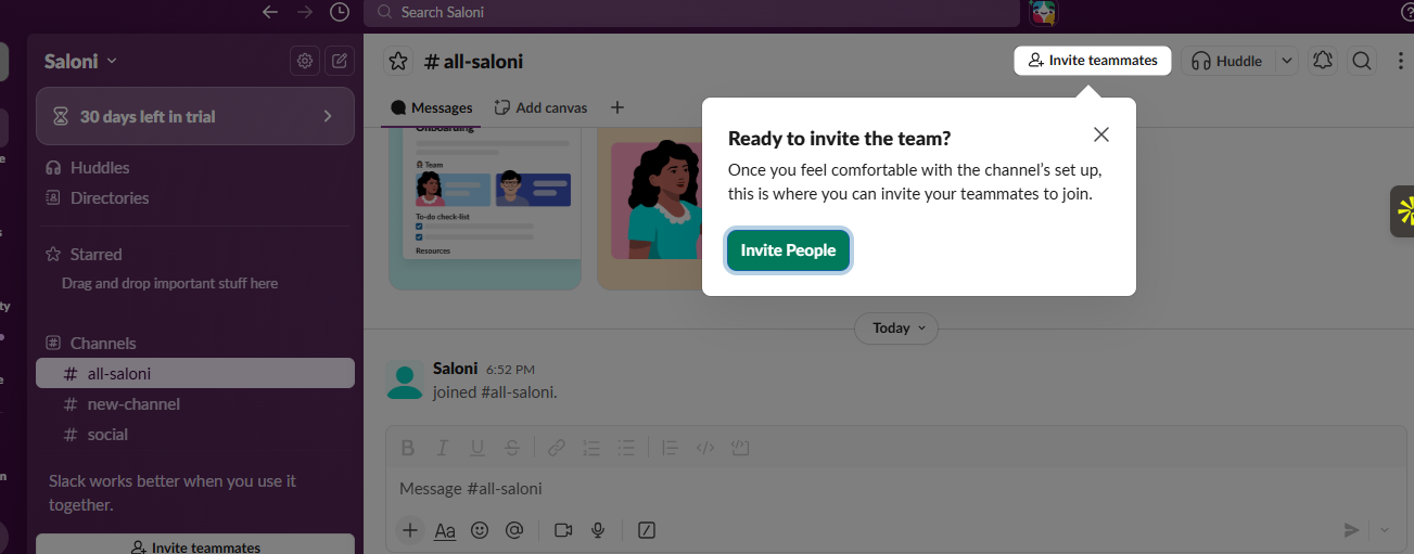
When you first log into Slack, you don’t see a blank screen or a long product tour. Instead, Slack relies on empty states to guide users through the onboarding process.
An empty state in SaaS is what users see when there’s no data yet. Slack uses these spaces to provide context. When you open a channel with no messages, the interface explains what the channel is for and prompts you to either send your first message or invite teammates.
Slack also uses Slackbot, a user-friendly automated bot, to send a direct message. When you reply, you learn the core functionality of sending messages by actually doing it.
Why this works:
Slack reduces friction by guiding users inside the interface, so they learn by doing instead of reading instructions. This lowers cognitive load and removes guesswork, since the next action is always clear.
💡 The takeaway:
Focus on writing impactful microcopy inside empty states. Write short, action-led prompts that tell users what to do next and why it matters. For example, instead of “No messages yet,” guide the action with something like “Send your first message to start the conversation.”
2. Notion personalizes the onboarding flow based on user personas
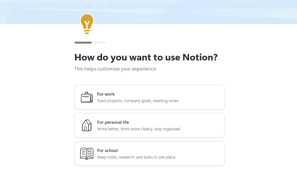
When users sign up for Notion, one of the first things it asks is how they plan to use it, whether it’s for work, personal use, or school. It also asks about their role. They shape the entire user onboarding process.
Based on these answers, the workspace users land in feels different. If they’re working in a team, Notion sets up project boards, meeting notes, and docs. It even pre-populates them with example content, so they can see how everything fits together without starting from scratch.
I find this especially effective onboarding because you’re not guessing how to use the product. The structure is already there. You can explore, edit, and adapt it to your needs from the first session.
Why this works:
Notion reduces friction by tailoring the workspace to each user’s intent, so they recognize familiar setups instead of figuring everything out from scratch. This leans on recognition over recall, which makes it easier to start using the product right away.
💡The takeaway:
Use segmented onboarding. Ask 1–2 focused questions upfront, such as use case or role, and map each answer to a specific starting point inside the product. Pre-load that experience with relevant templates or examples so users can start working without setting things up from scratch.
3. Duolingo gets users to learn by doing from the first interaction
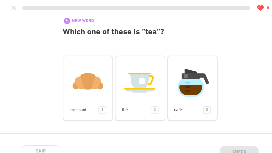
After choosing a language and a daily goal, Duolingo moves you straight into a short activity. You see a simple prompt with visual options, and you’re expected to respond right away.
There’s no moment where you’re figuring out what to do next. The interface makes it obvious. You tap, get user feedback, and move forward. Within a few seconds, you’re already translating words and matching phrases, which is the core action Duolingo is built around.
I like this because it skips the usual onboarding process most apps rely on. Instead of preparing users, it lets them start. That shift makes the onboarding experience feel lighter and keeps new users from dropping off early.
What it does well
Duolingo gets users to take small actions right away and shows instant feedback, which builds early confidence and momentum. This leans on learning by doing and immediate feedback loops, where quick wins push users to continue.
💡The takeaway:
Design onboarding around time-to-first value. Aim to get users to a real outcome within the first session, ideally within minutes. Top-performing products hit value in under 5 minutes, and even small delays reduce conversion and retention.
4. Dock.us guides users with a structured onboarding workspace
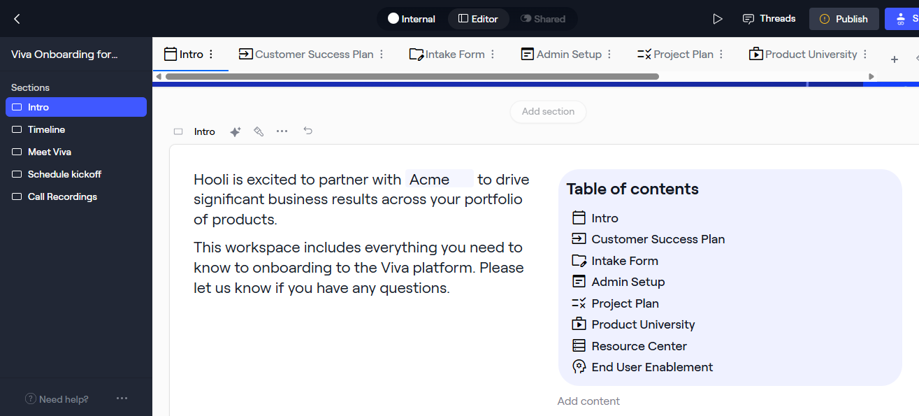
After signing up for Dock, you’re dropped into a workspace that already looks complete.
There’s a clear structure in front of you, like sections like kickoff, timelines, resources, and next steps are already laid out. You can move through it, click into different parts, and understand how everything connects without needing instructions.
What I like here is that Dock doesn’t expect you to figure out the onboarding process on your own. It shows you what it should look like from the start.
Why this works:
Dock removes the need for users to plan or structure things upfront by showing a complete, ready-to-use workspace. This reduces decision fatigue and relies on clear mental models, where users follow a visible structure instead of figuring it out themselves.
💡The takeaway:
If your product involves structured workflows, start users with a complete, pre-built setup that reflects the ideal flow. Then let them edit and adapt it as they go without needing to plan everything from scratch.
5. Dash helps users find content instantly with a search-first onboarding flow
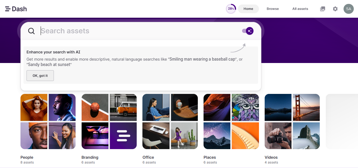
When you land inside Dash, your attention goes straight to the search bar. It’s the most prominent onboarding element on the screen, and everything else supports it.
You also see example content right away, like images, categories, and suggestions that make it clear what you can do. There’s even a hint showing how to search using natural language. You don’t need to explore menus or settings to figure things out. The product shows you how it works up front.
I like this because there’s no delay between signing up and understanding the value. You can start searching for files, images, or documents immediately, even before uploading your own files.
Why this works
Dash puts the core action front and center and lets users try it immediately with real examples. This leans on recognition over recall, where users understand what to do by seeing and interacting instead of figuring it out.
💡The takeaway:
Make your core feature the most visible element on the first screen so users can understand what the product does within seconds. Bring value forward by letting users interact with it right away instead of placing it behind account setup steps.
6. Calendly guides users to create and share their first event quickly
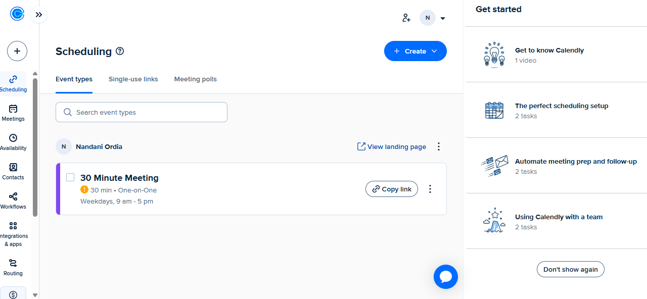
The first thing you notice in Calendly is a ready-made event with the meeting type, timing, and shareable link already in place. Even if you haven’t explored anything else, you immediately understand what the product does and how to use it.
You can copy the link, open the booking page, and experience the flow from the other side within seconds.
I’ve seen many onboarding experiences focus too much on setup. Calendly flips that. It brings you close to the outcome first, then lets you adjust things if needed.
Why this works
Calendly shows a working outcome from the start, so users know exactly what they’re trying to achieve and how to get there. This builds goal clarity and reduces cognitive load, since the next step is already visible.
💡The takeaway:
Make the outcome visible early so users can see what they’re working toward. When the end result is clear from the start, users move forward without second-guessing the next step.
7. Dropbox nudges users to upload their first file right away
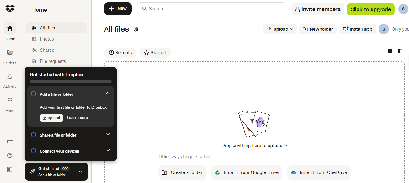
Dropbox doesn’t leave you staring at an empty dashboard.
The moment you land inside, the interface points you toward one thing, i.e., adding your first file. There’s a large upload area in the center, and a checklist on the side that breaks down what to do next. You don’t need to explore menus or guess where to start. The product tells you.
What I like here is how everything reinforces the same action. The empty space, the upload button, and even the checklist all push you in the same direction. It’s hard to miss what you’re supposed to do.
Why this works
Dropbox focuses users on one clear action and reinforces it across the interface, so there’s no confusion about where to start. This taps into the Zeigarnik effect, where users feel motivated to complete tasks once they’ve started making progress.
💡The takeaway:
Make the first action obvious and reinforce it. If users know exactly what to do when they land in your product, they’re more likely to take that step. In my experience, good onboarding doesn’t leave users guessing, but it points them forward.
8. Canva personalizes onboarding with template-driven workflows
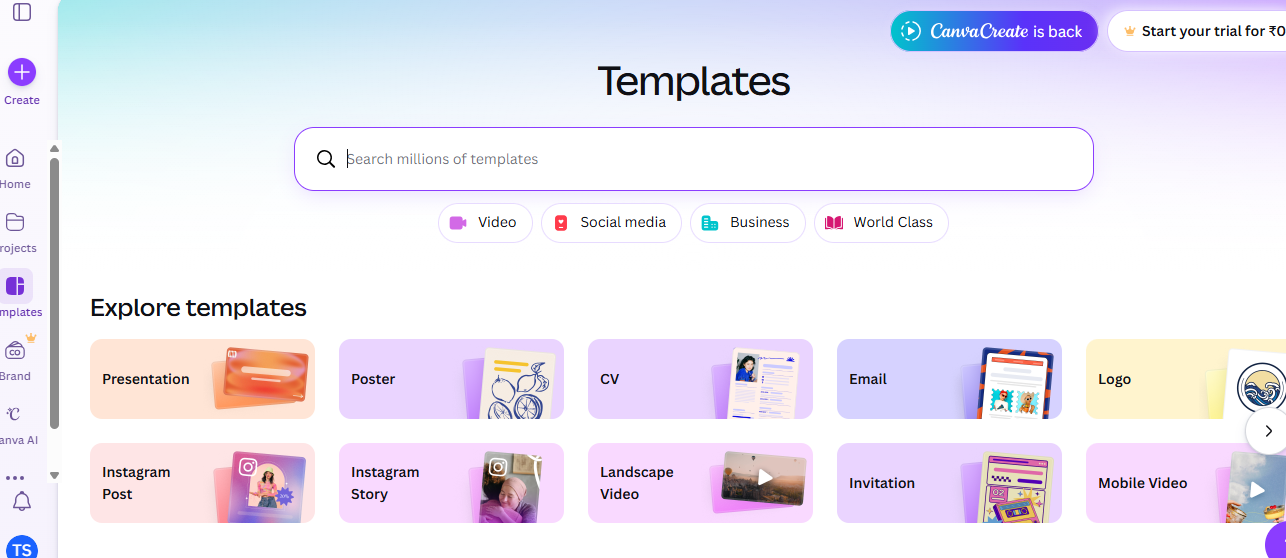
Canva is a massive design platform with hundreds of tools. If they tried to explain every feature during the signup process, users would panic. Instead, Canva asks you what you want to design: a presentation, an Instagram post, or a flyer.
Based on your choice, Canva drops you into the editor with a relevant template already loaded. They use subtle interactive walkthroughs to point out the specific tools you need for that template. If you choose an Instagram post, they show you where the photo filters are. They don’t bother showing you the chart-making tool until you actually click the charts tab.
This is the essence of contextual user engagement. Give the user the exact information they need, at the exact moment they need it, and nothing else.
Why this works
Canva narrows the experience based on user intent and reveals features only when they’re needed, so users stay focused on one task at a time. This uses progressive disclosure, which reduces decision fatigue by limiting how much information users see at once.
💡The takeaway:
If your product has multiple use cases, don’t try to explain everything at once.
Start with what the user wants to accomplish and guide them from there.
In my experience, onboarding works best when it feels like progress. When users can achieve something tangible early on, they’re more likely to stay engaged and explore further.
9. Toggl gets users to start tracking time immediately
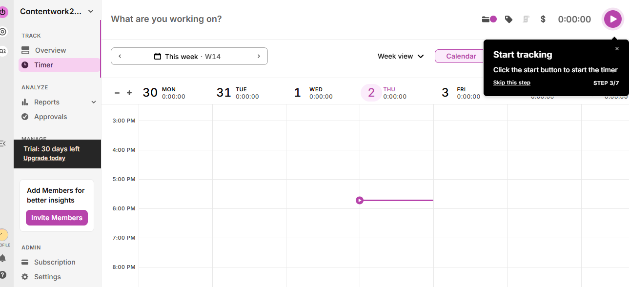
With Toggl, there isn’t much to figure out. The screen is mostly empty, except for a timer and a clear prompt pointing you to start it.
You see a short message telling you to click the start button, and that’s pretty much it. There’s no pressure to configure anything first. You don’t have to set up projects or fill in details before you begin.
What stands out here is how little the product asks from you. You don’t need to create projects or organize anything up front. You can begin tracking time first and deal with the rest later.
Why this works:
Toggl removes anything that could delay the first action, so users can start tracking time without setup. This follows the principle of reducing friction to action, where fewer steps increase the likelihood of users getting started.
💡The takeaway:
Make the first action effortless.
If users can get a feel for the product right away, they’ll understand it faster and are more likely to keep going.
10. Mural guides users inside the canvas with contextual prompts
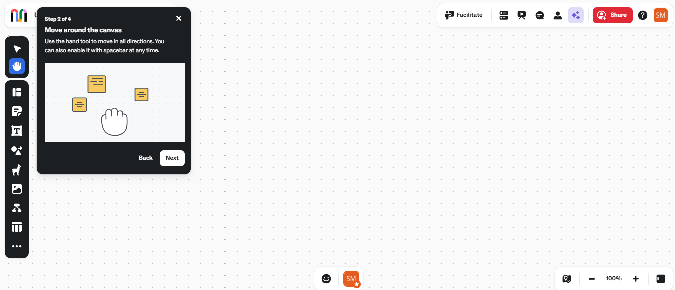
When you open Mural for the first time, you’re dropped straight into a blank canvas. Mural places small, focused prompts directly inside the workspace. You’ll see short tips like how to move around the canvas or zoom in and out, right when you need them. The instructions are tied to the exact action you’re trying to take, so you don’t have to pause and think.
At the same time, the toolbar sits right next to you with clear visual icons like sticky notes, shapes, and text, which makes it easy to start interacting immediately.
I like this approach because it respects how people actually learn. When you’re on a visual board, the fastest way to understand it is by moving, clicking, and placing things. And not by going through a long tutorial.
Why this works
Mural places guidance inside the workspace and reveals it only when users need it, so they can act on it right away. This uses contextual learning and progressive disclosure, which reduces cognitive load by tying instructions to real actions.
💡The takeaway:
If your product has a complex interface, don’t try to explain everything at once.
Guide users inside the environment where the action happens. When users can learn while doing, they build confidence faster and reach value much sooner.
11. Userpilot drives onboarding with in-app guidance and contextual flows
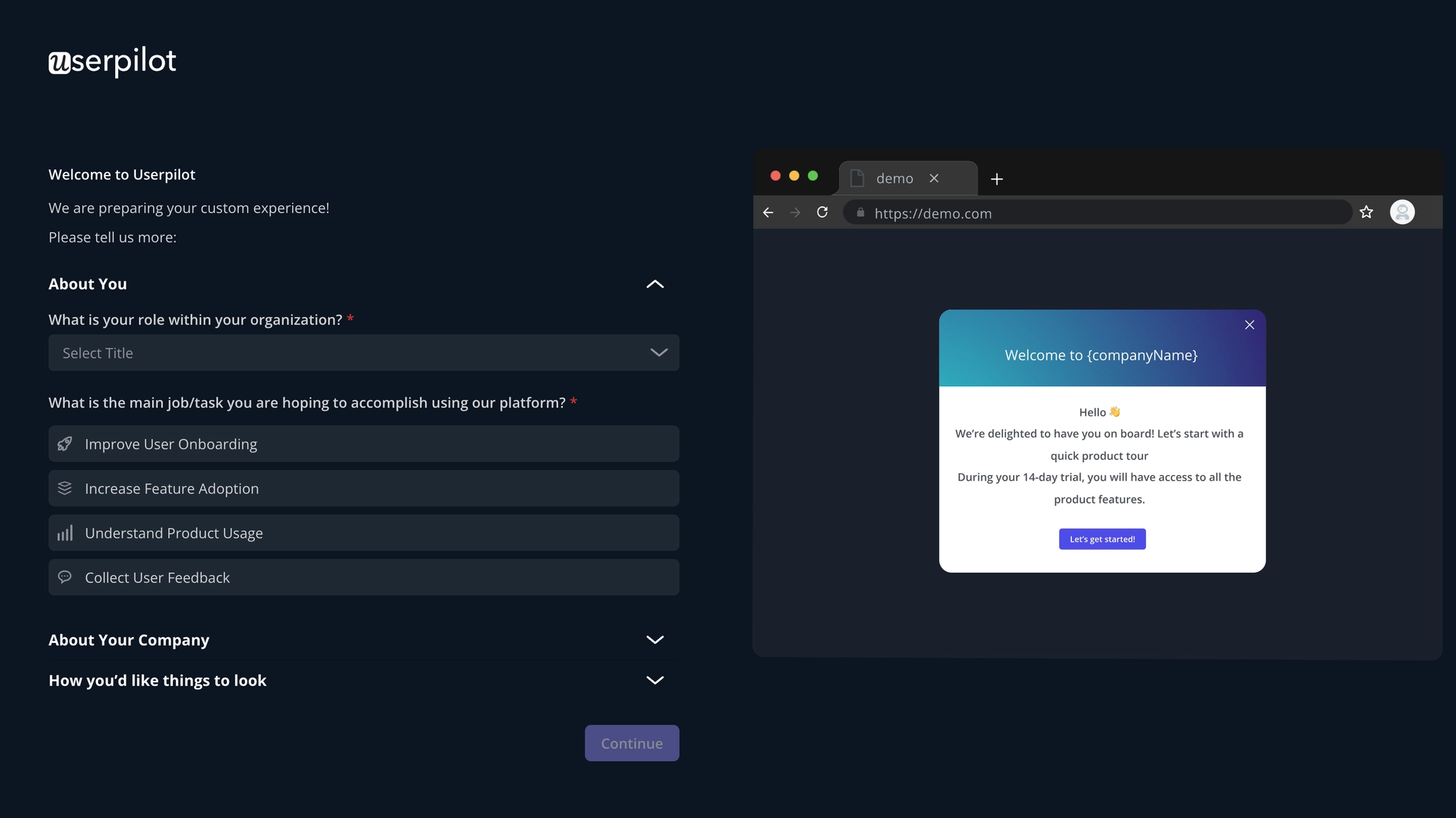
Inside Userpilot, the fastest way to understand the product is to start building something, and that starts with a few simple questions about your role and goals.
Instead of showing a static dashboard, Userpilot layers guidance directly on top of the UI. As you move through the product, you’ll see tooltips, checklists, and prompts that guide you toward setting up your first flow or tracking events. Each step is tied to a real action.
We’ve designed the guidance to adapt to what you’re doing, so each prompt is tied to the next meaningful step instead of showing everything at once. This keeps the experience focused and helps users start using features without needing to memorize how the product works.
Why this works
Userpilot guides users inside the product with step-by-step prompts that are triggered based on what they’re doing, so they can take action without pausing to figure things out. This uses contextual guidance and behavior-driven onboarding, which reduces cognitive load and builds momentum through small, completed steps.
💡The takeaway:
Userpilot is a great example of how onboarding should work inside a product. Instead of relying on static tours or documentation, it focuses on guiding users in real time, based on what they’re trying to do. If you want to improve your onboarding experience, teach users through actions that actually help them reach value faster.
TL;DR: What do the best user onboarding experiences have in common?
From what I’ve seen across these user onboarding examples, the biggest thing is how the onboarding experience is designed.
Across the best user onboarding experiences, a few patterns show up consistently:
- They focus on immediate value instead of long product tours.
- They adapt to different users and user personas.
- They break the user onboarding process into small, actionable steps.
You can tell what to do next without reading anything
When the interface is intuitive, users can jump straight into the product and start using basic functions without needing a manual or a long explanation. The next step feels obvious.
This behavior isn’t new. Back in the 1980s, researchers at IBM described something called the “paradox of the active user.” The idea is that most users skip instructions and start using the product immediately. I’ve seen this play out across almost every onboarding example since then.
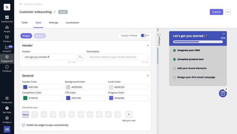
So instead of forcing users through a rigid onboarding flow, the best apps design onboarding around action. They use visual cues, placement, and context to guide users inside the interface itself. If you’re building your own onboarding strategy, focus on helping users take action early. One way to do this is by creating checklists tied to specific user goals, like setting up a feature or launching a flow, and showing them at the right moment.
With Userpilot, you can build these checklists without code and target them to different user personas. So instead of showing the same onboarding flow to everyone, you teach users based on what they’re actually trying to achieve.
You feel like a power user on day one, even if you aren’t
According to Miller’s Law, users can only process a limited amount of information at a time. When the interface throws everything at them, it ends up overwhelming users, and that’s where drop-off happens.
The best user onboarding experiences avoid this by keeping things simple. They guide users through basic functions first, then gradually introduce more as users move forward in the onboarding process.
You’ll often see progress bars, short onboarding steps, and subtle visual cues that help users complete small actions without needing a long product tour.
If you’re designing your own onboarding strategy, break the entire onboarding process into smaller milestones tied to user goals. With Userpilot, you can build no-code checklists for different user personas and add progress bars to gamify the onboarding experience. It reduces cognitive load, and users focus on one action at a time instead of trying to process everything at once.
You feel the product shrink to fit your use case
A tailored onboarding flow starts by asking a few focused questions, like role or goal, and uses those answers to decide what users see first.
A marketer might see campaign tools first, while a product manager sees analytics or workflows. The same product, but a different starting point.
This keeps the initial view relevant and cuts down the number of choices users face. With fewer paths to scan, users can start using the product without figuring out where to begin.
You get personalization that doesn’t feel like data collection
Personalization works best when it doesn’t slow users down.
A common onboarding mistake is turning signup into a long form. Too many questions during account creation break momentum, especially when users are trying to get started quickly.
A better approach is to ask only what’s needed to set the initial direction, then adjust the experience based on how users interact with the product.
When everyone goes through the same onboarding, users end up sorting through steps that don’t match their goals. Good segmentation avoids that by showing only what matters first.
You’ll see this across many of the best user onboarding examples, especially in mobile app onboarding. The product starts simple, then evolves as users move forward in their user journey. Advanced users see more depth over time, while new users aren’t overwhelmed.
Real-time personalization builds on this by responding to user behavior as it happens. As users click, explore, or skip steps, the product adapts what it shows next, keeping the experience relevant without adding friction.
You break something on day one, and the product handles it gracefully
No matter how well onboarding is designed, users will make mistakes early on. What matters is how quickly the product helps them recover.
Clear error states that explain what went wrong and what to do next, keep users moving without confusion. Instead of leaving users stuck, the product guides them back to the next step.
Good onboarding UX also adds support inside the product. Contextual in-app guidance, like tooltips or embedded help, ensures users don’t have to leave the interface to figure things out. This is especially useful for first-time users navigating new or complex processes.
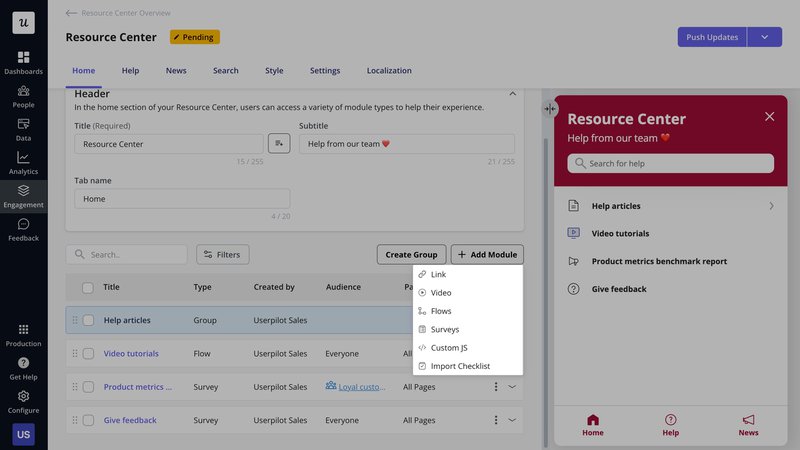
With Userpilot, you can go a step further by adding embedded help centers directly inside your product. So when users get stuck, they can find answers without interrupting their flow.
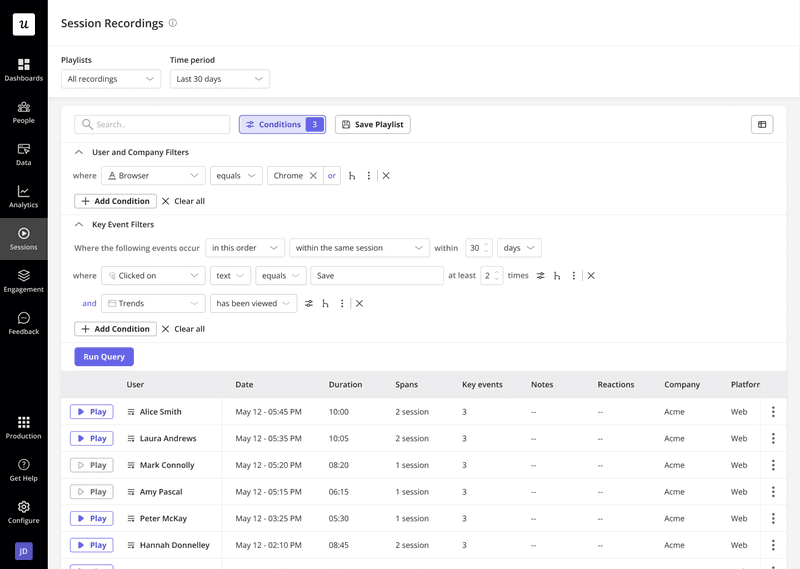
You can also use funnel analysis to see where users drop off in the onboarding process, and session replays to understand what’s causing friction. Instead of guessing, you can watch how users interact and fix the exact points where they struggle.
Build better onboarding flows
Good onboarding helps users take action quickly and see value without friction.
The best flows keep things focused, show the next step, remove unnecessary steps, and guide users inside the product as they go.
With Userpilot, you can build contextual in-app guidance, personalize flows for different users, and track drop-offs to keep improving the experience.
Keep it simple, keep it relevant, and help users move forward from the first click.
FAQ
What are some unique and cool app onboarding experiences?
Some of the most interesting onboarding experiences come from tools that keep things simple and action-focused.
For example, Arc Browser introduces its interface through a guided setup, helping users understand the key features without overwhelming them. Superhuman takes a more hands-on approach by guiding users through setup step by step, so they can start using the product quickly after the signup page.
What is onboarding in UX?
Onboarding in UX is how you help new users get started and see value quickly. It begins right from the signup page and guides them toward using a key feature without confusion.
Instead of explaining everything, good user onboarding shows users what to do next. It keeps things clear, especially in a mobile app, where attention is short. When users don’t have to stop and think, they move faster, and that’s what supports product growth.
How to design an onboarding flow?
- Define the outcome users want to achieve in their first session.
- Map the shortest path from signup to that first action.
- Break the flow into small, clear steps that guide users forward.
- Introduce one core feature at a time based on what users are trying to do.
- Use in-app prompts, checklists, or tooltips to support actions inside the product.
- Track user behavior and refine the flow based on where users drop off.
How long should onboarding last?
Onboarding should last until users reach activation, the point where they experience real value from your product.
In most cases, this should happen as quickly as possible, ideally within the first session after signup, since reducing time-to-value is critical.
Instead of showing everything upfront, guide users step by step toward key actions. You can introduce advanced features later as users become more familiar with the product.
This keeps onboarding focused, reduces cognitive load, and helps users reach value faster without feeling overwhelmed.

