SaaS Welcome Screen: A Guide for Creating an Excellent First Impression
Welcome screens in SaaS apps are an underutilized piece of real estate that can be so much more than just a welcome message in your onboarding flow.
A well-designed welcome screen can have a significant impact on your new user activation, customer engagement, satisfaction level, and ultimately, churn and retention. They can help you convert more users from viral user referrals. If you think I’m overselling it – keep reading.
And yet, according to our State of SaaS Onboarding research – 33% of SaaS companies don’t have them at all.
So, how to design the perfect product welcome page for your SaaS to turn it into a tool for segmentation, personalization, and conversion rate optimization? You will find all the answers below!
What is a welcome screen?
Welcome screens, also called welcome pages, are the first thing that users see when they log in to your application for the first time. They usually include important information to guide users and can include a survey to collect valuable data for personalization.
A welcome screen is often combined with a SaaS welcome email to capture a user’s attention and guide them toward success.
Why do you need a welcome screen for your app?
Let’s look at a few reasons why having a welcome screen is essential for your SaaS product.
1. Greet users as they initiate their customer journey in-app
But being cutesy with your welcome screen message will not compensate for poor new user onboarding. Your users want to reach their professional goals with your tool and meet their expectations as fast as possible. We are here to do business, not make friends after all.
That’s why it is so important to use your welcome screen to segment your new users, and then show them the right experience flow that will get them where they want to go.
2. Segment your users
Now, depending on how complex your product is you may be targeting several different personas, who want to do very different things inside your app.
Let’s take our own example: Userpilot is a product growth platform for product teams.
But what does this really mean? In practice, Userpilot can be used by:
- A Product Marketing Manager or a Product Manager who wants to build a new user onboarding flow without involving their devs
- A PM who wants to run an NPS survey in-app
- A PMM who wants to announce new product launches inside their app
- A Customer Service Manager who wants to quickly promote their new webinar to a specific segment of users
- A UX designer to test product usability
…as you can see, these use cases and goals are very different.
We can’t risk dragging a busy PM through a long product tour about building onboarding experiences if all they came for is the NPS (which is why everybody hates product tours, btw.)
So we need to ask them who they are, and what they want to do.
And the welcome screen is the perfect place to do this.
Some of our users have already implemented this:
Kontentino decided to put the microsurvey in the second part of their welcome screen.

We will talk about how to put that microsurvey into the welcome screen a bit later, plus how to gamify the whole experience.
But now – think about how asking these questions impacts your user’s experience later.
Look at ConvertKit’s (an email marketing platform for creatives) welcome screen:

If you’re moving from another email marketing tool, you probably have an email list that you want to import.
You will also be more familiar with email marketing in general – so ConvertKit can skip some of the basic explanations for you.
On the other hand – if you’re a complete newbie – you may need help with basic things.
Your user journey milestones and the ‘Aha moment’ will also be completely different:
- As an email marketing newbie, it may be when you’ve collected your first 100 subscribers
- For a seasoned email marketer, it may be when you see how easy it is to create an automated email sequence
As you see, what answers your users give in the welcome survey should determine what they see next.
That’s why early user segmentation is so important.
2. Personalize the onboarding journey to shorten time to value
To follow up on what we’ve discussed in the previous point – ConvertKit’s onboarding flow really differs depending on your answer:
If you said you are moving from another tool, it would make sense to ask which one and offer customized help with the move, right? Duh!
ConvertKit did exactly that:

This is what ‘advanced’ email users see in the next step: a checklist pointing them straight to the advanced email features:

On the other hand, when you choose ‘I’m just starting with email’ in the first step, you get a different next step:
This checklist points them to the basic features that will allow them to collect their subscribers and perform basic actions (sending the first email).

As you can see – the microsurvey in the welcome screen is essential to providing the user with a more relevant onboarding experience.
This allows the app product manager or marketer to build an interactive, personalized walkthrough instead of the boring, old-school product tour.
As a result, the users achieve their goals faster, become more satisfied, and stay for longer.
We will see how to build such welcome screens in the following sections.
3. Don’t lose invited users
‘John is inviting you to join his workspace!’ – we all know these emails.

But if what happens next looks anything like this:

…things may get a little…difficult.
As an invited user, how are you supposed to figure out how to make the best use of your invite if all you see is an empty dashboard?
No onboarding flow, no tooltips helping you pick up where John left off, nothing?
This is another excellent example of a use case where the right welcome screen can save the day.
Design a different welcome screen for invited users, reflecting the use cases an invitee may find themselves in.
Since StoryChief is a platform for writing, editing, and pushing content to different channels – blogs and social media – an invited user may need to either edit someone else’s post, schedule a social media post with links to the published content, or write a (guest) post of their own.
Giving them the option to pick their use case and then showing them how to accomplish their goals will significantly reduce their TTV – and thus make StoryChief a more productive content collaboration tool.
4. Convert more people from user referrals
Now, there are invites and there are invites.
If you’re lucky enough to have a product with a viral coefficient (meaning each of your users generates a certain number of new users by some sort of an invitation or referral – think early Facebook or Dropbox – a welcome screen will give you an opportunity to convert more of this kind of users.
Each time a user sends an invite, you have an opportunity to convert the invitee into a new user.
But you need to really sell the tool to such invitees – remember, they haven’t made the decision to join themselves. And it’s not the inviting user’s job to convey the value proposition of your product.
So make sure that in your welcome screen for the referee you include information about your product
Like in the example below:

How to create welcome screens? (+Successful examples)
Now that we have discussed the different upsides of welcome screens, let’s zoom in on the specific UI patterns that will allow you to reap these benefits. We’ll show you how to build them + a few good examples.
Building a SaaS app welcome screen from scratch
If you opt for a code-free product experience tool like Userpilot to build your welcome screen – it will literally take you minutes to design one.
Plus – it will be easier to segment the users by responses, and instantly trigger the right follow-up onboarding experiences.
So – here’s how to build a welcome screen in Userpilot:
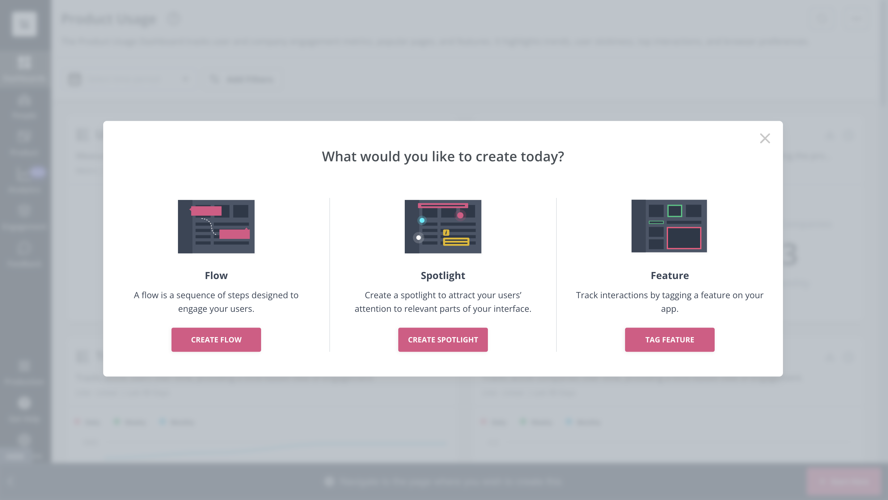
Go to the web page where you want the welcome screen to appear and turn on Userpilot’s Chrome extension. Click on +Create New and then on +Start Here. Choose the Flow option to start creating your first screen.
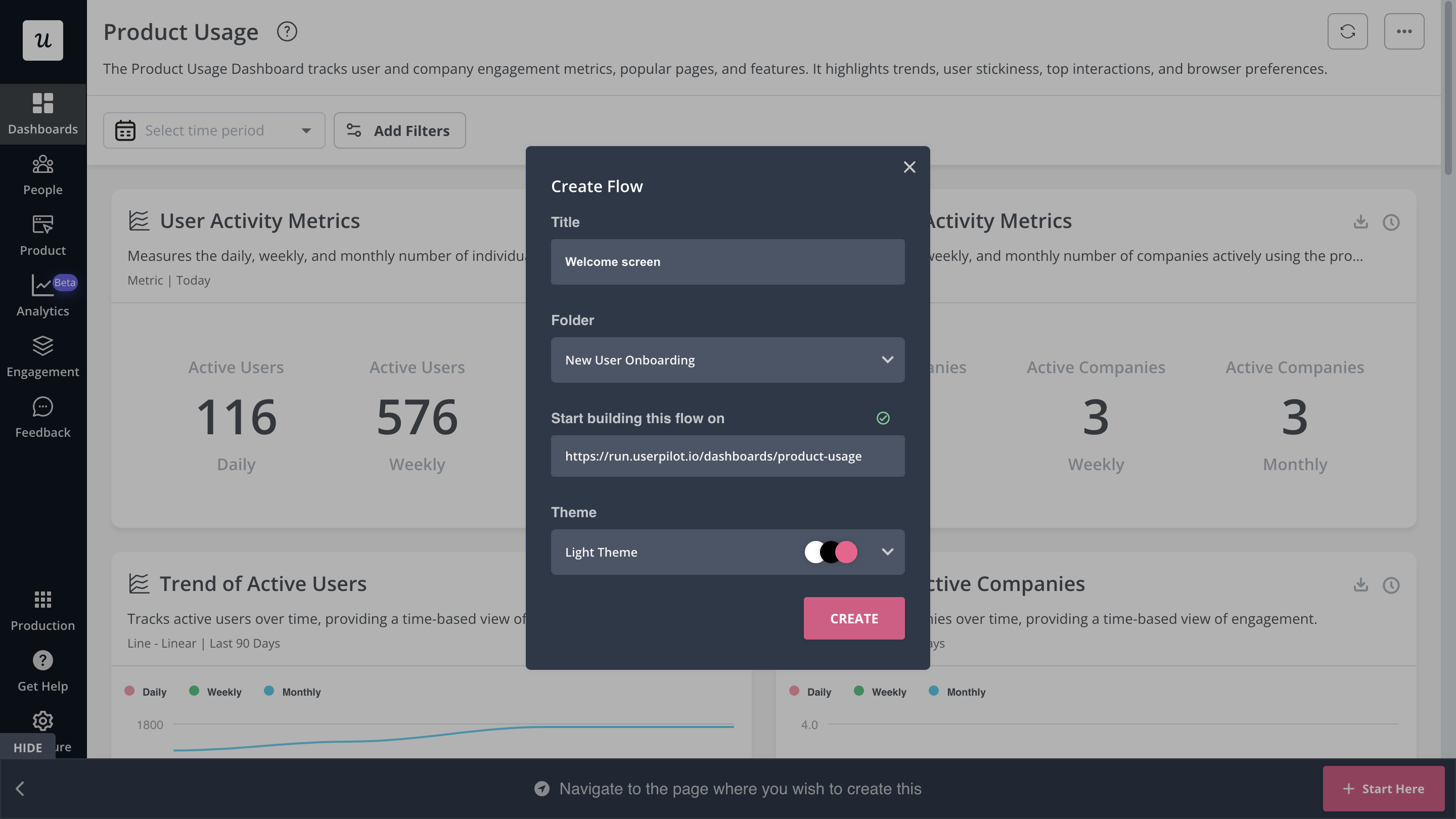
Give your welcome screen a name and select the relevant theme.
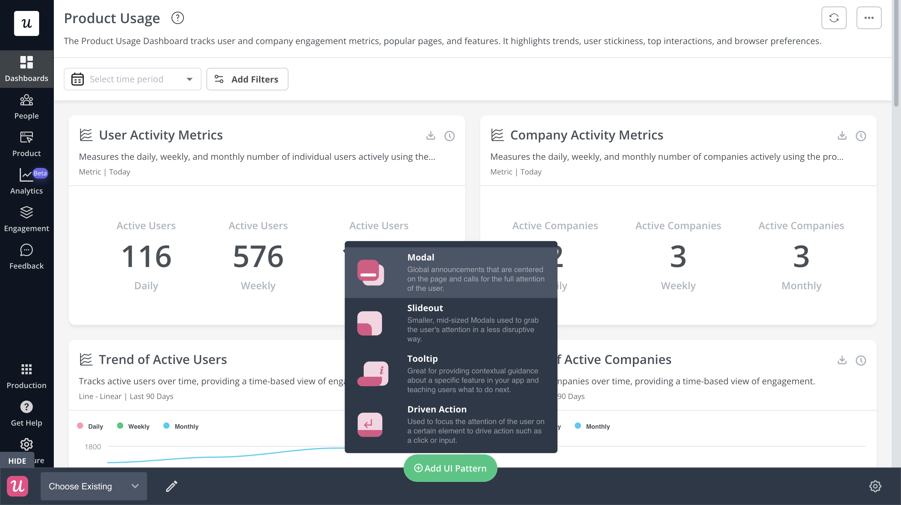
Choose a UI pattern to build the welcome page. We suggest going for a welcome modal.
Choose a template or if you like a more hands-on approach, create the modal from scratch.
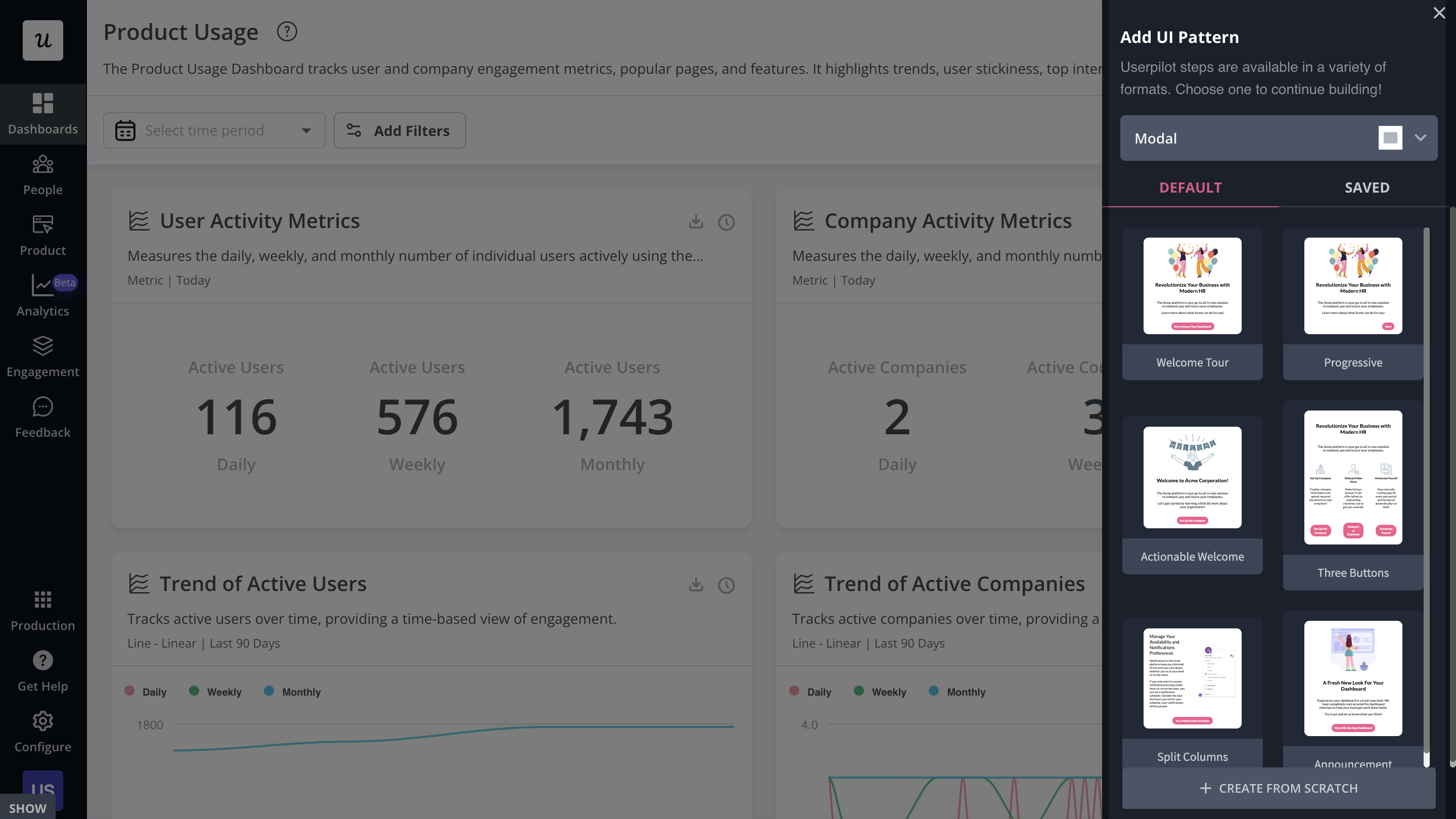
From over here, adjust the copy of the welcome message. You can use Userpilot’s AI writing assistant feature to help you create a simple message that is also impactful. Change the image, adjust its placement, and increase the background opacity – there are a ton of features to play with.
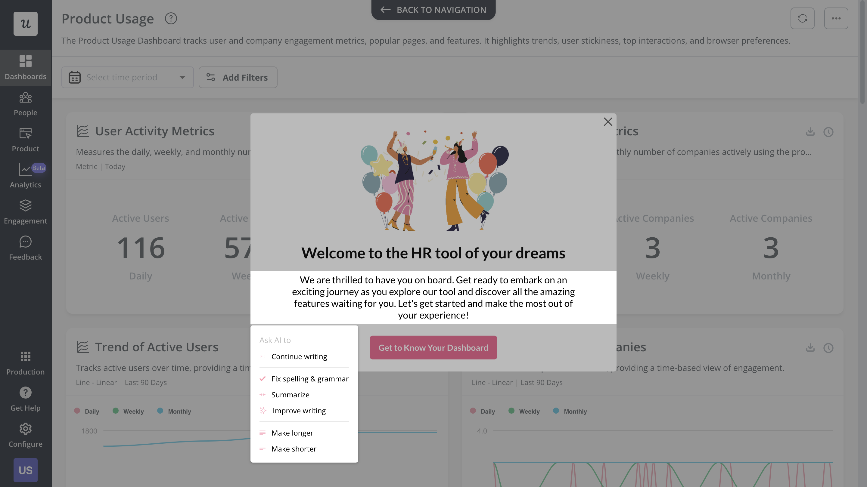
Well, that was easy. No, let’s learn how to add a microsurvey to your welcome screen
But first, let’s see a couple of welcome message examples that make the most of users’ time and guide them toward their goals.
Examples of Saas welcome screens
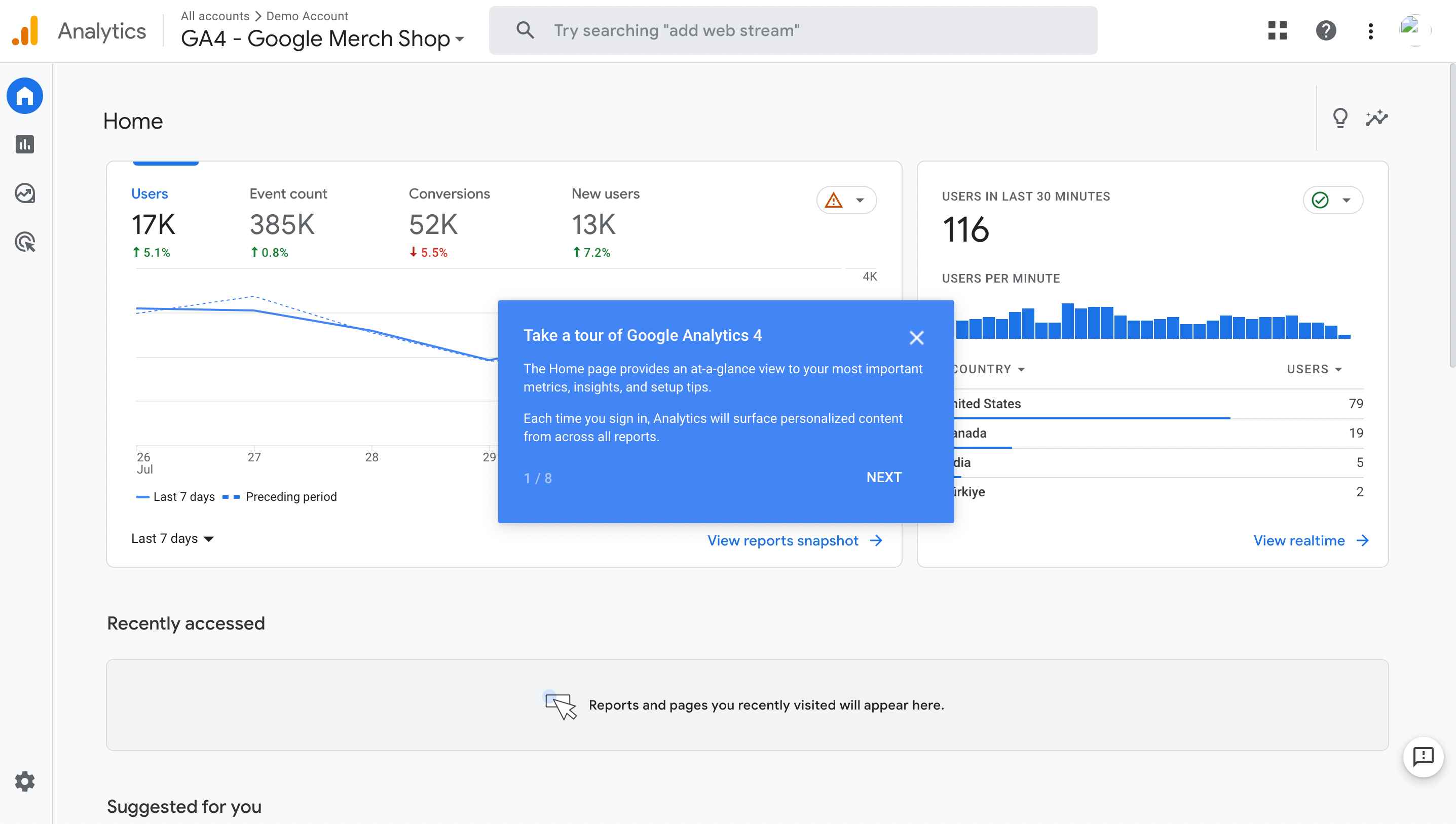
Google Analytics 4 created a to-the-point welcome message that makes customers familiar with their homepage. It also invites them to initiate a product tour.
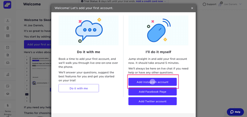
Another great example is Sked Social which created its welcome screen with Userpilot. This is ideal for complex products that require connection with other tools. What is great about this single-page welcome message is that it gives users a choice – add the account manually or do it with them over call.
How to add a welcome survey to your SaaS welcome screen?
As we’ve mentioned earlier – the key to a successful welcome screen is collecting data about your users’ roles, goals, and Job-To-Be-Done. In other words – who they are, and what they ‘hired’ your product for.
The easiest way to do this is by asking questions with a microsurvey.
Userpilot allows you to easily embed a microsurvey into a welcome screen modal with either multiple-choice questions with radio buttons, or a short or long text answer:
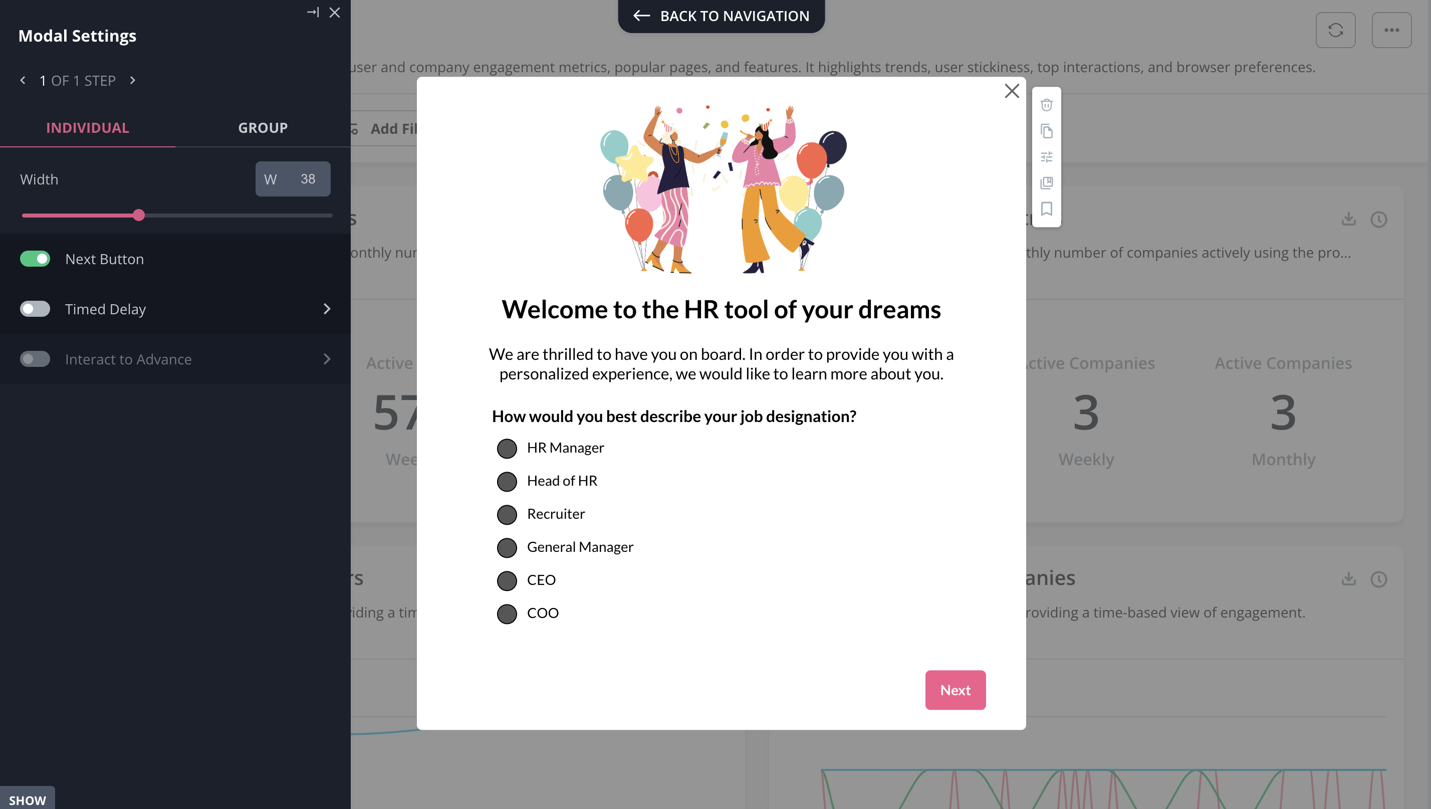
Examples of good welcome screen microsurveys

Quickbooks provides a neat icon-based survey asking the user about their use case.
ClearCalcs did something similar but also threw in a progress bar.

If you really want to take your welcome screen game to the next level….why not gamify it? 😉
Gamifyting the welcome screen
Adding gamification elements to a welcome screen makes it more engaging. Simply put – it means users will be more likely to provide the answers.
So – how to gamify your welcome screen?
Replace the radio buttons/icon buttons asking about the role with avatars and allow the users to pick their own ‘scenario’ of the ‘game’ corresponding to their use case/JTBD.
Examples of gamified welcome screens
To create a personalized experience and boost long-term retention, Asana created avatars that users can select based on their professional goals.

Another example is Groupize which used Userpilot to gamify their welcome message by introducing its interactive assistant, G.G.

Final thoughts
A welcome screen that says ‘hello’ and nothing else is a big missed opportunity. An opportunity to learn more about your new users and personalize their onboarding accordingly, as well as to reduce TTV for the new and invited users, and to convert more referees.
Plus, if you just say ‘hi’ in your welcome screen – then it makes it just another annoying popup that separates your users from what they want to do.
So – regardless of what your product is – take note of the best practices for building SaaS welcome screens that provide real value for your users. You will be paid back for your effort in higher retention rates over time.
If you want to create welcome screens easily and use them to personalize customer experiences, then there is no better tool than Userpilot. Book a demo to learn more.




![Best User Onboarding Tools for SaaS [Categorized by Use Case]](https://blog-static.userpilot.com/blog/wp-content/uploads/2025/06/Best-User-Onboarding-Tools-for-SaaS-1024x670.png)