Chameleon vs Whatfix: Which is Better for Interactive User Guides?20 min read
Get The Insights!
The fastest way to learn about Product Growth, Management & Trends.
Chameleon vs Whatfix – quick summary
- Let’s explore how Chameleon and Whatfix compare when it comes to creating interactive user guides.
- Chameleon is a product adoption platform. It enables SaaS teams to leverage real-time user data to build beautiful on-brand experiences, improve user onboarding, and drive product-led growth.
- Interactive user guides — whether in the form of linear product tours or interactive walkthroughs — can streamline the product adoption process for new users. Whatfix lets you build interactive user guides with task lists and smart tips on multiple platforms.
- If you’re looking for a better option for creating interactive user guides, Userpilot exceeds both functionality and value for money compared to other tools on the list.
- Userpilot is a product growth platform that drives user activation, feature adoption, and expansion revenue. It also helps product teams collect user feedback, streamline onboarding, and gather actionable insights from analytics. Get a Userpilot demo and drive your product growth code-free.
What is an interactive user guide?
An interactive user guide is a set of UI patterns designed to work together and help customers understand how to use your product.
There are two main types of user guides: full product tours (which tend to be more detailed and time-consuming), and interactive manuals (using tooltips and real-time guidance to provide more contextual help to your customers).
Interactive user manuals are an excellent way of engaging and educating your users, helping them to get the most out of your product, and improving user onboarding and feature adoption.
Must have features for interactive user guide tools
Not all tools are built the same. Some offer different advantages over others while some will simply get you basic functionality but at a low price. It depends on your budget and needs which will be the best tool to build interactive user guides.
Here’s what to look for as the main functionalities when picking a tool to build in-app guides:
- Good range of UI patterns to use for building your guides.
- Ability to customize each interactive guide to fit your brand and style.
- Segmentation so you could trigger the guides to the right audience at the right time. A one-size-fits-all approach won’t bring you the desired results.
- The ability to trigger the user guides when specific in-app events happen is nice to have and will help you build more contextual in-app experiences.
- Minimum product usage analytics, to be able to track how users engage with the product, and where they get stuck so you can build relevant user guides to help them.
The above list is not exhaustive but it’s a starting point. Depending on your product, you might also need automated localization, A/B testing capabilities, advanced analytics or security, and more.
Chameleon for creating interactive user guides
An interactive user guide is a combination of prompts used when onboarding users in order to help them understand how to use your product. Users learn and build habits by interacting, so here’s how to make that happen with Chameleon:
- Hotspots: Hotspot is a beacon or a pulsating dot that can be attached to any element on your product’s interface. A hotspot captures a user’s attention without breaking their flow or current intention. By clicking (or hovering) on the hotspot, a user can get more details on that feature and begin to engage better.
- Launchers: Launchers function based on customizable widgets that can be used as checklists or help menus (more like manuals) to deepen user engagement and feature discovery. With these checklists, you can motivate and guide users to complete key setup or activation tasks. These self-help menus provide searchable interactive guidance for key workflows, pro tips, or common questions.
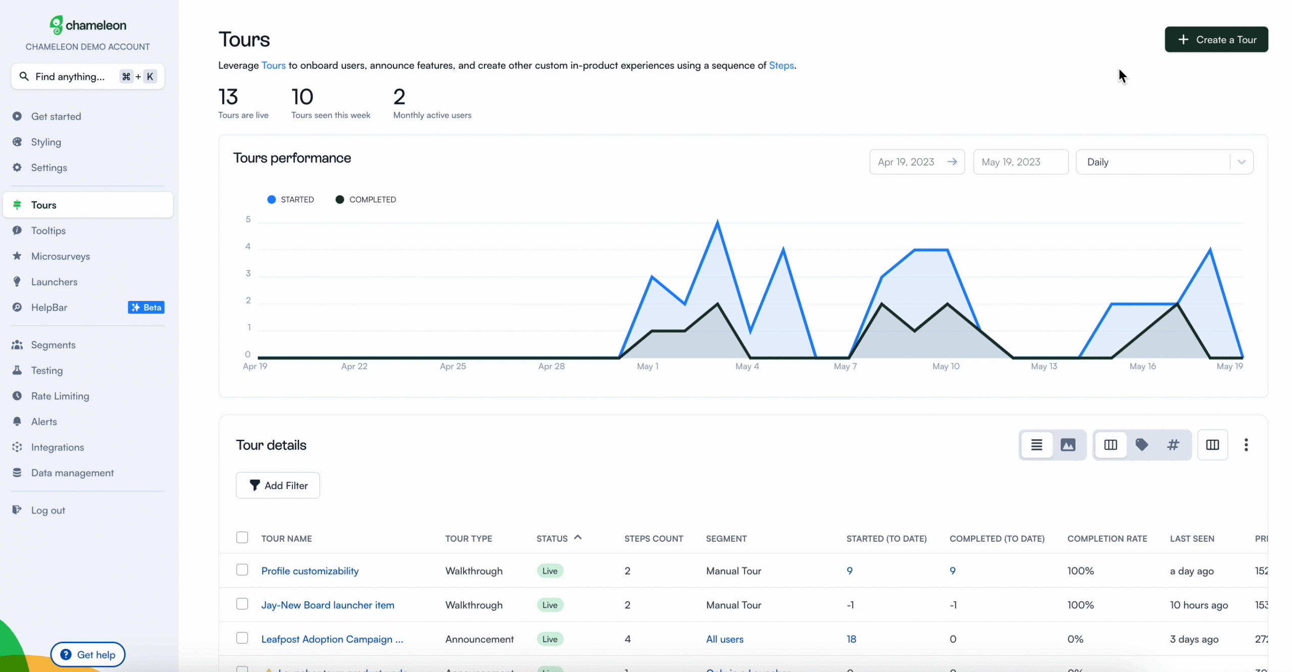
- Tours: Tours help you guide, successfully onboard, support, or celebrate your users’ journey, from discovery to mastery of your product. Chameleon’s tour is not very interactive, and Chameleon doesn’t offer interactive guides unlike other tools (Userpilot).
Offering interactive self-service support with a resource center feature is very important, but Chameleon falls short of this. For now, Hotspots and launchers are the most beneficial features for interactive user guides. Aside from being able to do all these on Userpilot, you can also track and analyze the efficiency of your interactive guides on user behavior.
No-code product tours in Chameleon
Product tours are an essential tool for a product manager in guiding users toward their “Aha!” moment or showcasing high-value features that are being underused.
Below is a range of features that are accessible for use when creating product tours with Chameleon:
- Partially no-code editor: Product tour software with little development support is essential. Therefore, creating an effective interactive product tour should require minute coding knowledge. However, Chameleon has a steeper learning curve and is not entirely a no-code tool.
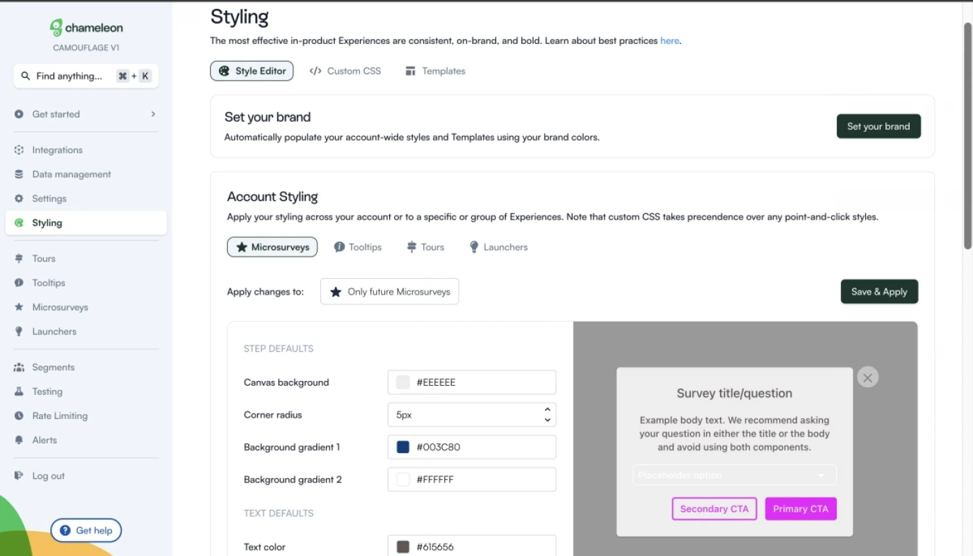
- Fully customizable styling: From simple things like fonts, colors, and button shapes to custom CSS, you should be able to tailor every single in-product tour to look 100% on-brand.
- Native A/B testing: Chameleon helps you create variations of in-app flows until you find what users engage with the most. Let’s say you create a segment for an e-commerce product campaign, you can test the flow of in-app messages repetitively using different copies and designs.
- Contextual targeting: One of the most powerful capabilities of Chameleon is the ability to show in-product experiences to the most relevant users. All you need to do is define specific user groups and create segments that you use to target your experiences. Chameleon offers a few basic pre-configured audiences, which you can use without sending any custom data to Chameleon. This is set automatically.
In-app messaging in Chameleon
In-app messages are timely, relevant, and contextual notifications your users see while interacting with your product or app. The common use cases are improving onboarding flows, offering self-serve support, and getting relevant user feedback.
How can Chameleon help you create effective in-app messages? These features are in your arsenal.
- Modals: Modals are used to grab the user’s attention. For example, you can use modals for your in-app tutorials and anchor them to specific elements on the page. Or you can add a pop-up with an animated confetti effect to celebrate once the user successfully completes onboarding.
- Tooltips: Tooltips are short messages related to specific UI elements that provide additional explanations and guide users toward taking specific actions. They often help users discover the product value and quickly reach their “Aha!” moment.
Whatfix for creating interactive user guides
Interactive user guides — whether in the form of linear product tours or interactive walkthroughs — can streamline the product adoption process for new users. Whatfix lets you build interactive user guides with task lists and smart tips on multiple platforms.
Here’s an overview of Whatfix’s interactive guide capabilities:
- Task Lists: Task lists are Whatfix’s version of an onboarding checklist. This feature will display a targeted list to give new users a clear view of what their next steps should be. You can also set the task list to always display on-screen until every task is complete.
- Smart Tips: Whatfix’s smart tip functionality lets you embed contextual guidance within the UI of an application. These could consist of tooltips that expand when interacted with or input validation for information entered on text fields.
- Mobile Guides: Whatfix Mobile lets you build interactive flows for customers or employees who are using applications on a mobile device. This ensures that users get the same Whatfix onboarding experience regardless of which platform they’re on.
No-code product tours in Whatfix
Whatfix’s digital adoption platform may be separate from its product analytics solution. Still, it does offer a well-rounded feature set for building no-code product tours, task lists, and smart tips that help new customers/employees learn about a product.
- Product Tour: Whatfix lets you use custom pop-ups that greet customers, brief employees, and lead into an interactive tour of the product’s core functionality. You’ll also be able to embed multimedia — such as microvideos — that help with onboarding and adoption.
- Task List: Whatfix’s task lists (essentially onboarding checklists) give each customer or employee a tailored list of in-app flows that they should complete before proceeding. You can even tweak the settings to keep the task list visible until all tasks have been completed.
- Smart Tips: The smart tips feature shows contextual guidance within the UI of a particular product. For instance, this could be a tooltip that expands when customers use a specific feature. These smart tips can also be used to validate text field inputs from users.
In-app messaging in Whatfix
In-app messaging helps you keep users engaged and provides an opportunity for sharing important updates. Whatfix uses in-app flows, contextual help embeds, and a self-help widget to help you share key messages with your users.
- In-App Guidance: Whatfix’s no-code flows and product tours are the primary means of communicating with employees or customers using an application. Whatfix lets you create pop-ups, task lists, and various UI patterns for guiding users through the adoption process.
- Contextual Help: Whatfix contextual help embeds let you insert guidance within the UI of a product to ensure users have easy access to key information when they need it most. These could include tooltips that expand when users interact with them.
- Self-Help: The self-help widget is always present on the right side of your users’ screens. This lets every customer or employee easily search for product documentation or other resources that they might need while using a specific application.
Pros and cons of Chameleon
Despite its strong performance when it comes to creating personalized and highly customized user experiences, Chameleon is not the most competitive tool when compared to similar products.
Here are three reasons why you might need to look elsewhere:
- You are on a budget: To get access to all the needed tools for proper onboarding and adoption, you need to pay for the higher plans that can get expensive.
- Requires CSS knowledge: Custom CSS works by targeting specific elements of Chameleon Experiences to change their styling. However, not all users have an idea what CSS is all about, so you need to be technically savvy.
- Analytics are not advanced: Chameleon doesn’t possess robust analytics features like Userpilot does. You might want to consider another tool if you need accurate product and user analytics, without paying for additional tools.
Pros of Chameleon
From a wide array of features to aesthetic UI patterns that can create any flow no matter how customized they need to be, Chameleon is no doubt a powerful tool for scaling product adoption.
It works in a similar way to Userpilot and offers similar features: styling, analytics, templates, goals, A/B testing, and checklists.
Let’s look at the pros of using Chameleon:
- Intuitive no-code builder: Chameleon comes with an easy-to-use Chrome Extension builder.
- Engaging tour guides: Build interactive tours to onboard users, announce features, and create other customer in-product experiences using simple steps.
- Good range of in-app messaging and UI patterns: Easy to create custom modals, slide-outs, tooltips, hotspots, launchers (checklists or resource hub), and more.
- Full two-way and deep analytics integrations: Chameleon fits into your stack, and easily connects with your favorite tools to send data to, and from Chameleon. It offers the deepest integrations, with analytics tools, CRMs, and more.
- Effective segmentation and targeting system: Leverage user data and experiences to structure effective marketing messages and tour guides for a specific target audience.
- Advanced A/B testing: Drive continuous improvement of in-app messages and define the ideal user experience with precise A/B testing.
- Rate limiting: No user wants to be overwhelmed with multiple product tours, in-app messages, and tasks. With rate limiting, you can reduce the number of user experiences — one step at a time, with clarity over speed.
Cons of Chameleon
While Chameleon is a deep production adoption tool with an array of great features, there are still some downsides. Here are the main cons of the tool:
- Not entirely no-code: Early on, we stated that Chameleon can be used without code. True. But it is not a completely no-code tool. You’ll need the help of a technical-savvy employee in your team to sort out some build-up as the learning curve is steeper.
- Hard-to-use interface: The new UI is a bit harder to use (a lot of clicking), and there can be minor bugs here and there.
- Limited experiences: There are some limitations to the user onboarding flows. For instance, you can’t run multiple in-app experiences at the same time, as you can in Userpilot.
- Pricey: The Startup plan is quite expensive (starts at $349/mo for 2500 MAU and includes just one launcher). This means you need to go for the Growth plan, where you pay more but save more at the same time.
Pros and cons of Whatfix
Whatfix is priced lower than its closest competitor (WalkMe) while letting you onboard both customers and employees to software applications. That said, there are a few clear scenarios where you might want to look for alternative solutions:
- If you’re the type of customer who wants to “try before they buy”, then Whatfix isn’t going to be the right fit. The trial request form on their website is buggy, you’ll need to wait a month to hear back on your request, and you might end up with a demo instead of a trial.
- Many customers have complained about the subpar support that Whatfix offers. There are multiple reviews on websites like G2 citing slow resolution times, high success manager turnover, and an overall lack of technical assistance from the Whatfix team.
- Despite claiming to be built for enterprise organizations, Whatfix’s analytics capabilities leave much to be desired. If you’re looking for advanced analytics capabilities, then find alternatives like WalkMe, Userpilot, or Appcues.
Pros of Whatfix
Whatfix may not be as popular or widely adopted as competitors like WalkMe but it does have its fair share of benefits:
- Pricing: While Whatfix does not publish the exact cost of its plans publicly, numerous reports from customers suggest an average entry point of $1,000/month. This is significantly cheaper than its closest competitor, WalkMe, which reportedly starts at closer to $10,000/month.
- Automation: Whatfix Flows helps you automate repetitive tasks to save time. The Whatfix Flows dashboard also lets you analyze your existing flows and then use them to create entirely new automation in a single click.
- Integrations: Whatfix’s third-party integration options make it easy to incorporate the solution into the rest of your tech stack. It integrates with Salesforce, Amplitude, Google Analytics, Slack, and more — providing a good selection of the top CRM, analytics, and communication tools.
Cons of Whatfix
Whatfix offers a more affordable employee onboarding solution than its closest competitors but is limited by its lackluster analytics and support — along with its high-friction trial signup process for prospective customers.
Here are the key drawbacks of using Whatfix:
- Whatfix is quite lacking in the analytics department — both in comparison to direct competitors like WalkMe as well as other onboarding solutions like Userpilot, Appcues, or Pendo. If detailed user data matters to you, you’ll want to consider alternatives.
- Technical assistance (or the lack thereof) is arguably one of Whatfix’s largest weaknesses. While all plans promise to give you a customer success manager, most Whatfix users complain about the subpar support they provide.
- While Whatfix has a trial request page on its website, this form is buggy and inconsistent. You can reach out to support to request a trial directly but resolution times can be upwards of a month — and, in the end, you may even be redirected to a demo call instead of a trial account.
Chameleon vs Whatfix: Which one fits your budget?
Understanding the cost implications is paramount when selecting the right solution for creating interactive user guides, so here’s a detailed pricing comparison of Chameleon and Whatfix.
Pricing of Chameleon
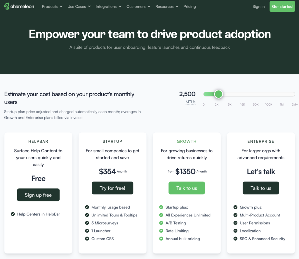
Chameleon’s pricing is based on your product’s monthly users. From the Startup plan (for small companies to get started and save) to the Growth and Enterprise plans (for larger organizations with advanced requirements) billed via invoice.
Here’s an overview of the pricing plans, and features of each plan:
- Help Bar: This is a standalone search function on top of your product, allowing users to search your knowledge base articles.
- Startup plan: For small companies to get started. Fee: $354/month, billed Monthly, usage-based, Unlimited Tours and tooltips, 5 microsurveys, 1 Launcher, Custom CSS.
- Growth plan: For growing businesses to drive returns quickly, from $1350/month. Everything in the startup plan, plus: unlimited microsurveys & launchers, A/B testing, and rate limiting is paid annually with bulk pricing.
- Enterprise plan: For larger organizations with advanced requirements. The fee for this plan is not stated on the website rather, you get to talk to the team. You get everything in the growth plan, multi-product account, user permissions, localizations, and SSO/enhanced security.
The Growth plan seems to be the real deal because of the exciting features that can boost your product marketing. For example, you can’t get the rate limiting feature on the Startup plan, including A/B testing. These are relevant and powerful product adoption weapons that should be in your arsenal if you truly want to win more users.
Is the startup plan expensive?
Yes, compared to Userpilot, about a $170 difference. It’s best to opt in for the Growth plan for the juicy benefits, where you pay $1350 annually rather than paying a whopping $5000+ yearly for the startup plan.
Pricing of Whatfix
Whatfix doesn’t have public pricing listed on its website. It also charges separately for its product analytics solution but we won’t be going over those plans since we’re focusing on the digital adoption platform.
Here’s an overview of the three plans available for Whatfix web:
- Standard: This includes core features like in-app guidance, contextual guidance, a multi-media knowledge base, and content aggregation capabilities. It also includes access to pre-built surveys and up to two integrations.
- Premium: This includes additional features such as automatic content localization, automated flow testing, unlimited integrations, and single sign-on (SSO). You’ll also be able to build custom surveys while on the Premium plan.
- Pro: This includes the features from previous plans as well as enterprise-exclusive options such as self-hosting. This plan is targeted towards customer-facing applications with a million or more users.
Userpilot – A better alternative for building interactive user guides
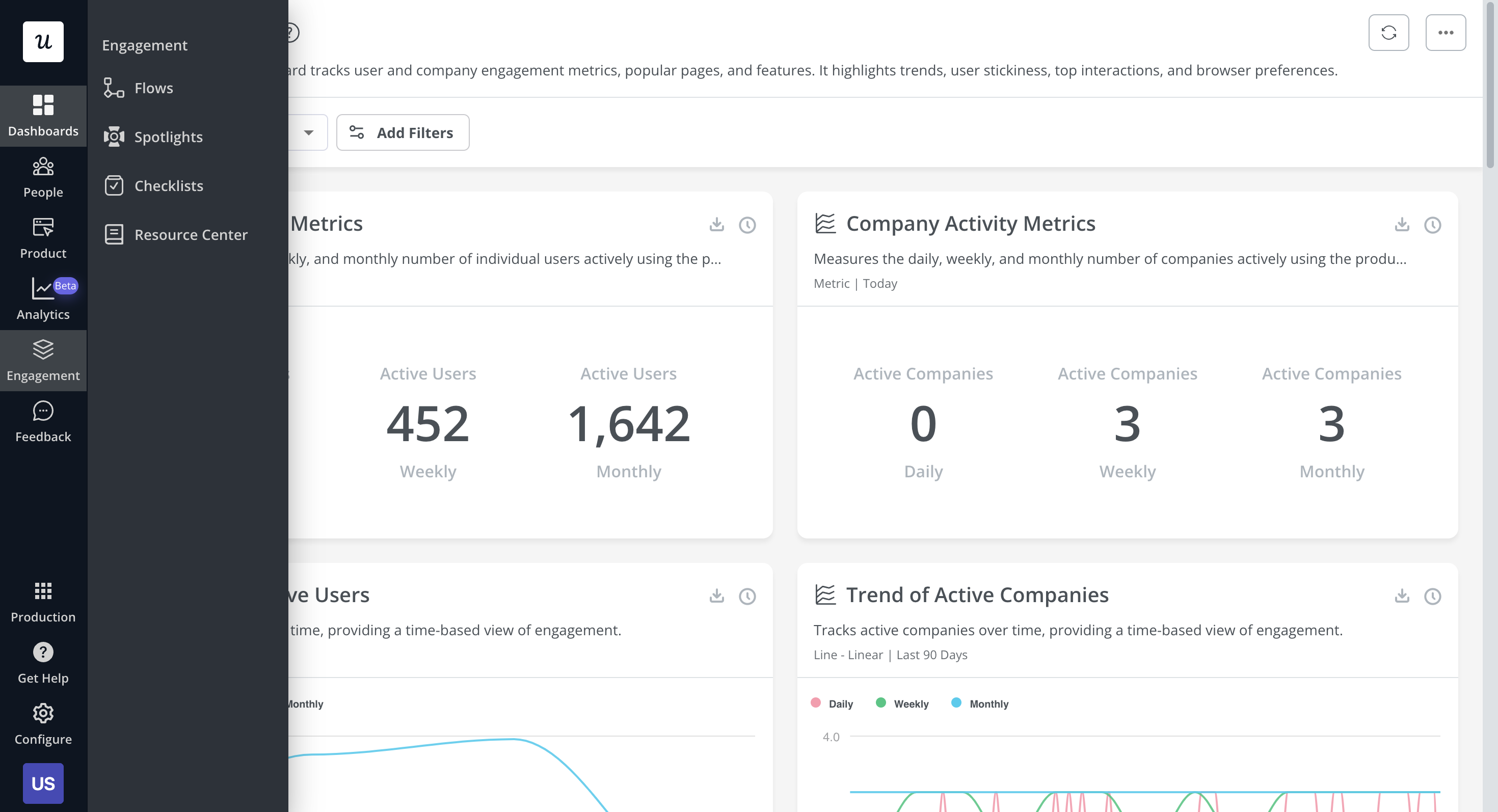
Userpilot is a product growth platform that drives user activation, feature adoption, and expansion revenue. It also helps product teams collect user feedback, streamline onboarding, and gather actionable insights from analytics.
With Userpilot, you’ll be able to track both product usage and user behavior to get a holistic view of how customers use your product — which will guide future development, improve the user experience, and inform your growth efforts.
No-code product tours in Userpilot
Product tours are an effective way to show new users what a product can do and reduce the time-to-value (TTV) for them. Userpilot lets you build advanced product tours, set contextual triggers, and target specific audiences, all without writing a single line of code.
Here are the Userpilot features that you can use to build a product tour for your users:
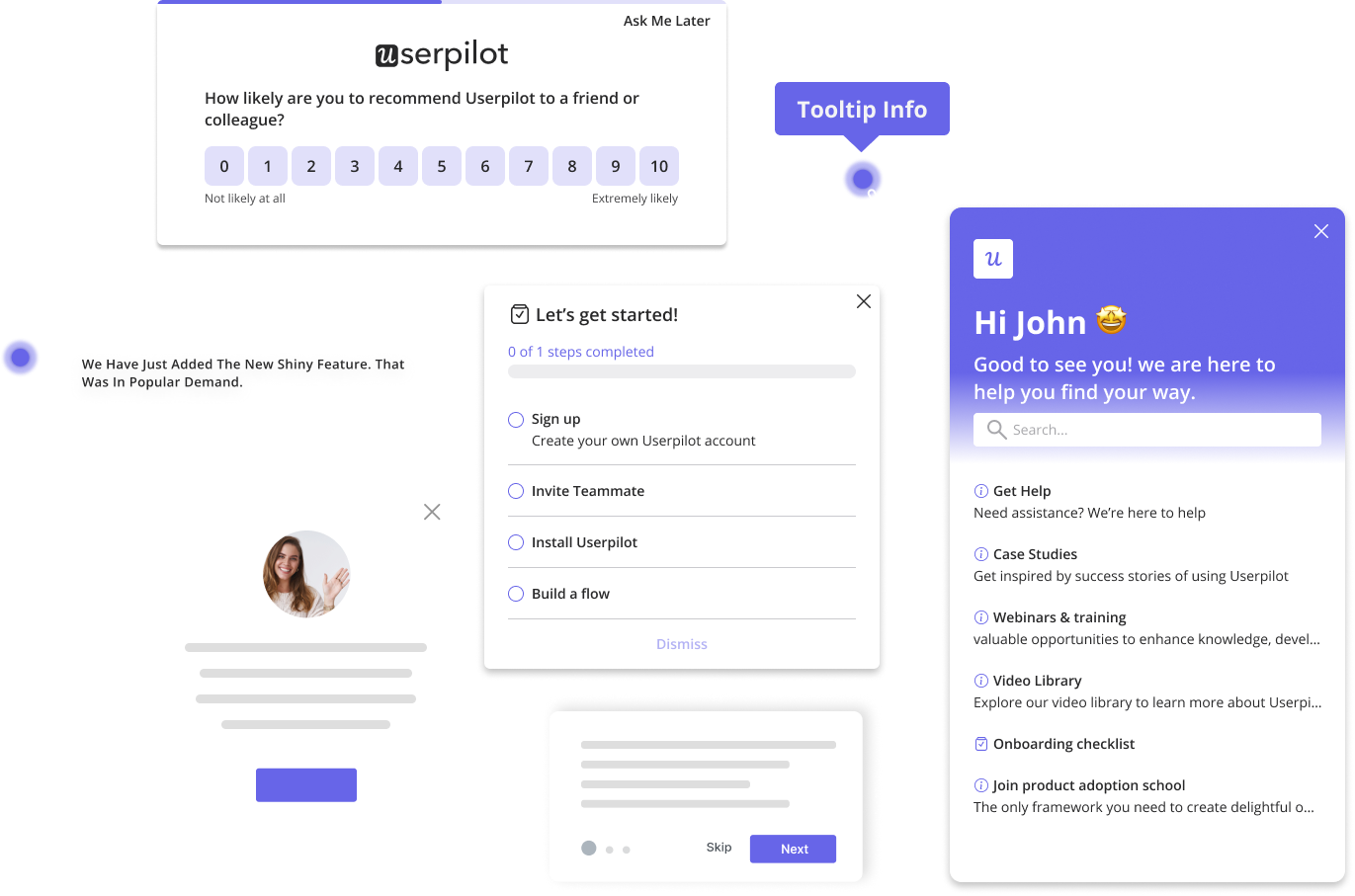
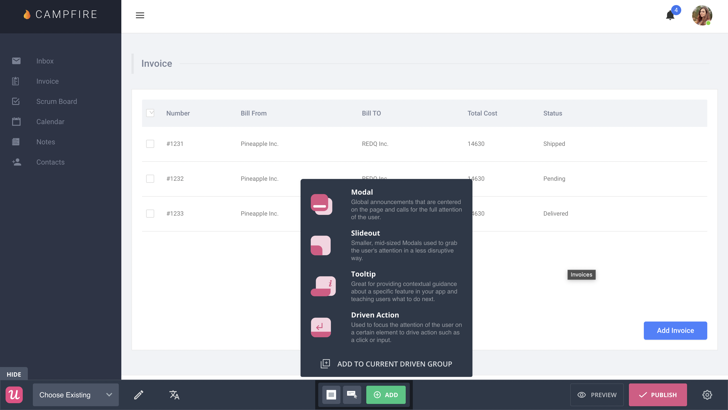
- Flow builder: Userpilot’s no-code flow builder has a variety of UI patterns to choose from, such as modals, slideouts, tooltips, and driven actions. All UI patterns are available for use regardless of which Userpilot plan you’re on. All you need to do is install the Chrome extension.
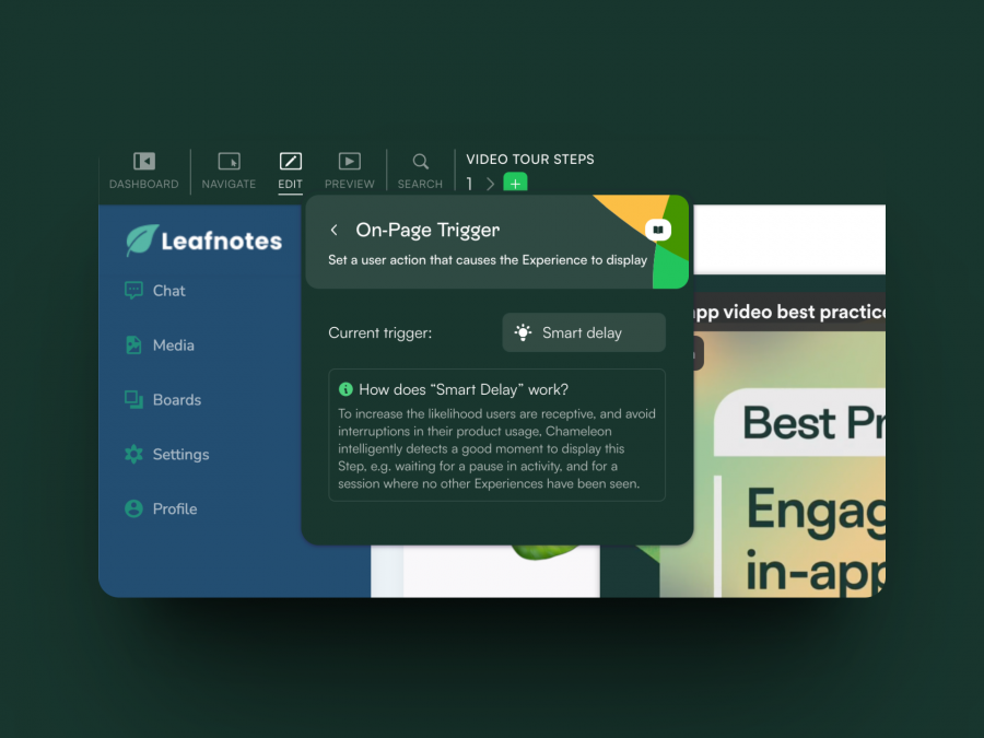
- Contextual triggers: Userpilot lets you set triggers for your flows to ensure that they appear at the most contextual moments. Flows could be triggered when users land on a specific page or when a tracked event occurs. There are also manual triggering options that you can tinker with.
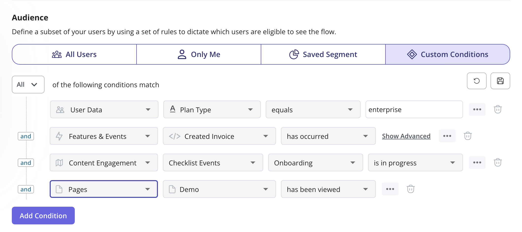
- Audience targeting: Userpilot’s audience targeting setting lets you set the conditions needed for a flow to show up for a specific user. You can use these settings to create flows that target a specific segment or exclude certain users from seeing a flow if certain conditions are met.
In-app messaging in Userpilot
In-app messaging enables communication within your product to onboard new users or drive feature adoption among existing customers.
Here are a few ways you can send in-app messages using Userpilot:
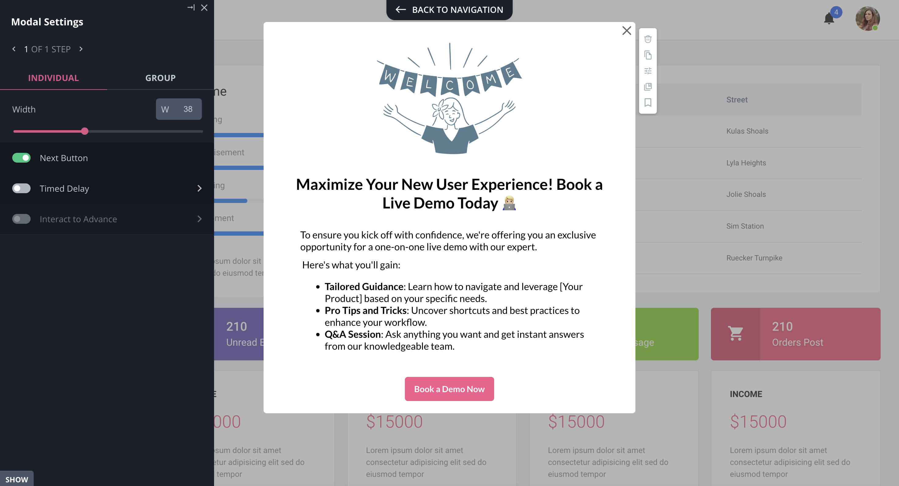
- Modals: Userpilot lets you use modals to send unmissable in-app messages to your users. Simply choose from one of the six templates or create a new modal from scratch. You’ll be able to use text, emojis, images, and videos to help your modals get the message across to users.
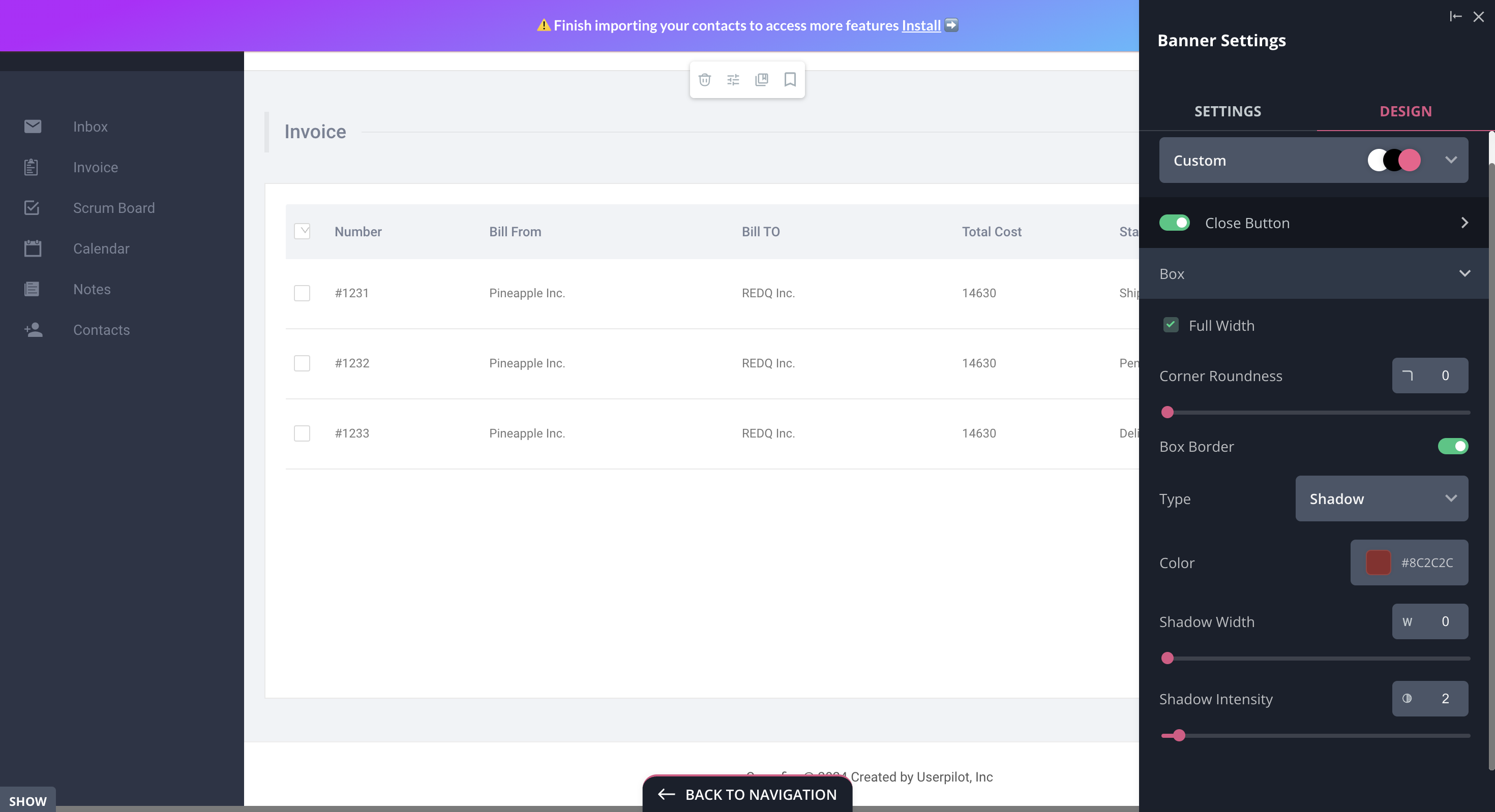
- Banners: Userpilot banners can be used to send in-app messages that are urgent but don’t need to take up the entire screen. You can also add blocks with text, emojis, images, videos, forms, custom JavaScript functions, and more to style banners to your liking.
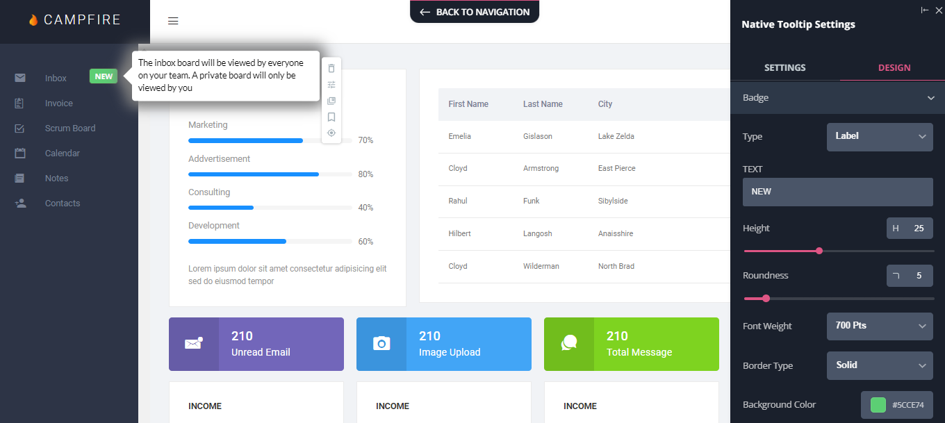
- Tooltips: They are the least intrusive form of in-app messaging as they only show up when users hover over an element or click on an info icon. You’ll be able to adjust the height, shape, color, and placement of tooltips to make them native-like.
Pricing of Userpilot
Userpilot’s transparent pricing ranges from $249/month on the entry-level end to an Enterprise tier for larger companies.
Furthermore, Userpilot’s entry-level plan includes access to all UI patterns and should include everything that most mid-market SaaS businesses need to get started.
Userpilot has three paid plans to choose from:
- Starter: The entry-level Starter plan starts at $249/month and includes features like segmentation, product analytics, reporting, user engagement, NPS feedback, and customization.
- Growth: The Growth plan starts at $749/month and includes features like resource centers, advanced event-based triggers, unlimited feature tagging, AI-powered content localization, EU hosting options, and a dedicated customer success manager.
- Enterprise: The Enterprise plan uses custom pricing and includes all the features from Starter + Growth plus custom roles/permissions, access to premium integrations, priority support, custom contract, SLA, SAML SSO, activity logs, security audit, and compliance (SOC 2/GDPR).
What do users say about Userpilot?
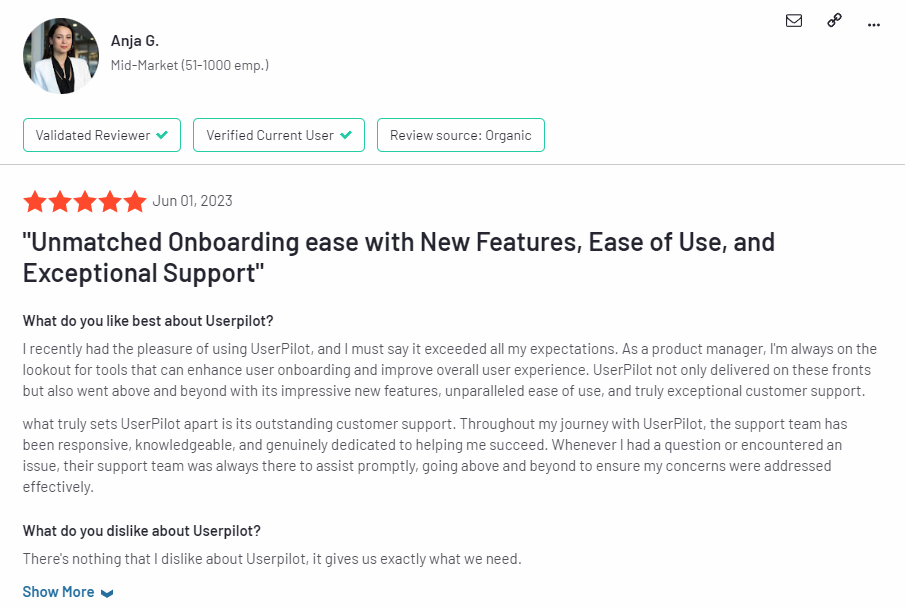
Most users laud Userpilot for its versatile feature set, ease of use, and responsive support team:
I recently had the pleasure of using Userpilot, and I must say it exceeded all my expectations. As a product manager, I’m always on the lookout for tools that can enhance user onboarding and improve overall user experience. Userpilot not only delivered on these fronts but also went above and beyond with its impressive new features, unparalleled ease of use, and truly exceptional customer support.
What truly sets Userpilot apart is its outstanding customer support. Throughout my journey with Userpilot, the support team has been responsive, knowledgeable, and genuinely dedicated to helping me succeed. Whenever I had a question or encountered an issue, their support team was always there to assist promptly, going above and beyond to ensure my concerns were addressed effectively.
Source: G2.
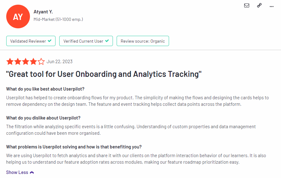
Of course, other users are also kind enough to share constructive criticism regarding specific features like event tracking filters:
“The filtration while analyzing specific events is a little confusing. Understanding of custom properties and data management configuration could have been more organised.”
Source: G2.
Conclusion
This is the end of our thorough comparison between Chameleon and Whatfix. You should be able to make a confident decision by now. If you’re looking for a solid tool for building interactive user guides that promises great value for money, give Userpilot a go. Book a demo today.

