How to Create Product Tours [UI Patterns, Tips, and More]

![How to Create Product Tours [UI Patterns, Tips, and More] cover](https://blog-static.userpilot.com/blog/wp-content/uploads/2024/02/fi8_ff6fa776041e1caf4114280829ba5507_2000-1024x670.png)
Most onboarding improvement efforts start the same way: create product tours. However, not every product needs one, and not every product tour is especially helpful.
So, how do you know if your product needs a tour? And if it does, how do you make it short, engaging, and useful? That’s exactly what I’ll cover in this guide.
Does your product need a product tour?
Before building a product tour, I like to ask one simple question: Will this improve the in-app experience?
A great tour should enable users to get unstuck, find core features, and reach value faster. But if your product is already intuitive, or if users can find what they need on their own, adding a tour might just slow them down.
So here are a few questions I use to decide if we need a product tour at all:
- Are there any advanced features that might confuse new users?
- Is there a key action users need to complete early to get value?
- Will a simple tooltip or checklist get the job done more efficiently?
- Can we test a lightweight interactive product tour to see if it improves outcomes?
In some cases, a short, contextual product walkthrough works much better. In others, users just need clearer in-app guidance at the right moments. The bottom line is that your product tour should solve a real problem for the user onboarding process and make the experience smoother. If it doesn’t, skip it.
How to choose product tour UI elements?
Once you’ve decided to build a product tour, the next step is picking the right format. Do users need a quick heads-up? A prompt to take action? Or a persistent guide they can refer to while they explore?
The UI patterns you choose, like tooltips, modals, or other interactive elements, play a big role in shaping the experience. In this section, I’ll take you through the most effective options, when to use them, and how we use each one in Userpilot.
Tooltips for a step-by-step user onboarding process
I think tooltips are one of the most versatile UI elements you can use for product tours. They’re lightweight, context-aware, and easy to tailor based on user goals. At Userpilot, we typically use two types of tooltips:
- Static tooltips: These are used to inform, not prompt. They’re great for small UI changes or updates where a quick, in-context note works better than full user guides or walkthroughs.
✅ Surfer, for example, uses static tooltips to walk returning users through their redesigned interface. It’s a simple, low-friction way to improve the in-app experience.
- Interactive or action-driven tooltips: These are action-driven and perfect for onboarding new users or encouraging new feature discovery. They work best when you want to prompt users to do something specific.
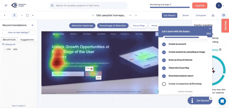
✅ A great product tour example of how to do this right is Attention Insight. They use Userpilot’s no-code builder to create an interactive walkthrough. This tour is triggered from an onboarding checklist, guiding users through key product features that demonstrate immediate product value.

Hotspots for subtle feature discovery
Hotspots are small, animated cues placed within the user interface. They highlight certain features without being intrusive or breaking the flow. This means there’s no fixed path to follow. A hotpot will simply say, “You might want to check this out,” and let the users explore at their own pace.
I’ve used hotspots to highlight key features that don’t need much explanation but are still essential to a great experience. It’s especially useful after the initial onboarding, when you want users to discover more value over time and drive feature adoption organically.
With Userpilot, you can set up hotspots based on behavior, page views, or events. It’s a subtle but effective way to enrich your own product tour and keep the experience feeling timely and relevant.
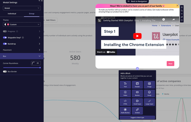
Modals for welcome messages and static content
When I’m planning a user onboarding flow, I often start by asking: what’s the one thing new users need to know before they dive in? That’s usually what I use modals for.
Modals are great when a product doesn’t need a full interactive walkthrough, but there’s still something critical users need to understand. You can use them to set expectations, explain an important feature, or even include a short video tutorial. It’s a simple way to give context before users start exploring on their own.
With Userpilot, you can customize modals with visuals, copy, or even lightweight interactive demos. It’s flexible enough to support any kind of product tour experience, whether you’re onboarding or highlighting a key flow.
Slideouts for persistent and side-by-side instructions
Slideouts are great when you want to guide users through more complex workflows while still letting them interact with the interface. They sit off to the side, so users can take action while keeping helpful instructions in view.
Slideouts also help encourage users to complete more complex flows without overwhelming them. I’ve used slideouts when a flow spans multiple steps or pages, like setup wizards, feature configuration, or deeper onboarding journeys.
They’re also helpful when you want to break an interactive walkthrough into smaller, more manageable chunks.
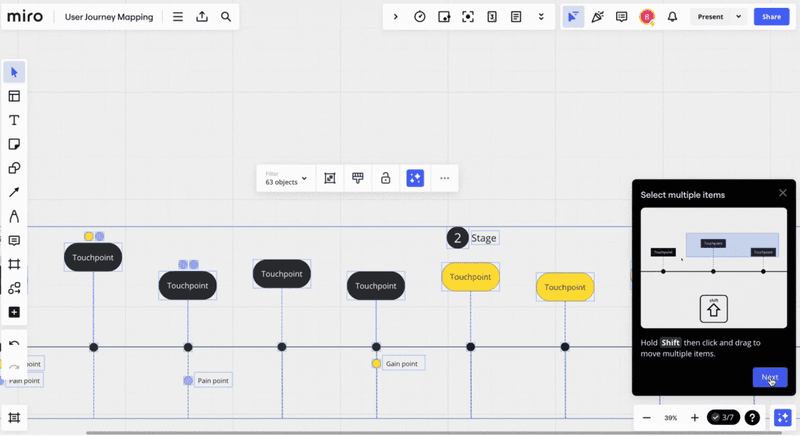
✅ Miro is a great product tour example here. It uses a slideout to teach the Shift + drag shortcut, keeping the command visible while users perform it. Since it’s off to the side, users can follow along without breaking focus.
With Userpilot, you can design slideouts that include text, visuals, buttons, or even mini product demos. It’s a simple way to explain features, reduce drop-offs, and create a more dynamic, engaging onboarding process.
How to implement an interactive product tour?
You don’t need to write a single line of code to create interactive product tours. In fact, most teams I work with launch theirs faster and with less friction by using no-code tools like Userpilot. Here’s how I typically do it:
Lay out the steps of your product tour
When it comes to product tours, more steps don’t mean more clarity. That’s why I always aim to keep it short; 3-5 steps is usually the sweet spot. It’s enough to guide users through the essentials, but not so much that it turns into a tutorial maze.
Start by identifying the key product features you want new users to engage with early on. These should be tied to your product’s core value, or what we often call the “time to value” moment. If a step doesn’t support that, leave it out.
Add content and visuals to drive user engagement
I’ve seen too many product tours that feel like filler: plain text, vague instructions, and nothing that helps the user. If you want users to stay engaged, you need to give them something that feels worth their time.
That could be a short explainer video, a helpful GIF, or even a quick checklist to help users through setup. In Userpilot, I like embedding visuals right inside the flow. It’s fast to build, and it makes the interactive product tour feel more human and helpful.
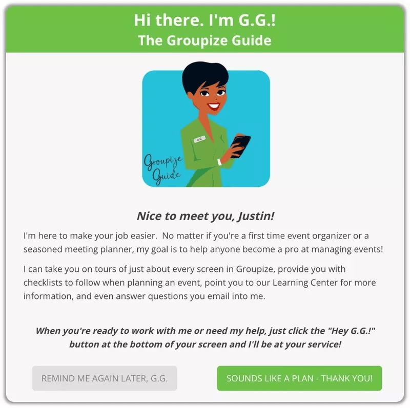
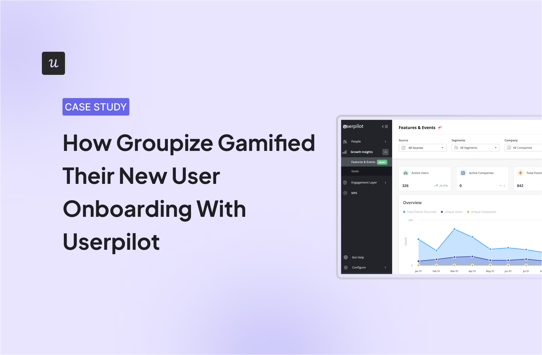
We did something similar with Groupize. Not only did they add gamified elements to their onboarding flow with Userpilot, they also built the award-winning onboarding assistant G.G.! The result was a happier customer success team and an onboarding process that felt more fun, smooth, and way more effective.
Define when and who sees the tour
One of the biggest mistakes I see is showing the same tour to everyone, regardless of their role, stage, or behavior. That usually leads to confusion, or worse, users ignoring it completely.
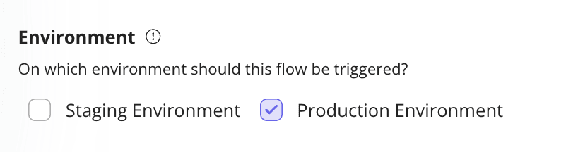
Instead, I use Userpilot’s flow settings to control exactly when the tour appears and who sees it. You can trigger it based on page visits, actions, or custom events. You can also target specific user segments and create personalized product tours that align with what users understand and expect at that point.
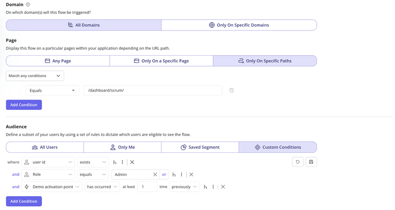
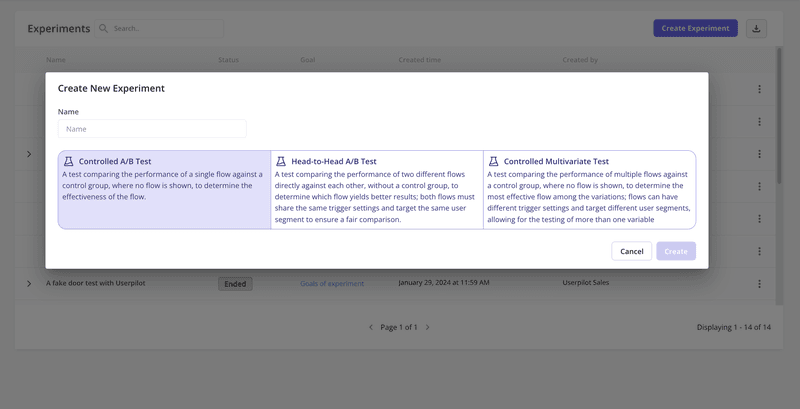
You can also run A/B tests on Userpilot to experiment with different interactive elements, steps, or messages. I’ve used this to figure out what works best to prompt users to take action or guide users through more complex flows.
Test your product tours before the official launch
Before I roll out any product tour, I test it in staging first. What looks fine in the editor can break in the actual UI.
With Userpilot, I use the staging toggle to check the whole flow, from the first tooltip to the last step. Even simple tours can trip up. A tooltip might block a button. A step might not trigger if the user skips something.
Then once it’s live, you can use Userpilot’s native analytics to track how real users are interacting with the tour and fine-tune from there.
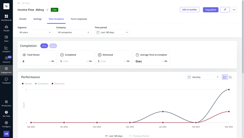
Monitor product tour performance and collect user feedback
For this, you can use Userpilot’s native analytics for in-app experiences to track how users interact with it step-by-step: where they drop off, where they pause, and whether they complete key steps.
You can see:
- Completion status: How many users skip or complete your product tour?
- Step completion breakdown: What are the most skipped steps? Which step are users most likely to drop at?
- User list: Who completes or dismisses the flow? What happened (via session replays)?
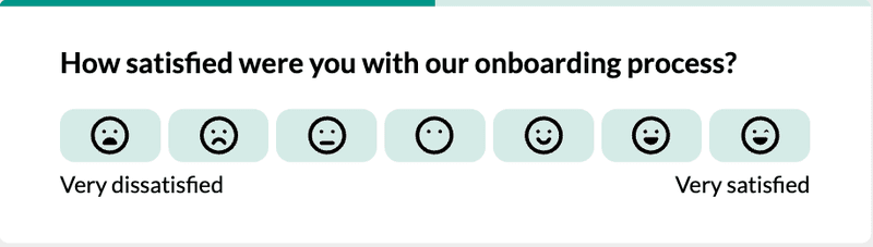
But because numbers alone aren’t enough, I also like to collect user feedback directly inside the tour. A quick in-app survey at the end can bring up issues you’d never catch in the data. If users skip or dismiss a tour, I’ll often follow up with a different question to learn why.
That’s also what our users love about Userpilot: You can tie your feedback to in-app events that help with data-driven decisions.
Create better product tours with Userpilot!
Whether you’re helping new users get started or nudging someone toward a key action, the goal of a product tour is always the same: deliver an experience that feels helpful, relevant, and smooth.
With Userpilot, you can build tours that feel natural, highlight your most critical features, and actually move the needle on user adoption. You don’t need code, and you don’t need to wait on dev cycles. Just a clear idea of what users need, and the right tools to meet them where they are.
Book a Userpilot demo and see how it can turn your product tours into real value moments.
FAQ
What is a product tour?
A product tour is an in-app guide that helps new users explore your product. It uses tooltips, modals, or interactive demos to highlight key features. Unlike static video tutorials, product tours are interactive, contextual, and designed to improve onboarding and shorten the time to value.
What is the difference between product tour and walkthrough?
A product walkthrough is usually linear, guiding users through a fixed set of actions. A product tour can be more flexible and personalized, adapting to user segments or behavior. While a walkthrough focuses on task completion, a tour supports exploration at the user’s own pace.
How long should a product tour be?
A short, focused tour (just 3-5 steps) is usually more effective at drawing user attention than a long one. Highlight just a few different features that matter most early on. You can always follow up with tooltips or product demos later, rather than overwhelming users in a single flow.
What is a product walkthrough?
A product walkthrough is a guided, step-by-step experience that helps users complete a task. It’s often used in onboarding or setup flows and works best when you need to ensure users follow a specific path to understand features or drive product adoption. But not all product tours need to be walkthroughs; in many cases, lighter contextual guidance works better.
About the author
![Best User Onboarding Tools for SaaS [Categorized by Use Case]](https://blog-static.userpilot.com/blog/wp-content/uploads/2025/06/Best-User-Onboarding-Tools-for-SaaS-1024x670.png)