24 Essential Types of Charts for Data Visualization: Examples & Use Cases


There are more types of charts and graphs than ever before. Graphs and charts are a great way to display statistics and visualize data points.
As we move deeper into the era of data, data visualization is even more important. It helps product managers motivate teams to action, impress stakeholders, and quickly derive actionable insights.
But as any data visualization expert will tell you, few things are as annoying as the wrong use of visualizations. This article explores 24 types of charts and graphs and how they are used.
Funnel charts
A funnel chart is useful in business contexts for tracking how visitors or users flow through a pipeline. The chart shows a series of steps and tracks the completion rates for those steps.
The width of each part of the chart shows how many users make it to each stage relative to other stages. If you have two or more stages of sequential data, the funnel chart can help you see how each stage impacts the final result.
The most common use cases for funnel charts include:
- Conversion tracking and analysis.
- Measuring progression through sales and marketing funnels.
- Identifying bottlenecks in multi-step processes like manufacturing.
- Analyzing deal pipelines.
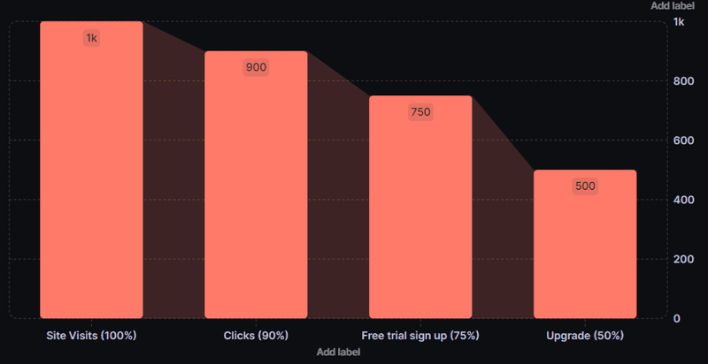
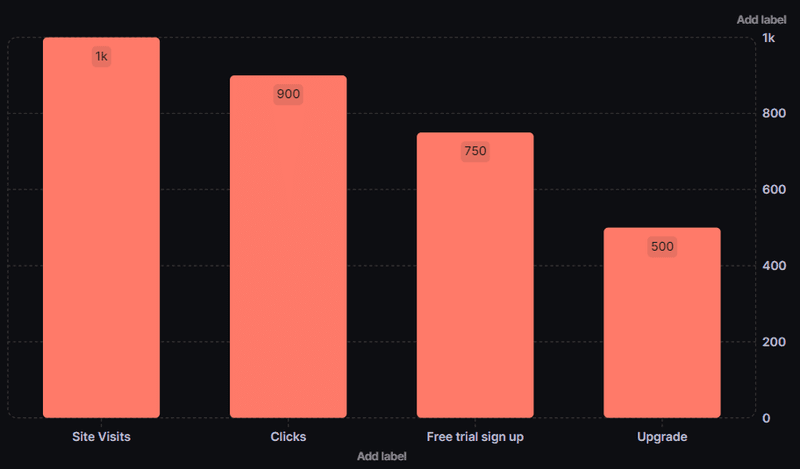
A practical example of a funnel chart usage
In this example, a funnel chart displays an onboarding or signup process. The chart helps you to see which steps have the most drop-offs in the process, enabling you to track the problem source easily.
Bar charts
The bar chart is one of the first types of charts you’ll learn about. This chart indicates values by the length of bars, with each bar corresponding to a measured group.
A bar chart can be oriented vertically or horizontally. The horizontal bar chart is ideal when you have a lot of data points and, as a result, a lot of bars to plot. It also gives you more space to write out bar labels.
Bar charts are excellent numeric comparison tools, with bar sizes revealing the relative difference in sizes. This visual comparison chart makes it easy to see which data group is the biggest or most common. Its use cases include:
- Comparing products or categories.
- Visualizing web traffic or product usage by month or year.
- Tracking marketing conversions, etc.
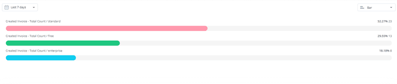
A practical example of a bar chart usage
As earlier noted, bar charts are great when comparing numeric values. In this example, the bar chart compares the number of standard, free, and enterprise invoices created over the last 7 days.
Stacked bar chart
The stacked bar chart is a modified bar chart with each bar divided into smaller bars. This division allows you to compare different items and show the composition of each item.
So, in addition to comparing primary groups like a regular bar chart, the stacked chart also illustrates the breakdown of each group’s constituent parts.
Stacked bar charts are useful for comparing more than one grouping of variables. This can be ideal, for example, when comparing sales distribution over time. Each bar can represent a period (say, a month) and be further segmented to show sales across different categories.
Other use cases include:
- Tracking website traffic and its composition.
- Comparing survey results.
- Analyzing event distribution over multiple platforms.
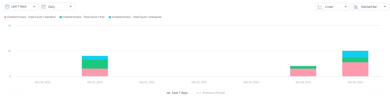
A practical example of a stacked bar chart usage
In this example, the stacked bar chart is used to compare how many users created a specific type of invoice each day for the last 7 days.
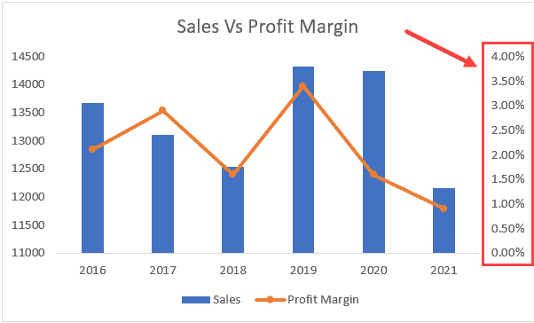
Dual-axis charts
Dual-axis charts are visualization tools that use two different axes to display the relationship between data series with potentially different scales or units of measurement.
Also known as combination charts, they overlay two different charts for easy comparison. This can be useful to compare two perspectives on the same chart, allowing for deeper insights.
The typical dual-axis chart combines a line chart with a bar chart. Some common use cases for this chart type include:
- Analyzing trends with different units.
- Highlighting correlation across scales.
- Identifying hidden patterns and outliers.
A practical example of a dual-axis chart usage
In this example, the dual-axis chart compares sales values and profit margins for each year – from 2016 to 2021. Here, we see that profit margins are unconnected to sales values, and they’ve declined since peaking in 2019.
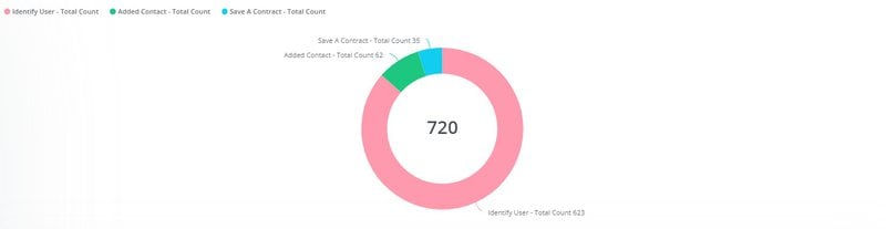
Pie charts
One of the most popular types of charts, pie charts are circular charts that visualize a part-to-whole relationship. The complete chart is a pie, with each slice representing the portion of the pie occupied by a variable.
Each slice in the pie, therefore, represents a percentage of the pie, with the total sum of all slices adding up to 100%. This form of data representation, thus, makes it easy to see the relative size of each data point to the whole.
Typical use cases for pie charts include:
- Percentage of profit or sales from different channels.
- Number of users to perform one action versus another.
- Size of different customer personas versus the total number of customers, etc.
A practical example of a pie chart usage
This pie chart example illustrates the number of new signups who perform a key action. From the chart, you can easily see that more users tried to identify a user, with fewer users creating or saving a contract.
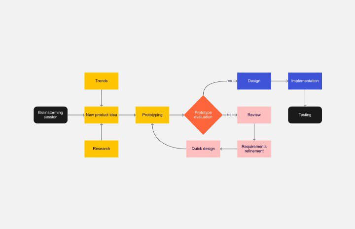
Flow charts
Flow charts are used to visualize workflows, depicting each step in the process and how they relate. It enables you to sequence a process step-by-step, from beginning to end, making analysis and documentation easy.
A simple flow chart can connect straight lines from point A through C. However, flow charts can also have multiple pathways and journeys, illustrating more complex sequences with multiple conditions and decisions.
The typical flow chart enjoys many organizational uses, including:
- Mapping out the customer journey from discovery to activation, retention, etc.
- Planning and documenting project flows in project management.
- Planning and auditing UX and UI flows and processes.
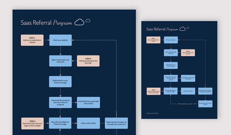
A practical example of a flow chart usage
This fairly simple flow chart illustrates the flow of a user from new signup to referrer. Given how referral programs work – with users bringing new users who bring others – it’s no surprise that the chart’s design is cyclical.
Scatter plots
Also known as scatter charts, scatter plots visualize the relationship between two numeric variables. It consists of two axes, each representing a data set, with points plotted using dots at the intersection of each axes.
A scatter plot shows the correlation between numeric variables – whether that correlation is linear or non-linear, strong or weak, positive or negative. It enables you to identify outliers and understand your data’s distribution easily.
The scatter plot is ideal when you have two numeric data sets and want to quickly see the pattern in the data or the relationship between both variables. This type of chart can be useful when comparing:
- Web traffic numbers with the number of new customers.
- Sales growth versus advertising spend.
- Trial users versus paid users, etc.
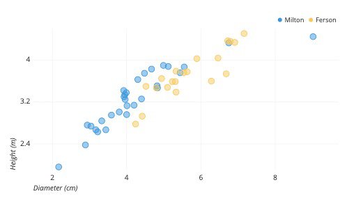
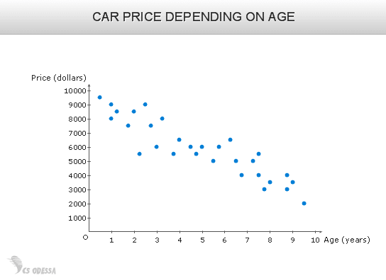
A practical example of a scatter chart usage
The scatter plot in this example shows the relationship between car prices and the car’s age. Very quickly, we notice this is a negative relationship, with prices dropping as the car’s age increases.
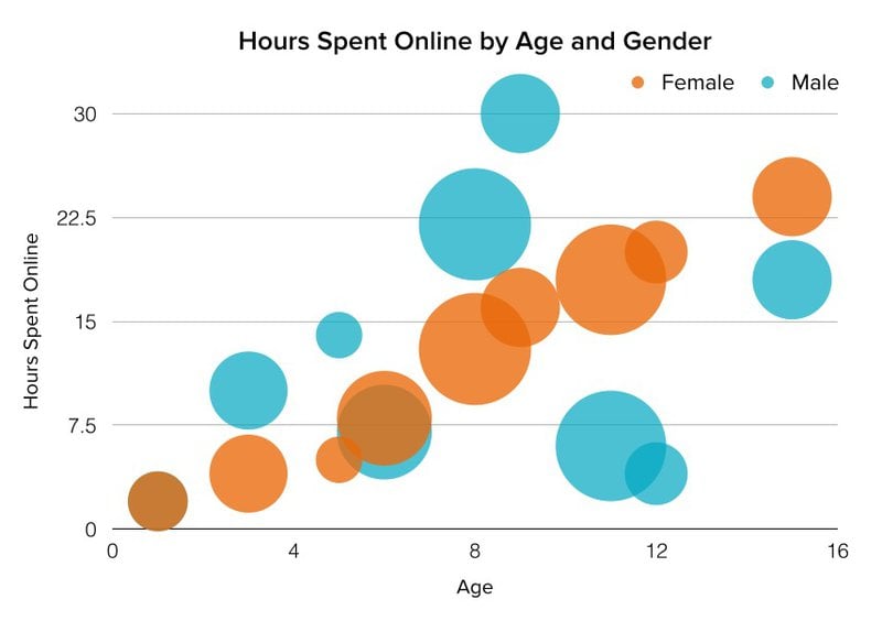
Bubble charts
Also known as a bubble plot, the bubble chart derives from a scatter plot. It is a chart that demonstrates the relationship between three numerical data points. It can also be modified for three numeric and one categorical variable.
Your typical scatter plot shows the distribution or relationship between two numeric variables. When a third numeric variable is added, the bubble chart builds on the base plot by having the third variable’s value determine the size of each point.
Bubble charts are great for visualizing trend lines over time. They’re also great for demonstrating the relationship between multiple variables. Some ideal use cases include:
- Analyzing product usage and feature adoption patterns.
- Tracking campaign performance metrics such as clicks, conversions, and impressions to visualize their impact on investments.
- Analyzing team performances. For example, you could compare sales reps based on their close rate, pipeline value, and deal size.
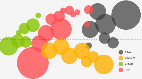
A practical example of a bubble chart usage
The bubble chart below demonstrates how many hours each age group spends online. The bubble colors are a factor of the gender of the group, and bubble sizes are affected by their engagement level while online.
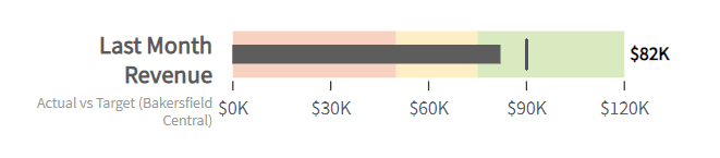
Bullet charts/Bullet Graphs
The bullet chart is a compact and visually compelling tool used to present data comparisons within a single chart or metric. This type of chart is like a progress bar fused into a bar/column chart.
How the chart works is fairly simple. An external bar shows the values from the desired metric, maxing out at a target value. Then, an inner “bullet” bar shows the actual value.
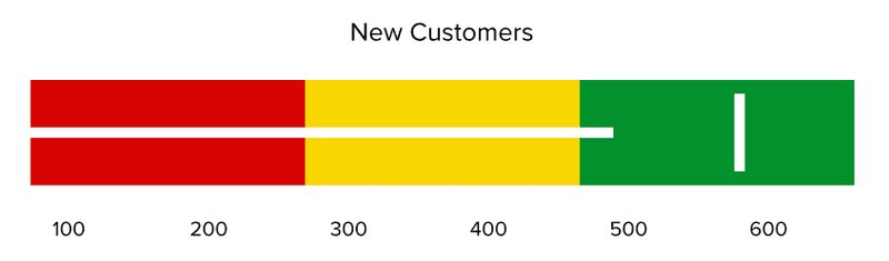
A bullet chart is an excellent tool for comparing performance against goals. It’s ideal for visualizing KPIs (such as revenues, profits, etc.) against their goals/targets. It’s also great for:
- Comparing product usage data year-over-year.
- Analyzing actual customer satisfaction scores versus target values.
- Analyzing year-over-year customer shopping habits, etc.
A practical example of a bullet chart usage
In the above example, the bullet graph compares the target revenue (120k) versus the actual revenue (82k) for the previous month.
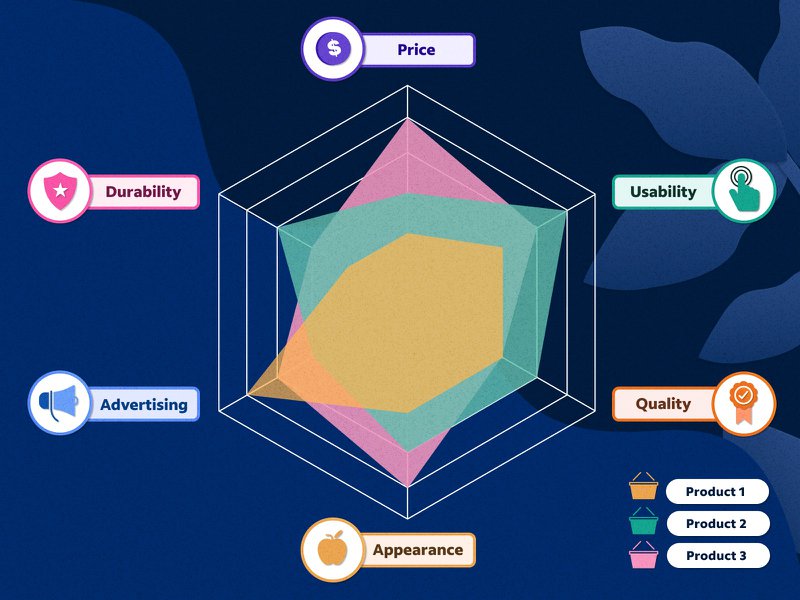
Radar charts
Also known as a spider chart, star chart, or web chart, the radar chart compares a minimum of three quantitative variables. The chart consists of a series of radii, each representing a different category, splayed out from a center point.
Data points are plotted along their corresponding axes, forming a polygon. The closer a data point is to the outermost circle, the higher its value. This visual representation enables quick comparison across metrics.
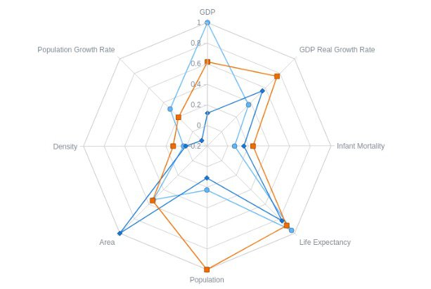
The radar chart type can be useful when:
- Comparing marketing campaign performances across metrics like impressions, clicks, conversions, cost per acquisition, etc.
- Measuring feature impact using metrics like user adoption, revenue growth, and customer satisfaction.
A practical example of a radar chart usage
In this example, a radar chart is used to compare three products across six quantitative data points (price, usability, quality, advertising, etc.).
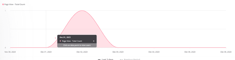
Area charts
Area charts and graphs begin with the same foundation as line charts. Data points are plotted using dots, with a line connecting each point. The only difference is that the space between the x-axis and the line is shaded.
The shading on the area chart makes it easy to visualize changes in volume over time. Thus, rather than focus on specific values, it shows the general changes that occur over a period.
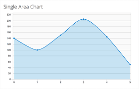
A practical example of an area chart usage
In this example, the area chart visualizes the page views of a segment of users over the last 7 days.
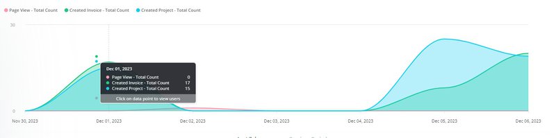
Stacked area charts
The stacked area chart is a combination of multiple area charts (multiple data series) on the same graph. It is particularly designed as a comparison chart and is useful for showing part-to-whole relations.
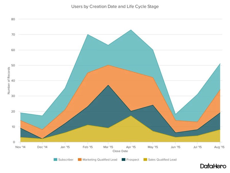
Stacked area charts are comparison tools for multiple data sets (or series) over time. Some use cases include:
- Comparing products or product categories’ performances over time.
- Visualizing the outcome vs. goals of key performance indicators (KPIs).
- Comparing overall trends in the industry, etc.
A practical example of a stacked area chart usage
The stacked area chart below visualizes the number of user actions (page views, invoice creation, and project creation) over 7 days.
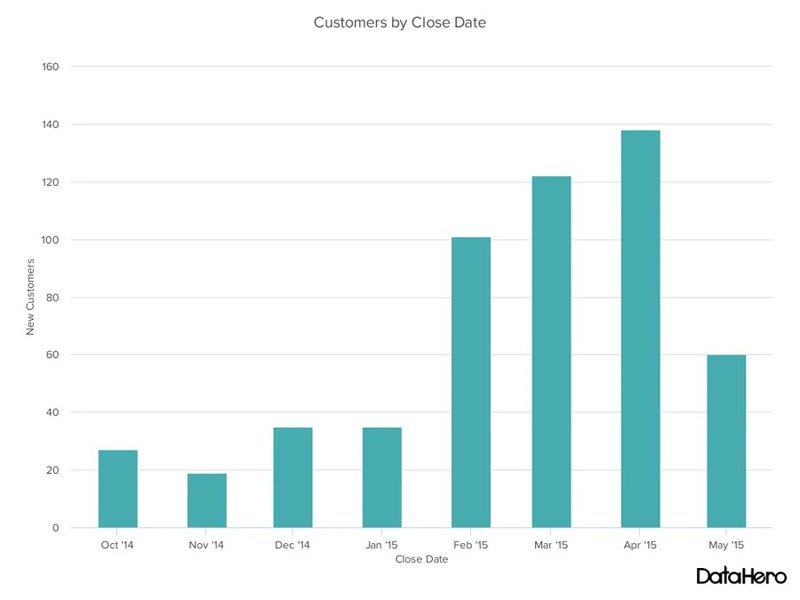
Column charts
Column charts are very similar in style to bar charts. Also known as the grouped bar chart, you can think of these types of charts as bar charts in columns.
Each group contains color-coded bars for different categories or items, with each category making an appearance for each data point. Columns for each data point are separated using spacing.
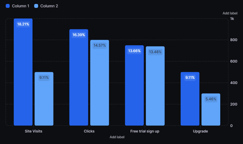
Column charts are ideal when comparing multiple series, as opposed to a bar chart which represents data from one series only. Example use cases include:
- Comparing average order value for different customer segments.
- Charting the number of active users or feature adoption rates for different features, etc.
A practical example of a column chart usage
In the example below, the column chart shows the evolution of a company’s sales volume over an 8-month period. You can easily see that sales peaked in April 2015 and were lowest in November 2014.
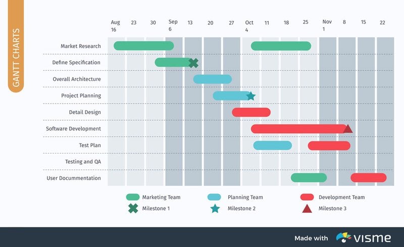
Gantt charts
Gantt charts are visual project management tools that help you plan, track, and coordinate tasks over time. They bring all completed and uncompleted tasks into one place.
The left side of the chart displays all tasks, while the right side represents the project timeline (in days, weeks, or months). In addition to schedules and timelines, the chart also highlights dependencies and milestones.
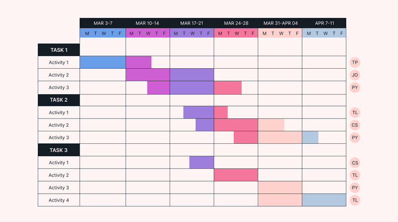
Gantt charts are great tools for analyzing, planning, and monitoring projects. This makes it excellent for:
- Planning and tracking product development tasks and timelines.
- Tracking leads in a sales process, etc.
A practical example of a Gantt chart usage
The Gantt chart below was designed for the project planning phase. Using color codes, it identifies who is in charge of each task. Other graphics also identify different milestones and their expected completion dates.
Line charts
A line chart or a line graph is one of the best types of charts for visualizing data trends over time. Amongst the oldest charts and graphs out there, they are versatile, simple, and easy to use.
The chart typically has a numeric variable on the vertical axis and a timeline on the horizontal axis (in days, weeks, months, etc.). The intersection of both values is plotted with a dot, and all dots are connected by a line.
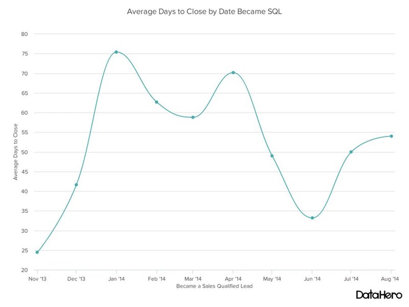
Line charts are ideal for visualizing trend lines over a period. They make it easy to see positive spikes and negative downturns. Some of its use cases include:
- Comparing sales prices over time.
- Visualizing trends in customer acquisition over a period.
- Measuring the performance of your service channels over time, etc.
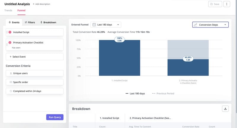
A practical example of a line graph usage
The chart below combines two line graphs for comparison purposes. It compares the number of users who started onboarding versus the number who completed it in the last 180 days.
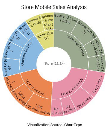
Sunburst charts
The sunburst chart is a type of multi-level pie chart used to illustrate hierarchical data. It consists of a series of concentric outward rings, with each ring corresponding to a different hierarchical category.
Each outer ring represents a higher hierarchy and is sliced up according to its relationship to the inner (parent) circle. Although the sunburst chart is often a better alternative to treemaps, it typically takes up a lot more space.
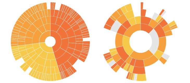
The sunburst chart is ideal for illustrating hierarchical data, such as an organizational chart, or creating a sort of historical hierarchy by breaking down data by periods.
For example, branches of an organization can be represented by designated colors, with different levels showing divisions in the organization and taking on the parent color.
A practical example of a sunburst chart usage
The sunburst chart in this example breaks down a store’s sales of mobile devices. It starts from the total sales, moves out to sales by brand, and ends at sales by device models.
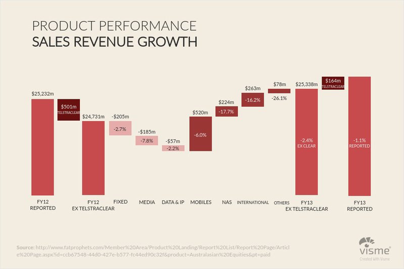
Waterfall charts
A waterfall chart is a special chart type for showing how an initial value changes over time. It records all intermediate changes, whether positive or negative, as well as the final value.
By providing the story beyond the starting and ending points, the waterfall chart makes it easy to understand how different factors impact your data.
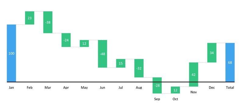
This type of chart is useful for understanding the progression of numbers. This makes it ideal in financial sectors, human resources, and customer analysis. Some use cases include:
- Visualizing positive and negative changes in customer churn over a period.
- Illustrating changes in free trial, new, or current users over time.
- Visualizing changes in revenue or profit over time, etc.
A practical example of a waterfall chart usage
The waterfall chart below illustrates a product’s financial performance over a financial year. Here, we notice every revenue and expense that impacts its growth positively or negatively in the lead-up to the reported growth for financial year 13.
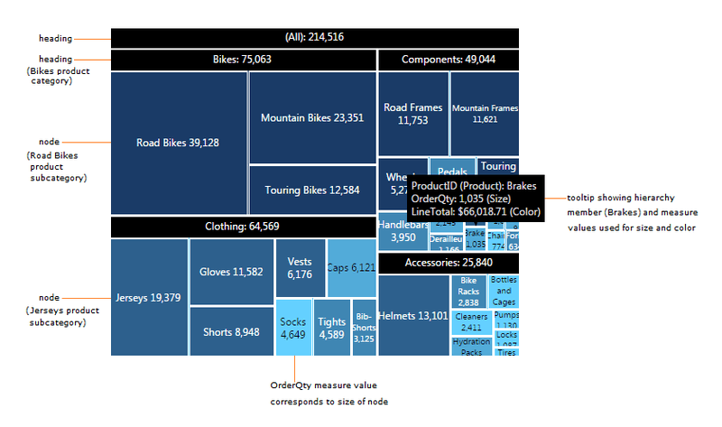
Treemap chart
Much like sunburst charts, treemap charts are ideal for hierarchical data. They use nested rectangles of varying sizes and colors to represent data points within a defined hierarchy.
Categories in a treemap can be subdivided into smaller rectangles if the data contains subcategories. This makes them a great tool for visualizing relationships, both within and between categories.
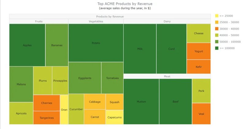
The treemap chart is a major upgrade on the regular bar chart as it easily visualizes which items (products, features, functionalities, etc.) contribute the most to an overall value/goal.
For example, you can use a treemap chart to visualize feature engagement levels. Each rectangle represents a feature (e.g. file sharing, task management, etc.), with its size reflecting the feature’s usage share.
Other sample use cases include:
- Analyzing user behavior and feature preferences across different customer segments to tailor your offerings.
- Uncovering unexpected relationships between feature/product categories.
- Comparing product performances (revenue, sales, adoption, etc.) to identify similarities or anomalies within and between different categories.
A practical example of a treemap chart usage
The detailed treemap chart below shows the sales volume for different product categories and sub-categories for a company that sells bikes and bike gears.
There are four main categories – bikes, components, clothing, and accessories, each sub-divided into smaller product categories for easy comparison.
Mekko charts
Also known as the Marimekko chart, the Mekko chart is a powerful visualization tool for dissecting data and representing part-to-whole relationships.
Mekko charts resemble treemap charts but work like stacked bar graphs. Like the treemap, it begins with a large rectangle divided into groups and sub-groups according to size.
However, these groups are organized side-by-side, with each group sub-divided proportionally based on their sub-categories. Unlike stacked bar graphs, though, Mekko’s x-axis isn’t limited to comparing time progression.
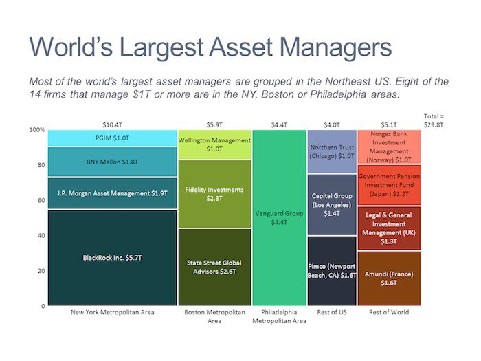
Although it is a rarely used chart type, the Mekko is ideal for situations where you want to emphasize scale differences between data groups. For example, you could use the chart to:
- Track the composition of leads generated by different channels (paid, organic, referral, etc.) and their conversion rates.
- Analyze feature adoption rates for different features across customer segments to reveal product-market fit variations.
- Visualize the progression of users through different user journey stages to identify drop-off points and areas for improvement, etc.
A practical example of a Mekko chart usage
The Mekko chart below illustrates the market share of different smartphone operating systems and the age composition for each. A glance at the chart reveals that Android, Apple, and BlackBerry enjoyed the majority (and similar) market shares at the time of publishing.
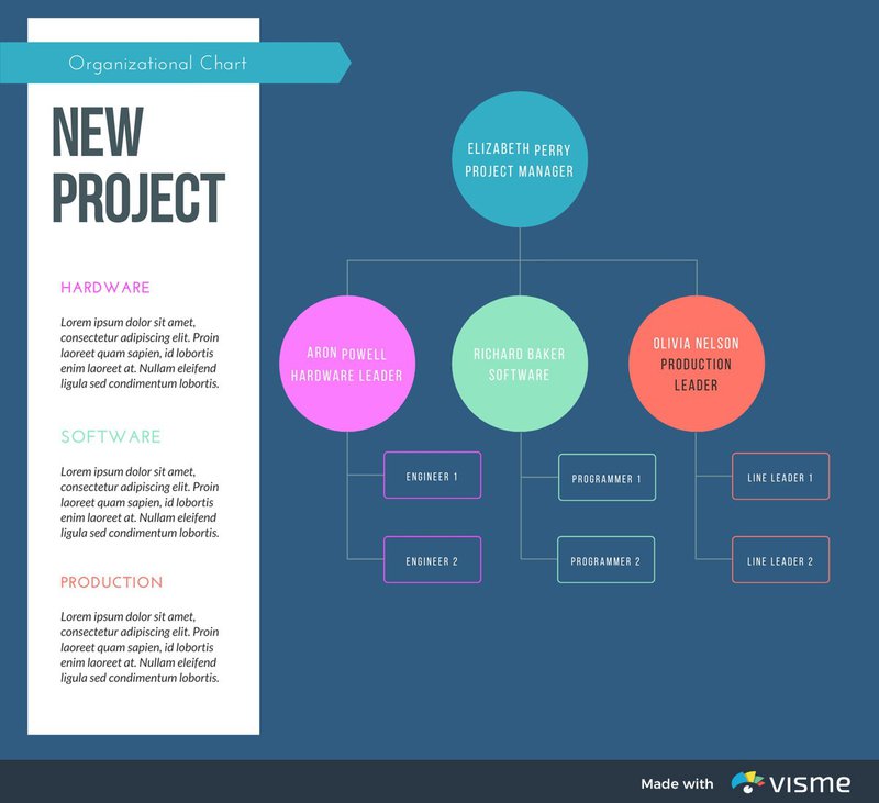
Hierarchy diagrams
Hierarchy diagrams are similar in appearance to flow charts. Also known as an organizational chart or organigram, this chart type illustrates the structure of an organization and the relationships within it.
Hierarchy diagrams excel at visually depicting relationships within a system or organization, revealing the order and flow of information. It usually consists of shapes that represent individual elements and clear connection lines depicting relationships and hierarchical flow.
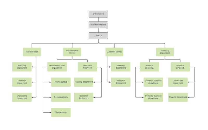
Common use cases for hierarchy diagrams include:
- Depicting organizational structure, relationships, roles, and responsibilities.
- Visualizing the architecture and flow of features and functionalities within a product.
- Mapping out user access levels and permissions to ensure data security and control, etc.
A practical example of a hierarchy diagram usage
Below is an example of a simple hierarchy diagram depicting roles and communication lines for a new project. There is an overall project manager and three teams, each with a head and two members.
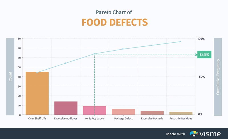
Pareto charts
A Pareto chart is designed to reveal the most important information among many. Also known as the 80/20 chart, it provides a visual representation of the Pareto principle: 20% of causes influence 80% of outcomes.
To do this, it combines a bar graph with a line graph to illustrate the individual values of each category and the cumulative value of the entire total.
The bars on the chart reveal the value of each item, ranked in descending order of value. Meanwhile, the cumulative line graph shows the percentage of the total value added by each bar.
Pareto charts highlight the top contributors to an outcome, making it easy to identify priority areas. Some sample use cases include:
- Analyzing traffic sources for a SaaS website or product to find the top 20%.
- Identifying the 20% of customer care issues that generate the most support tickets.
- Determining the 20% of product features used by 80% of users to guide future resource allocation and development plans, etc.
A practical example of a Pareto chart usage
In this chart, a company tries to determine the top 20% of defects affecting food products. The visualization makes it easy to see that the first three problems account for over 80% of food defects.
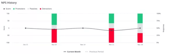
Control charts
A control chart compares a data set to a predetermined “control” set. Also known as a process behavior chart, it excels at visualizing process performance over time, enabling you to detect variations promptly.
Control charts typically display a central line representing an average or expected value. There may also be upper and lower control limits to define expected boundaries for normal data.
Points outside of these boundaries, therefore, are identified as outliers and marked for further investigation.
There are many different types of control charts, each designed for a specialized purpose. Depending on your choice of control chart, sample use cases may include:
- Tracking average ticket resolution times to identify outliers that may indicate bottlenecks.
- Tracking the frequency of software errors to identify patterns and unmask underlying issues.
- Monitoring churn rates to identify spikes in subscription cancellation and take remedial action, etc.
A practical example of a control chart usage
In this example, a control chart is used to track NPS history and compare it to prior trends, enabling you to easily identify progress or setbacks.
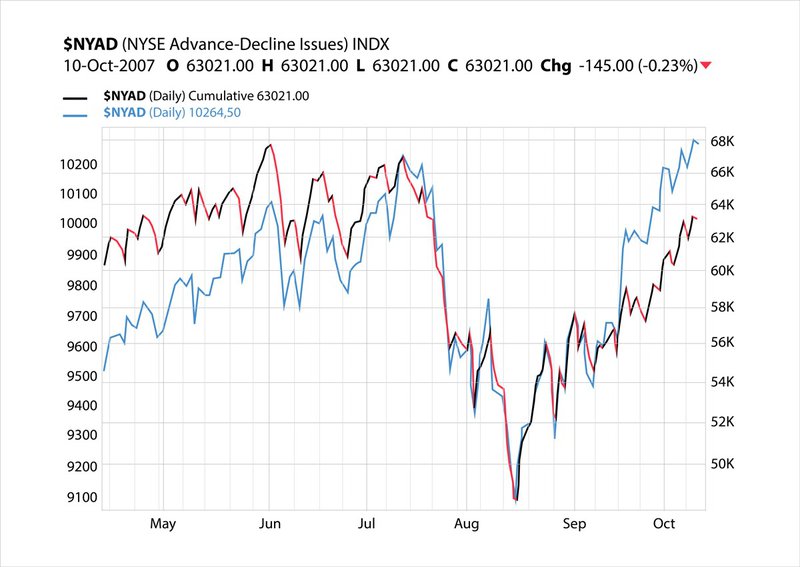
Stock charts
Stock charts are visual representations of a stock’s price movement over time. These charts are popular in the financial market and are used by traders and investors to analyze trends, identify opportunities, and make decisions.
The typical stock chart is an adaptation of the line graph into a histogram. Each line tracks the changes in a stock’s price, and multiple lines can be layered over themselves to compare multiple stock performances.
Stock charts are hyperspecific to the financial market. Use cases include:
- Portfolio management.
- Trading signals and algorithms.
- Investment research and analysis, etc.
A practical example of a stock chart usage
The stock chart below tracks the performance of the $NYAD index, an excellent tool for assessing the overall health of the market.
When to use each type of charts and graphs?
Knowing the different types of charts and graphs is only the first step. To succeed with data visualization, you must also know how to choose the right chart for your data.
What follows is a good rule of thumb that can help you make that decision.
- Comparison charts: The column, mekko, bar, pie, line, scatter, and bullet charts are ideal if you want a visualization that helps you compare data points and value sets.
- Part-to-whole charts: These charts help you visualize the parts of a larger item. They include the pie, stacked bar, waterfall, area, stacked area charts, etc.
- Distribution charts: These charts help you to visualize the distribution of your data and identify outliers. They include the scatter plot, Mekko, line, column, and bar charts, among others.
- Trend Analysis: Graphs and charts like the line, dual-axis, and column charts help you easily determine how a data set performed at a specific time.
- Relationship charts: Charts such as the bubble chart and scatter plot are ideal when you want to show how one variable relates to one or more variables.
About the author