10 Great In-App Tutorials That Drive Product Adoption
Looking for some captivating that will inspire your own creation? Look no further!
Generally speaking, good tutorials successfully showcase the product’s features, eliminating frustration and improving product adoption.
In this article, we examine the types of in-app tutorials, go over some examples, and discuss some best practices to consider while creating your own guide.
Find the Perfect In-App Tutorial For Your Users
Overview of in-app tutorial examples to drive adoption
- In-app tutorials are built-in guides and walkthroughs that help users understand and navigate your app.
- These tutorials drive user engagement, help users understand your value proposition, and boost product adoption.
- There are different types of in-app tutorials, including interactive walkthroughs, standalone in-app messages, and micro-videos.
Some excellent in-app tutorial examples include:
- Rocketbots in-app tutorial.
- Groupize in-app tutorial.
- Demio in-app tutorial.
- Kommunicate in-app tutorial.
- Salesflare in-app tutorial.
- Notion in-app tutorial.
- Figma in-app tutorial.
- ProdPad in-app tutorial.
- Slack in-app tutorial.
- Canva in-app tutorial.
Some tips to help you create truly effective in-app tutorials include:
- Use different UI patterns such as modals, tooltips, slideouts, and hotspots.
- Personalize in-app tutorials for different user segments.
- Leverage AI writing assistants to refine the copy of your in-app tutorials.
- Ask for user feedback and improve your in-app tutorials based on it.
- Run A/B tests and multivariate tests to continuously optimize your tutorials.
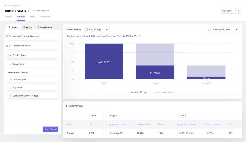
- Analyze the effectiveness of your guides with funnel analysis and improve.
What are in-app tutorials?
In-app tutorials are built-in guides within the product.
They are interactive guides that help users navigate the app’s features, workflows, and best practices with ease.
Types of in-app tutorials
In-app tutorials come in a variety of formats, each catering to a different situation or learning style. Some common types include:
- Standalone in-app messages: These are brief informational messages that appear when you hover over an element (button, icon, etc.). They are also known as tooltips and are used to offer quick explanations about the element’s function.
- Interactive walkthroughs: These are engaging guides consisting of different UI patterns that handhold users and teach them how to use a particular feature step-by-step.
- Micro-videos: These are bite-sized video tutorials embedded within the app. They offer concise “how-to” explanations for users and are perfect for those who prefer video explanations.
10 Great in-app tutorial examples that educate and guide users
Let’s now explore some effective in-app tutorial examples across different SaaS products and services to inspire your user onboarding strategy.
1. Rocketbots
Rockebots (respond.io) is a product messaging platform that enables you to automate your chats, manage multiple inboxes, and drive conversions.
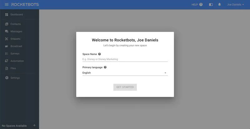
To encourage users to use the product, Rocketbots’ welcome screen personalizes the user greeting and urges the user to create a “Space” to begin. This ensures the new user is engaged right off the bat.
Rocketbots also provides a user onboarding checklist that highlights key actions new users must take to reach the activation point. One of these “key actions” involves finishing the provided in-app tutorial.
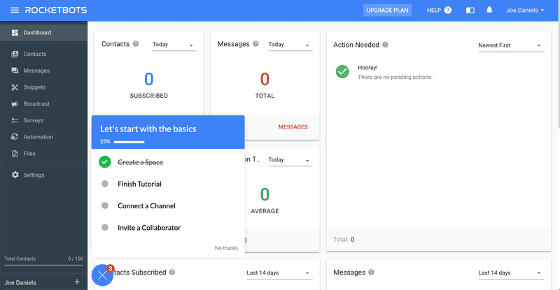
By incentivizing users to complete the tutorial, they ensure each new user is equipped to navigate the product successfully.
By the time the user is done with the checklist, they’ll have created a space, connected a messaging channel, and invited their first collaborator. Indeed, they’ll be on their way to becoming active users.
2. Groupize
Groupize is a management platform for group and corporate business travel and events. It is designed to “democratize events management,” making it accessible to users of different technical levels.
To ensure the product was user-friendly, Groupize created in-app guidance for its users. They made an interactive in-app assistant named G.G. (Groupize Guide).
As new users launch the product for the first time, the assistant welcomes them and introduces itself.
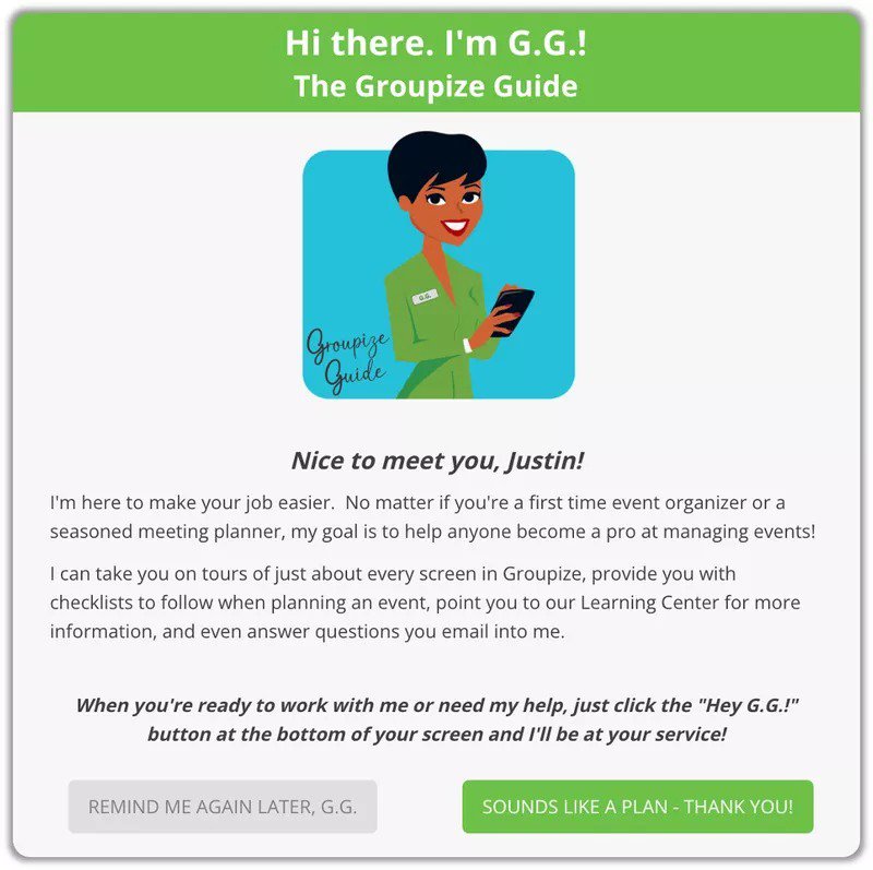
They also provided continuous onboarding to make G.G. knowledgeable and accessible. For example, after creating an event in Groupize, G.G. pops up with a brief message encouraging you to publish the event.
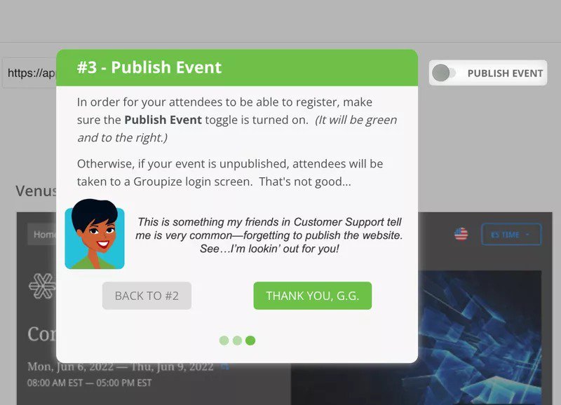
To ensure its accessibility, Groupize also created an in-app resource center. This enables users to summon G.G. whenever they need it, while also enabling G.G. to provide more detailed help content.
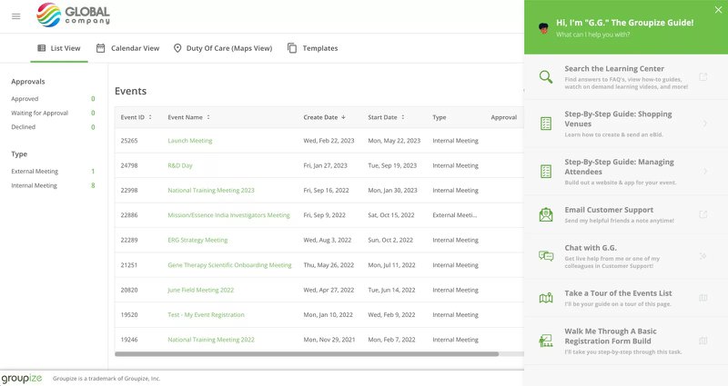
Instead of writing support for obvious queries like “How do I add a hotel?” users direct such questions to G.G. As a result, support requests are now fewer, containing questions that really require human intervention.
3. Demio
Demio is a webinar-hosting service designed to boost attendee engagement and encourage audience participation. It also incorporates analytical insights to enable you to track your webinar back to revenue.
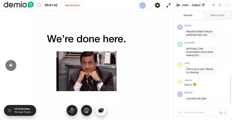
Demio’s in-app tutorial for new users seamlessly combines a product tour with a walkthrough. First, you get a tour from a product specialist showing you what a webinar hosted on the Demio platform looks like.
Next, users are provided with a user onboarding checklist to guide them to activation. Users can then complete the tasks on the checklist independently to create and host their first webinar.
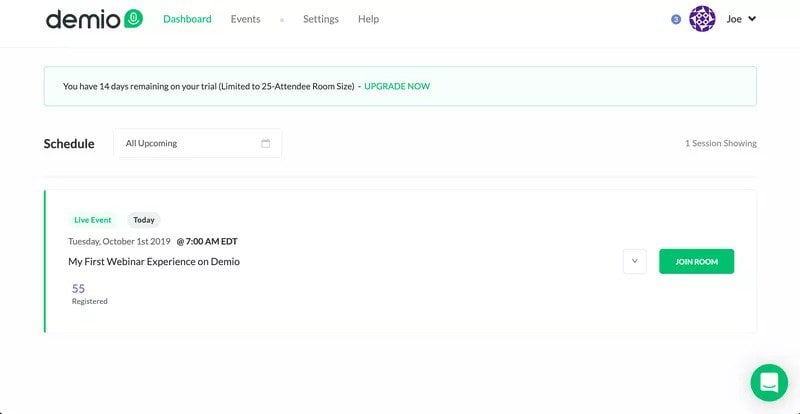
By guiding users to take necessary actions, Demio makes the user onboarding experience interactive. This combination of a product tour and walkthrough, thus makes it easier for users to navigate the product.
4. Kommunicate
Kommunicate is a chat-based customer support tool that helps companies to combine chatbots with human agents to deliver blended, high-quality, 24/7 support.
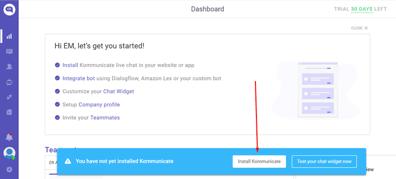
They created in-app tutorials and provided interactive in-app guidance to help users discover existing features and aid feature adoption.
For example, Kommunicate created a walkthrough to guide users through the steps required to integrate the chatbot. The result was a 15% increase in their signup-to-chatbot-integration rate.
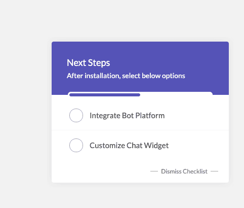
Next, they identified the 5 most important features that correlate with conversion and integrated them into a checklist. The introduction of this checklist led to a 4% increase in the adoption rate.
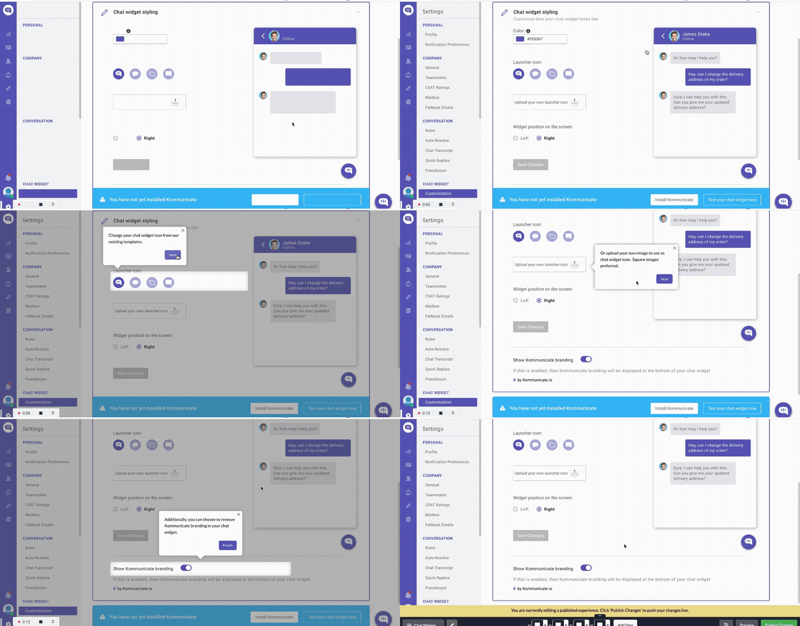
Finally, they provided interactive walkthroughs for the different features to aid feature adoption. For example, the chat widget customization walkthrough provided valuable in-app training for users, leading to a 3% increase in its usage.
5. Salesflare
Salesflare is a specialized Customer Relationship Management (CRM) tool designed to cater to the needs of small businesses and startups.
As new users land on the welcome screen, they’re given the option to choose whether they’d like to get the walkthrough immediately or skip it. This allows those who like to explore or who may already be familiar with the product to move on without the walkthrough.
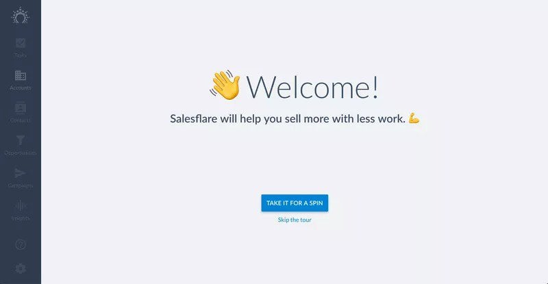
For users who opt for the walkthrough, Salesflare provides in-app guidance via a clean, easy-to-follow interface. For example, a simple tooltip directs attention to a suggested contact and guides the user to import their first contact.
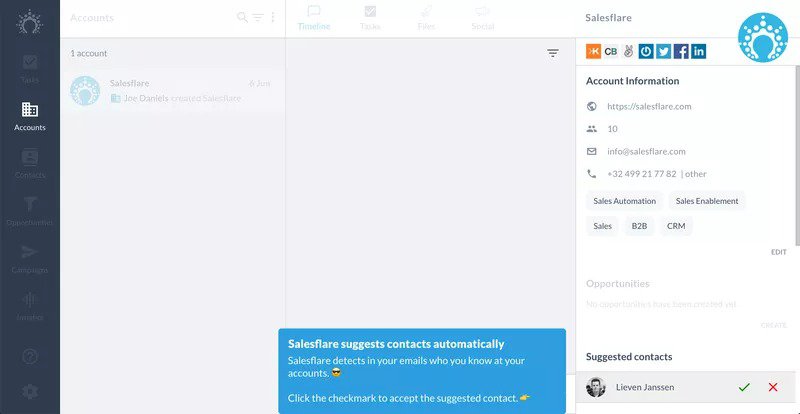
In another example, Salesflare uses a tooltip on the Opportunities tab to show new users how to organize their sales pipeline and streamline their user acquisition efforts.
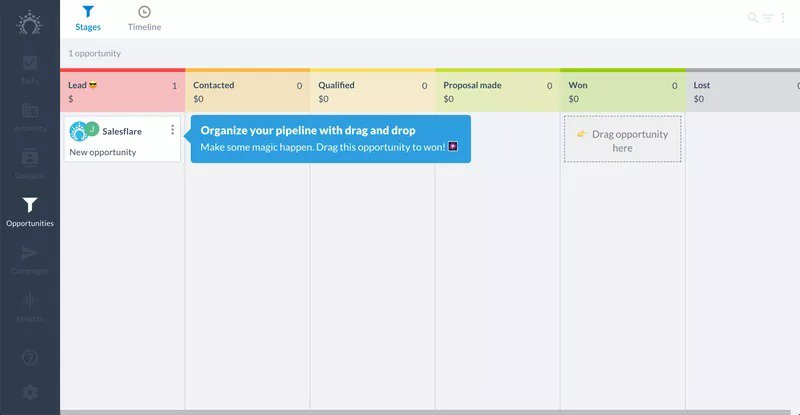
Finally, this walkthrough screen encourages users to take necessary actions that will make using the product easier, such as connecting their calendars and email.
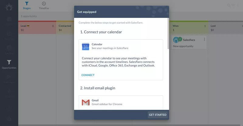
Thanks to this series of in-app guides, Salesflare ensures its new users are ready to immediately extract value from the product.
6. Notion
Notion is a digital workspace that blends everyday work apps into one. It enables you to capture your thoughts, manage projects, or even manage your entire organization’s workflow.
To help new users get off to a good start, Notion utilizes its welcome screen to collect valuable user data. It uses a welcome survey to understand users’ needs and jobs to be done (JTBD).
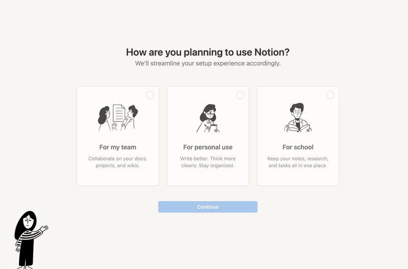
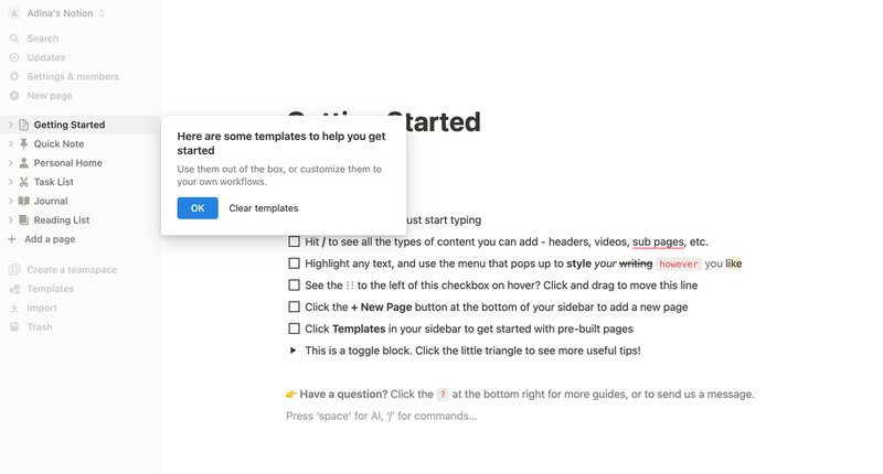
Once you get into the app, Notion pre-populates your page with a checklist of actions. The checklist shows you how to use the product while also showcasing what a Notion page looks like.
Finally, to help you get started, a tooltip directs you to some customizable templates.
7. Figma
Figma is a hugely successful collaborative design tool for designing and prototyping. Their success has been fueled by their ease of use, which is itself fueled (in part, at least) by their onboarding process.
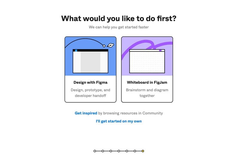
To reduce friction for new users, Figma uses a welcome survey that gets their name, team, and use case. Right after that, though, Figma asks users what they’d prefer to do first.
This is because Figma recognizes that its product has two major use cases: design and whiteboard. Based on the user’s immediate preference, they launch a tailored onboarding experience to provide the necessary in-app guidance.
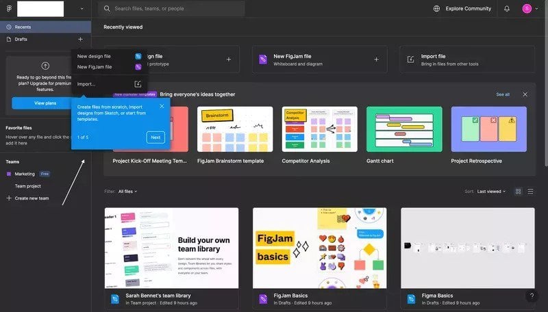
Figma also fills the dashboard of first-time users with relevant demo content. On the one hand, it demonstrates what the dashboard will eventually look like.
On the other, it contains a welcome video and tutorial content to help the new user.
8. ProdPad
ProdPad is a product management software that helps product managers develop their product strategy, create and manage product roadmaps, and manage teams.
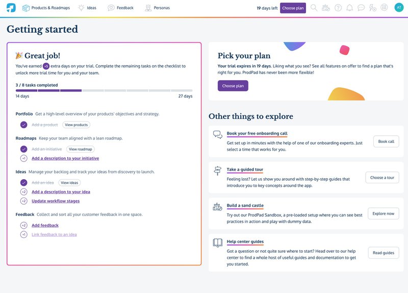
To help new users quickly test out the product’s core functionality, they use a modal to prompt them that they can extend their trial by completing some onboarding tasks.
These tasks enable ProdPad to collect valuable data about the user’s desired use case. They also drive user engagement, ensuring the user reaches the Aha! Moment sooner.
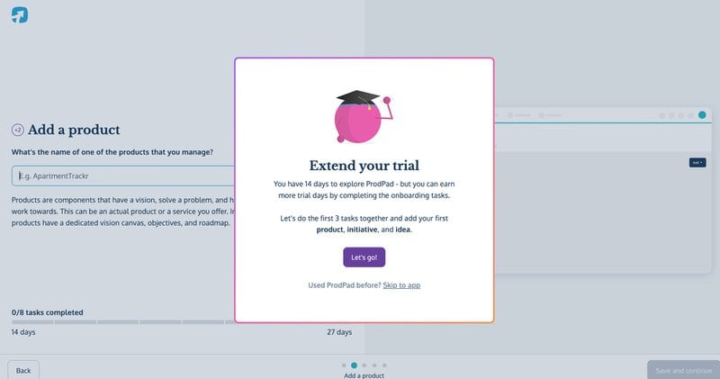
For each of the first three tasks, ProdPad uses in-app tutorials to help users complete them successfully. However, they also Getting Started guides to illustrate how different tasks can be completed.
9. Slack
Slack is one of the most successful digital workspaces to ever exist and is also one of the foremost in-app tutorial examples for SaaS products.
Slack’s superpower lies in its ability to clearly articulate its value proposition, which is evident on both the Slack home page and on the welcome screen.
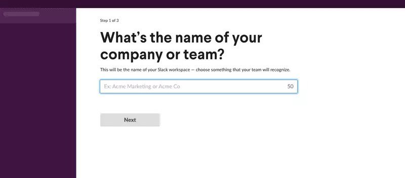
Once you get past the welcome screen, though, Slack requires you to complete a simple onboarding survey. They ask for your company name and what you’re working on to help them personalize your experience.
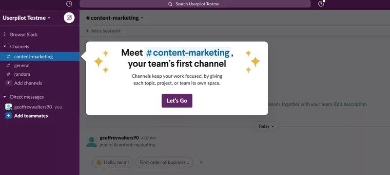
Finally, the user is presented with a prompt to complete a guided tour of the product and discover all of its valuable features.
10. Canva
Canva is a free-to-use graphic design platform that empowers users to create social media posts, banners, posters, presentations, logos, and more.
Thanks to its simplicity, Canva is loved by non-graphic persons who want to get a quick design out. With that in mind, they go all out to help new users navigate the platform easily.
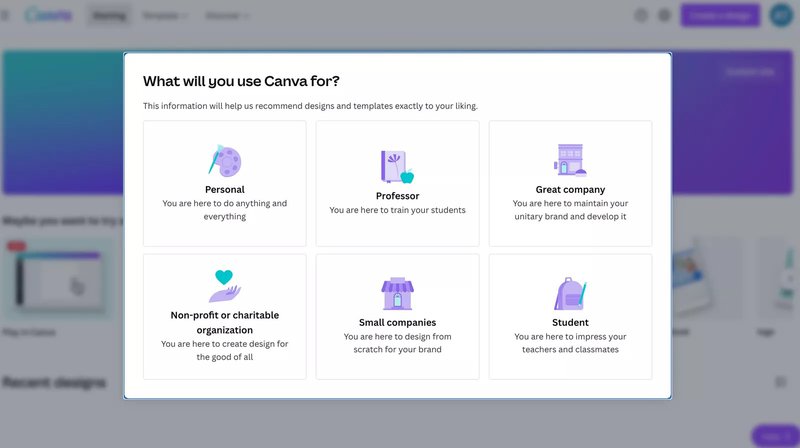
Immediately after signing up, an onboarding survey pops up to determine the user’s goals. This provides them with valuable information for personalizing the onboarding experience.
On the next screen, Canva uses an engaging copy to get the user to “Play in Canva,” a clever way of getting them to use (and know!) the tool.
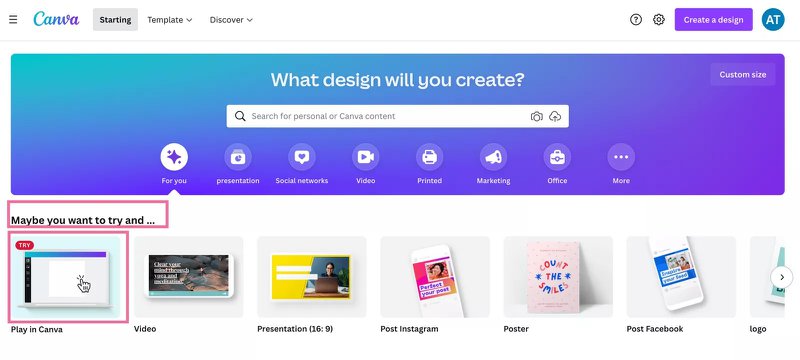
Within moments, Canva gets the new user to begin creating their designs while using cleverly worded tooltips to explain how the tool works.
Best practices for creating in-app tutorials
Thanks to the in-app tutorial examples you’ve seen so far, you may now have an idea of how these tutorials can be built into your onboarding flow.
Now, though, let’s zoom into the qualities of a good in-app tutorial.
Use different UI patterns
Our brains get easily bored when seeing the same thing over and over again. To prevent that from happening, mix and match different UI patterns within your in-app tutorials.
Examples of in-app messages you can use include:
- Checklists – a list of tasks and checkboxes that usually appear at the very beginning of the tutorial.
- Tooltips – small text boxes that contain information about an element.
- Modals – attention-grabbing large patterns that cover the whole screen.
- Slideouts – in shape similar to modals but are less intrusive.
- Hotspots -flashing icons that trigger something else once clicked.
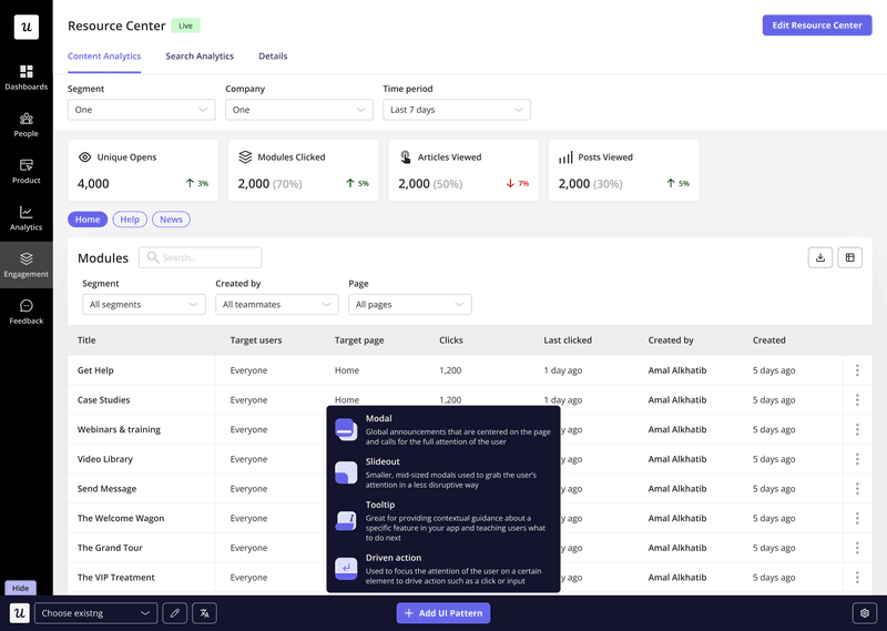
This should keep your tour visually appealing and stimulating, ensuring it is interesting enough for the user’s attention.
You should also customize each UI pattern to match your brand colors and create a consistent onboarding experience.
Personalize in-app tutorials for different user segments
As you may have noticed with some of the in-app tutorial examples above, users often adopt the same product to do different jobs. This means that they may adopt your product but focus on different aspects of the product.
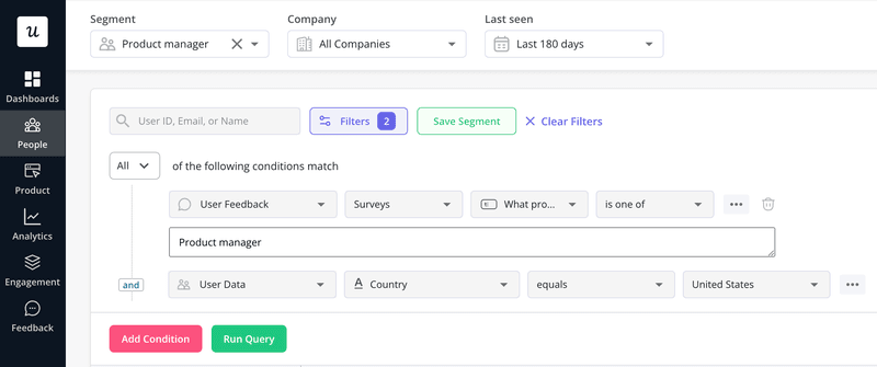
To ensure each user’s need is catered to, create in-app guidance relevant to each use case in your product. The user onboarding flow for each use case should highlight the core features needed to achieve that goal.
Treat each use case as a different user segment and use a welcome survey to determine each user’s use case.
Use AI to improve the microcopy in your user guides
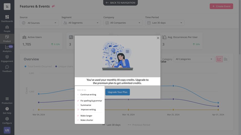
One of the most important parts of your in-app tutorial is your microcopy. When properly written, this small piece of content ensures your guide is clear, concise, and self-explanatory.
Thankfully, with the rise of several specialist AI-powered writing tools, writing a good microcopy is easier than ever.
Collect user feedback and improve your in-app tutorials
Just as with building products, you need user feedback to tell you where you’re succeeding or failing.
To understand that, it’s best to ask the user directly. Once the user completes the tour, trigger an in-app survey to understand their experience with it.

Your goal, however, will be to go beyond the ratings to get granular insights. For that, you can use follow-up questions to dig deeper, find areas for improvement, and ultimately, improve the walkthrough.
Run A/B test and multivariate tests to find the best tutorial
So, here’s the truth… you aren’t creating in-app guides for yourself. With that in mind, you’ll need to try out different designs to see what best resonates with your audience.
This means testing out different UI patterns, microcopy, graphics, CTA buttons, colors, and whatnot.
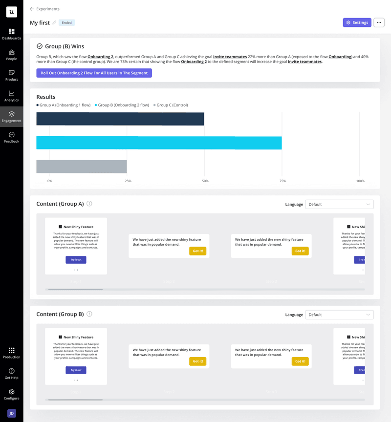
With A/B and multivariate tests, you can determine the best-performing variant of an in-app tutorial and deploy it for the rest of the users.
For example, you can set your goal for the product experiment as inviting a certain number of users into the product and then monitor which color CTA button helps achieve this.
Measure the effectiveness of your tutorial with product analytics
Finally, the goal of any in-app tutorial is to promote user engagement and drive product adoption.
to understand whether or not your tutorial is effective, dive into your analytics to track your tutorial’s performance.
For example, you can analyze the onboarding funnel to understand if the drop-off from one step to the next is too much. If it is, you can make modifications to your tutorial to improve its effectiveness.
