How to Create Interactive User Guides for Your SaaS Product
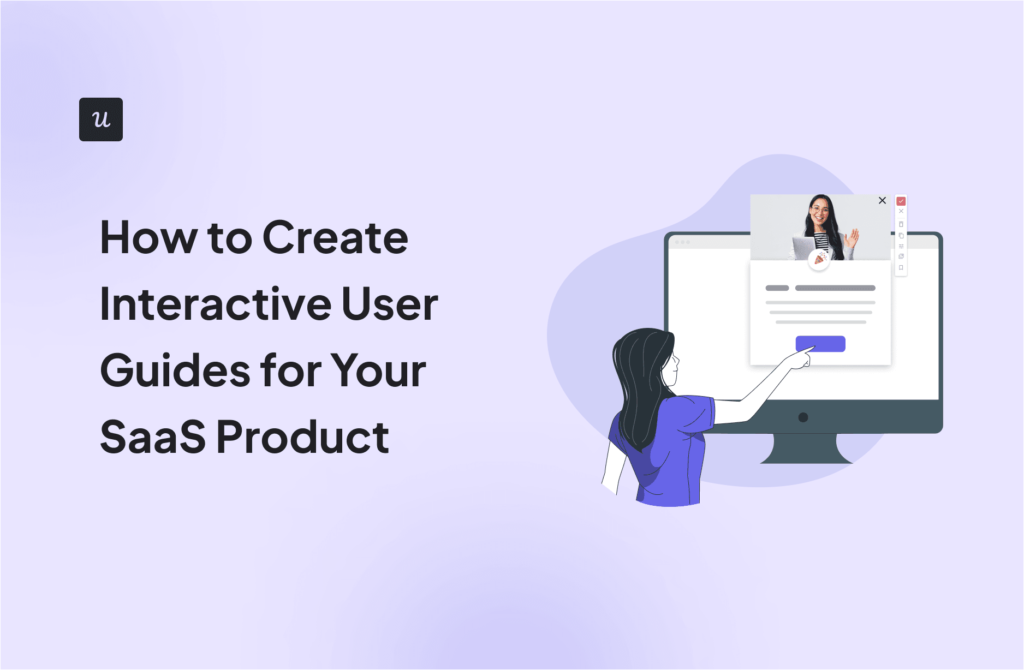
You want your SaaS users to understand your product, not just log in. And you’ve likely considered interactive user guides. But are they just pop-ups or a real driver of adoption?
Here’s the truth: generic product tours and help docs with detailed instructions don’t cut it. Users need action-driven guidance. They need to do to learn.
In this guide, I’ll show you how to build interactive walkthroughs to enhance user engagement. We’ll cover the types of guides that work, why no-code tools are essential, and the practical steps to building effective, personalized experiences.
Build interactive user guides in-house (not recommended)
For most software companies, creating interactive manuals from scratch is the wrong approach.
Why?
Rather than reinventing the wheel, your developers should prioritize their efforts around enhancing your software – making it faster or more visually appealing – and regularly shipping updates that delight your customers.
Building and maintaining a tool has a big impact on the development efforts. Even minor changes or tweaks lead to more developer time clogged up – and that means you are not completely free to customize your approach.
It’s difficult to do rapid-fire A/B testing, and you lose the opportunity to gather valuable user data.
Finally, there’s a lack of flexibility.
You’ll likely only be able to build something that all your users interact with in the same way, rather than being able to target distinct segments with contextually relevant information.
Given that product personalization is one of the main reasons users engage with interactive guides, that’s a big problem.
Create interactive user manuals with no-code tools
Using a pre-built platform is a much better option.
With the low technical barrier to entry, anyone from operations to customer success managers can quickly create an interactive tour, which means you can reduce reliance on software developers.
Rather than a ‘one size fits all’ approach, you can trigger user guides contextually – so based on the specific actions the customer has taken, targeted support is triggered to help them navigate and use the product more effectively.
It’s also a far more flexible choice.
There are dozens of variables you might want to adjust, from small changes to copy to tweaking the design. In a custom-built tool, this represents a significant amount of work – in a no-code tool, it’s incredibly simple.
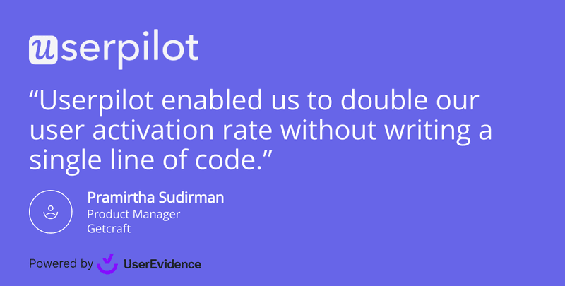
That gives you the freedom to experiment and improve your software. As our customers put it:
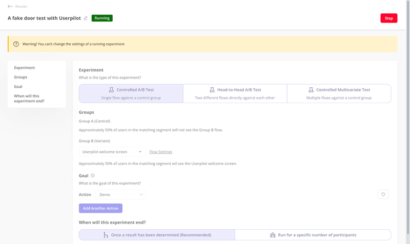
In addition, customer adoption tools make it easy to see which version of an interactive user guide performs more effectively with A/B testing (and adapt your approach accordingly).
A/B testing helps you to test different versions of your user guides rapidly against a control group.
So, using a no-code tool is a no-brainer.
But how do you actually go about putting a guide together? How do you create something that engages and helps your users?
This section of the article explains the key steps in the process.
A note – we’re using Userpilot as an example here, so these steps might be slightly different in a different tool. However, the underlying principles will be the same.
1. Set up a goal
It’s very tricky to build an effective guide if you haven’t thought carefully about what you’re trying to demonstrate.
Rather than a lengthy tour of every feature in your product, flip it around and think from the user’s perspective. Think about the features they use and why they use them – what are your customers trying to achieve?
When you’ve picked a feature to tackle, you can set a range of product goals of what you might need your users to do to experience value.
Remember that what gets measured, gets managed – this data will help you to understand whether your interactive manual has been a success or not.
2. Create an in-app flow
Once you’ve decided on your goal, the next step is to put together a new in-app flow.
The first step to building an interactive guide is creating a new flow. You can either navigate to the Flow dashboard….
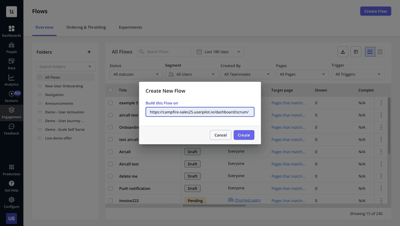
Set the page you want your guides to trigger, and you’re ready to start building.
You’ll have a range of UX patterns to choose from, but the majority of interactive guides use a combination of driven actions and tooltips.
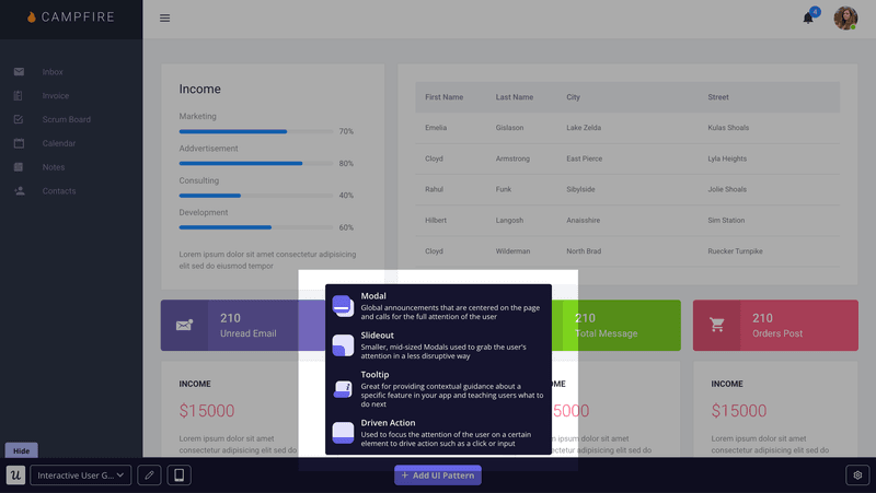
Driven actions are a bit of functionality unique to Userpilot, and they are all about tailoring a product tour to the user’s needs. This allows you to focus on choosing the right features to explain (rather than wasting time building permissions).
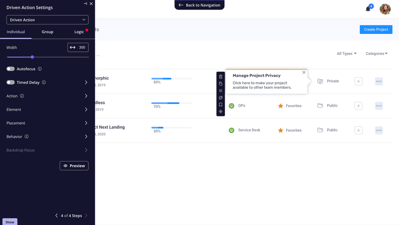
You should always consider the context when considering which action you want your user to take.
In the example above, you can see the range of options you have to choose from. It’s important to think carefully about which action makes the most sense in the context of the flow.
Making your customers physically hover over something, click, drag, or engage in any way with your product is the best way to help them understand complex features. It’s one of the most powerful self-service tools you can deploy.
So when should tooltips feature in your interactive guide?
Tooltips explain what your customer has to do and how to do it. The example below demonstrates how you might insert them into a flow.
You should use them at specific points in the journey to provide contextual instructions. That helps users better understand how your product works and build up their knowledge base.
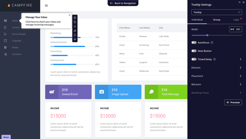
Tooltips can form a valuable part of any interactive guide.
You can then easily link a combination of driven actions and tooltips together to create guides that generate interest and support new users.
3. Set your guide to trigger for different custom user segments for a personalized experience
Should you treat your customers as one uniform group?
Absolutely not – every user has different goals, ambitions, and needs.
Instead of adopting a blanket approach, you should think in terms of user segments: groups of customers who interact and engage with your product in a similar way (or share something in common).
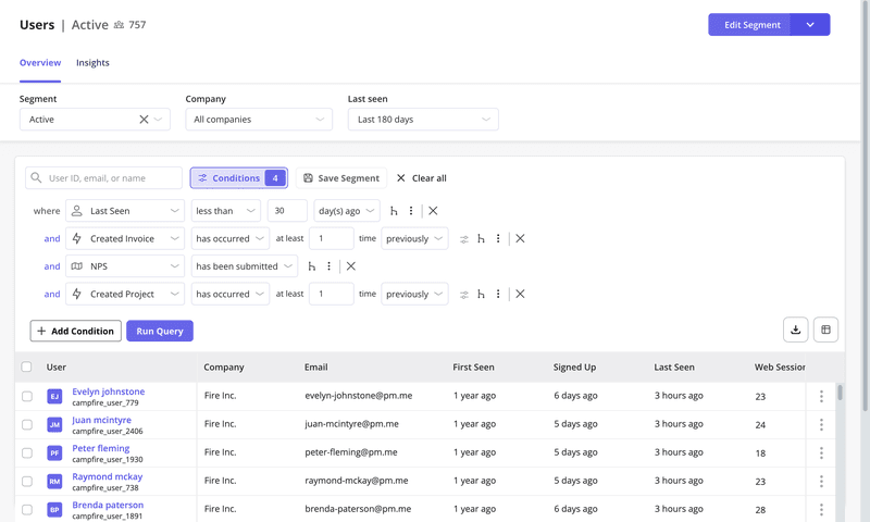
To get the most out of interactive guides, they should be targeted to address the needs of different user cohorts.
You can break this down in several ways:
- User role
- Jobs to be done
- Engagement
- Feature adoption
- Activity levels
- Other custom attributes
You can either specify a segment you’ve already built or set specific conditions for each interactive guide you build.
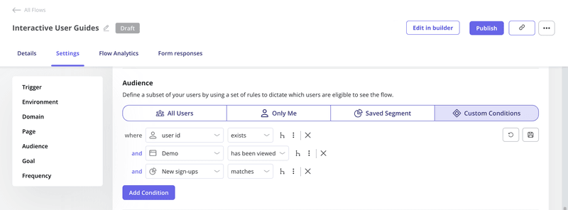
That makes it simple to trigger in-app user manuals that are focused and relevant to each group.
Creating interactive user guides to enhance user onboarding with Userpilot
We’ve covered how creating an interactive user guide can be an extremely valuable activity for boosting retention rates and engagement and supporting your product goals.
But there’s more to consider – by picking the right software, you can expand the tools you have available for how you engage with users in-app.
Segment your users to trigger contextual help messages and guides across the onboarding process
As already mentioned above, context is everything when you create interactive user guides. To make sure they trigger for the right users, use advanced segmentation.
You can create different user segments for each user onboarding stage and group users based on their in-app engagement and behavior.
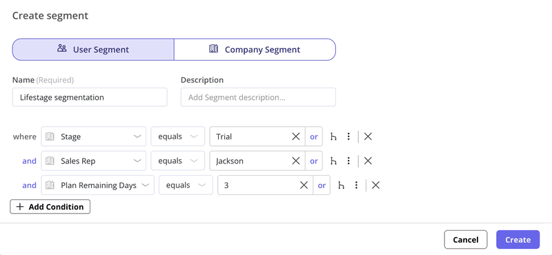
Build user guides and shorten the learning curve
User guides are great for showcasing advanced features and engaging users by showing them exactly how to progress through your application.
Let’s take a look at the example below from Attention Insight. Spun up in minutes with Userpilot, the in-app guide is extremely effective for explaining how the tool works.
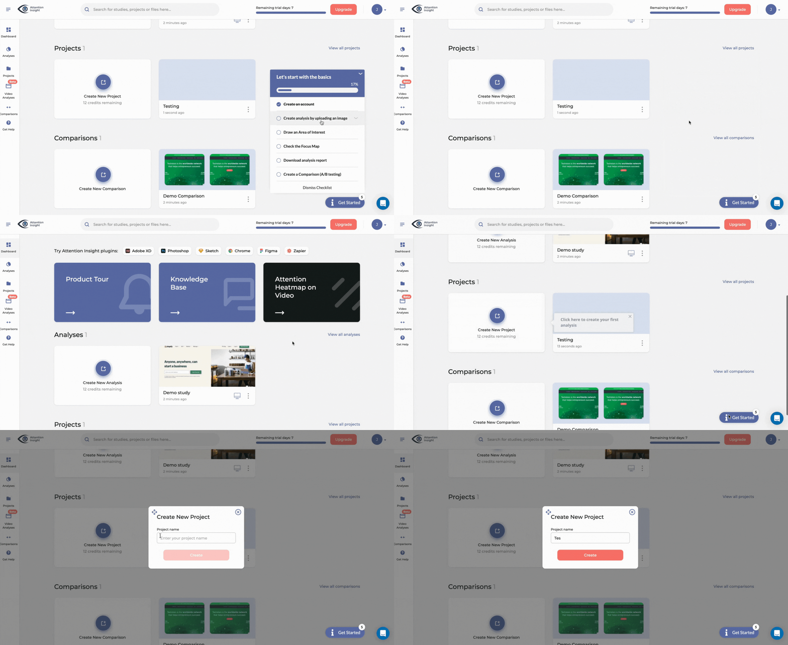
With no-code functionality and a user-friendly interface, you don’t need technical expertise to create user guides in Userpilot. Just pick a template (or start from scratch) and drag and drop elements to design walkthroughs.
Guide users with onboarding checklists
A checklist is also a useful tool to consider if you want to drive digital adoption. They are particularly useful for crafting engaging user onboarding experiences.
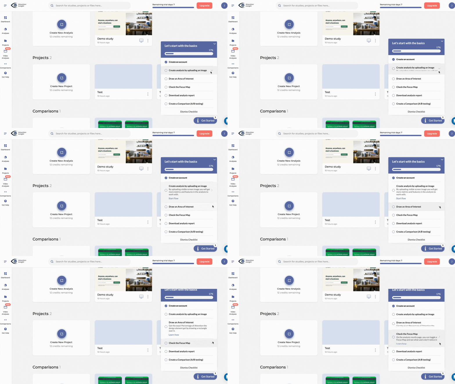
Checklists that drive interactive guides enable a personalized approach, which is great for engagement.
By setting out the tasks users need to complete to hit milestones in the journey, it’s clear to the user what they need to do to progress – and with each option triggering a different interactive guide, their onboarding experience is personalized to their needs.
Offer self-service support with a resource center feature
Users are always going to need additional support.
Having a great customer support team is a critical part of any successful digital product. But it’s possible to mitigate a big chunk of upcoming support calls by building a resource center.
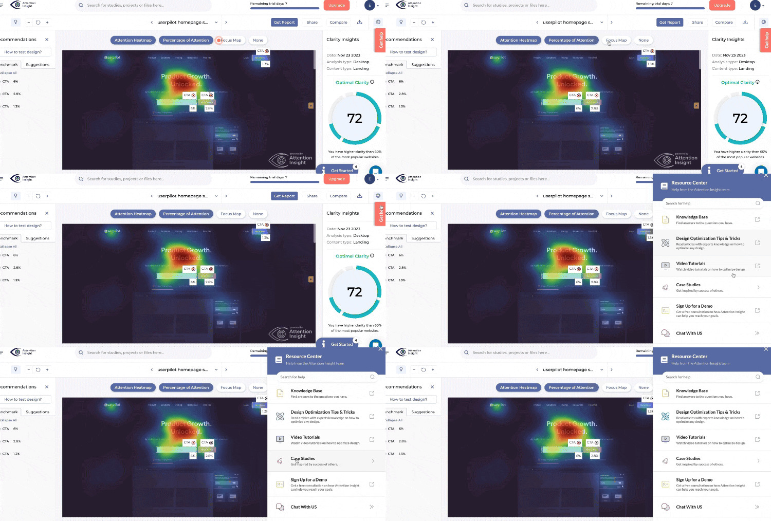
Resource centers are a fantastic tool – they help your users choose the level of support they need from a range of different options.
It’s a sensible way to help your users get the help they need when they need it.
Whether they are looking for in-app help, a direct link to contact support, or they want to dig into the details of support documentation – making sure user guides are easily accessible and can be triggered when a user needs them is a wise idea.
Use video tutorials during the onboarding process of new users
Not only can you build an entire resource center full of guides, but you can also trigger video tutorials or step-by-step guides directly from inside it. You can also embed videos in the modals.
To make it even easier, personalize the modules shown to each user based on different user segments.
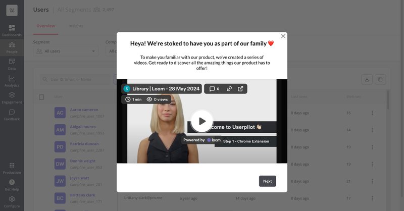
Track and analyze the efficiency of your interactive guides on user behavior
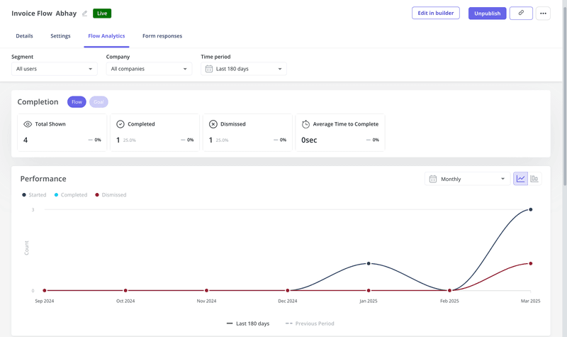
Is your interactive guide successfully helping users navigate and adopt your product? You can find this out by tracking the performance of the flows you create in Userpilot.
Check how many users complete and dismiss the interactive walkthrough and the average time taken by them to complete it. You can also track which modules get more traction than others.
Collect user feedback regarding your interactive guides
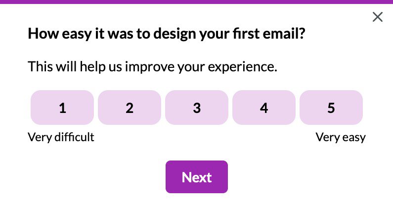
Another way to measure the performance of your interactive user guides is by directly asking your customers about them. You can launch in-app surveys the moment a user completes the walkthrough.
💡 Pro tip: Use both close-ended and open-ended questions to gain valuable insights regarding your guides.
Level up your user onboarding with interactive guides!
We’ve covered a lot in this article!
Now you know what an interactive user guide is, when you’d use one, how to create them, and the tools that work alongside them.
Hopefully, you also understand that building a user guide is all about providing the most effective way for your users to get value from your business as soon as they can.
Want to get started with building interactive user guides? Get a Userpilot Demo and see how you can create interactive user manuals that drive adoption and delight your customers.

