13 Best SaaS Landing Page Examples to Inspire Yours in 2026


I’ve reviewed many SaaS landing pages, and one thing is consistent: most of them struggle to turn attention into action. That challenge is reflected in the data as well, with the median SaaS landing page converting at 3.8%, based on Unbounce’s benchmark research.
That gap between attention and conversion is exactly what separates average pages from high-performing ones.
I’ve rounded up 13 of the best SaaS landing pages, breaking down what each one does well, where it falls short, and the ideas you can apply to your own page.

Key elements of high-converting SaaS landing pages
Every SaaS business is different, so every SaaS landing page looks a little different, too. A handful of key elements still show up on almost every page that converts well.
- Hero section: This is what loads before anyone scrolls, and the first 15 seconds decide whether they stay. Lead with a clear value proposition and a specific number, because a headline like “12x faster revenue recovery” or “67% ROI” beats a generic “save some time.”
- Features and benefits: Spell out what the product does and, more importantly, the outcome it delivers, since benefit-led features and benefits consistently outperform feature-only copy. Clear, tiered pricing tables and an FAQ section remove barriers by answering the hard questions before they stall a sale.
- Social proof: Testimonials, recognizable customer logos, star ratings, and case studies all make it easier to trust you. Place proximal social proof right next to the CTA to cut last-minute hesitation. Plus, add trust signals like SOC 2 and GDPR badges to address enterprise security objections, and stack third-party proof points, such as G2 badges and industry awards, that you can’t manufacture on your own.
- Demo video: A short product video showcases core capabilities and addresses pain points that text struggles to convey, which matters most for complex products. Raw, founder-style video now tends to outperform polished explainer reels.
- Call to action (CTA): One high-contrast button, visible without scrolling, beats a page full of competing links. Spell out the outcome, since CTAs like “Get started in 30 seconds” or “Start your free trial” lift conversion by setting clear expectations.
- Interactive product demos: Ungated, clickable demos now generate 2x higher engagement than static screenshots, and those leads close 20% to 25% faster because they have already self-educated. The same idea applies in-app, where you can build interactive product tours that let visitors experience value before they sign up.
- AI personalization: Swapping headlines, imagery, and case studies by industry or role can lift conversions by roughly roughly 40% when the segments are real, and the variants genuinely differ. Generic, one-size-fits-all pages leave that gain on the table.
- Page load speed: Every 1-second delay in load time cuts conversions by about 7%, per 2026 landing page data, and slow pages increase bounce rates before a visitor reads a word. Speed is the cheapest conversion lever most teams ignore.
13 SaaS landing page examples and what makes them convert
Studying real SaaS landing page examples beats any checklist, so here are a few of the industry’s very best.
These 13 SaaS products span AI app builders, project management, payments, and commerce, and every page below is broken into what works, what could be sharper, and the takeaway you can apply.
1. Lovable
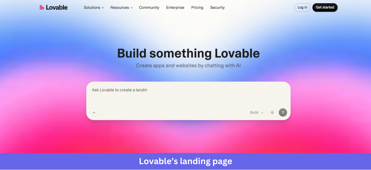
Industry & purpose: This is a SaaS landing page for the AI app-building category, built to convert curious builders, makers, and non-technical founders into project starters by letting them describe what they want to build before they even create an account.
What works:
- The hero is the product itself. Instead of describing what Lovable does, the page drops a real prompt input (“Ask Lovable to create a landing page for my…”) directly into the hero, so visitors can start typing immediately and skip the entire “sign up to try it” friction step.
- The “Lovable in numbers” section uses three oversized stats: 36M+ projects built, 200K+ projects per day, and 300M daily visits to Lovable-built applications. Concrete numbers do the credibility work that vague claims like “trusted by thousands” never can.
- The “Meet Lovable” three-step explainer (start with an idea, watch it come to life, refine and ship) walks visitors through the journey in one or two sentences per step, paired with the prompt-input visual so readers see exactly what they would do.
What could be improved:
- Using the embedded demo still requires registration; you cannot just freely play with it.
- The “Ready to build?” CTA at the bottom repeats the exact prompt input from the hero. After scrolling through templates and stats, a more outcome-focused CTA like “Ship your first app in minutes” would convert better than a duplicate input box.
Key takeaway:
Let visitors experience the product right on your landing page, reducing the number of steps they need to take. Interactive demos can communicate value faster than screenshots, videos, or feature descriptions.
2. Linear
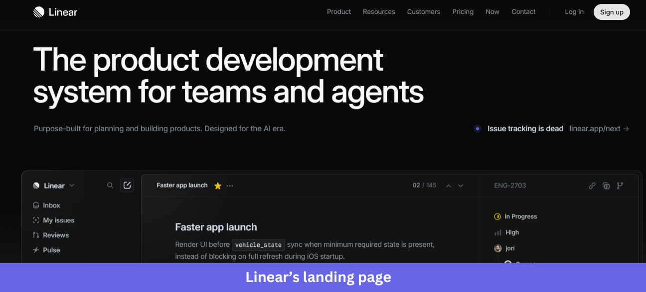
Industry & purpose: This is a product page for the AI-era project management category. It’s built to convert engineering and product teams (and the AI agents they work alongside) into Linear users.
What works:
- The hero headline “The product development system for teams and agents” puts agents on equal footing with people, and the subline “Designed for the AI era” reinforces it. It’s a precise, 2026-forward positioning statement that signals exactly who the product is for.
- The whole page is a continuous walkthrough of the real product UI in dark mode. There are no abstract illustrations or stock dashboard mockups. Only the actual Linear screens with real-looking issue titles like “Faster app launch” and live activity from collaborators, including AI agents.
- The customer logo row (Vercel, Cursor, Oscar, OpenAI, etc) sits right under the hero. These are recognizable, premium tech brands, so the social proof lives in the company Linear keeps, with no testimonials required.
What could be improved:
- The “Issue tracking is dead” link in the hero is small and easy to miss. For a claim that bold, it deserves more visual weight or a dedicated section rather than a low-contrast secondary link.
- The final CTA “Built for the future. Available today.” uses two equally weighted buttons (Get started and Contact sales). Without a clear hierarchy, indecisive visitors may stall, and making one the primary action would reduce friction.
Key takeaway:
Put your product at the center of the experience. A distinctive interface can capture attention, reinforce your brand, and help visitors understand the product faster.
3. ReadMe
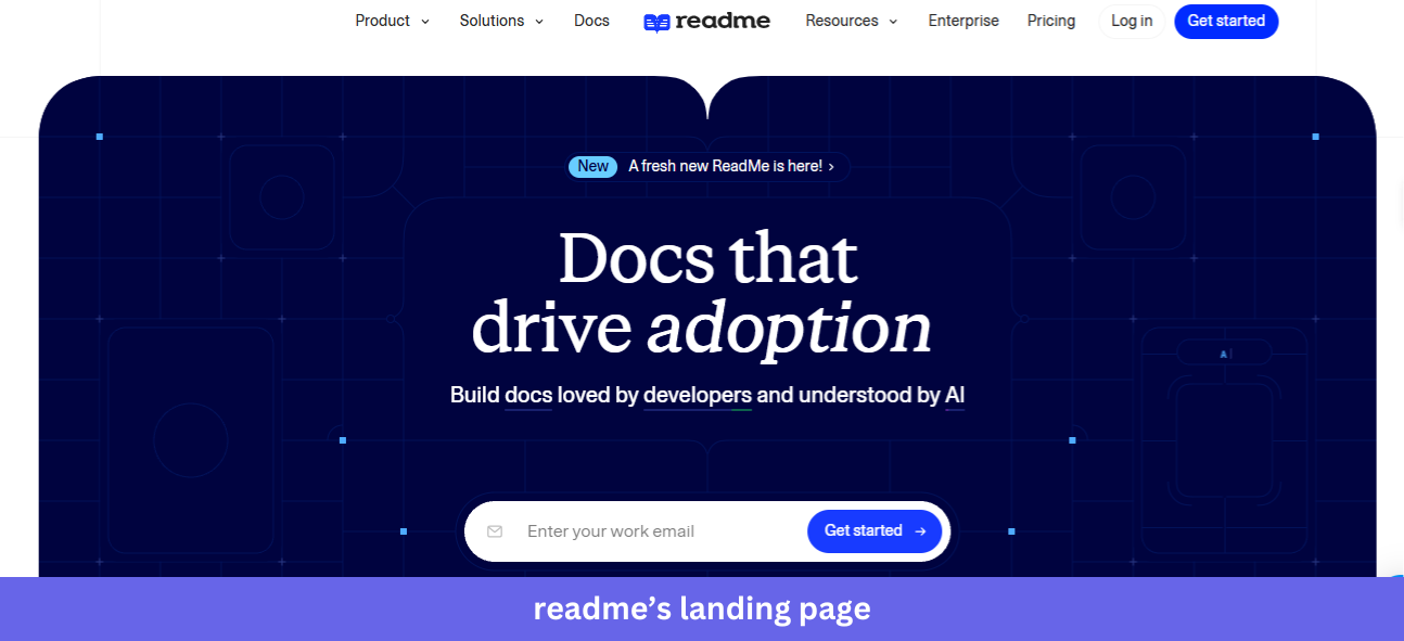
Industry & purpose: This is a product page for the developer documentation platform category. It’s built to convert API teams, technical writers, and developer experience leads into trial users.
What works:
- The hero contains an animated tab preview showing the actual ReadMe interface, including the Guides sidebar, Recent Releases section, and built-in “Ask AI” assistant. An email field with “Get started” sits right above it, so visitors see what their docs will look like and get instant signup access.
- The customer logo grid (NVIDIA, Voyage AI, Asana, VISA, etc) and the “Where great docs come from” section with the live NVIDIA API documentation example do double duty. Visitors see who uses ReadMe and what those companies’ docs actually look like, powered by ReadMe.
- The “Write in the browser, your IDE, or our AI writer” section flags three workflows at a glance, then backs each with a real screenshot, such as the WYSIWYG editor and a Git diff view. It answers “will this fit how my team already works” before the question is asked.
What could be improved:
- The italic-and-color treatment on the headlines (“docs that drive adoption”, “build great docs”, “built for your workflow”) repeats across nearly every section and loses impact through overuse. By the fifth section, the visual hook stops working.
- The final CTA “Get a preview of your docs” reuses the same email field as the hero. After 12 sections, the visitor deserves a sharper final ask than the input box they already saw at the top.
Key takeaway:
Show your product in real-world use. Customer examples help visitors see how the product works in practice and make your proof points more credible.
4. Notion
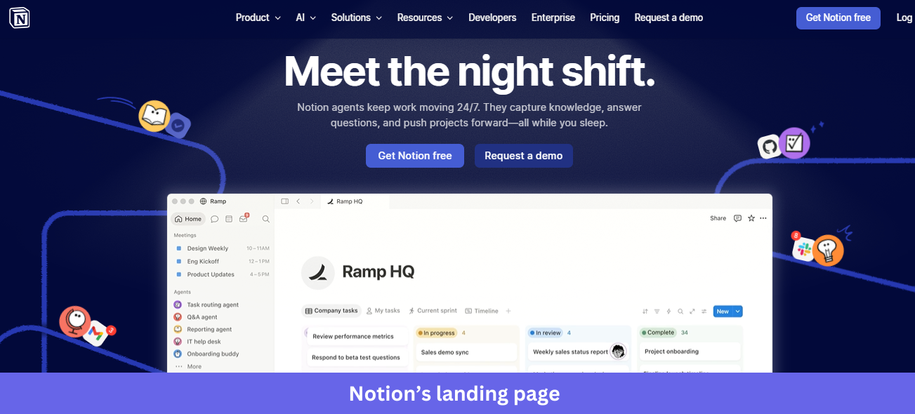
Industry & purpose: This is a product page for the all-in-one workspace category, repositioned around AI agents and built to convert teams into users via free signup.
What works:
- The hero headline “Meet the night shift” is unexpected and memorable. It frames AI agents as a workforce instead of a feature, and the subline (“Notion agents keep work moving 24/7 while you sleep”) makes the value concrete, with dual paths via “Get Notion free” and “Request a demo.”
- The “Trusted by 98% of the Forbes Cloud 100” line above the logos turns a generic social proof row into a hard, specific stat. Those logos then include AI-era brands like OpenAI, Cursor, and Lovable, signaling Notion’s relevance to modern teams.
- The “More productivity. Fewer tools.” section is actually useful. A checkbox-driven calculator shows teams their monthly savings ($340 per month, or $4,080 per year for a 10-person team) from consolidating tools, turning a vague “save money” claim into a personalized number that visitors can play with.
What could be improved:
- The hero product screenshot (the Ramp HQ workspace) is dense and hard to scan at this size, and the columns of task names blur together. A simplified or zoomed-in version would let the functionality come through.
- The page ends with four competing CTAs (Get Notion free, Request a demo, Download for Windows, Download from Microsoft Store). By the bottom of the funnel, it has scattered, and one clear next step would convert better than a menu of options.
Key takeaway:
Use specific proof points to establish credibility. Unique customer, market, or usage statistics are more memorable and convincing than broad claims that any competitor could make.
5. Webflow
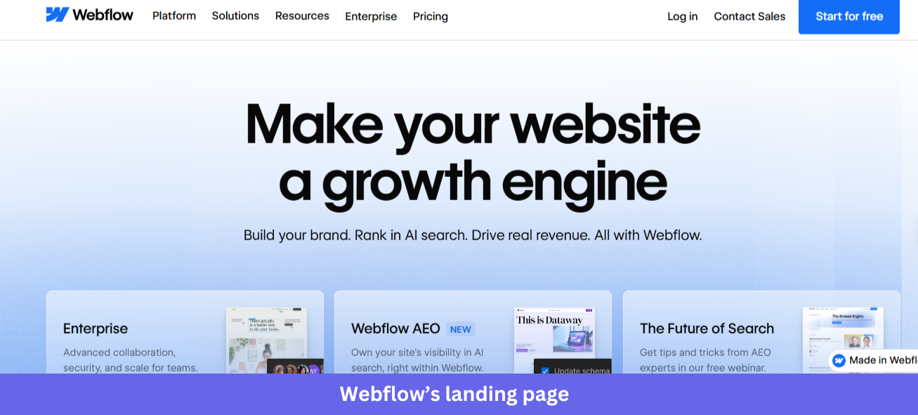
Industry & purpose: This is a product page for the visual web development and CMS category, repositioned in 2026 as an “agentic web marketing platform”. It’s built to convert marketing teams, brand-led companies, and enterprise buyers into trials or sales conversations.
What works:
- The hero headline “Make your website a growth engine” is short and outcome-led, paired with a subhead that names three concrete benefits: “Build your brand. Rank in AI search. Drive real revenue.” It’s easy to scan in a single glance.
- The customer story cards under “300,000+ brands move the needle” each use a hard data point as the hook: “32 global sites launched in 10 days” (Verifone), “20% increase in site-wide conversion” (Lattice), “$6M in cost savings annually” (Orange Theory). Specific numbers attached to named executives beat generic testimonials.
- The “Everything marketing teams love about Webflow” section uses a dropdown that lets visitors pick their role, which is tied to a personalized list below. It’s a smart way to handle the multi-stakeholder reality of B2B SaaS buying without bloating the page.
What could be improved:
- The hero stacks three cards (Enterprise, Webflow AEO, The Future of Search) on top of a partially visible product screenshot. That muddiness leaves visitors unsure whether to click a card, scroll to the product, or hit the primary CTA.
- The page carries at least four distinct CTAs (Start for free, Contact Sales, Talk to sales, Discover Webflow AI). Each one makes sense on its own, but together they fragment the path forward, and one clear primary action per section would convert better.
Key takeaway:
Turn broad claims into evidence. Quantified results paired with a clear source make your message more credible and easier for visitors to trust.
6. Stripe
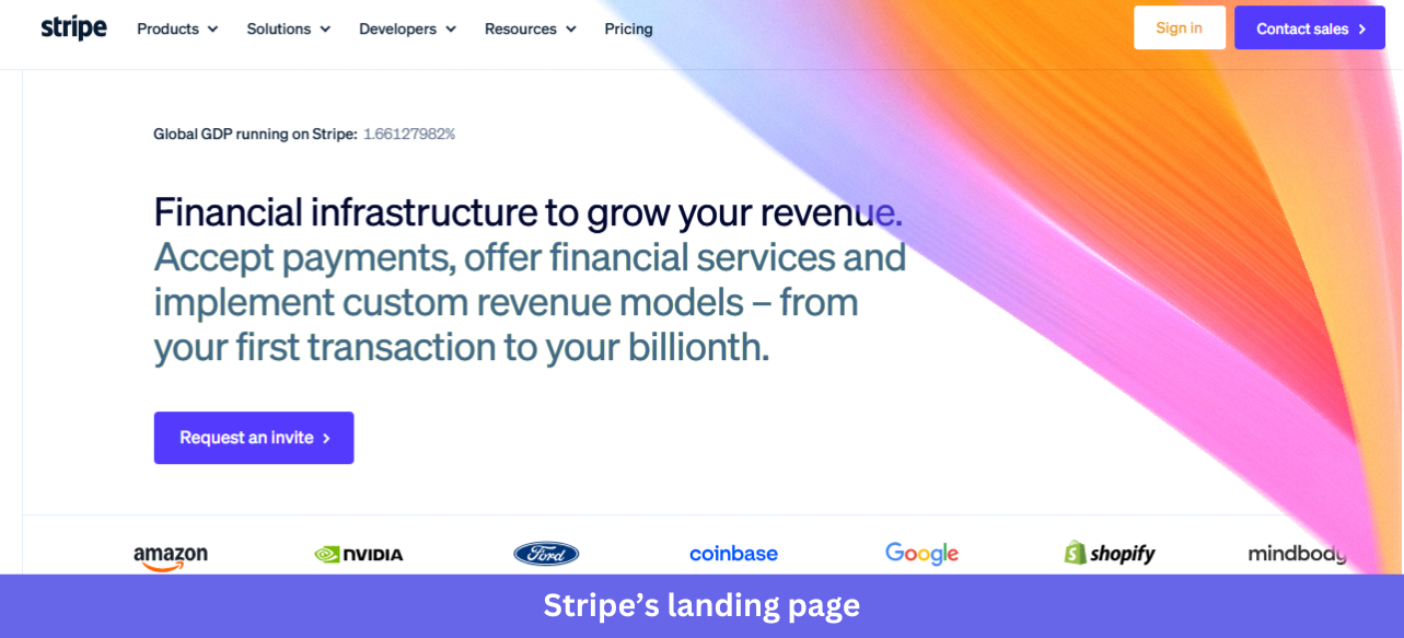
Industry & purpose: This is an enterprise use-case page for the global payments infrastructure category. It’s built to convert finance, ops, and engineering leaders at large adaptive enterprises into enterprise sales conversations.
What works:
- The hero pairs a concise headline (“Global payments are evolving. Stripe can help.”) with an animated globe that reinforces “global.” It’s restrained, with no product screenshot, only a polished statement of intent that signals enterprise-grade confidence.
- The “46 countries” grid and the full “Supported payment methods” matrix are remarkably thorough. Stripe lists every country and every supported payment type (cards, wallets, bank debits, buy now pay later, cryptocurrency) in one structured table, answering a regional rollout buyer’s questions before they ask.
- The third-party validation is heavyweight and current. “The Forrester Wave: Merchant Payment Providers, Q1 2026: A Leader” and “2025 Gartner Magic Quadrant for Recurring Billing Applications Leader” sit prominently, and enterprise buyers trust analyst firms more than marketing copy.
What could be improved:
- The page is text-dense for an enterprise landing page. Long paragraphs under “Intelligent revenue optimization” and “The Stripe enterprise payments stack” demand careful reading, and breaking them into scannable cards or pulled-out stats would help senior decision-makers who skim first.
- The only CTAs are “Contact sales” and “Talk to a specialist,” both gated and sales-led. That fits the enterprise intent, but it leaves smaller mid-market visitors with nowhere to go.
Key takeaway:
Give enterprise buyers the depth they need to evaluate your product. Detailed information, transparent comparisons, and answers to common purchasing questions can build trust and reduce friction during the buying process.
7. Airtable
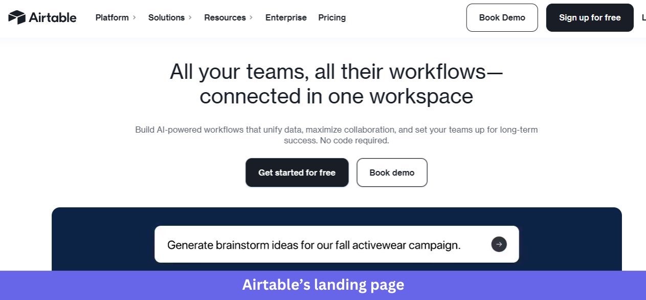
Industry & Purpose. This is a product page for the no-code workspace and AI app-building category. It’s built to convert product, marketing, and ops teams at large enterprises into free signups or demo bookings.
What works:
- The hero shows an actual Airtable view (“Pipeline Radar / High growth SaaS targets”) populated with real-looking data: Snowflake, Figma, Notion, etc., rated by tier, ARR, and funding stage. Above it sits a search bar with the natural-language prompt “Surface top SaaS accounts with up-to-date signals,” so it reads as a specific B2B workflow rather than a generic table.
- The customer logo strip leads with Anthropic, Harvey, Mercor, etc, a deliberately mixed roster of frontier AI companies and Fortune 100 enterprises. It signals that Airtable is credible for both ends of the market.
- The “Sophisticated workflows in minutes, not months” section uses a numbered left-sidebar nav (01 AI app building, 02 Agents at Scale, 03 Meet Omni, 04 Enterprise capabilities) tied to specific use-case cards. It’s progressive disclosure done well, letting visitors pick the layer they care about.
What could be improved:
- The chat widget icon repeats on every section of the page. It clutters the right-hand side and competes with actual page elements.
- The “Say hello to Omni” section is visually quieter than everything around it (light blue gradient, soft type), and the CTA at the bottom appears cut off. For a flagship feature, it deserves stronger visual weight or its own section.
Key takeaway:
Show your product solving a specific problem. Use realistic data, recognizable examples, and a clear workflow so visitors can immediately understand the value you’re offering.
8. Asana
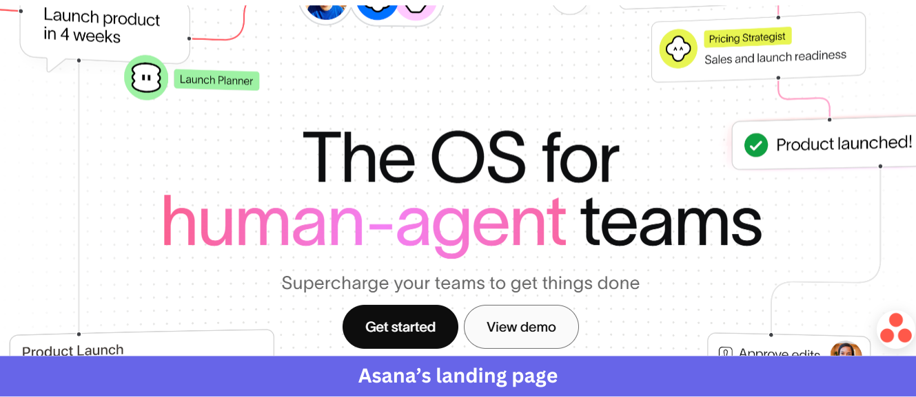
Industry & Purpose: This is a product page for the project and work management category, repositioned in 2026 to focus on human-agent collaboration. It’s built to convert enterprise teams (especially the Fortune 100 buyers Asana calls out) into trials or contact-sales conversations.
What works:
- The hero headline “The OS for human-agent teams,” with “human-agent” set in pink, makes the positioning impossible to miss. Floating UI elements around it (Launch Planner, Pricing Strategist agent, a “Product launched!” confirmation) preview what human-agent collaboration looks like.
- The “85% of Fortune 100 companies choose Asana” stat sits directly above the customer logo row (Amazon, Accenture, Johnson & Johnson, Dell, Merck). A specific number plus recognizable enterprise names earns trust at the right scale.
- The “AI Teammates” cards (Launch Planner, Workflow Optimizer, Compliance Specialist, Status Reporter) each list specific skills and integrations as tags. Every agent has a defined job description rather than vague AI capabilities, so visitors immediately understand what each one does.
What could be improved:
- The footnote “Accurate as of December 2023, includes free and paid users” on the 85% Fortune 100 stat is over two years old by 2026. And refreshing it would strengthen the credibility it’s working hard to build.
- The “Recognized as a leader by top analyst firms” section shows Forrester Wave 2025 and G2 Top 50 2025 badges, but the Gartner Magic Quadrant card has no visible year. A consistent recent year across all three would tighten the proof.
Key takeaway:
Reflect your positioning in the product experience. If you’re introducing a new category, audience, or use case, make sure visitors can see it in action instead of relying on headlines alone.
9. Loom
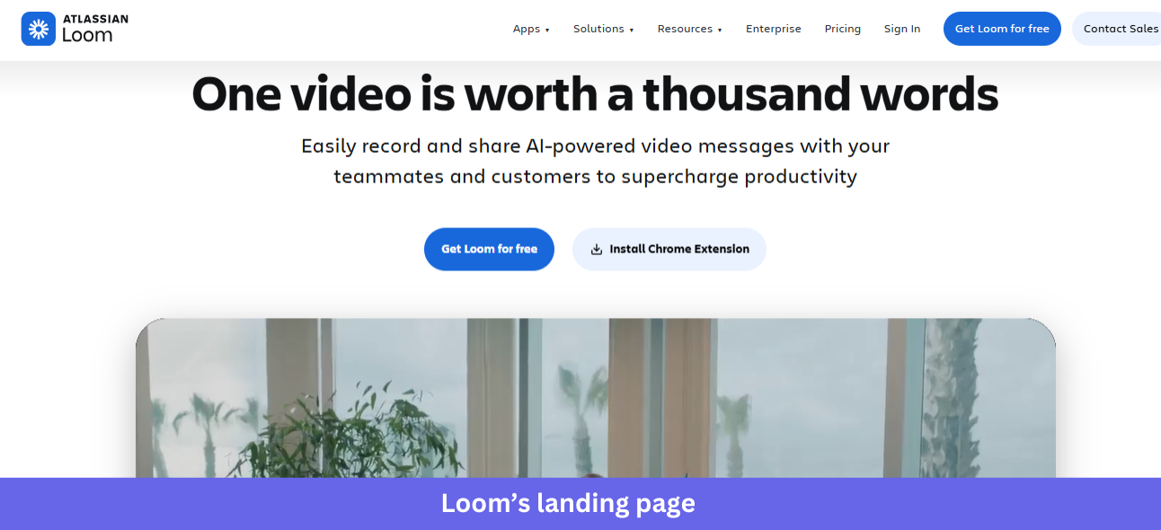
Industry & Purpose: This is a product page for the async video messaging category, now part of Atlassian. It’s built to convert teams (sales, engineering, support, design) into free signups via download or Chrome extension.
What works:
- The hero pairs a memorable headline (“One video is worth a thousand words”) with a large autoplay preview directly below. That video shows a real person filmed inside an office rather than a stock illustration, marked “1 min” with a 1x playback control, so the page demonstrates the product by being a Loom video itself.
- The “Millions of people across 400,000 companies choose Loom” line sits between the hero and the logo strip (HubSpot, Lacoste, LaunchDarkly, etc). That mix of B2B SaaS and Fortune 100 names signals Loom works for any team size.
- The “Video messaging for all use cases” section uses four color-coded cards (Sales, Engineering, Customer support, Design), each with a specific outcome, so visitors can find their own team at a glance rather than reading a long feature list.
What could be improved:
- The “Ship faster with AI bug reports” section is the only AI feature near the top, but it sits mid-page on a blue background that fights the surrounding white sections. For a flagship 2026 AI capability, it deserves hero placement or its own section above the fold.
- The “Atlassian Loom” branding in the header signals the acquisition, but the copy never reinforces it. Visitors who don’t know about the Atlassian deal may wonder where Loom’s roadmap is heading, and a one-line reassurance would close that loop.
Key takeaway:
Turn your hero section into a product experience. Giving visitors a chance to interact with the product immediately is often more persuasive than explaining how it works.
10. Figma
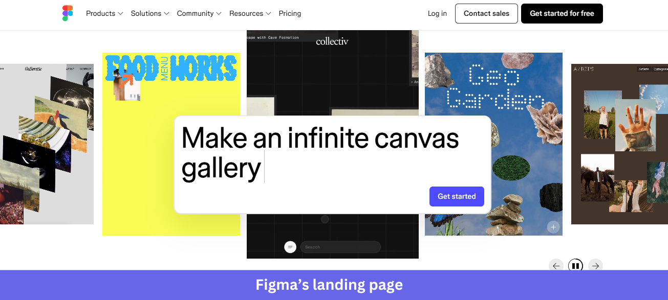
Industry & Purpose: This is a product page for the collaborative design and product-building category, now repositioned as an end-to-end “prompt to code to design” platform. It’s built to convert designers, product teams, and developers into free signups.
What works:
- The hero rotates through real Figma files from named creators (Rhythm Dance, Gallerie, Food Menu Works, Collectiv, Geo Garden) with a floating prompt input, “Make my cursor reveal an image,” overlaid on top. Showing actual community work as the hero canvas signals “this is what real users make” without saying it.
- The customer logo strip (Airbnb, Atlassian, Dropbox, etc) is one of the strongest in any 2026 SaaS landing page. Eight household names, each instantly recognizable, mean no “1,000+ teams” stat is needed.
- The “Prompt, code, and design from first idea to final product” section uses horizontal tab navigation (Prompt, Design, Draw, Build, Publish, Promote, Jam, Present) tied to an interactive preview of a real Figma file mid-edit, with cursor names (Maria, Robin, Amina) visible. It proves the multi-user collaboration claim.
What could be improved:
- The page quotes Henry Modisett (Head of Design, Perplexity), but the supporting case studies are visual-only (a “Get more done with Figma” tile, a Diana Mounter / GitHub testimonial) without outcome metrics. Adding metrics such as revenue, adoption, or hours saved would strengthen the evidence.
- The “Get started for free” CTA sits on a colorful illustrated background midway down the page, and the decorative shapes around it pull attention away from the button. A cleaner treatment would convert better.
Key takeaway:
Highlight what your customers create with your product. Real examples make the value tangible and provide stronger proof than staged screenshots.
11. PartnerStack
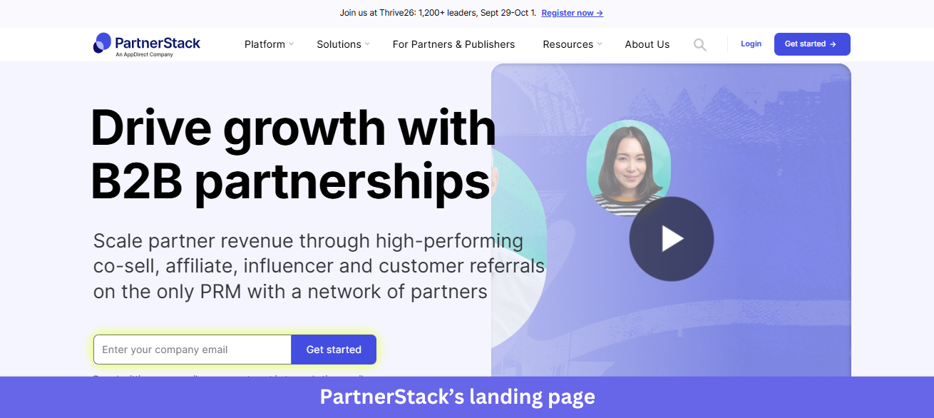
Industry & Purpose: This is a product page for the B2B partnership management (PRM) category, built to convert SaaS go-to-market teams (heads of partnerships, affiliate marketers, channel managers) into demos or trials, and partners into network signups.
What works:
- The hero pairs a clear headline (“Drive growth with B2B partnerships”) with an email capture form, sitting next to a “Watch 1-minute video” preview. Those two parallel paths let visitors act now or learn first, handling both buyer-readiness states.
- The “142,787 active partners” stat is exact rather than rounded, paired with three more precise figures ($3,246,946,930 in sales through the network, 780,454,488 customer actions, $451,682,082 in commissions paid). Unrounded numbers read like real platform data.
- The “Testimonials across the web” section uses a two-row grid, vendor testimonials in dark blue and partner testimonials in light blue, with source attribution (“See our G2 reviews”) above. Showing both sides of the network speaks to PartnerStack’s two-sided audience.
What could be improved:
- The hero CTA (“Get started” in yellow) clashes with the otherwise purple-and-white palette. That yellow is meant to grab attention, but it creates inconsistency with the purple secondary CTAs further down.
- The bottom of the page splits into two equally weighted CTAs, “Book a demo” for vendors and “Join the network” for partners. That serves both audiences, but indecisive visitors may stall, and a simple “Not sure? See how it works” tiebreaker would help.
Key takeaway:
Back your claims with precise numbers. Specific metrics make your results easier to believe and give visitors a clearer sense of the value and scale behind your product.
12. Shopify
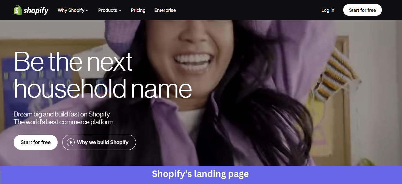
Industry & Purpose: This is the main brand page for the commerce platform category, repositioned in 2026 to focus on solopreneurs and AI-driven commerce. It’s built to convert independent sellers, growing brands, and enterprise merchants into free trials.
What works:
- The hero is a video of a real person filming in their home kitchen, a parent and child making a product video together. Its headline, “Be the next solo-preneur,” sits over the video with a clear “Start for free” CTA, showing a target customer rather than abstract success.
- The “Sell everywhere people shop. Online and in person. Across AI and on social.” headline pairs with three visual cards: a ChatGPT shopping interaction showing Steve Madden shoes, an in-store mobile checkout, and a Glossier product page. One sentence, three real channels, three real brands.
- The “15% higher conversions, 250M+ high-intent shoppers” block makes a precise claim (“Shopify Checkout with Shop Pay converts up to 50% higher than guest checkout”) with an external citation. That source disclosure is more than most SaaS landing pages bother with.
What could be improved:
- The “Based on external study with a Big Three global consulting firm in April 2023” footnote is now over three years old. For a stat as central as “15% higher conversions,” a more recent benchmark would strengthen the claim.
- The page spreads six distinct CTAs across sections (Start for free, Why we build Shopify, Pick a plan that fits, Take your shot, plus secondary explore links). Each section is strong on its own, but the overall path feels fragmented for first-time visitors who just want to start a store.
Key takeaway:
Frame your product from the customer’s perspective. When visitors immediately recognize their goals, challenges, or aspirations, they’re more likely to keep exploring.
13. Zoom
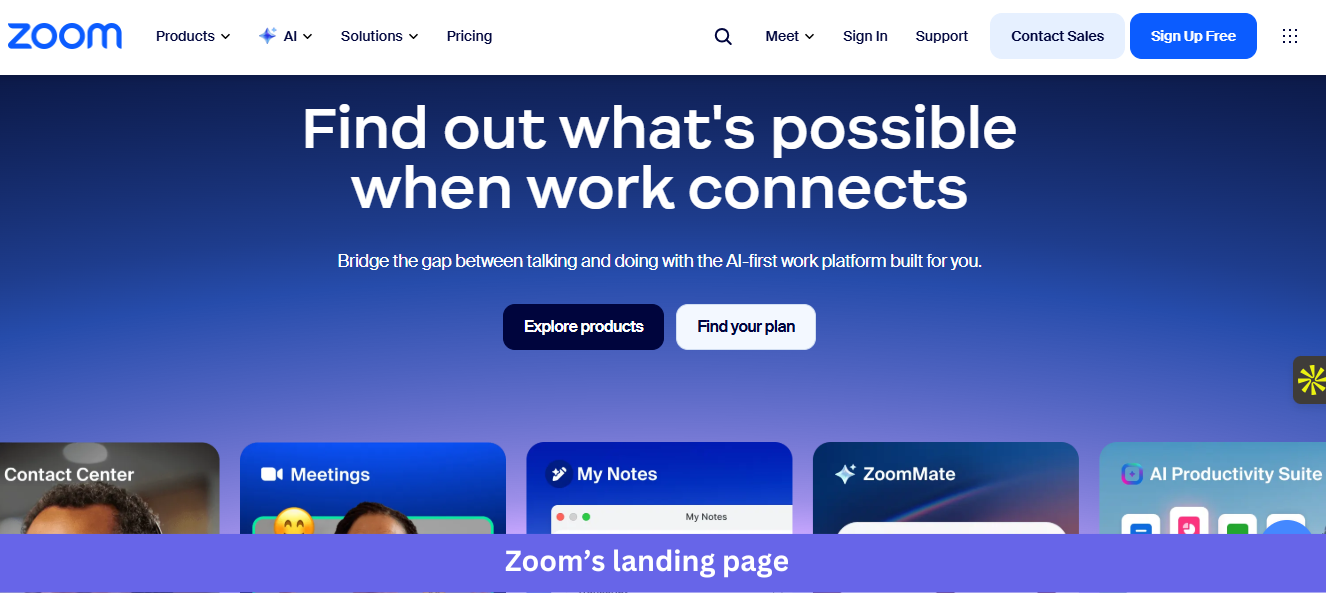
Industry & Purpose: This is the main brand page for the unified communications and collaboration category, repositioned in 2026 as an “AI-first work platform”. It’s built to convert business buyers, IT decision-makers, and enterprise teams into free signups or sales conversations.
What works:
- The hero pairs a question-style headline (“Find out what’s possible when work connects”) with a horizontal product carousel showing five Zoom products in real UI: Virtual Agent, Contact Center, Meetings, My Notes, and ZoomMate. Visitors immediately grasp that Zoom is no longer only for video calls.
- The triple analyst-validation row (Gartner Leader for the 6th year running, Gartner Voice of the Customer for CCaaS, and Forrester Wave Leader) sits before the use-case section. Three different firms confirming leadership across multiple product lines is heavyweight proof for enterprise IT buyers.
- The third-party rating block underneath shows specific scores from three platforms with volumes: 4.5/5 from 7.9k+ reviews on Gartner Peer Insights, 4.6/5 from 54.9k+ reviews on G2, and 8.5/10 from 5.8k+ reviews on TrustRadius. Most pages cite one rating; Zoom cites three and discloses the sample size for each.
What could be improved:
- The hero has two competing CTAs (Explore products, Find your plan), but neither is a direct signup, and the “Sign Up Free” button lives only in the header nav. For a free-tier product, the primary signup deserves hero placement.
- The product carousel shows five products at once, with arrow navigation beneath it, and visitors who scroll past may miss what each one does. A short label or one-line description under each card would make the breadth claim clearer.
Key takeaway:
Layer different types of social proof throughout your landing page. Third-party reviews, analyst reports, customer ratings, and testimonials work together to strengthen trust.
What’s changed in SaaS landing page design in 2026
Pull these 13 SaaS landing page examples together, and a pattern I keep seeing emerges. The pages winning made five shifts that the median page still hasn’t.
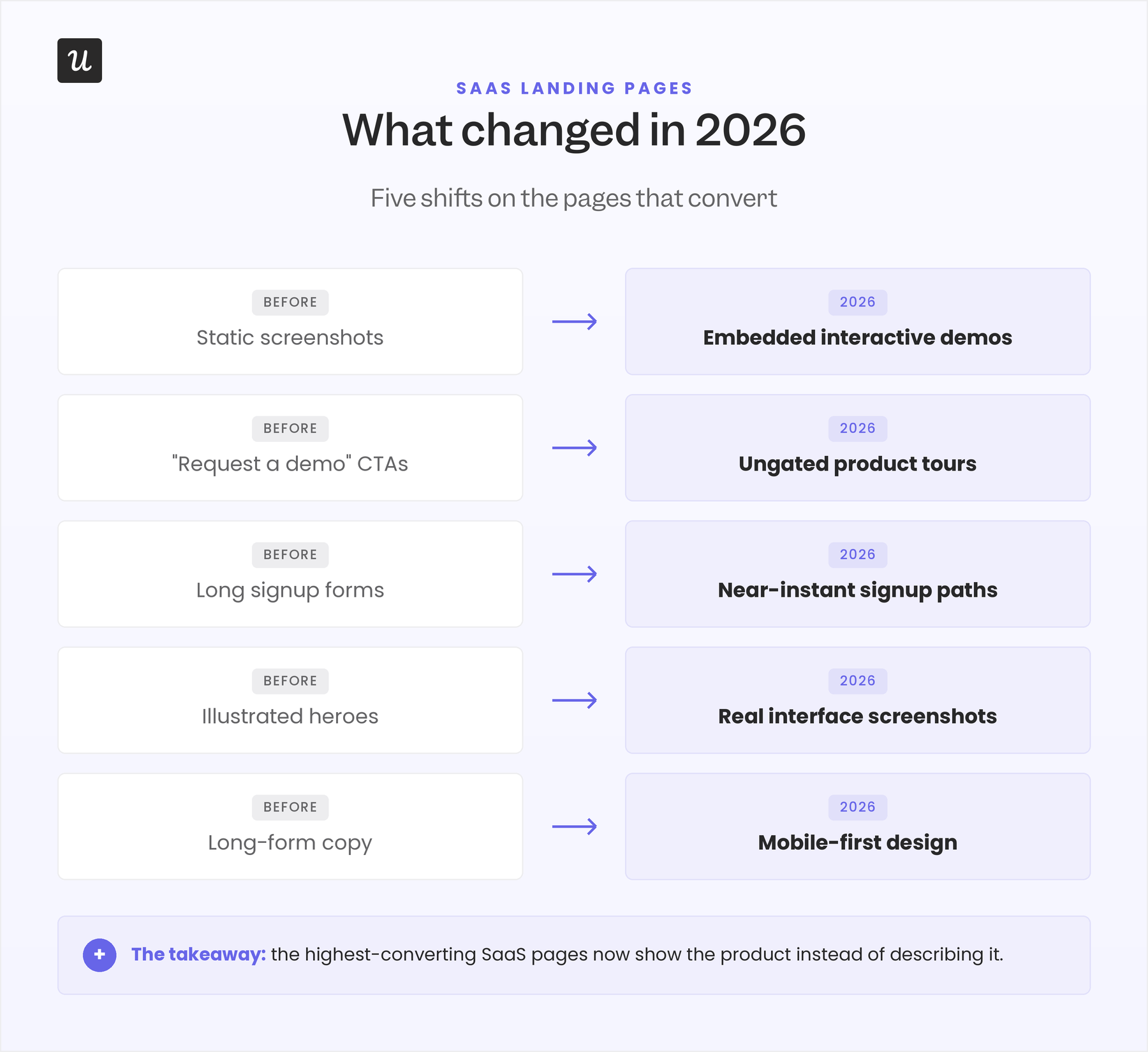
- Static screenshots became embedded interactive demos: The hero is now sometimes the product itself, not just the image of the product. With tools’ UIs getting increasingly simplified, I suspect the number of such landing pages will increase.
- “Request a demo” gave way to ungated product tours: When UpperHand swapped its “Request a Demo” CTA for an ungated interactive tour, the same aimers.io analysis reports a 127% lift in qualified leads from that single change.
- Long signup forms shortened to near-instant paths: Three-field forms convert at 10.1% compared to 3.6% for nine-field forms, so pages now lead with “No credit card required” (Woodpecker) and try-before-signup heroes like Lovable’s prompt input and ReadMe’s interactive API explorer. Our guide to free-trial best practices covers how to shorten that path without compromising qualification.
- Illustrated heroes became real interface screenshots: Split-screen layouts and live product UI replaced the abstract illustrations that used to fill the top of the page.
- Long-form copy gave way to mobile-first design: With roughly 65% of landing page traffic now on mobile, the pages that convert are built for a phone screen first, with desktop second.
Final words
As long as you have social proof on your landing page, crystal-clear CTA buttons, and a SaaS product that’s worth using, you should have no trouble getting prospective customers to hit the button you want them to.
Simply remember that conversion is a process. Even the best SaaS landing page won’t get every visitor to sign up on the first visit, so keep optimizing the copy and design until potential customers become paying ones.
With Userpilot’s native mobile SDK, you can also onboard and engage mobile app users with personalized messaging, push notifications, and surveys.
If you’re ready to give your product users the best experience possible, it’s time to get your free Userpilot demo today.
About the author