User Engagement in 2026: Human Signals, Agent Signals, and What Your Dashboard Misses


User engagement is having a measurement problem in 2026, and most product teams haven’t noticed yet. Open any product analytics dashboard right now and you’ll see the same chart shapes you saw in 2023: weekly active users, session length, feature adoption rates, a stickiness ratio. But the user behind those numbers has split into two distinct kinds, and one of them might not be a human at all. (For a fuller view of the analytics shift behind this, see our Product Analytics overview.)
I’m Natalia, Userpilot’s Sr. Product Marketing Manager. I run product launches here, I watch session replays for an hour at a time, and I argue with our product team about which engagement metrics still mean anything in the agentic era. The version of the engagement playbook below is the one I wish I’d had when I started in this role.
Salesforce delivered 2.4 billion Agentic Work Units in Q4 of fiscal 2026 alone. That number is a metric Salesforce had to invent, because the existing ways of counting user engagement (clicks, sessions, page views) made no sense for software being used by software.
The historical playbook for user engagement said: count active users, watch DAU/MAU, track feature adoption, run an NPS survey, fix the friction. That playbook still works, partially. What’s changed is who is creating the signal. Half of the engagement showing up in modern dashboards is being produced by AI agents calling tools through MCP. The other half is being produced by humans whose product usage has become more sporadic, more outcome-driven, and far less click-heavy.
Meanwhile, the rate of shipping has roughly doubled. Yazan Sehwail, Userpilot’s CEO, summed up the pressure this puts on product teams: “As producing features becomes cheaper and faster, instead of releasing one or two features per quarter, now you’re releasing 7, 8, 9. It becomes even harder for product teams to manually track each one and understand usage for each one.” So the dashboard is louder, the signal-to-noise ratio is collapsing, and the most important user engagement signal a customer success team can read might be a sudden absence after a cluster of activity (more on that later).
User engagement in 2026: Summary
For those of you who don’t have the time to read (or your agents 😅), here’s the short version of the rewrite.
The new definition of user engagement:
- User engagement is the extent to which a user (human or agent) repeats a value-creating action in your product.
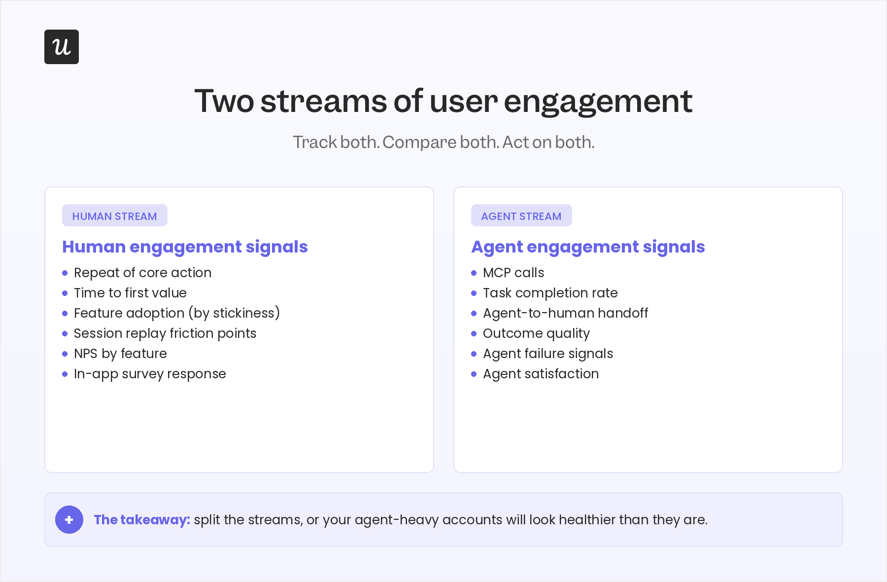
- The signal has split into two streams: human engagement signals and agent engagement signals.
- Activity metrics (DAU/MAU, session length, page views) are starting to break in agent-heavy accounts.
- Outcome metrics (core-action repetition, task completion, time to first value) still work and matter more than ever.
Your user engagement strategy by stream
Human stream:
- Define an “active” user as someone who completes a core, value-creating action (not someone who logs in).
- Watch repeat-of-core-action over a 30-day window, not DAU/MAU.
- Use session replay to figure out why drop-off happens, then close the loop with a targeted in-app checklist or tooltip.
- Run NPS by feature, not at the account level, so you can tell which parts of the product create advocates and which create frustration.
Agent stream:
- Add a task-completion event for every agent action, separate from human events.
- Track outcome quality (did the agent’s action produce the user-intended result?) not just call volume.
- Monitor agent-to-human handoff as its own funnel, because that’s where most agent value leaks.
- Watch agent failure signals proactively, since agents don’t complain in support tickets.
Readiness checklist: is your engagement strategy ready for both streams in 2026?
- Have you defined a core action for each user role? If your “active user” is still “anyone who logged in,” your dashboard is lying to you.
- Are you watching for clusters of activity followed by silence? A sudden absence after sustained use is a stronger churn signal than a slow decline.
- Do you split human engagement and agent engagement? If you blend them in one chart, agent-heavy accounts will look healthy when they aren’t.
- Can you go from a funnel drop-off to a session replay to an in-app fix without a dev ticket? If the diagnostic triage takes a sprint, you’re shipping fixes too slowly to matter.
- Do you measure outcome quality for agent actions, not just call count? An agent that calls your API 10,000 times and produces nothing useful is anti-engagement, not engagement.
What user engagement actually means now (the two-stream model)
The textbook definition of user engagement is: Existing users interacting with your product in ways that indicate real value. That definition still holds. What’s changed is that “user” used to mean a human with a keyboard, and now it means either a human or an AI agent (or, increasingly, a human directing a fleet of agents).
For the human stream, user engagement still looks like exporting a video in a video editor, sending a message in Slack, or uploading a file in Dropbox. The action is value-creating, repeatable, and tied to a clear outcome. Gallup’s long-running research found that a fully engaged customer represents a 23% premium in share of wallet, profitability, and revenue compared to the average customer, while actively disengaged customers deliver a 13% discount on the same measures. Engaged users genuinely behave differently, and the financial gap shows up in customer lifetime value.
For the agent stream, user engagement looks like a Claude or Cursor agent calling your product’s MCP server to complete a multi-step task on a human’s behalf. The agent doesn’t scroll, doesn’t hover, doesn’t ignore a tooltip. It executes a task and either succeeds or fails. Both kinds of engagement matter. Both produce revenue. Both deserve a measurement model.
The post you are reading replaces a 2023-vintage definition of user engagement with a 2026 one. Here’s the model:
- Human engagement signals. Repeat of core action. Time to first value. Feature adoption. Friction points surfaced via session replay. NPS and in-app survey responses. These are the same signals product teams have always tracked, but the bar for what counts has moved upward (more on that in the next section).
- Agent engagement signals. Task completion. Outcome quality. Agent-to-human handoff. Agent failure signals. Agent satisfaction (yes, this is now measurable too). These are signals most engagement dashboards don’t track at all because they were built before agents were users.
💡 Read related blog posts: Product-Led Growth in 2026: Transition into the Agentic AI Era
Why traditional user engagement metrics are starting to break
The first move for any product team running a 2026 user engagement audit is to look hard at which metrics still earn their place on the dashboard. Some of them do. Some of them are quietly producing noise.
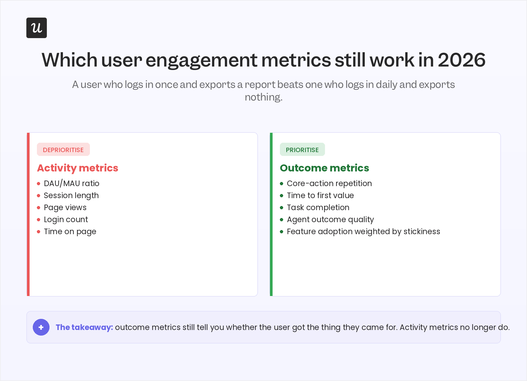
The metrics that are starting to break tend to share one trait: they measure activity, not outcome. The metrics that still work measure whether something useful happened.
Activity metrics to deprioritise
The strongest case for deprioritising activity metrics comes from James Mitchinson, Userpilot’s Head of Customer Success. James has seen accounts that log in every day and produce zero outcomes, and accounts that log in once a week and run their entire business through the product. He puts it plainly:
“If a customer has a lot of tickets, it can look like they have concerns about the platform. But an even bigger indicator of churn risk is if a customer was engaged in submitting tickets, and then all of a sudden, that stops.”
That observation, generalised, is why DAU/MAU as a dashboard hero metric is on its way out. A user who logs in five times this week and accomplishes nothing is producing anti-engagement signal. The user you actually want often logs in once, exports a high-value report, and disappears for six days. The activity number can’t tell the two apart.
The same logic applies to session length. Long sessions used to be read as a positive signal. They’re now often a confusion signal: the user couldn’t find what they needed and spent twenty minutes flailing.
Outcome metrics to prioritise
The metrics that survive the 2026 cut are the ones that ask: Did the user actually get the thing they came for? For most B2B SaaS products that means a short list:
- Repeat of core action over a 30-day window. Did the user perform the value-creating action again, on their own, without a nudge?
- Time to first value. How fast did the user reach their first meaningful outcome? Average TTV for SaaS sits at about 1 day, 12 hours, 23 minutes, but the right benchmark is your own.
- Feature adoption weighted by stickiness. Did the user try the feature, or do they keep coming back to it? Trial-only adoption flatters the data.
- NPS by feature. Not at the account level. By feature. So you can tell which parts of the product create advocates and which produce silent frustration.
The silent-engagement signal that most dashboards miss
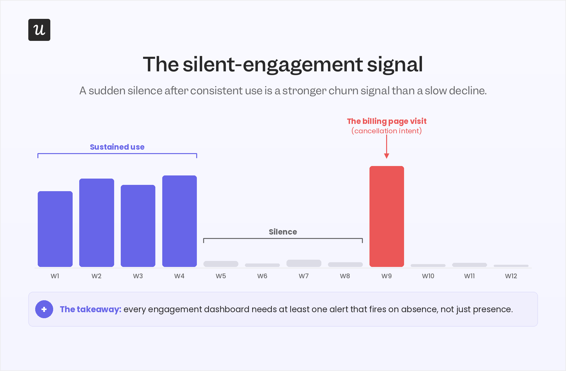
This is the contrarian piece of the post, and it comes directly from James. Most engagement dashboards are tuned to flag a slow decline: a user whose weekly logins drift from five to three to one. That pattern still matters, but it’s not the strongest churn signal Userpilot’s CS team watches for in 2026. The strongest signal is the opposite shape: a cluster of activity followed by silence, then a single anomalous return.
James walked me through the pattern:
“If we see that maybe nobody from a customer account has engaged in a long time, and then suddenly they’re back in the platform, interesting to go check what they’re up to. And maybe it’s one login to look at the subscription and billing page. Most CS leaders would know what that probably means. Looking for clusters of activity followed by moments of silence on the platform can be a good indication that a user’s given up.”
Two things make this signal unusually sharp. First, it’s invisible in any DAU/MAU chart, because the absolute numbers can sit inside a normal band for weeks. Second, it carries very high precision: the “billing page visit” pattern correlates strongly with cancellation intent, in a way most leading indicators don’t.
This is also why Kantar’s framing of “silent signals” in B2B CX matters. The dashboard view of user engagement is built around what users do. The CS view, increasingly, is built around what users stop doing. Both views need to coexist, and most product teams are still only building the first one.
The practical implication: every user engagement strategy in 2026 needs at least one alerting rule that fires on the absence of activity, not just on its presence. In Userpilot, the cleanest way to build that is to use Signals with a “no event in N days following a streak of activity” condition, paired with a session replay link so a CSM can land on the account with context, not a generic email.
💡 Read related blog posts: Cohort Retention Analysis 101: How to Measure User Retention
The four user engagement metrics that still matter in 2026
Once the activity-versus-outcome reframe is in place and the silent-signal alert is live, the day-to-day engagement scorecard simplifies. There are four metrics worth running a product team around. Yes, the categories are familiar. The bar for what counts has moved.
1. The “active user” you actually believe in
“Active” is the cheapest and most misused word in product analytics. Re-define it as the user who completes a core, value-creating action over a defined cadence (daily, weekly, or monthly depending on your product). For Slack, that’s sending a message. For Dropbox, that’s uploading and sharing a file. For Userpilot, that’s a customer using flows, signals, and session replay together to ship an engagement fix.
A quick test: ask three people on your team to define “an active user” for your product. If you get three different answers, your dashboard is currently measuring three different things.
2. DAU/MAU, with a caution
Product stickiness as a ratio (daily active divided by monthly active) is still worth watching, but it is a habit indicator, not a value indicator. The average DAU/MAU for B2C SaaS sits around 13%, and for B2B SaaS around 40%. Treat those as habit benchmarks. Treat core-action repetition as the value benchmark. The two charts should agree most of the time. When they diverge, the value chart is the one telling you the truth.
3. Feature adoption (weighted by repeat use)
Userpilot’s own benchmark research found the average core feature adoption rate across 181 companies was 24.5% (median 16.5%). That number is useful as a floor: if your critical features are below this band, the feature isn’t reaching the audience it was built for. But adoption alone overstates progress. A user who tries a feature once and never returns is closer to a churn signal than an engagement signal.
Abrar Abutouq, one of Userpilot’s PMs, ran into this exact issue with a mobile feature. The team released mobile support and the adoption number looked low. He pushed back on the denominator:
“The adoption and engagement were quite low from the beginning. I created a form and asked users just one question: do you support a mobile application at the moment? That helped me frame how we look into the data. Instead of saying only 10% of all customers are using mobile content, I could say 25% of customers who actually had a mobile app were using the feature.”
Same data, different question, very different story. Feature adoption is a denominator problem at least as often as it is a numerator problem.
4. NPS by feature, not by account
The average NPS for SaaS falls between 31 and 36. The number itself matters less than the process around it. Two changes earn the spot on the 2026 scorecard. First, run NPS contextually (trigger it inside the feature, not as a quarterly email blast). Second, segment NPS by feature, so you can spot which parts of the product create advocates and which produce detractors. A 32 at the account level can hide a 60 on one feature and an 11 on another, and only the feature-level view tells you where user satisfaction is actually breaking. Pair the score with one open-ended follow-up so you collect user feedback you can act on, not a sentiment headline.
For an honest walk-through of how to actually deploy these surveys without annoying users, see our deeper guide:
💡 Read related blog posts: In-app surveys in 2026
How to actually improve user engagement?
Knowing your engagement metrics are off is the easy part. Fixing them inside a week, without a dev ticket, is what separates teams that move user engagement and teams that talk about it. The pattern Userpilot’s own product team runs internally, repeatedly, is a three-step diagnostic triage that turns raw user behavior data into a fix shipped the same day. Every step surfaces a different layer of user pain points, and the loop closes inside the product so the next user never hits the same wall.
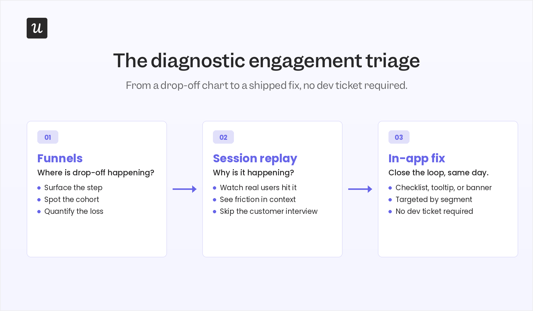
The triage works like this. Funnels show where users drop off. Session replay shows why. A targeted in-app message, checklist, or banner closes the loop. Each step takes minutes, not sprints.
Step 1: Use funnels to see the “where”
Funnel analysis surfaces the specific step where users stall. The point of this step is not insight, it’s location. You’re not trying to understand the user yet, you’re trying to find the segment of the funnel that warrants closer inspection. Userpilot’s funnels view will give you the count and the conversion rate at every step.
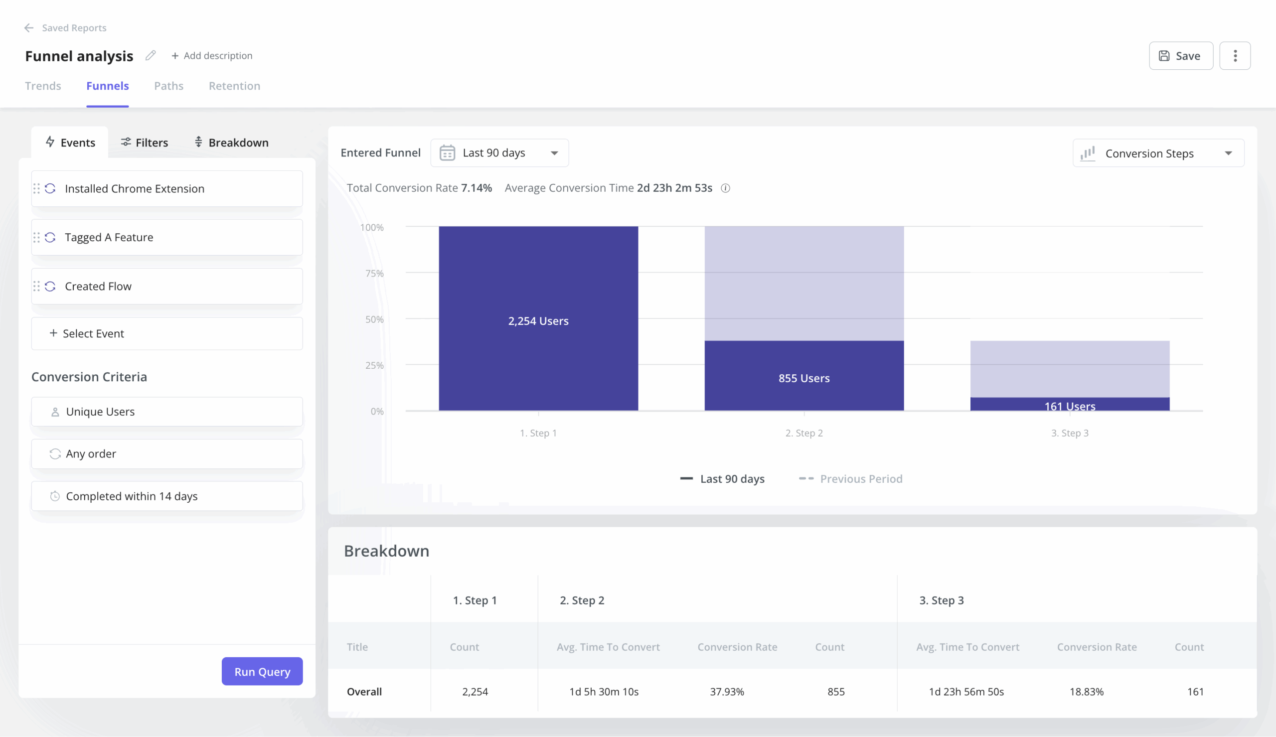
Kevin O’Sullivan, Userpilot’s Head of Product Design, described the funnel they watch for the email feature: “We released auto capture, and we went from an experience where no events were being labeled to seeing a huge increase in these events being labeled.” The funnel from domain verification to first email send showed an average gap of around 60 days, which on its own was a strong enough signal to justify a redesign.
Step 2: Use session replay to uncover the “why”
Once a funnel surfaces a drop-off step, session replay turns the where into a why. This is the most consistently cited engagement tool inside Userpilot. Every internal expert who fed into this post raised it.
Kevin used session replay to save a feature the design team had nearly removed: “Things like session replay, where we’ve received feedback on an issue within product, or maybe where we actually haven’t received the feedback, but we’re seeing it in the data. Users are dropping off a particular page, to just jump directly into those sessions, not have to burden and bother the customer.” On one specific decision, the team was about to cut a distribution chart from the redesigned analytics view. Session replay showed about 10% of users hovering meaningfully on it. The chart got a collapsible toggle instead of the axe.
I caught a hard-to-reproduce bug the same way. We would not know about this bug without the session replay. Activation dropped unexpectedly, the issue was intermittent, replay was the only place it was visible.
Amal Al-Khatib, one of Userpilot’s product designers, runs at least one hour of session replay per week as a habit. “Sometimes I would focus on a feature we just released, and sometimes I would just watch anything, the latest sessions related to the areas that I work in.” This habit catches issues before they become support tickets.
Step 3: Fix the issue with an in-app engagement patterns
Once the funnel says where and replay says why, the third step is to ship a fix without a dev cycle. The cleanest example came from Abrar:
“I simply, you know, just create a checklist to activate the user into the email feature and walk them through step by step what they do, adding maybe a reminder notes.”
The whole loop, from funnel drop-off to session replay to a deployed checklist, ran inside hours, not a sprint. Abrar described the broader pattern: “By using Userpilot, we rely a lot on session replay. Like, after releasing a feature, to see how they interacted with it. If there are any friction points we can add this thing right away.”
James uses the same triage on the CS side, but for the opposite purpose: not to fix the product, but to reach out with context. “If maybe we have a really hard time getting ahold of a customer, and we can see that they’ve been active on the platform a little bit recently, we can go and watch those sessions and see what feature they’ve been trying to engage with and how successful they’ve been.” A CSM who opens an email with “I saw you were trying to set up your domain verification, here’s what tripped most teams up at that step” gets a response. A generic check-in does not.
Closing the user engagement loop across channels
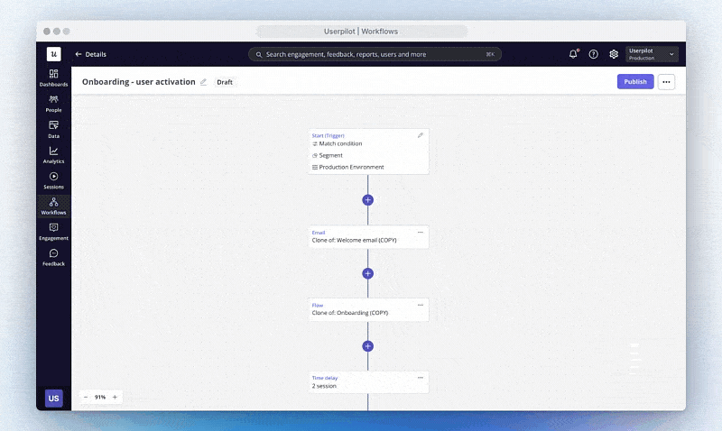
The triage above lives inside the product. Real user engagement strategies span in-app messaging, email, mobile push, and increasingly the channel where an agent is doing the user’s work on their behalf. The orchestration layer matters as much as the diagnosis. Userpilot’s Workflows is the multi-channel layer for human user engagement, and the team’s been using it internally for everything from re-engagement to launch promotion to marketing campaigns tied to a product release.
A worked example: I ran an AB test on a new feature announcement. Half of users got the in-app notification, half didn’t. The version with the in-app message produced a 200% lift in adoption. “You can come back with actual data to your team, not just what one vocal customer said.” That is the orchestration loop working end to end: an in-app message wired into the same workflow that tracks the conversion, with the result feeding back into the launch plan.
The practical rules for the loop:
- Trigger an in-app message at the moment of value, not in a generic onboarding flow.
- Use email and push as the off-ramp for users who pause, not the entry point.
- Make every triggered message tied to a measurable downstream action, so you can prove or disprove the lift later.
- If a workflow doesn’t have a target metric attached, it shouldn’t be shipped.
What user engagement looks like when the user is an AI agent
Everything above is the human-stream playbook. The faster-moving part of the 2026 user engagement conversation is the agent stream, and most product teams haven’t built for it yet. The shape of the work is genuinely different, but the principle is the same: measure outcome, not activity.
An agent calling your product through MCP doesn’t click, doesn’t hover, doesn’t scroll, and doesn’t trigger a session in the human sense. It calls a tool, completes (or fails) a task, and hands a result back to either a human or another agent. Three signals matter for the agent stream:
- Task completion rate. Of the tasks an agent attempted on your product, what proportion finished successfully? This is the agent-side equivalent of “active user,” and it is the headline metric of the agent stream.
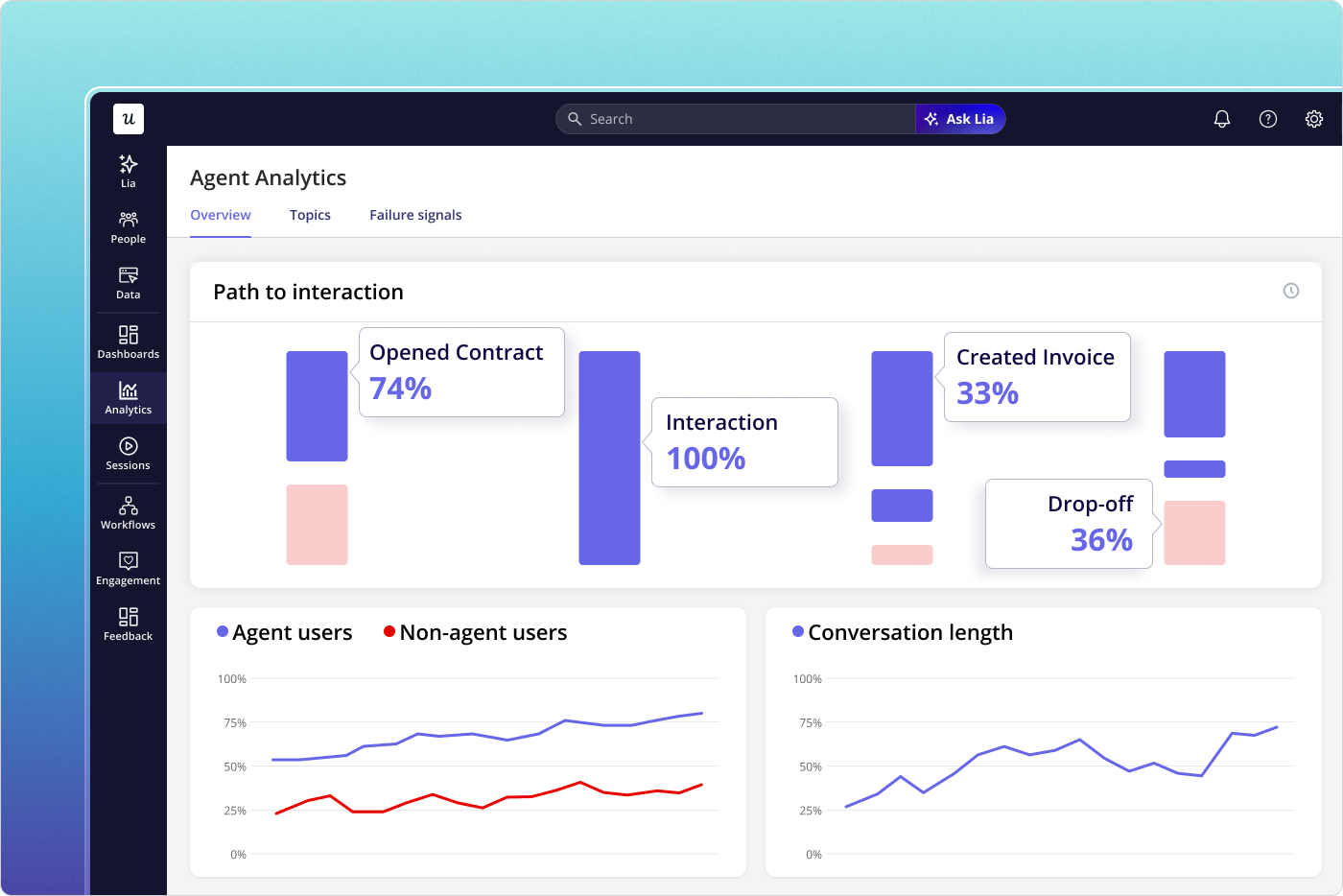
- Outcome quality. A successful task is not always a good task. Did the agent’s action produce the user-intended result? This is where most agent dashboards stop short and where Agent Analytics is built to go deeper.
- Agent-to-human handoff. When an agent hits a step it can’t complete, how cleanly does the work move to a human? Friction at the handoff kills agent value faster than failure inside the agent loop itself.
Abrar’s intuition on where this goes is a useful sketch: “Imagine if AI would interact with your data and see the friction points, maybe create the flows for you, and then the last step is just to review them. And recommend: if you run this flow, the adoption of feature X would increase by X percentage.” That is the long-term shape of agent-assisted engagement work, and Userpilot’s own AI agent, Lia, is being built around exactly this loop.
Yazan described Lia’s design principle directly: “You create a project, tell it what you want, and it does the rest. It builds all the reports around that goal, analyzes by segments, where the drop-off is, builds the dashboards, and comes up with actionable insights: why do people convert, why do people not convert, and here’s what you need to do.” The same diagnostic triage Userpilot’s product team runs by hand, the agent runs continuously. That doesn’t replace the human work, it changes its rhythm.
User engagement myths that need to die in 2026
The 2026 audit also surfaces five myths that still show up in product team conversations and stubbornly refuse to leave.
- Myth 1: More activity means more user engagement: Activity is the cheapest proxy. Long sessions can mean confusion, frequent logins can mean a stuck user. The fix is to measure outcome instead: did the user complete the core action, and did they come back to complete it again?
- Myth 2: Personalisation needs a complete user profile: Most personalisation value comes from one or two recent behaviours, not from a 40-field profile. What the user did in the last session, and which step they paused on, predicts more useful next-actions than role and company size.
- Myth 3: You can fix disengagement at renewal: Churn surfaces months before the renewal date. Watch the early signals (skipped features, the cluster-then-silence pattern, declining feature adoption depth) and intervene in week six, not week 50.
- Myth 4: User engagement belongs to the product team: CS catches friction first, support sees recurring issues, marketing shapes positioning. Engagement is cross-functional or it’s nothing. The shared dashboard, fed by behavior data the whole team can read, is more important than which team owns it. Power users and at-risk users surface in different reports, but both inform the same product roadmap.
- Myth 5: You can’t measure user engagement at small scale: Small scale is when engagement measurement is easiest, not hardest. The cohort is small enough to read by hand, the patterns surface in days, and the bad habits get killed before the product grows around them. Define the active-user action on day one, not at series B.
How Userpilot helps run a 2026 user engagement strategy
Most of the tooling for the playbook above lives inside Userpilot, and the team has been building toward the two-stream model deliberately over the last year.
For the human stream:
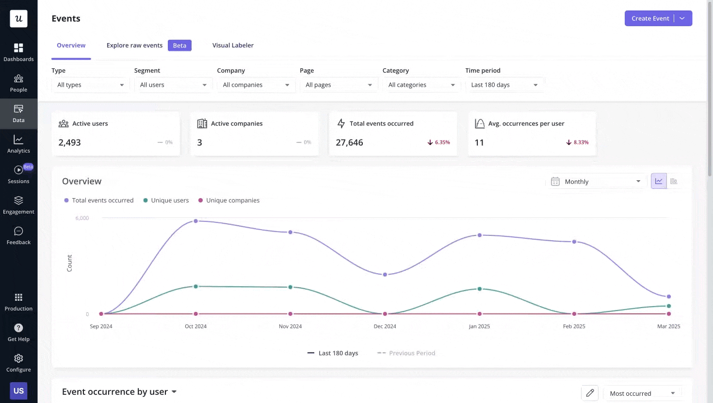
- Product Analytics covers the funnel and feature-adoption side, with the events dashboard the team uses for daily review.
- Session Replay is the diagnostic instrument the triage runs on. Comments on replay sessions let the design team flag specific moments for product review without a meeting.
- User Feedback (NPS and in-app surveys) closes the loop on why behaviour looks the way it does, with response rates in the 10 to 30% band versus 2 to 3% for email surveys.
- Workflows orchestrates the cross-channel response (in-app, email, mobile) without needing a separate marketing stack.
- Signals fires the alerts on the silent-engagement pattern, the cluster-then-silence shape James watches for.
For the agent stream:
- Agent Analytics tracks task completion, agent satisfaction, agent failure signals, and per-feature agent usage in one view.
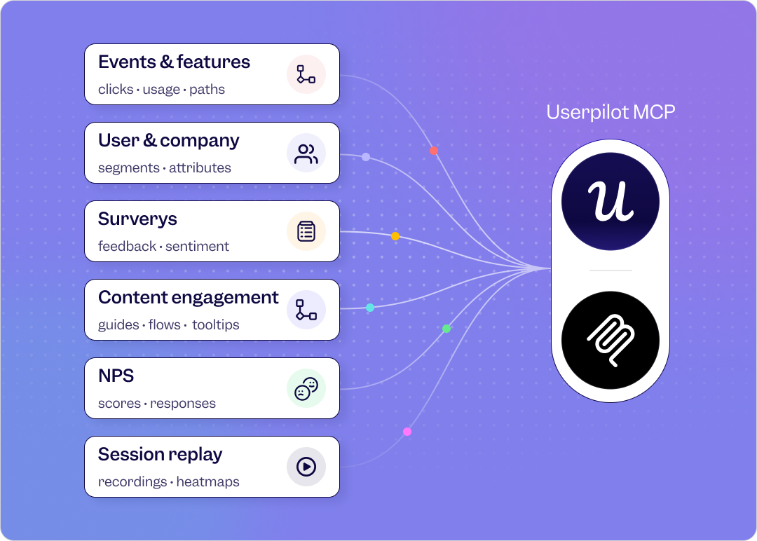
- MCP Server lets agents call Userpilot the same way they call any other tool, so agent activity is first-class in the engagement data, not a footnote.
- Lia runs the diagnostic triage continuously and surfaces recommendations rather than waiting for a Monday review.
Where user engagement is heading
Two patterns are worth watching as the next year plays out.
First, the two-stream split (human signals and agent signals) will become the default shape of every product engagement dashboard, not a power-user view. Companies that blend the streams will keep mis-reading agent-heavy accounts as healthy. The teams that separate the streams will get a much clearer read on where their business is actually heading.
Second, the diagnostic triage will move from a weekly habit to a continuous, agent-assisted loop. The work Abrar described (funnel surface, replay watch, in-app fix shipped within hours) is exactly the kind of loop an agent can run on top of a properly instrumented product. The PM’s role shifts from running the triage by hand to reviewing what the agent recommends. The work doesn’t go away, the cadence accelerates.
The user engagement model that matters in 2026 is a simple one. Define the core action for each user role, measure repeat of it across the customer journey, watch for silence as carefully as you watch for activity, and instrument the agent stream as if it were a second product. Pair every diagnostic with a closeable loop, and ship the closing move inside the same day. Done well, this is also how you compound customer lifetime value: highly engaged users stay longer, expand faster, and turn into the brand-loyal customers that quietly carry your revenue line. The rest is execution.
If you want to see what the two-stream model, the silent-engagement alert, and the diagnostic triage look like inside Userpilot, book a demo. Someone on my team will walk you through the exact setup I run every week, with your data, on your funnel.
FAQ
What is user engagement in 2026?
User engagement is the extent to which a user (human or AI agent) repeats a value-creating action in your product. The 2026 version of the definition adds the agent stream, so user engagement is now measured as two parallel signals: human engagement (clicks, sessions, feature adoption, NPS) and agent engagement (task completion, outcome quality, agent-to-human handoff).
How is user engagement different from customer engagement?
User engagement focuses on what users do inside the product. Customer engagement is broader and covers every channel a paying customer interacts on (email, chat, sales calls, community, support). User engagement is a subset of customer engagement, and it’s the part that produces the most measurable behavioural data.
What is a user engagement plan?
A user engagement plan defines the core actions you want users to repeat, the metrics you’ll use to measure repetition, the alerts you’ll fire on silence, and the in-app and cross-channel responses you’ll ship when the signal moves. In 2026, the plan should explicitly cover both the human stream and the agent stream.
About the author