14 SaaS Onboarding Emails That Increase User Activation
Looking for inspiration to help you craft engaging SaaS onboarding emails?
This article shows you 14 examples from top SaaS companies, along with best practices you can implement to reduce the time to value and boost user adoption rates.
What is a SaaS onboarding email?
SaaS onboarding emails are a series of automated or manually sent emails that guide new users through their initial experience with the product.
By providing users with key onboarding resources, these emails play a critical role in ensuring users smoothly transition from mere sign-ups to becoming active and engaged users.
Why send welcome emails during the onboarding process?
A warm welcome email is often the crucial first step in successful user onboarding. It immediately establishes a connection and sets the tone for a positive experience with your product. Here’s why it’s so important:
- Engage new users from the get-go: Most new users can’t wait to explore your tool. A well-crafted email takes advantage of that initial enthusiasm, welcoming users, thanking them for choosing the tool, and providing resources that build momentum from the onboarding start date.
- Offer them a seamless onboarding experience: Welcome emails clearly outline the next steps in the onboarding process, providing structure and managing user expectations. This streamlines the experience and avoids confusion.
- Improve user activation with help resources: Welcome emails often include links to helpful resources, such as setup guides, tutorials, or a knowledge base. This early access to support encourages users to explore and find quick wins with your software, resulting in better user activation and adoption rates.
- Reduce churn: The initial engagement and support that welcome emails provide significantly impact a user’s decision to continue using your product. Once users interact with your tool long enough to experience its value firsthand, it becomes an added motivation to adopt your product into their daily workflow, reducing your churn rates and boosting customer retention.
- Engaging and inclusive subject line.
- Detailed explanation of key features without overwhelming users.
- The final CTA leverages user excitement to drive immediate action.
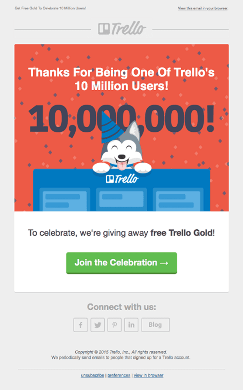
- Using social proof triggers the bandwagon effect, driving better engagement.
- The “Join the Celebration” button is prominent and encourages immediate action.
- The email invites users to connect on social media.
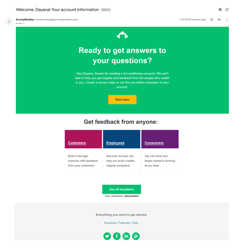
- It addresses users by name to build an instant connection.
- It uses simple copy designed to help users start building surveys right away.
- Providing a direct link to “See all templates” offers users a quick way to start without having to figure out the next steps on their own.
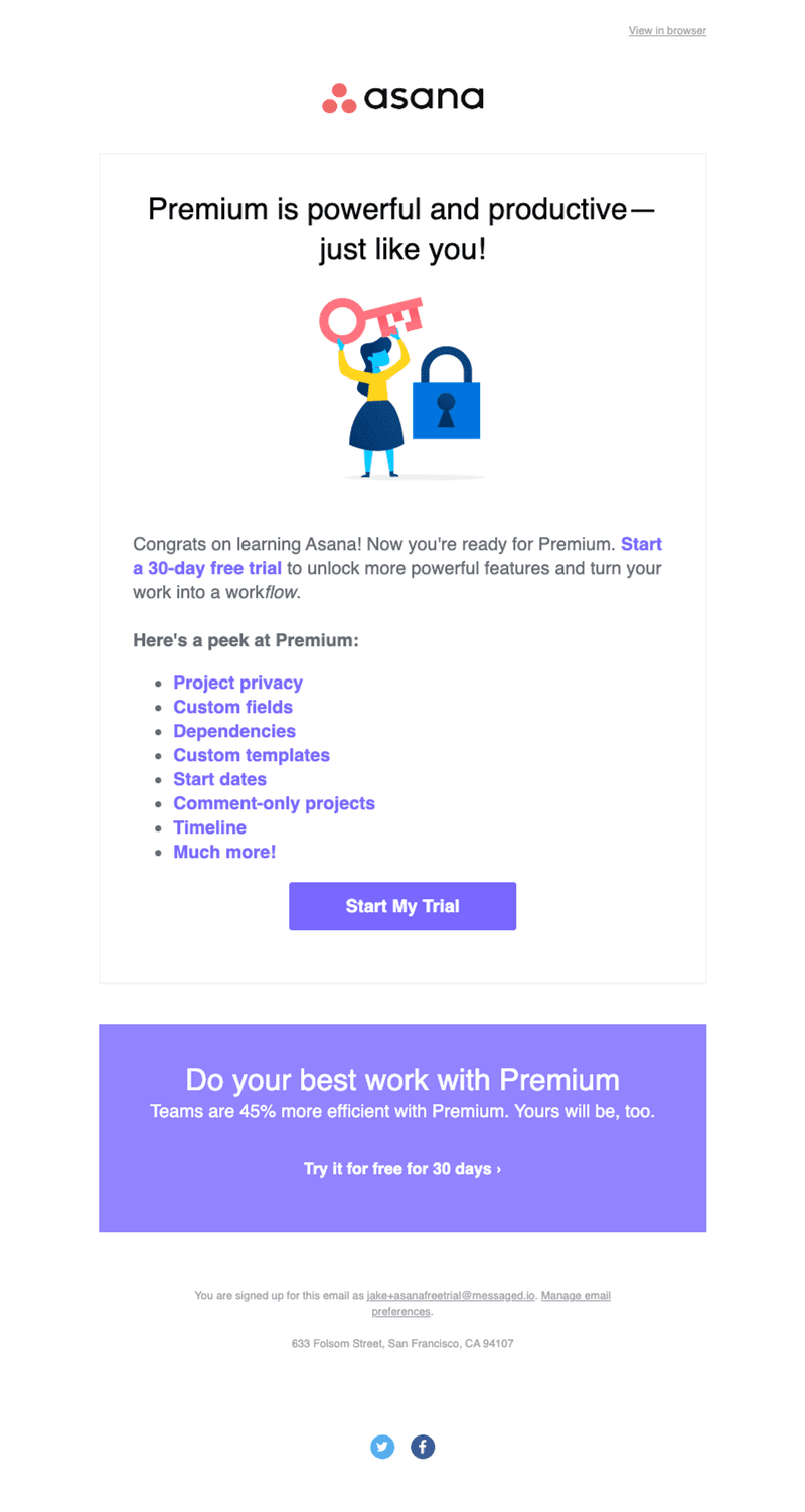
- Complimenting the user creates a positive association with the brand.
- The email provided a contextual list of premium features to position the tool as powerful and entice users to try the paid plans.
- Adding stats helps to convince users further.
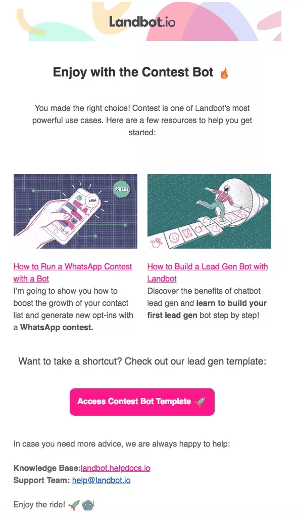
- Personalized resources to help new users get started immediately.
- The copy is highly specific and avoids unnecessary details that may distract new users.
- It has a clear CTA that simplifies the user’s next step.
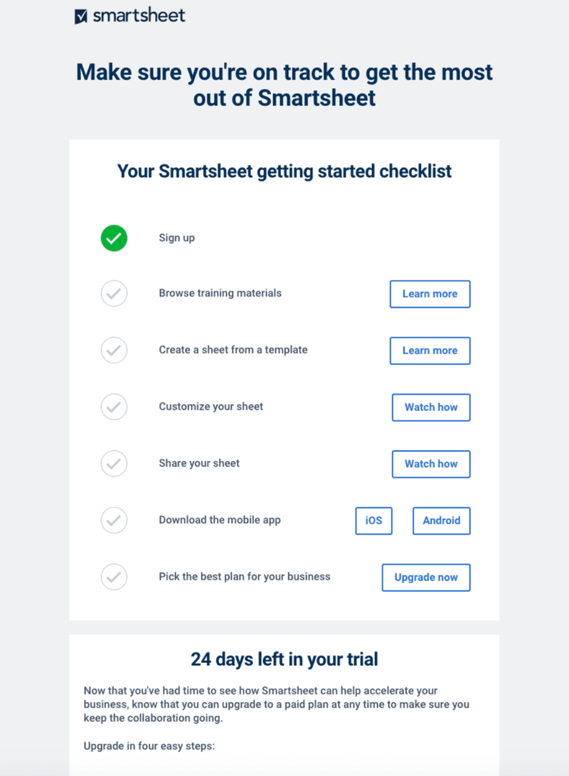
- The checklist structure offers a straightforward guide for new users to get up to speed.
- Each step in the checklist has a corresponding action button.
- The email subtly reminds users about the free trial period and includes an “Upgrade now” button.
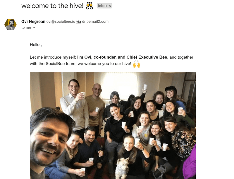
- The simplistic design and group photo evoke almost the kind of feeling you’d have if it were a physical welcome for a new team member or customer.
- It creates a sense of community and stays on-brand with lines like “Welcome to the hive” and “Chief Executive Bee.”
- Including a team photo makes the company feel more human and approachable. Depending on your company’s internal systems, you can copy this approach and include photos of key leaders or simply people from the success or marketing department.
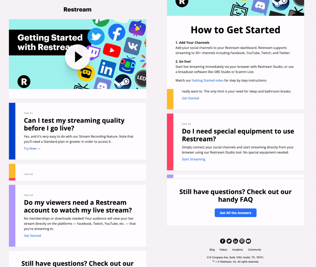
- Restream stays true to its niche by offering a video walkthrough.
- The email provides proactive support by answering common questions and directing users to a page where they can get more answers.
- It uses contextual and smartly worded CTAs to prompt immediate action.
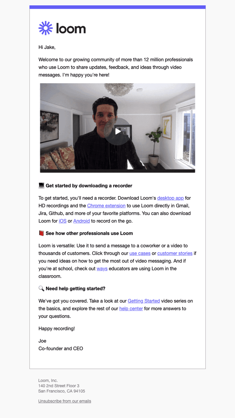
- The email outlines clear, actionable steps for the user to start using Loom.
- It leverages social proof to make users feel like a part of something big.
- The email includes links to the Getting Started video series and Loom’s help center, providing proactive user support.
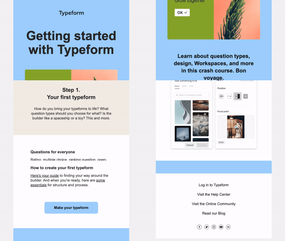
- The subject makes it clear that users should expect more emails (step 1/3).
- The email includes screenshots and visuals to show the aesthetics and functionalities of Typeform.
- Providing links to the help center, online community, and blog empowers users to find solutions when confused.
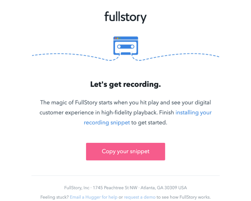
- The subject line creates FOMO, which leads to increased click-throughs (feel free to use this as an email template for reducing churn but don’t overdo it, or you risk having counter results over time).
- The email stays on brand with its language and visuals, reinforcing the identity of FullStory.
- FullStory’s email is short and has a clear CTA. There’s no point wasting users’ time with a long copy when you can make it short like this.
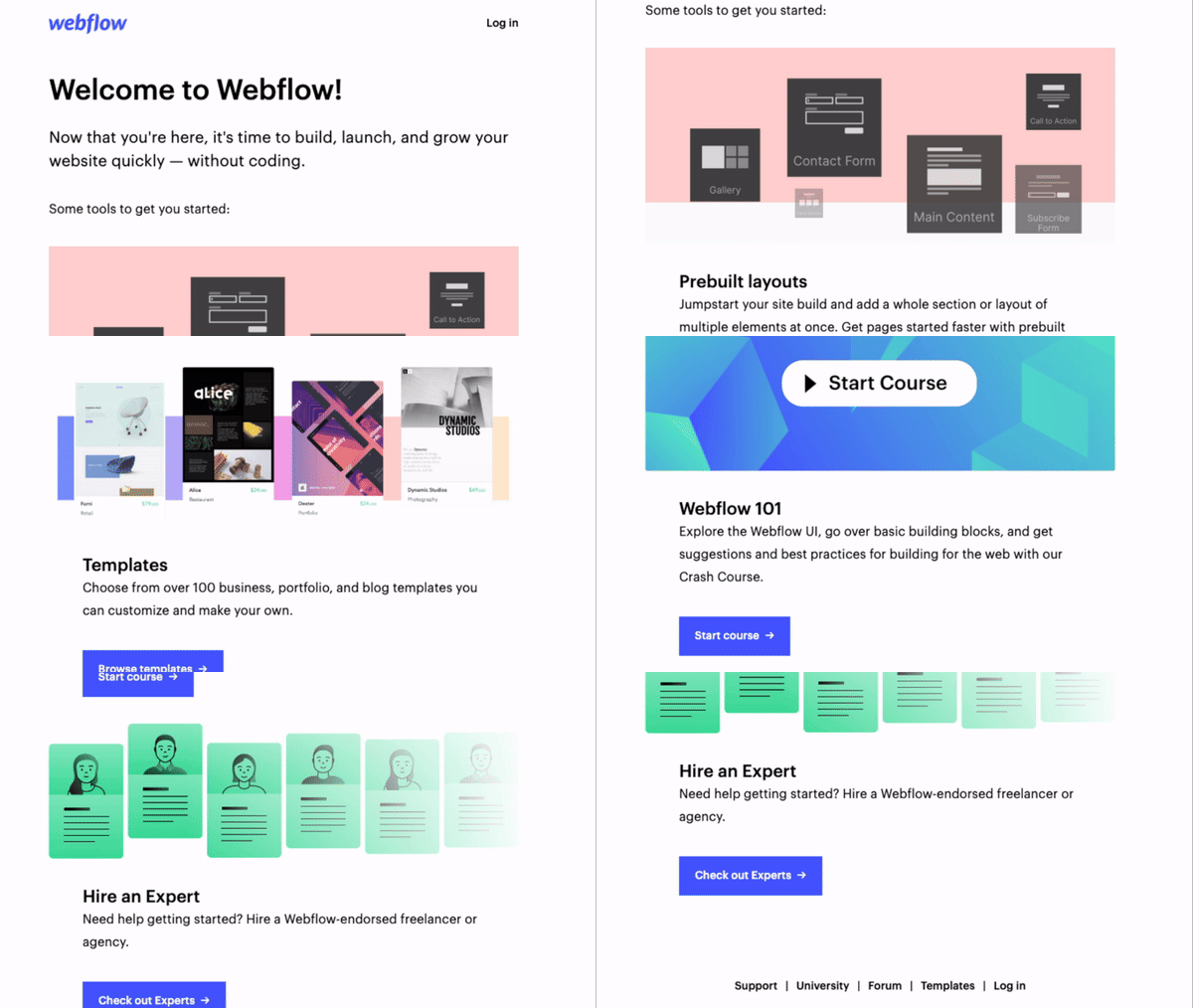
- It highlights key features along with visual designs to help users get up to speed quickly.
- Promoting the Webflow 101 course encourages users to learn the platform deeply.
- Each section has a clear CTA, guiding users on what to do next.
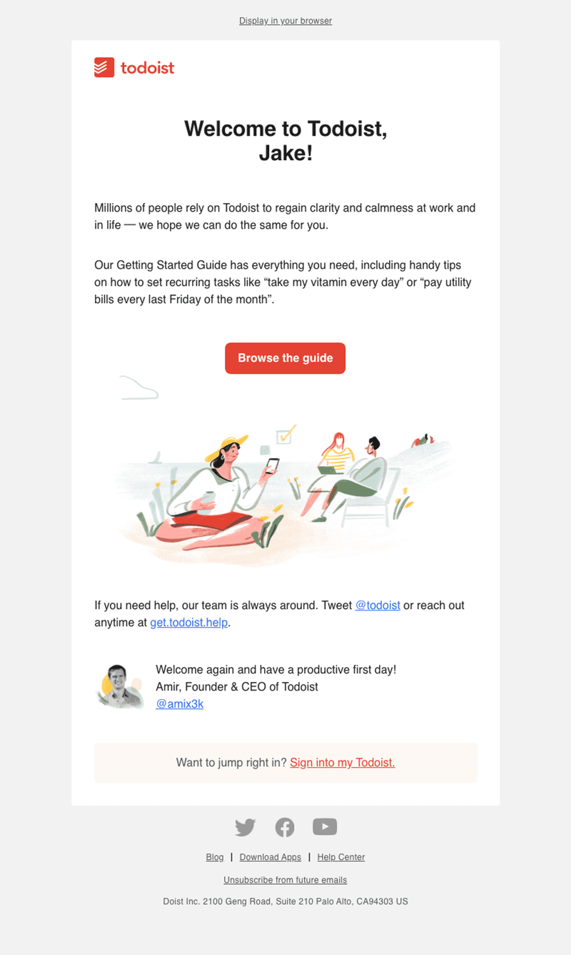
- The copy clearly communicates what to expect from the getting started guide.
- The design is clean and easy to skim.
- Todoist provides additional support resources at the end of the email for users who might need help.
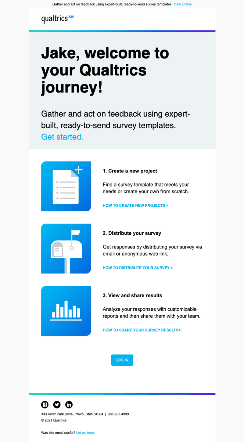
- Addressing the user by name helps personalize the onboarding experience.
- Each step in the email includes a link to a how-to guide.
- It has a prominent “Log In” button, encouraging users to dive into the platform immediately.
14 impactful onboarding email examples from SaaS companies
Now we get to the meat of this article. Below are onboarding email examples and their key takeaways:
1. Grammarly introduces new users to its key features
Grammarly is a writing enhancement app that assists users in improving their writing by checking for various error types, including grammar, punctuation, style, and spelling.
In its email, Grammarly combines welcoming language with a clear illustration of the benefits and functionalities that the tool offers.
Key takeaways from Grammarly’s email example
Subject: You + Grammarly = The Dynamic Duo
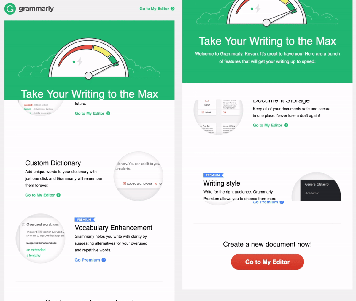
Grammarly’s welcome email.
2. Trello leverages social proof in their welcome email
Trello is a collaboration tool that helps teams organize projects and tasks using boards, lists, and cards.
This email was sent when the company crossed 10 million users. It leveraged this social proof and an incentive (free Trello Gold) to get users to engage more deeply.
Key takeaways from Trello’s email example
Subject: We think you’re 1 in 10 million. Here’s some free Trello Gold.
3. SurveyMonkey guides users to the next action
SurveyMonkey is an online survey creation and management platform that allows users to create and distribute simple surveys, collect data, and analyze results.
The onboarding email is short, straightforward, and personalized, showing users the value of the tool without wasting time.
Key takeaways from SurveyMonkey’s email example
Subject: Welcome, Dayana! Your account information
4. Asana introduces a free trial for their premium plan
Asana is a project management tool that helps teams streamline their work, from daily tasks to strategic initiatives.
The company triggered this email to congratulate free users for completing the onboarding steps and upsell them on the benefits of upgrading to the premium plan.
Key takeaways from Asana’s email example
Subject: A Premium experience just for you
5. Landbot shares use case-based emails
Landbot is a chatbot-building platform that lets users create conversational user experiences without coding.
The email below focuses on promoting one of the platform’s powerful use cases—a contest bot—and encouraging users to get started.
Key takeaways from Landbot’s email example
Subject line: Free resources for the Contest Bot
6. Smartsheet uses a creative checklist in their SaaS welcome email
Smartsheet is an enterprise platform for work management and collaboration.
Their welcome email employs a checklist approach to guide new users through the early stages of using the tool.
Key takeaways from Smartsheet’s email example
Subject: Checking in with you
7. SocialBee focuses on humanizing their first interaction
SocialBee is a social media management tool that helps individuals and businesses schedule posts, grow their online presence, and manage all their social media efforts from a single platform.
The welcome email focuses on building a meaningful and personal relationship with the user, which is consistent with what the brand helps customers achieve.
Key takeaways from SocialBee’s email example
Subject line: Welcome to the hive!
8. Restream offers video instructions in their onboarding welcome email
Restream is a service that allows creators to broadcast live video content to multiple streaming platforms simultaneously.
This welcome email provides users with video instructions on how to get started and uses text to answer simple FAQs.
Key takeaways from Restream email example
Subject: Getting started is easy. Open for step-by-step video instructions!
9. Loom encourages activation with an interactive onboarding email
Loom is a video messaging tool that enables individuals and businesses to communicate more effectively through video messages.
The platform’s onboarding email uses interactive elements to encourage new user activation.
Key takeaways from Loom’s email example
Subject: Welcome to Loom! 🎥
10. Typeform shares a step-by-step guide along with customer success resources
Typeform is a simple tool that specializes in creating engaging and interactive forms, surveys, and quizzes.
The platform’s onboarding email is comprehensive and divided into three parts to avoid overwhelming new users.
Key takeaways from Typeform’s email example
Subject: Step 1/3: getting started with Typeform
11. FullStory lowers new user churn rate with their onboarding email
FullStory offers digital experience analytics, providing insights into user interactions on websites and apps.
One thing that made this onboarding email stand out is the fact that it’s contextual—triggered if users haven’t installed the recording snippet in the first few weeks of signing up.
Key takeaways from FullStory’s email example
Subject: You’re not getting the FullStory yet
12. Webflow sends a power-packed welcome email to new customers
Webflow is a visual website builder that allows users to create and design professional websites code-free.
The email’s design is clean and visually appealing, reflecting the capabilities of the Webflow platform itself.
Key takeaways from Webflow’s email example
Subject: Welcome to Webflow!
13. Todoist shares their getting started guide
Todoist is a task management app that helps users organize their to-dos, set priorities, and track progress.
The welcome email from Todoist addresses the core value proposition of the tool—helping to regain clarity and calmness—and connects this directly to the new user.
Key takeaways from Todoist’s email example
Subject: Welcome to Todoist, Jake!
14. Qualtrics explains the customer onboarding process in three steps
Qualtrics is an experience management platform that enables organizations to collect and analyze feedback from customers and employees. The onboarding email shares three quick steps for conducting surveys with the platform.
Key takeaways from Qualtrics’s email example
Subject: Welcome to your Qualtrics Journey
Best practices for crafting an effective welcome email for new users
As you can probably guess from the examples above, crafting successful onboarding emails goes beyond using email templates or writing anything that comes to your head and ending with “best regards.”
Here are some strategies to ensure optimal results:
Make your onboarding email relevant with personalization
Most or all of your emails will be automated and based on specific email templates, but adding a personal touch makes all the difference.
How do you access new user data for effective personalization?
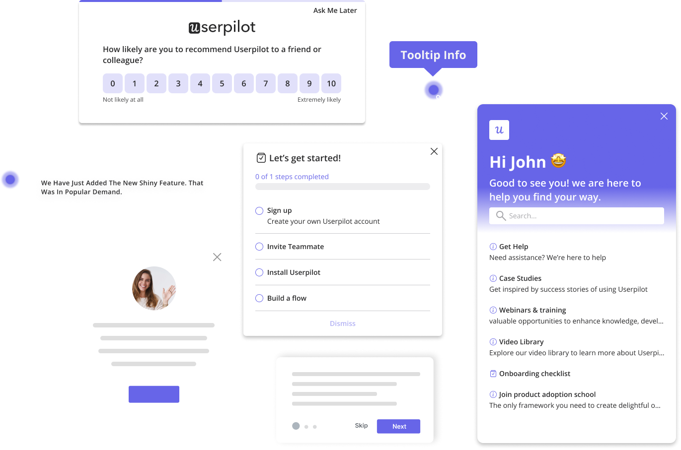
A good approach is to trigger a welcome survey like the one below. You don’t want to bore users with too many questions. Only ask basic stuff like their roles, goals, or savviness with using tools like yours.
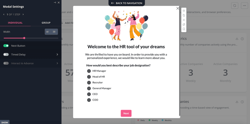
Segment users into different groups based on their responses to your surveys and trigger personalized emails.
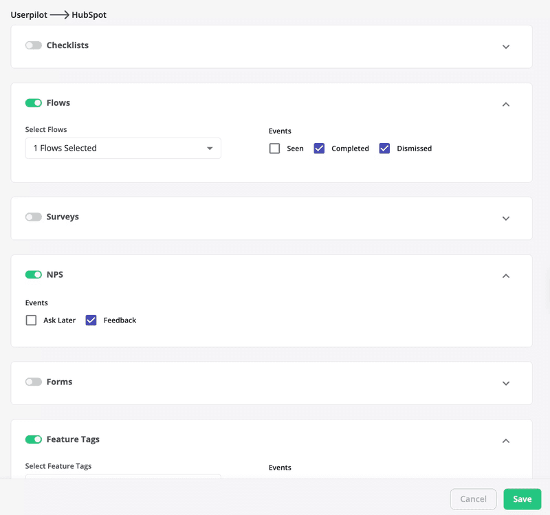
With the right tools, you can automate this process while you focus your energy on other things. For example, Userpilot-HubSpot integration makes it easy: collect user data and segment them with Userpilot, then transfer the data to HubSpot and trigger your surveys from there.
Only share information that is essential for new users
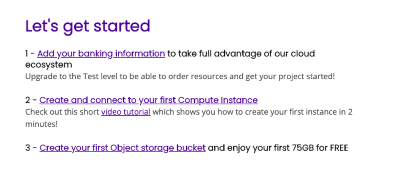
New users are still getting used to your app, so try not to overload them with information—especially in the first week of using your tool.
Introduce only essential features along with the appropriate help resources. You can conduct secondary onboarding later in the user journey when customers are more comfortable with your product.
Make sure your email has a responsive design
A responsive design means your email is able to adjust and adapt its layout and content to fit different screen sizes, resolutions, and devices.
With this, it becomes easy for users to access your emails irrespective of their device. One mistake companies make is to design email elements—copy, CTA, graphics—only for web and desktop users.
However, with mobile users making up for 54.7% of all internet traffic in 2023, you can be certain that a good chunk of your users will access your onboarding emails from mobile. So, ensure everything you send out can easily adapt to different screens.
Use onboarding emails to trigger in-app onboarding flows
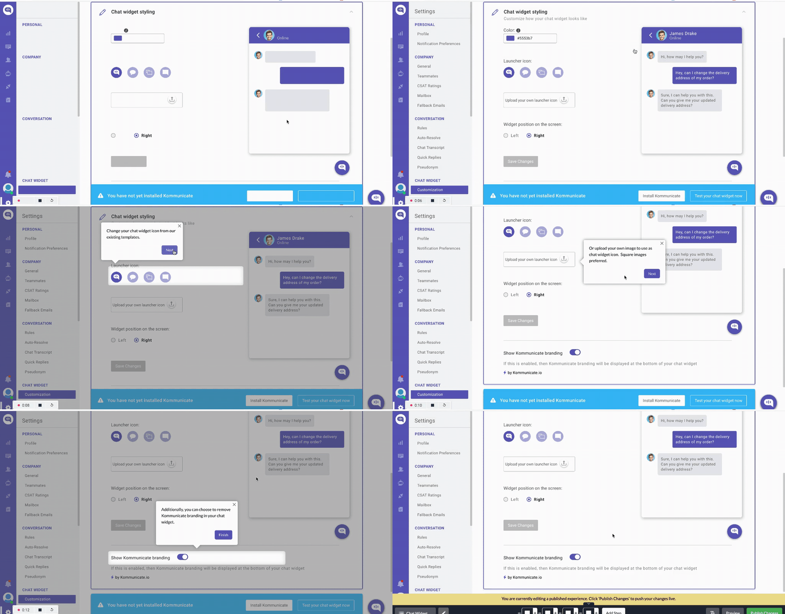
Pair your emails with in-app onboarding to give users a comprehensive and smooth onboarding experience.
For example, imagine you send an onboarding email that asks users to create their first chat widget. Clicking on the CTA should take them to an in-app interactive walkthrough that guides them through creating that widget.
Conclusion
We hope you now have all the inspiration you need to create your own onboarding emails.
Ready to get started delivering effective SaaS onboarding emails? Book a demo now and see how Userpilot can help you collect data upfront and segment users to trigger personalized and contextual emails.

