What is In-Product Messaging and How Do You Create It? (code-free!)
Here at Userpilot, we’re seeing an increasing number of SaaS companies utilize in-product messaging as a means to communicate quickly and efficiently with their active users. In-product messaging is a great way to prompt users who are not currently the new features you have to offer.
In fact, a study from Reckless Agency found that in-app messaging had a 75% open rate. This is 45x higher than email and 3x higher than push notifications. The in-app guidance provides the target audience with relevant messages to help them adopt key features and drive user engagement.
If you’re not sure what this type of communication channel should look like for your business, or how you should go about building it from scratch, this article is here to help you.
What is in-product messaging (short summary)
- In-product messaging displays to your customer inside your product while they are using it.
- It’s not the same as a push notification. These are personalized messages for existing users, informing them about the new features to make them easily accessible. Even potential customers can be reached with targeted messages tailored to their needs.
- The immediacy and relevance of in-app guides make it a powerful tool for product managers. Users don’t raise support tickets unless they need human intervention.
- The main different categories of in-app messages include online chat, modals, tooltips, product tours, microsurveys, and product notes.
- Typical use cases for in-app messaging are user onboarding, subscription expiry notifications, success messages, maintenance notifications, upsells, referrals, and converting trial users into paid ones.
- It’s very simple to build in-app messages on Userpilot without using code.
What is your biggest challenge with product messaging?
How are you currently building your in-app experiences?
What’s your primary goal with improving your in-product messaging strategy?
Unlock a powerful, code-free in-product messaging solution.
Userpilot empowers your product and marketing teams to create targeted, contextual in-app experiences that drive user engagement and growth—without relying on developers.
A definition of in-product messaging
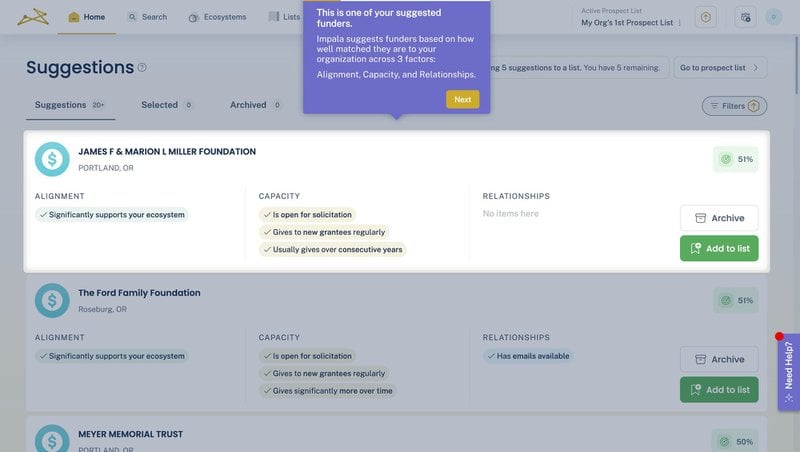
An in-product message is any type of communication that displays to your customer inside your product while they are using it.
Check out this example of an engaging message Impala created using Userpilot:
This type of product marketing strategy is also referred to as “in-app messaging,” or even just “product messaging.”
The term can be applied to any type of digital product, whether it is mobile apps, websites, or even Chrome extensions.
Thanks to the magic of responsive design, in-app messages can also be sent on any device type: desktop, mobile, or tablet.
So, is in-product messaging the same as a push notification?
Not really, no.
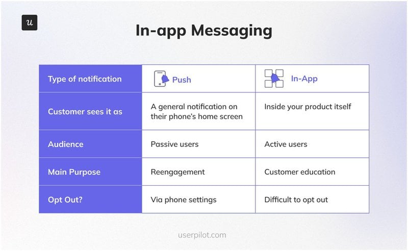
A push notification is a message from your app that appears on the user’s phone or browser, even if they’re not using your product at the moment.

As such, it’s primarily a way to get your customer to re-engage with your app when they’re doing something else.
WhatsApp’s push notifications, which let you know when someone texts you, are a classic example of this. The problem with push notifications is that your product communications will compete with tempting notifications of social media posts.
By contrast, an in-app message appears directly within your product. Put another way, your user won’t see it unless they log in to your app. Focusing on key benefits in in-app product messaging not only helps with feature adoption, but it also reveals valuable insights.
The following chart sums up the main differences between these two channels:
Why is in-product messaging valuable?
In-app messages are a product marketer’s dream.
Given that you can send a personalized message to the customer based on the specific UI element that they’re interacting with within the present moment, there are few communication channels that are more immediate or context-based.
This is tremendously powerful, for numerous reasons:
If a user is browsing a feature that is part of a more expensive plan, or he is about to reach free limits, you can send them a message telling them to upgrade based on usage data. You can also use the in-product messaging to announce upcoming events, price cuts, deep dive workshops, free trial ending reminder, and more.
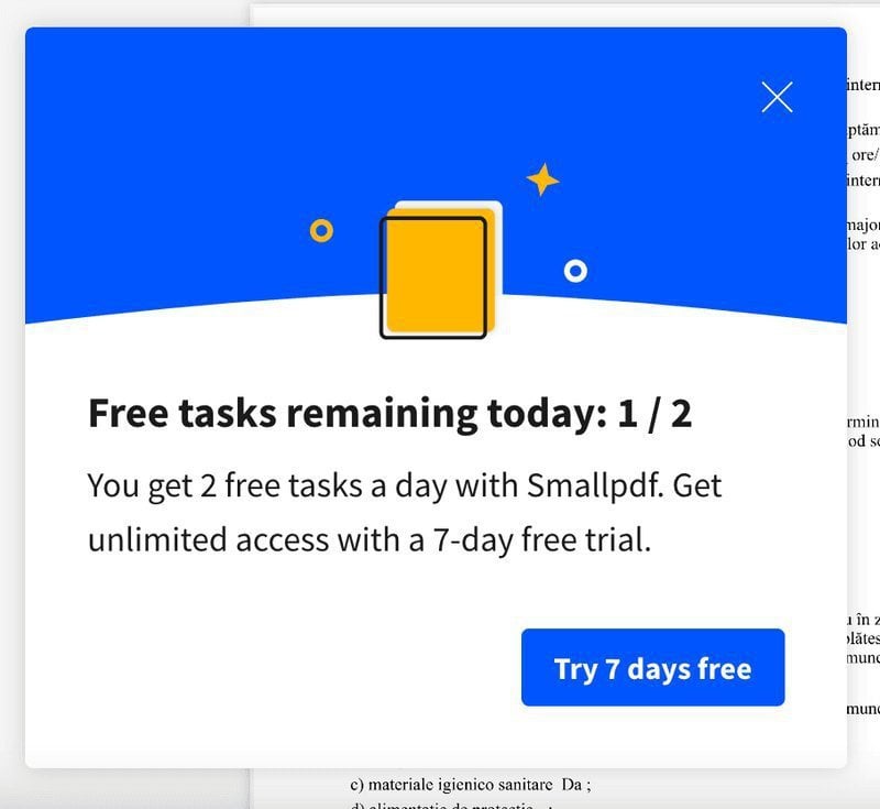
If your customer is stuck on a particular feature, you can serve them with a tooltip that explains exactly how that feature works. These product communications help the users with practical advice on how to use the product better.
The trick is to understand your users. Who are your users? What are their needs, preferences, and pain points? Understanding your users will help you create messages that resonate with them and deliver to them at the right moments. This way, you can positively control the conversion rates.
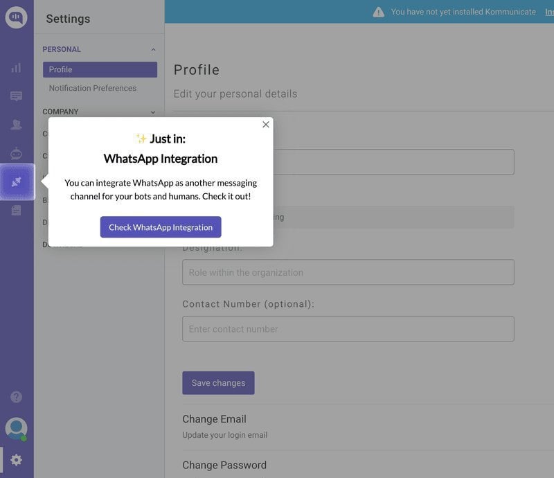
Problem solved!
Or, if you release a new feature that seems especially appropriate for one particular user segment, you can create targeted messages that promote that feature to them.
No wonder Intercom found that in-product messages are 1.5 times more likely to be opened than emails, and 6.7 times as likely to receive a response.
That translates into better for your SaaS business, which is a metric that has a tangible effect on the bottom line.
But that’s not all.
Internal benefits of in-product messaging for SaaS teams
In the absence of in-app communication, your support team will be messing around with a large, unwieldy tool stack.
Imagine if your customer communication is spread across Zendesk, email, phone, the kitchen sink…
Sounds like a mess to me.
Now, we’re not saying you’ll eliminate those other tools completely by using in-app messaging, but there is something to be said for the immediacy of talking to your customers right inside your product.
When Cledara switched from email to in-app messaging, they received dozens of interested companies in one week, a response that typically took two months through email.
“Within a week, we were able to register several dozen companies already saying they’re interested in the new feature. With email, you’d get the same number of responses within two months.” – Gerard Masnou, Head of Support and Operations at Cledara
And if your app is already full of helpful tooltips, driven actions, and hotspots, all of which point the way for your customer, there’s a good chance that your support team will have fewer ticket requests, to begin with. You can also have user guides as a knowledge base and relevant content as blog posts.
Add in the fact that your new employees will also be able to use your existing product roadmap as a way of getting up to speed with the software they’re working with.
Perhaps you can start to see why we’re so excited about the number of possibilities that in-app messages can create.
So let’s get a little more concrete.
What are the different types of in-product messaging?
Here are a few in-app communication patterns that you’ll see frequently.
As you read this, consider whether any of these might be a useful addition to your digital product.
Online chat
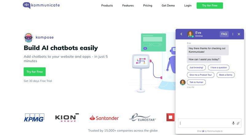
The quintessential type of in-product messaging, adding chat functionality to your app allows you to instant message in real-time with your user base from inside your product.
If you’re thinking that this would be a pain to build from scratch, well… you’re right.
However, messaging software like Zendesk and LiveChat makes this super easy in 2022. Simply install third-party chat solutions like this, and you’re good to go.
Modals
A modal is what’s known as a “dedicated UX pattern,” called so because it’s so large that the user’s entire screen is dedicated to it.
They’re often used for communicating important announcements that demand your user’s entire attention, such as:
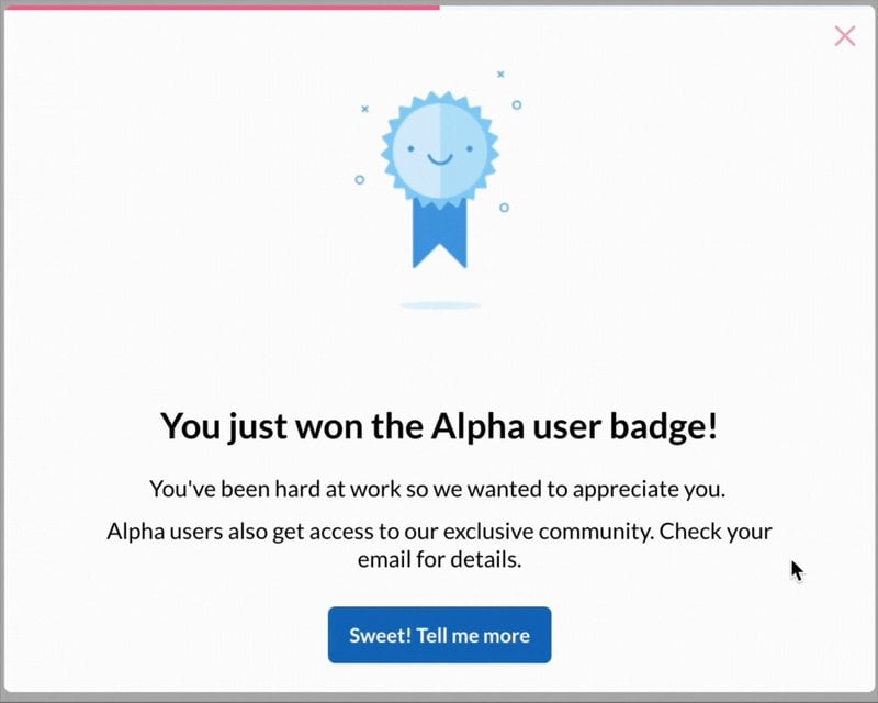
I’ve also seen many SaaS companies use modals to welcome new customers to their product, announce new features, or upsell a more expensive plan level.
Tooltips
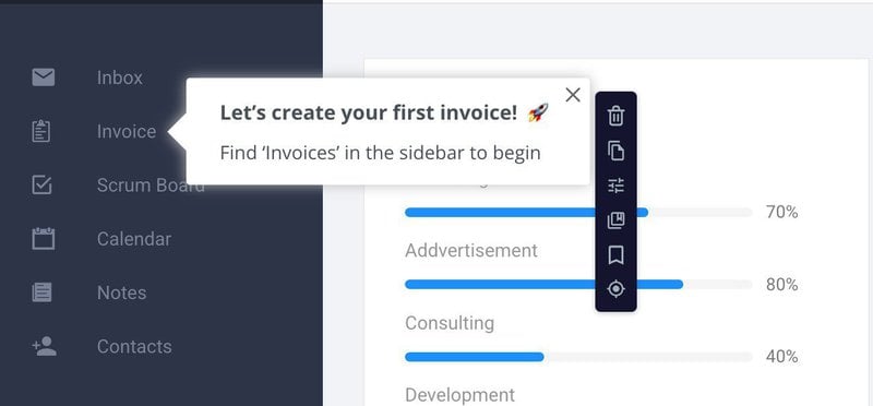
Tooltips are commonly used to explain one particular UI element, which perhaps isn’t immediately intuitive.
The user has but to hover over the element in question, and the tooltip will magically appear to provide them with the guidance that they need.
For simple problems, the immediacy of a tooltip is so much more appealing to a customer than having to search through a knowledge base, or (worse) spend half an hour phoning a support agent.
Product tour
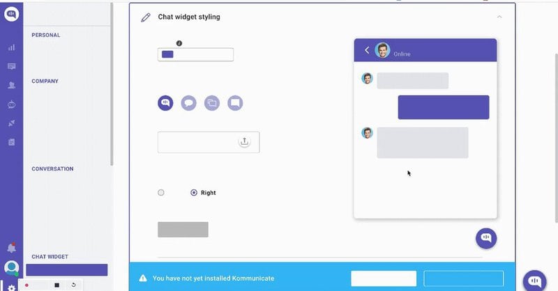
Put modals and tooltips together and add a few more UI elements together such as hotspots, and you get a product tour.
This is a whole series of in-app messages that lead the user around a new product or feature.
But beware!
Just as you wouldn’t want to spend time in a lecture that says the same thing over and over, your customer also won’t appreciate it if your product tour is linear and discusses your features in a pre-set order.
Your users want to be treated as individuals.
So please: skip the linear product tour and ensure that your in-app communication is a two-way, interactive conversation.
For more on why users hate linear product tours, check out this post.
Microsurvey
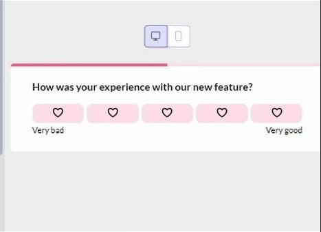
As the name suggests, this is a short survey that appears in-app.
There are two types of microsurveys.
There are quantitative surveys, which seek to gain measurable feedback about an aspect of your product. NPS surveys are a classic example of this.
Then there are qualitative surveys, in which you get your customer to qualify their previous quantitative answer.
So if you used these in tandem, you might have an NPS survey, followed by another survey asking the user why they chose that particular score.
Just remember to keep the surveys short! 2-3 questions are plenty.
Product notes
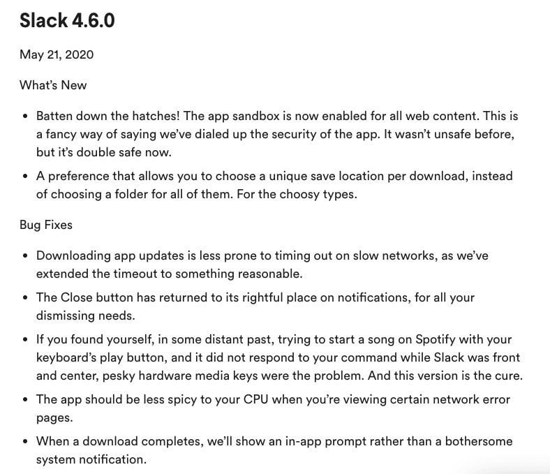
These are the notes you publish in-app when you release a new product or feature.
From your customer’s perspective, they can feel like part of a broader dialogue with you, assuming that you incorporated user feedback into the new release.
When Zoezi started using Userpilot to send release notes through in-app modals instead of emails, they could finally see who actually read their updates. This helped them extract key metrics based on the user interactions.
The engagement part in Userpilot has been the easiest for us to make a difference because then we can understand if our users understand better what they’re supposed to do. We have a few flows that we’ve tried, and we also do release notes now with the modal, which is really good, and then we can see how many click the actual release notes or not. – Isa Olsson, UX Researcher and Designer at Zoezi
Even if you need to use technical language, do ensure that you keep things as short and accessible as possible.
Videos and supplementary resources can be a great way to break up the wall of text. Showing the right message at the right time helps your target audience learn more about the additional features the software has to offer.
For more best practices and a release notes template, check out this article.
Now, let’s put all these in-app messaging ideas together and see how they might provide you with value.
Use cases for in-product messaging
Disclaimer: This is not intended as an exhaustive list! These are just ideas to get you thinking.
User onboarding
You can think of onboarding users as educating your customers on how to get the most from your product.
This is a process that begins in the awareness phase of marketing (pre-boarding) and should ideally continue throughout the entire customer lifecycle.
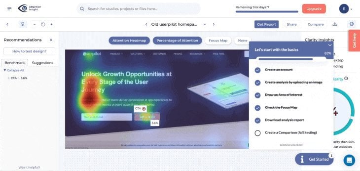
To get a user activated, Attention Insight requires them to create at least one heat map analysis. To make this happen, Attention Insight used Userpilot and created a personalized onboarding checklist and engaging messages to guide users through an interactive walk-through of the process.
Trial to paid
Growing numbers of SaaS companies are pursuing a freemium business model.
This means that they can let their users explore the product at their own pace, and then only choose to pay for an account if they like what they see.
It’s a great value for users who want to try before they buy, so the freemium model also tends to increase sign-up rates.
In this in-app modal, Loom encourages users to upgrade upon reaching the usage limit. Create a copy that focuses on the value proposition of the upgraded plan. You can also try different messages to see which one gets the most engagement.
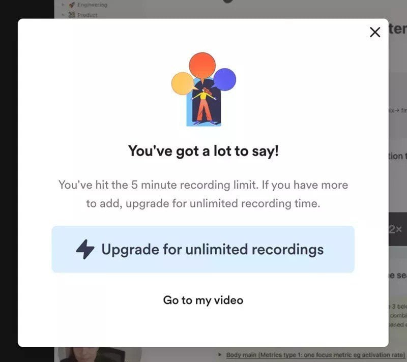
You can create such a modal that triggers automatically for users directly inside Userpilot.

Expired subscription
Speaking of urgent, if there were ever a good reason to interrupt your user’s workflow, the imminent expiry of their subscription would be just that!
Sending an email to communicate that they need to renew is better than nothing, but there’s no substitute for the immediacy of an in-app message.
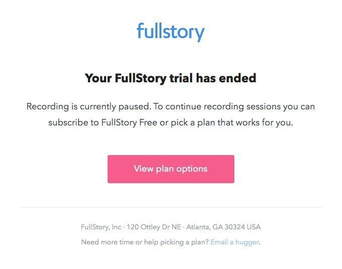
In this example, the session replay tool FullStory makes use of a modal to take up the user’s screen and grab their full attention.
Note the subtle reminder of the value their product provides: in this case, “recording sessions.”
This makes it clear that the user will need to resubscribe to get these benefits back.
Success messages
However, users navigate towards success in your product, it’s in your interest to make them feel good about themselves after using it.
That dopamine hit will keep your customers coming back for more.
As an aside, if you’re interested in the ethics of exploiting dopamine responses for commercial gain, this post is well worth a read.
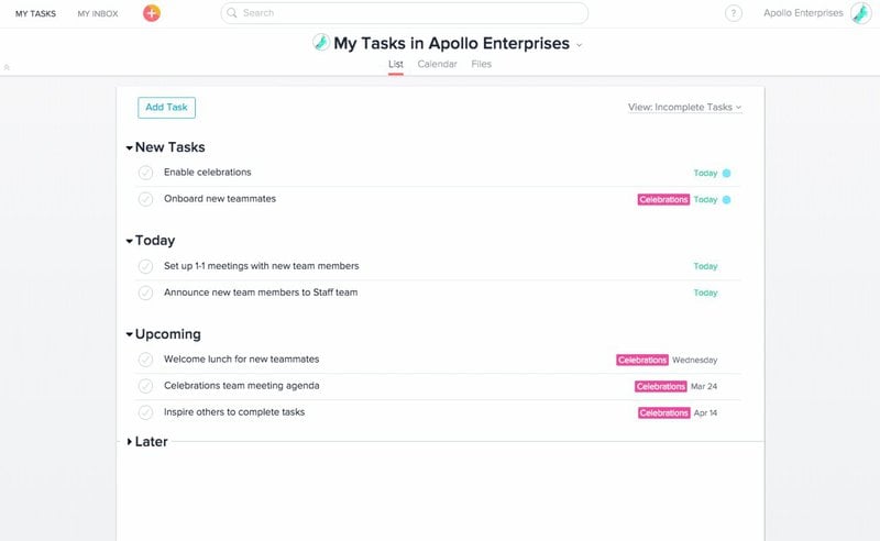
The classic example of an in-app success message comes from the project management tool Asana.
They use gamification and funny unicorn emojis to give their users a sense of accomplishment and put a smile on their faces after they finish a task.
Downtime for maintenance
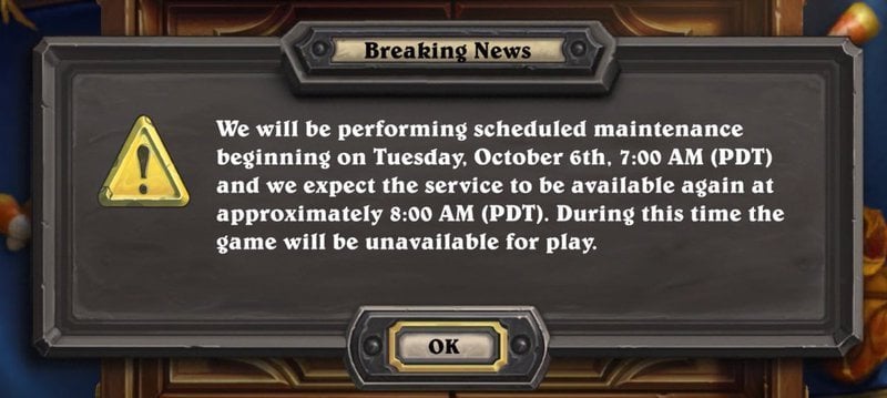
Few things are more frustrating than logging in to your favorite game after a long day of product management, only to find that it’s offline for maintenance.
That’s why many online games have started notifying their players in-game ahead of time when they can expect maintenance time.
This helps prevent any nasty surprises.
Here’s an example of the online card game Hearthstone informs users:
Upsell a secondary feature
Upsells are a great way for all SaaS companies to maximize Lifetime Customer Value.
A great time to offer upsells is once your user has activated and demonstrated through their in-app behavior that they might be interested in a secondary feature.
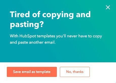
In this example, HubSpot offers a secondary template feature in-app to users who have been seen trying to copy and paste.
Referral program
All SaaS businesses love to receive referrals. It’s basically free marketing, or you could also see it as getting more from each individual customer relationship that you already have.
In-app messages are a great way to incentivize referrals.
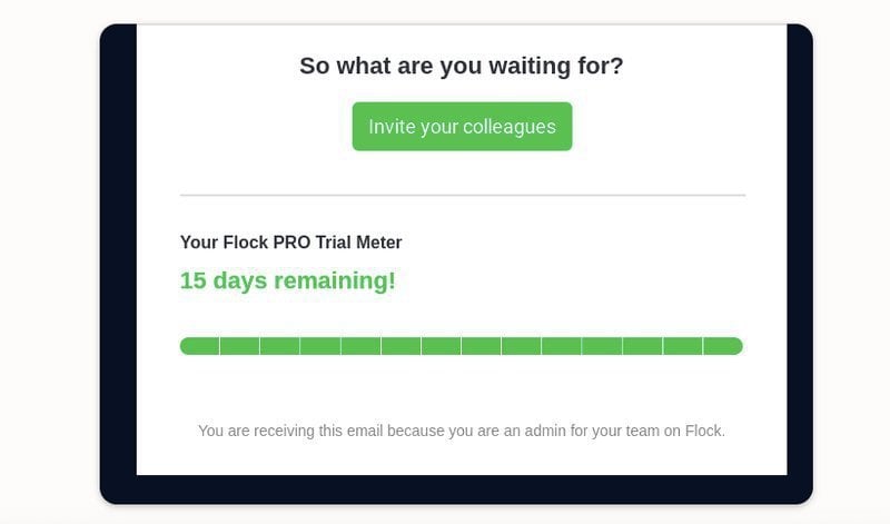
In this example, Flock has created an in-app referral modal that rewards customers with an additional day of free trial for each person they refer.
The progress bar and “trial meter” add a nice sense of gamification.
How to create in-product messaging in Userpilot
Creating in-product messages in Userpilot is super simple, whether you’re working on web or mobile.
For web apps, all you need is our Chrome extension. If you want to onboard new users in your mobile app, we have Userpilot’s SDK for you. With interactive features like targeted onboarding flows that utilize slideouts, carousels, and push notifications, you can create a truly engaging in-app experience for your users.
Both are no-code, so you don’t need to be technical (I’m definitely not!), and your devs don’t need to lift a finger.
Let me show you how I built a quick tooltip to explain the “Income” section in our Campfire demo app.
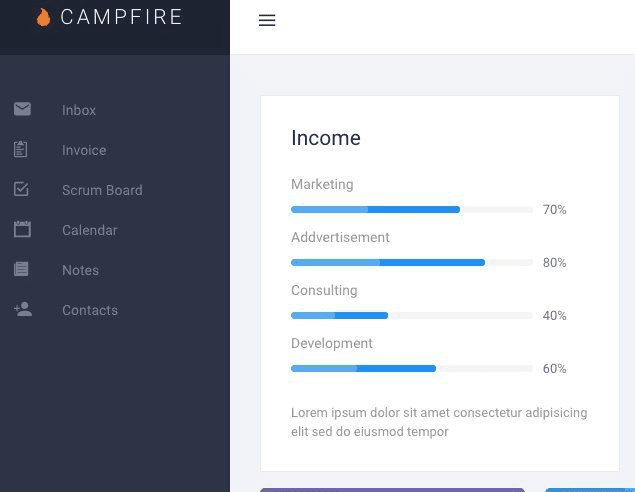
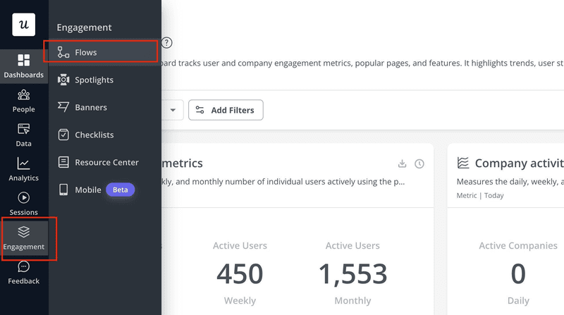
Start by heading over to Engagement → Flows in the left-hand menu.
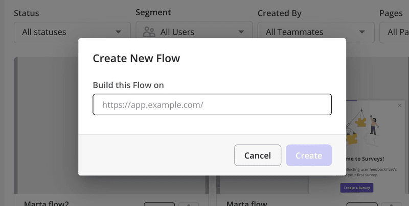
Then click Create Flow in the top right, and enter the URL of the page you want to build your flow on, in this case, the Campfire dashboard.
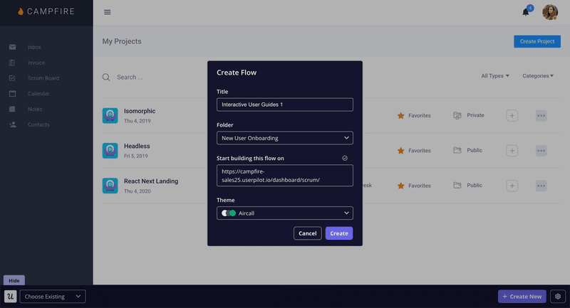
This will open up a new window with the live page. You’ll see your app just as your users would.
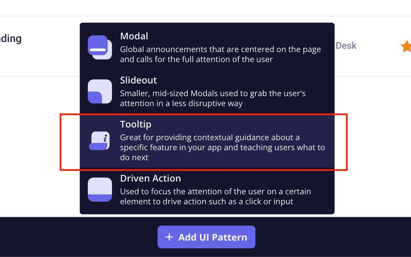
Now choose the type of UI pattern you want to create from the pop-up. I picked Tooltip.
From there, you can either start from scratch or select a ready-made template. I usually go with “Start from scratch” if I want more control over things like layout, image, or copy.
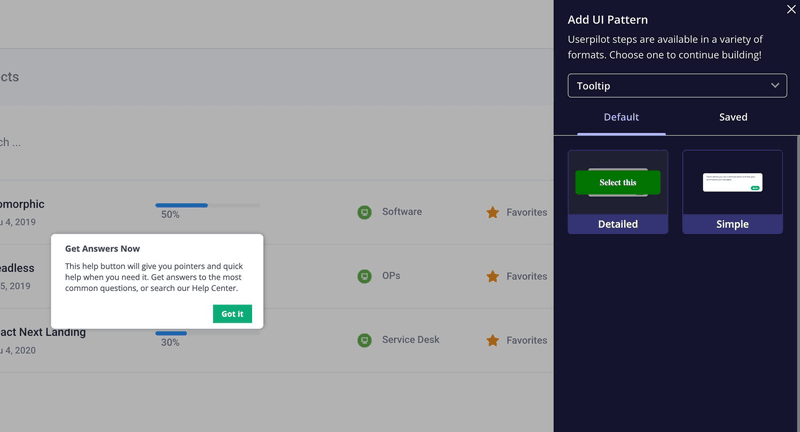
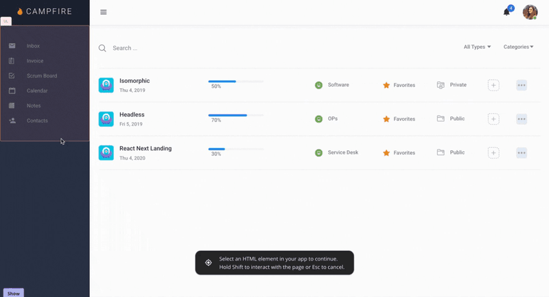
Next, hover over the element you want the tooltip to be anchored to. I’m picking the “Income” section and clicking to attach it.
Then you can start customizing: write your message, add a button, tweak positioning, and choose what happens when users interact with it. The customization options are super flexible; you can make the button static, trigger another flow, open a page, or whatever you need.
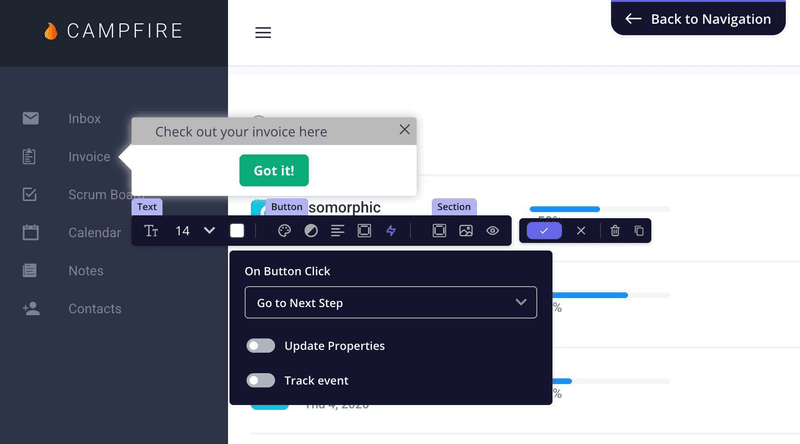
And to speed things up, I used our AI writing assistant to tweak the copy and translate it (yes, it works across languages too).
All in all? Took me less than 10 minutes to go from idea to working tooltip. And again, I didn’t write a single line of code.
Enabling user actions for product management using Userpilot
After reading this article, you should now know:
- What in-product messaging is and why it matters.
- The different types of in-app messages.
- Various ways you can put in-app messaging to work for your business.
- How to create product messaging on Userpilot without writing a line of code.
If you’d like to see what Userpilot can do for your in-product messages, we’ve got some good news for you.
Userpilot comes with a free trial, meaning you have nothing to lose by giving it a spin. Sign up for a demo today!


![What are Release Notes? Definition, Best Practices & Examples [+ Release Note Template] cover](https://blog-static.userpilot.com/blog/wp-content/uploads/2026/02/what-are-release-notes-definition-best-practices-examples-release-note-template_1b727da8d60969c39acdb09f617eb616_2000-1024x670.png)
