First Time User Experience (FTUE) For SaaS Products: How to Design a Great Onboarding Experience For Your Users

What does FTUE stand for?
FTUE is an acronym for First Time User Experience. It’s also spelled FTUX.
What is first-time user experience (FTUE)?
First-time user experience is the sum of all new users’ experiences during their first interaction with your product. This includes their thoughts, emotions, and conclusions through the process.
It’s much like going to a museum for the first time.
Your FTUE in that museum consists of how easy it was to gain access, what you think about the entry fee, the staff you met, and your general feeling about the items in the museum. After a couple of minutes or hours, you’ll leave with conclusions based on those experiences.
You may feel excited that the experience was worth your time and recommend it to friends. Or you may be angry that the museum didn’t live up to its promise and may even be tempted to leave a negative review online.
Your SaaS first-time users go through the same experience. The only difference here is that their experience is entirely online.
First-time user experience is a crucial part of the overall UX onboarding process. And if done well, it’ll lead users to their Aha! moment quickly, which will make them appreciate your product and, in turn, enhance retention.
We’ll discuss why first-time user experience is important to user retention, but first, let’s be sure we’re on the same page about what UX onboarding means.
What is UX onboarding?
UX onboarding uses psychology to understand user motivations and jobs to be done. The goal is to use this information to create onboarding flows (as well as mobile onboarding flows) that help the user quickly see how the product can help them.
Done well, UX onboarding guides the customer through the different journey stages and ultimately turns many of them into paying customers.
How do you currently understand the expectations of your first-time users?
Why is the first-time user experience important for activation and user retention?
Remember the museum example we used earlier?
Imagine entering the museum, and there’s no guide at all. You don’t know how to find your way, and the artifacts displayed aren’t labeled, making it hard to identify what you’re looking at.
What would your reaction be?
Most people would leave before they even get to explore the museum. It’s the same thing that happens with SaaS customers. If users feel lost when they log into your app for the first time, they’re very likely to churn before interacting with the product enough to reach activation.
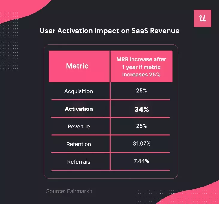
The first-time user experience is something every SaaS company should invest in, considering that activation has the biggest impact on MRR in a 12 month period.
When you excel at FTUE, new users will always feel welcome on your platform. That first impression will signal that you’re the ideal solution to their problem, making them want to stick around.
What does the first-time user experience include?
We’ve said that the first-time user experience involves all experiences that a new user has with your product. These can be categorized into the following:
- The AHA moment
- The activation point: core feature discovery and engagement
- The perceived effort required to get value from the product
The AHA moment
This refers to the excitement a user feels when they realize that your product is a potential solution to their problem.
In other words, the user gets to their Aha moment when they think, “This software is what I’ve been looking for!” The Aha moment typically comes after the first couple of interactions with your tool.
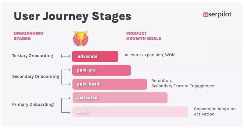
The activation point in the user journey
Contrary to what some people think, the Aha moment isn’t the same as the user activation point. The latter is a step forward in the process.
While the Aha moment is when the user realizes you could solve their problem, the activation point is when they’ve used your core features and are certain about what they felt in the Aha moment – they’ve now experienced the value.
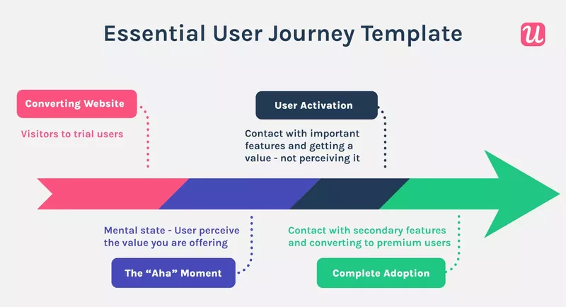
The user’s perceived effort and experience
This is about the overall users’ experience and how they perceive the effort required to get value by using your app.
You can reduce this effort score by shortening the time to value for your product. This way, users don’t have to spend too much time before they “get” your software.
Effort can be measured with customer effort score surveys. The survey uses a 1 to 5 or 1 to 7 scale or emoticons to measure users’ feelings after engaging with a feature or completing a milestone.
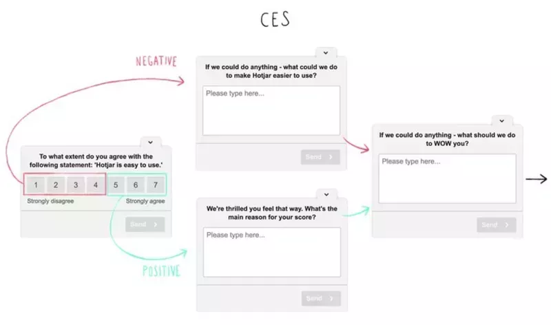
A high score means your customers are finding your product easy to use. Low scores indicate you need to make your product experiences more seamless, while also finding ways to increase the user’s familiarity with your features.
How do you create a great first-time user experience (FTUE)?
You’ve seen the importance of a good first user experience; now it’s time to learn how to create one for your users. The steps listed below will guide you.
Understand your user’s expectations
You can create what you think is a stellar onboarding UX, but your users won’t feel the same way if it doesn’t resonate with them.
Hence, the first step is to understand your users and their jobs to be done. You can achieve this with short forms during the signup flow or micro surveys on the welcome page.
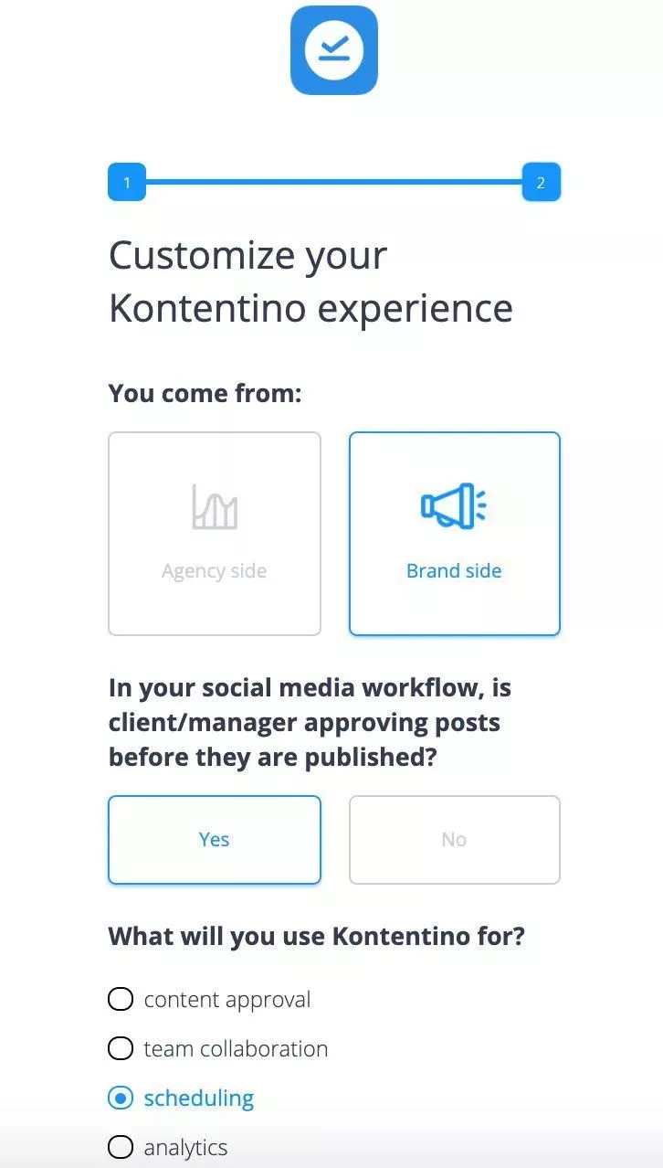
Personalize the user onboarding process based on the user’s needs
Use the information uncovered from the signup flow or welcome screen you created in the step above to personalize the onboarding for each user segment.
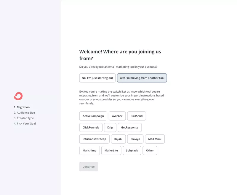
Consider the example below from Convertkit.
If the user is just starting out, they will need to learn more about an email marketing tool and how to use it, so the path will be different compared to someone who already has experience using a similar tool. That’s personalization at work.
Replace the boring product tour with interactive guides
Long product tours are outdated and boring. The reason is simple: they’re not personalized. Use contextual short guides instead. These guides are more helpful because they’re designed to surface when the user specifically needs them.
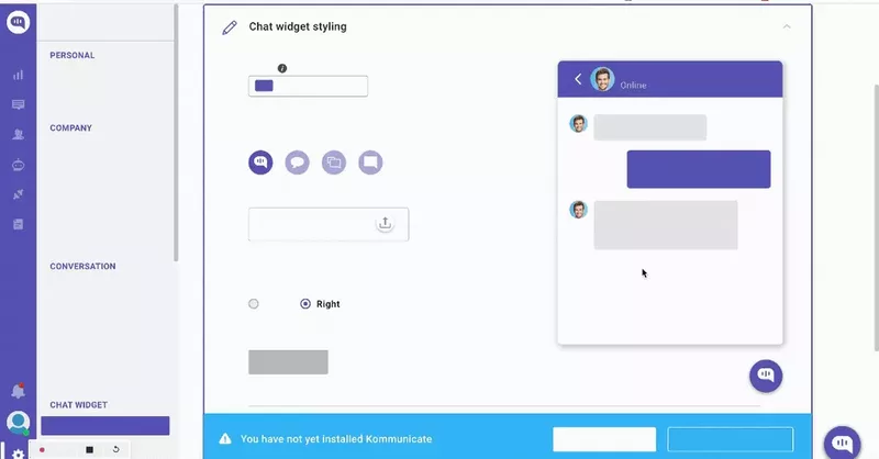
Use UI design patterns (tooltips, checklists, modals) and shorten the time to value
UI design patterns are great tools for getting first-time users up to speed with your product. Implement visual elements like tooltips, checklists, or modals where necessary to accelerate and secure the user learning experience.
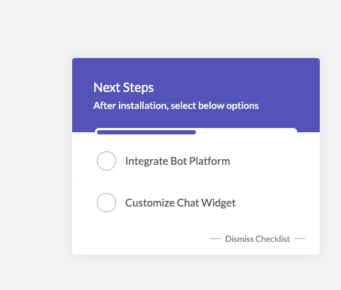
Or consider mixing them. For example, pair an in-app checklist with tasks to guide users to experience value faster while simultaneously launching in-app guides that help users complete each task.
This is what Kommunicate has done. The checklist below triggered the interactive walkthrough we talked about in the previous step.
Collect feedback with micro surveys and improve
This is a crucial step in enhancing the product experience.
Collect feedback from existing users to see areas of your product or onboarding that need improvement.
CES and NPS surveys are effective here as they enable you to understand users’ overall experience with your product, assist in discovering friction points, etc. Don’t forget to add qualitative questions because there’s a limit to what numbers and emoticons can tell you about a user.

Mobile surveys, including mobile NPS, are a quick way to measure customer satisfaction, gather real-time feedback, and boost engagement.
UX onboarding best practices for a great first-time user experience
How do you onboard users the right way while ensuring you create a good first impression for users?
Here are good UX onboarding best practices to keep in mind:
- Break the onboarding process into easy steps
- Keep your microcopy conversational and inviting
- Weave gamification into the process, so it doesn’t feel like a chore
- A/B test different onboarding flows and improve
- Offer self-serve support through in-app help centers in case new users get stuck
Don’t overwhelm users: break the onboarding process into steps
You overwhelm your users when the onboarding process is a lengthy product tour, walking them through every feature of your product, then asking them to remember it all.
This can eventually feel demotivating, especially if the process is too long.
You can avoid demotivating users by breaking the process into smaller steps they can finish quickly.
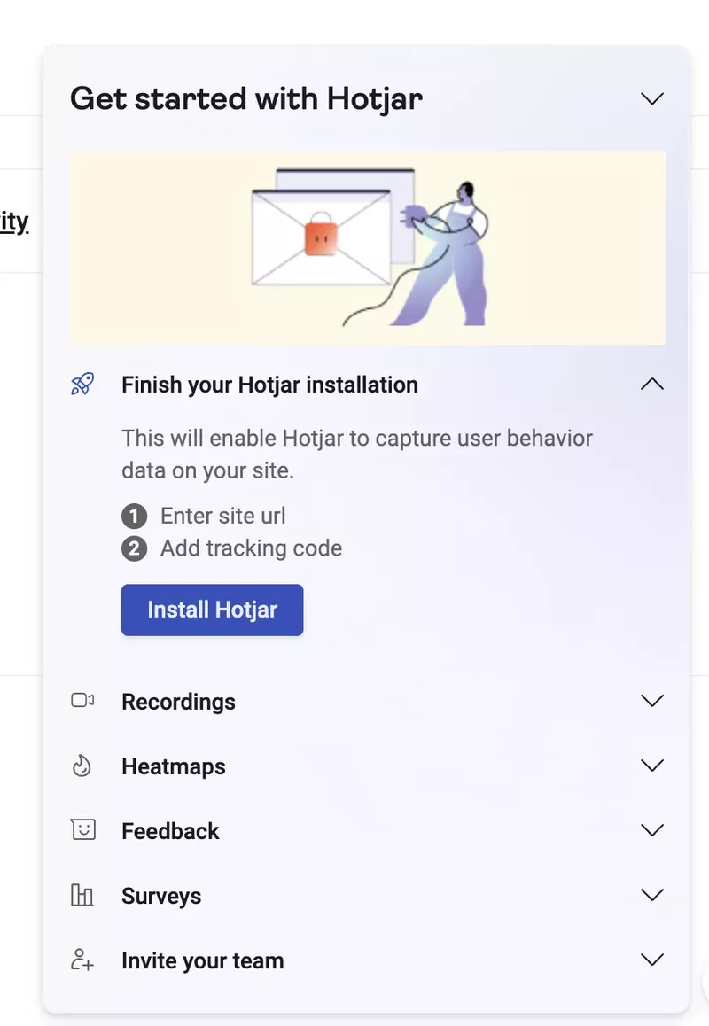
Use short checklists that quickly bring people from one point to the other in the onboarding flow.
Use conversational microcopy that drives new users to take action
Remember, the goal is to make user onboarding as enjoyable as possible. This is why your microcopy should be more conversational than formal.
Avoid sounding corporate or pushy.
Focus on writing copy that makes your users smile while creating some level of emotional attachment, and ultimately drives users to take action. To do this well, imagine talking to a friend, not just a random account you probably will never meet in real life.
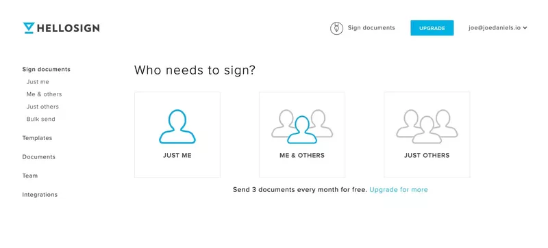
HelloSign makes a good example of this.
When you first log in, you’re greeted with a screen that asks, “Who needs to sign?” and given three options to choose from.
That’s a super friendly way of asking users to select the option that best describes them.
Good copy is one that addresses the emotional states of your users and caters to their needs and worries. Don’t just use it when welcoming users or during product tours. Implement conversational microcopy in every aspect of your product design.
Add a progress bar and other gamification elements
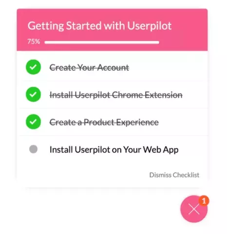
Gamification triggers our innate desire to finish incomplete tasks. Gamified checklists, progress bars, and the likes enable users to see how far they’ve gone and what’s left to complete the onboarding.
They’ll naturally feel motivated to stay focused, not wanting to leave the task incomplete. But this will never happen if there’s no design pattern showing their progress.
Gamification is not only applicable during the initial stages of your product. If it’s possible, try to apply it throughout the user journey.
A/B test different onboarding flows and improve
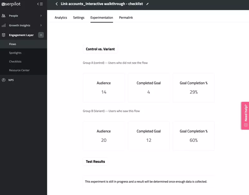
You won’t know what idea works best until you’ve tried a few. A/B test different in-app flows to see which works better for your product.
Test the different flows against faster time to value, higher activation rates, and low CES scores. Then choose the method that brings the most results.
Fortunately, Userpilot lets you test flows against specific goals.
For instance, you could test if adding an interactive guide to core features of the app positively impacts the activation rate, or maybe test gamified checklists as discussed above. Basically, you could test any onboarding flow with Userpilot and analyze your results against a goal in real-time.
Offer self-serve support in case new users get stuck
Users have two options when they get stuck after engaging with a few features: they either try to sort it out themselves or contact support.
But it often takes a couple of hours for the typical support team to reply to queries, and you don’t want the user to perceive your product as difficult either.
So what do you do to avoid such friction?
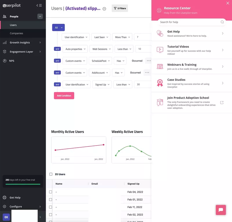
Provide self-serve support! In simple terms, this means providing support to users through knowledge bases or help centers so that they don’t have to email or phone the support team to solve basic issues.
Self-serve support makes help available to users in different formats, ranging from help docs to tutorial videos.
First-time user experience (FTUE) examples
Personalized empty state for great FTUE: Mural and Todoist
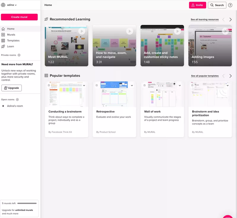
Mural has several learning videos for both new and existing users. In the image below, you can see that the ones most suitable for new users were categorized under the “Recommended videos” section.
There’s also a red “Create mural” button at the top left, waiting for users who have gone through the tutorial videos and are ready to start using the app.
To make the experience easier, they also recommended templates based on different situations. Overall, Mural’s first-time user experience is a good one as it’s easier to get started by not looking at a blank page.
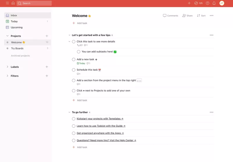
Todoist is another company that’s big on personalization. The app uses one stone to kill two birds: new users are onboarded using prompts that simultaneously showcase the product’s value.
Not all SaaS products can afford to showcase their main functionality using the product empty state, but you should go for it if your features align with the flow.
Tooltips for guidance will improve FTUE: Slack
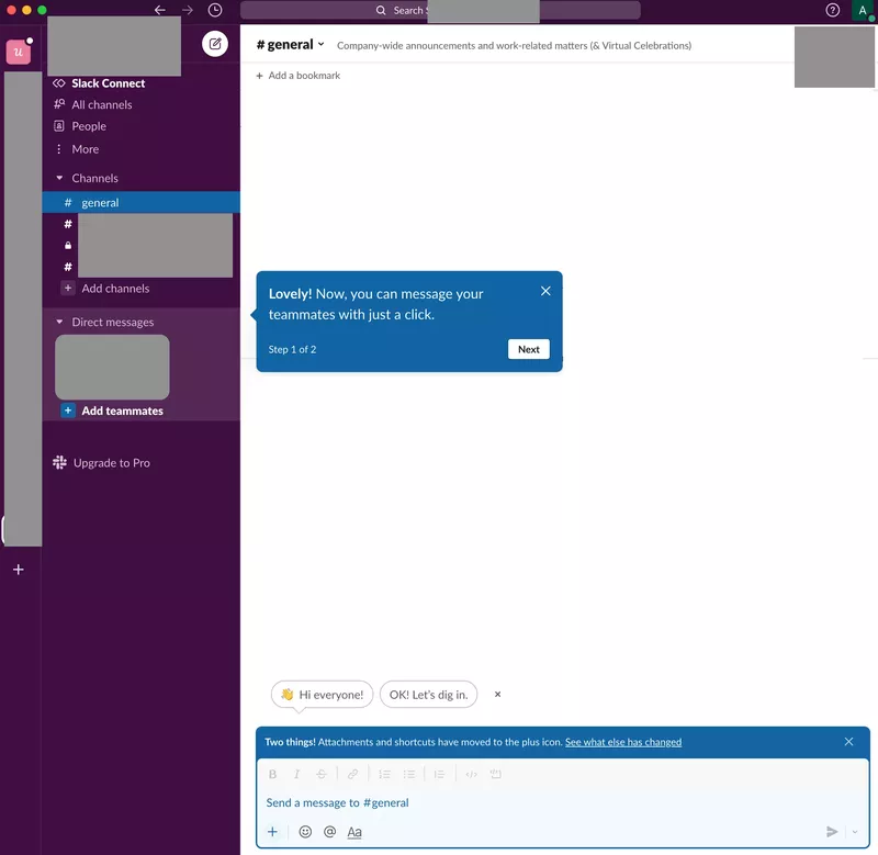
Slack uses tooltips and conversational microcopy to bring new users onboard.
It was also nice that the onboarding process was broken into small steps and labeled accordingly. This enables users to know how many more tips they have ahead. For instance, it shows “step 1 of 2” in the image below.
This will encourage users to continue because they’re almost done with the process.
Gamified checklists prompt users to engage and improve FTUE: Loom
Remember the gamification thing we mentioned earlier? Loom is one of those SaaS companies using it.
They created a checklist you can tick after completing each task with a clear and prominent progress bar. Imagine already ticking off 5 out of the 6 points on the list.
The user is not likely to quit at this point because they’re thinking, “It’s just one task left. I can’t wait to finish and tick it off.” Marking the tasks complete along the way, gives users a dopamine rush they wouldn’t want to miss. That’s the power of gamification.
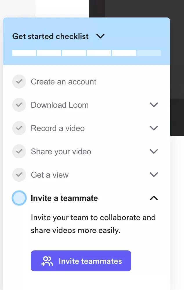
When you add already completed tasks into your checklist, for example creating an account, you already give the user the impression they are closer to the finish line.
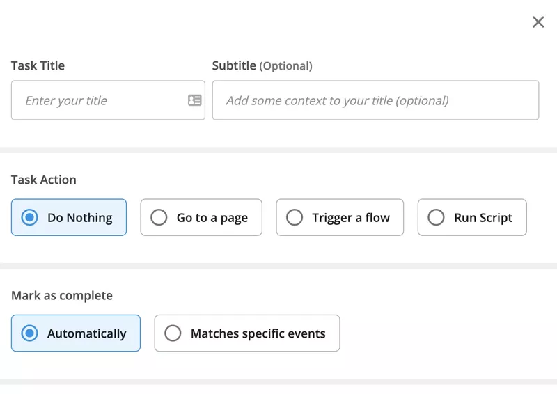
You can set tasks as already completed when building checklists in Userpilot by clicking “do nothing” and “mark complete.” There are different task options available to choose from if you want completion to be defined by performing a specific task.
Conclusion
The first experience a user has with your product is critical because it determines if they stick with you or not. You won’t always have a second chance to make an impression, which is why it’s always effective to invest in making a good first impression on your users.
This means personalizing the user experience and using UI and UX design patterns to direct your onboarding process. You won’t keep everyone who signs up for your tool, but with a good first-time user experience, many of them will reach activation and stay with you for a longer duration.
Want to build code-free onboarding experiences and charm users during their first interaction with your product? Book a demo call with our team and get started!

