What I’ve Learned About Software Onboarding: Mistakes, Best Practices, and Metrics


What does it take to grow your business and achieve a net retention revenue above 90%?
Since 2018, we went from building an onboarding product for startups to offering a full suite of PLG tools to mid-market companies and enterprise accounts. In my experience, I know that this level of growth and retention doesn’t come from just having an excellent product.
I have spoken to hundreds of product managers who built incredible tools but watched their churn rates climb month after month. They usually make the same mistake, which is assuming the product will speak for itself.
They dump users into a dashboard, pop up a generic 15-step tour that everyone skips, and then wonder why nobody reaches the “Aha!” moment.
Growth comes from guiding users to value, not just showing them features. In this guide, I will address the common challenges and give you the best practices to build better software onboarding experiences!
Most common mistakes in software onboarding
As I mentioned, many PMs assume that the product will sell itself. And thus, think that just pumping product tours to new users will be enough to onboard them.
This assumption leads to 5 mistakes that will make any product bleed users. Let’s explore each:
Mistake #1: Overwhelming users with too many steps too soon
I’ve learned that onboarding usually breaks at the moment we try to explain everything at once.
You see, when onboarding introduces too many steps upfront, friction compounds. This is because (according to Hick’s law) the time it takes to make a decision increases logarithmically with the number of choices available, leading to decision fatigue much faster.
We confirmed this with our SaaS Product Metrics research. We noticed that new users drop off more during the first session. And since the average SaaS time-to-value is just over one day, any friction in the first day will quickly consume users’ motivations to activate.
The strategy here is clear: make the initial onboarding as linear as possible to reduce decisions.
Mistake #2: Forcing one user onboarding process for every role
This one frustrates me because most people know that about 50% of customers expect a relevant onboarding process, yet only 26.8% of companies offer high personalization.
If your product serves marketers, developers, and sales teams, why would you show everyone the same five-step checklist? A marketing manager doesn’t need API documentation upfront. A developer won’t care about your campaign builder.
When you force a generic path on everyone, you’re making users do the work of figuring out what’s relevant to them. That creates unnecessary friction right when motivation is highest.
Mistake #3: Burying the “Aha moment” behind setup friction
One of the most common challenges I encounter is when customer success teams struggle to differentiate “setup” from “onboarding.” They celebrate when a user uploads a profile picture, but that action delivers zero value to the user.
You need to distinguish between two distinct phases:
- Functional software onboarding (Setup): The sprint from signup to the first moment of value. This covers technical configuration, account creation, and the initial “hello.” This isn’t very valuable for users, but it’s the necessary evil to access value.
- SaaS product adoption (Value-based): The habit formation phase, where the tool becomes essential to daily workflows. This is where the user thinks, “I can’t do my job without this.”
Therefore, high tour completion rates mean nothing if users are just clicking through to dismiss pop-ups.
To determine if you’re focused on setup or success, ask yourself:
- Does the first screen ask for data (setup) or offer a template (value)?
- Can the user achieve a micro-goal in under 3 minutes?
- Do you congratulate users for finishing the tour, or for completing a task?
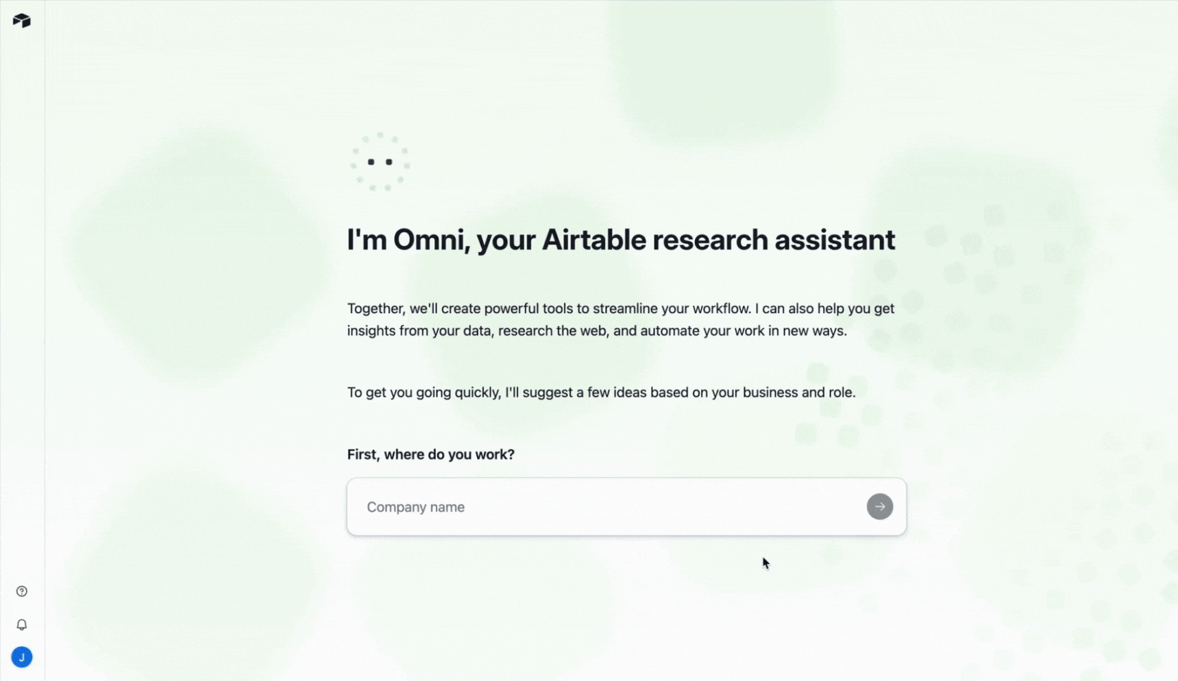
In Airtable, for example, the setup is part of the value realization process.
It asks you for information about your company and your role, and then uses the AI assistant (Omni) to generate relevant templates for your use cases.
The user needs to do almost nothing to experience a benefit in their first session.
Mistake #4: Missing contextual help at critical moments
Users don’t usually abandon your product because they can’t do something. They abandon it because they don’t know what to do next.
When you hit a confusing screen without guidance, you either pause the task or reach out to support. Baymard Institute found that 18% of users abandon flows simply because they feel lost or overwhelmed, which shows how quickly uncertainty turns into disengagement.
I’ve seen this pattern clearly with our customer Kommunicate. Their data showed that 60–70% of users engaged with only three to four core features, while support kept receiving support tickets about capabilities that already existed.
The issue clearly was a lack of help at the exact moments users needed direction.
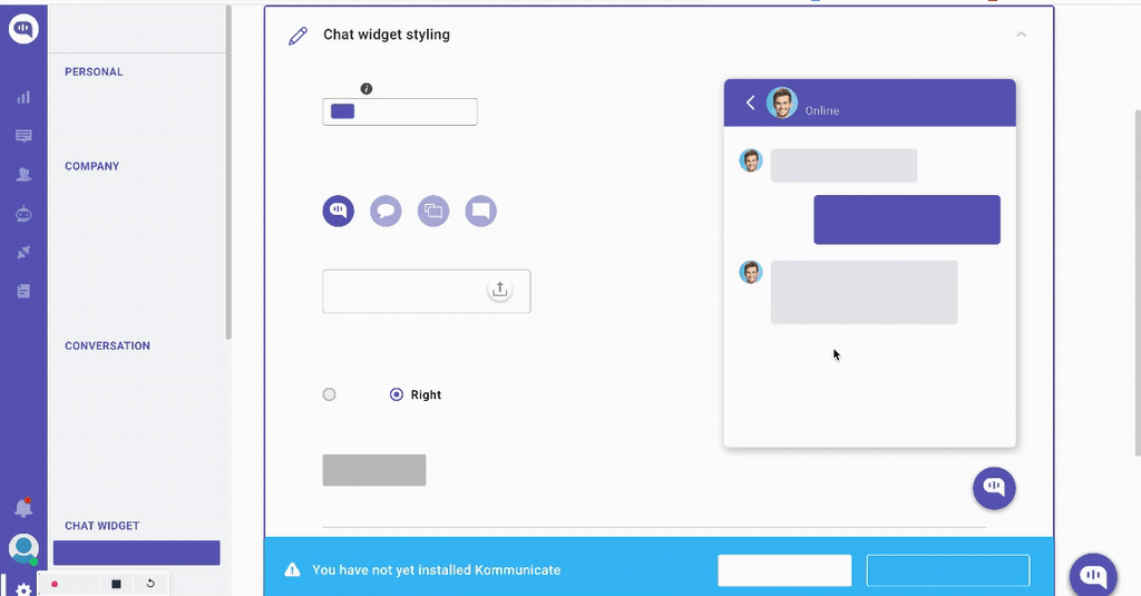
We helped them address this onboarding challenge by adding contextual tooltips and walkthroughs triggered by real user behavior. Once interactive guides appeared directly inside the workflow, friction dropped. 86% of users completed chat widget customization, a key activation milestone, and overall feature usage increased by 3%.
Mistake #5: Failing to show progress and next steps
I’ve watched too many users get halfway through onboarding, lose their place, and never come back.
The problem is that they don’t know how far they’ve come or what’s left to do. When users can’t see their progress, every additional step feels endless. That uncertainty creates friction, and friction kills momentum.
Without visible progress, users face three critical problems:
- They can’t gauge effort: Is this step 2 of 3 or step 2 of 20? Uncertainty about the remaining work triggers drop-offs.
- They can’t resume easily: Returning users who left mid-flow have no way to pick up where they stopped, so they either start over or give up entirely.
- They don’t feel accomplishment: Completed tasks disappear without acknowledgment, eliminating the psychological reward that fuels motivation to continue.
This isn’t just theory. Research on the Endowed Progress Effect shows that people are significantly more likely to complete a task when they can visualize progress toward an onboarding goal.
In onboarding contexts, simple progress indicators like checklists, progress bars, or step counters can dramatically increase completion rates.
Best practices for a successful software onboarding process
Now, how can you design your onboarding so users can experience the value of your product fast?
In my opinion, these are the 7 best onboarding practices that will turn your product into a customer engagement engine:
1. Build the onboarding flow around one core outcome
I always start by picking one “core outcome” (which is the first meaningful result a new user comes for) and designing onboarding to get them there fast.
Psychologically, this works because people are task-focused. They want to get the job done, not study the product. NN/g calls this the “paradox of the active user”. It also cuts cognitive load by reducing how much users must juggle in working memory at once.
For example, if you offer product analytics, the core outcome might be “seeing an engagement trend.” So onboarding guides users to connect one data source and open a ready-made dashboard template. While integrations, advanced settings, and extra features should stay out of the way until after that first win.
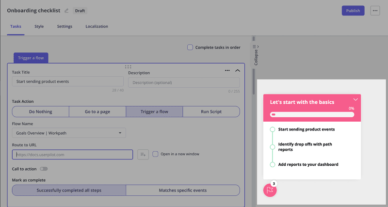
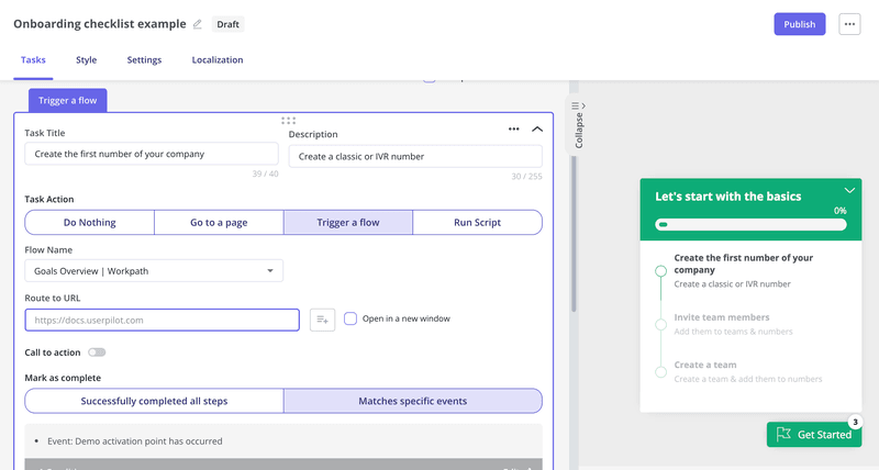
My favorite way to break down this core outcome is through an onboarding checklist. I use Userpilot to create a no-code checklist for each desired outcome (e.g., setting up a chart, creating a flow, etc) and then target each of them to a relevant user persona. This checklist will appear as the user engages with the product, and they can even trigger an interactive walkthrough when clicked on.
2. Use progressive disclosure to reduce cognitive load
The reason progressive disclosure works comes down to a fundamental limit in how your brain processes information.
According to Miller’s Law, you can only hold about seven chunks of information in working memory at once. So when you present a UI showing all possible features, you’re asking users to process more than their brains can handle at the moment (leading to early abandonment).
So what I highly recommend is to reveal features only when users demonstrate they’re ready for them.
Let’s take Slack as an example. When you first sign up, you see a minimal interface with only channels, messages, and search.
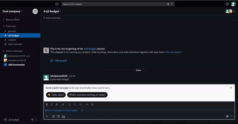
Advanced features like workflows and custom integrations only appear after you’ve sent messages and joined channels. This sequencing prevents overwhelm while still giving power users access to depth when they need it.
My go-to onboarding tool to implement this is Userpilot. It lets me trigger tooltips and walkthroughs based on how users behave in the product.
Plus, the favorite aspect of our users is that you don’t need to invest engineering resources to add onboarding tooltips or trigger in-app surveys based on events. It’s all done in a user-friendly no-code builder.
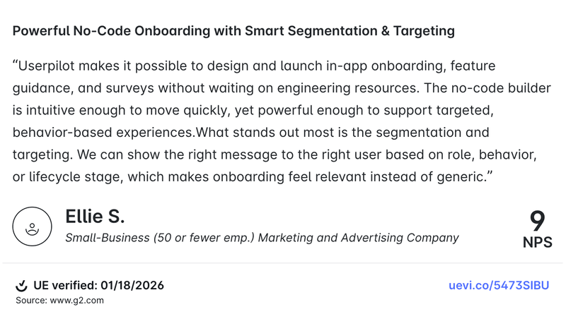
As Userpilot’s user put it:
3. Make effort visible with progress feedback
I treat progress feedback as part of the onboarding flow. Users should constantly see that their actions worked and that they’re getting closer to finishing.
NN/g’s “visibility of system status” principle is exactly this idea. It includes micro-interactions like button state changes, confirmations, and progress indicators when something takes time.
Psychologically, it reduces uncertainty. When users can’t tell what’s happening or how much is left, the effort feels bigger than it is. A progress bar, a clear step count, and small milestone celebrations turn a vague setup into a sequence of wins.
Progress indicators also make waiting feel less painful because the system is clearly “doing something.”
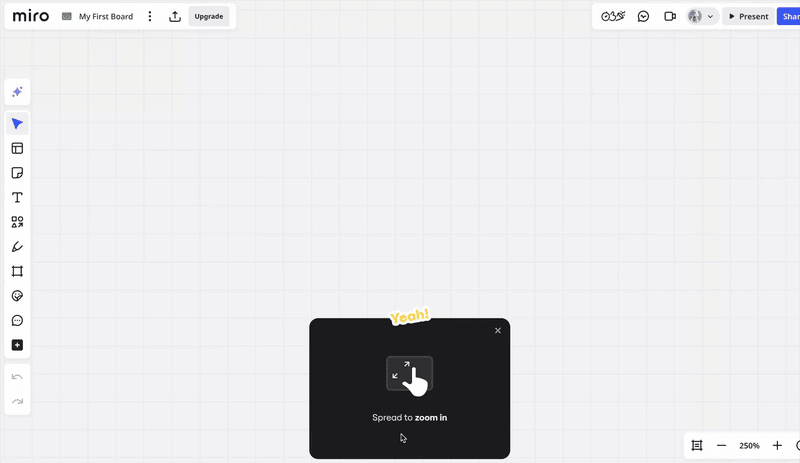
Miro’s onboarding is a great example of this. It gamifies the onboarding tasks in a way that feels easy and engaging. Each message shows which one of the four steps you’re in, and in the end, you get a finished template you can start using for your goal.
4. Reduce “mental math” in every onboarding task
I think of mental math as any moment where users have to translate, infer, or calculate something before they can move forward.
Psychologically, the fix is to shift effort from the user’s head into the interface. That’s recognition over recall. Instead of asking users to remember rules or figure out what a field wants, we make the right answer obvious with defaults, examples, constraints, and in-context help.
For example, rather than asking a user to decide which events to track on day one, we can suggest the top 3 common events, preselect one, and show what “good” looks like with a sample. Instead of making them guess formatting, we validate inline and explain errors as they type.
With Userpilot, we can add those hints right where decisions happen using tooltips and driven actions, and connect them to a checklist step so users don’t have to stop and think about what to do next.
5. Personalize customer onboarding paths with segmentation
I treat segmentation as a way to remove irrelevant work. When we send everyone through the same onboarding, we force users to sift through steps that don’t match their goal or role.
The solution is as simple as segmentation, which is tailoring the experience based on who the user is and what they’re trying to accomplish.
Additionally, segmentation doesn’t have to be complex. This is how I approach it for onboarding:
- Start with a simple question during signup using a welcome survey: “What’s your role?” or “What do you want to accomplish first?” Userpilot can easily trigger this survey when a user logs in for the first time.
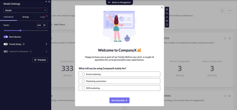
- Route users to a relevant onboarding flow based on their answer: A product manager sees project tracking features. A designer sees collaboration tools. With Userpilot, I can design branched paths for multiple outcomes and trigger them based on the user’s survey response.
To get started, focus on identifying the 2-3 most common user segments and build distinct paths for each. No need to personalize every possible variation.
6. Keep onboarding guidance optional and easy to find
Not everyone needs guidance at the same time, and some users prefer to explore at their own pace before asking for help. When you force guidance on users who don’t want it, you create friction instead of removing it.
When guidance is forced, it can trigger psychological reactance, which is the pushback people feel when their freedom is threatened, and it makes them resist the message even if it’s helpful.
Autonomy matters for motivation, too. Self-Determination Theory and HCI work built on it show that experiences feel better when users retain control over what they do next, instead of being “driven” through steps.
And when users do look for help, they behave like information foragers. They follow the easiest “scent” to the answer and abandon paths that feel costly.
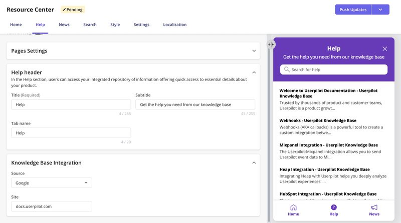
So I aim for in-app guidance that’s always available, easy to discover, and simple to replay. A good pattern is a resource center where users can pull what they need in the moment, search for answers, and reopen walkthroughs later.
Userpilot supports this with a resource center that can group modules, target content to segments, add search, and even surface knowledge base articles through integrations.
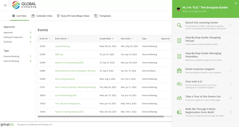
We’ve seen this work with our customer Groupize, who initially had their assistant G.G. pop up on every page. They got continuous feedback that it felt too pushy, so they moved G.G. into the resource center instead.
Now users can summon help when they need it, and they can also replay previously viewed walkthroughs if they need a refresher. This shift made the guidance less intrusive while still keeping it accessible.
7. Instrument the onboarding funnel like a product growth funnel
This is the operating system behind great onboarding, where we stop debating opinions and start improving what the data shows.
The first step is defining a small set of onboarding milestones, then tracking them the same way we’d track a checkout funnel. In practice, I’m looking at five signals:
- Activation rate
- Time-to-value
- Step-by-step drop-off rates
- Guide engagement
- Month-1 retention rate
Once those are instrumented, the workflow becomes simple. We run small experiments weekly, one change at a time, then measure the impact to decide whether to keep it or kill it. That discipline matters because funnels are systems. If we change three things at once, we can’t learn what moved the metric.
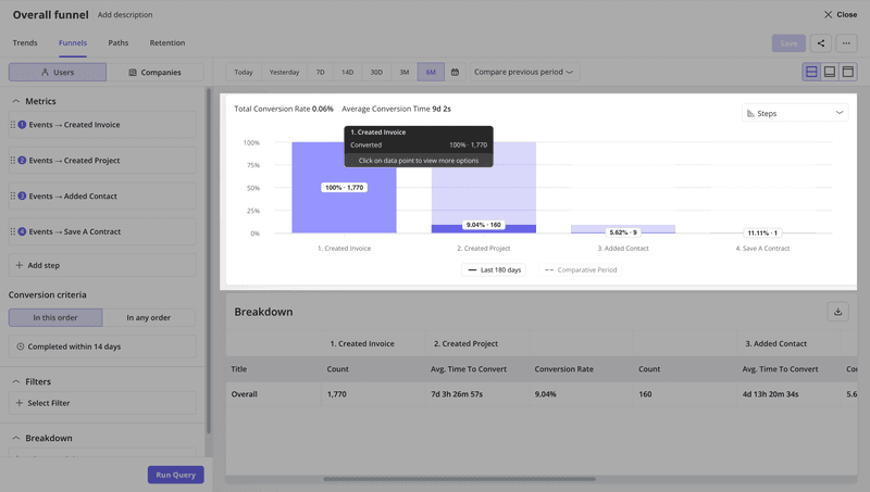
Userpilot makes this easy because the product analytics layer is built for this loop. We can build funnel analysis reports to see conversion and drop-off between onboarding steps, compare segments, and identify areas of friction.
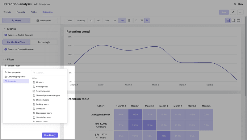
We can also measure onboarding asset performance, like checklist engagement, directly in analytics. And for early retention, Userpilot supports retention cohort analytics so we can see whether onboarding changes improve week-1 and week-4 stickiness, not just day-1 completion.
What’s coming next is the part I’m most excited about. We’re layering AI on top to shorten the loop between “we see a drop-off” and “we ship a fix.” If you’re excited too, join our beta!

Key metrics to measure onboarding program success
As I just mentioned, I see the onboarding process similarly to a PLG funnel. I track relevant metrics to look at signs of friction, perform consistent experiments to optimize the onboarding process, and use data to perform fixes that close the feedback loop.
But what metrics are most impactful to your onboarding success? For me, these are mandatory:
- Activation rate: It’s the percentage of users who have experienced the value of the product via a key action (e.g., sending the first invoice, creating the first dashboard, etc). According to our benchmark, the average activation rate in SaaS is 37.5%.
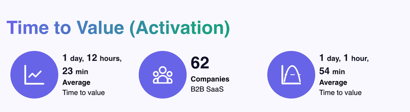
- Time to value (TTV): Measures the time it takes users to achieve the activation stage or experience the “Aha!” moment. The average SaaS takes about 1 day and 12 hours (based on our benchmark).
- Onboarding completion rate: Tracks the percentage of new users who follow and complete your onboarding process. Our research showed that 19.2% is the average completion rate of onboarding checklists in SaaS.
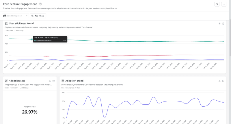
- Feature adoption rate: This metric calculates the percentage of users who engage with a specific feature. The average SaaS has a core adoption rate of 24.5% according to our benchmark.
- Month-1 retention rate: Shows the percentage of new users who stayed active one month after signup. Our benchmark showed an average of 46.9%.
Thankfully, Userpilot lets me create custom dashboards with any metric I want. So if I want a dashboard with all my onboarding metrics, all I need to do is drag-and-drop the corresponding widgets into it and save. And then share it with my team to keep track of our onboarding progress.
FAQ
What is the software onboarding process?
The goal of software onboarding is to help users (either customers or employees) adopt a new product. It involves walking users through core or new features, offering personal help when they get stuck, and motivating users to complete tasks that will lead them to the activation stage.
What are the 5 stages of the onboarding process?
- Welcome and orientation: Set expectations, confirm the user’s goal, and point them to the “next best action.”
- Setup: Help users connect data, invite new team members, install integrations, or configure essentials.
- First value: Guide users to experience the product’s core value.
- Feature discovery and adoption: Introduce key features progressively (based on role, use case, and behavior).
- Habit and expansion: Reinforce repeat usage, encourage deeper adoption, and open paths to upgrades (more seats, add-ons, higher plans).
What is the meaning of onboarding software?
Onboarding software refers to tools that help you guide new users throughout a software product. They usually let you create interactive walkthroughs, add tooltips, implement onboarding checklists, and build an in-app resource center.
About the author