Best Kompassify Alternatives for SaaS30 min read
Get The Insights!
The fastest way to learn about Product Growth, Management & Trends.
Top Kompassify alternatives to consider
- Here are the top Kompassify alternatives you can consider:
-
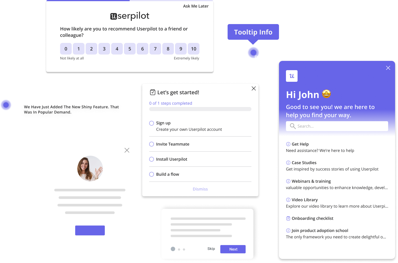
- Userpilot is a product growth platform that drives user activation, feature adoption, and expansion revenue. It also helps product teams collect user feedback, streamline onboarding, and gather actionable insights from analytics. With Userpilot, you’ll be able to track both product usage and user behavior to get a holistic view of how customers use your product — which will guide future development, improve the user experience, and inform your growth efforts.
- Appcues is a robust product adoption and user onboarding platform for web and mobile apps. It enables product teams to create, implement, and test personalized in-app onboarding experiences. The platform also helps you announce new product features and collect customer feedback. What makes this platform even better is the fact that it offers no-code features that make it suitable for non-technical teams.
- Pendo is a product adoption platform that lets teams monitor product usage, analyze user behavior, and publish in-app guides. The no-code solution focuses on increasing user engagement and driving feature discovery. Additionally, Pendo also lets you survey users, segment customers, and see how many site visitors or MAUs your web app is getting. Certain features like product areas, data explorer, product engagement score, and resource centers are locked to the Starter plan or higher.
- Chameleon is a product adoption platform. It enables SaaS teams to leverage real-time user data to build beautiful on-brand experiences, improve user onboarding, and drive product-led growth. In addition, it empowers product teams to create and manage dynamic in-product experiences. With Chameleon, SaaS teams can now create beautiful product tours that help, guide, and delight their users throughout their journey. All of these are possible without coding!
- Interested in driving product growth without coding? Book a demo to see how we can help!
What is Kompassify?
Kompassify is a cloud-based, no-code client onboarding tool for small and midsize businesses. The no-code approach makes it great for non-technical teams to do product tours, checklists, walkthroughs, progress tracking, and real-time analytics.
Kompassify is easy to use and doesn’t cost as much as its competitors. The price is a steal if you’re starting, as it’s built for startups and SMBs. But it’s only available on the web; there’s no iOS or Android application yet.
What are the main use cases for Kompassify?
Understanding the core functionalities and use cases of Kompassify is crucial for deciding whether or not it’s the right choice for you.
Without further ado, let’s see the primary scenarios where Kompassify is useful for your SaaS business!
Kompassify for user onboarding
Kompassify packs robust features to help teams create the perfect onboarding experience.
These include:
- In-app Product Walkthroughs: With Kompassify’s in-app product walkthroughs, you can direct your customers every step of the way. Teams can set up guides within the application itself.
- Event-Triggered Actions: Event-triggered actions allow businesses to track user behavior. And take actions based on specific events. For example, you can set up an onboarding flow on Kompassify so that when a user completes a step, it triggers a personalized tutorial relevant to their progress. This real-time guide makes onboarding a breeze. And provides you with valuable data on which onboarding elements are most effective.
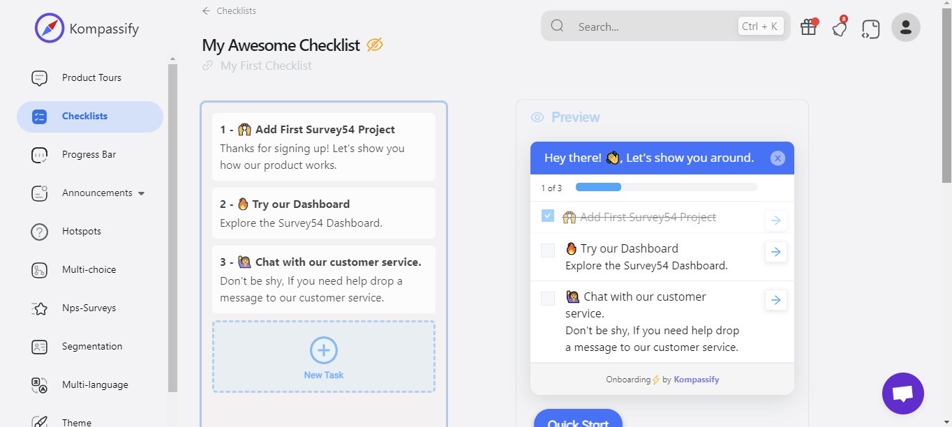
- Checklist: Use the onboarding checklist feature on Kompassify to break down complex processes into manageable tasks, so users can track their progress. This fosters a sense of accomplishment throughout the onboarding process.
- Personalized Onboarding: With multi-choice onboarding, Kompassify empowers you to personalize customers’ onboarding experiences. This tailored approach ensures each of your users engages with the platform in a way that suits their preferences and needs.
- Kompassify Builder: The Kompassify Builder Chrome extension streamlines the process of creating and previewing product tours without altering your website. Once satisfied, integrate the tours into the website using the provided code snippet. This eliminates technical barriers for a smooth onboarding experience.
Kompassify for product analytics
Product analytics is not Kompassify’s primary use case, as it is mainly an onboarding and product tour platform.
But here are two ways to use Kompassify for product analytics:
- Customer Segmentation
Kompassify helps product teams analyze customer behavior data and preferences during onboarding. And use the insights from the data to improve the product.
Although you can segment users on Kompassify, it lacks common integrations for external analytics and marketing. Consider Appcues or Userpilot for better options.
- Survey Analytics
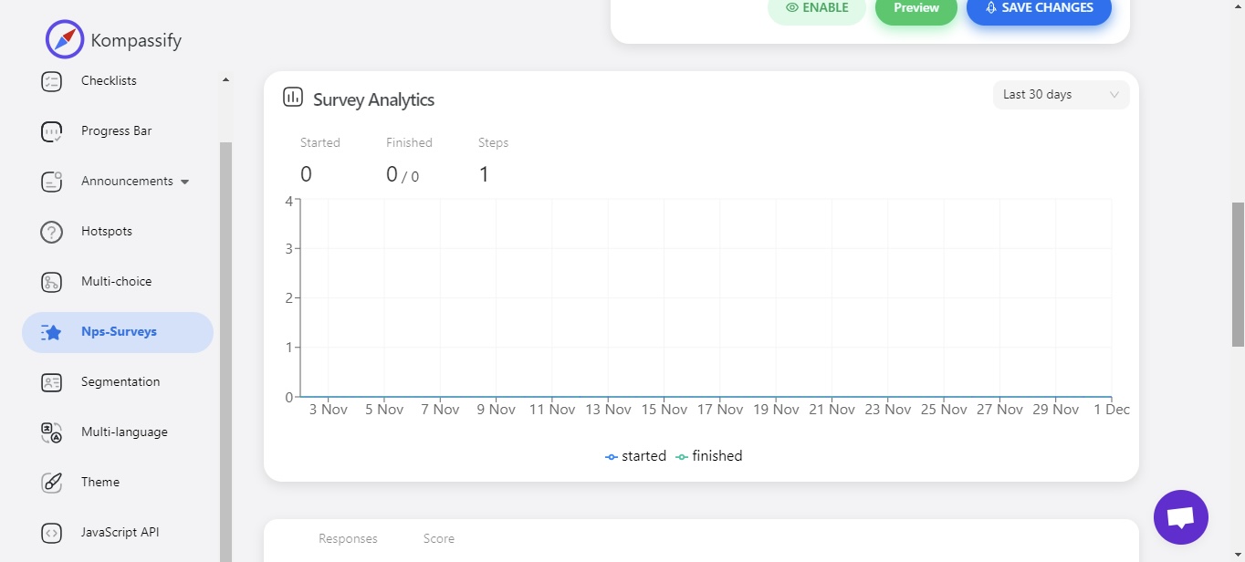
On Kompassify teams can create Net Promoter Score (NPS) surveys. These surveys help you gather valuable feedback, understand your users’ sentiments, and track your NPS performance in real-time with ease.
Beyond surveys, you can use Userpilot to collect and analyze product data such as events and feature usage. Book a Userpilot demo to see how you can unlock new growth opportunities.
Kompassify for self-service support
Researches always suggest that most customers try solving issues on their own before reaching out to live support. Truth is, customers want to be able to find answers online and speak to service reps only when necessary.
Self-service support helps customers use your resources to find solutions to their problems independently instead of contacting your team.
Kompassify is a customer onboarding application and not a stand-alone self-service support tool. But you can use some of its features, like custom resource centers and personalized tours, to guide and create happy customers.
Consider alternatives like Intercom or Userpilot for more robust self-service options.
What are the pros and cons of Kompassify?
Pros of Kompassify?
Kompassify is an available onboarding solution for mid-market SaaS companies looking for a robust but at the same time very easy-to-use, no-code tool for user onboarding, product adoption, and simplified product analytics. Let’s have a look at the pros of using Kompassify:
- No-code Builder: With Kompassify’s no-code intuitive builder, you’ll be able to build, preview, and deploy your onboarding experiences without having to write complex Javascript code.
- Powerful Feedback Options: Create and publish a Net Promoter Score (NPS) survey in seconds and measure your customer satisfaction and sentiments about your product.
- Easy Onboarding: Use checklists to simplify the onboarding journey for your customers and keep them engaged.
- Customer Segmentation: This feature allows for the segmentation of customers based on various criteria. This can be particularly useful for tailoring onboarding experiences and communications to different user groups.
- Gamification: Kompassify incorporates gamification elements, which can enhance user engagement and motivation during the onboarding process.
- In-app Walkthroughs and Widgets: Kompassify enables you to guide your users toward conversion with in-app walkthroughs and widgets.
Cons of Kompassify?
While Kompassify has some pros, it still has some drawbacks. Here are the cons of Kompassify:
- Insufficient Analytics and Lack of Integrations: The tool reportedly lacks in providing comprehensive analytic data and doesn’t offer integrations with other analysis tools.
- Being a relatively new tool, Kompassify has experienced issues with bugs and crashes, particularly after downloading its Chrome extension
What do users say about Kompassify?
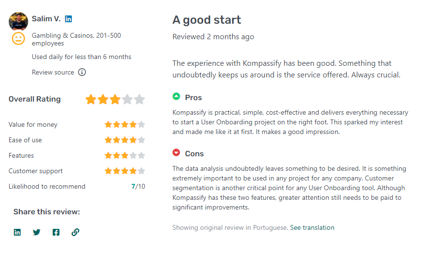
While there are not so many Kompassify reviews on G2, a few users have given 5-star reviews about how great of a tool it is. However, these reviews are outdated. here’s a sneak peek of one of those good reviews from Capterra;
It requires little to no knowledge about code to build functional User Onboarding tours. Its quite easy to setup and to build the steps. It’s also possible to segment your users to see different tours and guides.
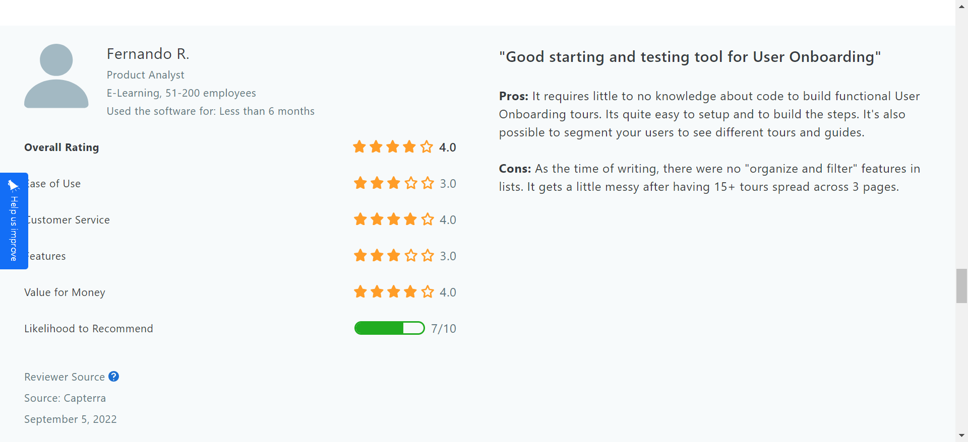
The data analysis undoubtedly leaves something to be desired. It is something extremely important to be used in any project for any company. Customer segmentation is another critical point for any User Onboarding tool. Although Kompassify has these two features, greater attention still needs to be paid to significant improvements.
Does Kompassify fit your budget?
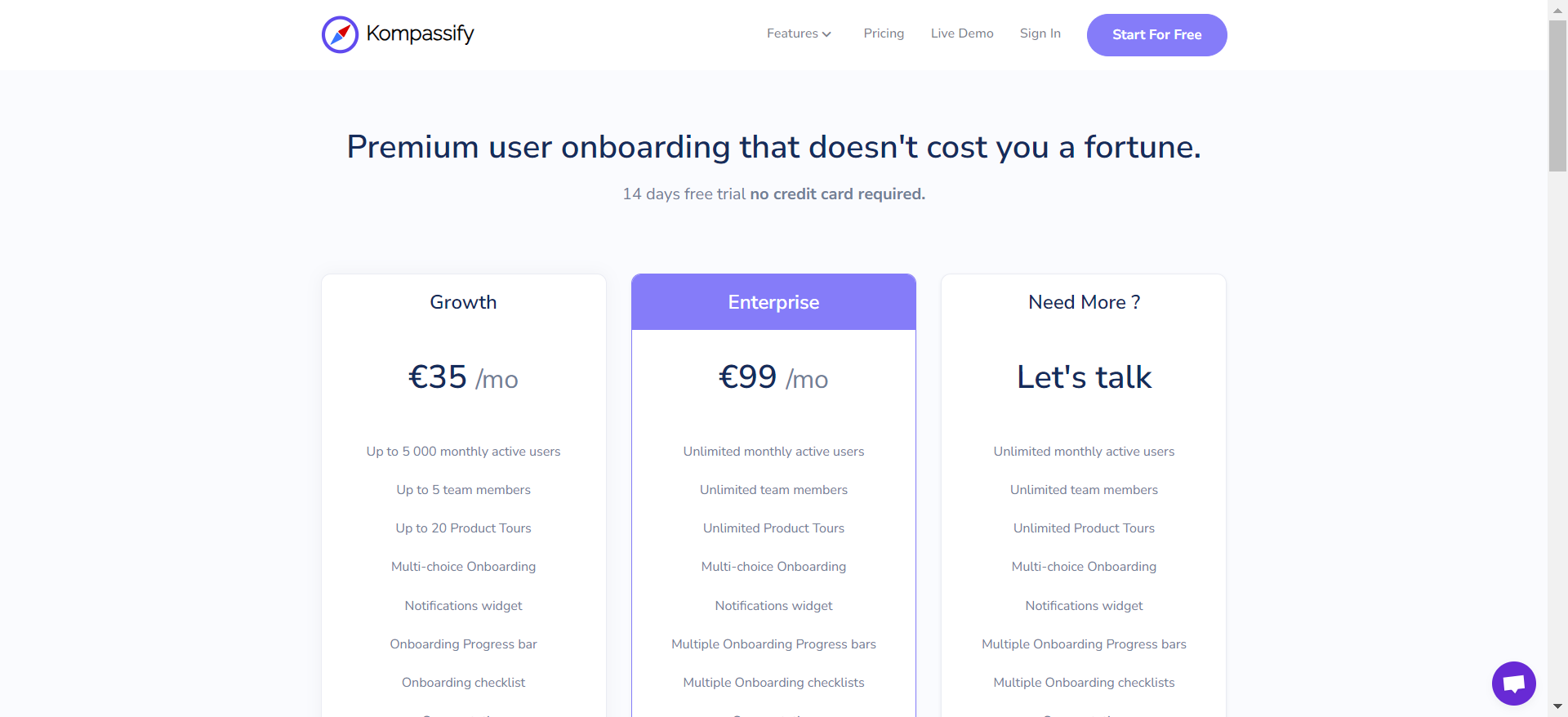
Kompassify’s pricing plan is divided into three affordable levels with upgrades to advanced features from the Growth plan to the “Let’s talk plan”.
- The Growth Plan: Tagged at €35 per month for SaaS brands with up to 5000 monthly users and up to team members. You can create a maximum of 20 product tours per month and multi-language onboarding
- The Enterprise Plan: This plan is €99 per month for SaaS enterprises with unlimited monthly active users. You can give access to as many team members and you can create unlimited product tours. A big up from the growth plan is the removal of Kompassify branding assets on your onboarding assets.
- The “Let’s Talk Plan”: If you need more offerings than the first two plans, you can reach out to the Kompassify team to talk. The peak of this plan is getting access to custom features native to your brand’s unique value proposition.
3 Reasons why you might need a Kompassify alternative
Let’s look at the most common scenarios where Kompassify is not the right tool for your user onboarding needs, and you should be looking at other alternatives:
- Lack of Integrations and Poor Analytics Functionality: Kompassify doesn’t provide sufficient analytic information for customer feedback and product adoption. It doesn’t have integrations with any analysis tool either, giving customer success managers a hard time deciding whether it’s effective or not. So, you might have to look for alternatives like Mixpanel and Appcues.
- You want Diverse Features: Exploring alternatives to Kompassify might reveal platforms with a broader range of features tailored to your specific needs.
- You want Unlimited Mobile Compatibility: Kompassify’s exclusive focus on web functionality neglects the growing importance of mobile platforms like iOS and Android. Exploring alternatives ensures you find a tool that seamlessly integrates with both web and mobile applications, providing a more versatile and accessible solution for your needs.
Better alternatives to Kompassify
Considering alternative options to Kompassify can often lead to discovering more tailored solutions that better suit your needs. Here are the top Kompassify alternatives you can consider:
- Userpilot is a product growth platform that drives user activation, feature adoption, and expansion revenue. It also helps product teams collect user feedback, streamline onboarding, and gather actionable insights from analytics. With Userpilot, you’ll be able to track both product usage and user behavior to get a holistic view of how customers use your product — which will guide future development, improve the user experience, and inform your growth efforts.
- Appcues is a robust product adoption and user onboarding platform for web and mobile apps. It enables product teams to create, implement, and test personalized in-app onboarding experiences. The platform also helps you announce new product features and collect customer feedback. What makes this platform even better is the fact that it offers no-code features that make it suitable for non-technical teams.
- Pendo is a product adoption platform that lets teams monitor product usage, analyze user behavior, and publish in-app guides. The no-code solution focuses on increasing user engagement and driving feature discovery. Additionally, Pendo also lets you survey users, segment customers, and see how many site visitors or MAUs your web app is getting. Certain features like product areas, data explorer, product engagement score, and resource centers are locked to the Starter plan or higher.
- Chameleon is a product adoption platform. It enables SaaS teams to leverage real-time user data to build beautiful on-brand experiences, improve user onboarding, and drive product-led growth. In addition, it empowers product teams to create and manage dynamic in-product experiences. With Chameleon, SaaS teams can now create beautiful product tours that help, guide, and delight their users throughout their journey. All of these are possible without coding!
Let’s see the features and functionalities of these tools for different use cases!
Kompassify vs Userpilot
There are many ways how Userpilot is different (and in a lot of ways better!) from Kompassify. Let’s explore the features of Userpilot, how it’s better than Kompassify, and how it may fall short too.
Userpilot for user onboarding
User onboarding is a crucial part of the customer journey as it speeds up the adoption process and increases retention rates. Onboarding is one of Userpilot’s core use cases along with product growth analytics and user feedback, so it has plenty of features that you can utilize.
Here are some Userpilot features you can use when onboarding new users:
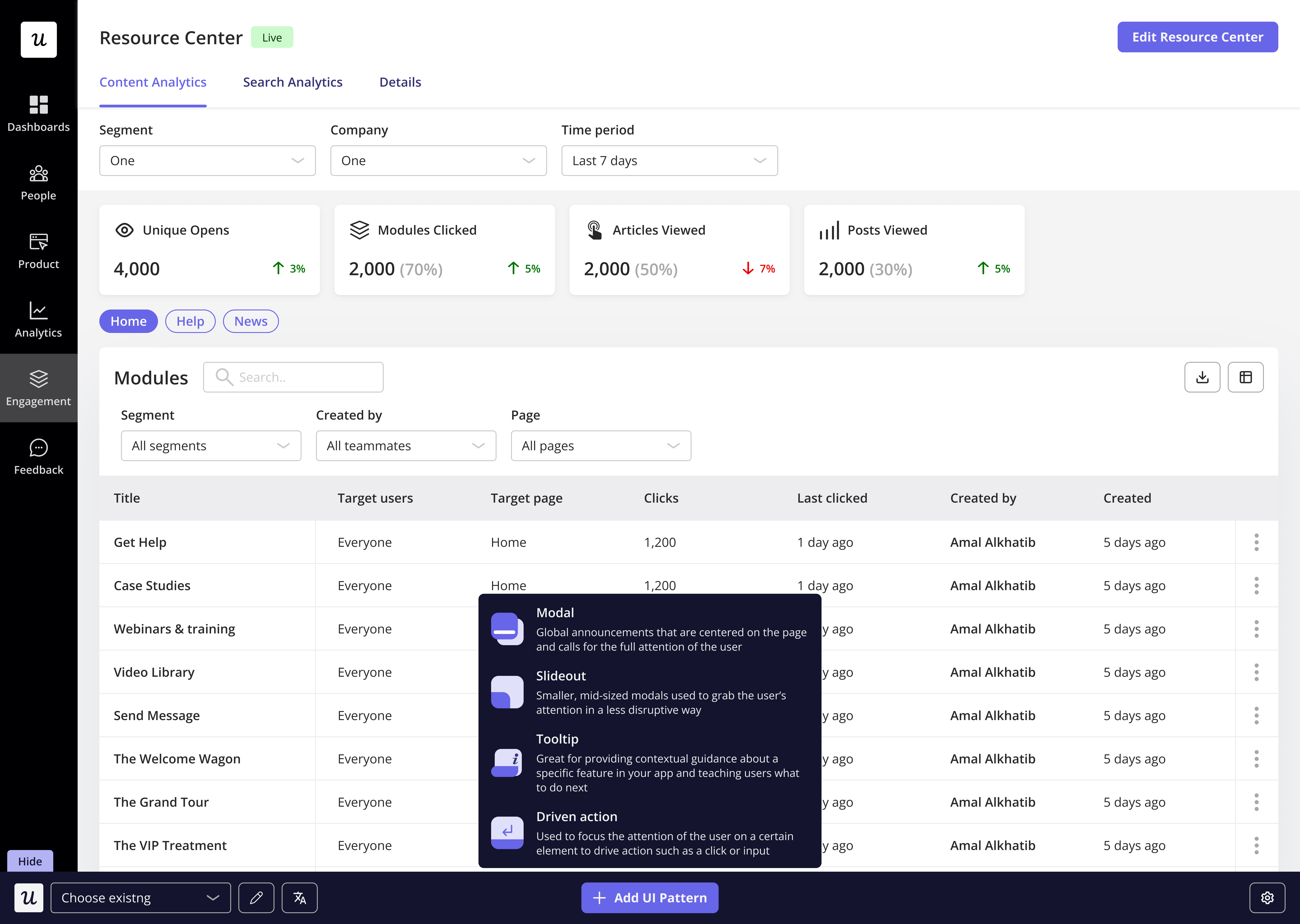
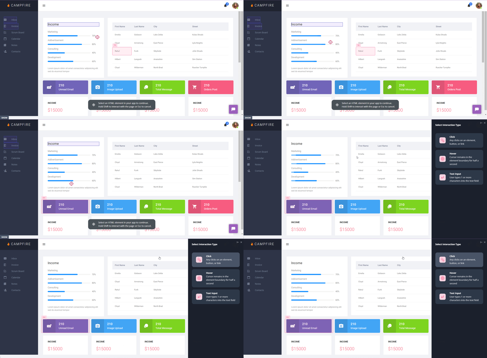
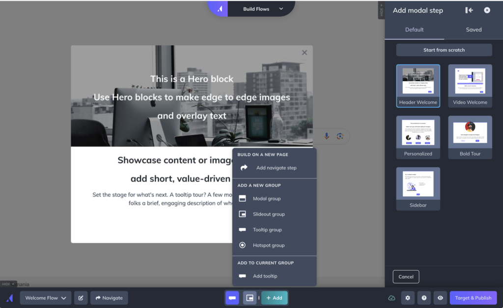
- No-code builder: Creating flows with Userpilot is as simple as installing the Chrome extension, selecting the UI patterns you’d like to use, and then editing the content/settings to suit your use case. You can also use templates to create modals, slideouts, tooltips, and driven actions.
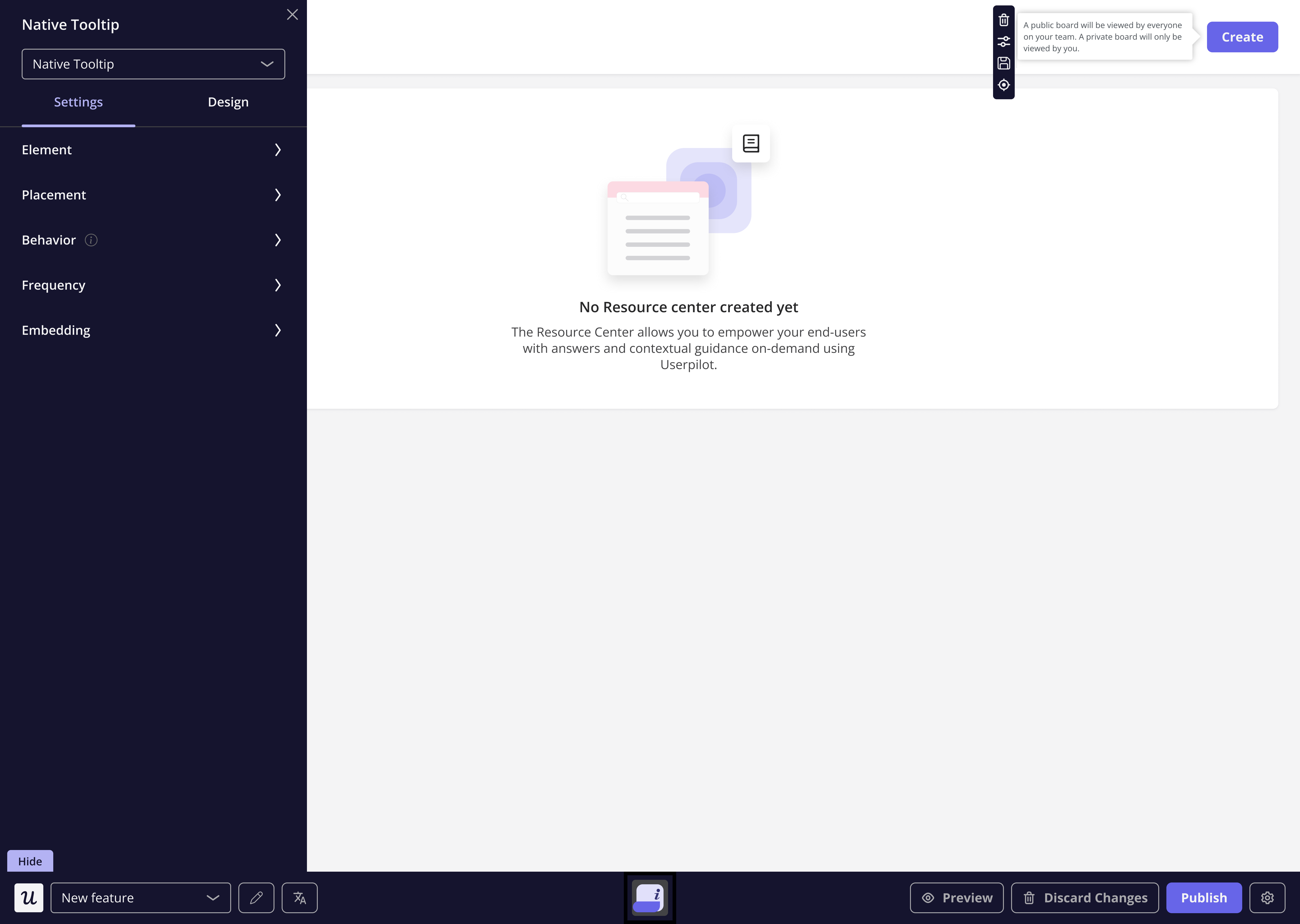
No-code flow builder in Userpilot. - Native tooltips: Userpilot lets you create native tooltips that show up when users hover over an element or click on an information badge. Since these native tooltips attach to the element itself, they aren’t page-dependent and will show up on any screen where that element is visible.
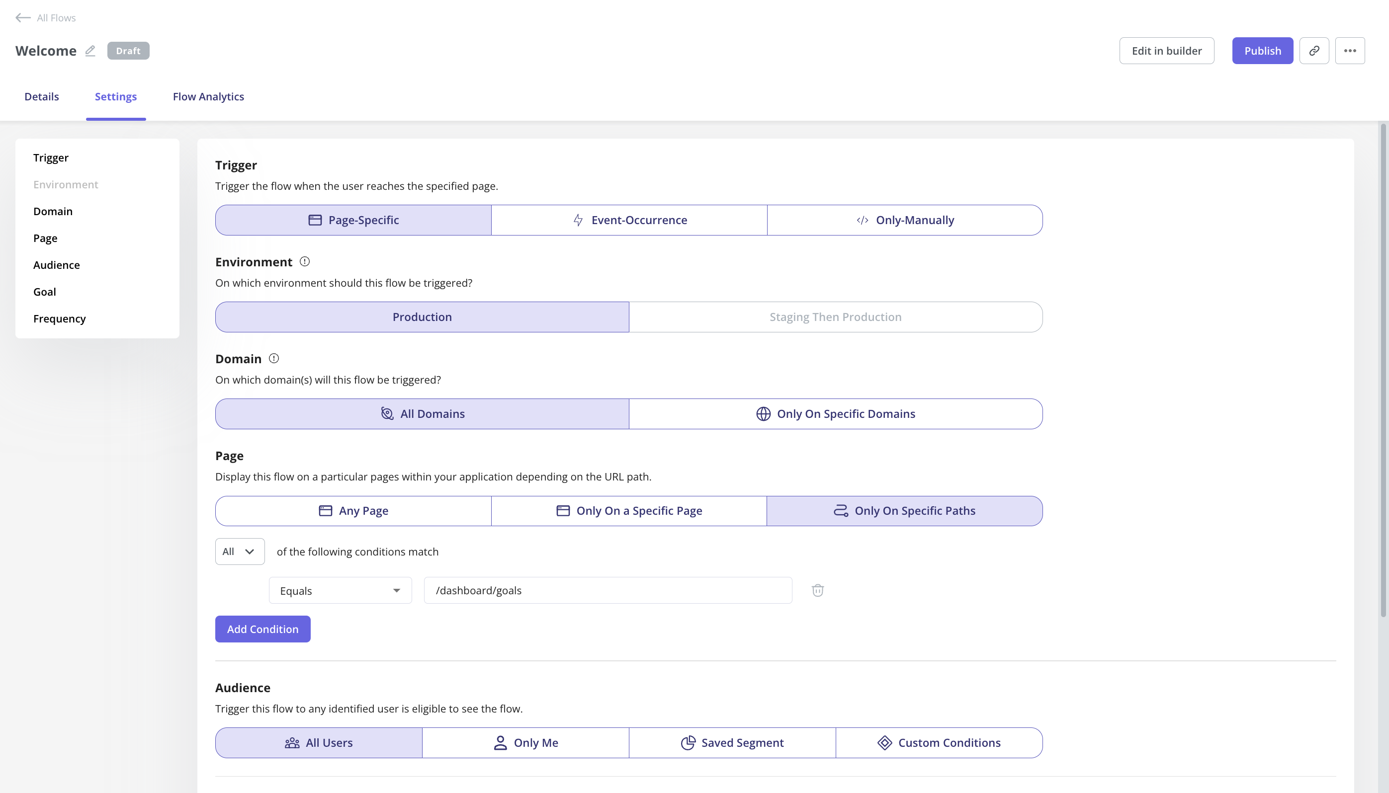
Build native tooltips with Userpilot. - Advanced flow settings: With advanced condition settings, you can decide when, where, and who you’ll be triggering your onboarding flows. This helps you create contextual and personalized onboarding experiences that drive engagement and adoption.
- Onboarding engagement analytics: You can easily assess the impact of your onboarding flows, guidance, etc. by analyzing the engagement rate of tooltips, interactive walkthroughs, checklists, etc. In addition, you can also build reports (funnels, paths, etc.) or dashboards to track your core onboarding metrics i.e. activation, stickiness, drop-offs, etc.
Userpilot for product analytics
Product analytics lets you collect and analyze data about how users interact with your product so you can extract actionable insights. Userpilot lets you look at granular product analytics, such as which features have the highest adoption rates, and big-picture insights like trend reports. Here are Userpilot’s top product analytics features:
- Feature tagging: Userpilot’s click-to-track feature tagger lets you view how many times a feature has been used and by how many users to measure its adoption. Users on the Starter plan can add up to 10 feature tags while those on the Growth or Enterprise tier can create unlimited tags.
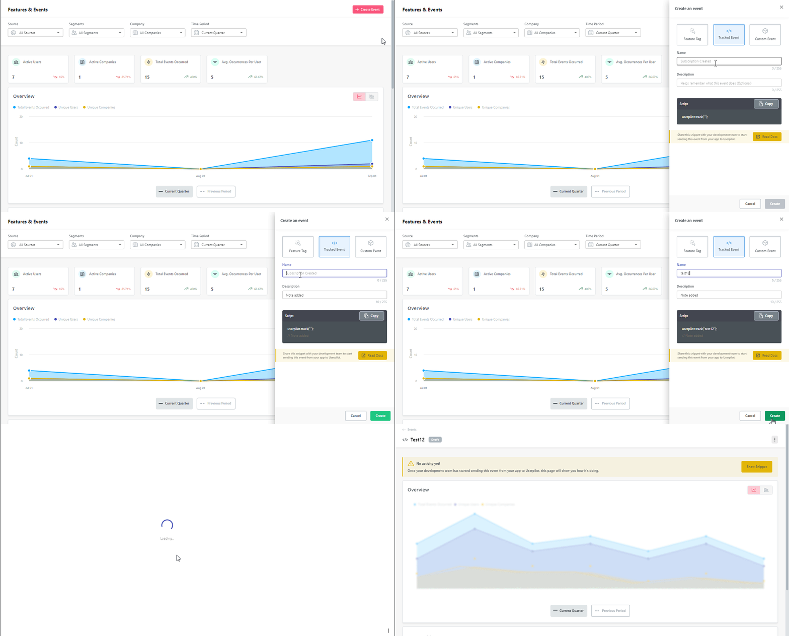
No-code feature tags in Userpilot. - Event-tracking: Alongside no-code feature tags for feature engagement tracking, you can also track other events unique to your product using event-tracking. You can also create a group of events to track a specific process i.e. onboarding, subscription, etc.
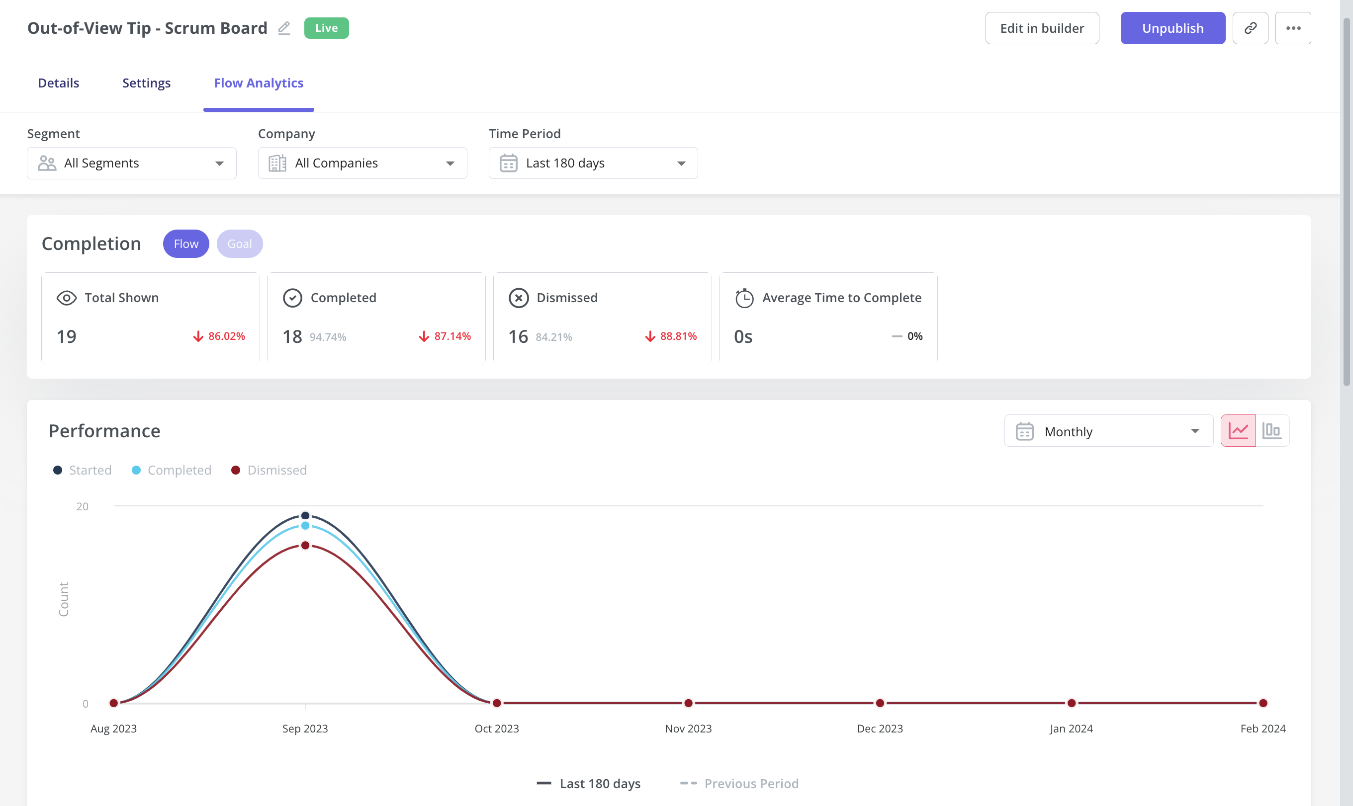
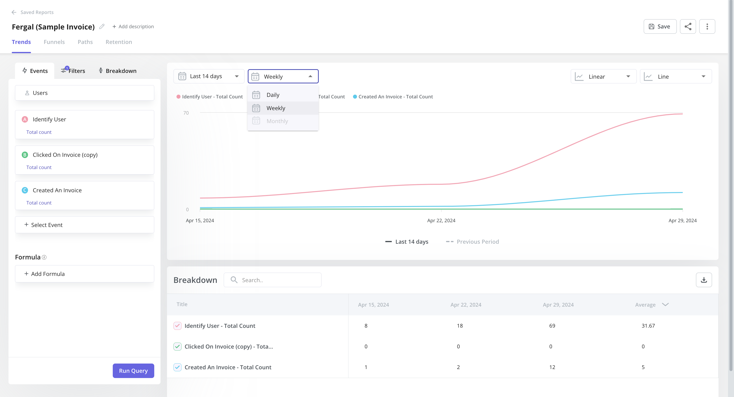
Create tracked events to monitor server-side data. - Trends and funnels: Userpilot’s trends and funnels report lets you extract actionable insights from big data. You’ll be able to see which stage of an onboarding/conversion funnel most users drop out on and create trend reports with detailed breakdowns by user or period.
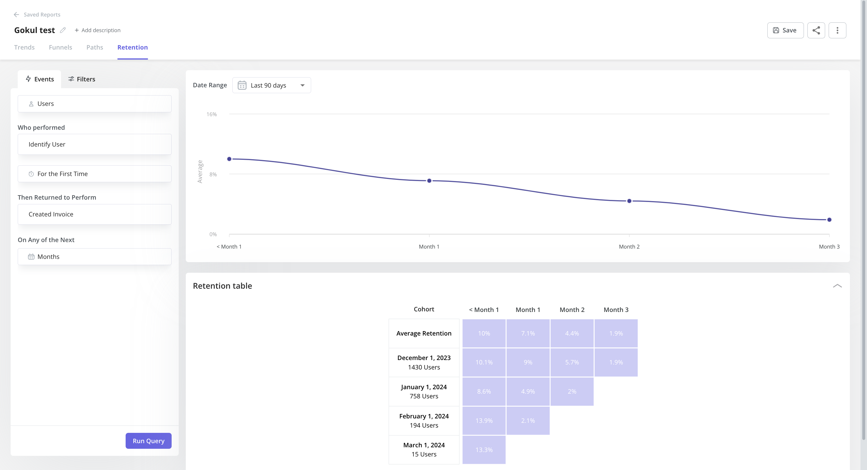
Example of a trend report in Userpilot. - Retention tables: This lets you gauge product performance – how effective it is at retaining users using cohort tables and retention curves.
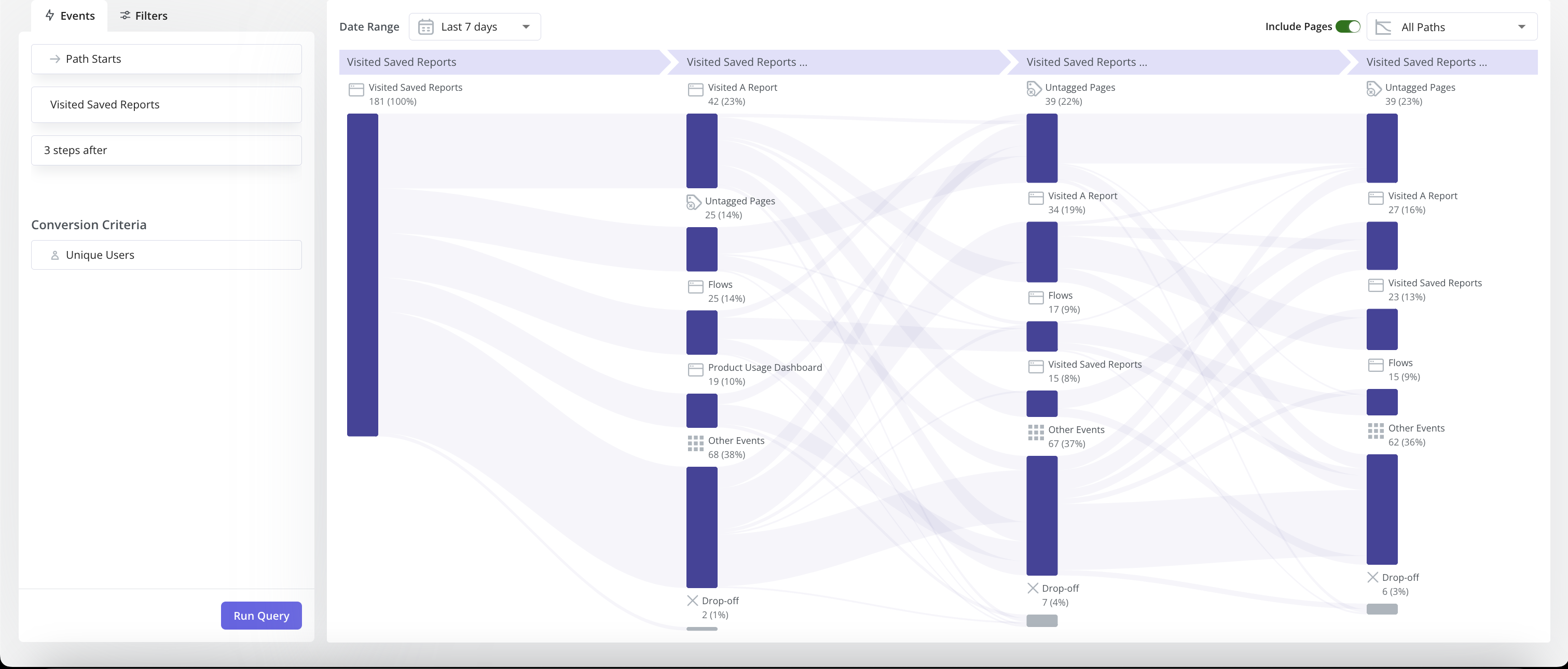
- Paths: You can generate and access path reports directly within the reporting builder in Userpilot, alongside funnels, trends, and retention reports. With Paths, you can have an overview of how users navigate your product features – offering invaluable insights into their interactions with your products.
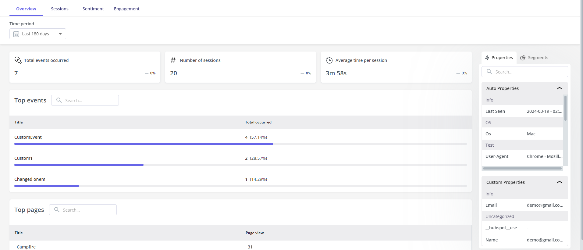
- User & Company profiles: Here you can view data related to a certain user/company to gain insights into their behavior and improve the overall user tracking experience. This helps you understand how they engage with your product or platform, better identification of areas of improvement, and tailor their offerings more effectively.
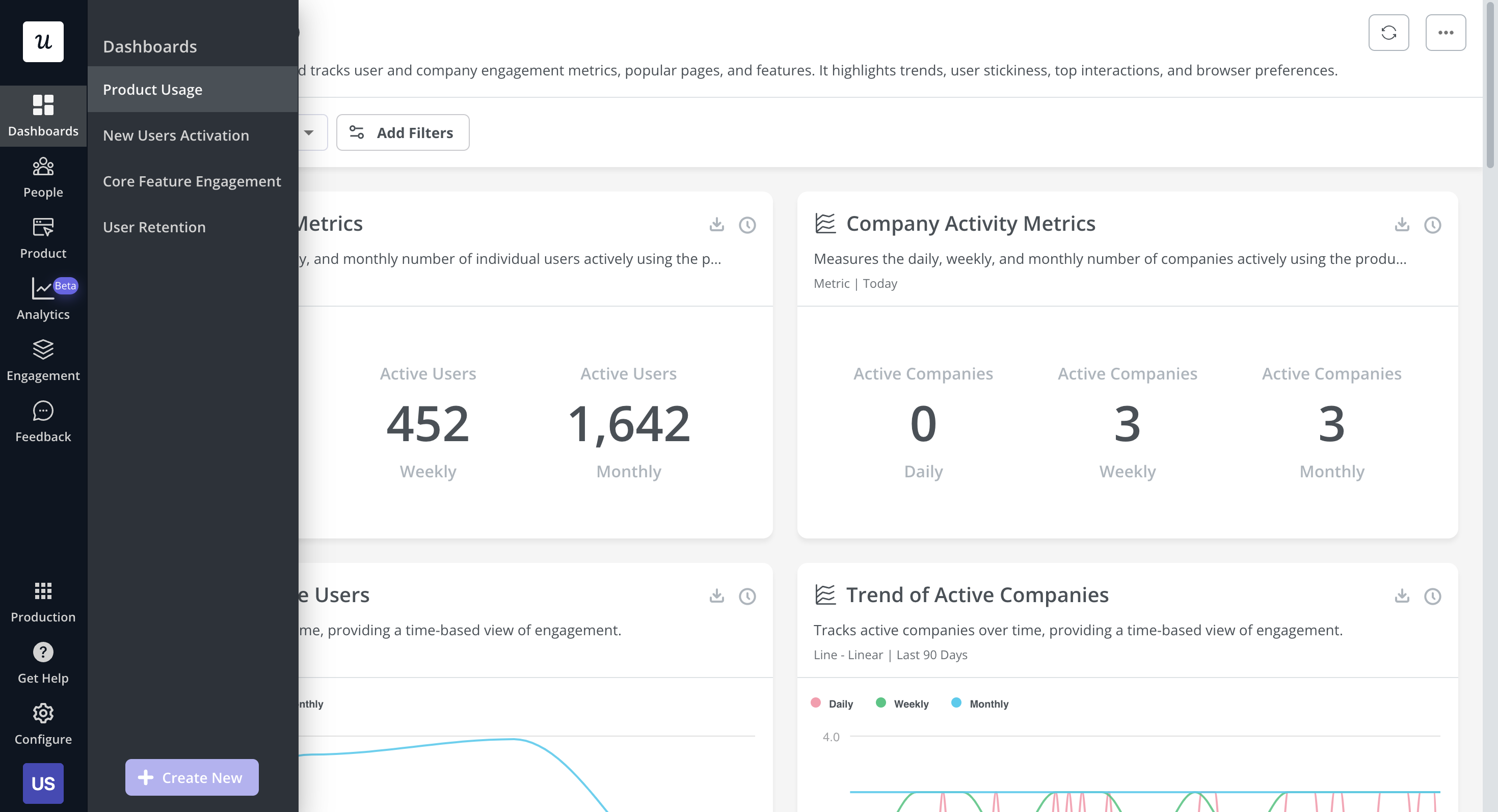
ser profile with top event data that provides insights into what feature they regularly engage with. - Analytics dashboards (Product Usage, New Users Activation, Core Feature Engagement, User Retention, etc.): These dashboards enable you to keep track of your key product performance and user behavior metrics at a glance, without any technical setup required.
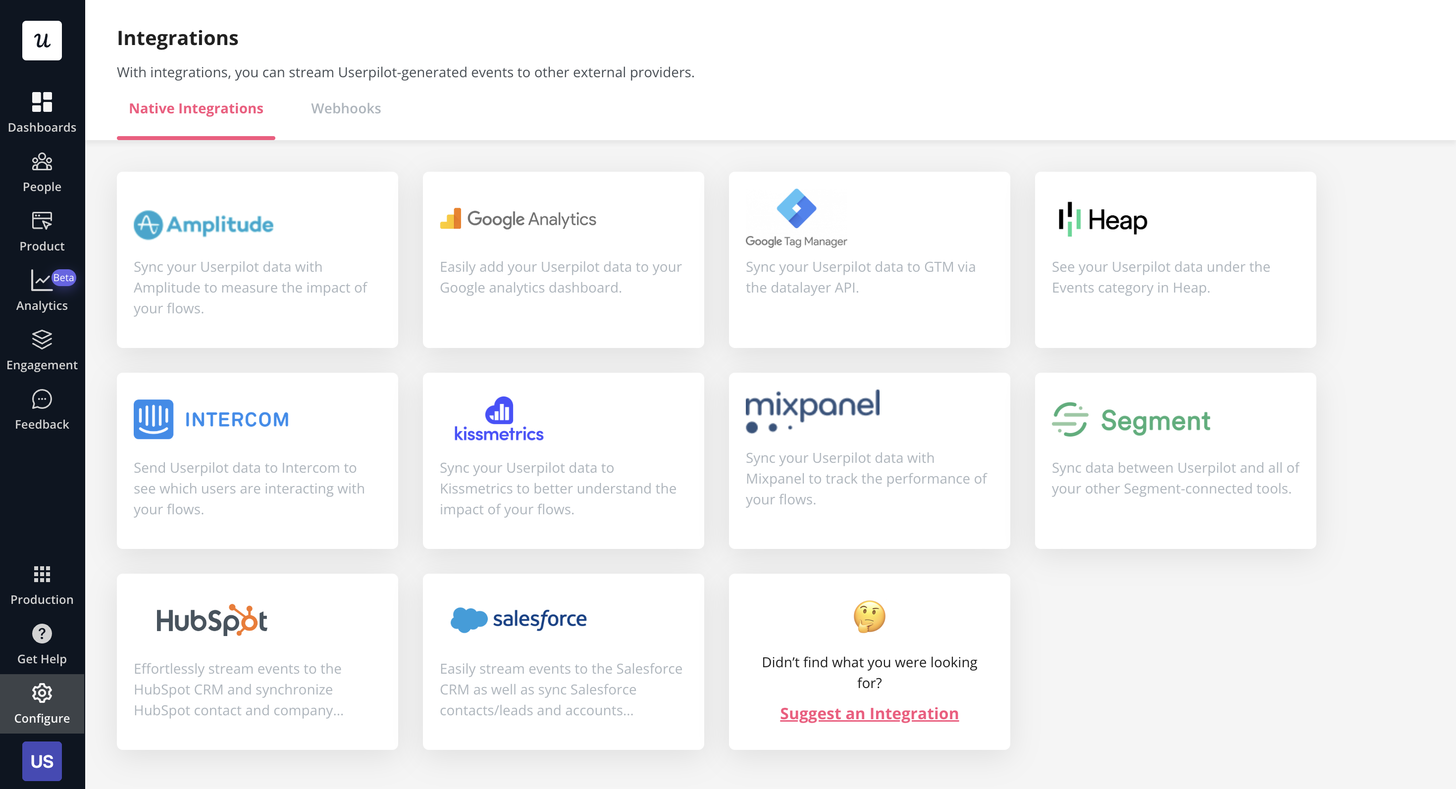
- Analytics integrations: Userpilot integrates with some of the most popular analytics tools like Amplitude, Mixpanel, Segment, Google Analytics, and more. This makes it possible to sync product analytics both ways between the tools in your tech stack (two-way integration is only available for Hubspot at the time of writing, more to come).
Userpilot for self-service support
Here’s how you can use Userpilot to create a self-service customer experience:
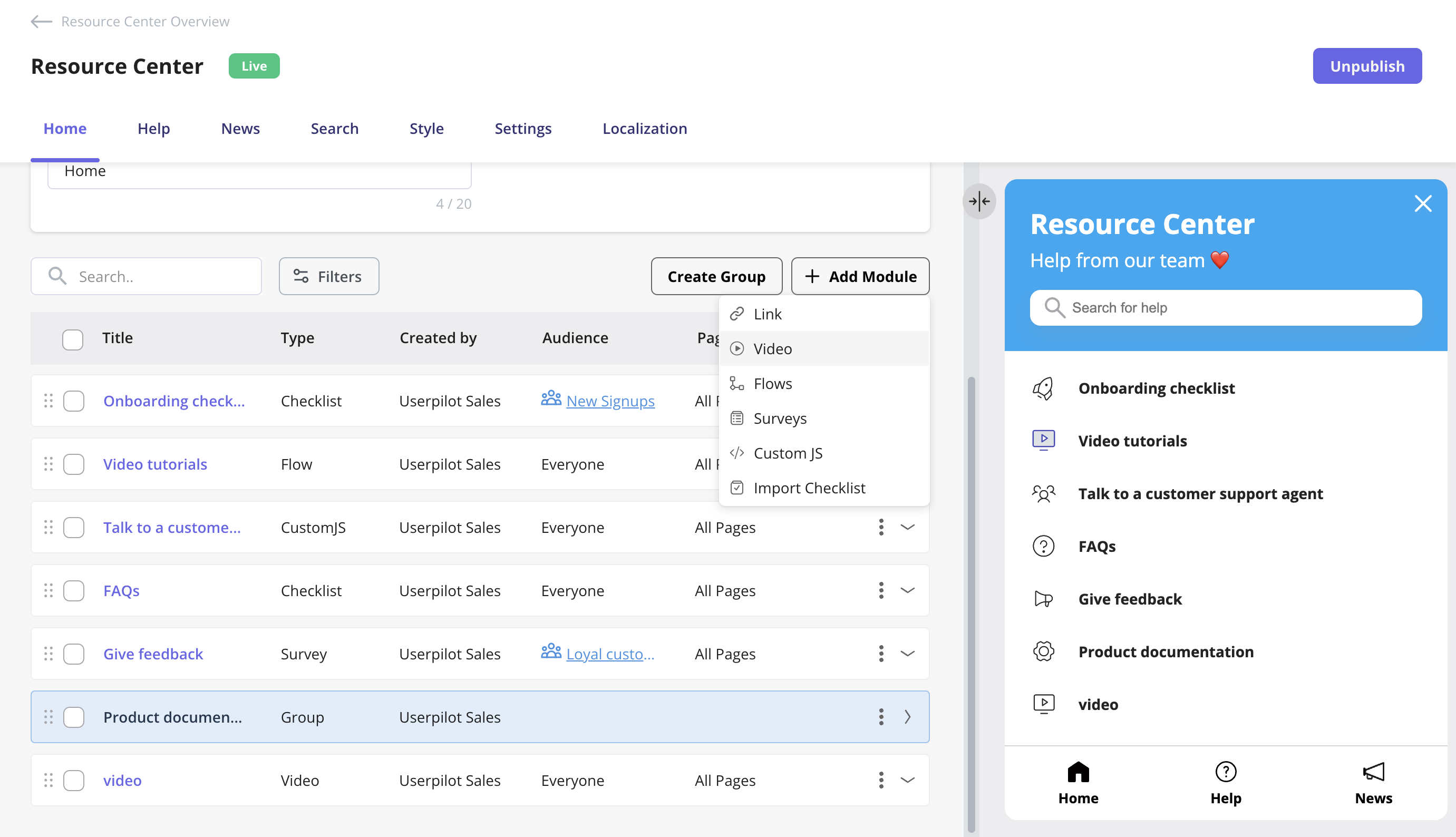
- No-code builder: Userpilot’s no-code resource center lets you add modules without writing a single line of code. Module options include links, videos, flows, custom JavaScript functions, and checklists. You can also group modules into sections to help users navigate the resource center.
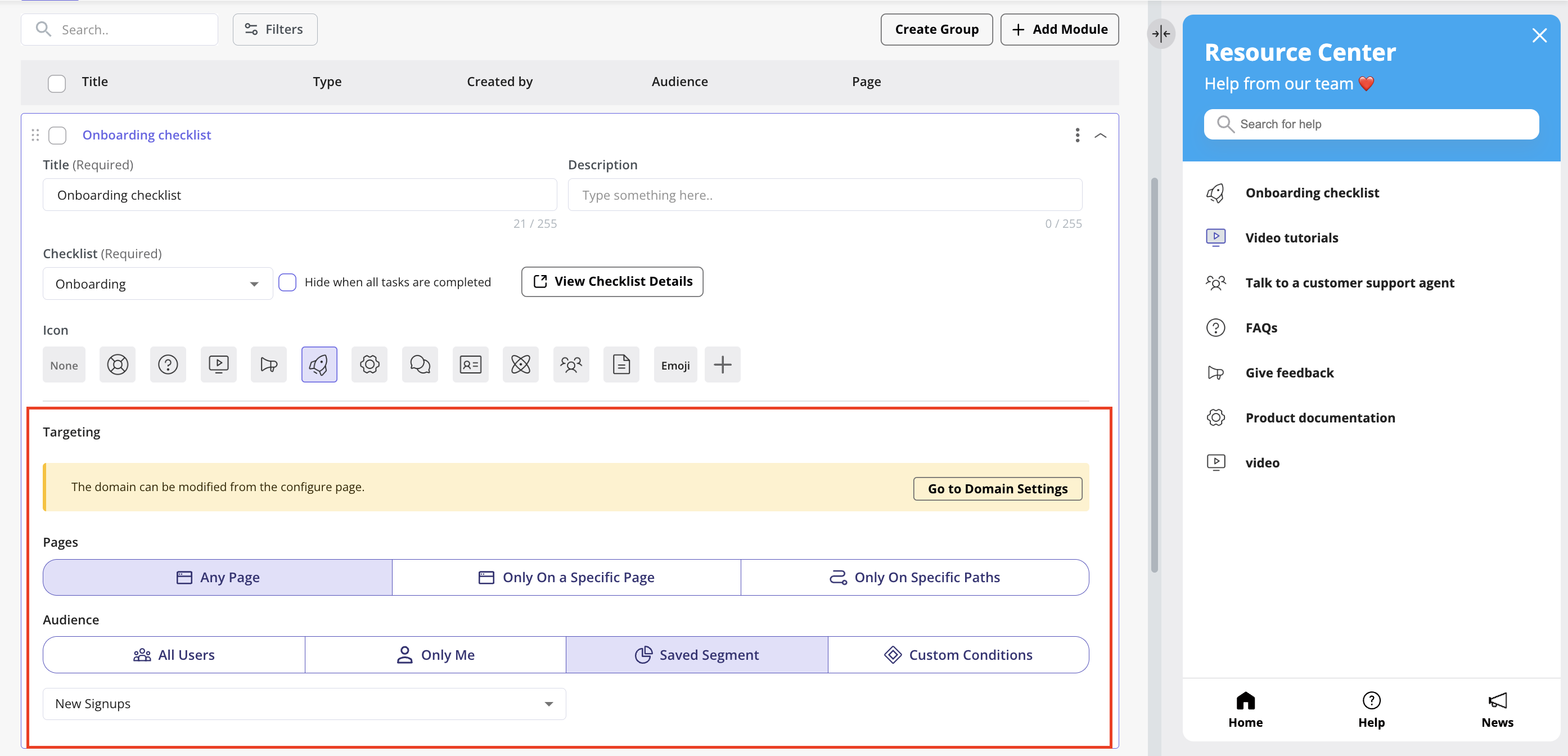
Add different types of content to your resource center. - Module segmentation: Userpilot’s segmentation settings let you hide or show specific modules within your resource center based on audience settings. This makes it possible to create modules for different user segments and hide resources that aren’t relevant to other users.
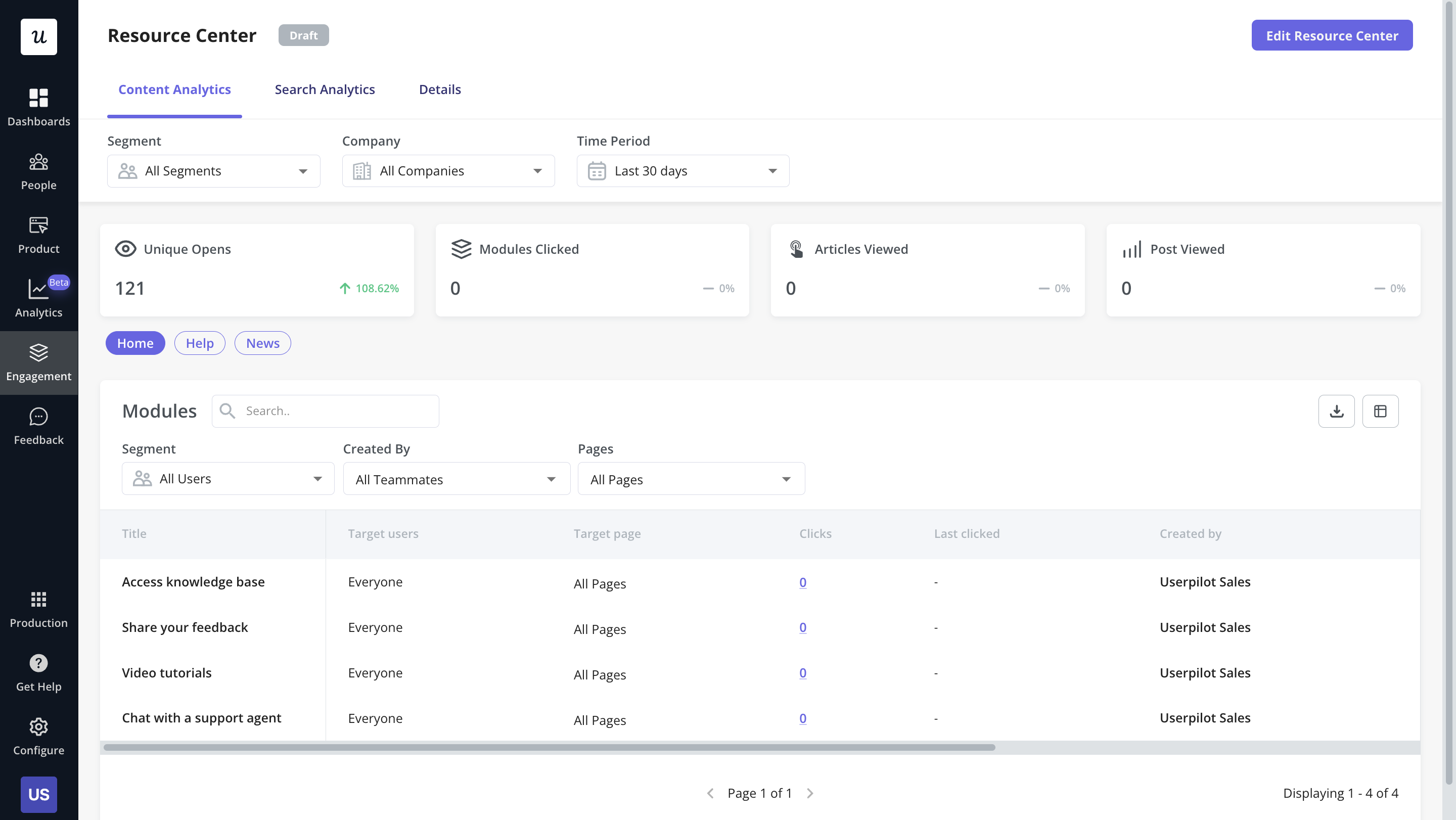
Help module visibility condition settings. - Resource center analytics dashboard: The dedicated analytics dashboard helps you see how many unique visitors your resource center gets, how many modules have been clicked, the overall click rate across your user base, and popular search terms. This will make it easier to gauge resource center performance and identify if anything is missing from your resource center.
Resource center content analytics in Userpilot.
Pricing of Userpilot
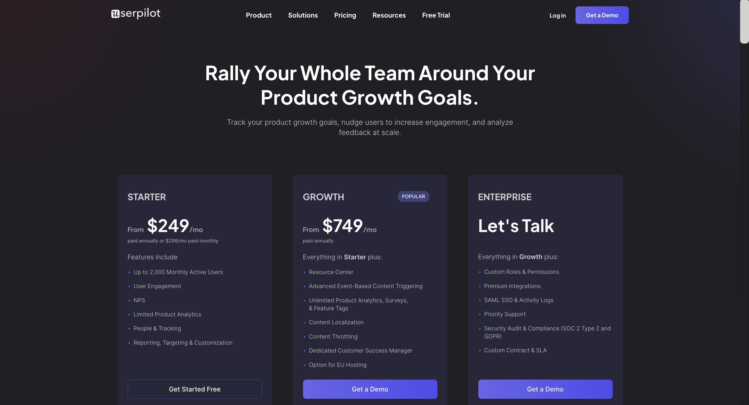
Userpilot’s transparent pricing ranges from $249/month on the entry-level end to an Enterprise tier for larger companies.
Furthermore, Userpilot’s entry-level plan includes access to all UI patterns and should include everything that most mid-market SaaS businesses need to get started.
Userpilot has three paid plans to choose from:
- Starter: The entry-level Starter plan starts at $249/month and includes features like segmentation, product analytics, reporting, user engagement, NPS feedback, and customization.
- Growth: The Growth plan starts at $749/month and includes features like resource centers, advanced event-based triggers, unlimited feature tagging, AI-powered content localization, EU hosting options, and a dedicated customer success manager.
- Enterprise: The Enterprise plan uses custom pricing and includes all the features from Starter + Growth plus custom roles/permissions, access to premium integrations, priority support, custom contract, SLA, SAML SSO, activity logs, security audit, and compliance (SOC 2/GDPR).
Kompassify vs Appcues
There are many ways how Appcues is different (and in a lot of ways better!) from Kompassify. Let’s explore the features of Appcues, how it’s better than Kompassify, and how it may fall short too.
Appcues for user onboarding
Onboarding new users seamlessly is one of the primary use cases of Appcues. The platform offers a wide array of features to help you improve user activation, conversion, and retention.
Let’s take a closer look at how Appcues facilitates new user onboarding:
- Drag-and-drop builder: Appcues’s no-code builder lets you create personalized onboarding tours and checklists to assist and educate new users. You can customize UI patterns like hotspots, modals, slideouts, and tooltips to guide users.
- In-app user guides and product tours: You can use various UI patterns, such as hotspots and tooltips, to introduce new users to product features in a pre-defined sequence. Similarly, you can use checklists to guide users as they explore your app.
- Checklists: You can also create checklists with Appcues (NOT available on the Essentials plan) and prompt users to take action. These are ok but have limited functionality (you can’t trigger JS functions or add gamification elements) compared to alternatives, such as Userpilot.
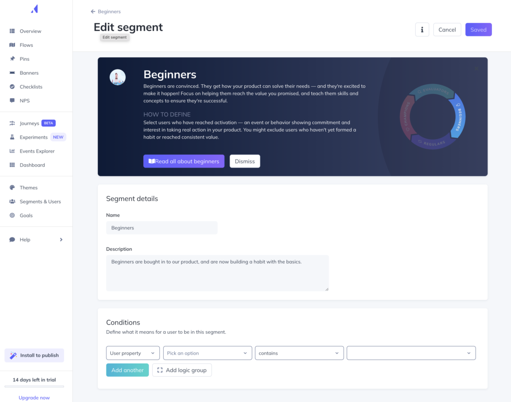
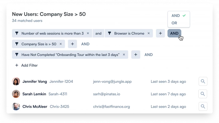
- Segmentation: You can use one of the pre-defined audience segments or create customer segments based on plan tier, lifecycle stage, and other factors. It’s possible to target individual segments with personalized messaging and journeys.
- Measure and improve: You can track in-app flow performance and measure events (limited to 5 on the Essentials plan) to identify areas of improvement.
- Test and optimize: The newly introduced A/B testing feature lets you test different onboarding flows. You can compare the performance of different in-app sequences, identify the best-performing ones, and refine onboarding flows.
Appcues for product analytics
Besides creating onboarding journeys, Appcues also helps you monitor product adoption and user behavior. The best part here is that you don’t need any coding experience to set up product analytics on Appcues.
Note that since Appcues doesn’t focus on analytics, the features it offers are limited. If you need access to cohorts, retention analysis, funnels, paths or trends, you will need a different tool.
Appcues offers the following features for tracking product usage analytics:
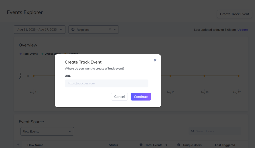
- Click-to-track: Available in Appcues Builder – the Chrome Extension, this feature lets you define and track new events by using feature tags, such as when a user fills a form field or hovers over a menu. It gives you insight into how users are engaging with your product’s UI.
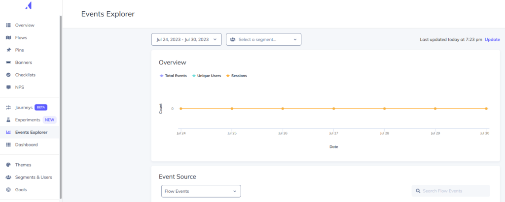
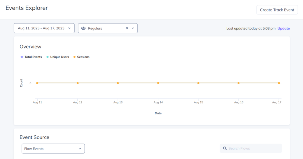
- Events Explorer: Available in Appcues Studio – the main dashboard, Events Explorer lets you validate and visualize various events, making it easier to measure product adoption and user engagement over a given period.
- Appcues also offers integrations with analytic tools like Amplitude if you need more data tracking.
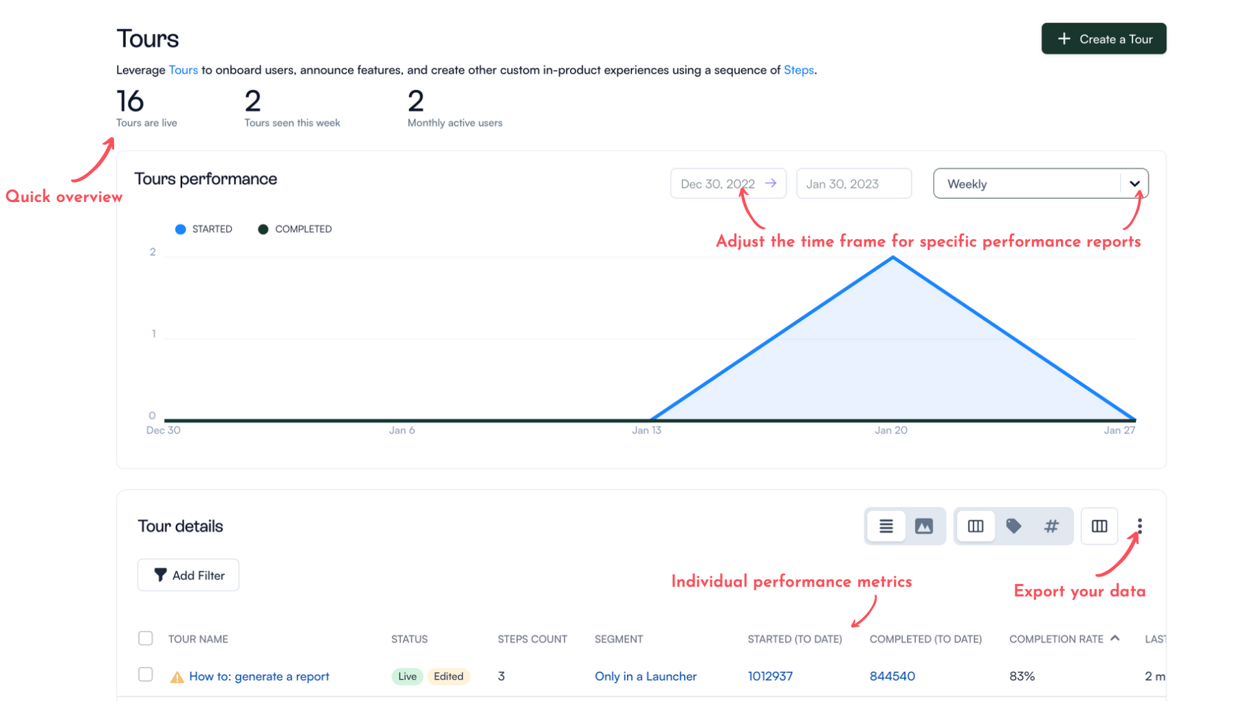
- You can also track flow engagement analytics using Appcues, but this will only tell you how well your in-app guides are performing and how users engage with them.
Keep in mind that Appcues’s element detection algorithm isn’t the most powerful. Platforms like Userpilot do a better job at tracking user engagement for specific in-app elements, on top of offering more advanced analytics features like funnels, trends and cohort analysis.
Appcues for self-service support
Appcues is primarily designed as a tool to facilitate user onboarding through personalized product tours and walkthroughs. There are a few features you can use to provide self-service support, too.
These include:
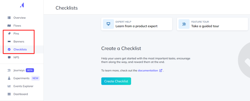
- Launchpads: With Launchpads, users can access various Appcues flows from a dropdown notifications menu. You can use them to create a robust resource center within your product. That, in turn, lets users troubleshoot common problems on their own.
- Checklists: Checklists let you create contextual in-app walkthroughs that familiarize users with different product features. Combining them with other UI patterns like modals, hotspots, and tooltips can help enhance self-service support.
- Pins: Pins appear as always-available tooltips and buttons that let you provide constant hand-holding to new users.
It’s worth noting that Appcues, as a standalone tool, can’t help you provide complete self-service support. You’ll need other elements, such as AI-powered chatbots and FAQs, to empower users.
Pricing of Appcues
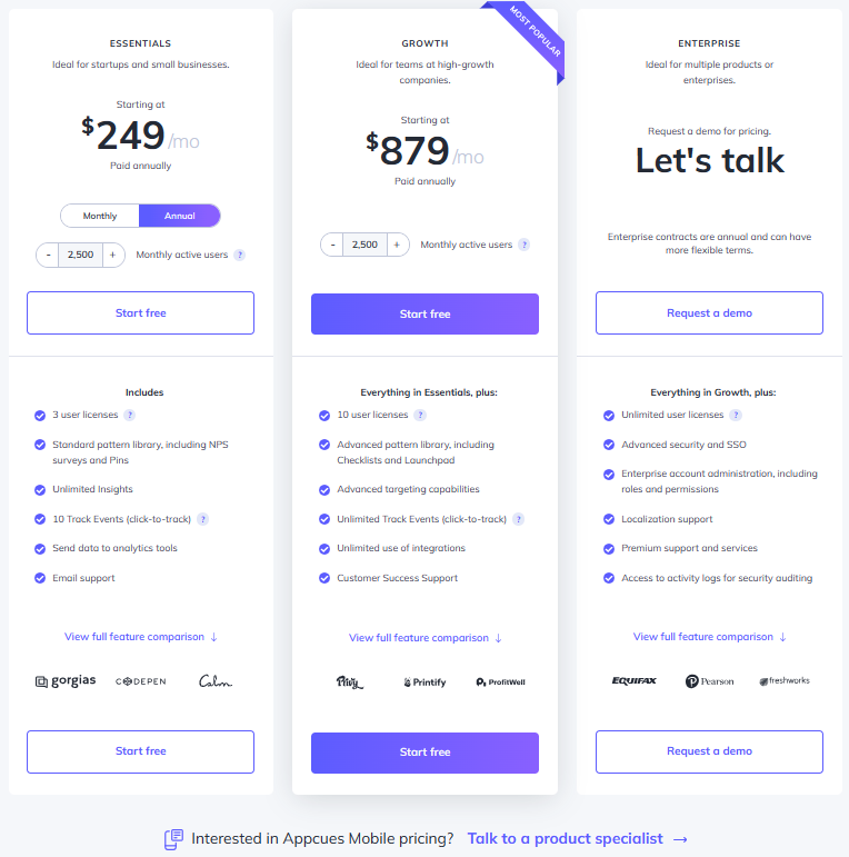
Pricing for Appcues starts at $249 per month, with the platform offering three distinct tiers – Essentials, Growth, and Enterprise.
The total cost can vary depending on the number of monthly active users (MAU). For instance, the Essential plan starts at $249 per month for 2500 MAU but jumps to $299 for 5000 MAU.
Here’s a detailed glimpse of the different pricing tiers:
- Essentials: It’s the basic tier that starts at $249 per month. It includes 3 user licenses and lets you add up to 5 audience segments. Some UI patterns, such as checklists, launchpads, and custom CSS support, aren’t available. Customer support is only available through email.
- Growth: This tier starts at $879 per month (for 2500 monthly active users) and includes 10 user licenses. You can target unlimited audience segments and use the full spectrum of UI patterns. Additionally, you can access the Premium Integrations package, which includes integrations with Slack, Salesforce, Marketo, and Zendesk.
- Enterprise: This is the most feature-packed tier and includes robust security controls like role-based access and activity logs. It’s also the only tier that comes with multi-account and localization support. Besides email and phone support, you also get a dedicated Customer Success Manager and Technical Implementation Manager. Pricing is available on request.
All three plans come with a 14-day free trial, where you can test unlimited flows and track up to 5 events. You can extend the trial by another 14 days by installing the Appcues SDK in your app. Additionally, you don’t need a credit card to sign up for the free trial.
Keep in mind that the above pricing plans are applicable to web apps. Pricing for Appcues Mobile is available on request.
It’s also worth noting that Appcues is pricier than some of the other product adoption tools available in the market, including Userpilot. For instance, Userpilot’s basic tier (Starter) lets you add up to 10 audience segments and includes the complete set of UI patterns.
Kompassify vs Pendo
There are many ways how Pendo is different (and in a lot of ways better!) from Kompassify. Let’s explore the features of Pendo, how it’s better than Kompassify, and how it may fall short too.
Pendo for user onboarding
Pendo is a product adoption platform that has the usual onboarding features that are commonly included with similar solutions. However, those using Pendo Free will need to note that they’ll need to find a new onboarding solution once they cross 500 MAUs or upgrade to the paid version.
There are a few ways you can use Pendo to improve your new user onboarding flows:
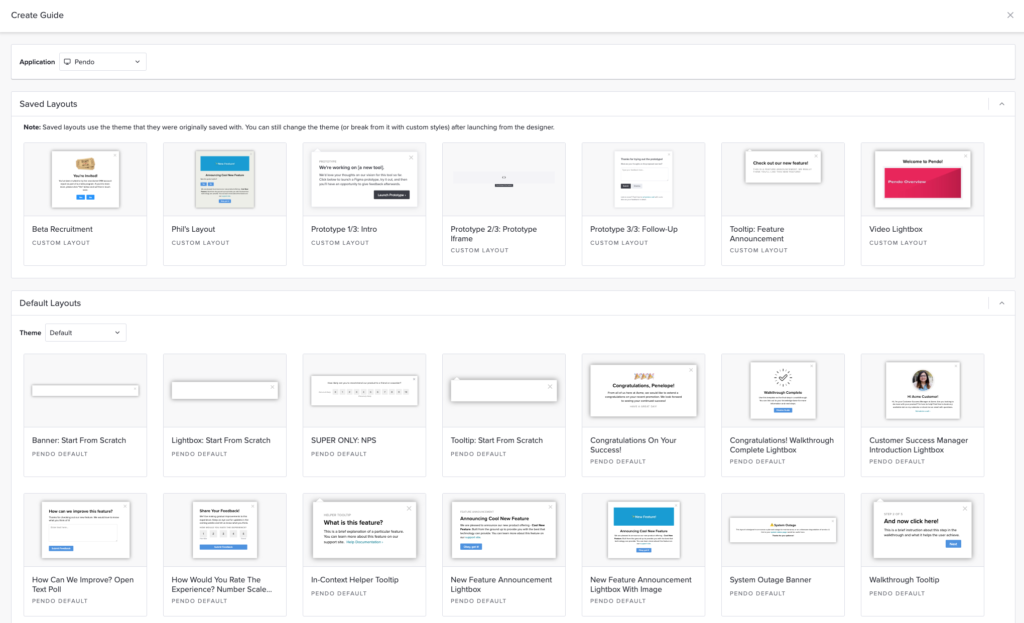
- Guide Layouts: Pendo has layout templates for lightboxes, banners, and tooltips that you can use to build onboarding flows for new users.
- Flow Triggers: Pendo’s guide activation options let you trigger an onboarding flow when new users land on a particular URL, use a specific device type, interact with a tagged element, or match the target segment.
- Localization Settings: Localization settings can stop an onboarding flow from triggering if it hasn’t been translated into the user’s chosen language. Because Pendo has no AI-powered localization features, you’ll need to upload language CSVs manually for this to work.
- Onboarding Module: You can add the onboarding module to your in-app resource center in two clicks then change the color, text style, and progress icon to align it with your product’s brand palette.
Pendo for product analytics
Pendo has no shortage of product analytics capabilities as both native features and third-party integrations. You’ll even be able to access the most important metrics like MAUs and feature use from the home dashboard itself.
Here’s a closer look at Pendo’s analytics features:
- Native Analytics: Because Pendo is a product adoption platform, most of its adoption and engagement analytics are native to the solution. This means you’ll be able to track the number of views, clicks, and interactions that specific in-app guides or product areas get.
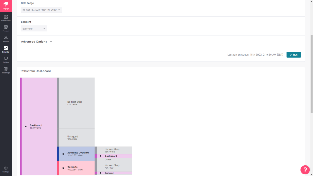
- Paths: The Paths section of your Pendo account shows you which paths users take when coming from a specific page or which path they took to get to a particular page. You’ll also be able to sort this data by segment, date, or see the paths taken by individual visitor IDs.
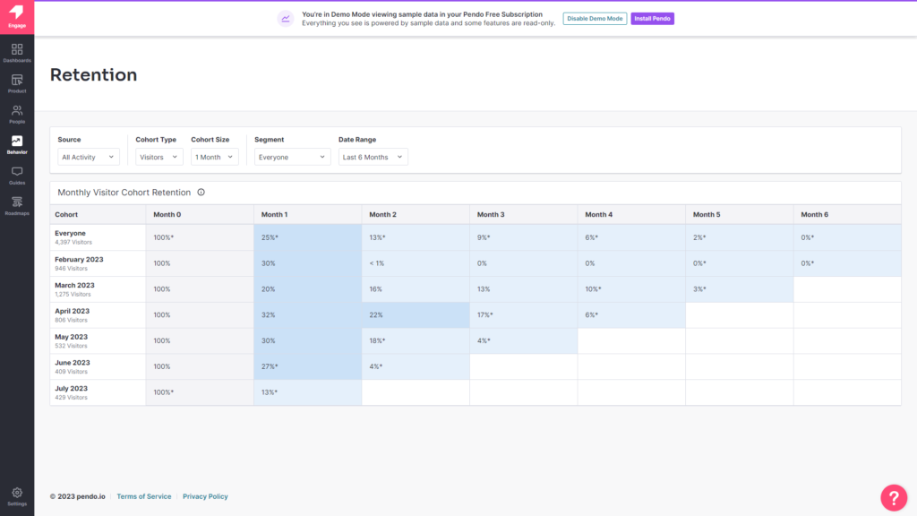
- Retention: Pendo’s retention analytics dashboard lets you see cohort retention data from month to month. You’ll also be able to toggle between visitors versus accounts, switch between weekly or monthly views, and measure retention for specific segments.
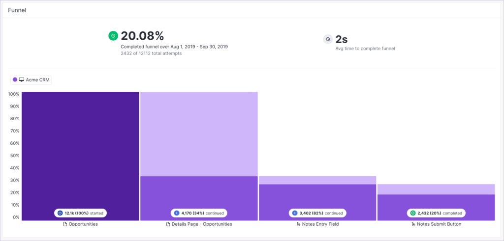
- Funnels: Pendo’s funnel analytics can tell you how many unique visitors have seen your funnels, how many attempts have been made to get through the funnel, and the average time it takes to complete the funnel. You’ll also be able to see completion rates and sort by date or segment.
- Analytics Widgets: Pendo’s home dashboard lets you choose which widgets you’d like to add or remove. You’ll be able to select from various analytics widgets that track product goals, feature adoption, guide views, time-on-app, and other core metrics.
- Third-Party Integrations: Pendo has integrations with tools like Salesforce, Intercom, Segment, Slack, and more. Linking your Pendo account with these third-party solutions will make syncing and sharing data seamless (but do note that Pendo doesn’t update analytics in real time).
Note: Pendo’s HubSpot integration is a one-way integration, which means you won’t be able to sync data both ways between the two tools. You’ll need to upgrade to the Growth plan or higher to use Pendo integrations.
Pendo for self-service support
Self-service support is a must-have for any SaaS company.
Here are the best Pendo features to use for self-service support:
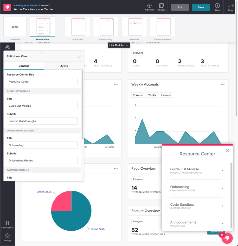
- Resource Center: Pendo’s in-app resource center can serve as a self-service portal with different modules for each stage of the user journey. Create a dedicated section for onboarding resources or segment the visible modules so users only see the most relevant guides.
- Tooltips: In addition to educating new users, tooltips can also be used to link to product documentation, onboarding resources, and tutorial videos that will help your customers solve their own problems.
- Live Chat Integrations: When you integrate your Pendo account with either Drift or Intercom, you’ll be able to embed a live chat widget within the in-app resource center. This is very helpful for customers who try to solve a problem themselves but realize they need real-time assistance.
Note: You’ll need to upgrade to the Complete plan or higher to use Pendo integrations and resource centers.
Pricing of Pendo
Pricing for paid Pendo plans is only provided on a quote basis and there are no listed price ranges on the solution’s website. That said, certain reviews have stated that prices start at upwards of $20,000 per year for a single product and more than twice that for higher plans.
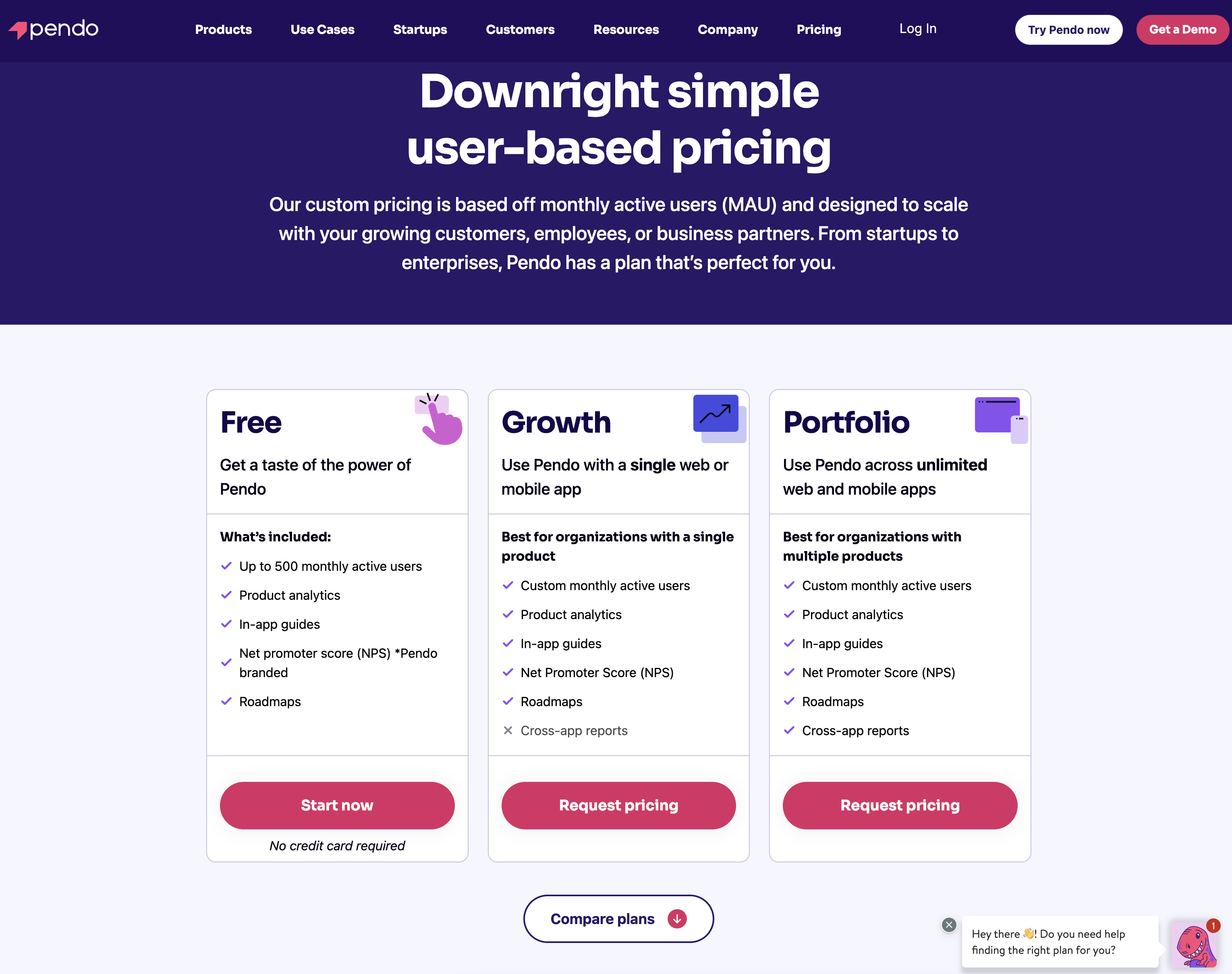
Pendo has two paid plans and one free version that is limited to 500 MAUs which makes it accessible to startups but difficult to scale in the long run.
Here are the differences between each Pendo plan:
- Pendo Free: The free version of Pendo can accommodate 500 MAUs and has features like native analytics dashboards, feature tagging, event tracking, segmentation, NPS surveys (with Pendo branding), analytics reports, and in-app guides.
- Growth: Pendo’s Growth plan is designed to be used for a single web or mobile app but can accommodate a custom number of MAUs. It includes features like native analytics dashboards, in-app guides, NPS surveys and response tracking, and customer support.
- Portfolio: Pendo’s Portfolio plan is targeted towards customers who want to use the tool for multiple web and/or mobile apps. Features include guide experiment capabilities, cross-app executive dashboards, cross-app journey reporting, and access to product engagement scores.
Kompassify vs Chameleon
There are many ways how Chameleon is different (and in a lot of ways better!) from Kompassify. Let’s explore the features of Chameleon, how it’s better than Kompassify, and how it may fall short too.
Chameleon for user onboarding
Users expect to be shown the red carpet with a welcome tour for your product. Chameleon helps you create welcome tours that gets users beyond their first “Aha”.
Here are some features of Chameleon for new user onboarding:
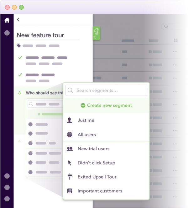
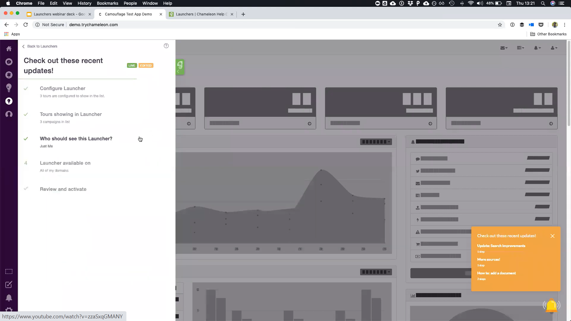
- Segmentation: You can use custom segments to show a sequence of your product tours over time. The hyper-targeted onboarding flows are tailored to your users’ needs. Here’s a short example of what the tour session can look like:
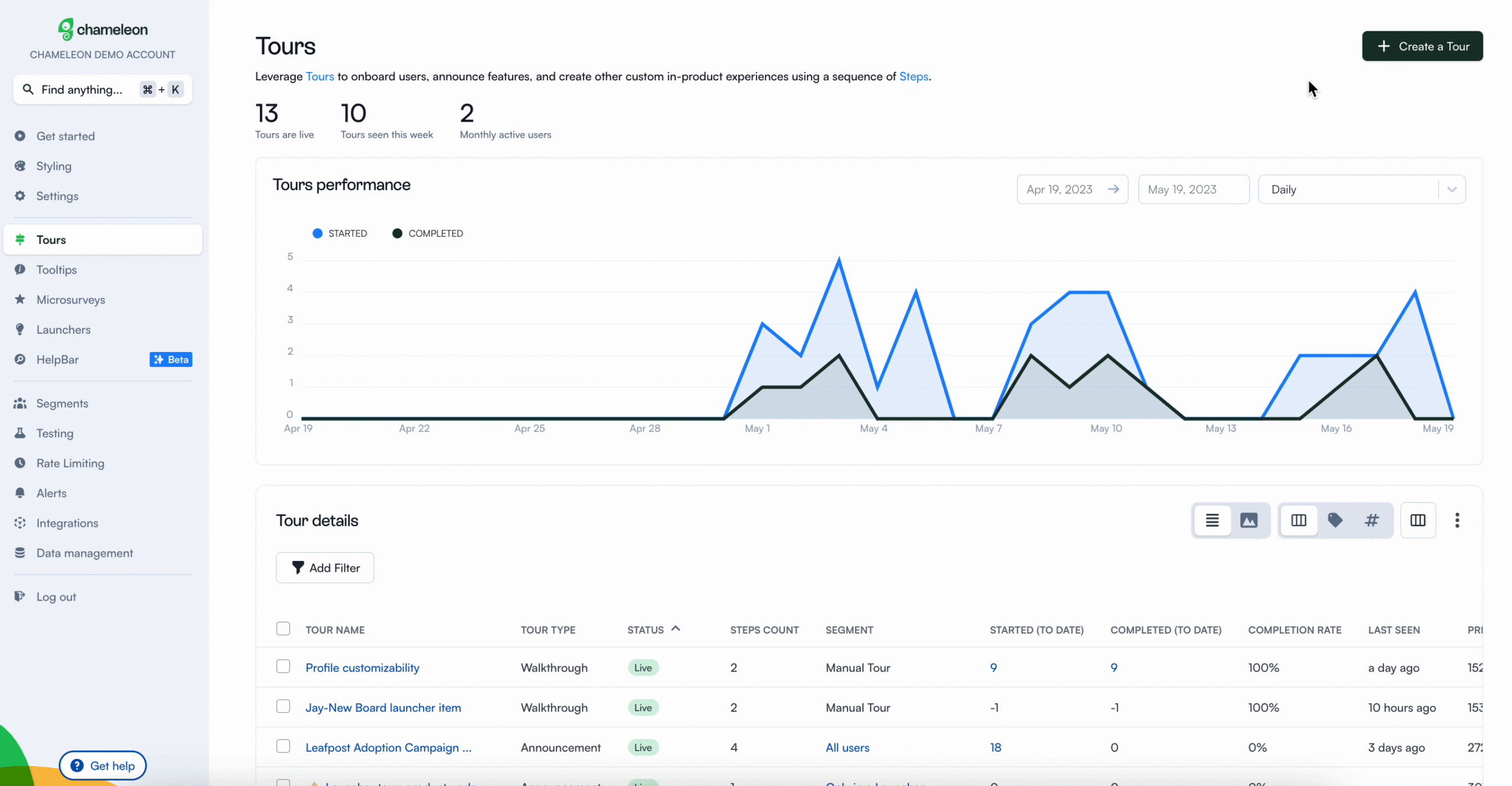
- Clear Analysis: Easily assess and optimize your user onboarding tours with real-time data.
- Launchers: Build onboarding checklists, including items like Loom videos and knowledge base articles to help users unlock more value.
- Customization options: Enjoy fine control over where the onboarding flow appears, choose who sees it, and define how users can interact with it.
Spoiler alert: when you subscribe for the Starter plan, you get access to just one launcher which is very limited for many onboarding use cases. However, you get unlimited access when you pay an extra $971 for the Growth plan.
Chameleon for product analytics
Here’s a breakdown of Chameleon’s standout features in the context of product analytics:
- Seamless Integrations: Chameleon offers seamless integration capabilities, granting you access to best-in-class user analytics tools such as Segment, Mixpanel, Heap, FullStory, and more. This interconnectedness enhances your capacity to harness a comprehensive view of user behavior.
- Comprehensive Tracking: Chameleon excels in tracking various events throughout your user onboarding process. From tracking tour initiation and completion to monitoring button clicks and user exits, Chameleon provides real-time insights into your product tours. This level of granularity ensures you stay attuned to every user interaction.
- Efficient Data Collection: Simplify data collection through Chameleon’s data schema, easily managed via Google Sheets. This streamlined process ensures that you capture and structure essential data effectively, empowering your product analytics endeavors.
In essence, both Userpilot and Chameleon offer robust solutions for user analytics. However, Chameleon takes the lead in the realm of integrations with top-tier user analytics tools. This integrative approach enhances your ability to harness the full potential of your product analytics initiatives.
Chameleon for self-service support
The self-service methodology focuses on giving users the tools necessary to solve some problems on their own without having to reach out to support agents. This often includes elements like knowledge bases, chatbots, and interactive walkthroughs
Here are Chameleon features that will help you provide self-service support for SaaS companies:
- Tooltips: Tooltips help users understand unfamiliar or complex parts of your product when they need it the most. It keeps your UI simple by reducing the noise or the need to explain everything within your interface. Since your users may have different levels of expertise and backgrounds, they may not find everything in your product intuitive, you can use hover tips to explain certain product terminologies and elements in your workspace.
- Help widgets (self-serve widget): The self-serve widget (resource center in Userpilot) clarifies where users can get help and what resources are available. Through launchers on Chameleon, you can deploy a self-serve widget out of the box. By showing customized Launchers based on the feature the user is currently using, you can deploy custom and interactive self-serve support across your whole product without pushing users off track to an external knowledge base.
- Interactive product tours: One of the best ways to offer users self-serve support is by allowing them to take interactive product tours at their own pace. You can educate those ready to learn something new while letting other users take it later when they may have more time or are ready to engage further with your platform.
Pricing of Chameleon
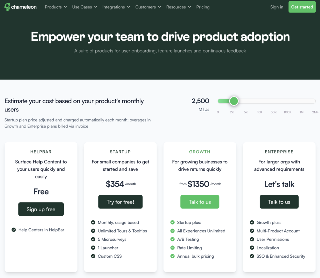
Chameleon’s pricing is based on your product’s monthly users. From the Startup plan (for small companies to get started and save) to the Growth and Enterprise plans (for larger organizations with advanced requirements) billed via invoice.
Here’s an overview of the pricing plans, and features of each plan:
- Help Bar: This is a standalone search function on top of your product, allowing users to search your knowledge base articles.
- Startup plan: For small companies to get started. Fee: $354/month, billed Monthly, usage-based, Unlimited Tours and tooltips, 5 microsurveys, 1 Launcher, Custom CSS.
- Growth plan: For growing businesses to drive returns quickly, from $1350/month. Everything in the startup plan, plus: unlimited microsurveys & launchers, A/B testing, and rate limiting is paid annually with bulk pricing.
- Enterprise plan: For larger organizations with advanced requirements. The fee for this plan is not stated on the website rather, you get to talk to the team. You get everything in the growth plan, multi-product account, user permissions, localizations, and SSO/enhanced security.
The Growth plan seems to be the real deal because of the exciting features that can boost your product marketing. For example, you can’t get the rate limiting feature on the Startup plan, including A/B testing. These are relevant and powerful product adoption weapons that should be in your arsenal if you truly want to win more users.
Is the startup plan expensive?
Yes, compared to Userpilot, about a $170 difference. It’s best to opt in for the Growth plan for the juicy benefits, where you pay $1350 annually rather than paying a whopping $5000+ yearly for the startup plan.
Conclusion
As you can see, there are many different competitors and alternatives to Kompassify. We’ve discussed a few above – but which one is the best?
The answer is “it depends” – but we strongly believe that if you’re a mid-market SaaS company looking for a great user onboarding and product analytics tool, Userpilot is the best option for you.
Hopefully, you found this post helpful. And if you need any help with how Userpilot is different, schedule a demo to get started!

