What is a Product Journey Map (And Why You’re Building It Backward)


Most product journey maps start at sign-up and trace the intended path through onboarding, activation, and key features up to a healthy, retained user. If you’ve built one of these, it’s probably accurate as it follows a logical user journey you want to see in your product. However, the intended product journey map is quite different from how users actually experience the product, and sometimes it gets lost in the documentation.
The intended path lives in your onboarding flow, in your activation checklist, in the product tour you built to guide new users through their first session. What isn’t documented anywhere is everything that happens between the steps you designed and the moment a user stops showing up: the friction that compounds quietly in transitions, the steps users attempt and abandon before they reach the milestone you were mapping toward.
When teams build a journey map from sign-up forward, they’re documenting intent. The map looks right because it reflects the designed experience. What it can’t show is the gap between what you built and what users encounter, and that gap is where almost all churn starts.
The most useful product journey maps don’t start where the user enters. They start where users leave off and trace back to understand what actually caused the drop-off. I’ve learned this from building these maps at Userpilot: a drop-off nobody anticipated, surfaced by a funnel report, diagnosed by working back from the friction point, fixed in hours without an engineering ticket. That process is what this article covers.

What a product journey map actually is
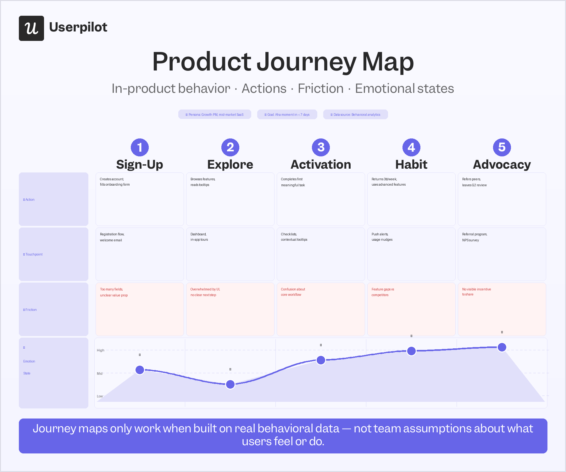
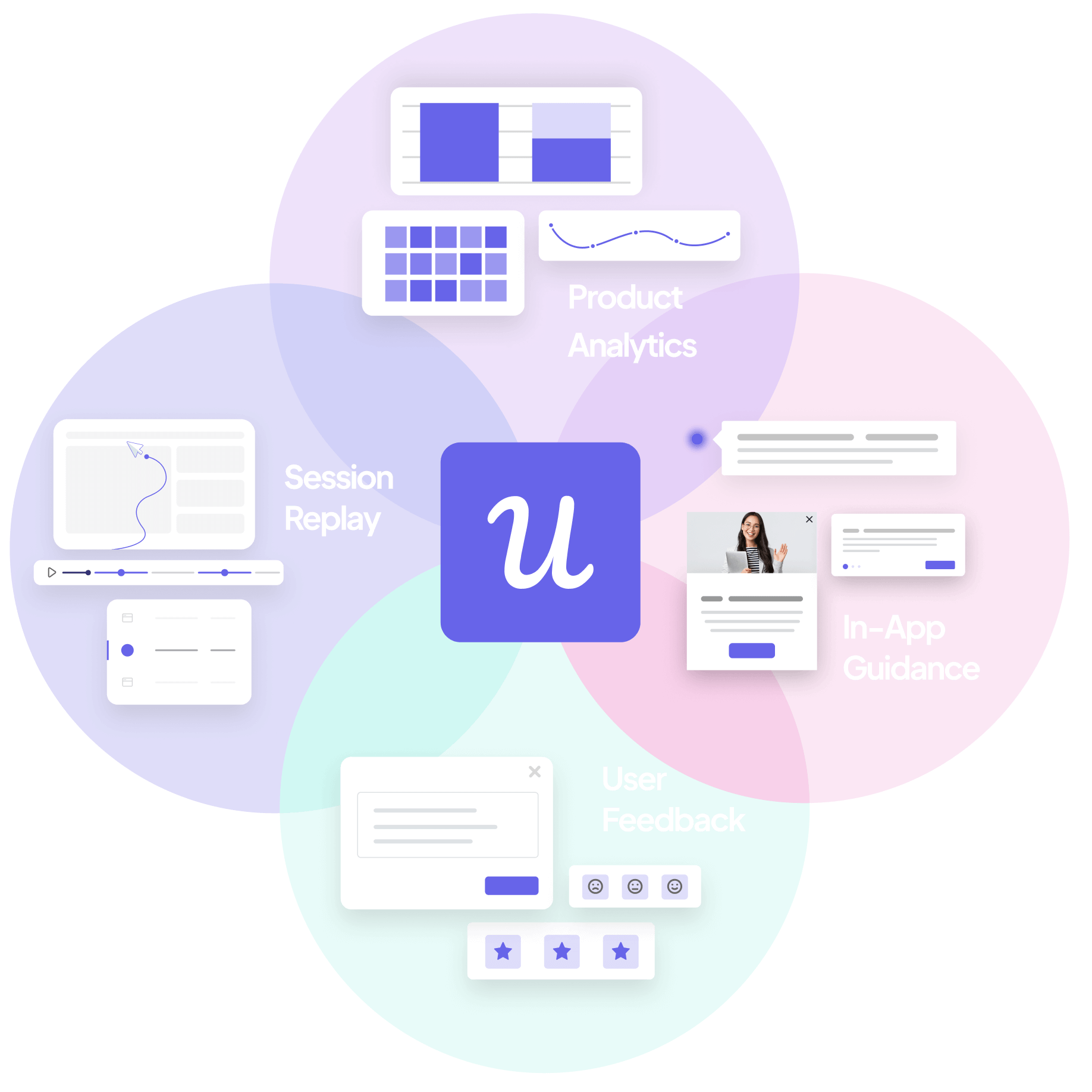
A product journey map is a visual representation of how users actually interact with a product or service, from sign-up through to the moment they reach genuine value or stop trying. It tracks actions, friction, and emotional states at each stage, scoped to in-product behavior rather than the broader customer journey your company manages across every channel and touchpoint. The key components are the same as those found in most journey maps: user personas, journey stages, touchpoints, pain points, and emotional states, populated with behavioral data rather than team assumptions.
The reason this distinction matters is that “product journey map” and “customer journey map” are used interchangeably by most teams, and that confusion results in the wrong tool for the job.
A customer journey map covers the full customer lifecycle, from initial awareness through the buying process, onboarding, retention, and post-purchase support. It spans multiple channels and every touchpoint the company owns. It’s also the customer experience arc that marketing, sales, and customer success teams manage together, and covers far more ground than what a product team needs to diagnose an in-product drop-off.
A product journey map is narrower and more diagnostic. It covers what happens inside the product after the user arrives: which features they touch, where they get stuck, where they drop off, and what they’re experiencing at each step. It’s the user journey map that PMs actually need: specific to in-product behavior, built to surface friction points, and designed to produce an intervention rather than a strategy document.
One thing both journey maps struggle to produce is the behavioral diagnosis that a product team needs to understand why users are dropping off at a specific step.
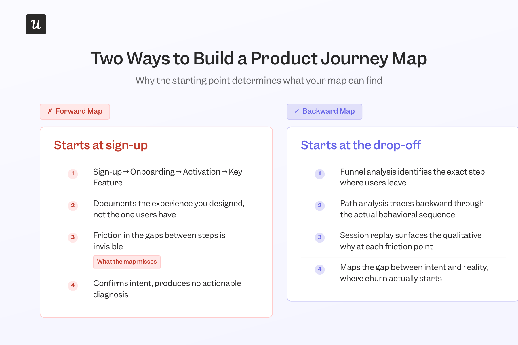
What forward-mapping product journey maps miss
The standard approach to product journey mapping goes like this: start at sign-up, document the steps the user is supposed to take, trace the intended path through to activation, and mark the pain points the team can predict. This produces a clean, accurate artifact, which is also a description of the experience the team already designed.
Friction that drives churn almost never lives in the steps the team planned for. It lives in the transitions between them, such as in the features users attempt and abandon, or in the gaps the designed experience didn’t anticipate, or in rage clicks you can access only with session replay or heatmaps. The forward-facing product journey map skips all of those because they weren’t part of the design process used to visualize product journeys in the early stages.
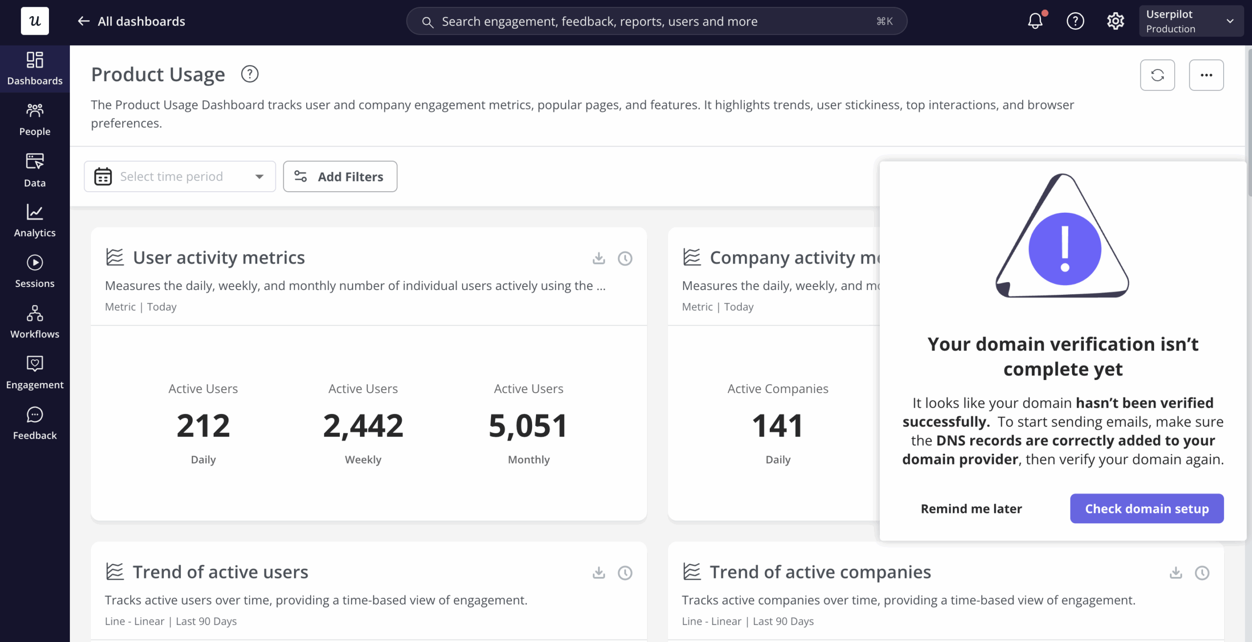
I saw this clearly when Userpilot shipped its email feature. The funnel report showed a sharp drop-off at the domain verification step, a technical prerequisite that nobody on the team had flagged as a likely friction point because it wasn’t part of the designed journey.
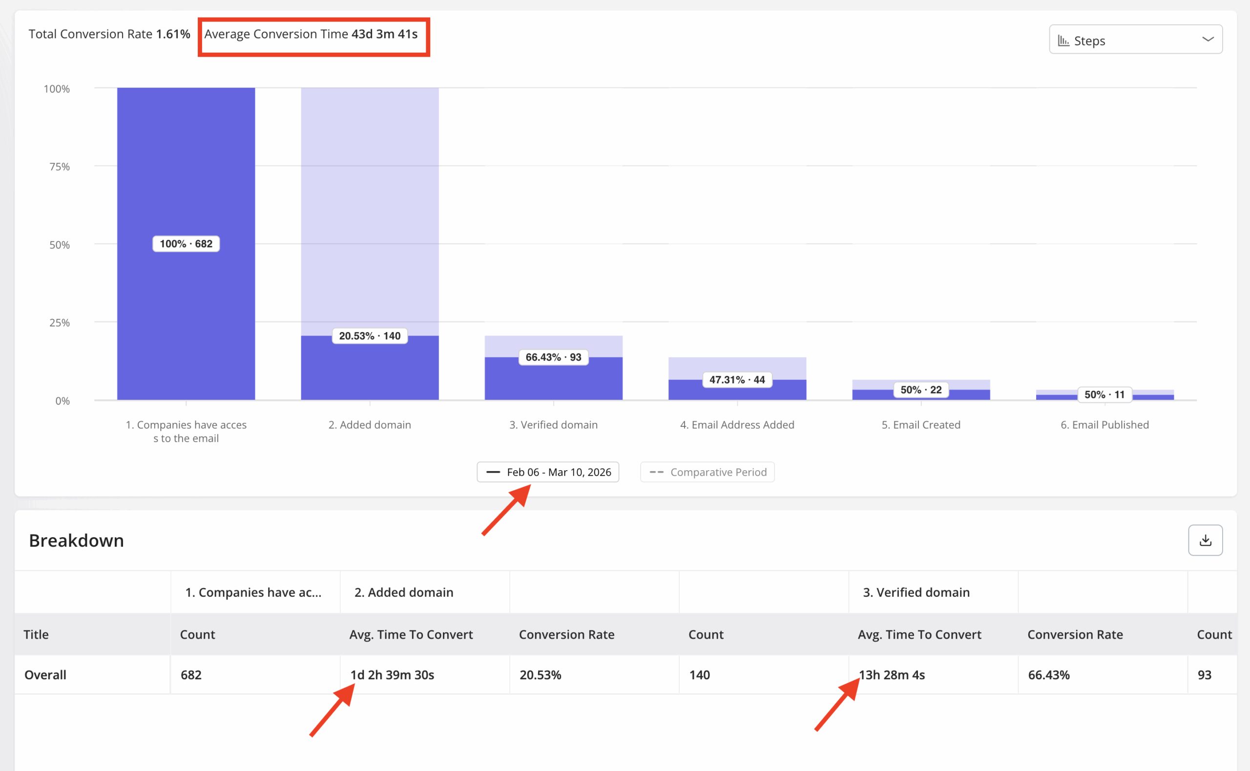
Working backward from that drop-off, the cause was obvious: users were arriving at domain verification without enough guidance on what was expected. Within a few hours, I built a targeting modal in Userpilot that appeared at exactly that step and walked users through what to do. It closed the drop-off quickly, without involving our dev team or touching the broader onboarding flow.
James Mitchinson, Userpilot’s Head of Customer Success, encounters the same pattern from his side of the product. Account health metrics that look healthy on the surface (logins, days active, session frequency) can mask an account where users are active but not achieving outcomes. In James’s words:
“I can think of a few instances in the last several months where we had customers off to a slow start. One in particular I can remember where it was clear progress wasn’t being made, but there were still a lot of logins, and being able to look at the difference between those two things; lots of activity, but the outcomes aren’t really materializing. It gave us the opportunity to go and have more of a frank conversation with the executive stakeholder about some of the challenges and frustrations they were experiencing, and we got them back on track before they gave up.”
The friction points in both cases were invisible to a forward-facing product journey map because they weren’t part of the designed experience. They showed up downstream in customer behavior data as high activity, low outcomes, approaching the decision point where users decide whether the product is delivering on its promise.
Getting to those friction points requires starting the map from the customer experience you’re actually delivering. The backward map helps you identify gaps between what the product promises and what users actually encounter. Those gaps are almost always where customer expectations about the product or service collide with what it delivers in practice.
The backward-mapping product journey process
Backward mapping follows five steps. The goal is to arrive at an intervention that addresses a diagnosed cause, rather than a redesign triggered by a symptom.
Step 1: Identify the drop-off point using funnel analysis
Before mapping anything, build a funnel report that covers the core sign-up-to-activation path, i.e., the steps from a new user arriving to the moment they first get genuine value from the product. Look for the step with the sharpest percentage drop.
Don’t pick the step you suspect is the problem, but let the data identify it. The domain verification drop-off was unexpected precisely because nobody had flagged that step as a risk. Userpilot’s funnel reports surface these patterns in customer data across your entire user base, segmentable by cohort, so the starting point for the map comes from evidence.
Step 2: Pull the path analysis backward from that event to see what preceded it
Once the drop-off step is identified, perform backward path analysis from that event to see what users did in the sessions leading up to it. Path analysis reveals the actual behavioral sequence: which features they touched, which pages they visited, how long they spent at each step, and where they looped back or got lost. It’s where you’ll see the gap between the intended path and the real one.
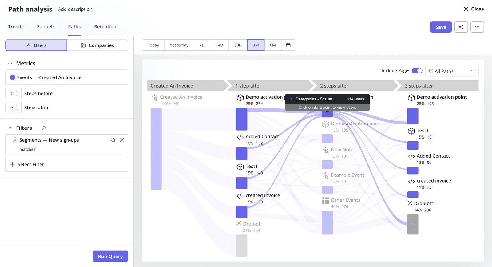
Users who dropped off at domain verification weren’t necessarily moving through the wrong flow. They were encountering a step they hadn’t been prepared for. The path backward from the drop-off showed that the preparation was missing, so you can decide what to fix.
Step 3: Layer in session replay to get the qualitative “why” behind the behavioral data
Path analysis gives you the behavioral sequence. Session replay gives you a better understanding of what the user actually experienced at the friction point: the form field they misread, the error message with no clear resolution, the step where the interface gave them no signal about what to do next. This qualitative layer turns a data point into a specific, actionable diagnosis.
James describes using the same combination for CS diagnostics:
“We can build a funnel report and look at several steps in a workflow and see where friction is happening and where drop-off is happening, and then we can also go and take a deeper look into a session replay for one of those moments of friction to see where our users are actually getting stuck or experiencing frustration.”
Session replay is the layer most teams treat as optional, and it’s the one that makes the diagnosis specific enough to act on. Knowing users drop off at step X is a finding. Watching a user stare at a form field, try to continue twice, and then close the tab is an intervention.
Step 4: Map the emotional state at each step leading to the drop-off
Using the behavioral sequence from path analysis and the qualitative context from the session replay, map what the user was likely thinking and feeling at each step leading toward the friction point. This is where the traditional journey map components (actions, thoughts, feelings, pain points) return to the process, grounded in evidence rather than in team assumptions about how users feel.
A user who dropped off because they were confused needs different treatment than one who dropped off because they lost confidence that the product could do what they needed it to. Both show up in funnel data as the same percentage, but the session replay and qualitative layer distinguish them. So map the emotional arc after you collect customer data.
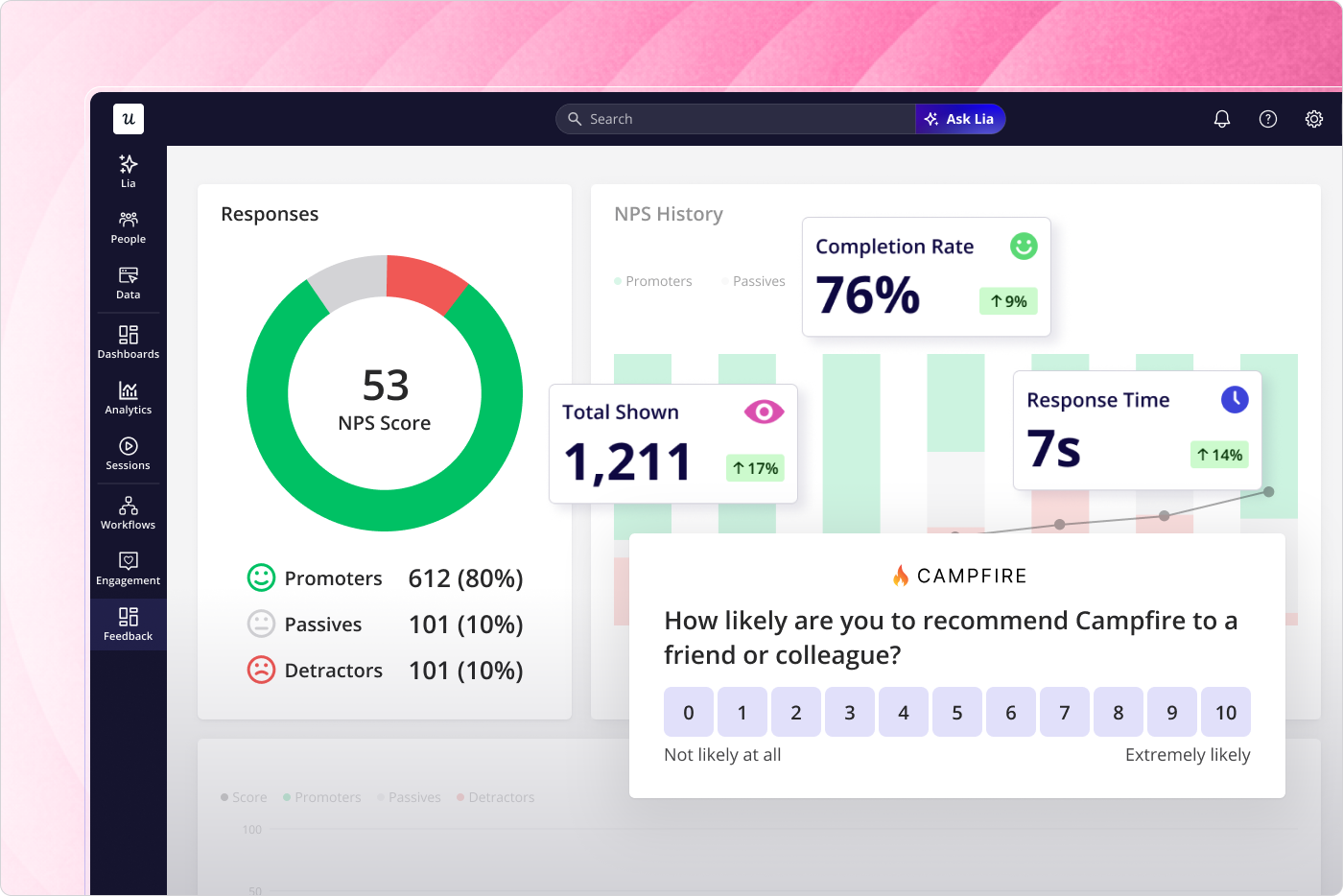
In-app NPS and microsurveys triggered at key steps collect customer feedback at the moment of friction rather than reconstructing it afterward. That real-time signal provides valuable insights that behavioral data alone can’t surface. It’s also the most direct way to identify pain points: a user’s own account of where they got confused is more precise than anything funnel percentages can show.
Step 5: Build the intervention from the diagnosed cause, not from the symptom
The drop-off is the symptom. What the emotional mapping in step 4 reveals is the cause, and that cause is what the intervention addresses. Because the intervention stems from a diagnosed root cause rather than from a data point, it can be specific and immediate.
For the domain verification drop-off, the cause was a missing prompt at a technically complex step. The right intervention was a tooltip at exactly that step. It matched the diagnosis so precisely that it worked quickly, without touching engineering. The alternative (responding to users not activating by redesigning the top of the onboarding flow) might have helped some users and done nothing for those actually dropping off at domain verification, three steps in.
The backward map found the right target. The intervention followed from the diagnosis. That’s the process: activation problems rarely have a single cause, but they do have a specific drop-off point. The cause is almost always upstream of where teams think to look when they’re building the map from sign-up onward.
The components every product journey map needs
Whether the map is built forward or backward, the components that make it useful stay the same. A journey map that captures only what users do, without how they feel while doing it, is informative. However, it’s not sufficient to design an intervention that actually works.
- User personas anchor the map to a specific user type whose journey is being traced. A self-serve trial user encounters very different friction points than an enterprise user who came through a sales process with a dedicated sales rep, and collapsing both into a single generic map produces findings too broad to act on. The user persona should reflect real user behavior observed in your analytics.
- Touchpoints are the specific moments where customers interact with the product: a form field, a feature, a step in a flow, or an in-app prompt. Each touchpoint is a node in the behavioral sequence revealed by path analysis. The customer interactions that a backward-built map traces are the ones that actually led to the drop-off.
- Customer actions are what the user does at each touchpoint: what they click, type, navigate to, or abandon. Funnel reports and path analysis capture actions at the aggregate level; session replay shows you the specific version of each action that preceded the drop-off. Both levels of detail matter because the aggregate tells you where to look, and the session tells you what to fix.
- Emotional states and customer pain points are what most product journey maps skip because they require qualitative data that teams either don’t collect or don’t collect until it’s too late to use. The backward-mapping process populates this layer with session replay and in-app feedback captured at the friction point, giving the team evidence of what users actually experienced rather than the team’s projections of what they might have felt. This is the component that explains a drop-off in terms that a product team can act on, and it’s where journey maps built on real data diverge most sharply from those built on assumptions.
- Opportunities are what the map is ultimately for: the specific changes the team could make at each step to reduce friction, meet customer needs, or accelerate progress toward value. In backward mapping, opportunities arise from the diagnosed cause at the drop-off point, making them testable rather than speculative. The onboarding checklist is often the tool that turns the opportunity layer into a user-facing experience. As James puts it: “You’re giving a road map, a blueprint to the customer for the journey that you intend for them to follow.”
Why the data feeding the templates is more important than product journey map templates
Miro, Figma, and UXPressia are the most common tools teams use to visualize journey maps. All three work for the visual layer. UXPressia offers more structured templates suited to B2B maps with multiple personas and reusable data components. Miro and Figma are better for collaborative workshops where the structure is still being worked out. The choice matters less than teams think, because the tool is not the constraint.
There are two related tools that are worth knowing about when creating a customer journey for a product team. The first is a service blueprint that extends the journey map by surfacing the internal processes and systems behind the touchpoints where customers engage most. It’s useful when a friction point is caused by something in the backend rather than the interface itself. The other is a future state map that documents what the journey should look like after a proposed intervention, giving the team a target to build toward rather than just a diagnosis of what went wrong.
A journey map template filled with team assumptions about how users move through the product is the forward-mapping problem in a different format: the container becomes a record of the designed experience rather than the real one. Any template works when the data feeding it is real (actual funnel drop-offs, actual path sequences, actual session observations) rather than the team’s best guess about what users encounter.
Userpilot is the data layer that makes a template accurate rather than aspirational. The funnel reports, path analysis, session replay, and in-app feedback tools all feed into the five-step backward-mapping process, which gives the template something grounded to contain. The whiteboard tool is where the map lives. Userpilot is where the map gets its evidence.
As customer needs shift and new friction points emerge in the data, the map should update to reflect the current state of the customer experience rather than a snapshot from the last mapping session. Treating it as a living document is what keeps it relevant, and maps that stay current are the ones that actually improve customer loyalty over time.
Build the map that starts where users actually leave
The standard product journey map documents the path you designed. The useful one starts at the drop-off and works backward to find the cause worth fixing because that’s where the gap between intent and reality actually lives.
If you’re looking at a funnel with an unexplained drop-off and want to run the backward-mapping process on real behavioral data, book a demo and see how funnel reports, path analysis, and session replay work together in practice.
About the author