New Feature Onboarding: How To Make Users Engage With Additions to Your Product


If you’ve released an innovative new product update, you may need to study the art of new feature onboarding before your customers want to use it.
Sometimes they won’t know where the new feature is; other times, they might see it, but not appreciate why it’s valuable to them.
In both cases, a better user onboarding experience should solve the problem.
But how do you go about teaching customers to understand new product features, without spending a fortune on code? Let me explain.
New feature onboarding – quick summary
- SaaS companies often use onboarding processes to teach customers how to use new features.
- A great user onboarding experience will prevent your support team from being overburdened with questions, and should also improve your feature adoption rate.
- Commonly used patterns for showing off new features include release notes, walkthroughs, tooltips and modals.
- Ensure that you segment your users so that they only see new features that are relevant to their use case.
- Your onboarding flows should be as contextual and as interactive for your customers as possible.
- Look to Calendly, Surfer, and Airbnb for some instructive examples of new feature onboarding.
Definition: What is new feature onboarding?
User onboarding process in general can be understood as the art of teaching new and existing users how to derive value from your product.
The term “onboarding” is most often associated with primary onboarding, which is when you walk a new user through the core functionality of your product. Generally, this involves a product tour of some kind.
But user onboarding extends beyond primary onboarding, as this chart demonstrates:
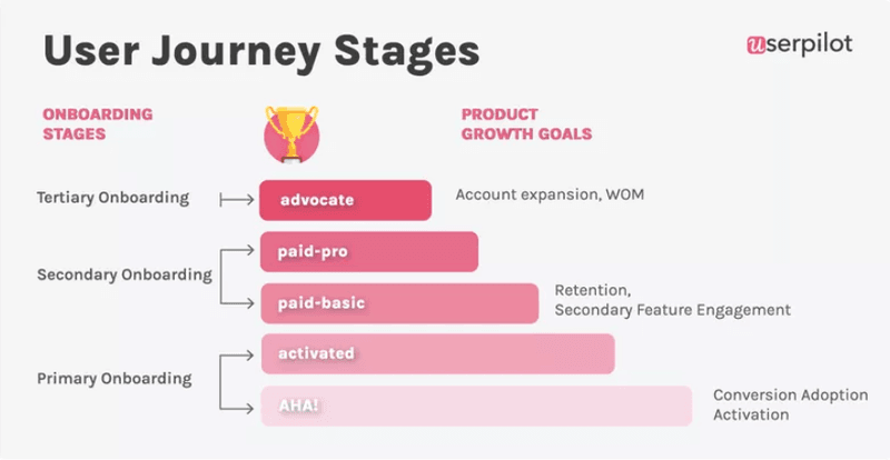
Later on, in the onboarding process, it’s common to teach established users how to make the most out of new features, especially ones that may have been added to your product since those users started their customer journey.
Product teams frequently introduce users with new features, as a way of trying to provide more value to customers and drive user retention.
Such features are not always intuitive to find and use, so product marketers need to guide customers in the right direction.
You can think of this process of customer education as a newly launched feature onboarding.
Why is new feature onboarding important for SaaS companies?
There are two main reasons why you should consider investing in user onboarding flows for the new features you build.
1. Your features will become more user-friendly
A great user onboarding experience makes it significantly more likely that customers will find and use your new feature.
Assuming that you’ve conducted careful user research and that the feature you’ve built is valuable, the customers who adopt your new features are less likely to churn.
Why would they? You’re providing them with something they want, AND you’re making it easy for them to discover it and use it.
Asana, for example, constantly introduces users to new features that might bring additional value to the user. A small tooltip can go a long way.
No one’s going to want to leave a product like that.
A higher rate of user retention means more monthly subscription payments for you!
But that’s not all…
2. Fewer help requests means you’ll save money on support costs
Look at the user onboarding experience from your customer’s perspective for a moment.
They see a new feature but are confused as to how it works.
Frustrated, they open a support ticket in an attempt to understand this new addition to a once familiar UI.
If your support agents respond in time, the customer will be mollified, but you will have still spent money paying a support team.
And if they don’t, well… let’s just say that this particular customer’s next NPS score won’t be super hot.
By contrast, if your user onboarding flow shows the customer how to use the new feature, the customer will be happy AND you won’t need to pay a support agent to assist them.
That means you won’t need to spend as much money on support salaries as you did before. Nice!
So what exactly might this new feature onboarding process look like in practice?
5 Common new feature onboarding techniques
Here are some ways that SaaS companies typically onboard their users into adopting new features.
#1 – Create release notes for groups of new features
If you’re announcing a group of new features all at once, it’s common to communicate that to your customer base using release notes.
Release notes can be distributed on social media, your blog, and your website, but it’s most effective to share them inside your product itself. That’s where you want your customer’s attention to be, after all.
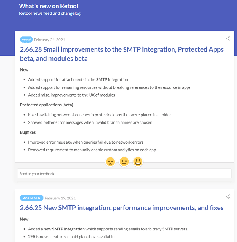
Although release notes are technical documentation by nature, it’s wise to make them as easy to read and accessible as possible. Use simple language, images, and videos to break down complex concepts.
If users want to deepen their understanding, you can always include additional resources for them to consult at their leisure.
From a branding perspective, it makes sense to stick to a release notes template that your customers recognize, ideally one that echoes the values of your brand. So if your brand is friendly and professional, then aim to communicate that in your release notes as well.
You can easily build templates for your release notes as modals in Userpilot, as well as subsequently share them in-app. Here’s how we launched our new and improved Resource Centre feature with an in-app modal.
#2 – Build walkthroughs that show off new features, step by step
If your new features are complex and related to your core value proposition, it might be worth creating an onboarding walkthrough for them.
A walkthrough is a collection of user onboarding UX patterns that all work in concert to show users how a new feature works. The customer walks through each onboarding pattern one at a time, step by step, hence the name.
Unlike a linear product tour, users are an active part of the process when it comes to product walkthroughs.
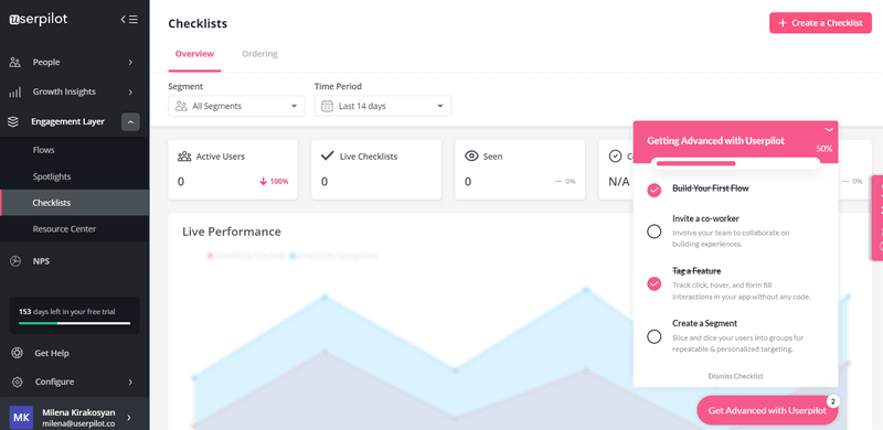
#3 – Build an onboarding checklist with a progress bar
Normally, SaaS companies onboard users with a checklist of tasks that the user actually has to complete of their own accord.
This is often known as an onboarding checklist – a list of key features that help users solve their JTBDs.
You can also include in your onboarding checklist a progress bar. A progress bar tracks how far the user has progressed through the features you’re trying to teach them.
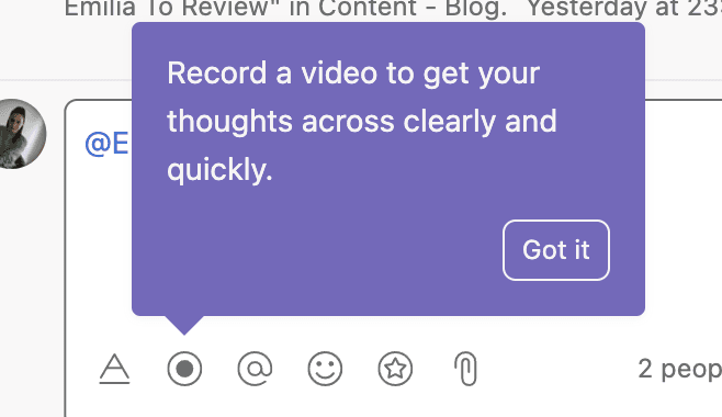
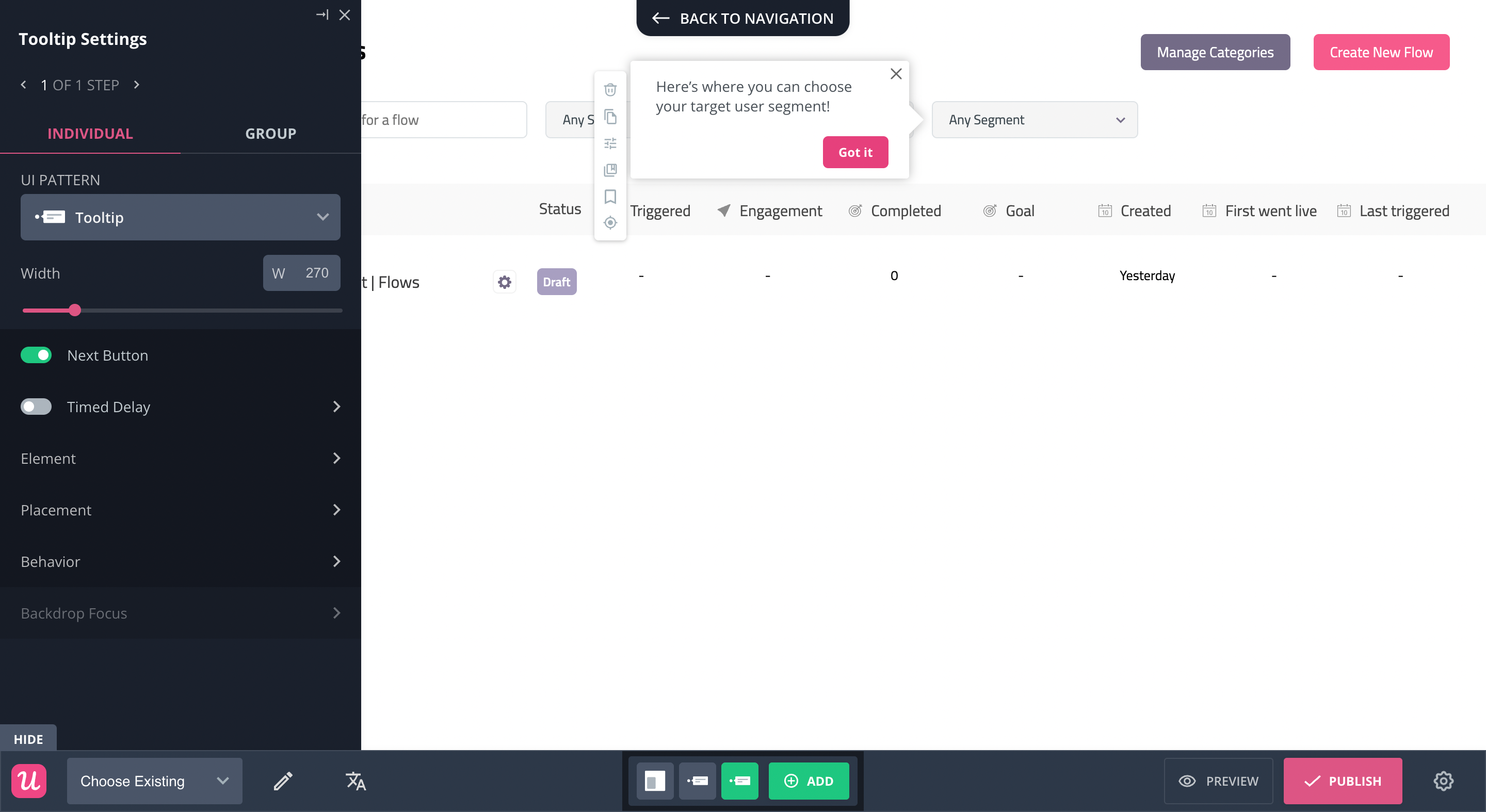
#4 – Use a tooltip to explain one feature at a time
But what if you’re only interested in onboarding users into one feature at a time?
In this instance, a tooltip is your friend.
A tooltip is a short piece of text that points at one UI element, normally displays when you hover over it.
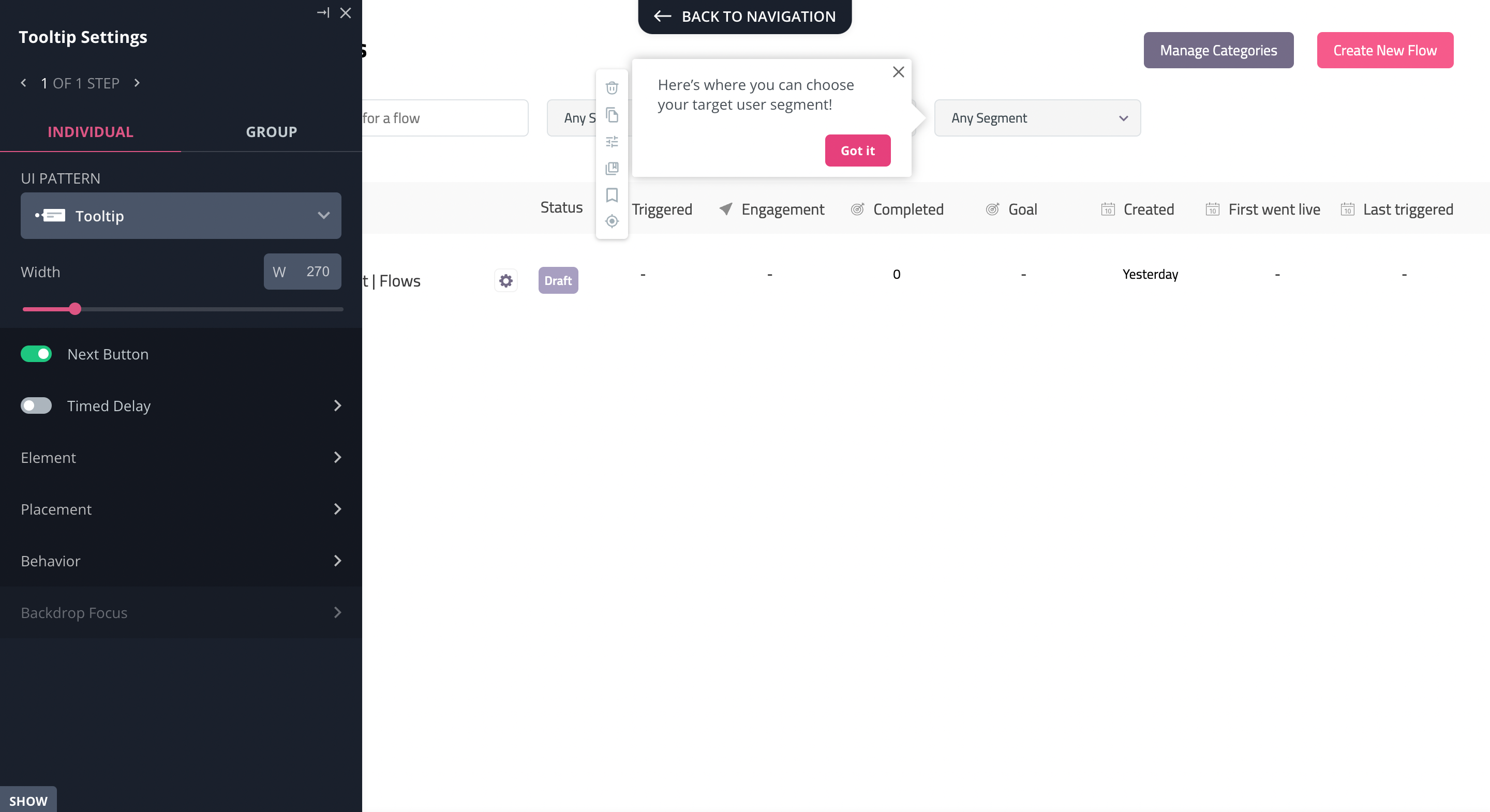
You can build two types of tooltips: a standalone “native” tooltip like the one above, or a sequence of tooltips that form part of a larger flow.
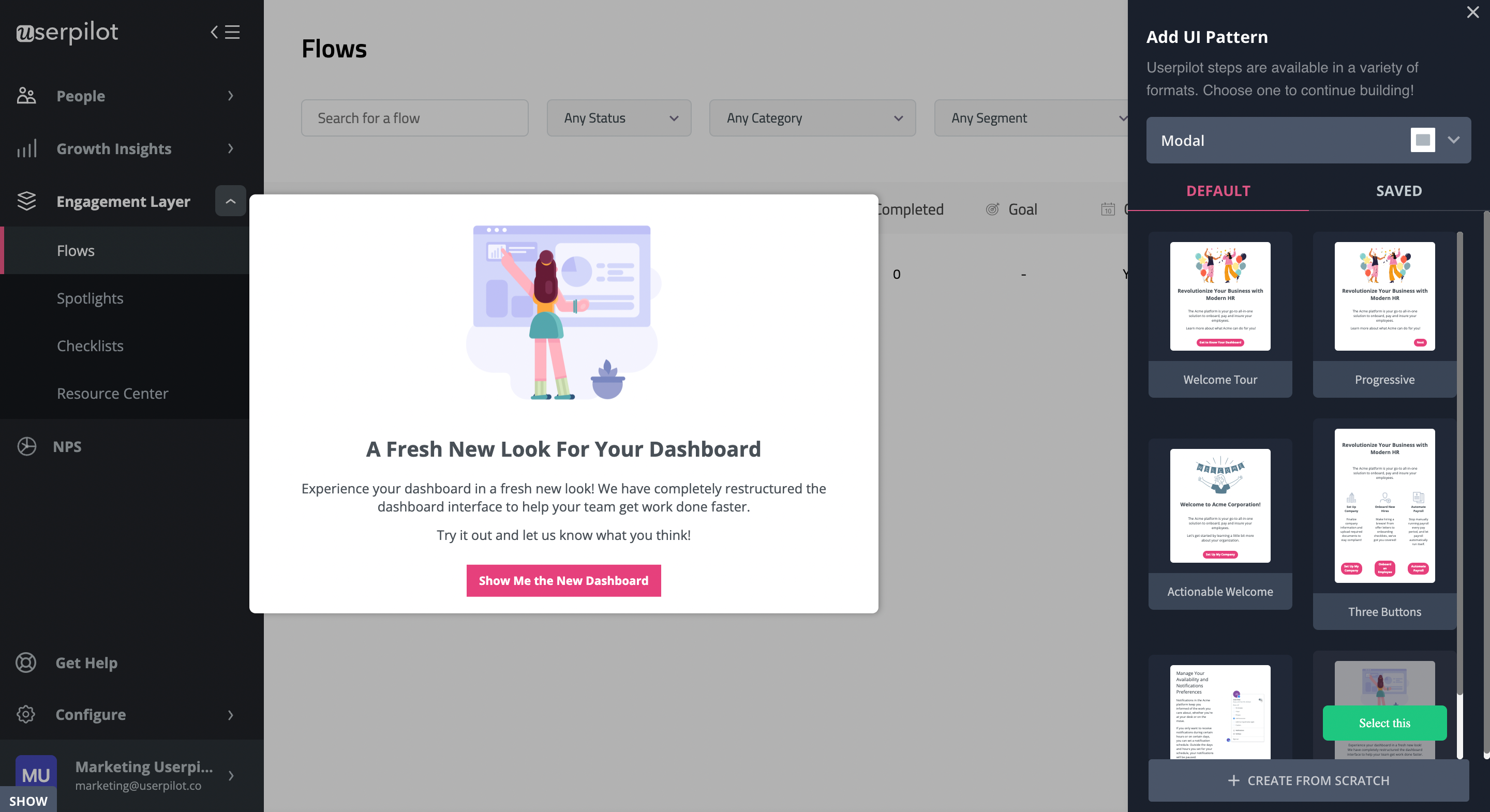
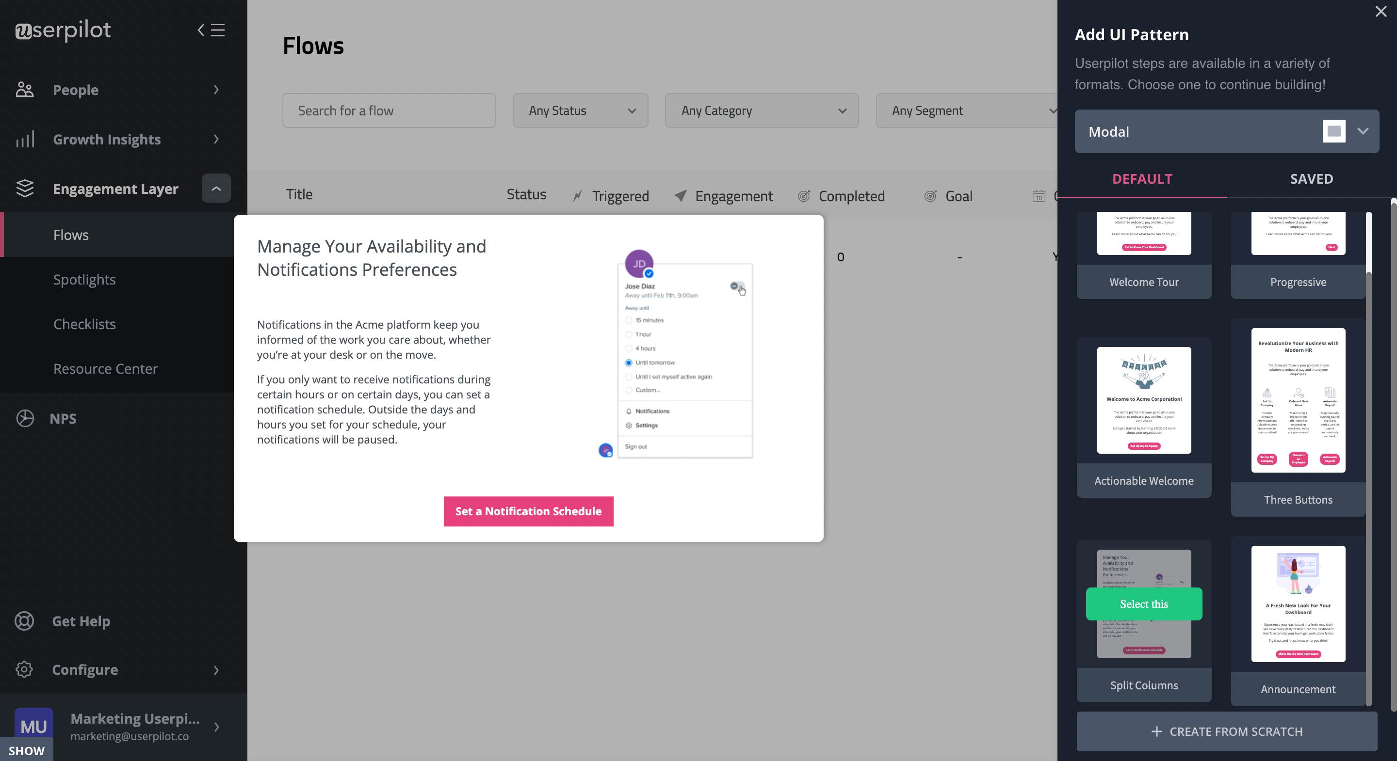
#5 – Create modals to direct customers’ attention towards new features
If your new feature is especially important or valuable, you might want to grab your user’s attention urgently by interrupting them in whatever they’re currently doing.
Modals are a great tool for this purpose. They consist of a large, rectangular text box that takes up most of the screen.
They are eye-catching because of their size, as well as the striking graphical elements that often accompany modals.
Note that the disruptiveness of a modal can be a weakness as well as a strength. If you overuse modals or other UI patterns, your customer is going to get frustrated that they constantly get interrupted.
You might want to avoid something in-app messaging overlapping.
This happens if the modals in question are system-generated, rather than voluntarily opened by the user.
So make sure you only include modals in your user interface when your feature announcement really is important.
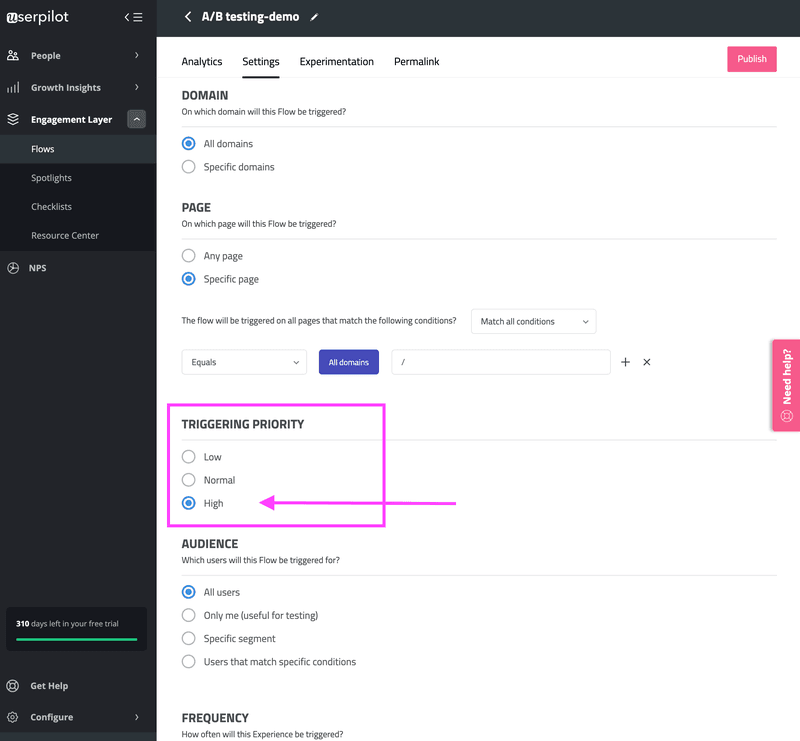
Also, you should pause or delay other in-app messages to enhance user onboarding experience.
Some tools will allow you to specify the triggering priority of your in-app flows.
What are the signs of excellent new feature onboarding?
Allow me to share some best practices with you that we’ve discovered in our conversations.
The best onboarding flows are hyper-contextual
By contextual, I mean that the onboarding should be in exactly the right place at exactly the right time.
Ideally, it should be so seamless from the user’s perspective that they barely even notice that they are being marketed to.
Tooltips are perfect for this, which is why they are such a popular secondary onboarding tool for enhancing contextual onboarding experience.
Tooltips appear right next to the UI element they’re explaining, point directly to the element in question, and can be programmed to appear automatically on the basis of user in-behavior.
If that’s not contextual onboarding, I don’t know what is.
Deliver a unique onboarding experience to each individual customer segment
Let’s be real here: there’s a good chance that not all of your users will judge your new feature to be valuable.
Imagine that you run a sales tool. You release a new widget that allows your customers to see the performance of all the sales reps on their team.
A new feature like this is only relevant to sales managers, not account executives who don’t have the clearance to view the performance of the other reps around them.
So if your new widget appeared to junior sales reps, your new feature would probably end up causing more harm than good.
The solution here is to use onboarding software to segment your users into distinct groups, according to their “Jobs to be Done” (JTBD) and in-app behavior.
Here’s what that looks like:
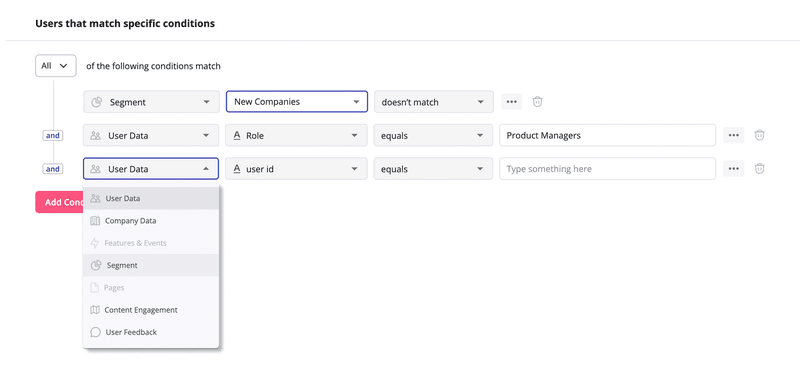
By segmenting your customers, you ensure that each user only receives onboarding about new features that are relevant to his or her individual use case.
User onboarding flows should be as interactive as possible
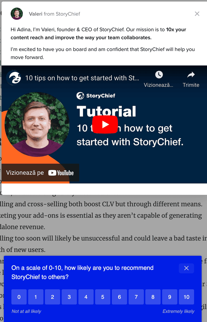
The worst thing you could do if you want to show off a new feature is use a static tooltip, like the ones that Pendo is (in)famous for:
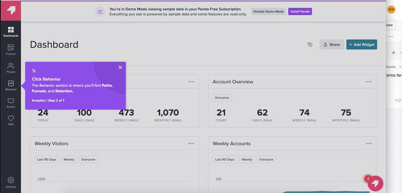
This problem is compounded if you use multiple boring purple tooltips like this in a row.
There’s no interactivity here. All the user is doing is reading the text passively.
By contrast, the best user onboarding experiences feel like a dialogue between your product and the user.
You can set up your user onboarding flows in such a way that they are responsive to the user’s input.
For example, in multi-stage feature tours, a user will only be shown the second part of the tour once he or she has completed the first stage.
Above all, there should be a focus on the customer actually using your product wherever possible, not just reading passively. Learning by doing is infinitely superior.
New feature onboarding examples that will inspire you
Now that you understand what new feature onboarding looks like when done properly, let’s check out some user onboarding examples and put some of the concepts we’ve learned together.
New feature onboarding example #1: Calendly
Calendly is well known for its appointment-booking software.
But there’s a problem. What if multiple busy people are meeting, and the odds of finding a time when all are free at once are scarce?
Calendly released this poll feature to solve the problem:
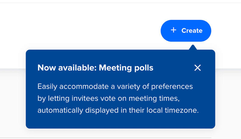
Note how the tooltip appears just at the right moment: when you’re about to create a meeting invite.
The header text is concise and easy to understand, and the subsequent body drives home the value of this new feature.
New feature onboarding example #2: Surfer
Surfer is an SEO tool that helps you rank your content on Google.
Recently, Surfer released two new features at once: Organizations and Unlimited NLP. Their chosen way to communicate this to their user base was release notes:
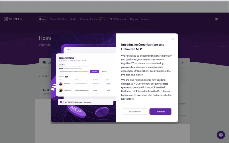
These notes trigger automatically whenever a user who has not seen them yet logs in.
The imagery on the left side is striking, matches Surfer’s brand colors and also demonstrates one of the two new features.
Note also that the CTAs give you a chance to read more information about the new features, if you so choose, but don’t force it on you.
New feature onboarding example #3: Airbnb
Airbnb’s software for booking private accommodation lets you chat with hosts to figure out the details of your stay.
If you’re staying in a competitive location like New York, you might sometimes need to speak with multiple hosts before you find something to your liking.
In cases like this, it’s valuable to be able to search through your chat history by keywords. So that’s what Airbnb added with this particular feature:
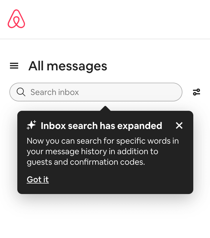
The tooltip is perfectly placed to successfully onboard customers into using this new feature. It’s right next to the search bar, so as to remind you that you can add keywords to your search.
The body text conveys the value of the new feature clearly, and the little star icon adds a dash of playfulness.
A user is unlikely to feel like this kind of tooltip is intrusive. And if they do, they can easily click on the CTA and be left alone.
Conclusion
And that’s a wrap! We hope that you’ve learned something by reading this far and that you now feel more confident about teaching your customers to adopt your new features.
If you want to save time and money in creating your onboarding process, you might consider looking into Userpilot.
A product adoption tool will help you build patterns like modals and checklists to supercharge your new feature onboarding process, all without having to write a line of code!
Grab a free Userpilot demo and start your onboarding journey today!
About the author


![What are Release Notes? Definition, Best Practices & Examples [+ Release Note Template] cover](https://blog-static.userpilot.com/blog/wp-content/uploads/2026/02/what-are-release-notes-definition-best-practices-examples-release-note-template_1b727da8d60969c39acdb09f617eb616_2000-1024x670.png)