How to Create an Effective Onboarding Tour with Userpilot
Most product tours suck. The onboarding tour is either too long, too generic, or so linear that it treats every user the same, no matter their role, goals, or experience.
The result? Users click through a few tooltips and drop off before they see any real value.
The good news? With the right approach (and the right user onboarding software), you can build a product tour that adapts to your users.
In this article, I’ll walk you through how to build better product tours with Userpilot.
A step-by-step guide to building your product tour
In this section, we’re diving into the top four steps you’ll need to take to make your user onboarding process effective!
Greet new users with welcome screens and collect important user data
Since your audience is visiting your product tour for the first time, they’ll ideally want to know more about your product and how you can help them. A welcome screen, in this instance, is a super effective way to acquaint yourself with them.
Alternatively, if you wish to know your customers better (e.g., their roles, pain points, or product use cases), you can use welcome surveys to gather user data. For example, here’s how our customer, Unolo, uses welcome surveys to familiarize itself with its audience:
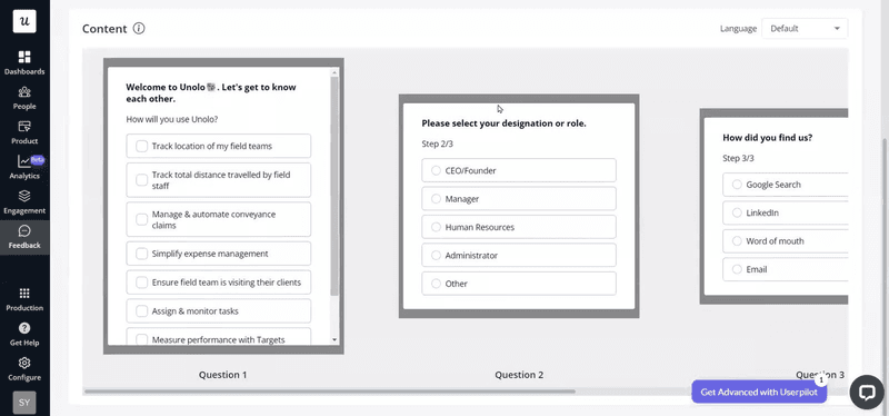
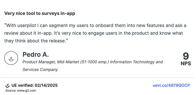
For both use cases (welcome screens and welcome surveys), Userpilot is here to help. To attest to our capabilities, here’s what one of our customers had to say:
Segment users based on their jobs to be done
Based on the data collected with the welcome survey, break customers with similar jobs to be done into user segments.
Then, you will be able to trigger a personalized user onboarding process that is relevant to each user persona. This will ensure your flow and conversations are contextual and relevant to the right user.
With the advanced segmentation tool in Userpilot, you can segment users into various categories based on their engagement, their feedback response, or company type.

We also offer a flexible triggering option, which allows you to create actions when a specific event has occurred. (You also further customize this by setting triggers for only a segment of your audience.) For example, if some users have not completed the initial onboarding, you can set a trigger to remind them.
Offer personalized onboarding tours for each user segment
With the user persona you’ve built from the above steps, it becomes easy to personalize the onboarding experience in a way that helps new users obtain value from your product based on their unique needs. I believe it’s also a good way of meeting user expectations for signing up for your tool.
For instance, if you use a project management tool or a product tour software, a product manager will have a different onboarding flow from a marketing manager.
Use checklists to engage each user persona with relevant key features
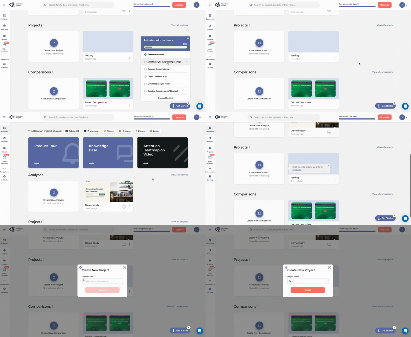
To optimize the onboarding flows you’ve created, use checklists with progress bars to capture user attention and make the process clear and detailed.
Onboarding checklists drive users to the activation point and highlight the most critical features users need to solve their pain points. The most important thing is to keep them short and straight to the point.
Something we always advocate at Userpilot is to create onboarding content alongside your checklists. For example, if your checklist mentions “Do XYZ,” you can give users contextual guidance through tooltips or videos on how to do XYZ.
As a reference point, you can look at one of our clients, Attention Insight. The company triggers guidance for each checklist task, walking users through the process so they can complete each action without friction.
Drive feature discovery and adoption with interactive walkthroughs
Use interactive walkthroughs to guide users step by step to engage with a feature for the first time. The checklist prompts them to take action and discover relevant product functionalities for them, while the walkthrough shortens the learning path by removing friction and increasing adoption.
The result? Users get to the activation stage, where they experience product value.
It’s my personal belief that interactive walkthroughs are better than linear product tours, simply because the former compels users to take action themselves. (Instead of just sitting idly on the other end of the screen!)
This is why our team enables branched onboarding in Userpilot, meaning users can follow different onboarding paths depending on their role, goal, or use cases.
This, in turn, allows you to make your onboarding experience engaging and truly interactive.
Collect user feedback regarding their onboarding experience and improve
Follow up with customers after onboarding, and understand whether the tour helped them unlock the value they signed up for.
In Userpilot, it’s super easy to set up survey triggers during key moments or user interactions to collect feedback. Currently, we offer 14 survey templates for different use cases. Every one of them has customization capabilities, so you can personalize them according to your will.
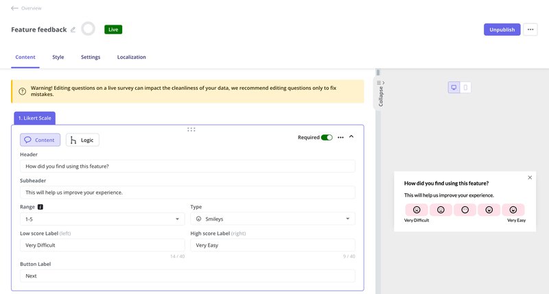
You can also localize your in-app surveys, get analytics, and create segment-specific triggers to ensure your questions are relevant to the user.
Effective strategies for creating onboarding tours
To increase your chances of creating an effective user onboarding experience, here are some strategies you should implement:
Replace linear onboarding tours with interactive walkthroughs
I personally think long and generalized product tours for onboarding users need to go. Users find them boring and abandon them in the middle.
Instead of an 11-step user onboarding process that confuses and overwhelms users with too much unnecessary info, create a product walkthrough that responds to the in-app behavior of the user in real-time.
Combine product walkthroughs in a resource center users can access on demand
Sometimes, users may accidentally exit the product tour, or simply may not need to go through it at the moment. Or they simply may feel the need to come back to it and experience it later.
Whatever the case may be, create an easily accessible and searchable resource center where users understand how to use the tool effectively and can access those tours when they want to.
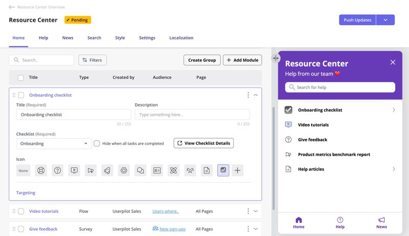
We’ve built Userpilot’s resource center with one goal in mind: To enhance the tour experience in the best way possible.
This is why you can:
- Include GIFs, videos, in-app flows, checklists, interactive walkthroughs, and other types of content in the resource center.
- Use JavaScript to create custom interactions (e.g., you can create a chat widget).
- Filter, categorize, and localize content to make it easier for users to navigate your site.
Trigger in-app experiences contextually
Declutter your product’s UI, one experience at a time, for the right user. Prioritize and make sure you don’t overwhelm users by including too much, too soon. Your onboarding tour should direct users to take one action at a time.
A personal recommendation I’ll make: Always use customer data to refine your onboarding process.
This applies not only to the initial onboarding session (when you introduce new users to your product). Rather, I’d recommend using this data whenever you introduce them to new features and product updates, or do any other similar activities.
You can easily collect customer data by leveraging Userpilot’s welcome surveys, reports (which detail how users interact with your product), session replays, autocapture, in-app polls, etc.
Once this data is with you, you can use it to create personalized tour triggers. In Userpilot, the process can look something like this:
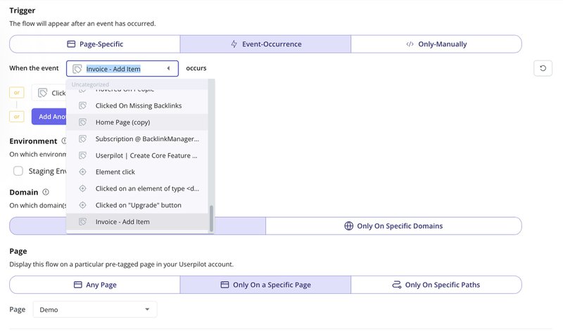
For instance, I could set up a tour about our analytics dashboard to only show for users who’ve been with us for 2+ weeks but haven’t clicked on “Reports” yet, catching exactly who needs that nudge.
Apply gamification to your product tours to improve user engagement
A neat trick I love is engaging users by adding fun onboarding ux elements to your onboarding experience.
Gamification can be in the form of celebratory modals when they complete a key action, badges, certificates, and other fun in-app experiences. This motivates users to further explore your product.
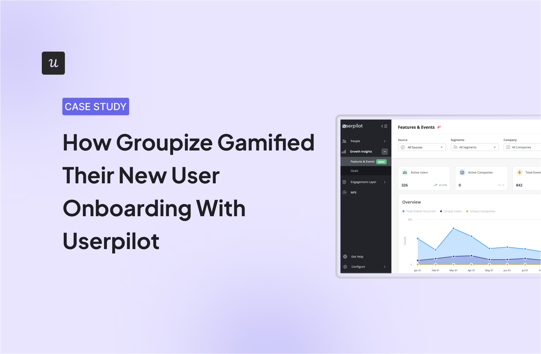
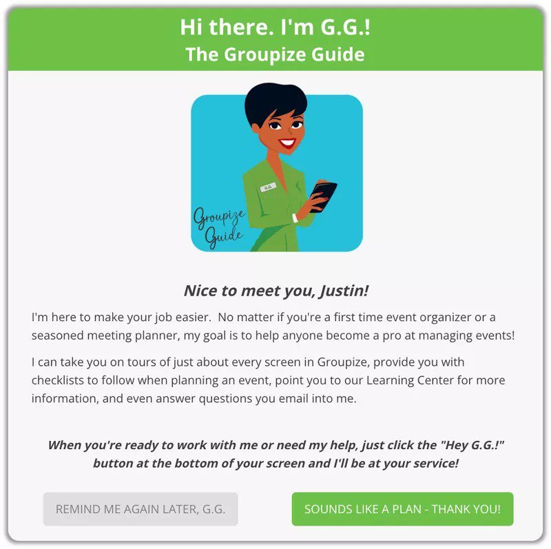
For reference, we can look at how Groupzie gamifies their onboarding process. The company built “G.G.,” an interactive assistant, with the help of Userpilot. G.G. assisted Groupzie customers through onboarding tours, interactive elements, step-by-step checklists, live chat, and more.
This onboarding gamification idea helped them reduce support tickets, and they were only directed queries that G.G. couldn’t solve.
Include in-app video tutorials in your onboarding tours
Videos are great for explaining complex things in a simple way. They are also more engaging, make it easy to replicate things, and shorten the time to value. Therefore, I believe it’d be beneficial to include them in your onboarding tour.
You can embed them into various UI patterns mentioned in this article, like modals or tooltips. You can even use AI-powered video tools like Synthesia to automatically generate video user guides by just typing in text.
If you’re looking to add video tutorials in a Userpilot onboarding workflow, you’ll be happy to know it’s super easy to do so; you can both embed or upload videos directly.
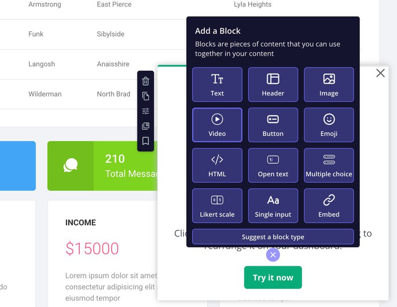
A/B test different versions of your onboarding flow
To do this, first, create multiple tours with different UI patterns and content types.
Then offer those tours to different user segments. After which, you can compare how they achieve the goals you set and identify the tour that results in a higher completion rate.
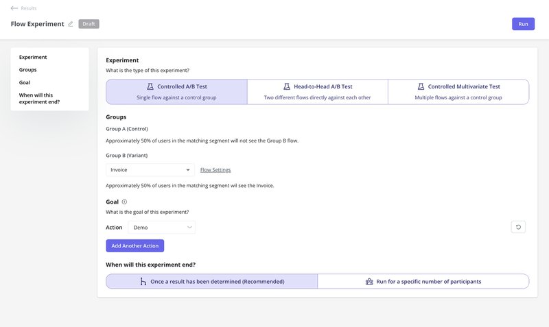
Currently, we offer three types of A/B tests:
- Controlled: Compares one variation of change against the existing version.
- Head-to-Head: Compares two variations.
- Controlled Multivariate: Compares multiple variations.
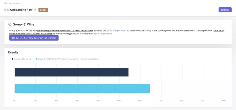
When Smoobu used Userpilot’s A/B testing capabilities (they tested two variations of their onboarding tour), it helped them deliver 17% more conversions.
What’s your main goal with an onboarding tour?
What’s your biggest onboarding tour challenge?
How many employees are at your company?
You’re ready for a better onboarding tour.
Userpilot helps you build personalized, interactive onboarding tours without writing a line of code. See how it works.
How do you measure the success of your user onboarding process?
You’ve done the hard work and put everything you need in place. But how do you know if it’s been a success or not?
So, here are some of the SaaS onboarding KPIs I recommend tracking:
- Activation Rate: This highlights the percentage of users taking action to get value from your product.
- Trial to Paid Conversion Rate: You use this metric to show how many of your trial users are turning into paying customers. Knowing this helps you forecast your revenue.
- Feature Engagement: For evaluating how well users engage with your different product features.
- Customer Onboarding Completion Rate: This is one of the most important indicators of the success of your onboarding process. It gives you an estimate of how long it takes users to complete their onboarding.
- Customer Satisfaction Score: This tells you how well users fared during product tours. You can make use of a customer satisfaction survey to get the data about this.
If your next question is “How to access such KPIs in Userpilot?” Well, you’d be happy to know Userpilot allows you to track multiple onboarding metrics (e.g., completion, step-by-step breakdown, average time to complete, etc.) through its analytics feature.
You can also filter results based on different categories (e.g., segments, companies, and time periods).
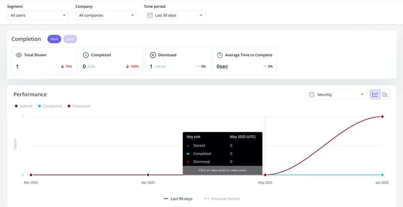
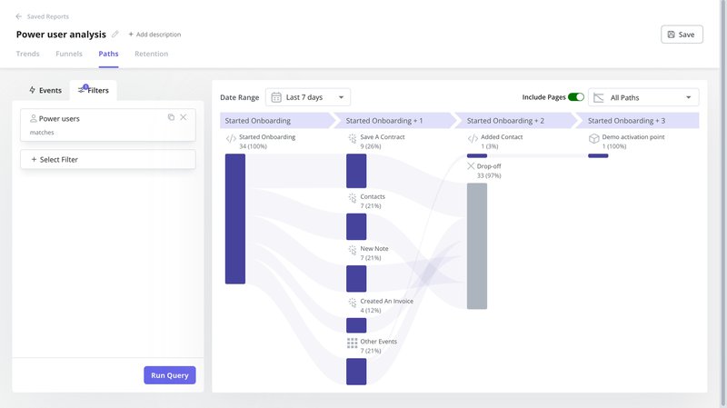
You can also run reports for different queries (e.g., paths, funnels, trends, and retention). This will help you identify how many end users completed the product tour, where they got stuck, etc. Same as before, you can filter your results here, too.
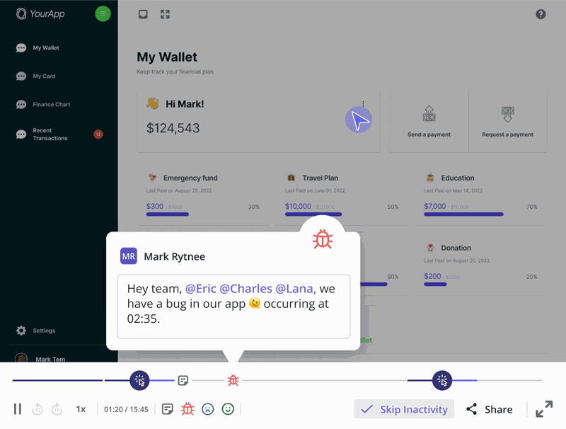
Lastly, another way you can track user journeys and identify their behaviors is by using session replays in Userpilot. This will track activities like page views, mouse movements, scroll depth, keystrokes, etc.
Inspiring user onboarding examples from SaaS companies
To show you what user onboarding done right looks like, we’ve highlighted two of our favorite SaaS user onboarding examples. Check it out.
Kommunicate’s interactive onboarding experience
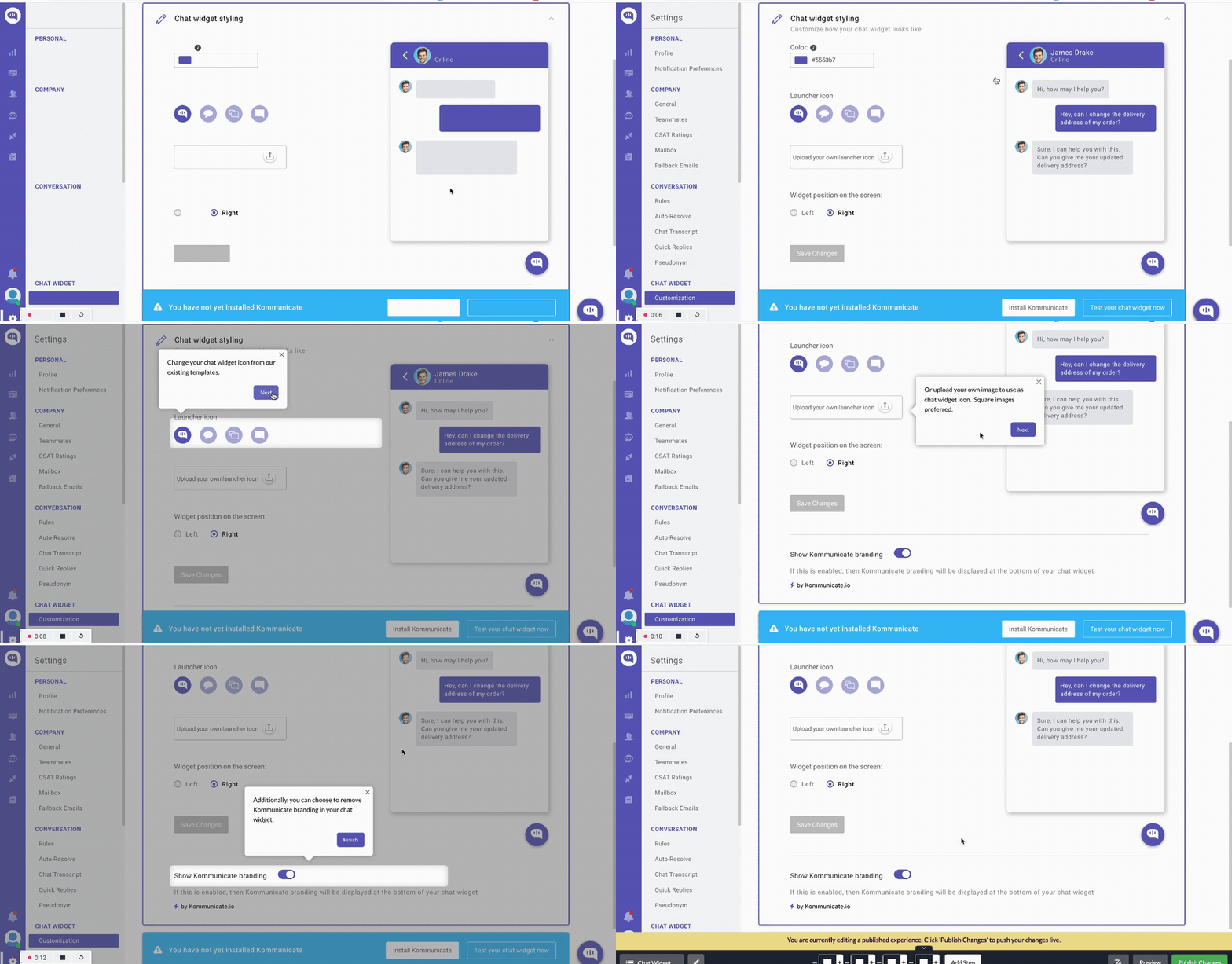
As a chat-based customer support tool suite, Kommunicate prioritizes feature adoption during its onboarding process. Here’s how they do it:
- Early wins: The core functionality of Kommunicate is its chatbot integration, and they make this an important part of their product tours. By ensuring new users add the integration button to their site, they unlock activation and feel a sense of accomplishment early in their onboarding journey.
- Gradual engagement: They go on to slowly point users to explore the different product features, especially those paying customers. In 5-7 steps during onboarding, they deliver upfront value with core features loaded with benefits that their customers enjoy the most. This, in turn, boosts both their feature adoption rate and conversion rate.
- Engaging interface: They make use of the right UI design elements to make onboarding seamless and engaging for their users.
Impala’s in-app guidance with embedded videos
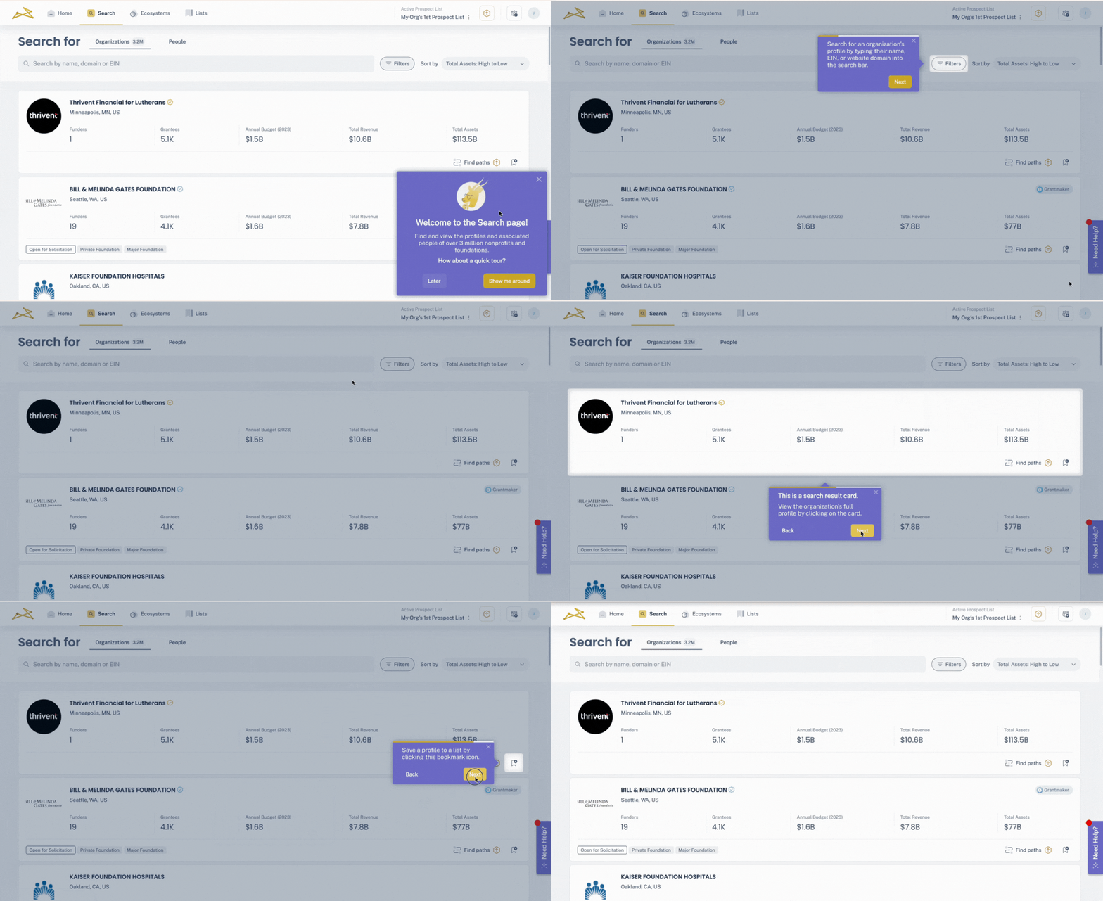
Faced with the challenge of creating a simple yet effective custom onboarding process, Impala turned to Userpilot to create product tours. Here’s what worked well for them:
- Personalizing flows: Impala created different product tours for different users; their initial tour was for fundraisers. They created an interactive walkthrough and used different UI patterns (tooltips, modals, etc.) to prompt users to take action.
- Gap identification: They used Userpilot’s custom dashboards and reports to track users who completed the tour vs. those who didn’t. Impala then retargeted the latter customers. They also used these reports to analyze customer behavior and find which steps/paths they take.
- In-app resource center: Impala deployed an on-demand resource center to help customers at friction points. They integrated with HubSpot and used different content formats to support this resource center.
Best tools for building an interactive onboarding tour
There are plenty of tools out there that promise to help you build onboarding tours, but not all of them are built for the same use case (or team size). Here are a few worth knowing:
- UserGuiding: A solid, affordable digital adoption platform for early-stage startups or small teams. It covers the basics well and is priced accessibly for companies just starting out.
💰 Starts at around $174/month. - WalkMe: Designed for large enterprises, especially for employee onboarding on internal tools or complex platforms. It’s powerful, but also heavy and more suited to IT-led teams.
💰 Pricing is custom and on the higher end. - Userpilot: This is what we built for companies that want to create personalized, scalable onboarding experiences across both web and mobile apps.
💰 Starts at $299/month.
Now, if you’re serious about building onboarding tours that actually drive adoption and scale with your product, let me walk you through what Userpilot can do.
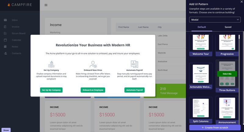
- Multiple UI patterns: To make your product tours engaging, you can use different UI patterns on different apps. For example, on web apps, you can leverage modals, slideouts, tooltips, and driven actions. On mobile apps, you can use slideouts and carousels.
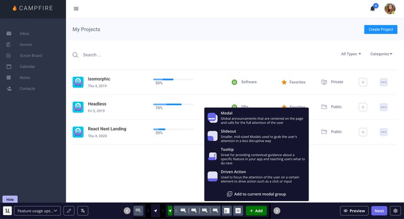
- Segmentation and triggering: You can create event or page-specific triggers to drive actions. For example, if a customer visits your reporting page, you can show them a tooltip on how to access reports. You can also segment your audience, so only the right users are targeted.
- No-code A/B testing: Userpilot allows three types of A/B tests, which allow you to optimize your onboarding tour content. The best part? You can also specify goals, zoom in on your test audience, and set a deadline at your own pace.
- Native flow analytics: Through this feature, you can find how many users started your onboarding process vs. how many completed it or dismissed it, alongside the average completion time. You can also filter replies based on user segments and timelines.
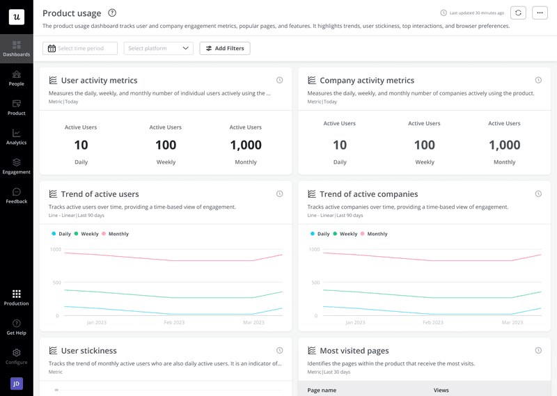
- Reporting features: We provide comprehensive reporting on different aspects of our product tour (e.g., funnels, paths, trends, session replays, autocapture, activity metrics, etc.). This, in turn, allows you to scale and optimize your performance.
Enhance user experience with Userpilot’s onboarding tour!
There’s no one-size-fits-all onboarding tour. What works for one user might completely miss the mark for another. And that’s exactly why generic, linear tours fall flat.
Onboarding today needs to be interactive, personalized, and backed by data, with built-in A/B testing, flexible segmentation, and real-time feedback to guide every decision.
That’s the kind of onboarding we believe in, and the kind we’ve built Userpilot to deliver. If that sounds like what you need, book a demo today!
FAQ
What is an onboarding tour?
An onboarding tour is your initial product tour. New users take this tour to understand how your product works.
What are the benefits of creating product tours?
We discussed the following benefits of product tours:
- Helps new users reach activation faster.
- Reduces friction and improves user retention.
- Improves new feature adoption.
What are the types of UI patterns used in an onboarding tour?
Modals, tooltips, hotspots, banners, etc., are some of the most-used product tour UI patterns.

