11 Great Onboarding User Flow Examples For SaaS Companies
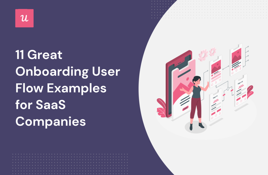
Creating an effective onboarding user flow is one of the most important tasks for any savvy SaaS owner.
If you want new users to get the most from your product – ultimately boosting user retention – you need to concentrate on getting user onboarding and mobile onboarding right.
In this guide, we break down real onboarding flows used by SaaS companies and explain why they work. These examples show how different products guide users from signup to value using distinct onboarding patterns.
Let’s dive in!
Understanding user onboarding flows.
In a nutshell, user onboarding describes the process that introduces users to your product.
Getting the onboarding experience right is tricky: it takes time for new users to understand your product’s main features. And until they understand your product’s features, they won’t start to realize the core value.
The tipping point where a customer begins to get value from your product is described as an ‘Aha! moment. You should craft an onboarding flow that slashes the time it takes to reach that tipping point, reducing the time to value.
The sooner new users get value from your product and grasp the core benefits of using it, the more likely they are to remain customers.
If you’re looking for a step-by-step guide on designing an onboarding flow from scratch, see our guide to user onboarding flows.
Why are user onboarding flows important?
To succeed in the modern software marketplace, products need to have a clear value proposition and focus on a user-centric experience. Crafting a great user onboarding flow is a key part of that.
User onboarding flows help in many ways:
- Introduce and familiarize new users with your application’s user interface by using a product tour.
- Showcase the core benefits of your product with in-app messaging.
- Teach new users how your application works.
- Finalize all account set up and registration for new users.
These benefits become much clearer when you look at how real SaaS products structure their onboarding flows in practice.
The three stages of the user onboarding process in SaaS
While onboarding flows differ by product, most SaaS onboarding experiences follow a similar structure across these stages.
User onboarding constantly changes and evolves – you should adapt your onboarding flows accordingly.
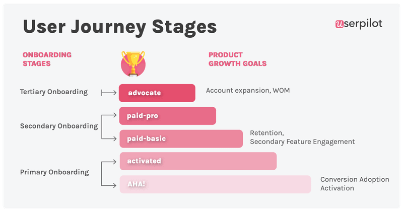
There are three distinct tiers to work through:
- Primary onboarding. This is new user onboarding – getting users to an ‘aha’ moment – and from there, to ‘activation‘ (experiencing value from your product’s core features).
- Secondary onboarding. This stage is about crafting onboarding flows that introduce a new user to your product’s more advanced features (that build on top of the core value in the first stage).
- Tertiary onboarding. This stage focuses on account expansion (upselling new features).
- Be focused on the user, not the product. Guide your users directly towards what brings them value – don’t show them the entire tool in a long, boring, product tour just because you’re proud of all the effort you put into building certain features.
- Create branched experiences. Personalize the onboarding experience for each user. Let them choose their path and identify which parts of the app make sense for them to learn about. Also, onboard and engage mobile app users by creating personalized messaging, push notifications, and surveys.
- Combine UI patterns for more holistic experiences. New user onboarding doesn’t have to follow the same repetitive process: you can use modals, tooltips, checklists, and other sorts of creative visual design to adapt the flow based on how a user interacts with your product.
- Test and learn. Iteration is the key to innovation. By focusing on testing concepts with your users and adapting the onboarding experience accordingly, you’ll give your product the best chance of success.
- Keep it simple. Brevity is key. Avoid overly long, meandering messages or product tours and cut to the chase.
- Don’t overload your users. Onboarding is a complex process: don’t overcomplicate things by asking your users to juggle multiple activities. Create an onboarding experience that focuses on one step at a time.
Types of user onboarding flow
Customers at different stages of the onboarding experience will have different goals: it’s tricky to get new user onboarding right if you adopt a boilerplate approach.
Let’s explore some of the most common types.
Account creation user onboarding flow
A key part of onboarding users is account creation – this type of onboarding experience is called a signup flow, and the goal is to finalize account setup and registration for all new users.
“Aha!” moment user onboarding flow
Rather than a flow that simply introduces users to your product, this sort of onboarding process is designed to bring users quickly to their ‘aha’ moment. These flows should focus on showcasing the core features and benefits of the product.
Use personalization to populate empty states using the information collected during the signup flow and enable users to make a fast start.
Create mobile-first onboarding flows, customizing welcome screens, carousels, and slideouts to deliver personalized messaging.
Product adoption user onboarding flow
This type of onboarding flow can be extremely tool-specific, but broadly it’s about educating users about how they can navigate your product’s interface to quickly get the best out of the tool.
With that in mind, this sort of flow should be primarily focused on education and helping users meet their goals using a range of techniques.
That might include an interactive walkthrough of a new feature, a detailed product tour, or a simple checklist and progress bar showing users how they are progressing through the onboarding process.
Feature and benefits user onboarding flow
These flows are primarily used during secondary onboarding – so not simply for new users.
As we discussed earlier, onboarding flows aren’t always about first impressions. They can also be a valuable tool for helping to teach users about new features and enhancements to your software.
Two tools used for this type of onboarding flow are tooltips and announcement modals.
Both are effective ways to communicate with your users about new features, target specific user segments with relevant messages, and get your customers to engage with your product.
What makes a good user onboarding flow experience?
Every SaaS has a different approach when it comes to user onboarding.
Why?
Because what works for one product might not work for another – you’ve got to consider the distinct offering, the user segments, and more.
However, there are some fundamental principles all good onboarding experiences share.
The goal for every product’s onboarding experience is to effectively navigate new users through the main features of the product. This enables first-time users to not only swiftly grasp how to use the product but also empowers them to slash the learning curve and experience value much faster.
All onboarding experiences should be user-centric.
That means using data and insight from user testing to iterate and evolve your onboarding experiences continuously.
What other principles should you follow?
Great user onboarding flow examples
Let’s look at how 11 different SaaS products tackle the user onboarding process and explore why they work.
#1 – Userpilot
Userpilot’s signup flow starts with creating an account using your email and setting up a password.
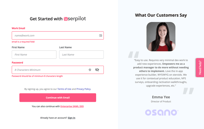
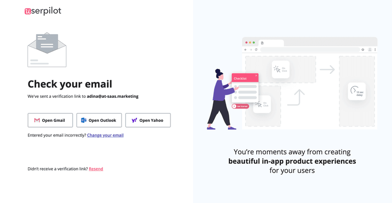
You are then prompted to verify your email. The use of social proof builds anticipation about what they’ll be able to do with Userpilot.
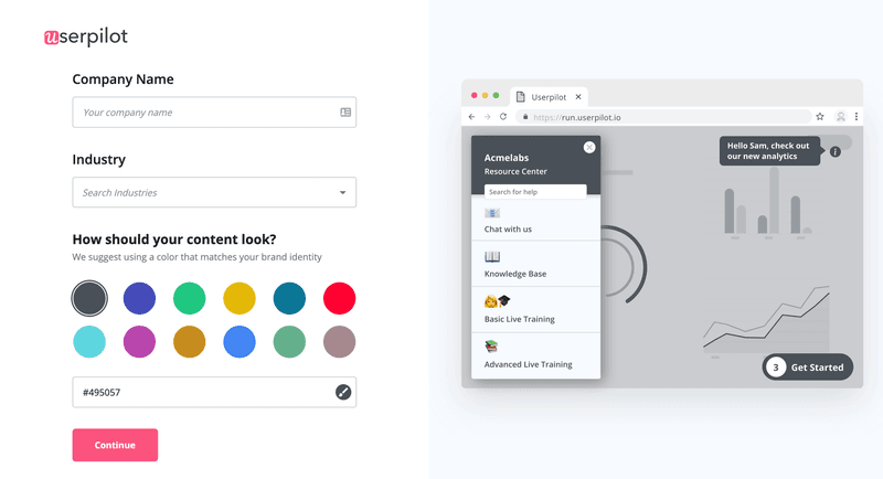
The next stage of the process asks you to choose a distinct brand color for the interface of the app – creating a more personalized experience.
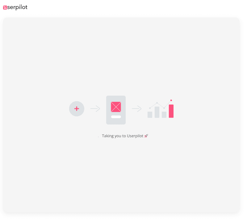
And then you wait for the dashboard to load.
Using a loading screen makes the most of users’ time by showcasing the product’s main capabilities while they wait.
Continue the onboarding experience by welcoming users to the app, and prompting them to take the final step to finish installation.
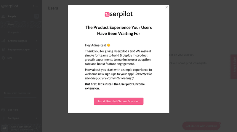
If a user skips it, they’ll see the tool with a range of empty states.
Userpilot focuses users’ attention on the first action they need to take to start getting value from the app. To help users we’ve included an interactive checklist that guides them through the next steps.
If a user runs into challenges, the help widget is clearly visible and provides a mechanism to contact support.
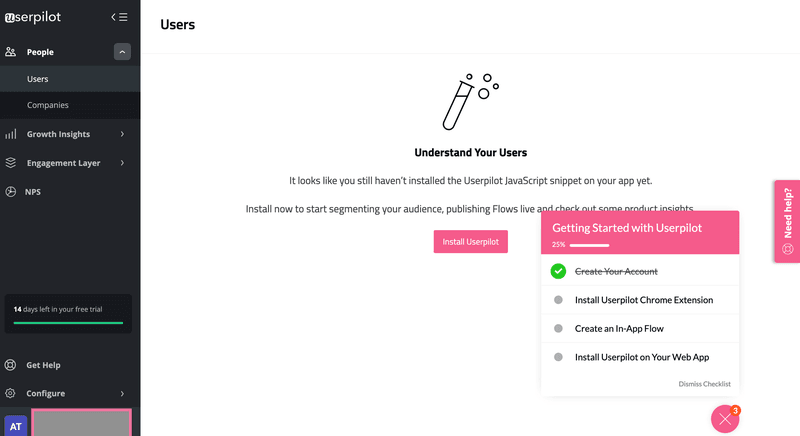
What makes the Userpilot onboarding experience so impressive is the combination of several themes: personalization, brevity, interactive elements, checklists, and a visually appealing interface.
These come together beautifully to create a fantastic first impression, help users understand the product, and ultimately help to boost customer retention.
With Userpilot’s mobile SDK, you can create targeted onboarding flows using slideouts, carousels, and push notifications without writing extra code.
#2 – Slack
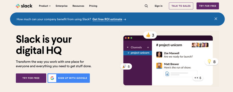
Slack’s onboarding starts directly from their home page.
The value the app has the potential to add to you and your organization is clearly articulated, and the ‘try for free’ button is an effective CTA drawing users in.
Next, you’re presented with the following screen. The data capture is stripped back to the essentials for rapid, frictionless signup.
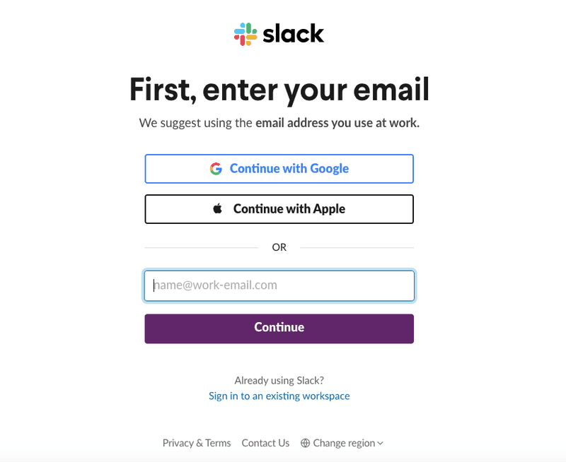
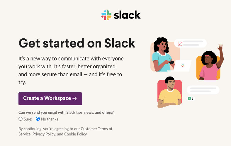
After you’ve entered your email, you’re presented with an engaging welcome screen.
Again, the value proposition is clearly articulated – it’s a great way to introduce users to the app.
In the next part of the onboarding process, Slack is keen to understand specific user needs so they can personalize what comes next.
They use a simple onboarding survey asking for the name of the company and what they’re working on.
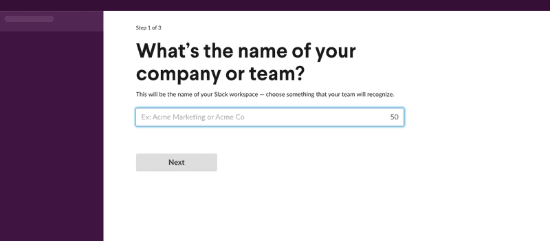
Asking one questions at the time helps to not overwhelm the user.
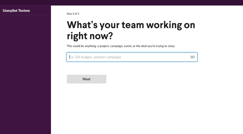
There are some intermediary steps encouraging users to invite their colleagues to collaborate, but that’s it! Users are shown the main Slack interface, with a prompt to complete a full feature tour.
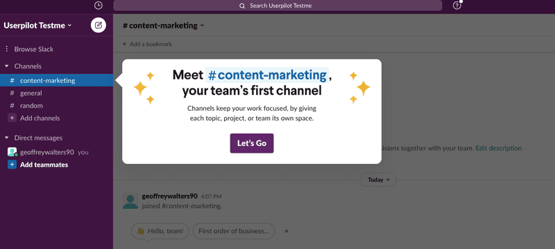
Slack has nailed the onboarding experience: they adhere to pretty much every principle we set out earlier.
Critically, their onboarding experience is ruthlessly designed to reduce the amount of time it takes for a user to start getting value from their tool.
#3 – Canva
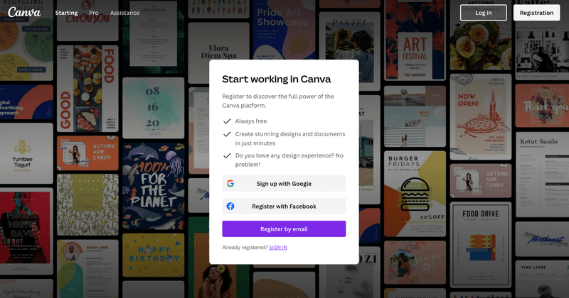
Canva starts their onboarding flow with a simple sign-up screen. The subtle background of completed designs is a nice touch.
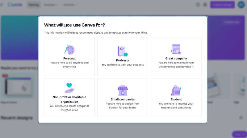
The next step prompts users for information about their goals. It’s a smart move to gather this sort of information during onboarding: it helps personalize the experience and give users a great first impression.
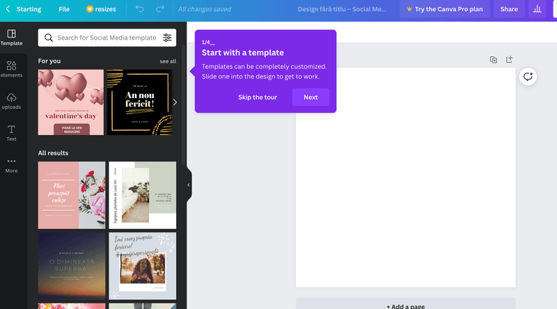
The next screen uses engaging copy to draw users towards a feature that lets them ‘play’ – an excellent way of getting to know the tool.
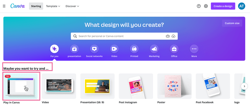
And that’s it!
From sign-up to creating original designs in a handful of steps, there are plenty of lessons to learn from the Canva onboarding experience.
#4 – Notion
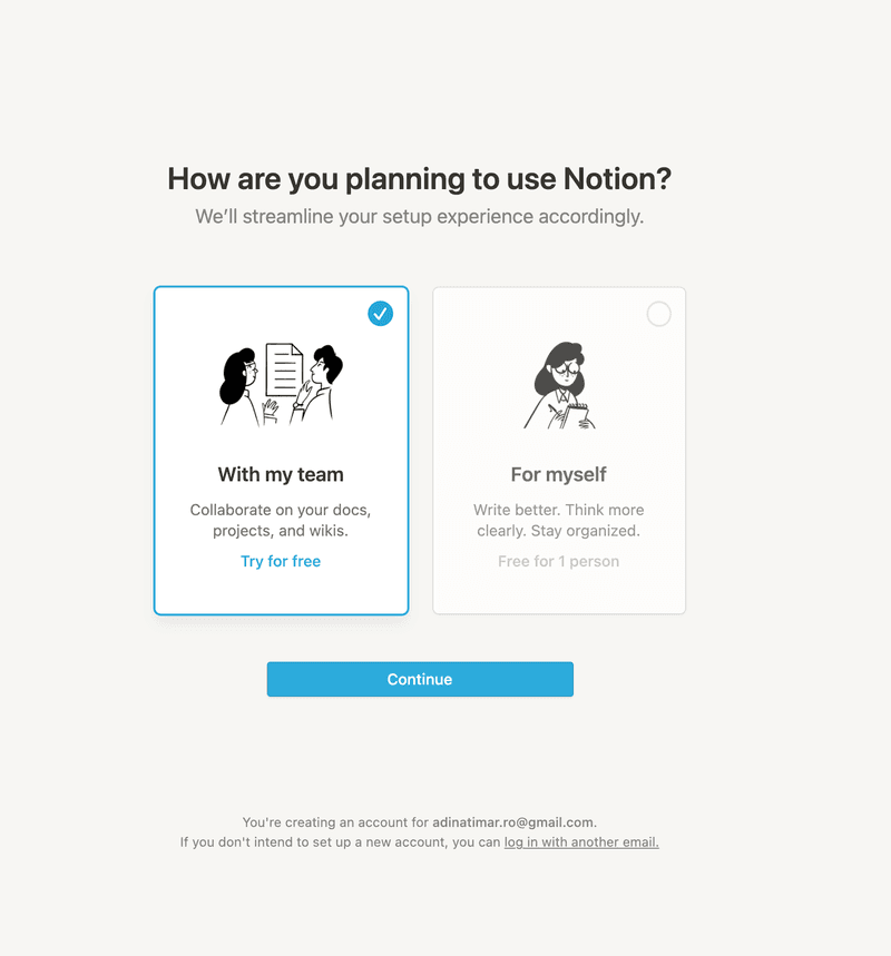
Notion’s onboarding flow starts with gathering some key data about the user, enabling them to branch the experience accordingly.
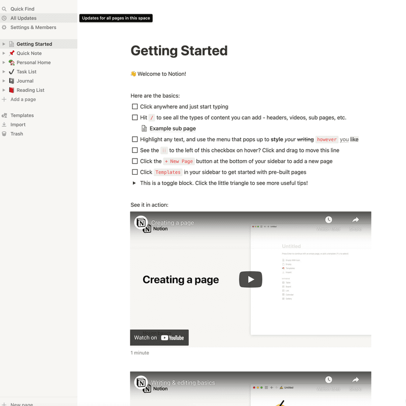
The user is then presented with a screen showing a checklist within Notion itself, setting the foundation for an effective ‘Aha!’ moment as the user grasps what the tool is for.
#5 – Fullstory
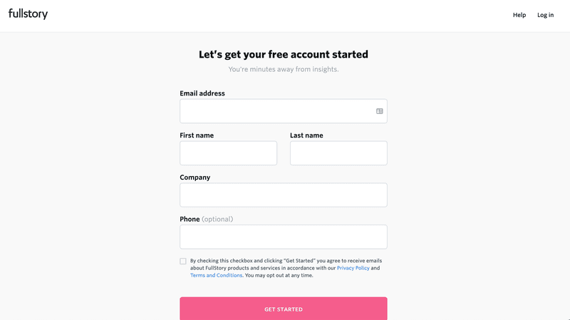
Fullstory kicks off the onboarding flow with a standard bit of information capture.
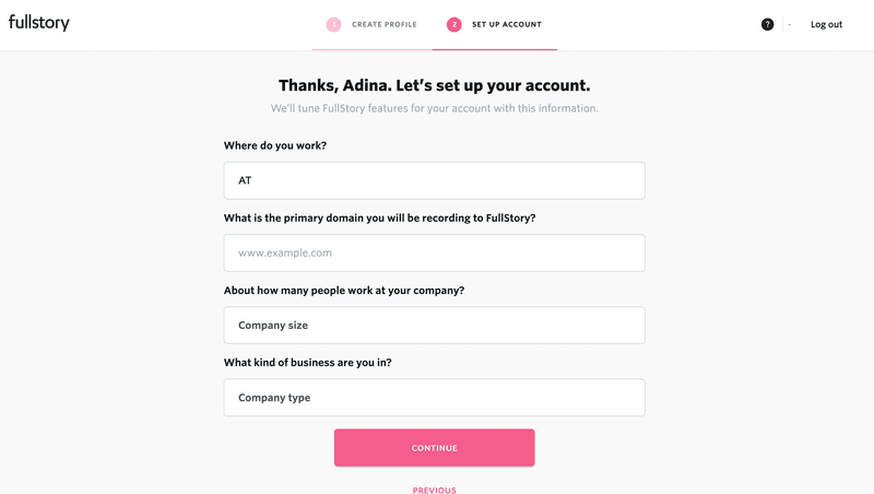
Next, they look at understanding what the user is trying to achieve with their app.
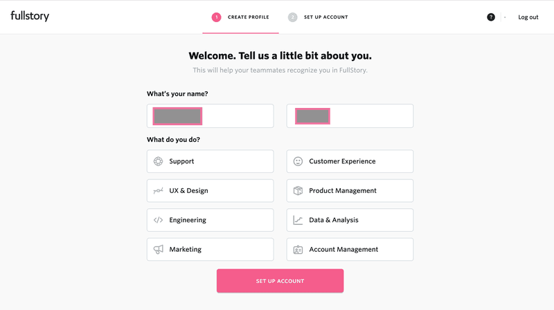
The progress bar is a great addition to this signup flow, increasing the chances of users finishing up the process.
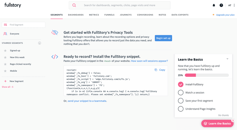
Once you’re done with that, you are greeted with an empty state prompting you to install the Fullstory snippet.
#6 – Productboard
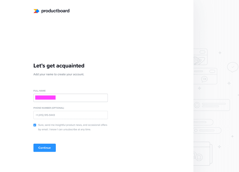
Less information is less intimidating for a user to complete the signup process with Productboard.
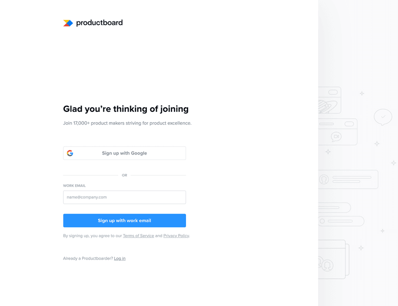
They ask the user for a few key pieces of information at a time, keeping the flow short and snappy.
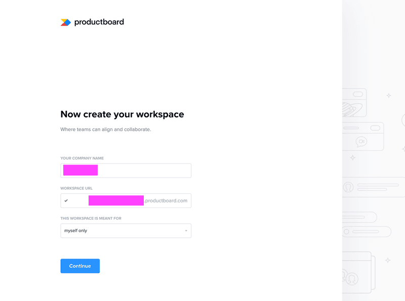
The final step is to set up a workspace. Just two pieces of information are needed to unlock this feature.
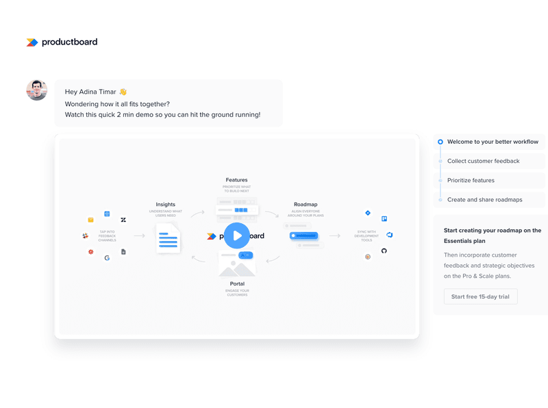
This welcome screen is engaging and gives users exactly what they need to get started.
#7 – Heap
After a user is asked to create an account, Heap prompts them to install the javascript code.
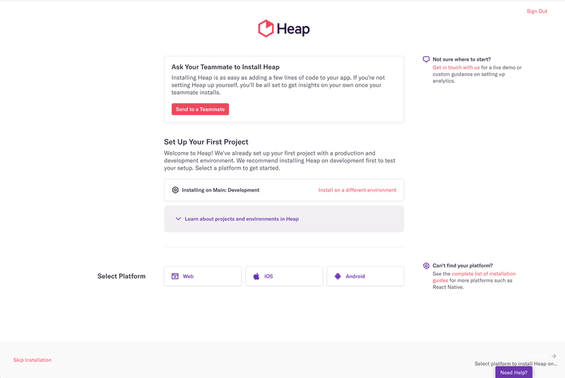
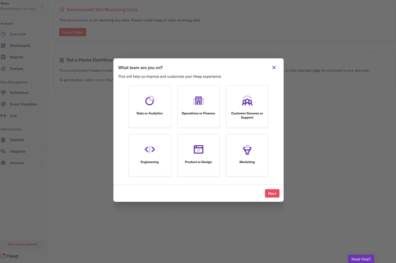
Heap then uses a visually appealing modal to collect relevant user data.
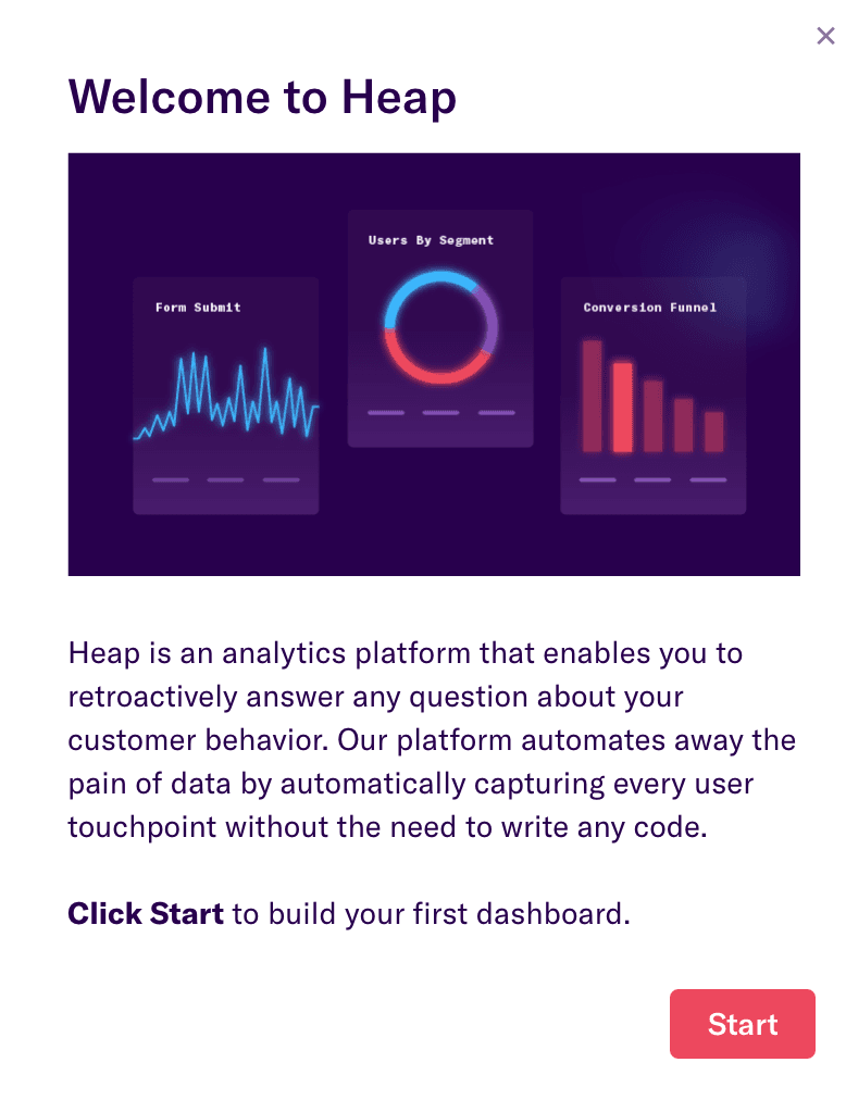
This is followed by a welcome screen with clear prompts to take action and for a user to create their very first dashboard.
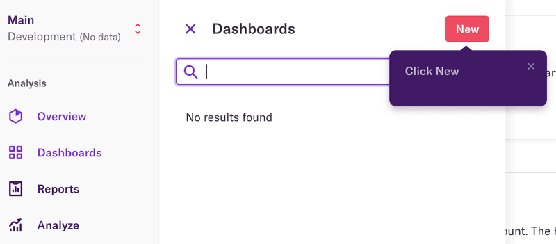
A series of tooltips are available to walk users through the detail and are triggered by the user when they need them.
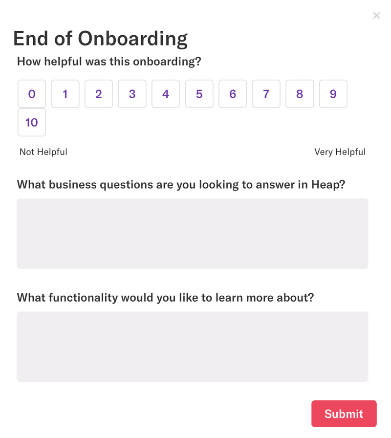
Heap finishes with an onboarding survey to collect insights and improve future onboarding experiences.
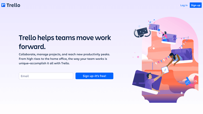
#8 – Trello
Trello has an extremely simple sign-up screen, with confirmation it’s free to start an excellent way of encouraging first-time users.
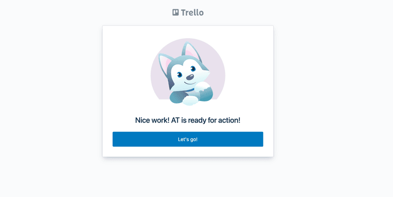
Users are greeted with a modal confirming they’ve signed up successfully.
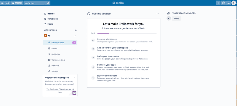
The final part of the onboarding flow is this detailed checklist, helping users navigate the app and getting to experience the value.
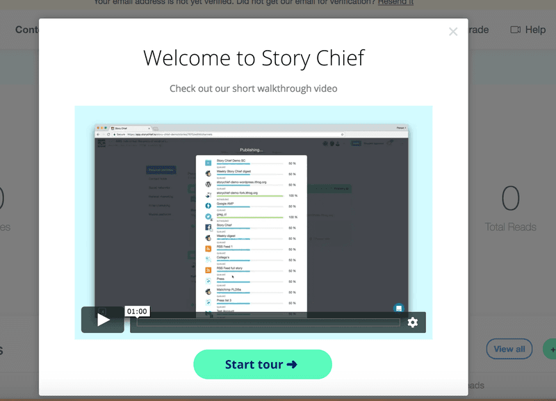
#9 – Story Chief
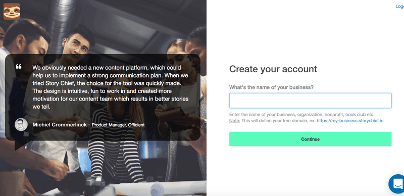
Story Chief has gone for a similar minimal approach, simply asking users for the name of their company.
The next part of the onboarding flow is a welcome screen with a video showing a short walkthrough of the app.
Users can then work through a checklist of activities to ensure they complete onboarding effectively.
#10 – ActiveCampaign
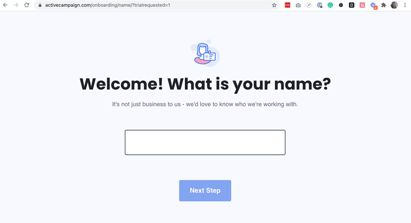
ActiveCampaign has a well-structured onboarding flow that prompts users to answer about one topic at a time, starting with personal details.
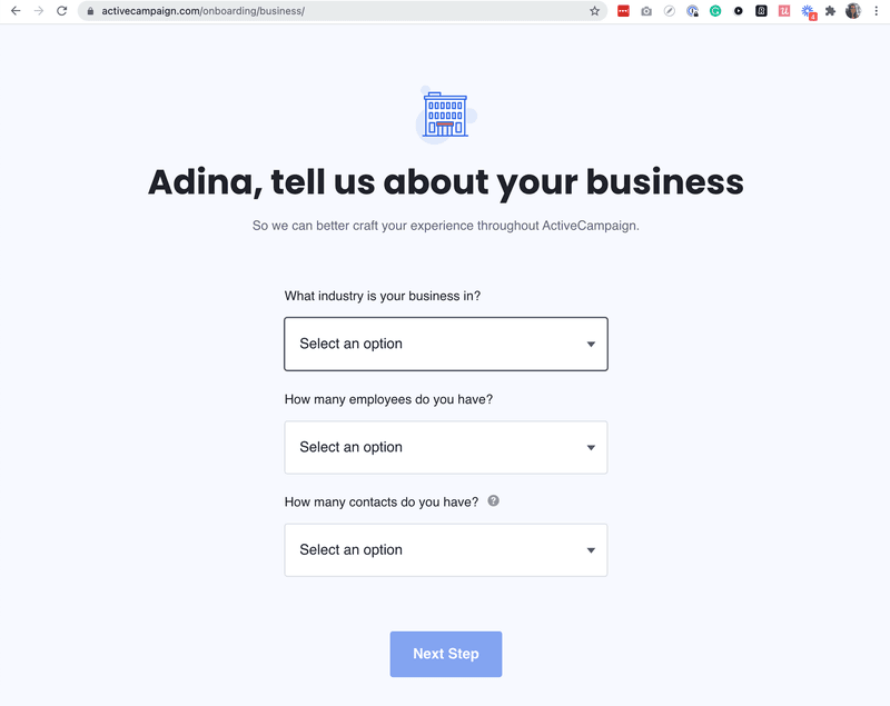
Their friendly tone continues to ask they ask for information about the user’s business.
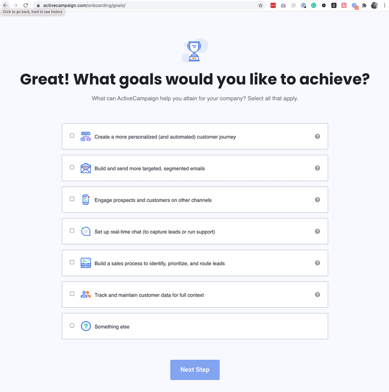
The next section focuses on company goals and objectives and allows for an even greater degree of customization.
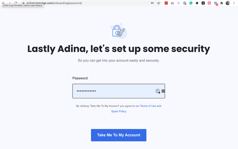
Password setup is the next step in the flow.
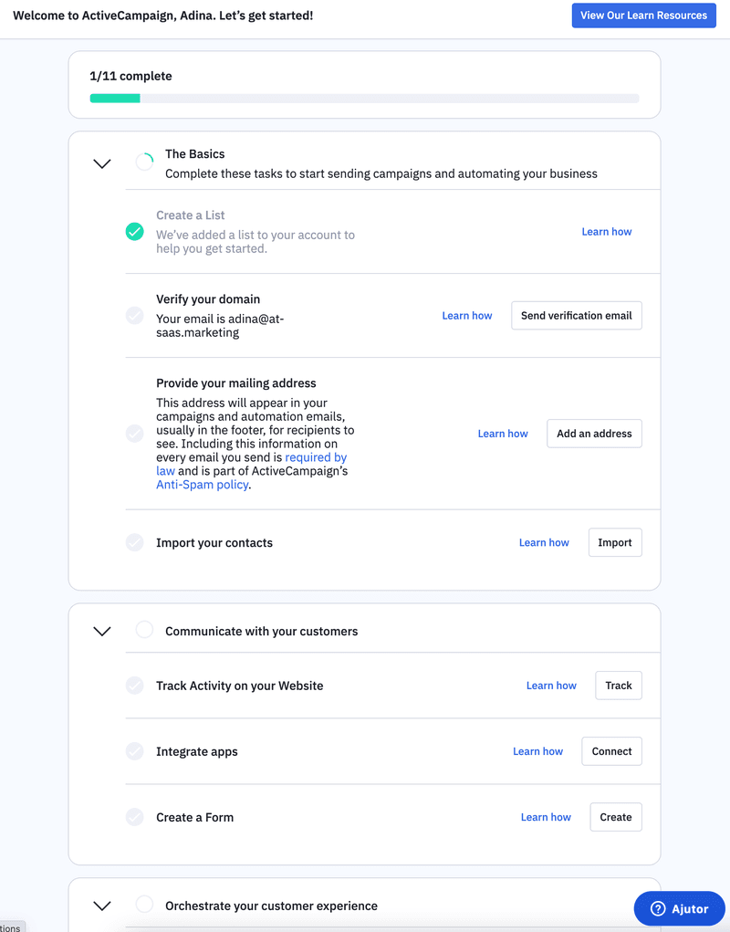
Finally, the user is presented with a detailed checklist of activities to work through.
#11 – Hotjar
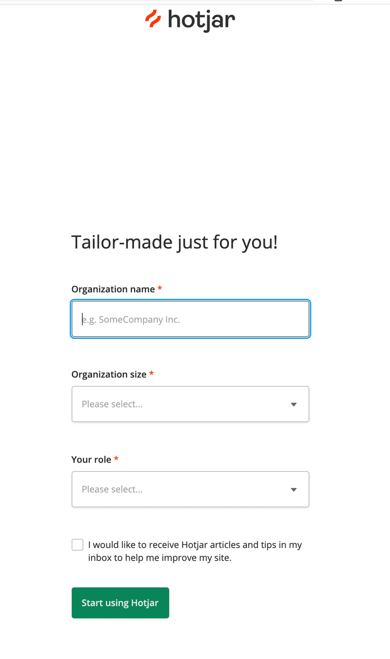
Hotjar starts with a straightforward signup screen.
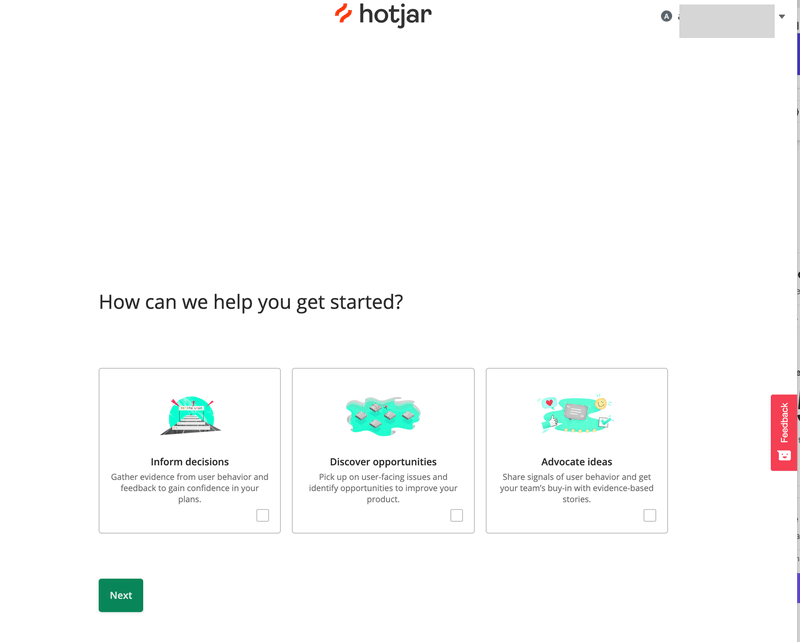
Next, they explore how they can help – enabling users to directly select the option most likely to meet their needs.
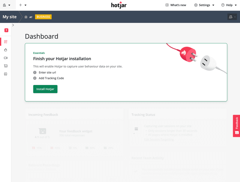
The user is then landed directly on the ‘Dashboard’ page, with a clear prompt to finish the installation and complete onboarding.
Conclusion
The onboarding flow examples we have discussed show that while no two products onboard users the same way, successful SaaS teams follow similar principles.
By sticking to the key principles – remembering to put the customer first and helping them make the most of your product – you’ll give yourself the best chance of getting it right.
Want to get started with creating a user onboarding flow? Get a Userpilot Demo and see how you can transform your onboarding process.

