Microcopy UX: Tips and Examples for Great UX Writing


How do you write a UX microcopy that helps users accomplish their objectives and drives conversions?
That’s what our guide to microcopy in UX design covers, so if you’re after the answer, you’re in the right place!
Let’s get right to it!
What is microcopy UX?
UX microcopy is the small yet significant pieces of written content in the user interface that help users navigate the application or website. Its main goal is to guide and inform users and enhance their user experience by making it more intuitive, friendly, and efficient.
Microcopy comes in different forms and shapes:
- Call-to-action (CTA) buttons (‘Sign up‘, ‘Book the demo’, ‘Learn more’)
- Error messages
- Placeholders and form instructions helping users understand what information to enter (“Password must be at least 8 characters.”)
- In-app guidance providing clarity about a feature or UI element (e.g. when you hover over it)
- New feature and product update announcements
- Confirmation messages (“Profile updated successfully.”)
Microcopy UX vs. marketing copy
UX microcopy and marketing copy are both essential parts of a product’s communication strategy but they serve different purposes.
Marketing copy uses persuasive, evocative, and emotionally driven language to engage and motivate users to take action. It appears in marketing collateral, and its main focus is promoting and selling the product.
In contrast, the primary goal of microcopy is to enhance the user experience by providing clear, concise guidance or information within a user interface. It focuses on usability and helping users navigate a website or app, complete tasks, understand features, and avoid errors.
To achieve this, it uses straightforward and instructive language – if marketing copy is a poem, microcopy is an instructional manual.
Why is it important to write a great UX microcopy?
While microcopy may not look particularly impressive or inspiring, it makes a huge difference to the quality of user experience and chances of product success.
Enhances user understanding and engagement
Microcopy is essential for onboarding users and helping them discover the relevant features. It also flattens the learning curve by helping users understand how to realize the full value of the available functionality.
It doesn’t stop here.
UX microcopy drives user engagement.
For example, the fact that you show users a feature once doesn’t mean they will adopt it. However, well-crafted copy, say in a contextually triggered tooltip, can prompt users to use the feature again and again until they start using it habitually.
Increases conversion rates across the user journey
No matter how intuitive your product and UX design are, some customers will get stuck.
Microcopy helps users overcome challenges and guides them at the key touchpoints, increasing conversion rates.
Even if there are no bottlenecks in the user journey, customers simply need a nudge to take action. This could be a CTA button prompting them to sign up for the free trial or a modal encouraging them to upgrade their plan based on their usage.
Builds customer trust
Microcopy also increases customer trust and loyalty.
How so?
First of all, microcopy that offers assistance makes users feel supported. This support enhances their trust in the platform, especially when they encounter challenges or need to make important decisions.
The tone of the microcopy can also convey empathy and understanding, making users feel that their needs and concerns are recognized. For example, friendly and helpful error messages can create a more positive experience than ‘cold’ technical ones.
Finally, microcopy can build trust among diverse user groups by improving the accessibility and inclusivity of the product.
The implications of poor microcopy
What happens if you get your microcopy wrong?
Well, it isn’t going to improve the user experience, that’s for sure. Most of the time, it’s likely to make it worse.
Greater user confusion and frustration
Microcopy is like road signs guiding drivers. They show them when to slow down, give way, and which turns to take. When navigating a complex highway system, they are absolutely priceless.
Unless they’re inaccurate, contradictory, or provide too much information.
If that’s the case, they can confuse the driver, waste a lot of their time, and, in some situations, cause a crash.
That’s exactly what happens when your microcopy is subpar. Instead of helping the user and removing friction from their experience, it confuses and frustrates them more.
Higher chances of customer churn
If poor UX microcopy confuses users instead of helping them overcome their pain points and provides inaccurate information, how likely are they to come back for more?
The early adopters may persevere for a bit, but most users won’t have the patience to deal with a product that’s difficult to use and doesn’t satisfy their needs.
They will churn.
Tips for writing better microcopy for a great user experience
Considering how important microcopy is for robust UX, let’s have a look at a few tips and best practices that will help you improve it.
Maintain a consistent tone of voice
Consistency is the key to writing trustworthy and accessible copy.
When the microcopy across different parts of an application or website sounds like it comes from the same source, it creates a sense of reliability and professionalism, which can increase users’ confidence in the product.
Consistent microcopy can also help you reinforce your brand’s personality, build a connection with users, and stand out from competitors.
Tailor your messages to meet your audience’s needs
Personalization of UX microcopy enhances the user experience and the effectiveness of the user interface.
Think about it:
How do you feel when you get a message or email with information that is irrelevant to your circumstances?
Confused? Disappointed? Don’t blame you.
Tailoring the message for different user personas or segments based on their past behavior increases the relevance of the message and allows them to achieve their objectives in less time and with less effort.
Moreover, such customized microcopy creates a more inclusive experience for users with unique accessibility requirements.
Finally, it sends a message to the user that you understand their needs and know how to satisfy them. This is key to building long-term relationships.
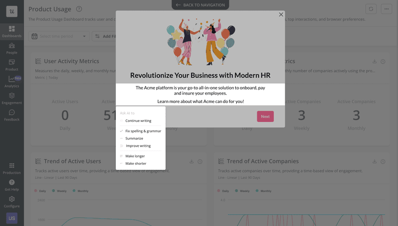
Use AI to write good microcopy
Writing good microcopy is easier these days than ever before, thanks to the widespread use of AI.
There are plenty of specialist AI-powered writing tools around, and many businesses embed AI technology in their product to increase their efficiency and effectiveness.
Prioritize clarity over creativity to remove potential user concerns
Remember the poetry analogy above? Well, the problem with poetry is that not everybody gets it.
That’s why microcopy isn’t necessarily the place to show off your creativity and ability to captivate readers or evoke emotional reactions.
Instead, focus on crafting clear and functional messages. Use simple language and avoid jargon. If you’re using humor, make sure it’s culturally sensitive and doesn’t obscure the main idea you’re trying to convey.
In this way, you reduce the risk of confusing or even offending users if they misunderstand or misinterpret your messages.
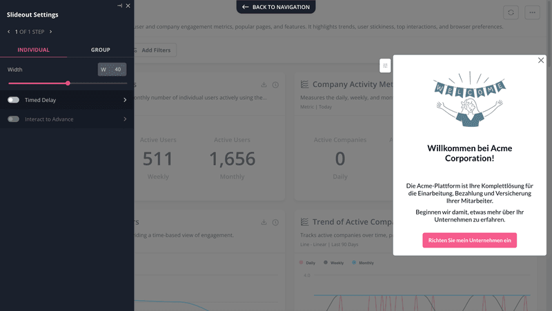
Localize UX messages for different audiences
The odds are that the user base of your SaaS product is spread all over the place. It’s likely that many users speak English, but not all. And even if they do, their command of the language may not be sufficient to grasp all the intricacies of the product.
So what’s the solution?
Localization.
Thanks to AI, it’s easy to automatically translate your microcopy into multiple languages so that users can read it in their native tongues.
Beware though that AI-powered translations may not cut it when it comes to complex and niche products. That’s why run them through a native speaker to ensure nothing is lost in the process.
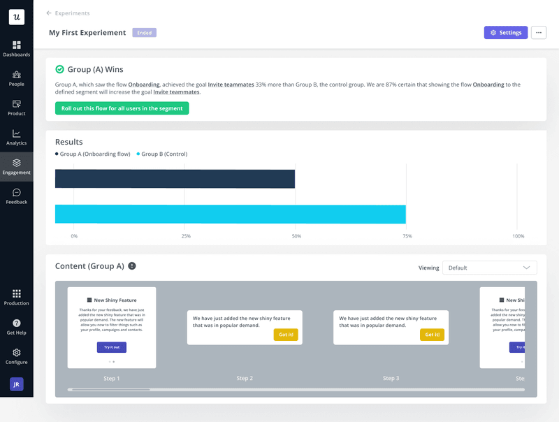
Test the impact of your UX microcopy and iterate
Before you trigger the messages for all your users, it’s good practice to test it with a small user cohort. In this way, you reduce the potential damage that poor microcopy could cause.
To do so, you can run A/B or multivariate tests to measure the effectiveness of various microcopy versions.
In such tests, you choose a representative sample of your user base, divide it into several groups, and trigger a different version of the copy to each of them. Then watch which performs the best.
A slightly more time-consuming but potentially more insightful way could be testing your copy through usability testing.
This involves giving the test participants a task to complete and watching them perform it. This is usually followed by an interview during which you collect qualitative feedback on their experience.
Examples of microcopy in UX to take inspiration from
Would you like to see how leading brands put the best microcopy practices to work?
Let’s look at a few brilliant examples of microcopy in UX design.
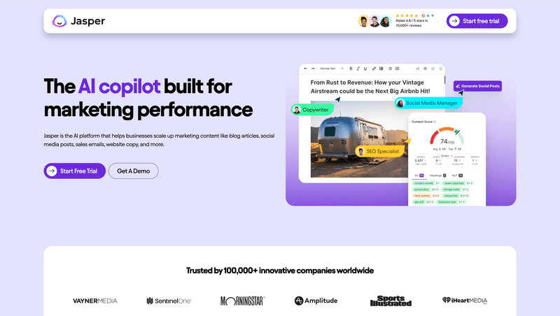
Jasper’s free trial page that motivates users to sign up
Jasper was one of the pioneers in the AI writing assistants niche, so they should know a thing or two about drafting solid microcopy.
Their landing page doesn’t disappoint.
The main heading, “The AI copilot built for marketing performance”, clearly introduces the product and its value proposition.
More details about specific use cases and Jasper’s target audience follow:
“Jasper is the AI platform that helps businesses scale up marketing content like blog articles, social media posts, sales emails, website copy, and more.”
Finally, there are two buttons with CTAs: “Start Free Trial” and “Get A Demo“. Simple but effective.
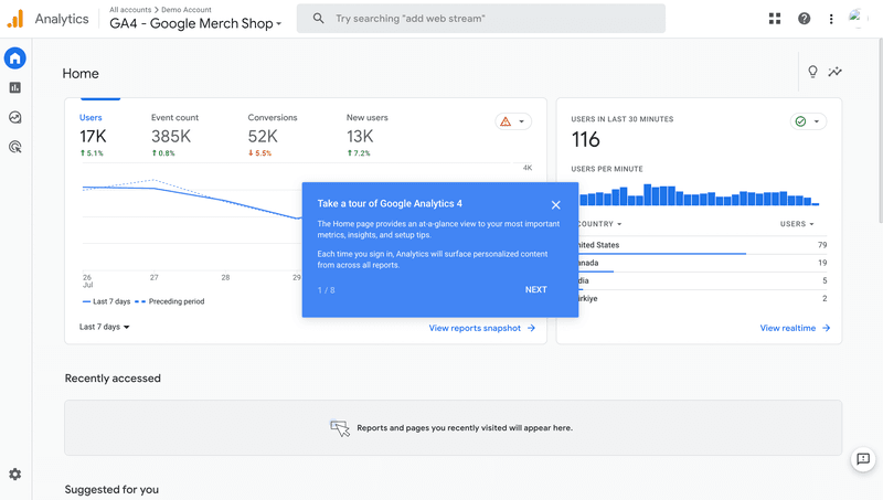
Google Analytics product tour message to onboard users
When Google launched Google Analytics 4, its UI was significantly different from its predecessor, Universal Analytics. It also offered additional functionality that wasn’t available in the previous version.
As a result, getting your head around the new tool took a while even for proper GA ninjas.
To help Universal Analytics users transition to the new product and onboard new signups, Google offers a product tour. It walks the users through the key features, dashboards, and reports.
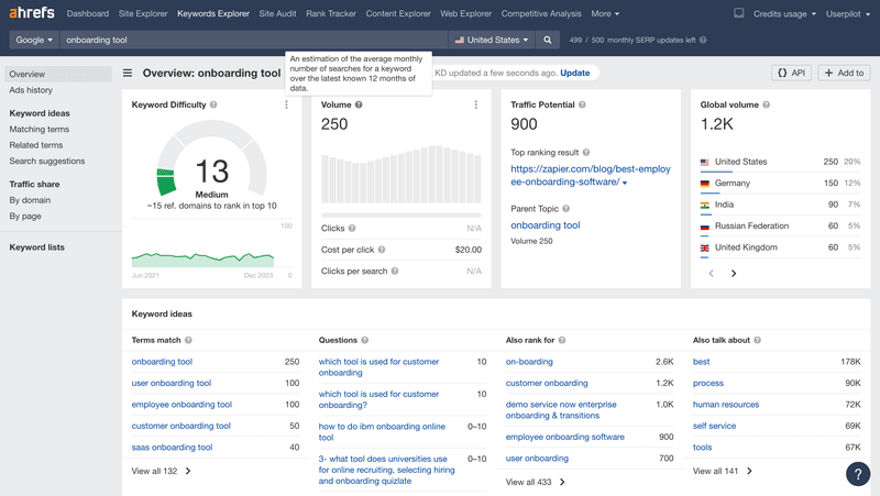
Ahrefs explanation message to alleviate users’ doubts
Ahrefs, one of the leading SEO suites, uses tooltips as well.
However, their main role is to provide guidance and information about its features and UI elements.
Whenever you hover over an element of the dashboard, a native tooltip appears. It explains what the feature does or how to interpret the metric.
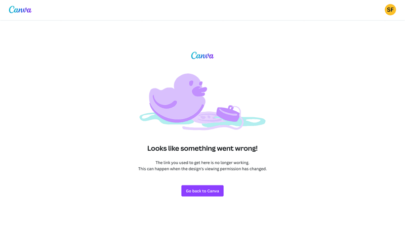
Canva’s simple error message
Canva is a graphic design platform for non-designers known for its intuitive and user-friendly design.
Microcopy contributes greatly to the outstanding user experience Canva offers.
Just check out this error message.
The heading, “Looks like something went wrong” plainly states that there’s an issue.
Next, the message provides the details of the issue (the link is no longer working) and explains why this could have happened (the designer’s viewing permission might have changed). This is vital as it can help the user resolve the issue.
Finally, there’s a button with a CTA (“Go back to Canva”) which enables the user to get back to the previous page and resume their work.
And no matter how frustrated you might feel by the experience, the duck illustration is bound to take the edge off.
Conclusion
Microcopy is an essential part of the UX. If written well, it can help the user navigate the product or website and achieve their goals in less time. If botched, it can be a source of havoc and confusion, and drive users away from the product.
The effectiveness of microcopy depends on multiple factors, like consistent tone of voice, clarity, or customization to the needs and expectations of your audience.
If you want to see how Userpilot can help you craft robust microcopy and design UI experiences that educate and guide users, book the demo!
About the author