How to Navigate App Conversion Optimization in the Vibe-Coding Era


App conversion optimization is changing faster in 2026 than at any point since the App Store opened.
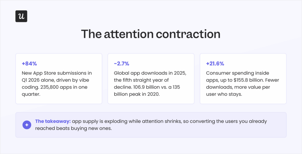
Developers submitted 235,800 new apps to the App Store in the first quarter of 2026, an 84% jump in a single quarter, driven by vibe coding (building software by describing it to an LLM), and Apple’s review queue stretched from 24 hours to as long as 30 days under the flood.
However, attention never grew to meet that supply. Global app downloads fell 2.7% in 2025 to 106.9 billion, the fifth consecutive year of decline, while consumer spending inside apps climbed 21.6% to $155.8 billion. People are downloading fewer apps and paying more for the ones they keep.
In short, building an app has collapsed from a six-month project into a weekend vibe-coding session. But winning users for that app has become an uphill battle, which is why your product growth strategy now lives or dies on your conversion strategy.
I didn’t want to turn this post into another 25-tips listicle. So for this guide, I will:
- Define what counts as an app conversion in 2026.
- Find out how attention is contracting and why it changes your conversion strategy.
- Provide ten app conversion optimization strategies, including quick wins and compounding plays.
- Shows how AI search is becoming the new front door for app discovery, and how to show up in it.

What counts as an app conversion in 2026
App conversion rate measures the percentage of users who complete a desired action: installing the app, moving from a free trial to a paid plan, activating a specific feature, or completing another predefined goal. Conversion rate optimization (CRO) covers the strategic and science-led approaches to improve conversions systematically.
The importance of conversion rate is not changing. Every conversion you gain reduces your customer acquisition cost while increasing revenue from traffic you already paid for.
Also, what “counts” as conversion differs by how the app is built:
- Native apps are designed for a specific platform (iOS or Android) and deliver the best performance and user experience because they tap directly into the device’s hardware and features (such as the camera, location, and contacts). A conversion for these apps starts with a download, then signup, in-app purchases, and so on.
- Web-based apps are built with standard web technologies like HTML, CSS, and JavaScript, run in a mobile browser much like websites, and need an internet connection to function. The conversion for these apps starts with a signup, followed by a free-to-paid plan upgrade.
- Hybrid apps combine both approaches to achieve cross-platform reach, trading off some performance and polish in the process.
Now, even if conversion rates haven’t changed, the funnel itself did. In 2026, the buying experience is increasingly beginning inside an AI assistant’s answer rather than a store search box, and users are now forming their opinion on your app based on LLM-generated answers.
Is your app conversion rate actually good? Benchmarks, with a warning
There is no universal good app conversion rate, as it varies by industry, app type, and goal. Still, you can get a basic idea from AppTweak’s per-category benchmarks:
- App store conversion rate (store visitors to downloads): Roughly 30-40% on iOS and 25-35% on Android.
- Trial-to-paid conversion rate (freemium model): 5-15%.
- In-app purchase conversion rate: 1-5%.
Context decides everything here. A 7% rate is excellent for in-app purchases and poor for a store listing. If you’re weighing how the trial model itself shapes that number, it gets more complicated than just “8% good, 4% bad”. Plus, the post-AI economy is bending these numbers. When tens of thousands of vibe-coded apps enter a category in a single quarter, the long tail of near-zero-conversion apps drags the “average” down, so even beating the benchmarks won’t be enough for an app’s success.
The attention contraction: More apps than ever, fewer downloads than in 2020
As I mentioned, new app supply grew 84% in a quarter, while global downloads sit roughly 28 billion below their 2020 peak of 135 billion. The supply and demand curves have crossed, and nothing suggests they’ll cross back.
Eric Seufert, the analyst behind the Mobile Dev Memo newsletter, described this dynamic years before the vibe-coding wave made it obvious. In his words:
“Generative AI is deflationary for content production but is inflationary for distribution.”
When channels saturate past the available attention, organic discovery stops working, and the gatekeepers of attention get to keep it. Apps are “content” in this sense, and the gate fee for new installs continues to rise.
Apple’s own transparency data shows the same signals. Weekly redownloads now outpace new downloads by more than two to one (according to Phiture’s analysis of 2026 ASO trends), meaning users return to apps they already trust far more often than they gamble on unknown ones.
For a product team, the conclusion is uncomfortable but necessary. The cheapest users are those already in your app who haven’t converted yet. That’s why I’ll go over conversion strategies designed for both short- and long-term results.
10 App conversion optimization strategies for the vibe-coding era
While vibe-coded apps might see some traction, they’re usually not optimized for retention and expansion, which is when they die.
This is where these app conversion optimization strategies shine. They’re not designed to fight for the limited attention in the market, but to retain and expand the users you get:
1. Optimize your app store presence
First impressions still determine split-second download choices, so your store listing remains your storefront. The basics haven’t changed:
- Use high-quality visuals (app screenshots, app preview videos, and other creative assets) to showcase what your app is made of.
- Write a clear, keyword-rich app title and description. Use bullet lists to break up walls of text and keep the writing engaging.
- Use benefits-oriented language that explains how your app’s features deliver value to users.
What did change is that your screenshot captions now do double duty. Treat the text overlaid on visuals as keyword-aware copy aligned with the high-performing long-tail keywords in your category, since vague labels like “All-in-One Solution” convert worse than concrete ones like “Track Your ROI”.
Game publisher ZiMAD showed how much that caption copy is worth. When the team rewrote its Bubble Birds 4 captions from feature labels like “Challenging and rewarding gameplay” into invitations like “Birds challenge you!”, the redesigned screenshots lifted installs by 32%.
Your visual assets should tell a story within the first few seconds, because skimming users weigh screenshots and preview videos far more heavily than the description. The same goes for trust signals: privacy labels show how user data is protected and whether it’s shared with third parties, and apps aimed at children face stricter review on both stores.
2. Improve app performance
Your app’s speed directly shapes its user experience. Google’s mobile research found that 53% of visitors abandon a page that takes longer than 3 seconds to load, and app users carry the same impatience into their first session. My working bar in 2026 is a 2-second load, and I hold our own mobile releases to it.
Good mobile UI design belongs in this conversation too, because screen size and one-handed use constrain everything on a smartphone. An app that’s intuitive and easy to navigate keeps users who’d otherwise churn without filing a bug report.
There are three basic best practices I check first:
- Optimize your app’s resources: Compress images and videos and trim code paths that slow the first load.
- Implement local caching: Cache data locally so content appears instantly after the first load.
- Seek and fix bugs fast: Bugs drain the fun out of any experience, so find and resolve them before they show up in reviews.
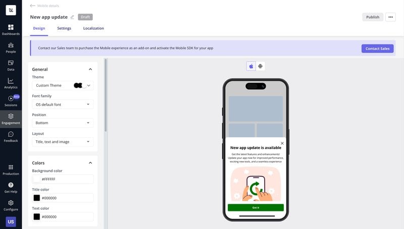
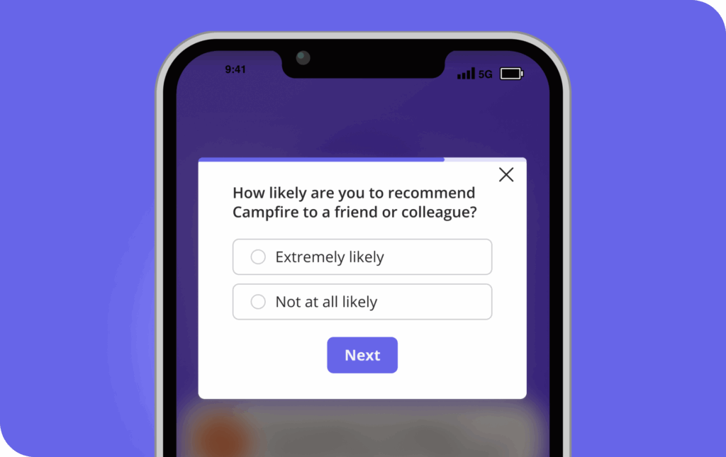
3. Use contextual in-app messages
Instead of scheduling announcements, keep new users engaged through in-app communication that’s timely, relevant, and behavior-triggered. These can include:
- Announcing new features when users are most likely to benefit from them.
- Delivering time-sensitive offers where urgency is real, not manufactured.
- Celebrating milestones (a completed challenge, a streak) to reinforce the behaviors that lead to conversion.
- Triggering helpful nudges when someone stalls at a known drop-off point.
For instance, if a user visits your pricing screen twice without upgrading, show a slideout that answers the most common objection for their plan (instead of blasting a generic discount three days later). In our case, we use Userpilot to build, target, and ship these messages (based on behavior, device type, or past interactions) without submitting another engineering ticket.
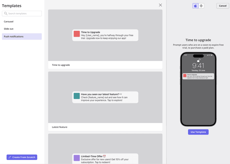
4. Send push notifications that answer “what’s in it for me?”
Push notifications prompt users to finish what they started, but only when the timing and value align. Generic push notifications get swiped away, while personalized reminders tied to what the user was actually doing earn the tap. So recommend triggering them off real behavior, like following up after an abandoned flow or nudging an unfinished onboarding setup, instead of blasting on a schedule.
The numbers here are blunt. Statistics compiled by Business of Apps show that personalization improves push reaction rates fourfold, while sending just one generic push a week drives 10% of users to turn off notifications and another 6% to uninstall the app entirely.
Every push has to answer the user’s only question: what’s in it for me? If the honest answer is “we want your attention”, don’t send it. When you do send one, deep link it to the exact screen it references so the user lands directly where the action happens.
An example of this: When a user completes two of three onboarding steps and then goes quiet for 48 hours, send a push that names the exact step left (“Connect your bank to see your first report”) and deep-links straight to it. That message outperforms re-engagement blasts because it finishes a job the user already started.
5. Offer incentives that deepen the relationship
Humans love rewards, and I can’t recommend them enough. The trap is reaching for Amazon gift cards or any external gratification by default, because although gift cards can buy a survey response, they don’t make users experience value from your product.
Instead, I think rewards should be an inherent part of your product. For instance, you could grant temporary access to premium features so users can quickly experience their full value and feel incentivized to upgrade.
Gamification is another way to provide these types of rewards. Streaks, challenges, and leaderboards turn a mild interest into a daily habit and, eventually, into a sense of commitment that might encourage them to convert to paid users.
Duolingo (a prime example of gamification) ran this exact play with its Streak Wager experiment, letting learners bet in-app currency on keeping a 7-day streak and doubling their investment if they did. The test produced a 14% lift in Day-7 retention, and the reward never left the product.
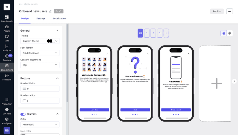
6. Onboard for the user’s first win, not your feature list
You might be tempted to design an onboarding tour that shows off all 20 features.
But that’s a mistake. In my experience, users decide whether an app stays on their device within about 30 seconds of the first open. New users want proof that your app delivers on its promise, and they usually need two or three features to get their primary job done.
So find out what that job is. A quick welcome survey inside your signup flow tells you the user’s objective, and from there, you can segment and trigger a flow tailored to that exact use case.
Then, optimize your onboarding flow to focus on the shortest path to that first win. This could involve:
- Cutting activation friction wherever it hides.
- Minimizing form fields and supporting autofill.
- Requesting only the permissions you need (asked in context, not at first launch).
- Offering one-tap payment options like Apple Pay and Google Pay when the moment to upgrade arrives.
- Setting up agentic workflows (like Userpilot’s AI agent, Lia) to automatically build in-app onboarding experiences from any outcome you want.
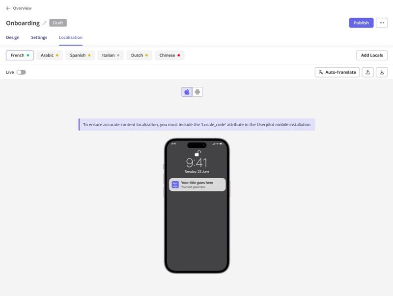
7. Localize more than the language
Localization is personalization at the market level, and translation is only its first layer. Real localization adapts payment methods, color schemes, layouts, and cultural conventions to each target market.
Airbnb is still my favorite example. The app supports over 220 locales and 60+ languages, and former Airbnb language manager Ge Zhongjun describes how entering China meant enabling Alipay and WeChat Pay, switching to Chinese maps, launching WeChat mini-apps, and reworking listing formats. Airbnb became a global product by behaving like a local one everywhere.
The translation layer, at least, no longer needs a project plan. A digital adoption platform can auto-translate all your in-app flows without developers, translators, or the need to rebuild a single flow from scratch.
8. A/B test at every touchpoint that matters
A/B testing moves you from assumptions to evidence, and in 2026, the ideas worth testing come from user feedback, teammates, and increasingly AI. Personally, I treat every one of them as an experiment that has to earn its place.
App icons and paywalls are the two most under-tested elements I see, and both sit directly on the conversion path. For example, after Hobnob tanked its conversion rate with a rebrand, its team tested icon variants and found one that beat the rebranded icon by 64%, restoring the page’s conversion within a single release.
A structured test loop looks like this:
- Define a clear objective: Name the metric you’re improving, whether onboarding completion, CTA click-through, or notification open rate.
- Isolate a single variable: Test one element at a time so the insight is unambiguous.
- Launch variations to segments: Deploy versions to comparable user groups.
- Measure and iterate: Wait for statistical significance, ship the winner, and repeat.
9. Collect feedback, then close the loop
User feedback is the fastest route to the “why” behind your conversion numbers. Only the users themselves can tell you if a friction point comes from a confusing flow, unclear copy, a missing capability, or a price objection.
In fact, a study of 4.5 million Google Play reviews found that responding to a review often leads the user to raise their rating, and public ratings are the exact social proof your store listing converts on.
But in my experience with surveys, timing matters a lot. So I recommend asking questions at a moment of friction rather than on a quarterly schedule. These triggers are my go-to for any survey:
- Survey the drop-off point: When a user abandons your upgrade or checkout screen, trigger a one-question survey asking what prevented them from completing the transaction. You’ll collect the objections (price, missing feature, trust) that your funnel chart can never show you.
- Survey the exit: A short survey on downgrade or cancellation catches the real blocker while the user still remembers it, and occasionally saves the account on the spot.
- Reply to store reviews: Fix the reported issue, respond publicly, and invite the reviewer to update their rating once the issue is resolved. The response is read by every future visitor, not just the reviewer.
Collecting is still only half the job, though. When a user takes the time to share a frustration, they might become a paying advocate if you fix the issue and communicate the resolution.
10. Find the bottleneck before you guess at fixes
The single most valuable habit in app conversion optimization is analyzing user behavior before deciding what to change. Which screens hold attention, where do users drop off, and which features go untouched?
I’ll give you a real example from my own roadmap. When we launched Userpilot’s email feature, the funnel showed a sharp drop at the domain verification step, and the obvious move was to file an engineering ticket and wait.
Instead, within a few hours, I created a targeted tooltip that highlighted the correct steps and showed users exactly what to do next. That closed most of the drop-off within days, without involving our dev team, and it taught me that the fix for a funnel drop is often messaging, not code.
This is where AI-driven personalization earns its place: tailoring recommendations, home screens, and dashboards to each user’s actual usage data, and using predictive signals to reach users before they churn.
However, feature velocity makes this discipline harder every quarter. As our CEO, Yazan Sehwail, puts it:
As producing and building features become a lot cheaper, instead of every quarter, you’re releasing one or two features, now you’re releasing 7, 8, 9. It becomes even harder for product teams to manually have to track each one and understand usage for each one.
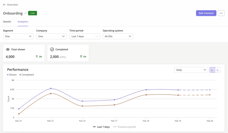
That’s when I recommend having a unified mobile analytics setup like Userpilot’s. It will track screen views, funnel steps, and custom events in one place. This way, your team can organize and track each release’s usage without juggling spreadsheets.
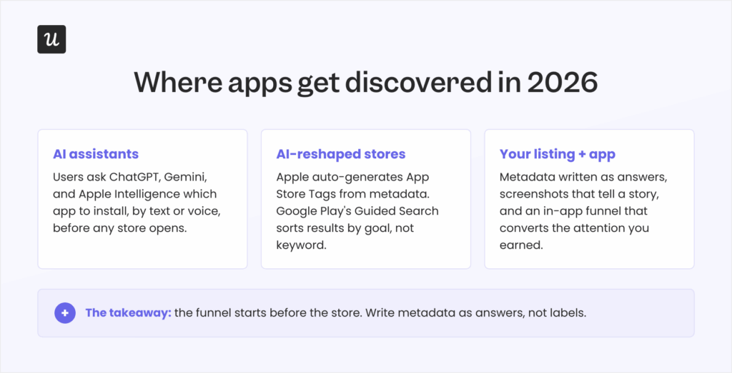
AI search is the new front door for app discovery
Lastly, app conversion optimization now happens before your store listing gets a single view. Users increasingly ask ChatGPT, Gemini, and Apple Intelligence which app to install, and the stores themselves are following suit: Apple now auto-generates App Store Tags from metadata using AI, and Google Play’s Guided Search sorts results by goal (“find a home”) rather than by keyword.
Dave Bell, co-founder of ASO firm Gummicube, framed the shift in a Business of Apps analysis:
“App recommendations are increasingly being surfaced within conversational environments that interpret full questions, layered intent, and contextual nuance rather than isolated keyword inputs.”
I recommend rewriting your metadata as answers rather than labels. State who the app is for, the specific problem it solves, and the measurable outcome it delivers. Think of the phrasing a real person would use when asking an assistant (by text or voice) for a recommendation. “What’s the best free photo editor that works without an internet connection?” is a query your listing either answers or loses.
Discovery is no longer exclusively human, either. AI agents now interact with software directly through standards like MCP, and Userpilot’s Agent Analytics exists precisely so you can see how those agent interactions behave alongside your human funnels, since an account’s “users” in 2026 may include both.
Turn shrinking attention into compounding conversion
App conversion optimization in 2026 comes down to one bet: the market will keep producing more apps than attention can absorb, so the winners convert the attention they’ve already earned.
Userpilot helps with personalized onboarding flows, contextual messages, push notifications, mobile surveys, and analytics to identify your bottlenecks, all without developer support. Want to see it on your own funnel? Book a demo.
FAQ
What is app conversion optimization?
App conversion optimization is the set of tactics and strategies used to increase the percentage of users who complete desired actions within your app, from install through trial, activation, and purchase.
How do I increase my app conversion rate?
Start with the quick wins: a sharper store listing, faster load times, behavior-triggered in-app messages, push notifications with real value, and incentives tied to product depth. Then invest in the compounding plays: focused onboarding, localization, A/B testing, feedback loops, and funnel analysis.
Is a 7% conversion rate good?
It depends entirely on which conversion you mean. For in-app purchases, where 1-5% is typical and 7% is strong, store-listing conversion or trial-to-paid sits below the usual range. Check the benchmarks section above for the baseline that matches your funnel.
About the author