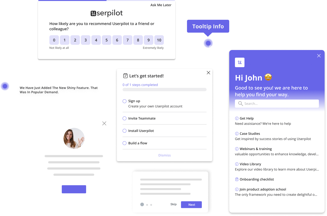
Looking at tooltip examples from other SaaS businesses is a great way to save yourself the time and hassle of trying to do it all from scratch.
Of course, we’re not advocating that you copy them outright, but every creative person throughout history has taken inspiration from their peers. So why should your onboarding UX be any different?
Let’s explore some of the most striking tooltip examples we could find.
Try Userpilot Now
See Why 1,000+ Teams Choose Userpilot
What is a tooltip?
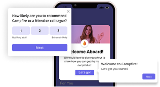
A tooltip is an unobtrusive box-shaped UI pattern with a short text section designed to explain how a specific element of your product works or to prompt users to take action, for example, engage with a new feature.
Tooltips are triggered by user actions (for example, when a user hovers over a UI element), or automatically, when the user visits a page.
Hotspots vs native tooltips
Native tooltips and hotspots are both popular UI patterns, often used together.
Hotspots are interactive elements that reveal additional content or trigger an action when the user clicks on them. Their job is to draw attention to a user interface element or feature without disrupting users’ experience.
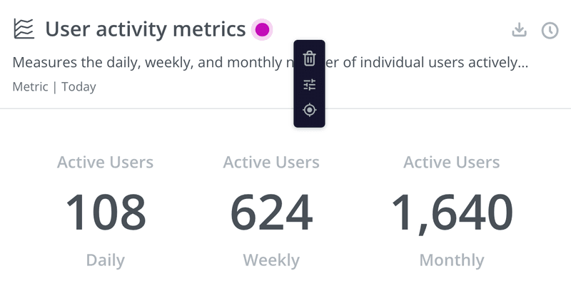
Native tooltips are short in-app messages that appear on the screen when the user hovers over them with a mouse pointer or clicks on a hotspot.
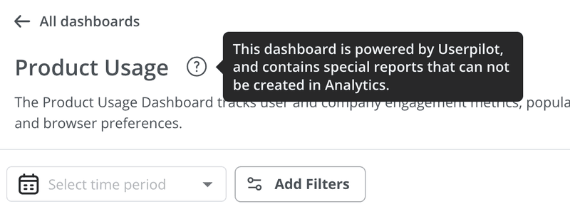
You can use it to educate a user about a particular feature. This is pretty handy if the feature use isn’t immediately obvious from its name.
What are tooltips used for?
Tooltips are versatile UI patterns. Here are 3 main ways to use them!
Tooltips for onboarding walkthroughs
One of the main tooltip applications is user onboarding: you can use them to activate users and help them adopt features.
Depending on the complexity of the feature, individual tooltips may not be enough to explain it.
If that’s the case, bundle multiple tooltips into a longer in-app experience flow, like an interactive walkthrough. That’s how you can teach the user how to use a particular feature or complete a task.
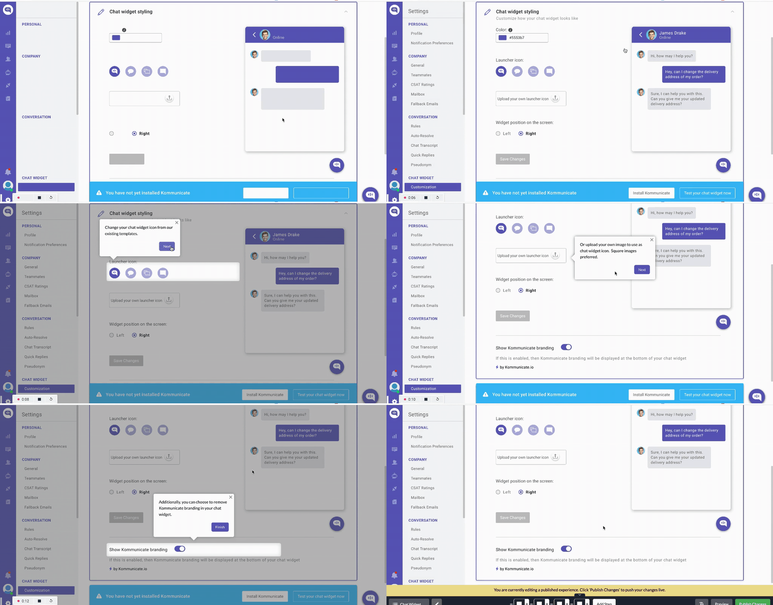
One of our customers, Kommunicate, designed a walkthrough that boosted the number of users who completed the chat widget customization (one of their key features) by 86%. This also increased the feature usage by 3%.
Tooltips for feature discovery
Another application of tooltips is for feature discovery later in the user journey.
You may need them in 2 situations:
One is helping users adopt existing features they haven’t discovered yet but that are very relevant to their use case and can dramatically improve their perceived product value.
Here’s an example of such a tooltip in Surfer with information about a key shortcut appearing on the screen as I write this paragraph.

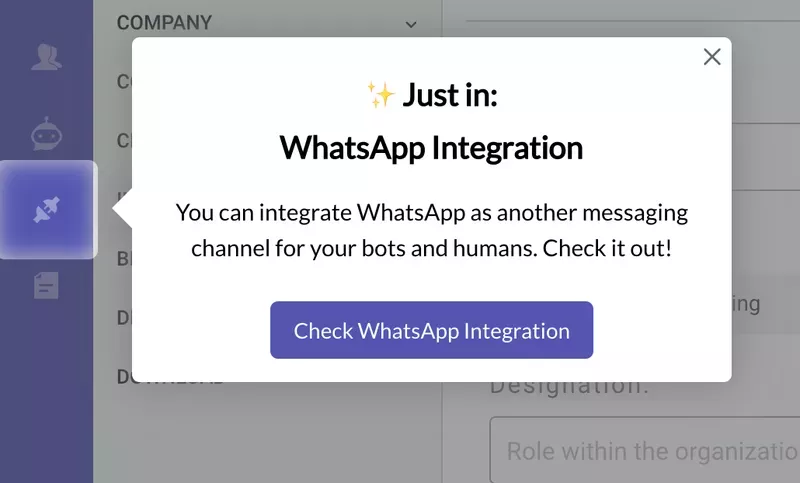
The other is announcing new features. There’s no point in releasing new functionality, no matter how useful it is, if you can’t communicate its value to the user and increase its adoption.
Tooltips for account expansion
Finally, you can use tooltips to draw user attention to premium features and prompt them to upgrade to higher plans.
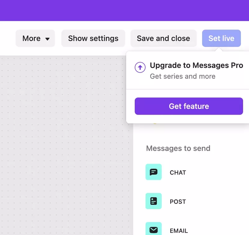
Here’s an example of how Intercom does it.
When the user clicks on a premium feature, an upsell tooltip encouraging them to upgrade to Messenger Pro appears.
Such tooltips work best when they target users at the right stage in the customer journey.
Top 12 tooltip examples to inspire you
Now that you know what tooltips are and what they can be used for, here are some examples of how you could use them.
1. Impala
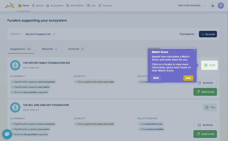
Impala, the open-source software platform for the non-profit sector, uses tooltips for user onboarding.
The company created an interactive onboarding experience, which helped them increase the activation rate by 100%.
The walkthroughs start with an overview modal followed by tooltips with more detailed contextual information as users interact with the interface.
The tooltips highlight key elements like the prospect match score and explain how to use them.
And most importantly, they prompt users to take action.
2. Talana
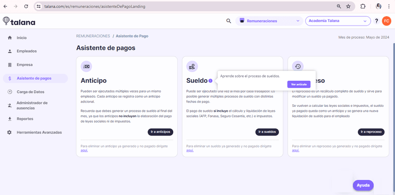
Talana is a complex HR platform that uses interactive walkthroughs and tooltips to streamline its onboarding process and improve user engagement.
Interactive walkthroughs offer users clear, step-by-step instructions on how to navigate the platform.
Meanwhile, tooltips provide real-time contextual assistance, helping users understand specific elements and features of the interface.
3. Attention Insight
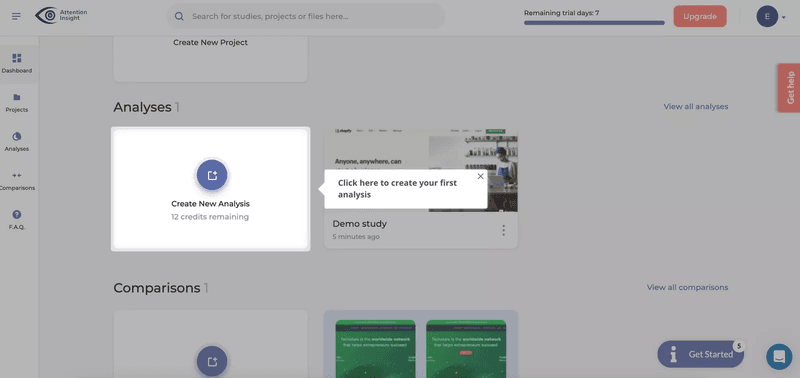
Attention Insight is another company to boost trial user activation by implementing interactive walkthroughs and tooltips.
These guided tooltips help users through key actions like creating heatmap analyses and tagging “Areas of Interest.”
The result?
User activation increased by 47%, with 69% of users creating heatmap analyses and engagement with the “Areas of Interest” feature growing by 83%.
4. Brevo
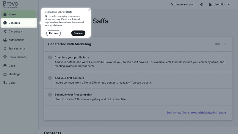
Brevo (formerly Sendinblue) enhances user onboarding through a combination of interactive walkthroughs and tooltips.
By using tooltips, Brevo highlights important sections of the dashboard—like contact management—and simplifies complex actions for users, so that they can better understand and engage with the product.
The best part?
Users have the option to temporarily dismiss the in-app messages and come back to them at a more suitable time.
5. Asana
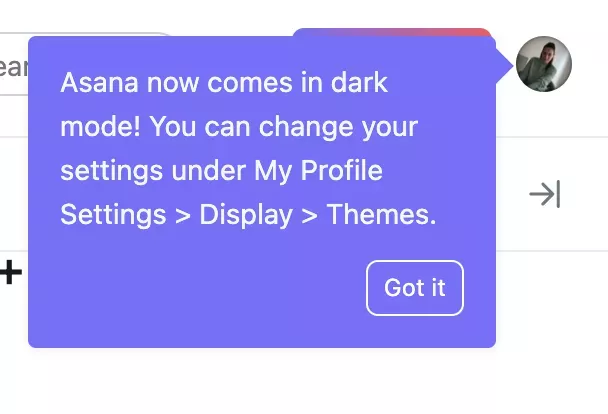
This tooltip is used by Asana to highlight the dark mode feature to their users.
Dark mode is far from being a core part of Asana. It’s more of a secondary feature.
Note how the colored tooltip stands out nicely against the plain background so that it gets your attention.
Note also that it’s easy to dismiss the tooltip once you’ve seen it. Just click on the CTA button. That way, you’re not left with an annoying tooltip that you can’t get rid of!
6. Slack
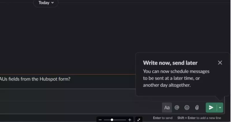
This tooltip appears next to the “send message” feature in Slack to tell users that they can schedule their messages to be sent later if they wish.
The “send message” feature is a primary component of Slack and one that’s very intuitive to use, but the “schedule for later” part of it is largely unknown.
As such, the timing and positioning of this tooltip are nothing short of genius. The tooltip appears at night, just when the user might be thinking that they don’t want to bother their colleagues after they’ve signed out, right next to the UI for sending messages.
Both the header and the body copy are extremely easy to scan and understand in a matter of seconds.
Slack gets full marks for relevancy and immediacy with this one.
7. Airbnb
It goes without saying that the average Airbnb user probably knows how to use a search bar, so creating a tooltip to explain a basic search function would have been overkill.
However, Airbnb made this particular tooltip to highlight the expanded functionality of their search bar.
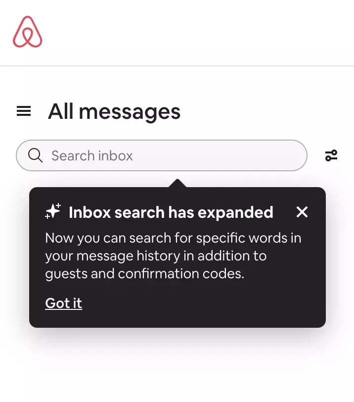
This seems like a smart move when search terms like “Corona” might be an important part of travel-related conversations.
And for users who didn’t know that this functionality was available, this tooltip serves as a valuable source of customer education.
See how extremely simple the tooltip content is? You can scan in a matter of seconds, and the black tooltip pops nicely against the white background.
8. HubSpot
Let’s face it: HubSpot CRM is a complex product, and errors made early in the user journey can be difficult—and costly—to rectify.
To save their customers from that, HubSpot uses two tactics.
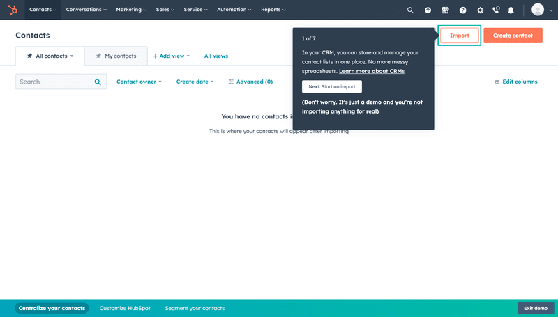
Users get access to a demo account where they can learn how to perform the key actions, like importing their contacts.
And a series of tooltips guide users through them.
To reassure users and encourage them to experiment with peace of mind, HubSpot reminds them that it’s just a demo.
9. Miro
This is a nice example of a tooltip being used to drive product growth.

As a collaborative brainstorming tool, Miro becomes more valuable to teams if multiple team members join the platform, so it’s very much in Miro’s interest to encourage customers to invite their colleagues.
In this particular example, it’s not the tooltip itself that stands out against the background, but rather the blue tooltip button. The color contrast means that it’s just asking to be clicked on.
That being said, if the customer doesn’t want to invite their colleagues for whatever reason, the tooltip still gives them a way out — in this case, through an X icon to the top-right.
10. Grammarly
Grammarly is an intuitive writing assistant that users can start using in minutes.
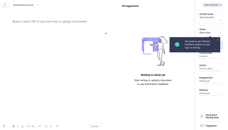
However, Grammarly’s web app offers more than just the main features. For example, users can customize their writing style.
The company uses tooltips to help them discover these more advanced features and maximize the product value.
Their design is simple and consistent with Grammarly’s branding. It even features the company’s logo, which breaks up the predominantly black pattern.
11. Ahrefs
One of the reasons that Ahrefs has become so dominant in the world of SEO is that its technology provides value to both beginner and advanced marketers alike.
Even a beginner SEO can navigate to Ahrefs’ dashboard and read off metrics like Domain Rating.
For slightly more advanced users, Ahrefs provides tooltips like this one to educate them about the technical potential of their platform.

Armed with the knowledge they’ve learned from this tooltip, an SEO lead could now collect different data from http and https sites, respectively.
The tooltip’s orange CTA button matches Ahrefs’ branding perfectly, and the color contrast of the white tooltip against the black header makes it easy to read.
12. Rocketbots
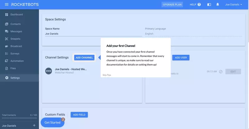
This is an example of a tooltip being used to lead customers towards activation.
Here’s how it works:
Rocketbots’ value proposition is to put all of your inboxes and messaging tools on one platform, as a way of saving you time. It calls these inboxes “channels.”
So to become an active user of Rocketbots, you need to connect to at least one channel. Without that, the platform doesn’t really offer you any value.
As a way of reducing time to value and getting its users to activate as efficiently as possible, Rocketbots has created this tooltip to encourage people to connect their first channel.
Note that the copy on this tooltip is unusually wordy. Rocketbots might explain this by arguing that it’s extremely important that users understand this feature, and the extra technical knowledge required to activate it justifies the additional friction.
Conclusion
After reading this article, you should have a better idea of what your brand’s tooltips should look like and what you can use them for.
Just promise me one thing: don’t code them yourself!
You’ll save time and money by using onboarding software like Userpilot to build them without coding.
Want to try it out for yourself and see? Book your demo today!

