Survey Data Analysis for SaaS: Understanding User Feedback At Scale

What is a survey analysis?
Survey analysis is a systematic process that involves examining and understanding survey report results to uncover patterns and insights to facilitate data-driven decisions.
Why should you analyze survey data?
Analyzing survey data plays a critical role in the success of any SaaS business. It helps you do the following:
- Make data-driven decisions based on real data from quantitative and qualitative feedback instead of assumptions.
- Gain actionable insights by analyzing data and identifying trends, patterns, and pain points from customer feedback.
- Identify improvement opportunities by understanding customer preferences, expectations, and satisfaction levels from their feedback.
Types of survey data
There are 2 main types of survey data you should collect.
Quantitative data
This type of data refers to numerical data or information you can measure, count, or express using numbers. It allows for statistical analysis and objective interpretation of measurable and countable information.
It’s a common practice for surveys to employ close-ended questions often to collect quantitative data. This approach streamlines the response process for the user by providing them with specific answer choices.
Qualitative data
In contrast to quantitative data, qualitative data delves into the non-numerical aspects of the information you collect.
Qualitative data refers to non-numerical or descriptive information that surveys collect via open-ended questions. This data provides insights into survey respondents’ subjective experiences, opinions, and perceptions. It also seeks to understand the ‘why’ behind the numerical data responses by respondents.
Types of survey questions
It’s essential to ask the right kinds of questions in your survey to collect the types of data we’ve discussed. Now, we’ll go through some of the fundamental types of survey questions that can help you gather meaningful, actionable data.
Close-ended questions
Close-ended questions offer respondents a set of predefined answer options. As you can easily categorize and analyze these questions’ responses, they provide a structured approach to collecting quantitative data.
Nominal scale questions
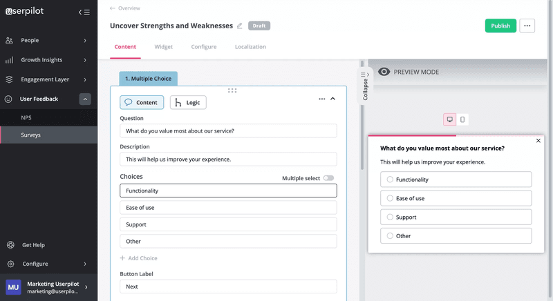
The nominal scale questions categorize or identify objects without any inherent order or numerical value. These questions gather data on attributes such as user roles, company sizes, or the most useful product features.
Ordinal scale questions
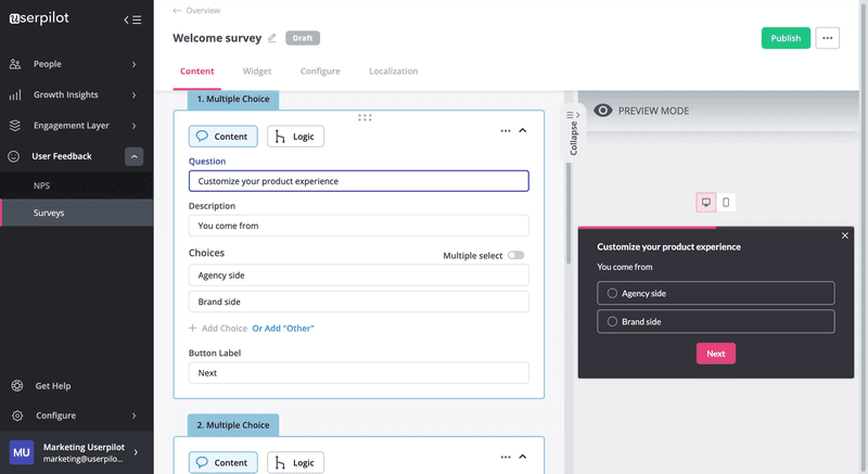
The ordinal scale questions introduce a ranking or ordering of answer options to check if one thing ranks higher than others. They allow respondents to indicate their preference or relative importance among different choices. For example, you may ask users to rank your 5 product features based on their perceived value.
Interval scale questions
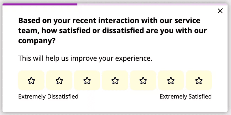
The interval scale questions capture the sentiment or feelings of respondents using a numerical scale. These questions often involve rating scales. For example, you can ask customers to rate their satisfaction level on a scale of 1 to 5, where 1 represents “Very Dissatisfied” and 5 represents “Very Satisfied.”
Ratio scale questions
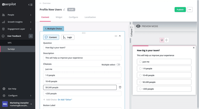
The ratio scale questions in surveys present response options in ranges with a true zero value. These questions allow respondents to provide quantitative data.
They can also offer SaaS businesses valuable insights into various aspects and draw meaningful conclusions. For example, you can gain insights into your users’ company size or numerical measurements by asking, “How big is your team?”
Open-ended questions
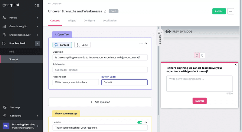
The open-ended questions involve text input from respondents and help collect qualitative data.
They allow individuals to freely express their thoughts, opinions, and experiences in their own words. You’ll often find them as follow-up survey questions asking respondents why they gave a certain response.
How to collect survey data?
Collecting survey data involves more than crafting questions and sending them out to your users. It requires careful planning and strategic implementation.
Let’s explore some of the best methods that can help you collect robust, meaningful survey data.
Include a survey in different in-app flows
You need to strategically incorporate surveys into various in-app flows, such as onboarding and cancellation processes. It helps you obtain valuable customer feedback and enhance your understanding of their preferences.
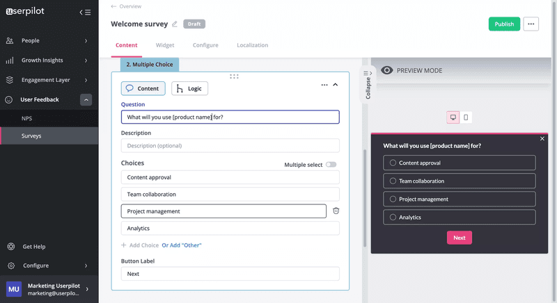
For example, using welcome surveys in the onboarding flow is a smart way to initially capture essential information from your users. You should keep the microsurveys brief with value-focused and contextually relevant questions. Personalizing the surveys by addressing users by their names in the surveys can also play a part in encouraging participation by establishing a human connection.
Churn surveys in the cancellation flow can also bring out valuable feedback about what you should improve. You’ll have to implement a microsurvey to ask the reasons for leaving when users initiate the cancellation process.
Send in-app surveys to relevant user segments
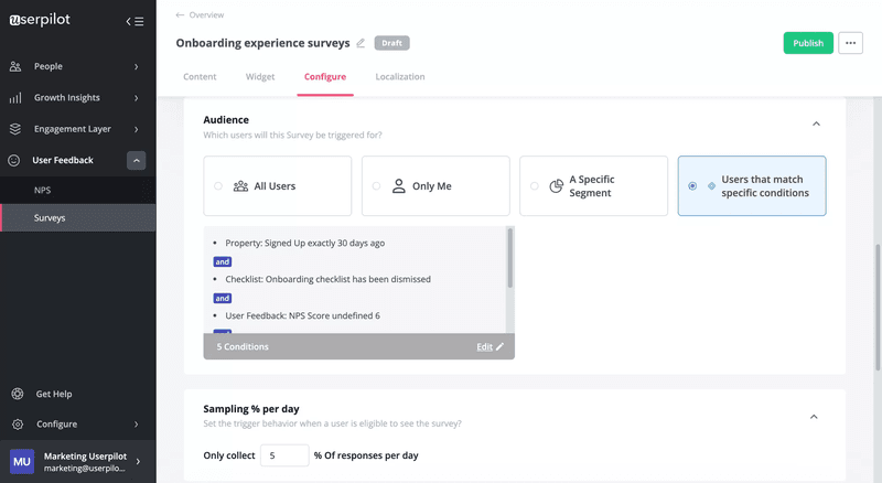
Sending in-app surveys to the right user segments is critical to collect survey data effectively. With powerful data segmentation capabilities, you can ensure your surveys reach the most relevant users and collect actionable feedback.
You should strategically segment your user base based on their behaviors, preferences, or stages in the user journey. Then you can send each segment its relevant survey by triggering them at key moments. For example, you may trigger surveys to people who drop off during the onboarding or remain disengaged with your product.
Trigger surveys based on user engagement
You can proactively trigger in-app surveys based on user engagement to gather important insights. By monitoring user behavior data and identifying customers with low engagement, you can trigger in-app surveys to understand their experiences, challenges, and suggestions related to specific features.
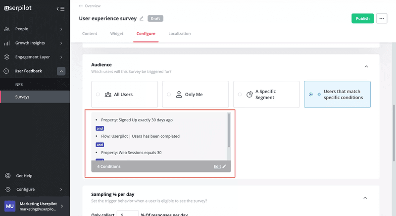
Another prime moment to gather feedback is right after users have engaged with your customer service. Capitalizing on this opportunity will encourage users to provide open and honest feedback about the support experience.
Use a passive feedback widget to collect data
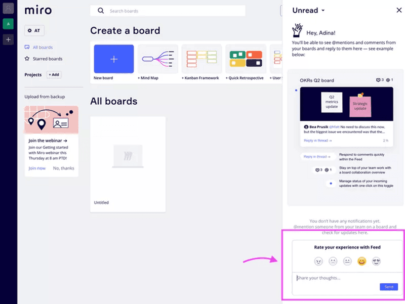
One of the key strategies for gathering valuable survey data is incorporating passive feedback widgets. These widgets allow users to give feedback whenever they want and make them feel you’re not getting in their way.
You should place the widgets in easily accessible areas, like sidebar panels, floating buttons, or discreet pop-ups, that don’t disrupt the user’s workflow. Then you may also provide diverse feedback options with both closed and open-ended questions.
This is how Miro uses a passive feedback widget to collect data.
Provide a feedback submission option in in-app resource centers
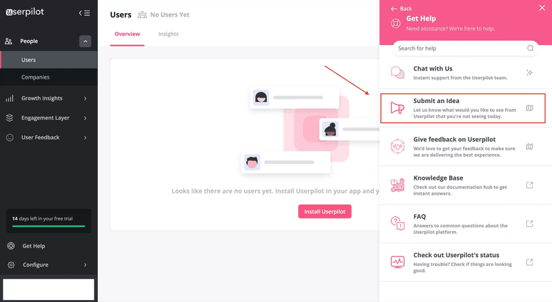
In-app resource centers serve as a hub of information for users and are an ideal location to include a feedback submission option. This approach offers a passive and user-friendly way for users to share feedback about various aspects, like feature requests or bug reports.
You must put the option prominently within the resource center interface so that users get to access it easily. When you use them for feature request surveys and bug reports, you can provide templates to offer customers structured information about their desired features. It ensures that customers provide comprehensive and actionable insights and aid you in making informed decisions.
5 survey data analysis methods for SaaS
Survey data analysis is a powerful tool for identifying trends and insights and driving strategic decision-making. Let’s check the 5 best survey data analysis methods for SaaS.
Analyze quantitative survey results to identify trends
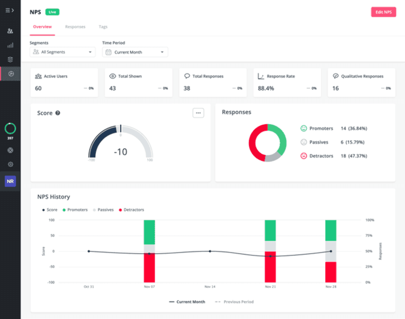
It’s essential to analyze the data from different data points and identify statistically significant trends to make the most of your quantitative survey results. It involves looking for patterns that may indicate trends. For example, you may track the average Net Promoter Score (NPS) using an NPS dashboard to discover customer loyalty trends.
You should have a combination of statistical analysis and domain expertise to draw conclusions from the data. It helps you extract actionable insights that drive informed decision-making.
Let’s say you notice a decline in average NPS scores among a specific customer segment. Then with your combination of skills, you can identify the need for targeted customer engagement initiatives or product enhancements.
Gain actionable insights with qualitative data analysis
You need to go beyond the numbers and delve into the qualitative data to understand your survey results truly. Analyzing qualitative data allows you to uncover the reasons behind user feedback. It enables you to close the feedback loop and make meaningful improvements.
Suppose a user chooses a specific score, such as a 6, in an NPS survey. It’s important to trigger a follow-up question and understand why they chose that specific score. Then you’ll discover the issue underlying these responses (bugs, performance, or anything else) and act to resolve these issues.
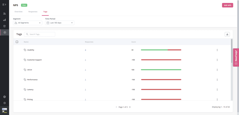
You can also tag and categorize these follow-up responses to identify common issues among your detractors. It’ll allow you to pinpoint recurring pain points and eliminate those for improvement.
Use survey data for a cross-tabulation analysis
Cross-tabulation analysis is a statistical method that lets you explore and analyze the connection between two or more variables. It allows you to compare data across segments and gain insights into the correlation between different factors.
For instance, you can use cross-tabulation analysis to compare the Net Promoter Score (NPS) between two segments. It’ll be one group that has received personalized onboarding experiences and another group that hasn’t. Then it’s time to examine the scores and analyze the cross-tabulated results to see and understand the correlation.
This visual representation of the relationship between variables with cross-tabulation assists you in identifying patterns and correlations. It further enhances your understanding of the impact of personalized customer experiences on overall satisfaction levels.
Leverage survey analytics tools for visualizing data
Survey analytics tools allow you to transform raw survey data into visual representations. Visualizing survey data through tools like charts, bars, and lines lets you gain insights at a glance. As a result, it gets much easier to identify and understand complex patterns within the data.
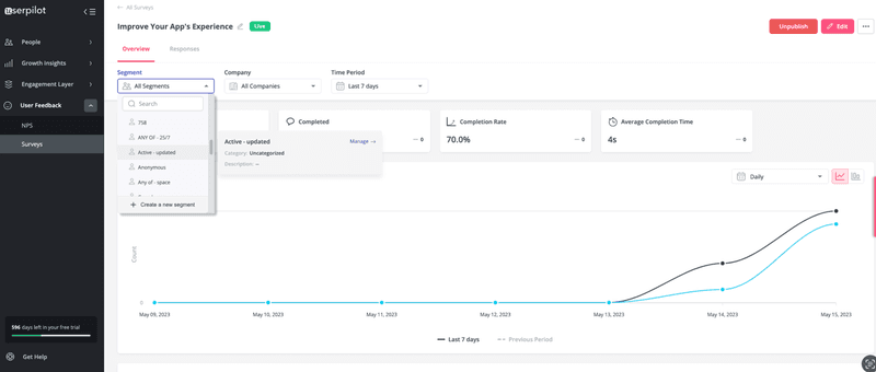
You may examine the survey completion rate over time among user segments and visualize it on a line graph. This visualization will help you understand how user engagement evolves across different stages of the user engagement funnel.
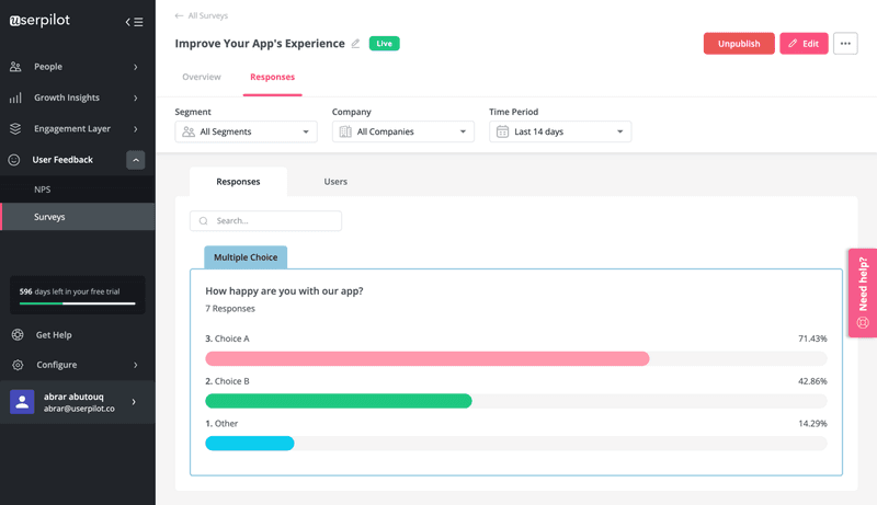
Survey analytics tools also play a crucial role in demonstrating response results per survey. Visualizing response data through charts or bars allows you to showcase the distribution of responses, providing a clear understanding of user sentiments and preferences.
Cross-reference survey responses with user behavior analytics
It’s also crucial to cross-reference survey responses with user behavior analytics to gain a more holistic understanding of user interaction. You can further paint a complete picture of user experiences and uncover valuable insights.
Suppose you asked survey respondents to rate their satisfaction with your product on a scale from 1 to 5. If a significant number of respondents express dissatisfaction, then it becomes necessary to dig deeper.
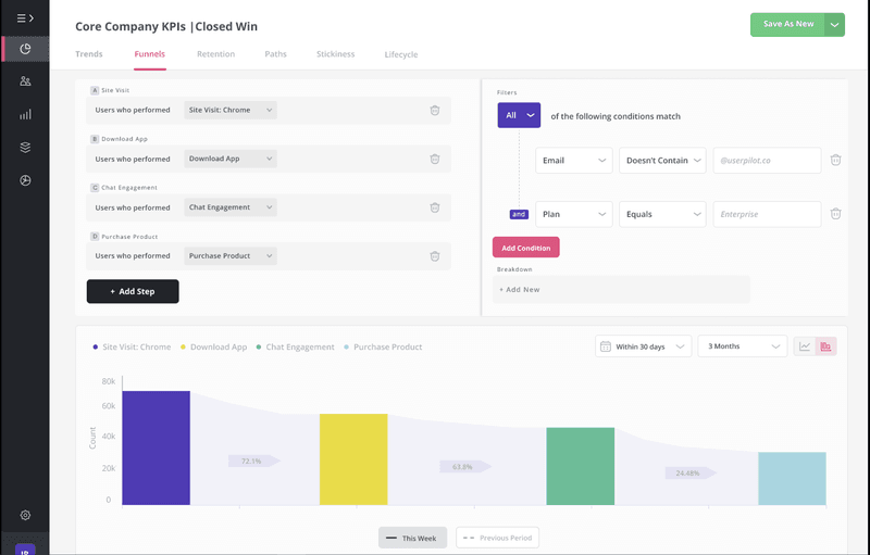
Then, cross-referencing these responses with user behavior analytics will bring out potential improvement areas. You may examine feature usage data to determine whether specific features have low adoption or usage rates.
It’s also possible to cross-reference with session replays and identify where the actual pain points or usability issues are. You can also correlate dissatisfied survey responses with user frictions to pinpoint specific stages or actions that may contribute to user dissatisfaction.
Best tools for analyzing survey data
Analyzing survey data is a complex task that requires meticulous effort regularly. This is where survey data analysis tools help you bring out meaningful insights from survey data.
Let’s review the best tools available in the market for analyzing survey data, including Userpilot, Qualtrics, and SurveyMonkey.
Userpilot – Best for sending and analyzing in-app surveys
Userpilot is a powerful platform that stands out for its extensive features that enable you to send and analyze in-app surveys.
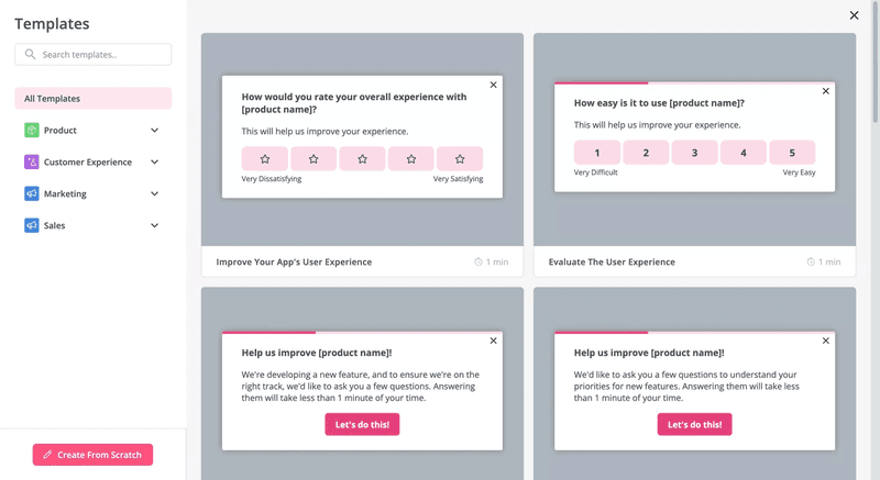
It offers two approaches – building a survey from scratch or using one of the templates available. You can start creating a survey with advanced configuration, like localization, audience segments, theme customization, etc. These features help you resonate your surveys with your brand and target your user base effectively.
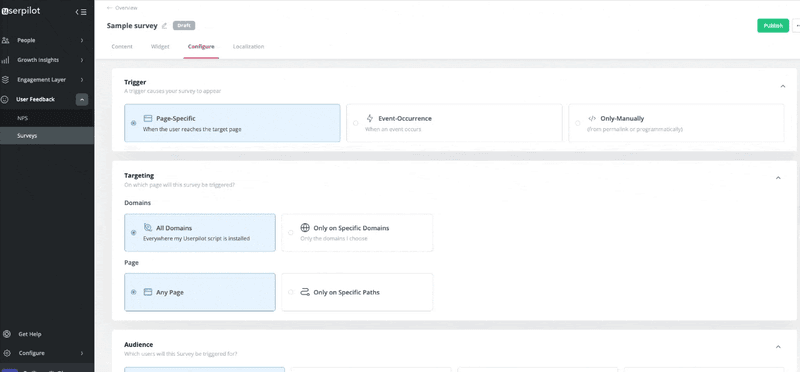
Userpilot’s functionalities extend beyond just survey creation. You can use it to analyze and compare completion trends and rates across different user segments and timeframes.
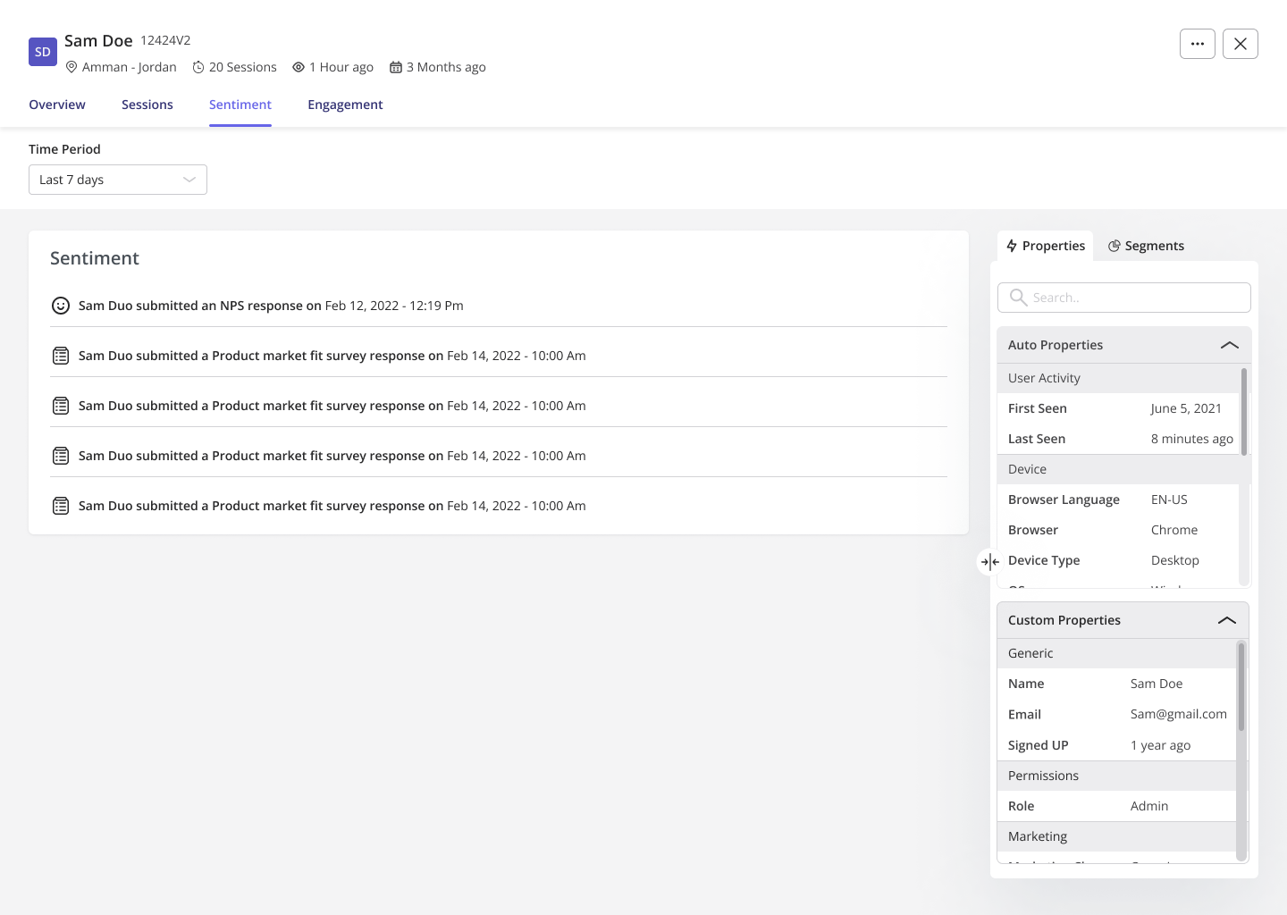
It can also analyze survey data more granularly by delving deeper into individual customer feedback. For instance, you can observe a user’s Net Promoter Score (NPS) history and how their sentiment towards your product has evolved.
Building on this, Userpilot’s native mobile SDK also allow customers to trigger NPS surveys directly on mobile, effortlessly gathering these valuable user insights on-the-go.
Qualtrics – Best for survey data analysis using AI and machine learning
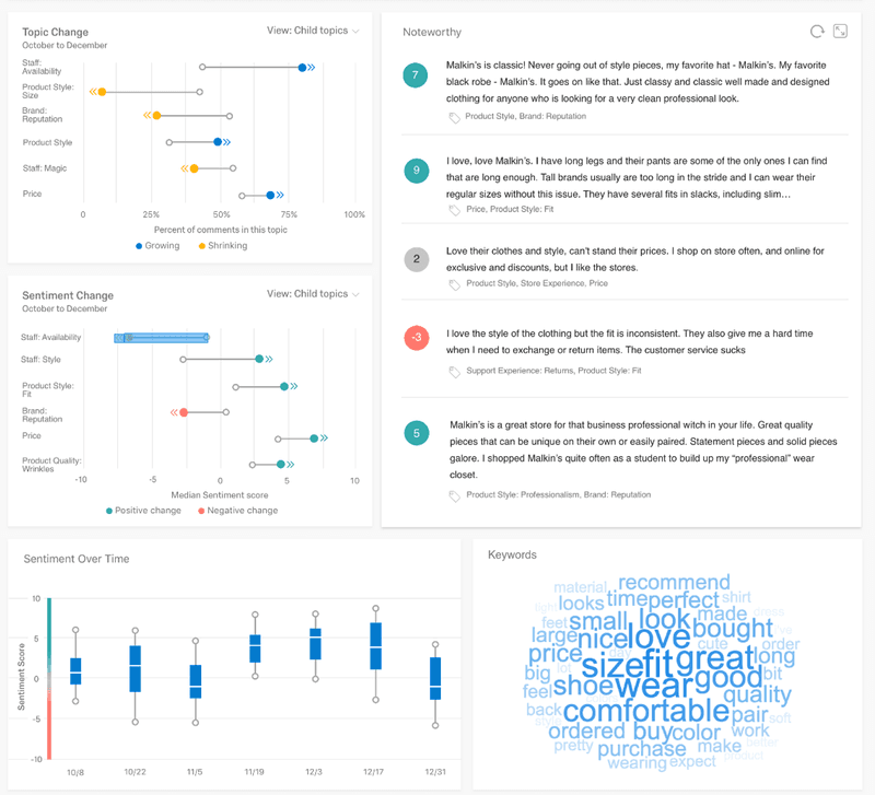
Qualtrics takes survey analysis to new heights by harnessing the power of machine learning and natural language processing (NLP). It excels at parsing and categorizing data from text feedback from customers. As a result, you can delve deep into the data and extract valuable insights that might otherwise go unnoticed.
Using NLP and machine learning in Qualtrics lets it accurately assign sentiment labels, such as positive, negative, or neutral, to customer messages and reviews. This feature not only saves you time but also ensures that you can quickly gauge the overall sentiment of your audience.
With Qualtrics, analyzing the sentiment distribution across different customer base segments becomes extremely easy. Then you can easily extract actionable insights from your open-ended questions and make data-driven decisions.
SurveyMonkey – Best for visualizing survey responses
SurveyMonkey can be a great tool for you when visualizing survey responses. Its rich features let you transform raw data into compelling visual representations to gain meaningful insights.
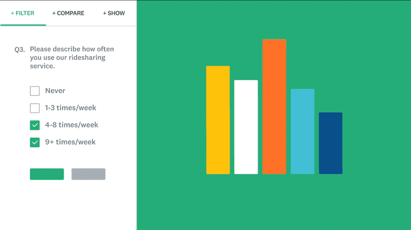
One of the standout features of SurveyMonkey is its automatic chart and graph generation. With just a few clicks, you can effortlessly convert your survey data into visually appealing charts and graphs.
Word clouds, another standout feature of SurveyMonkey, offer a unique way to interpret open-ended responses. You can quickly grasp the overall sentiment emerging from your respondents’ feedback by visually showcasing the most frequently used words. It is particularly useful when you have a large volume of open-ended responses and want to get a quick overview of the overall sentiments of your respondents.
Conclusion
In conclusion, survey data analysis is a game-changer for SaaS businesses seeking to understand their users at a deeper level. It helps you uncover patterns and trends within the data, identify pain points, and seize growth opportunities.
Implementing the methods we’ve discussed for collecting and analyzing survey data will help you improve continuously. And using the best available tools further makes it easier to analyze survey results and grow your business.
Want to get started with survey data analysis? Get a Userpilot Demo and see how to analyze survey data to gain actionable insights.

