UserGuiding for Product Adoption: Features, Pricing, and Review20 min read
Get The Insights!
The fastest way to learn about Product Growth, Management & Trends.
Must have features of Product adoption tools
When exploring product adoption tools, look for ones that are user-friendly and integrate well with your existing tech stack. Here’s what you should look out for:
- In-app resource center: A searchable knowledge base with resources like FAQs, video demos, and user manuals can help answer user questions.
- User segmentation: Personalize onboarding experiences by segmenting users based on company size, behavior, roles, and use cases to increase product adoption rates.
- User analytics: Effective user analytics features provide data on user behavior – revealing user activities, popular features, and potential drop-offs in the customer journey.
- Feedback collection: Tools that allow customization of surveys and feedback widgets can help you understand your users’ feelings and guide product improvements.
- Integrations: An ideal product adoption tool should integrate smoothly with other tools and systems in your tech stack, ensuring a cohesive experience and uninterrupted data flow.
UserGuiding features for Product adoption
As a no-code onboarding tool, UserGuiding has numerous features that will help you create onboarding flows for your new customers and guide them throughout their journey.
Here’s what you’ll get when you start using UserGuiding:
- Create interactive product walkthroughs without disturbing your developers as it’s completely code-free.
- Build onboarding checklists and drive customers to the activation point by eliminating the guesswork on what the next step should be.
- Create interactive elements, such as product tours, tooltips, and pop-ups, to help keep users engaged and increase the likelihood that they’ll complete the onboarding process.
- Create a resource center to add different educational resources for your users.
Though UserGuiding is a great tool for startups that don’t have much money to invest in an onboarding tool, it has very strict limitations for the Basic plan.
You can only create a maximum of 20 guides and hotspots, 2 onboarding checklists, and 1 resource center. If you want to create unlimited guides with unlimited UI patterns, you should go for the Professional plan which can cost from $299 to $399.
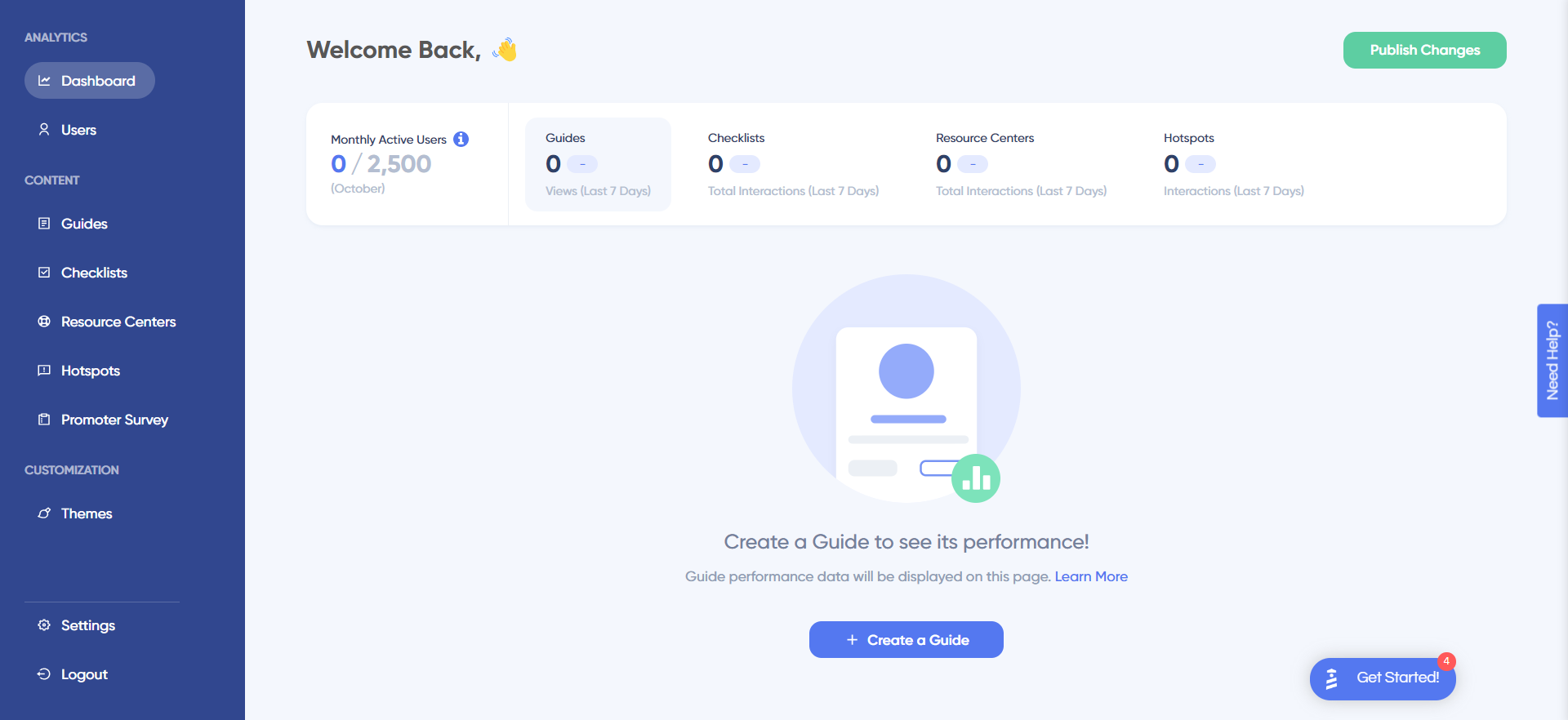
The one drawback when using UserGuiding for onboarding is the fact that its analytics dashboard only encompasses the elements that you’ve created within the platform. In contrast, Userpilot is able to track all elements, events, and behaviors throughout the entire user journey.
UserGuiding’s user segmentation
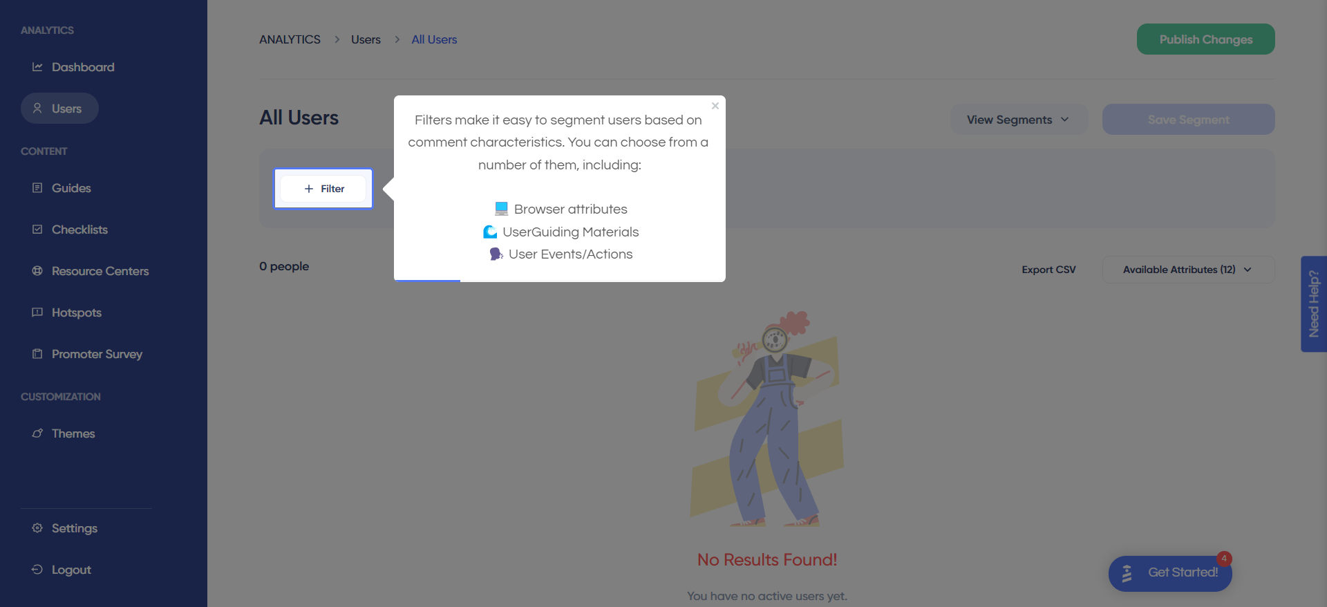
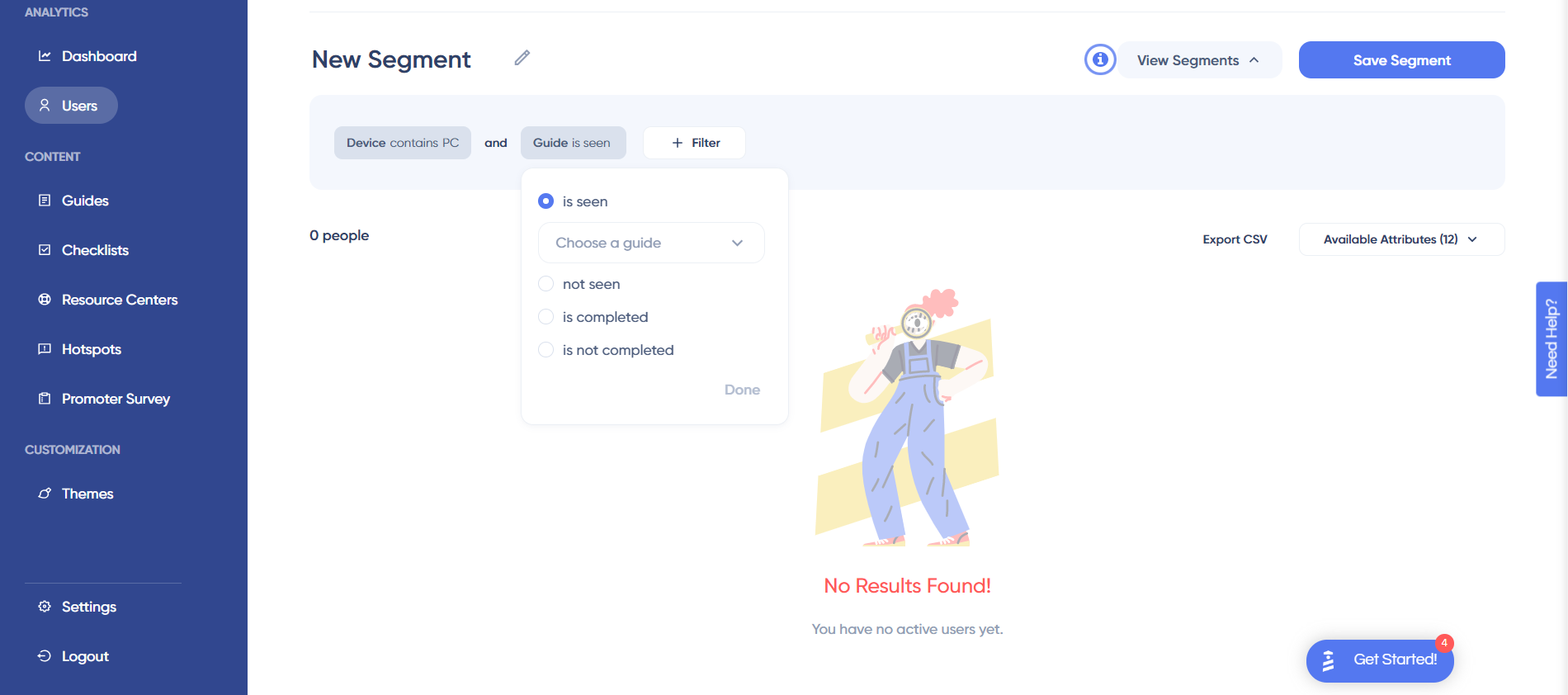
Customer segmentation is fairly straightforward with UserGuiding. All you need to do is apply filters based on which browser attributes users share, which UserGuiding materials they’ve interacted with, and user attributes such as IDs or when their first/last interaction was.
A few filter examples are:
- In-app guide interaction using UserGuiding basic guides analytics.
- Operating system. You could create segments based on which operating system your users are on when they access the product. Do note that UserGuiding is only compatible with web apps so you won’t be able to use employ the same OS tracking if you’re developing a mobile app.
- Checklist completion. The segmentation dashboard lets you filter users by which UserGuiding materials they’ve interacted with or completed. This makes it possible to create a separate segment for users who have already gone through the onboarding checklist (and therefore avoid bothering them with beginner-level UI patterns).
- User ID. If you want to get extremely granular with your segmentation then you could set a specific user ID as a filter. You’ll rarely find the need to do this but it could be useful when trying to track the behavior and events of power users.
UserGuiding’s interactive walkthroughs
Interactive walkthroughs are shorter than most product tours and encourage users to take action instead of just asking them to passively click through a linear series of modals. UserGuiding lets you create interactive walkthroughs by adding steps (either modals, tooltips, or input fields).
Here are the elements you can add while building UserGuiding interactive walkthroughs:
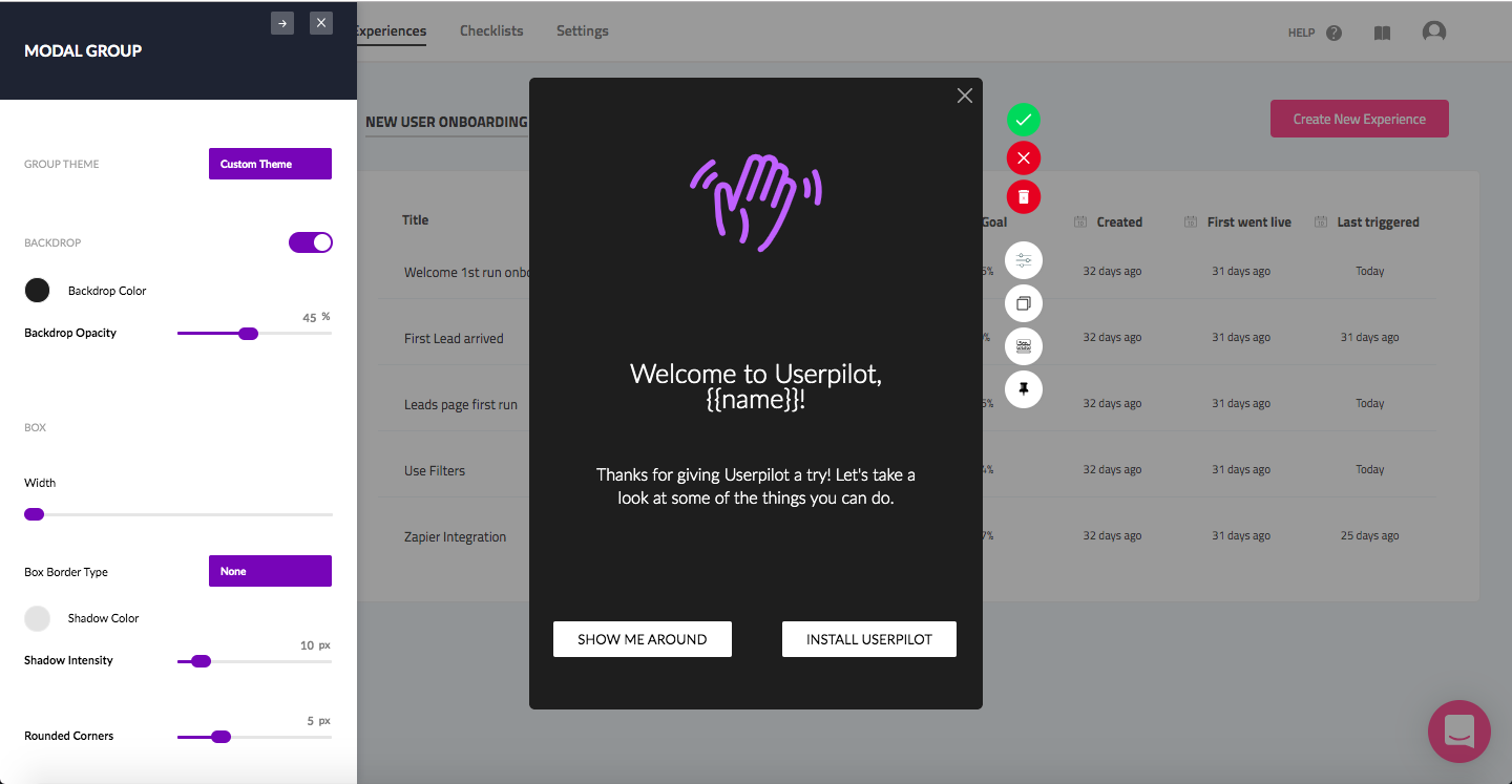
- Modals: You can add modals to your interactive walkthroughs by starting from scratch or choosing one of the available modal templates in the walkthrough builder. There are templates for discounts, announcements, welcome screens, and hero modals.
- Tooltips: Much like the modals, tooltips can also be created from scratch or added using one of the templates. Templates include single-tip tooltips, visual tooltips, and tooltips that only show up when you click an element.
- Input Fields: Input fields aren’t as common in onboarding flows but could be used during the account creation process or during welcome surveys. When adding the step to your walkthrough, you can decide which input fields are mandatory versus optional for users to fill in.
- Copying: You can copy existing guides and then make minor changes to see if they perform better than the original. Unfortunately, you’ll need to interpret the resulting analytics manually, as UserGuiding has no native A/B testing capabilities.
- Triggers: Select between automatic or custom triggers, then decide whether an interactive user guide should only appear once versus whenever the targeting conditions are met.
UserGuiding’s tooltips
Tooltips offer additional context during onboarding flows without cluttering the screen like modals or being too vague like hotspots. Tooltips can tell users what a certain feature does, which button to click on next, and how to accomplish specific tasks within the product.
Here are some pros and cons of UserGuiding tooltips:
- Emojis: UserGuiding tooltips have emoji support, which can help you add some personality to your onboarding flows and make automated in-app messages feel more human.
- Branding: Customers on the Basic plan will have a “Grow with UserGuiding” watermark on every tooltip they create, which could be distracting for their users.
- Analytics: UserGuiding only shows you how many views each guide gets, but it doesn’t offer engagement data for individual tooltips.
UserGuiding’s onboarding checklist
Checklists are a crucial part of the customer onboarding journey as they give users a sense of progress and help them identify their next course of action.
Here are the benefits and drawbacks of UserGuiding checklists:
- Customization: UserGuiding lets you change checklist colors to match your brand palette and add one of three celebration animations for when users complete them.
- Triggers: You can set certain checklist items as triggers so another UI element appears once they’ve been checked off the list.
- Limitations: Users on the Basic plan can only have two checklists active at a time (and upgrading increases the monthly subscription price by around 4x).
- Targeting: Because onboarding checklists must be created inside resource centers (rather than standalone), it can be difficult to target specific segments. This issue is exacerbated by the fact that you can only have a single resource center active while on the Basic plan.
- Localization: UserGuiding lets you localize onboarding checklists as well as the in-app resource centers that they’re housed in. Due to the lack of AI-powered localization, you’ll need to manually upload language CSVs for checklist localization to work.
- Gamification: UserGuiding’s goal tracking feature makes it possible to create customized checklists for users to gamify the onboarding process. You can also segment users so that each one has a unique onboarding journey with different challenge tasks.
- Analytics: Checklist analytics are available right on your UserGuiding homepage. Sadly, these are quite limited as they only show you the total number of interactions your checklists have gotten in the past seven days.
What are the pros and cons of UserGuiding?
UserGuiding’s pros
UserGuiding has quite a few benefits as a product adoption solution, particularly for early-stage SaaS companies that need an easy-to-use starter tool for their small (but growing) team of product developers or marketers. Let’s look at some of the pros that UserGuiding has to offer:
- Chrome extension – UserGuiding utilizes a no-code Chrome extension.
- Survey template gallery – UserGuiding lets you choose from six survey templates or create your own survey from scratch.
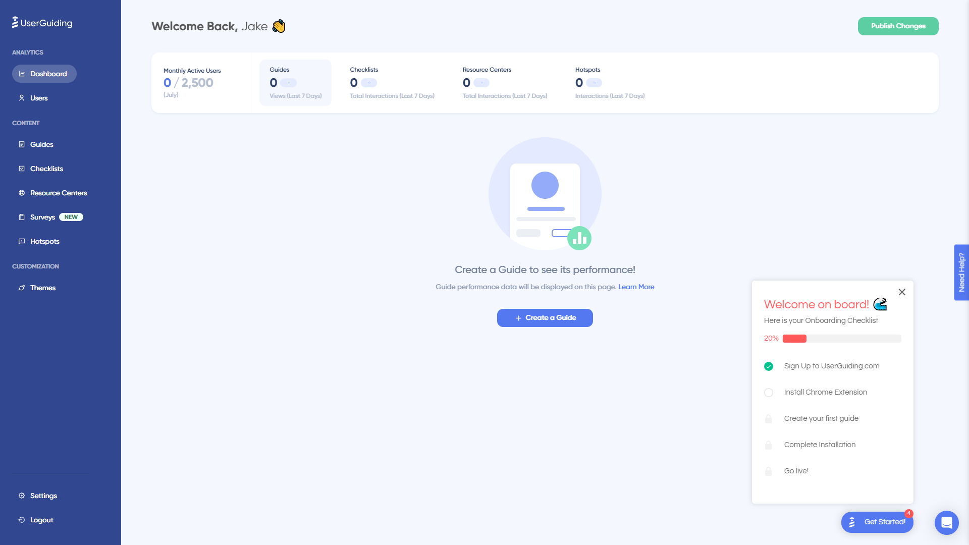
- Analytics dashboard – users can see their monthly active users (MAUs) for the month, monitor the number of views their guides are getting, and see how many interactions checklists or resource centers have had in the past week from the UserGuiding homepage.
- Custom themes – granular theme customization and color selection.
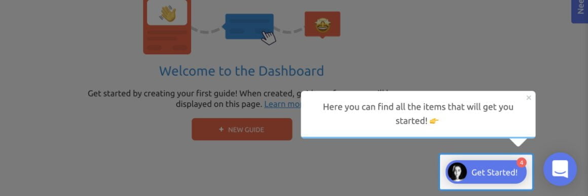
- Easy onboarding – onboarding checklist walks you through key steps, such as how to get the UserGuiding Chrome extension and create your first guide.
UserGuiding’s cons
While there are quite a few benefits to using UserGuiding, there are three significant drawbacks to note:
- Dashboard customization – you can’t edit your home dashboard or choose which analytics you want to see.
- Pricing jumps – upgrading from Basic (2,500 MAUs) to Professional (20,000 MAUs) increases your subscription cost by more than 4x.
- Manual localization – UserGuiding doesn’t have AI-powered localization, so you’ll need to manually download, translate, and upload every CSV when attempting to localize content for your product.
- HubSpot integration – the UserGuiding-HubSpot integration is only a one-way integration which limits its functionality and prevents you from setting up two-way data synchronization between both platforms.
- Limited analytics – the analytics dashboard only shows you data for onboarding materials created with UserGuiding and even those analytics are quite limited as surveys only show you total responses rather than letting you select a date range.
- Survey limit – you can only have one active survey on the Basic plan which is disappointing considering UserGuiding costs over $1,000 annually (whereas Userpilot lets you create unlimited surveys and collect up to 250 responses per month on the cheapest plan).
What do users say about UserGuiding?
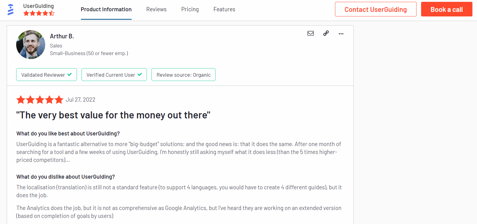
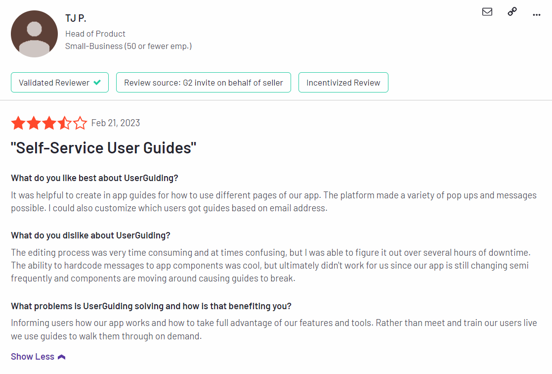
UserGuiding’s customers seem to be moderately satisfied with the solution despite some coding dependencies and plugin glitches:
“The most helpful thing is that as a product designer, I can define and set the guides ready and don’t depend too much on our dev team to put everything together. It’s straightforward to test, release and see it live!”
“Our new customers can buy our product by themselves and do their onboarding to get to know the product with the guides that show them everything they can do, so there’s no need for someone to explain everything.
Also, with UserGuiding, they can complete the minimal settings a client must do to use Worky. It saves us lots of time.”
Of course, some users were less satisfied than others:
“Price is too high for SaaS products like this. Doesn’t support mobile version of web app, when 80% customers using mobile phone. That’s why I will not use this app. Sorry guys.”
UserGuiding’s pricing
UserGuiding has three plans to choose from, targeted towards a range of business sizes from startup to enterprise.
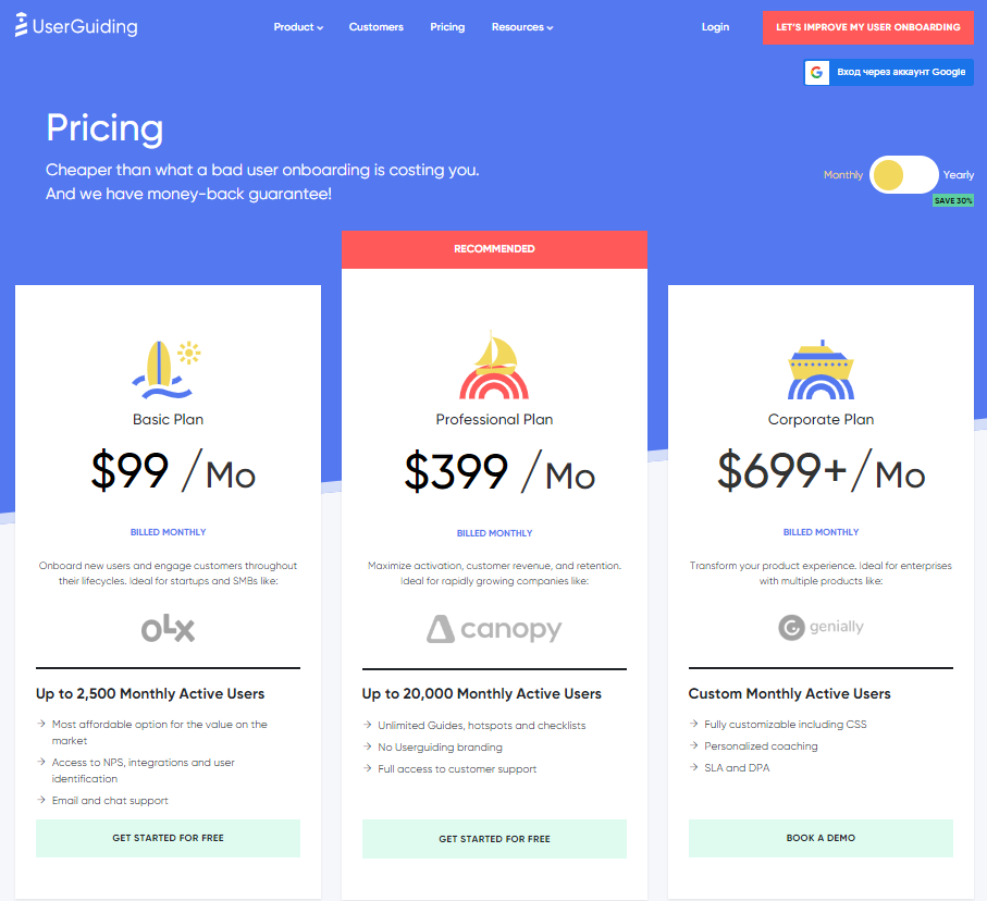
- Basic: Costing $89/month or $1,068/year, the Basic plan is targeted towards startups and SMBs. The Basic plan is quite limited as it caps your account at one active survey, two active checklists, and no more than 2,500 MAUs. Features include:
- Access to user identification features.
- Integrations with Google Analytics, HubSpot, Intercom, and more.
- Email and chat support.
- Customizable theme (only one).
- Professional: The Professional plan costs almost 4x as much as the Basic tier at $499/month or $4,668/year. That said, it significantly increases capacity to 20,000 MAUs and improves the quality of customer support you’ll receive. Features include:
- Removal of UserGuiding branding.
- Language localization.
- Full customer support access.
- Five team member seats.
- Five customizable themes.
- Unlimited guides and checklists.
- Corporate: Subscriptions on the Corporate plan start at $999/month but even if you get the annual discount you’ll still be paying at least $8,268 per year. Of course, this higher price does come with its fair share of enterprise perks. Features include:
- Service Level Agreement (SLA) + Data Processing Agreement (DPA).
- Up to 10 active surveys.
- Custom MAU capacity based on your needs.
- Unlimited team member seats.
- Unlimited customizable themes.
All monthly plans are marked down by 30% when customers choose to bill annually.
3 Reasons why you might need a UserGuiding alternative
You might need an alternative solution to UserGuiding if you fall into any of the following use cases:
- Advanced analytics: If you’re looking for a product adoption platform with full-suite native analytics then you’ll likely need to look at platforms like Userpilot or Appcues that are better suited to your needs.
- Create fully interactive product tours: While UserGuiding excels in creating in-app experiences and user guides, it may not offer the breadth of tools needed to fully support a comprehensive product adoption strategy.
- Build segments completely code-free: As segmentation features aren’t very intuitive and may require additional help from a developer.
Userpilot – A better alternative for Product adoption
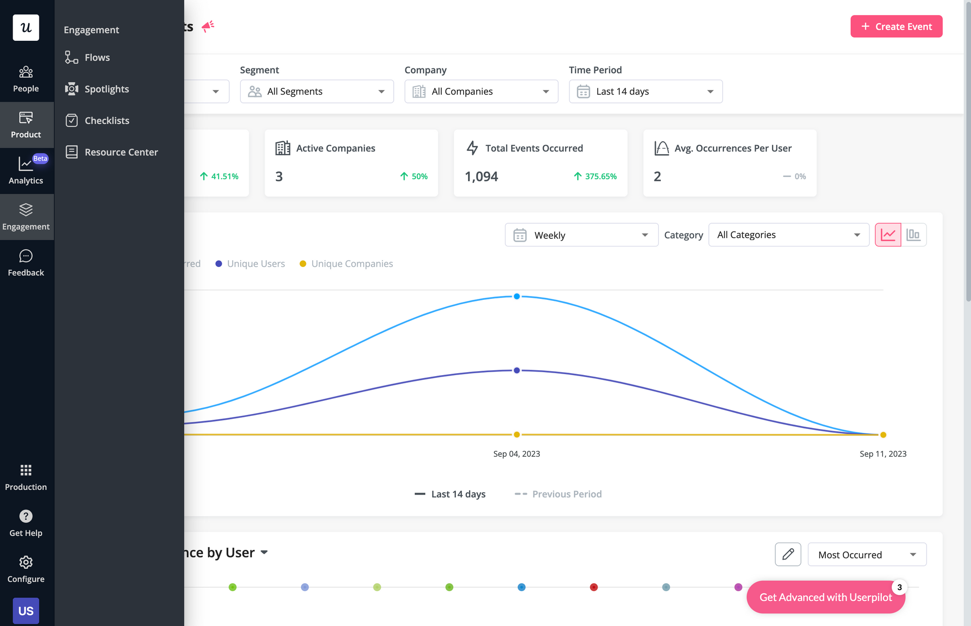
Here are some Userpilot features you can use when onboarding new users:
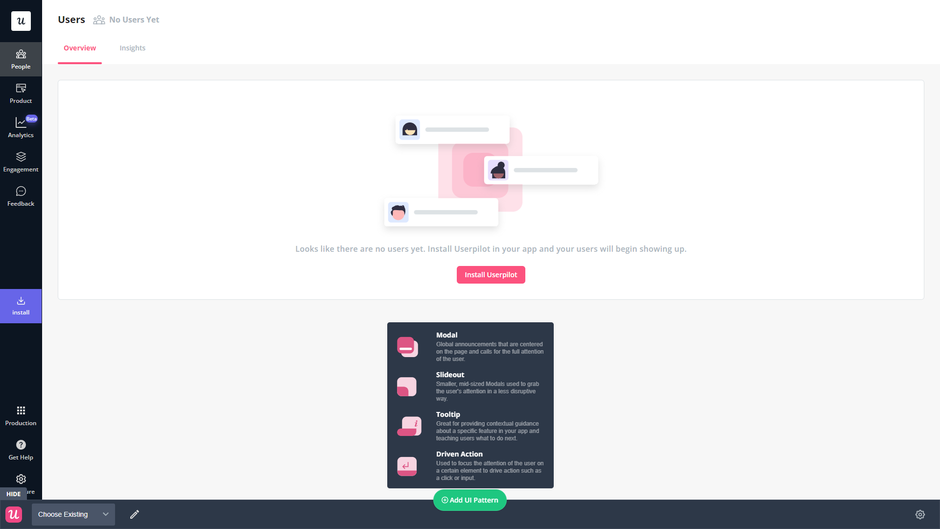
- No-code builder: Creating flows with Userpilot is as simple as installing the Chrome extension, selecting the UI patterns you’d like to use, and then editing the content/settings to suit your use case. You can also use templates to create modals, slideouts, tooltips, and driven actions.
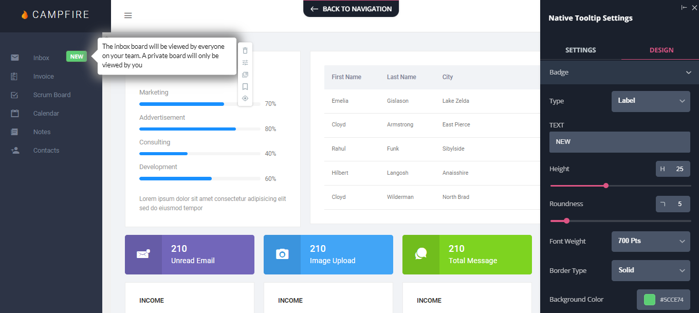
- Native tooltips: Userpilot lets you create native tooltips that show up when users hover over an element or click on an information badge. Since these native tooltips attach to the element itself, they aren’t page-dependent and will show up on any screen where that element is visible.
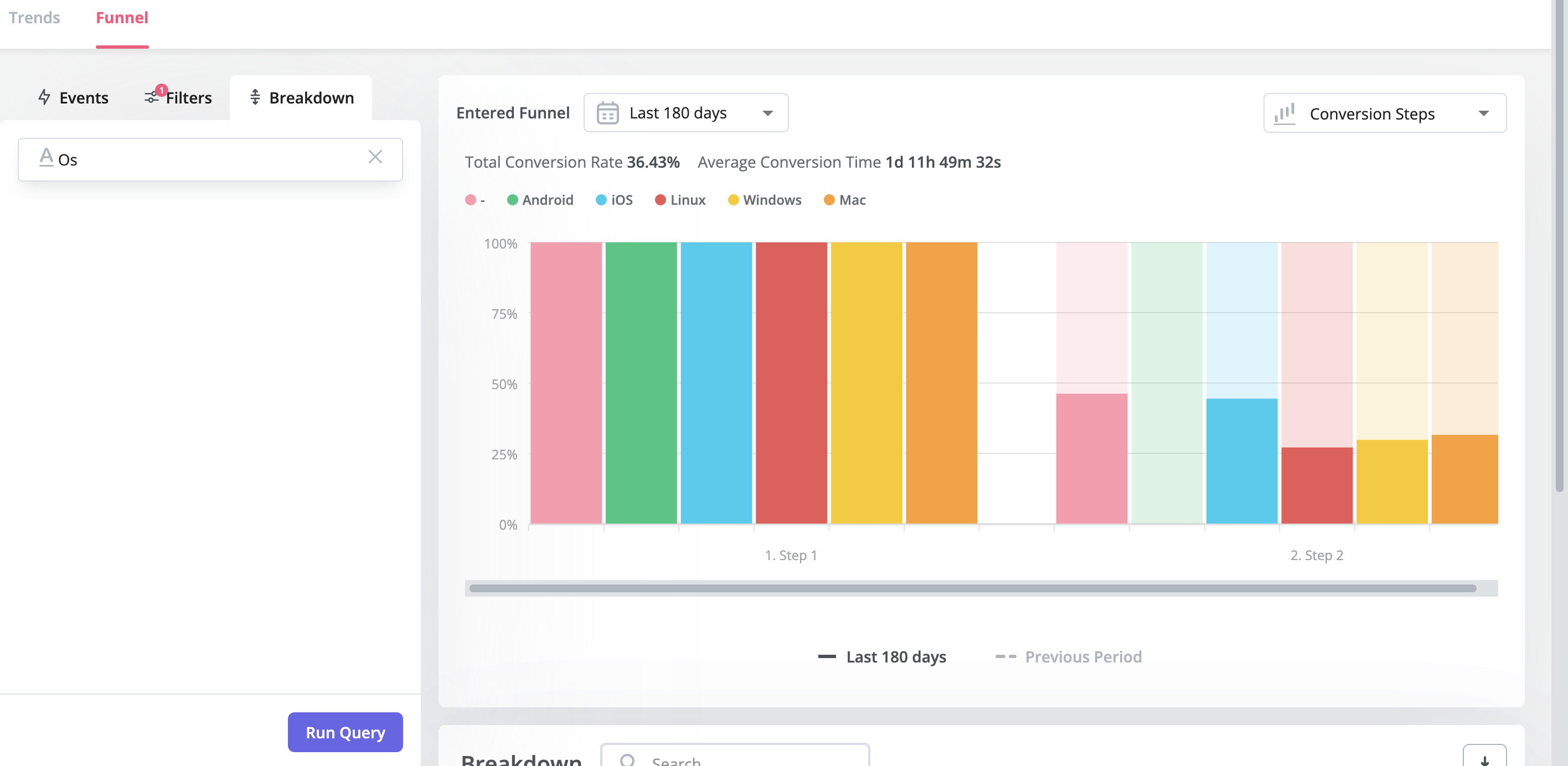
- Funnel analytics: Userpilot’s advanced analytics lets you create funnel reports that track the onboarding journey. You can also add filters (like name, user ID, signup date, operating system, country, etc.) and monitor the total conversion rate from the first step of the funnel to the last.
- User segmentation: Userpilot lets you segment users based on the device they’re using, where they’re located, their engagement data, or which NPS rating they selected on the latest survey. You can then filter your analytics dashboards to see which segments struggle with onboarding.
Userpilot’s user segmentation
User segmentation is essential for creating a personalized and contextual onboarding experience. Userpilot can segment users based on demographics, product usage data, NPS scores, and more. You can then trigger flows or filter analytics based on segments.
Here’s an overview of Userpilot’s customer segmentation capabilities:
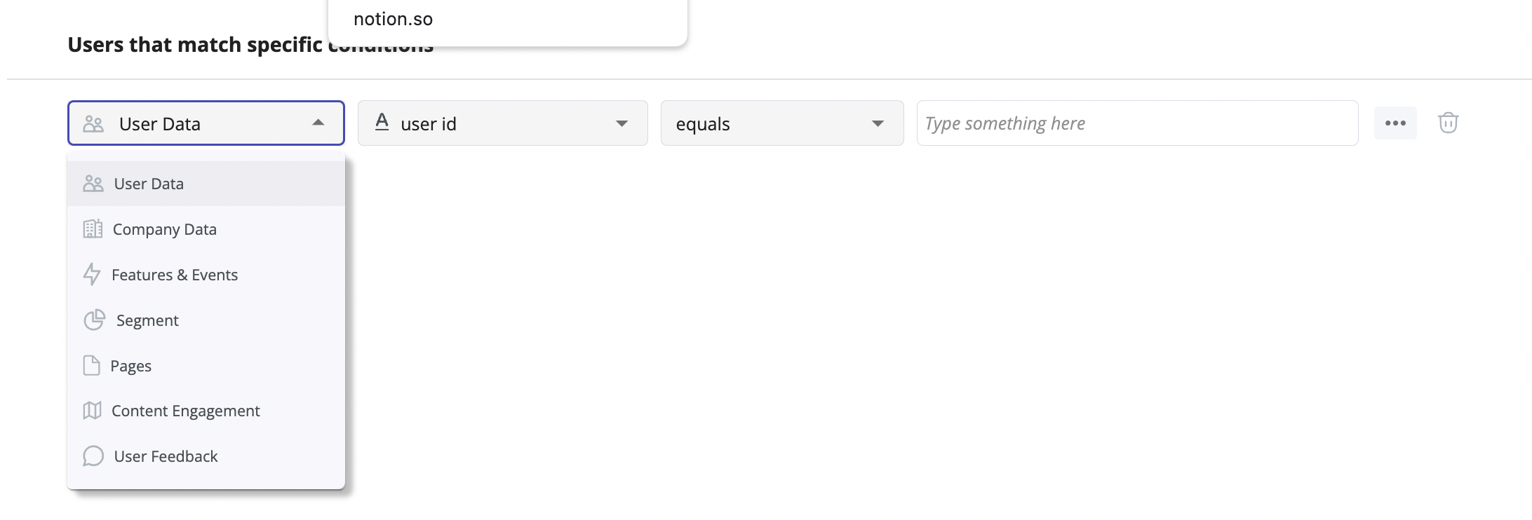
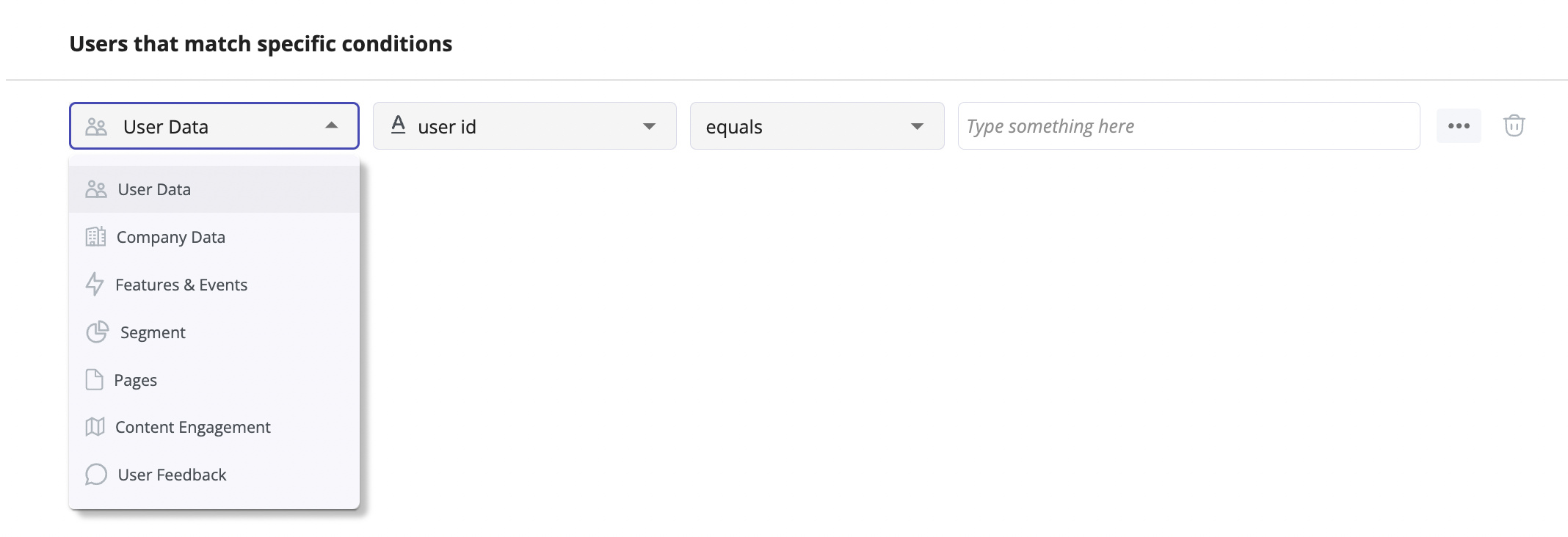
- Segment conditions: Userpilot lets you form segments by adding different conditions like user data, company data, features and events, etc. You can then use these segments as analytics filters or flow triggers later on.
- Analytics filters: Userpilot’s product analytics and user insights dashboards can be filtered to only display data from specific segments (or companies). This will help you extract insights from certain cohorts and compare how adoption or activation varies from one segment to the next.
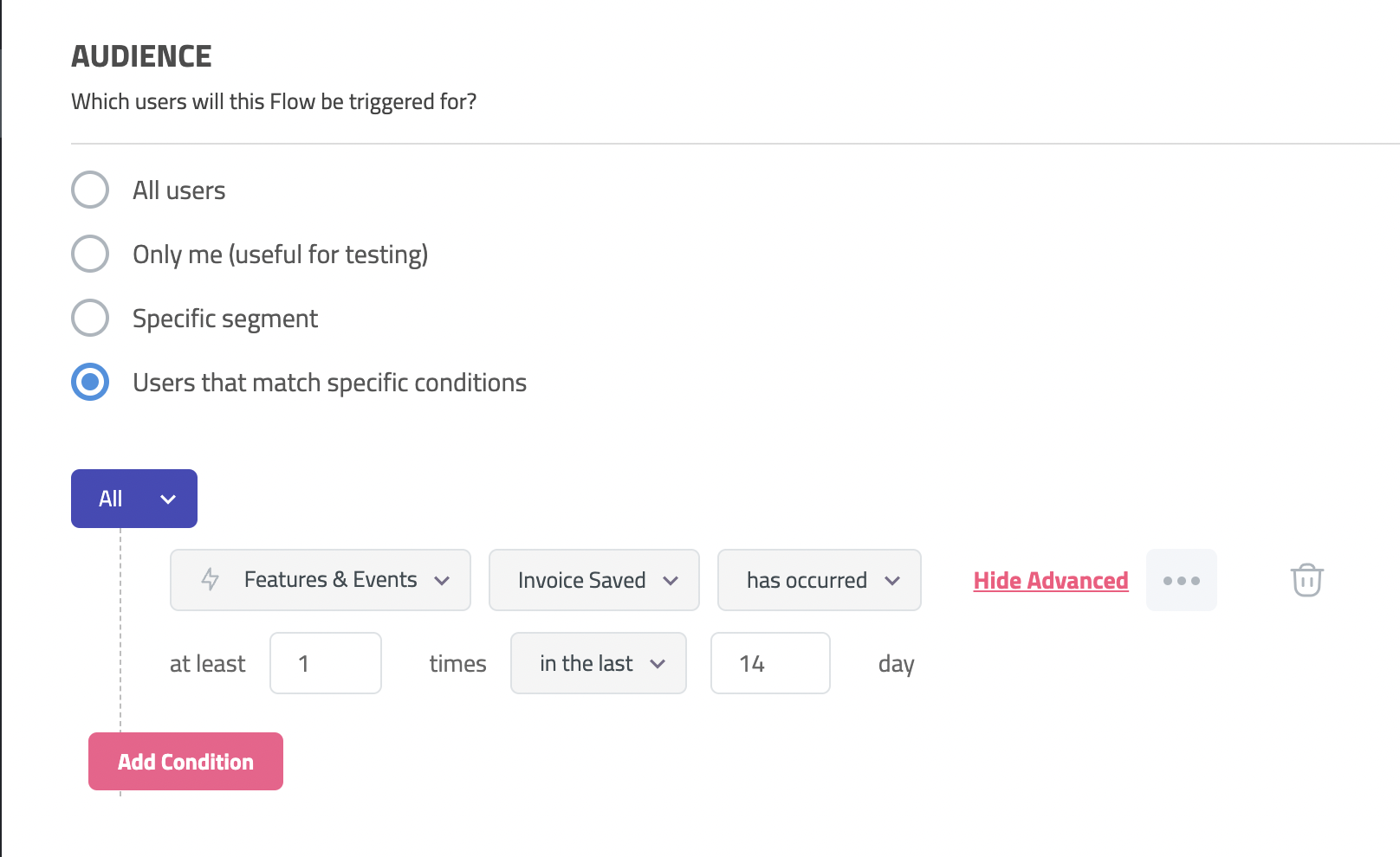
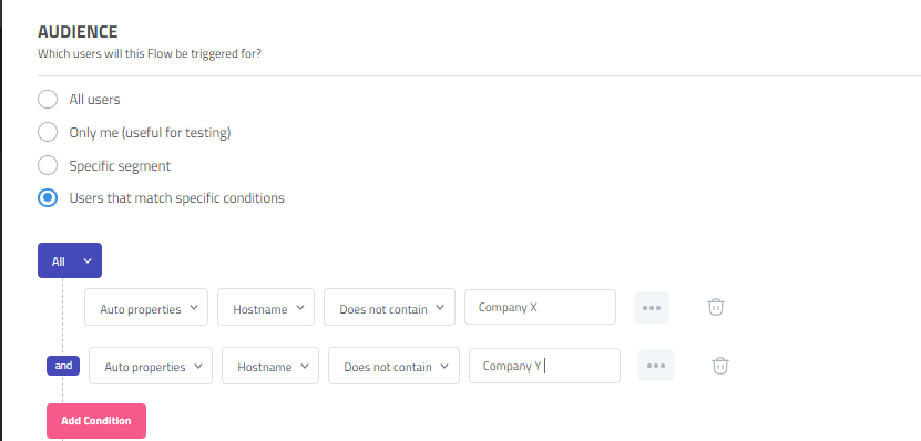
- Flow triggers: Userpilot’s audience settings let you trigger flows for specific segments or target users that meet certain conditions. You can combine this with page-specific or event-occurrence triggers to show relevant flows to the right users at the most contextual moments.
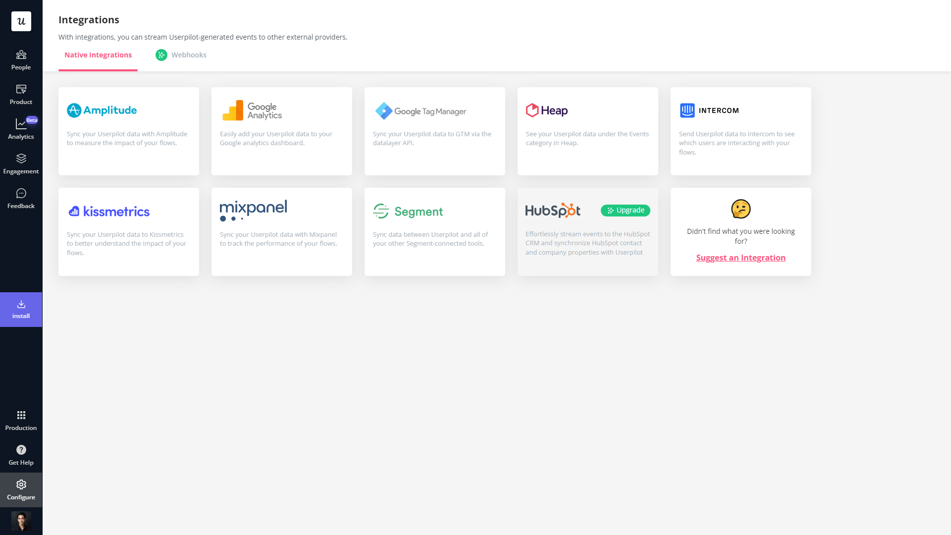
- External data: Userpilot integrates with tools like Amplitude, Google Analytics, Mixpanel, and Segment using a one-way integration. This means you can use the data inside Userpilot to build advanced segmentation and trigger contextual experiences. For more advanced use cases, the two-way integration with Hubspot lets you send and receive data, unlocking a full set of use cases.
Userpilot’s interactive walkthroughs
Interactive walkthroughs are better than linear product tours because they let new users learn by doing instead of dumping a ton of information on them all at once. Userpilot’s no-code features let you build advanced interactive walkthroughs and create personalized flows for each segment.
Here are the Userpilot features you can use to create interactive walkthroughs:
- No-code builder: Installing the Userpilot Chrome extension makes it possible to build interactive walkthroughs with zero coding needed. You’ll be able to use every UI pattern — such as modals, slideouts, tooltips, and driven actions — regardless of which plan you’re on.
- Welcome surveys: Userpilot lets you create welcome screens that survey users on what their primary use cases, roles, needs, etc., are. You can create different walkthroughs depending on their responses to ensure that there’s a personalized experience for all.
- Audience settings: The audience settings on Userpilot flows help you trigger or hide walkthroughs from specific users and segments. This makes it possible to create interactive walkthroughs that target a particular segment or trigger a flow when certain conditions are met.
Userpilot’s tooltips
Tooltips are the most straightforward way to offer contextual information to users without interrupting their workflows. Userpilot lets you create tooltips as part of your in-app flows, attach standalone tooltips to individual features, and leverage the power of AI to streamline the process.
Here are the ways you can use Userpilot to create tooltips:
- Tooltip flows: Tooltips are one of the UI elements you can utilize when creating in-app flows. You’ll be able to edit the size, placement, and behavior of your tooltip as needed. You could also toggle the option to continue or dismiss the flow if a tooltip’s element can’t be located.
- Native tooltips: Userpilot spotlights let you create native tooltips that expand when users click on an element or hover over a feature. Since these tooltips are attached to the features rather than specific pages, they’ll show up anywhere that the element is present.
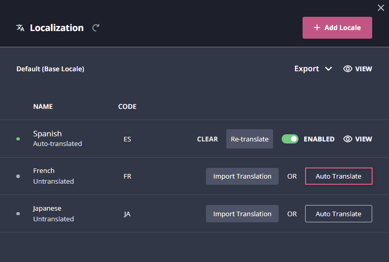
- AI assistance: Userpilot’s AI-powered capabilities help you create better tooltips in less time. You could use the writing assistant to create, shorten, or extend the content of tooltips and leverage automated localization to translate your flow’s tooltips to any of the 32 languages available.
Userpilot’s onboarding checklist
Onboarding checklists help new users learn about a product and reduce their time-to-value (TTV). Userpilot checklists can be created using the no-code builder, used to trigger specific actions, and tracked using the analytics dashboard to gauge overall engagement.
Here’s how you can use Userpilot to create an advanced onboarding checklist:
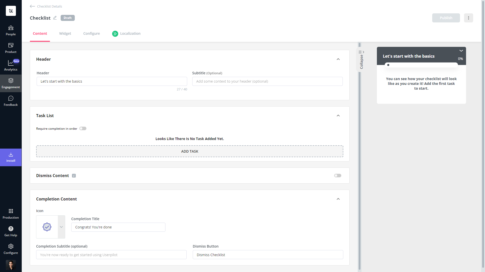
- No-code builder: Userpilot’s checklist creator lets you edit the content of checklists, add tasks, style icons, and configure the triggers for when your checklist should appear. You’ll also be able to choose from five widget icons (or upload your own) and recolor the widget to match your UI.
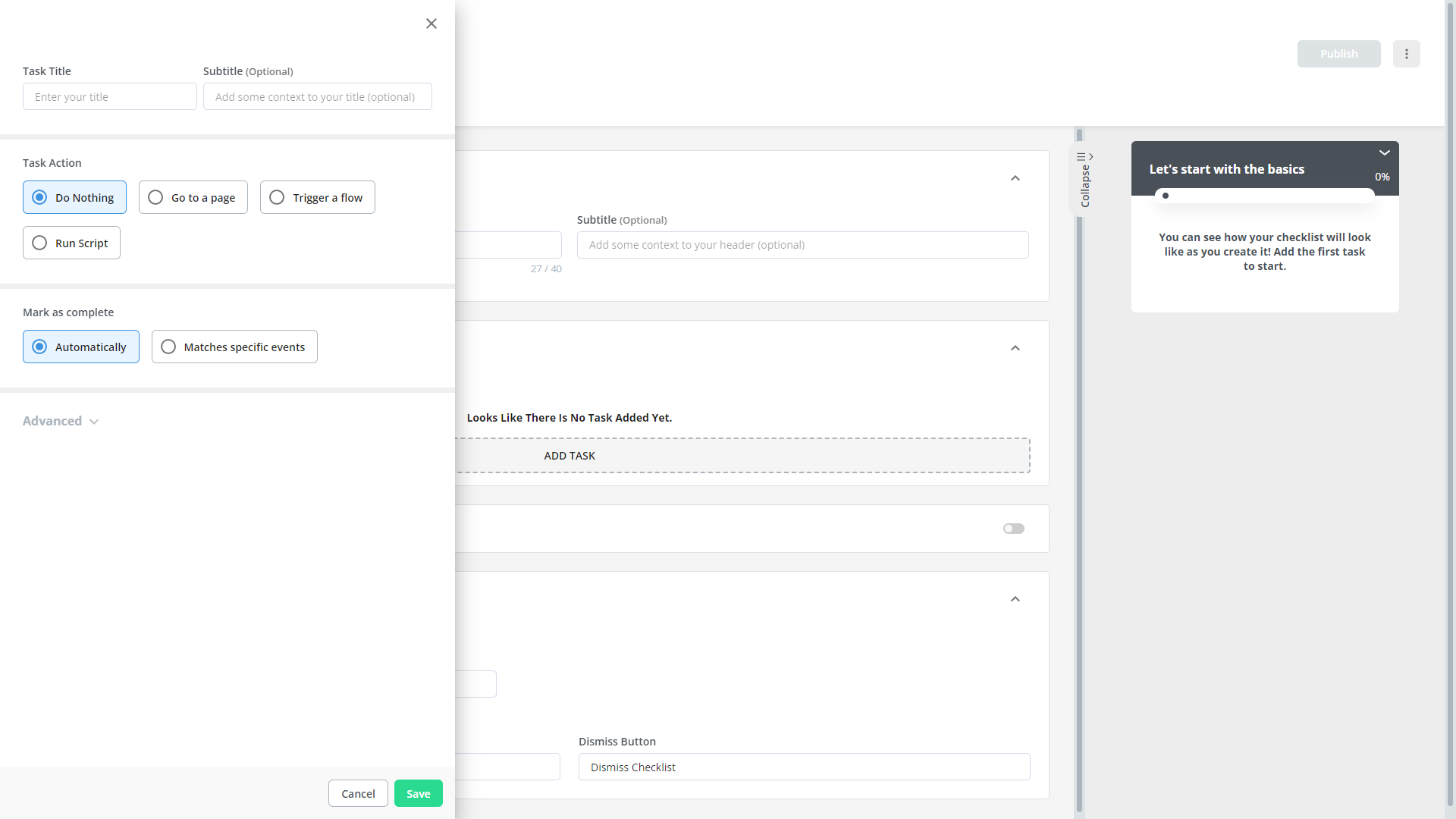
- Smart tasks: Checklist tasks can be set to trigger specific actions upon being completed, such as redirecting a user to a different page, launching an in-app flow, or running a custom JavaScript function. You can also set the conditions for when a task and action will be marked as complete.
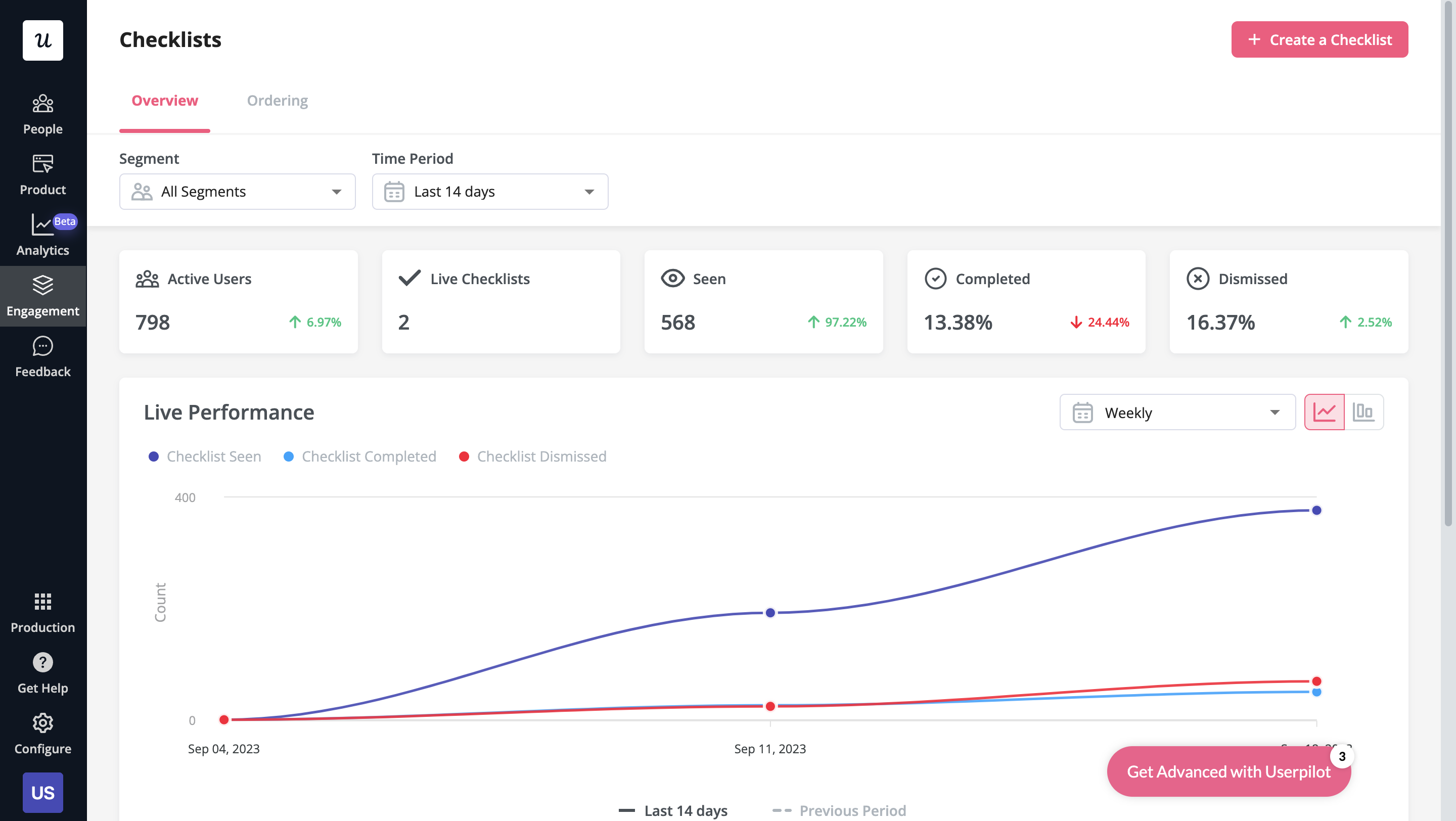
- Checklist analytics: The Checklists dashboard shows you all relevant metrics. These include the number of live checklists you have, how many views they’ve gotten, and how many have been completed. You can also sort these analytics by segment or time period to identify trends.
What are the pros and cons of Userpilot?
Userpilot’s pros
As a full-suite digital adoption platform, Userpilot has all the features you need to onboard users, track analytics, and gather feedback from customers without writing a single line of code. Here are a few pros of using Userpilot as your product growth solution:
- No-code builder: Userpilot’s Chrome extension lets you build flows, add UI elements, and tag features without writing a single line of code.
- UI patterns: There are plenty of UI patterns to choose from when using Userpilot such as hotspots, tooltips, banners, slideouts, modals, and more!
- Startup-friendly: Userpilot’s entry-level plan gives you access to all available UI patterns so you can hit the ground running.
- Walkthroughs and flows: Build engaging interactive walkthroughs and personalized onboarding flows that target specific segments of your user base.
- Self-service support: Build an in-app resource center to help users solve problems, customize its appearance to align it with your brand, and insert various types of content (videos, flows, or chatbots) to keep your customers satisfied.
- A/B testing: Userpilot’s built-in A/B testing capabilities will help you split-test flows, iterate on the best-performing variants, and continually optimize based on user behavior.
- Feedback collection: Userpilot has built-in NPS surveys with its own unified analytics dashboard and response tagging to help you retarget users. There are other survey types to choose from and you can even create your own custom survey.
- Survey templates: There are 14 survey templates to choose from so you can gather feedback on specific features or run customer satisfaction benchmarking surveys like CSAT and CES.
- Advanced analytics: Userpilot lets you analyze product usage data, monitor engagement on all in-app flows, and use the data to create user segments that are based on behaviors instead of demographics.
- Event tracking: Userpilot’s no-code event tracking lets you tag UI interactions (hovers, clicks, or form fills) and group them into a custom event that reflects feature usage.
- Third-party integrations: Userpilot has built-in integrations with tools like Amplitude, Mixpanel, Kissmetrics, Segment, Heap, HubSpot, Intercom, Google Analytics, and Google Tag Manager so you can share data between all the solutions in your tech stack.
Userpilot’s cons
Of course, no tool is perfect and there are a few cons to consider before choosing Userpilot as your user onboarding or product growth solution:
- Employee onboarding: Currently, Userpilot only supports in-app customer onboarding.
- Mobile apps: Userpilot doesn’t have any mobile compatibility which could make it difficult for developers with cross-platform applications to create a consistent user experience for both versions of their product.
- Freemium plan: There’s no freemium Userpilot plan so those bootstrapping their startup and need sub-$100 solutions should consider more affordable onboarding platforms like UserGuiding or Product Fruits.
What do users say about Userpilot?
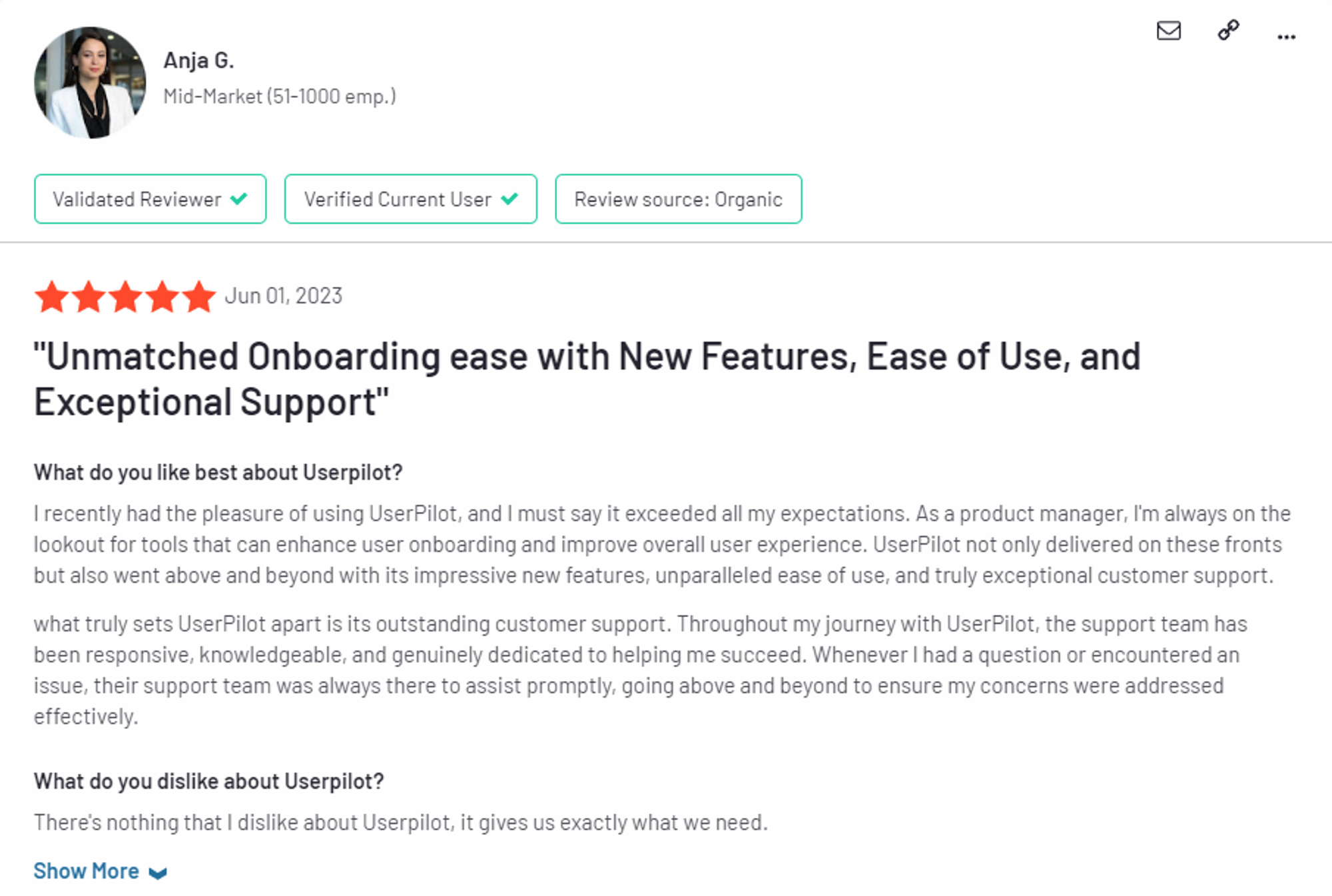
Most users laud Userpilot for its versatile feature set, ease of use, and responsive support team:
I recently had the pleasure of using Userpilot, and I must say it exceeded all my expectations. As a product manager, I’m always on the lookout for tools that can enhance user onboarding and improve overall user experience. Userpilot not only delivered on these fronts but also went above and beyond with its impressive new features, unparalleled ease of use, and truly exceptional customer support.
What truly sets Userpilot apart is its outstanding customer support. Throughout my journey with Userpilot, the support team has been responsive, knowledgeable, and genuinely dedicated to helping me succeed. Whenever I had a question or encountered an issue, their support team was always there to assist promptly, going above and beyond to ensure my concerns were addressed effectively.
Source: G2.
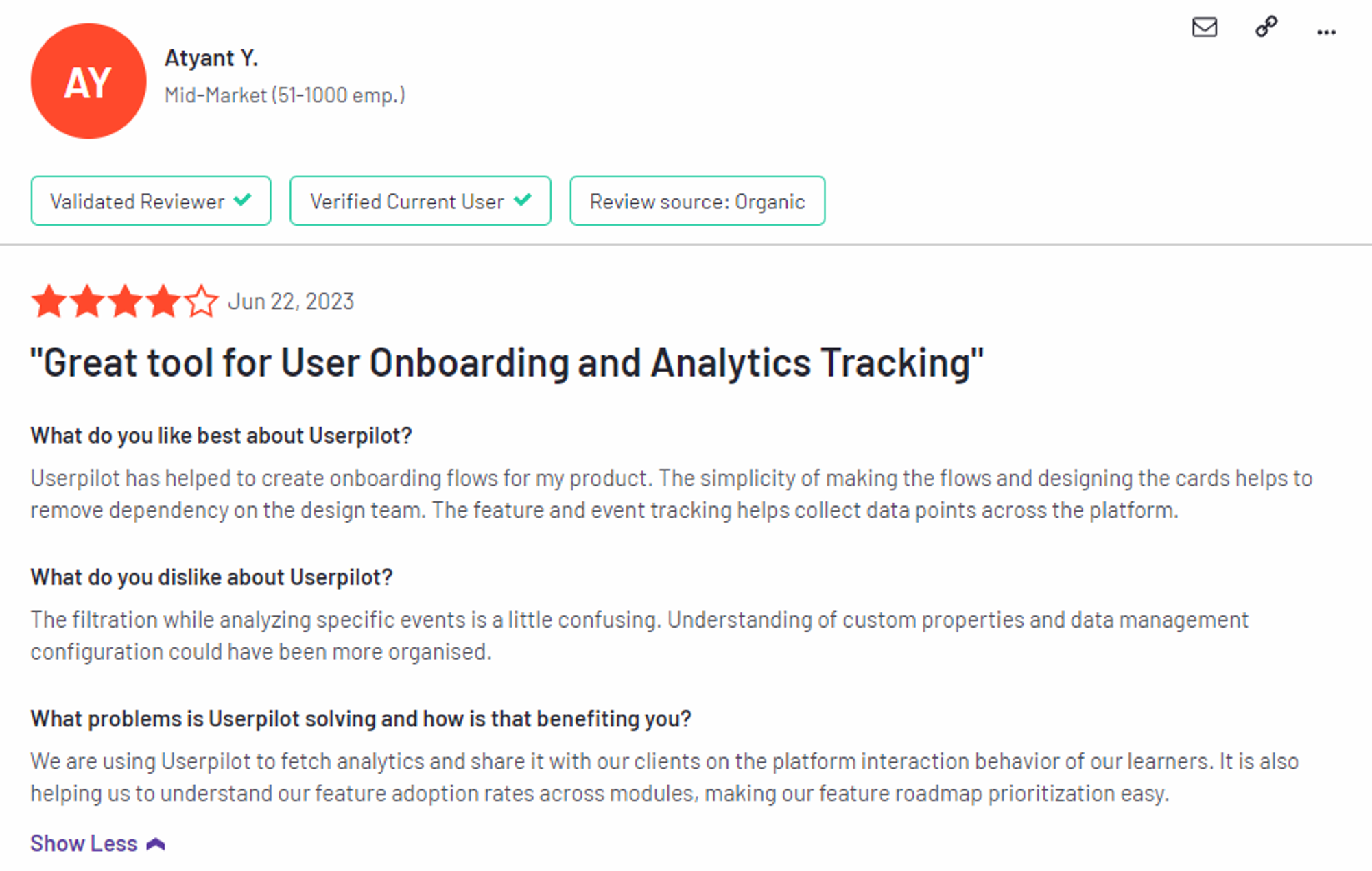
Of course, other users are also kind enough to share constructive criticism regarding specific features like event tracking filters:
“The filtration while analyzing specific events is a little confusing. Understanding of custom properties and data management configuration could have been more organised.”
Source: G2.
Userpilot’s pricing
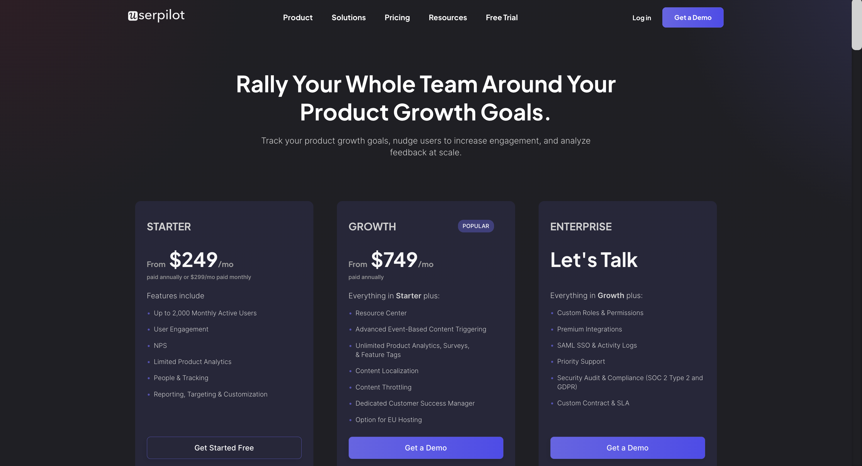
Userpilot has three paid plans to choose from:
- Starter: The entry-level Starter plan starts at $249/month and includes features like segmentation, product analytics, reporting, user engagement, NPS feedback, and customization.
- Growth: The Growth plan starts at $749/month and includes features like resource centers, advanced event-based triggers, unlimited feature tagging, AI-powered content localization, EU hosting options, and a dedicated customer success manager.
- Enterprise: The Enterprise plan uses custom pricing and includes all the features from Starter + Growth plus custom roles/permissions, access to premium integrations, priority support, custom contract, SLA, SAML SSO, activity logs, security audit, and compliance (SOC 2/GDPR).
Conclusion
There you have it.
It should be easier now to make an informed decision whether UserGuiding is your go-to option for Product adoption. Ultimately, the best choice will depend on your product and current needs.
If you’re looking for a better alternative to UserGuiding for Product adoption, book a Userpilot demo today to experience firsthand how it can enhance your user experience and drive product growth!
Looking for A Better Alternative for Product adoption? Try Userpilot
