Looking for an effective new customer onboarding tool and wondering if Stonly is the best option for your SaaS company?
With numerous Stonly alternatives, it can be challenging to make a final decision.
In this article, we’ll delve into precisely that – helping you determine whether Stonly is the ideal choice for your new customer onboarding needs. We’ll explore its features, pricing, and offer a comprehensive review to aid in your decision-making process.
Let’s get started!
Try Userpilot Now
See Why 1,000+ Teams Choose Userpilot
TL;DR
- Stonly is a good choice for new customer onboarding and it comes with features such as user segmentation, interactive walkthroughs, tooltips, and onboarding checklist. There are a few clear scenarios where Stonly wouldn’t be the best solution to use. If you’re in any of these scenarios then considering an alternative platform would probably be best:
- Feature Mismatch: If user onboarding or product adoption are your main goals, then Stonly’s feature set may not align with that use case. Its ability to build in-app guides or survey customers is limited by the platform’s coding requirements and pricing structure.
- Budgetary Constraints: Companies who are operating on a tight budget should steer clear of Stonly due to the extra charges that occur if your guides get more than 4,000 views per month. If guide views reach 30,000 then you’ll be paying an additional $500 on your plan each month.
- Existing Knowledge Bases: Building knowledge bases is the primary use case for Stonly’s feature set. If you already have an existing knowledge base, then you’d be better off with an alternative.
What is Stonly?
Stonly positions itself as a cheaper alternative to some of the pricier product adoption solutions on the market. In reality, it’s more of a customer service tool that can be used to build knowledge bases rather than an actual onboarding or adoption platform.
As a result, the tour builder on Stonly feels more like an add-on to its knowledge base functionality rather than a product of its own.
This also means that its in-app engagement features will be rather limited (especially in the no-code regard).
Must have features of new customer onboarding tools
Before selecting your ideal new customer onboarding solution, it’s essential to ensure it encompasses a range of must-have features that will set the stage for successful user adoption. Here’s what you should be looking for
- Ability to create no-code microsurveys for gathering customer information that can be used for various purposes such as segmentation, product improvements, etc.
- User segmentation that allows you to categorize your new customers based on factors such as company size, user roles, jobs to be done, behaviors, etc. so you can offer personalized experiences.
- Ability to create interactive and engaging onboarding flows that guide users through essential features and actions.
- Features for creating and triggering tooltips and in-app guidance to provide contextual assistance by explaining specific elements or actions within your product.
- Options to build onboarding checklists to help new customers keep track of essential tasks and milestones, ensuring they make the most of your product.
Stonly features for new customer onboarding
Seeing as Stonly is a knowledge base builder first and onboarding/adoption solution second, it has quite a few features that are missing, too basic, or difficult to use for user onboarding.
Some workarounds like interface triggers, guides that help you personalize content, and flow reports that show you which stage of the journey customers are getting stuck on could still be used:
- UI Triggers: Stonly lets you add triggers like pills (icons at the bottom of your screen), banners (bars on the top of your page), hotspots, icons next to an element, or hidden conditions. Note that triggers are only available on paid plans, so Basic users won’t have access to them.
- Guides: Stonly lets you build in-app guides through its visual editor. You’ll be able to add steps, links, surveys, contact forms, checklists, automation, and live chat embeds into these guides with little to no coding. Features like UI triggers or guide variables are limited to paid plans.
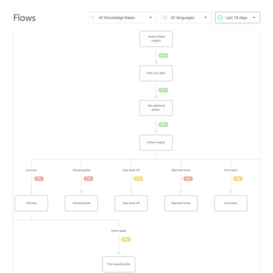
- Flow Reports: Stonly’s flow reports can help you identify which stages or steps of the onboarding journey most of your users are getting stuck on. However, this data is only updated every 15 minutes so you won’t be able to view real-time user path metrics with Stonly.
Stonly’s user segmentation
User segmentation is incredibly important for analyzing user data, tracking customer trends, and triggering in-app guidance at the most contextual moments. Stonly helps you collect user data, create custom properties, and set up targeted triggers for your guides.
Here’s an overview of Stonly’s user segmentation and targeting capabilities:
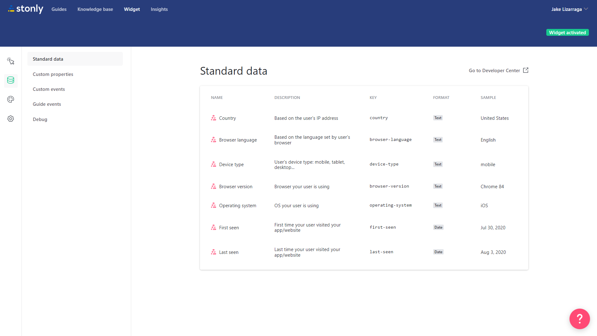
- User Data: By default, the Stonly widget is able to track standard data points. These make it possible to sort users based on which country they’re from, what language they speak, which device/browser they’re using, and when they were first/last seen.
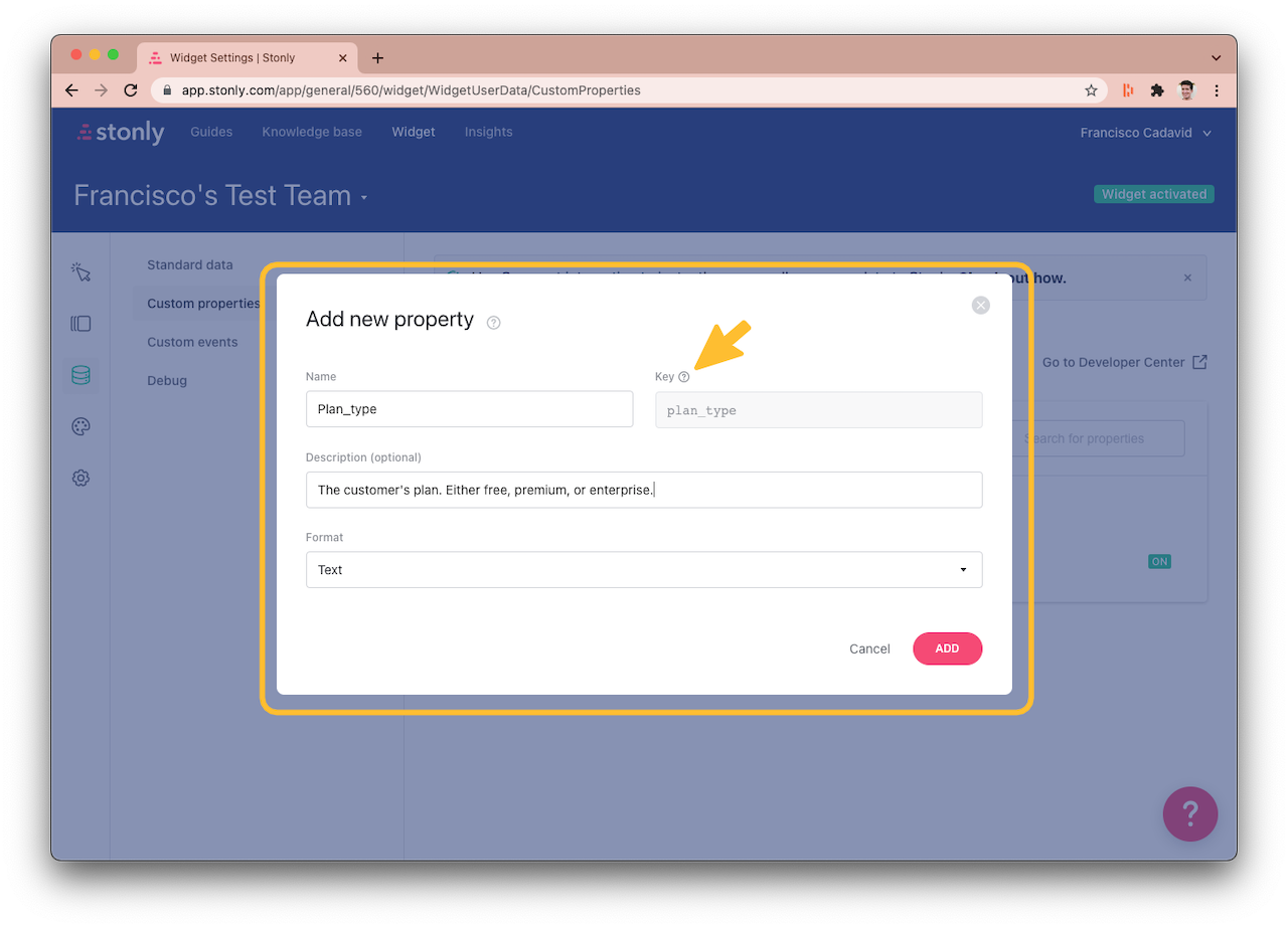
- Custom Properties: If the standard data points that Stonly collects aren’t enough, you can add new properties such as which plan a customer is on. You can also use the Segment integration to add a data source for user attributes and events if needed.
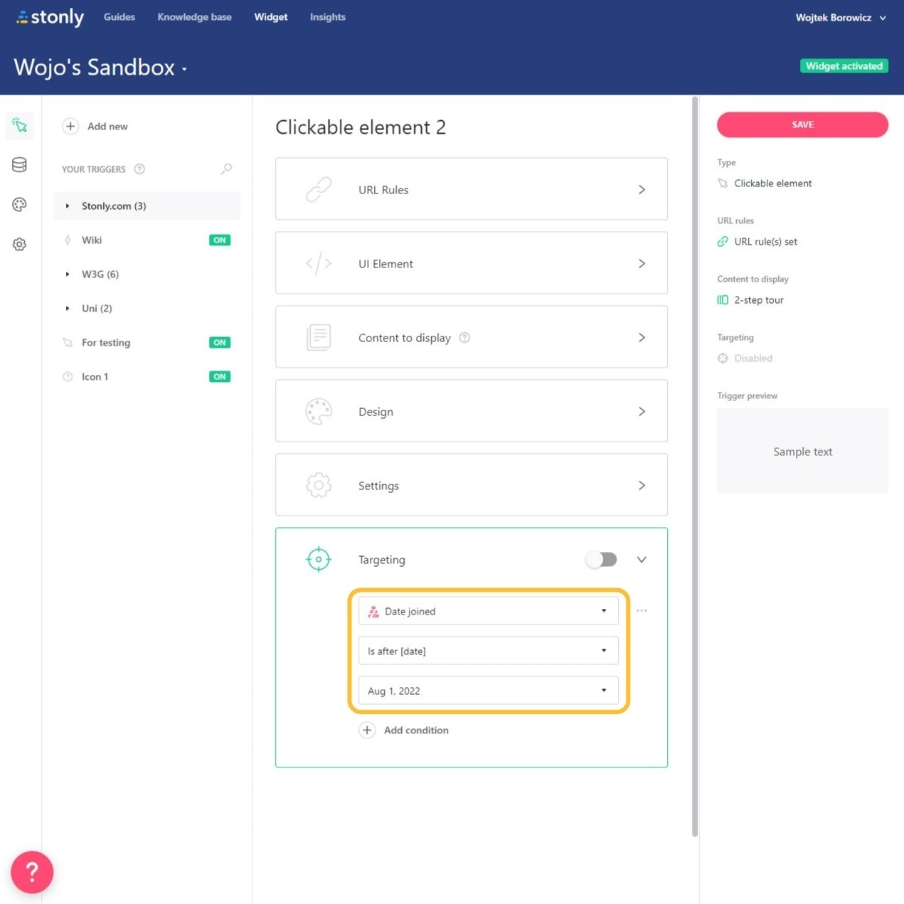
- Targeted Triggers: Stonly lets you add UI triggers that launch in-app content such as guides or multi-step tours. You can add targeting conditions to these UI triggers so that they launch guides based on which user properties are met or which checklist tasks have been completed.
Note: UI triggers are only available on Stonly’s paid plans so users on the Basic version of the platform won’t be able to use them.
Stonly’s interactive walkthroughs
Interactive walkthroughs are better than linear product tours because they help users learn by doing. Stonly’s knowledge base capabilities may be more fleshed out than its onboarding functionality, but it does have a guide builder, UI patterns, and analytics for walkthroughs too.
Here’s how Stonly lets you use interactive walkthroughs to improve onboarding:
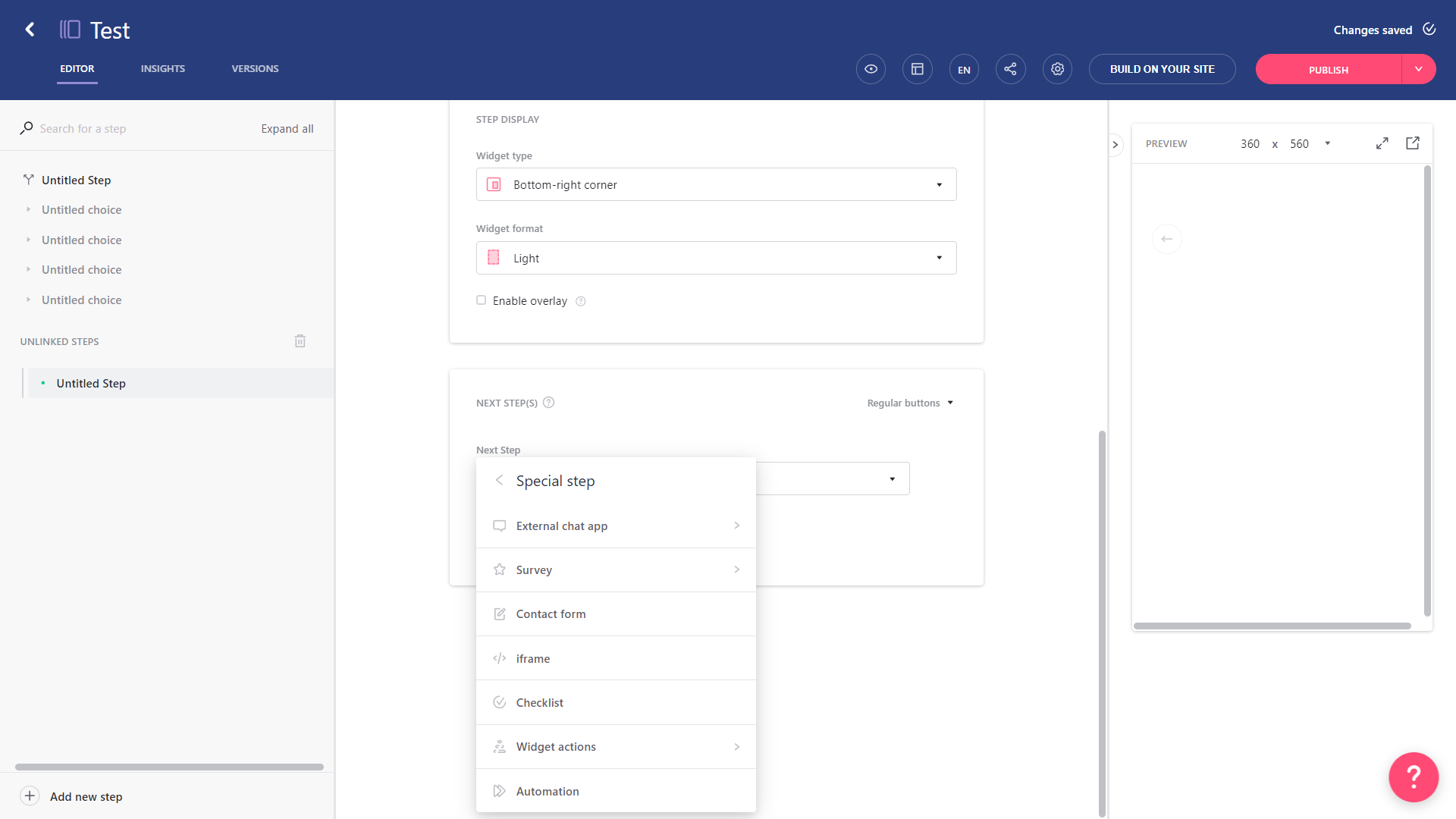
- Guide Builder: The Stonly guide editor lets you create guides, add steps, and edit your content without writing a single line of code. You can also add special steps like surveys, checklists, automations, or external integrations for chat apps like Freshchat and Intercom.
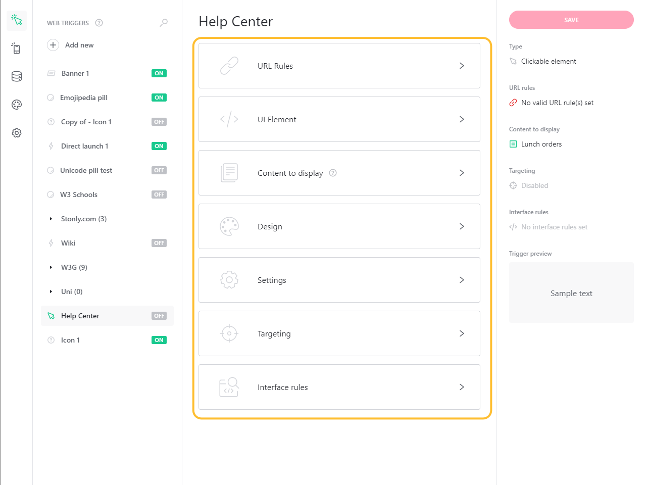
- UI Patterns: Stonly lets you trigger specific guides using various UI patterns. These include pill buttons at the bottom corner of the screen, banners on the top, info icons next to elements, and hidden triggers that activate conditionally. You can also edit the design or targeting for triggers.
Note: UI triggers are only available on Stonly’s paid plans so users on the Basic version of the platform won’t be able to use them.
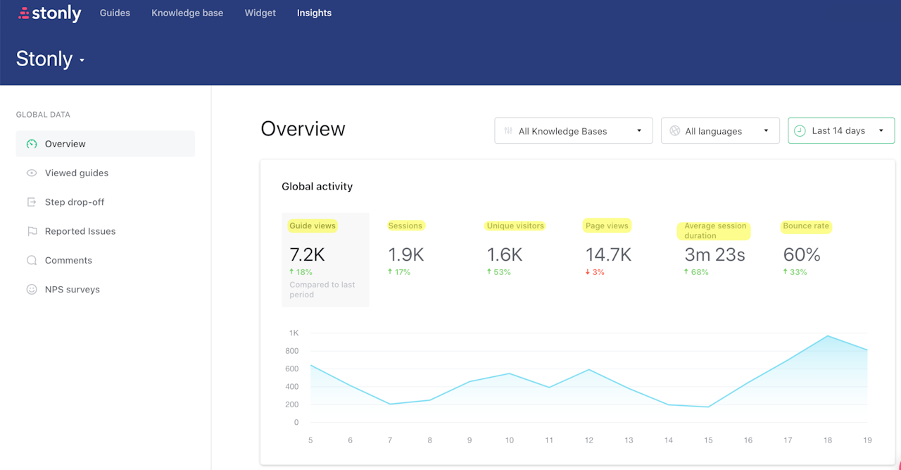
- Analytics Dashboard: In addition to letting you build interactive walkthroughs and trigger them contextually, Stonly also has an Insights dashboard for global analytics. This will help you track the total number of guide views, how many unique visitors saw them, and track top guides.
Stonly’s tooltips
Stonly lacks traditional tooltips that expand when users hover over an element but it does have information icons that can trigger guides:
Here’s how you can use Stonly to trigger contextual guides that work as onboarding tooltips:
- Icons: Icons are one of the UI triggers that you can add with Stonly. You can then launch a guide, tour, or knowledge base module when users click on the information icon next to an element or feature.
- Triggers: Because icons are a type of UI trigger, you’ll be able to apply Stonly’s targeting settings to them. These include URL rules for which pages the icon should be enabled on, targeting conditions based on user properties, and customized designs.
Note: UI triggers are only available on Stonly’s paid plans so users on the Basic version of the platform won’t be able to use them.
- Limitations: Unfortunately, Stonly doesn’t support native tooltips that expand when users hover over an element. Furthermore, failing to tag a UI element properly and set the necessary URL rules could lead to your tooltip triggers being deactivated entirely.
Stonly’s onboarding checklist
Stonly lets you build onboarding checklists from scratch, use its provided template, set task completion conditions, and monitor analytics for all checklists.
Here’s how Stonly helps you build user onboarding checklists:
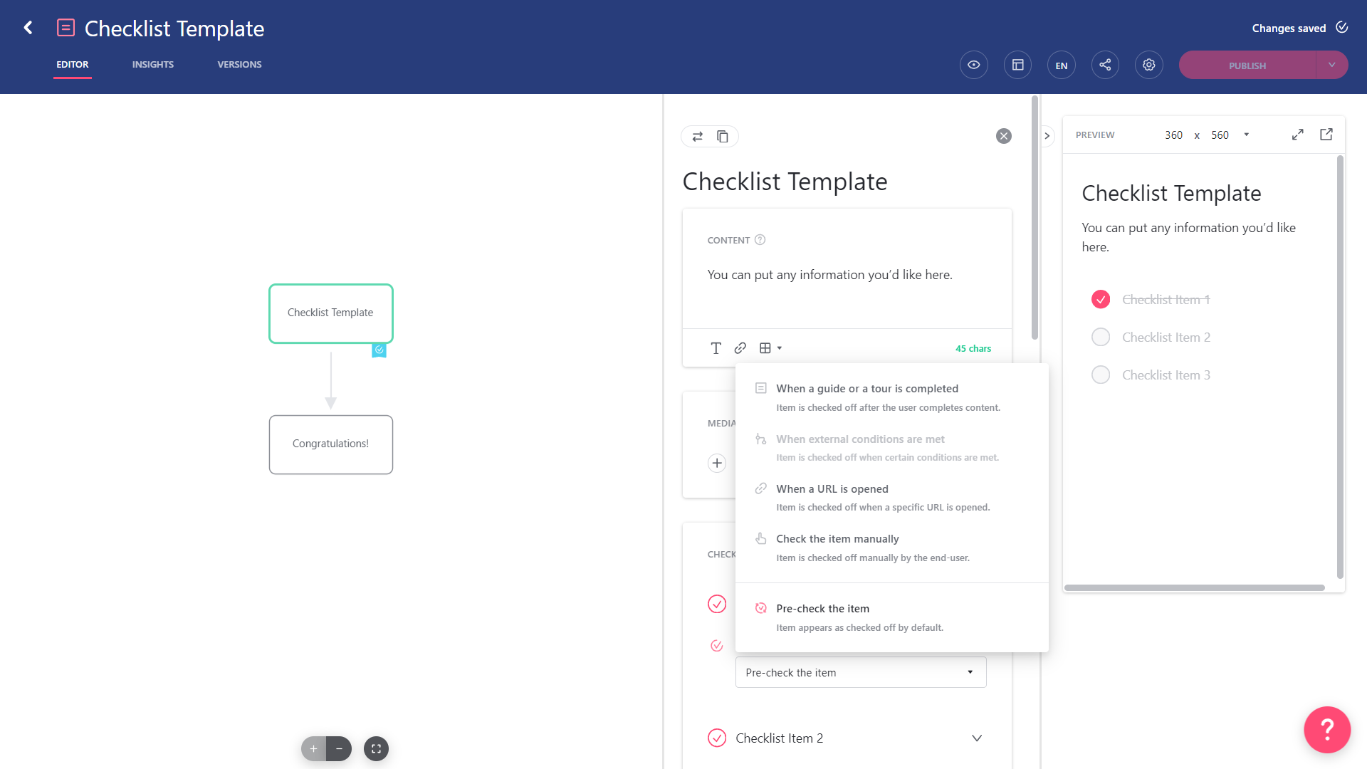
- Visual Editor: Stonly’s visual editor lets you build checklists that sit inside of guides, add tasks, edit content, and tweak settings without writing a single line of code. You’ll also be able to toggle between languages by clicking on the “EN” icon or revert changes using the builder’s file versioning tab.
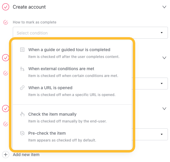
- Completion Conditions: Stonly checklists have multiple options for marking tasks as completed. You can have tasks that are pre-checked by default, make users check tasks off manually, or trigger completion when certain conditions are met (such as finished guides or URL opens).
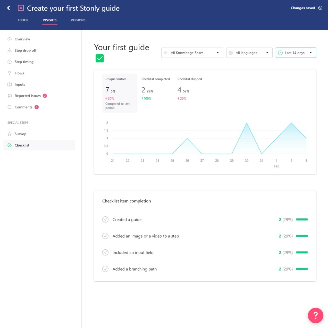
- Checklist Analytics: Stonly offers granular insights for every checklist you create. These analytics dashboards show you how many unique visitors have interacted with the checklist and how many skipped/completed it. You can also see completion rates for each individual task.
What are the pros and cons of Stonly?
Stonly’s pros
While Stonly isn’t as capable as full-on digital adoption solutions, it does have a few benefits:
- Self-Service Support: Because building knowledge bases is the primary use case for Stonly (and arguably its core product), it has advanced self-service support features that could outperform other adoption solutions, such as abundant live chat integrations.
- Analytics Dashboard: Stonly has a unified analytics dashboard that can show you global insights across all your guides. This makes it easier to track content engagement and monitor your key performance indicators (KPIs).
- Guide Builder: While other Stonly features such as event tracking, user targeting, data streaming, and styling require coding, the guide builder uses an intuitively designed visual interface to let you add, edit, or delete steps.
Stonly’s cons
Unfortunately, there are quite a few drawbacks to using Stonly that stem from its lopsided features, no-code capabilities (or lack thereof), and view-based pricing model:
- Feature Set: Seeing as Stonly is a knowledge base builder first and onboarding/adoption solution second, it has quite a few features that are missing, too basic, or difficult to use. If user onboarding and product adoption are your main use cases, consider alternatives.
- Coding Requirements: Unlike most of its competitors, Stonly doesn’t advertise itself as a no-code onboarding/adoption platform. This means you’ll need coding knowledge to track events, target users, stream data, and style your content.
- Pay-as-You-Go Pricing: Stonly’s pricing charges additional fees based on the number of views that guides get. Customers who don’t exceed 4,000 guide views per month won’t be charged extra, but those who do will pay an additional $250 to $500 monthly depending on volume.
What do users say about Stonly?
Despite Stonly’s limitations, there are some aspects of the platform that garner praise from users, such as the ease of publishing:
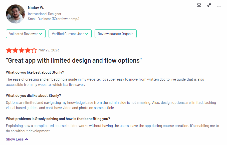
The ease of creating and embedding a guide in my website. It’s super easy to move from written doc to live guide that is also accessible from my website, which is a live saver.
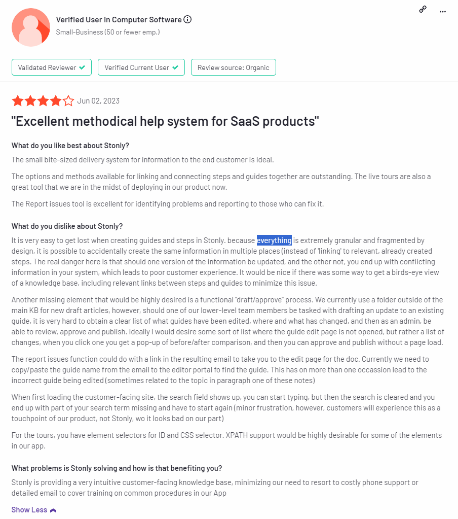
“It is very easy to get lost when creating guides and steps in Stonly. because everything is extremely granular and fragmented by design, it is possible to accidentally create the same information in multiple places (instead of ‘linking’ to relevant, already created steps. The real danger here is that should one version of the information be updated, and the other not, you end up with conflicting information in your system, which leads to poor customer experience. It would be nice if there was some way to get a birds-eye view of a knowledge base, including relevant links between steps and guides to minimize this issue.
Another missing element that would be highly desired is a functional “draft/approve” process. We currently use a folder outside of the main KB for new draft articles, however, should one of our lower-level team members be tasked with drafting an update to an existing guide, it is very hard to obtain a clear list of what guides have been edited, where and what has changed, and then as an admin, be able to review, approve and publish. Ideally I would desire some sort of list where the guide edit page is not opened, but rather a list of changes, when you click one you get a pop-up of before/after comparison, and then you can approve and publish without a page load.
The report issues function could do with a link in the resulting email to take you to the edit page for the doc. Currently we need to copy/paste the guide name from the email to the editor portal to find the guide. This has on more than one occasion led to the incorrect guide being edited (sometimes related to the topic in paragraph one of these notes)
When first loading the customer-facing site, the search field shows up, you can start typing, but then the search is cleared and you end up with part of your search term missing and have to start again (minor frustration, however, customers will experience this as a touchpoint of our product, not Stonly, wo it looks bad on our part)
For the tours, you have element selectors for ID and CSS selector. XPATH support would be highly desirable for some of the elements in our app.”
Stonly’s pricing
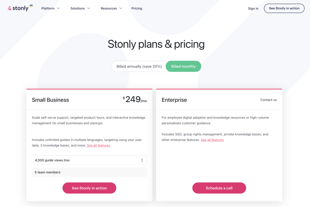
Stonly offers two paid plans. In addition to the base subscription cost, customers will also be charged additional fees if their guides get more than 4,000 views per month.
Here’s an overview of Stonly’s two subscription tiers:
- Small Business: Stonly’s Business tier is the entry-level paid plan that starts at $249/month but offers a 20% discount if you bill annually. It includes five team seats, unlimited guides, multi-language support, guide variables, and integrations. You’ll be billed extra if you exceed 4,000 guide views.
- Enterprise: The Enterprise version of Stonly uses quote-based pricing and includes all the features of the Business tier. It has additional features like surveys, automatic guide translation, advanced permissions, additional integrations, priority support, and single sign-on (SSO).
3 Reasons why you might need a Stonly alternative
There are a few clear scenarios where Stonly wouldn’t be the best solution to use. If you’re in any of these scenarios then considering an alternative platform would probably be best:
- Feature Mismatch: If user onboarding or product adoption are your main goals, then Stonly’s feature set may not align with that use case. Its ability to build in-app guides or survey customers is limited by the platform’s coding requirements and pricing structure.
- Budgetary Constraints: Companies who are operating on a tight budget should steer clear of Stonly due to the extra charges that occur if your guides get more than 4,000 views per month. If guide views reach 30,000 then you’ll be paying an additional $500 on your plan each month.
- Existing Knowledge Bases: Building knowledge bases is the primary use case for Stonly’s feature set. If you already have an existing knowledge base, then you’d be better off with an alternative like Userflow that integrates with Freshdesk, HubSpot, and Zendesk knowledge bases.
Try Userpilot as an alternative for new customer onboarding
It should be easier now to make an informed decision whether Stonly is your go-to option for new customer onboarding. Ultimately, the best choice will depend on your product and current needs.
User onboarding is a crucial part of the customer journey as it speeds up the adoption process and increases retention rates. Onboarding is one of Userpilot’s core use cases along with product growth analytics and user feedback, so it has plenty of features that you can utilize.
Here are some Userpilot features you can use when onboarding new users:
- No-code builder: Creating flows is as simple as installing the Chrome extension, selecting the UI patterns you’d like to use, and then editing the content/settings to suit your use case. You can also use templates to create modals, slideouts, tooltips, and driven actions.
- Native tooltips: Create native tooltips that show up when users hover over an element or click on an information badge. Since these native tooltips attach to the element itself, they aren’t page-dependent and will show up on any screen where that element is visible.
- Onboarding checklists: They help new users learn about a product and reduce their time-to-value (TTV). Userpilot checklists can be created using the no-code builder, used to trigger specific actions, and tracked using the analytics dashboard to gauge overall engagement.
- Interactive walkthroughs are better than linear product tours because they let new users learn by doing instead of dumping a ton of information on them all at once. Userpilot’s no-code features let you build advanced interactive walkthroughs and create personalized flows for each segment.
- Funnel analytics: Advanced analytics lets you create funnel reports that track the onboarding journey. You can also add filters (like name, user ID, signup date, operating system, country, etc.) and monitor the total conversion rate from the first step of the funnel to the last.
- User segmentation: You can segment users based on the device they’re using, where they’re located, their engagement data, or which NPS rating they selected on the latest survey. You can then filter your analytics dashboards to see which segments struggle with onboarding. user segmentation
If you’re looking for an alternative to Stonly for new customer onboarding, book a Userpilot demo today to experience firsthand how it can enhance your user experience and drive product growth!

