
Cohort analysis is a behavioral analytics method that groups users based on shared characteristics within a specific timeframe, rather than analyzing user behavior as a single unit.
Instead of asking basic questions like “How many new users did we add?” or “How many users do we have?”, it asks, “How are the users we acquired in January behaving compared to those we acquired in February?”
By isolating these groups, you can identify patterns in the customer lifecycle that remain invisible in aggregate behavior reports.
How do you currently track user retention and behavior?
When trying to understand what is cohort analysis for your users, what is your biggest blocker?
Which of these goals is your top priority right now?
Unlock the Hidden Insights in Your Data
Aggregate data hides the truth. To truly master what is cohort analysis, you need to isolate specific user groups and track their journey over time. Userpilot helps you spot friction points, identify stickiness, and optimize retention without writing code.
The benefits of cohort analysis
The benefits of cohort analysis extend far beyond simple reporting. Here are four reasons I conduct it regularly:
- Isolate product impact: Customer cohort analysis helps you understand the effect of each product change by comparing how neighboring groups of users behave over time. When you release an update or adjust a flow, the cohorts that joined just before and just after the change give you a clear picture of its influence, allowing you to see whether the change improved the experience or introduced new friction.
- Optimize customer lifetime value: You can’t improve LTV unless you understand which user behaviors are linked to long-term engagement. By examining behavioral cohorts, you can compare the LTV of users who completed a specific action with the LTV of the broader population, all drawn from real customer data rather than assumptions.
- Enhance marketing efficiency: Not all acquisition channels behave the same way once users enter the product. A Google Ads cohort might convert quickly at the start yet fall away after the second month, while an Organic Blog cohort might convert more slowly but remain active far longer. Cohort analysis lets you calculate the LTV to CAC ratio for each channel instead of relying on a blended average, which often hides these differences.
- Combat churn proactively: Cohort analysis shows the exact stage in the user journey where interest begins to fade, providing an opportunity to intervene early and improve user retention before it’s too late.
When to conduct cohort analysis
Cohort analysis is most useful at specific decision points when averages no longer provide enough clarity. I find it especially useful in these three situations:
1. When churn appears to be rising
If overall user churn increases, the aggregate number will not explain the cause. A cohort view allows you to separate users by acquisition source, plan type, or period of signup.
This helps you determine whether the change comes from a new marketing channel, a shift in customer mix, or an isolated segment that’s losing interest.
2. Before and after major product updates
When planning a redesign or a new feature launch, it helps to establish a baseline by examining the retention patterns of recent cohorts.
After the release, comparing new cohorts to earlier ones shows whether the update improved early engagement or introduced friction. If Week-1 retention falls for users who joined after the update, the onboarding experience or the change itself may need review.
3. When refining the ideal customer profile
Cohorts based on customer attributes such as industry, company size, or role help you group customers in a way that reveals which segments find long-term value in the product.
If one segment shows steady user retention while another declines sharply after a few months, the contrast offers practical guidance for product positioning, marketing allocation, and other future decisions.
![]()
Spot Hidden Churn Risks with Our Advanced Userpilot Cohort Analysis Tools

Cohort analytics use cases
Effective analysis rests on two pillars: tracking when users arrive (acquisition cohorts) and tracking what they do (behavioral cohorts). These represent the two primary use cases for cohort analysis.
1. User acquisition cohorts
These cohorts group users based on their acquisition date, so you can track them by the day, week, or month of account creation. This kind of time-based cohort analysis helps you compare how retention develops across each group.

Use cases for acquisition cohorts:
- Validate lead quality: Did users acquired during the Black Friday sale stick around, or did they churn faster than organic leads from the previous month?
- Measure long-term health: Is the customer lifetime value rising for newer cohorts? Cohort comparisons make this easy to see, and the difference can be significant—for example, Private SaaS companies with the highest Net Revenue Retention report median growth rates about 83 percent higher than the overall population.
- Assess onboarding impact: Did new signups from last month activate faster than signups from six months ago after you deployed a new checklist?
2. Behavioral cohorts
If acquisition cohorts answer the “When,” behavioral cohorts answer the “Why.” These groups are formed by looking at the actions users perform inside the product during a defined period.
The report helps you see which behaviors signal value, highlight which actions create engaged users, and reveal which patterns correlate with early drop-off. It also allows for correlation analysis. For example, by comparing the retention curves of two groups, such as “Used Export Feature” and “Did Not Use Export Feature,” you can pinpoint the actions that serve as your product’s “Aha” moments.

Use cases for behavioral cohorts:
- Onboarding efficacy: Do users who complete the onboarding checklist exhibit higher retention rates than those who skip it?
- Feature stickiness: Are power users of specific functions identified in your core feature dashboard significantly less likely to churn? Data suggests that customers engaging with over 70% of core features are twice as likely to stay retained.
- Integration value: Does integrating with Slack correlate with higher engagement in Week 4?
Step-by-step process for performing cohort analysis
Implementing this analysis doesn’t require a data science degree. In this section, I’ll walk you through the key steps my team and I use for efficient cohort analysis.
Step 1: Define your goal
Cohort analysis is flexible, but it only produces useful insights when the goal is clear.
So, begin by deciding exactly what you want to achieve. Are you trying to understand whether users return after their first session? Do you want to know if a new feature drives repeat usage? Or are you checking whether a recent onboarding update improved early activation?
I use the SMART goal-setting framework here because it forces you to shape the question in a way that supports clean cohort definitions. Imagine you want to track whether your onboarding checklist improves early retention. Here is how that turns into a SMART goal:
- Specific: Define the exact user behavior you want to measure. In this case, “Complete the onboarding checklist” becomes the action that places users into a behavioral cohort.
- Measurable: Choose the metric that indicates success. For early retention, this might be “Percentage of users who return within seven days after signup.”
- Achievable: Make sure the goal is realistic. If your current seven-day customer retention is 25 percent, a target of 35 percent is more grounded than a jump to 70 percent.
- Relevant: Confirm that the metric aligns with what you are trying to improve. If the issue is early churn, measuring long-term engagement does not help. Early retention is the correct focus here.
- Time-bound: Set a window for evaluation. For onboarding changes, I like to review the first two or three cohorts after the update and compare them against the previous baseline.

Step 2: Segment your audience
Once you know what you want to measure, the next step is to group users in a way that helps you see the patterns that matter most. You might split users by device type, acquisition channel, plan level, or the actions they took during their first session. The point is to separate the noise from the signal so you can see how different user segments move through the product.
A good segment should relate directly to your goal. If you’re studying new user retention, it makes sense to compare users who followed your onboarding walkthrough with those who skipped it. If you are reviewing a pricing change, you might compare cohorts based on plan type or trial length. When the segmentation aligns with the question you’re trying to answer, the patterns become clearer, and the next actions become easier to identify.
Userpilot’s segmentation capabilities allow you to build these groups based on factors like feature tags, tracked events, or user properties, isolating variables instantly.

Step 3: Select your timeframe
Your cohort analysis will only be useful if the timeframe reflects how people naturally use your product. A product with frequent, lightweight activity needs a tighter view, while a product with heavier or less frequent usage calls for a broader one.
The goal is to choose a timeframe that captures real usage patterns. If your product is used once a week, a daily cohort will look erratic and misleading. If your product is used many times a day, a monthly cohort may hide important shifts in customer behavior.
For most SaaS products, setting your report to track cohorts by week or month gives you a clear picture and smooths out daily volatility while still preserving the trends you need to evaluate.
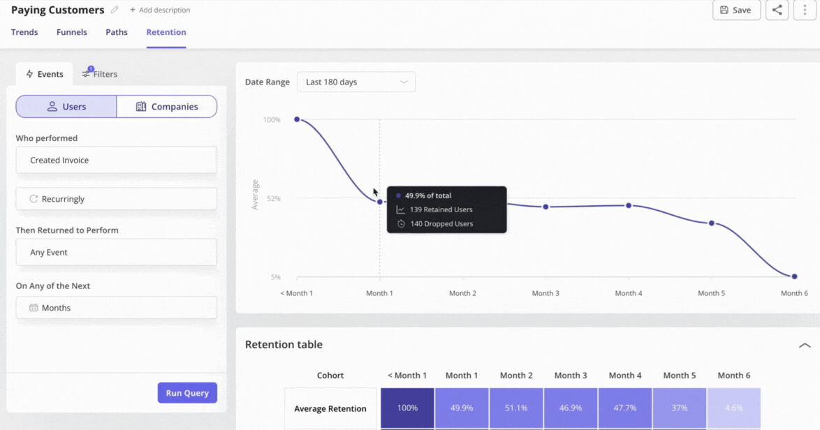
Step 4: Analyze the visualization
Once the retention table is in front of you, connect what you see back to the goal you defined in Step 1.
The table already shows how each cohort behaves across the timeline, so your task now is to look for patterns in the cohort data that relate directly to the metric you chose. If your goal is retention, focus on the first one or two columns to see whether newer cohorts hold their engagement longer than older ones.
If your goal is feature impact, compare the cohorts tied to users who completed a key action with those who did not and look for meaningful separation in their curves.
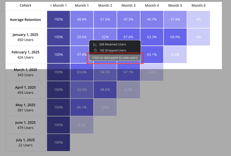
How to read a cohort table
The output of a cohort analysis is usually a table that looks like a staircase or a triangle. It can look intimidating at first, but it is simple once you know how to read it.
Here is a breakdown of the standard retention table layout:
- The vertical axis: This represents your cohorts. Usually, these are months (e.g., January, February, March).
- The horizontal axis: This represents the time passing since the user joined. It’s usually labeled as Month 0, Month 1, Month 2, etc.
- The cells: These show the percentage of the original cohort that is still active.
Month 0 is the starting point. It’s almost always 100% because that is when everyone signed up.
Month 1 shows how many people came back one month later. If 100 people signed up in January, and 61 came back in February, your Month 1 retention for the January cohort is 61%.
Reading it three ways
To extract insights, you read the table in three directions:
- Read the row (left to right): This tells you the lifecycle of a specific group and shows the exact points where users drop off as they move through the product.
- Read the column (top to bottom): This compares different cohorts at the same stage of their life. Compare Month 1 retention for January vs. February vs. March. If the percentage goes up as you go down the column, your onboarding is improving.
- Read the diagonal: This shows calendar months. It helps you spot external factors. If you see a drop across all cohorts in the same calendar month (e.g., everyone dropped off in December), it might be a seasonal issue or a server outage.
What if you don’t have enough data?
A common objection to cohort analysis is the idea that early-stage companies lack the sample sizes needed for meaningful insight.
This is a misunderstanding. At an early stage, you’re looking for signals rather than statistical certainty. If a cohort of fifty users shows that ten drop off at the same point, you don’t need a formal significance test to recognize a problem.
Waiting for “enough data” often means delaying product improvements until you’ve already lost many potential customers. Smaller cohorts can even be more valuable because they allow you to combine quantitative patterns with direct follow-ups through brief surveys or interviews to understand why users disengaged.
Cohort analysis traps to avoid
Cohort analysis can surface powerful insights, but it’s easy to lose clarity if you take the wrong approach. These are the pitfalls I watch for when reviewing retention patterns:
- Confusing correlation with causation: Just because users who “Use Advanced Search” retain longer doesn’t mean the search feature causes retention. It often means power users naturally explore more. To validate causation, guide a cohort of average users toward that feature with a Userpilot flow. If their retention rises, you’ve found a real driver.
- Analyzing micro-cohorts: Splitting data into groups that are too small, such as “Canadian Enterprise users on Tuesdays,” introduces noise instead of insight. Keep cohorts large enough to show real patterns or group them by quarter rather than by month when volume is low.
- Analysis paralysis: Don’t try to track every click or event. Focus on the key performance indicators that support your North Star Metric so the analysis stays anchored to your original goal.
Conclusion
You don’t need a data science team or a full analytics stack to use cohort analysis effectively and see useful patterns. Start with one acquisition cohort and one question: “Is our retention improving month over month?” Once you have that answer, move to a single behavioral cohort and ask, “Do users who finish onboarding stay longer?” Each answer provides you with a clear action to take, whether it’s guiding users toward a key feature or addressing a point of friction that prevents them from returning, and it becomes the foundation for targeted retention strategies that actually work.
Userpilot helps close the loop on this work. You can analyze cohorts to find the weak points in the journey, then use the same platform to guide users toward the steps that improve retention. Instead of juggling separate tools or waiting on engineering support, our platform gives you no-code tools to act on your insights immediately and build a smoother path for new and returning users.
Ready to see it in action? Book a demo call with our team to discuss your needs!
![]()
Simplify Complex Data and Optimize User Journeys Through Userpilot Cohort Analysis
About the author