25+ Best User Engagement Tools and Software


Your users are slipping away, and you’re not sure why. Low engagement, silent churn, and a product experience that feels more like guesswork than strategy.
Most teams are juggling 5+ disconnected tools—one for messaging, another for analytics, another for surveys—with no clear way to connect the dots. You’re spending more time wrestling with your tech stack than actually engaging users.
The right user engagement tools can change everything. From in-app messaging and behavioral analytics to feedback collection and multi-channel outreach, the tools in this guide help you understand your users, communicate at the right moments, and keep them coming back.
I’ve tested dozens of engagement platforms across different use cases and company sizes. Below, you’ll find 25+ tools with honest assessments of what they do best, what they cost, and when to use them.
What are the best customer engagement tools?
✅ Userflow: Best for in-app messaging, checklists, and flows. Plans start at $240/month.
✅ Sendbird: Best for communicating within the app. Different pricing applies for each use case. The chat feature is available for free, while voice and video calls cost $0.0010 and $0.0014, respectively. Business notifications require a custom quote.
✅ Userpilot: Best for no-code customer engagement and data collection on mobile and web. Pricing starts at $299/month.
✅ Intercom: Best for connecting with your support team through multiple conversational interfaces. Base price begins at $29/month. (Add-ons charged separately.)
✅ Zendesk: Best for managing multi-channel support tickets. Comprehensive suite plans start at $55/agent/month; you can also build your own plans starting from $19/month.
✅ Mailchimp: Best for email management for startups and early-stage businesses. Paid plans start at $13.35/month.
✅ ActiveCampaign: Best for email-based outreach for mid-level companies. The starter plan’s pricing is at $15/month.
✅ Klaviyo: Best for running email campaigns for enterprise brands. Paid subscription begins at $20/month.
✅ Twilio Flex: Best for managing sales and support interactions. Per-hour pricing begins at $1, and per-user pricing starts at $150.
✅ MessageBird: Best for global customer outreach. Plans begin at $45/month.
✅ Amplitude: Best for tracking customer behavioral data. Paid plans start at $49/month.
✅ Pendo: Best for understanding how users interact with your products. Pricing information is unavailable publicly.
✅ Hotjar: Best for tracking end-to-end user activity. Paid plans start at $39/month.
✅ AppMetrica: Best for analyzing mobile metrics. Paid subscription tiers begin at $90/month.
✅ HubSpot: Best for CRM-powered marketing and customer engagement. Platform bundles start at $9/seat/month.
✅ Salesforce: Best for scaling CRM workflows across larger teams. CRM plans start at $25/seat/month.
✅ Survicate: Best for collecting customer feedback from multiple sources. Paid plans start at $79/month.
✅ Typeform: Best for creating digestible surveys and quizzes. Subscription tiers begin at $25/month.
✅ SurveyMonkey: Best for gathering customer insights quickly and easily. Team plans start at $30/user/month.
✅ SurveySparrow: Best for using multiple channels to collect feedback. Plans start at $19/month.
✅ Freshdesk: Best for managing service tickets across channels. Pricing begins at $15/user/month.
✅ Delighted: Best for running global surveys for enterprise brands. Paid plans start at $17/month.
Best user engagement platforms that help you communicate better
To keep your customers invested and engaged with your products/services, you’ll need the help of these customer engagement tools.
They’re all beneficial for different use cases, some helping you communicate with your customers in-app, whereas others assisting you with support queries, email campaigns, multi-channel communication, and lots more.
#1: Userflow for in-app communication on web apps
With features like in-app surveys, checklists, and product tours, Userflow is one of the best no-code, lightweight tools for user engagement in web apps.
It lets you set up logic-based triggers, integrate with multiple tools, segment users, and supports multi-language messaging. You can also personalize flows based on customer behavior and attributes to deliver better customer experiences.
That said, Userflow (at the time of writing) doesn’t support native mobile apps.
Still, at $240/month for access to all these features, it’s an excellent pick for early-stage teams that want fast, code-free onboarding and engagement.
#2: Sendbird for live chat, in-app voice, and video calling
For companies operating in the B2C or C2C niche, Sendbird can mean the difference between a basic app with disconnected customer touchpoints vs. a fully connected experience where conversations feel built-in, support is always just a message or call away, and users never have to leave the app to get help.
That’s to say, Sendbird allows your customers to connect with each other or support teams (human, AI, or hybrid) over voice or video calls or via chat. You can also use this tool to send push notifications at the right time on the right channel (e.g., SMS, WhatsApp, mobile-push, or in-app messaging).
You can avail the paid offerings of this user engagement tool starting from $349 (for the chatting feature). Call pricing (per-minute) starts at $0.0010 for voice calls and $0.0014 for video calls, respectively. Unfortunately, for business push notifications, you’ll need to request a quote.
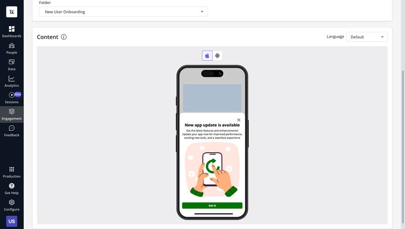
#3: Userpilot for customer communications for both web and mobile apps
As our brand name suggests, Userpilot is built with the end-user in mind, allowing you to communicate with them at the right time, in the right way.
For example, if you often communicate via web apps, you can ensure your messages are contextual and relevant to the right customer by using advanced user segmentation features and logic flow.
This can mean targeting sales and marketing teams (from the same company) separately, introducing key features to customers who were interested in something similar, or encouraging new users to complete customer onboarding.
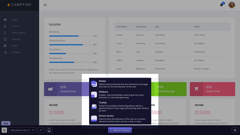
To make all this even easier, you get to choose how these messages appear (e.g., as tooltips, modals, slideouts, banners, or checklists). So, whether you’re announcing something new, offering in-app guides, or simply testing in-app messaging, there’s a format that fits just right.
One of my personal favorite features in-app is that you get to set up path triggers based on specific pages, events, or custom actions. For example, if a user visits the billing page, you can trigger a banner that says: “Get 20% off when you upgrade to an annual plan today!”
Userpilot also offers similar capabilities for mobile apps. That’s to say, you can avail the same powerful customer segmentation and trigger options when looking to set up mobile slideouts, carousels, and push notifications for mobile users.
#4: Intercom for conversational support
Think of Intercom as your frontline support team, available right inside your product. You can use this customer engagement platform to connect your service team(s) with your users; it also gives you the flexibility of letting AI handle easier customer inquiries, and getting human customer service teams for the more complex ones.
You’ll get the full AI + human support setup if you opt for the Intercom Suite. The company offers two products, “Intercom Suite” (which includes everything) and “Fin,” their AI chatbot, which you can buy on its own or as part of the Suite. The former is priced at $29/month per customer support seat, and the latter is priced at $0.99 per Fin resolution.
#5: Zendesk for ticketing and AI-powered self service
Zendesk is one of the godsend user engagement tools for busy customer service teams. It allows them to track every query (whether received through email, chat, social media platforms, or other channels) through a ticketing system.
But that’s not all that Zendesk does. Here’s how this customer engagement platform makes your life easier:
- Connects the right agent to the right queries depending on expertise.
- Provides your customer support teams with a 360-degree view of all customer interactions + resources they’ll need to address these queries.
- Allows AI to step in for FAQs.
- Tracks valuable insights on how customer interactions are being handled, and whether customer satisfaction has been achieved or not.
Key features like Zendesk AI and customer ticketing are available with the starter $19/agent/month plan. However, advanced features like multi-channel support, complex gen-AI replies, or routing to the right agent, etc., will only be available with more premium plans (their “Suite Professional” plan is most popular amongst users, and is priced at $115/agent/month).
#6: Mailchimp, ActiveCampaign, or Klavyio for email campaigns
If you’ve researched email marketing tools, you’ll know that Mailchimp, ActiveCampaign, and Klavyio are popular choices. At the outset, all these tools are great for marketing automation across multiple channels, with emails being their primary USP.
However, each of these email marketing tools is known for catering to different subsets of audiences. Mailchimp caters to startups and early-stage businesses. ActiveCampaign is great for mid-level brands looking to scale, whereas Klavyio is great for enterprise companies who wish to improve customer engagement in the most targeted way possible.
As such, Mailchimp’s lowest subscription tier begins with a free plan, but you can get access its better features such as audience segmentation, A/B testing, personal branding, etc. only with its Standard and Premium plans, which are priced at $20/month (500 contacts) and $350/month (10k contacts), respectively.
On the other hand, ActiveCampaign’s standard offering begins at 1000 contacts. While its starter plan begins at $15/month, it lacks key features like generative AI, predictive sending, advanced segmentation features, CRM integrations, etc. Instead, you can opt for these features under its highest subscription tier, which is priced at $145/month.
Klavyio’s pricing is completely dependent on how many users you have. At the very lowest tier (assuming you have around 250-500 monthly active users and only wish to send 150 SMS/MMS). Your “Email + SMS” pricing will begin at $20/month, which will integrate with 350+ solutions, allow you to send 5,000+ emails, showcase customer profiles, do multi-channel segmentation, etc.
However, if you’re an enterprise brand (with around 50-55k users and 100k SMS/MMS credits), Klavyio’s “Email + SMS” plan can cost you $1690/month, and go upwards as you scale.
#7: Twilio Flex for communication through multiple channels
Twilio Flex is a one-stop shop for managing all types of customer engagements, regardless of whichever channel it occurs, for both sales and support teams.
What sets Flex apart from its competitors is the fact that this solution is completely programmable. That’s to say, you can control every part of your customer experience.
For example, you can customize how your agents view customer data, personalize web push notifications, and improve customer relationships by connecting your users with sales executives who speak their preferred language(s).
Companies looking to add Flex to their tech stack can purchase it for $150 per named user or $1 per active user hour.
#8: MessageBird for customer communications with international support
If you’re a multi-national company, a customer engagement software like MessageBird can do wonders for you, and here’s why I think you’re going to like it:
- Unlike other customer engagement platforms we previously discussed, this one has a global-first infrastructure. (I.e., it allows you to send messages (SMS/WhatsApp) globally, is aware of time zone constraints, uses regional numbers for messages to ensure better deliverability, etc.)
- Multiple customer-facing teams (e.g., marketing, customer support, sales, etc.) can benefit from this solution as it’s built with different use cases in mind (and has templates to support such use cases).
While this user engagement tool’s base pricing starts at $45/month, if you’re looking for the key features I mentioned, you’re going to need to opt for the Advanced plan, which requires a custom fee.
Best customer engagement tools that help you collect customer data
Customer engagement is a part and parcel of any solution that claims to be the “best customer engagement software”. However, in this day and age, we require lots more from our user engagement tools. This includes managing customer data, providing us with valuable customer insights, tracking entire customer journeys, etc.
Safe to say, we don’t only want engagement; we need in-depth analysis of our user sessions to know what we’re getting right/wrong and where we can improve our experience(s). So, in this section, we’re going to be looking at tools that can help us achieve that
#9: Amplitude for behavioral data
If you wish to improve customer retention, Amplitude is one of the best user engagement tools specializing in analytics. It allows you to:
- Understand your entire user journey.
- Track all sorts of metrics.
- Replay sessions.
- Visualize how your users interact through heatmaps.
- Experiment with different features, layouts, and more!
While you can track a good amount of analytics within its free plan, you’ll benefit from the full capabilities of the product with the Growth Plus or Enterprise plans, both of which require you to contact the sales team to receive a quotation.
#10: Pendo for product planning and growth
Pendo allows you to track user sentiments and see how users engage with your product, which paths they use, features they like the most, where they drop off and on, etc., across both web and mobile apps.
This customer engagement platform is so popular, brands like United Airlines, iRobot, Zendesk, and Morgan Stanley use it as part of their tech stack to gain valuable insights.
While “Pendo for Product” is one of its more popular offerings, the company also offers support for IT and sales teams, and can be used across startups and enterprises. Unfortunately, it’s got no publicly available pricing information.
#11: Hotjar for heatmap and scroll analysis
Hotjar categorizes its service offering into three brackets:
- Observe (allows you to observe user behavior through heatmaps and session recordings).
- Ask (you can ask for customer feedback through surveys and a feedback button).
- Engage (lets you engage users by conducting interviews or running A/B tests on target users).
Currently, its most popular offering is “Observe,” as you can invite your whole team to view how customers interact (click, scroll, engage, etc.) with your product.
All of its user engagement tools are priced separately. If you wish to gather all user insights within its “Observe” offering (incl. tracking trends, funnels, and errors), we’d suggest you opt for the Scale subscription tier, which is available at $171/month.
#12: AppMetrica for mobile and attribution analysis
AppMetrica is a mobile-first customer engagement software built for teams that want to know exactly what users do after installing their app. It tracks everything from in-app behavior and session activity to install sources and crash reports, all in one dashboard.
This customer engagement software is especially handy for tying user actions back to marketing channels. Attribution and behavior analytics features are available in paid plans starting at $90/month.
Best customer engagement solutions that help you gather feedback
We’ve uncovered the user engagement tools that can collect data and help you communicate better. Now, let’s look at the engagement tools that would be indispensable in gathering feedback, because once you have that, you’re one step closer to driving user engagement and enriching engagement data!
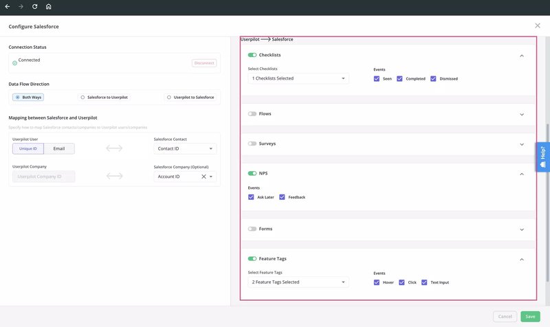
#13: Userpilot + HubSpot or Salesforce for enhancing CRM-based engagement with in-app data and feedback
If you connect Userpilot with CRMs like HubSpot or Salesforce (we offer two-way integrations), you can sync in-app behavior, survey responses (like NPS or CSAT), and user attributes (like plan type or lifecycle stage) directly to your CRM.
In reality, this means letting your teams use real product data to target the right users, send timely messages, and step in when someone’s at risk of dropping off.
For example, here’s how it could look IRL:
- Marketing teams can use HubSpot to send timely follow-up emails based on what users do (or don’t do) in the product. For instance, if someone skips onboarding, they’ll automatically get a reminder to pick it back up.
- Customer success teams can rely on Salesforce data from Userpilot, like NPS scores or usage drops, to know exactly who needs extra support or a personal check-in.
- Product teams can push insights from Userpilot into the CRM to better understand user behavior, which helps with things like identifying churn risks or spotting upsell opportunities.
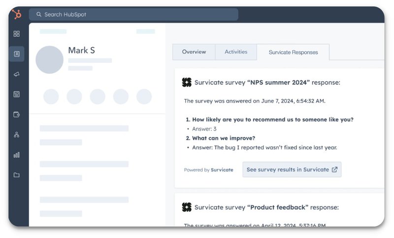
#14: Survicate + HubSpot for multiple channel feedback at key lifecycle stages
With Survicate’s native HubSpot integration (available via its app and Webhooks), you can push survey responses (like NPS, CSAT, or open-ended feedback) into HubSpot contacts and workflows.
Doing so will allow you to trigger emails, assign tickets, or adjust lifecycle stages the moment feedback rolls in without ever leaving your CRM.
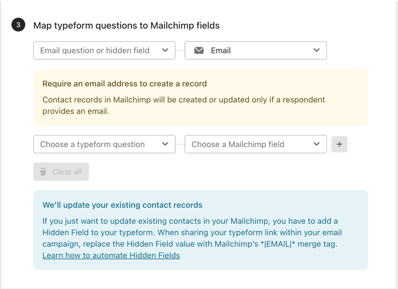
#15: Typeform + Mailchimp or Intercom for embedded email surveys
Typeform integrates with both Mailchimp (to add respondents to email lists) and Intercom (to create leads or update user profiles). One of them is a native integration, whereas the other can be connected via Zapier.
When combining these user engagement tools, you can embed surveys within your branded emails and collect feedback seamlessly. You can also use the same flow to personalize follow-ups, trigger automations, and create a loop of enriching user profiles based on survey responses.
#16: Zendesk + SurveyMonkey for branded conversational surveys
Same as above, if you connect SurveyMonkey with Zendesk, you can send branded surveys directly within Support, with custom fields and field mapping to your Zendesk customers. This is a fairly simple integration and doesn’t require tools like Zapier to make the connection.
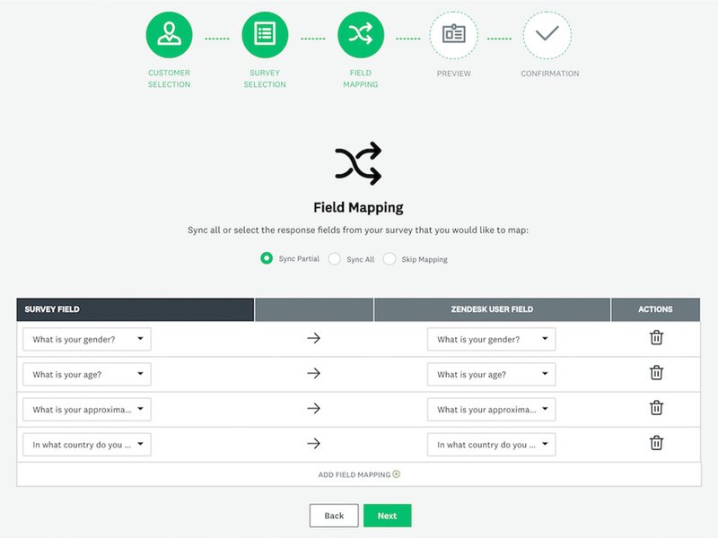
This integration not only helps in gathering feedback, but you can also use it to gain insights and improve your customer support interactions.
#17: Qualtrics + Salesforce for CRM-driven customer feedback
Qualtrics and Salesforce are some of the best user engagement tools out there. Together, they make it easier to collect meaningful feedback, understand your customers effectively, and boost customer loyalty.
You can connect both tools using the Qualtrics-Salesforce connector, which also lets you embed surveys directly in Salesforce and automatically send the feedback to the right contact or account record.
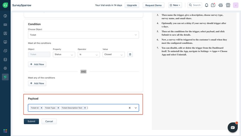
#18: SurveySparrow + Freshdesk for support satisfaction
Ever received a feedback form after getting off a support call? Well, this integration has the same capability. That’s to say, if you connect SurveySparrow with Freshdesk, you can send NPS and customer satisfaction surveys directly after a support interaction.
This is possible through SurveySparrow’s feedback expertise and Freshdesk’s capabilities of creating and updating tickets and contacts. You’ll also be happy to know this is a native integration and doesn’t require any connector tools.
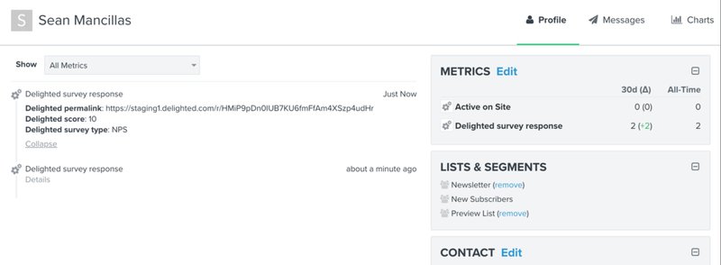
#19: Delighted + Klaviyo for automated email NPS campaigns
Same as before, you can use the combination of Delighted and Klavyio to gather customer feedback and run automation NPS email campaigns.
However, what sets this integration apart is that both these user engagement tools operate on a global scale and can easily manage a higher number of contacts; hence, they would be a more preferable option for enterprise brands.
This integration allows you to sync your feedback (both good and bad) back into Klaviyo, regardless of the survey types, distribution methods, or touchpoints you use.
Enhance in-app user engagement with Userpilot!
When it comes to customer engagement software, truth be told, there are tons of options to choose from in the market. What you need is a solution that fits the needs of your business just right.
And if your current business requirements happen to be:
- Engaging users in-app through videos, checklists, banners, and more.
- Gathering customer insights through session replays.
- Collecting feedback through surveys.
…then Userpilot’s just the solution you need.
Instead of making any bold promises on how this is the best customer engagement software in the whole wide world, I’d personally rather urge you to sign up for a free trial and check out its capabilities yourself!
FAQ
What is a customer engagement platform?
A customer engagement platform is a tool that provides different solutions and features to help you improve customer relationships and optimize user journeys.
What are the 4Ps of customer engagement?
The 4Ps of customer engagement are personalization, proactivity, problem-solving, and proximity. You can achieve all 4Ps by choosing the right customer engagement platform for your business that can uncover user journeys and experiences.
About the author