A Deep Dive Into Mobile App User Journeys: Lessons from Real Apps + Expert Tips

Many product teams don’t truly understand their app user journey. No surprise, then, that most apps lose 77% of their daily active users within just three days of installation.
I’ve felt that sting. Wasted ad budgets, failed feature launches, and a flood of support tickets. Without a clear view of the user journey, teams optimize the wrong things while real friction points go unnoticed.
To help, I broke down real apps step-by-step to uncover what works (and what doesn’t) at every stage of the journey, from first discovery to long-term loyalty.
In this guide, I’ll share those findings and show you how to use Userpilot to craft seamless, engaging mobile in-app experiences that keep users coming back.
What is a mobile app journey and why is it important to understand it?
A mobile app user journey is the complete story of how a potential customer discovers, activates, and adopts your product: every emotion, decision, and friction point from the first ad impression to the 30-day retention mark and beyond. When I map that story, patterns jump out that help me understand user behavior better.
However, let’s not confuse the user journey with the user flow.
A user flow is just one chapter in a user journey, like a linear path, such as tap “Sign Up” → enter email → confirm code. It answers the question, “Can people finish this task?” The user journey answers the question: “Does each stage motivate people to keep engaging?”
By laying out every app user journey stage, you can:
- Uncover pain points the moment they appear.
- Measure whether a tweak in any stage drives retention.
- Tie design, engineering, and marketing research to real user behavior.
Mobile app customer journey stages
Understand these stages in your customer journey to pinpoint where users drop off and where to intervene:
- App discovery(awareness): This is when a potential customers discover your app. The goal here is simple: spark enough curiosity so the prospect is interested in learning more about your app. Clarity and social proof on every external touchpoint (like social media, community forums, and blogs) matter.
- App download(acquisition): The app store page converts that curiosity into an install. Screenshots must preview real value, the description must hit the problem you solve, and early reviews should reinforce trust.
- App onboarding: When a user opens your app, they need to be able to answer “How can I achieve what I came here for?” in under a minute. Guide the user through key setup steps, but keep them minimal. Each screen should move them closer to a quick win: address input, profile photo, or any prerequisite that unlocks core functionality.
- In-app engagement(activation): This is the “aha” moment when the user gets your app’s core value. Think of the first grocery order placed, the first workout logged, or the first playlist saved.
- In-app purchase(monetization): Once users feel your app’s value, nudge them toward premium features that deepen that value: no hard paywalls before they see benefits. Contextual upsells (e.g., “Unlock express delivery for $3/month”) convert better than generic banners.
- Customer loyalty(retention): With a mobile onboarding tool such as Userpilot, you can send regular prompts, personalized content, and thoughtful push notifications, and keep satisfied users returning. At this stage, delighted users can refer other people and give reviews about your app.
How to map a mobile app user journey
User journey mapping isn’t guesswork: it’s a four-step system that turns scattered events into one clear story.
First, define your target audience (user personas). Next, list every touchpoint they hit when interacting with your app. Then plot those moments in a single visual map. Finally, attach KPIs so each leak shows up in the data before it hurts user retention.
Step 1: Create different user personas
A solid app user journey map starts with clear user personas because every stage should reflect and align with the motivations of users who navigate your app.
Let’s not confuse a buyer persona with a user persona.
A buyer persona is the person or committee that approves the budget (e.g., an ops director choosing a delivery partner for the company cafeteria). On the other hand, a user persona is the individual who experiences your app’s interface daily (e.g., office staff submitting lunchtime orders).
I create an actionable user persona with these tips:
- Collect raw inputs: Interview users, comb through support tickets, and export product-usage events.
- Define must-know fields: Role, company traits, key stakeholders they depend on, jobs-to-be-done, pain points, and how to solve them.
- Use the data to set conditions to make segments: I use Userpilot’s segmentation feature to group users based on several factors, including demographic and psychographic ones.

Step 2: Identify interaction touchpoints
You can’t see where users drop off if you don’t know the exact screens they hit in sequence. Paths and funnels provide granular information to track users’ interactions with your app.
Here’s an example of how I would use Userpilot paths and funnel analysis to see and understand how users navigate an app:
I would list the core events (like install, first search, cart add, and checkout), then specify them in Userpilot’s Paths. Paths shows that 41% of new shoppers in our delivery app jumped from “Add-to-Cart” to a promo-code page and never returned.

With those touchpoints mapped, the fix is obvious. Make the promo field on the checkout screen so shoppers can apply a discount without leaving the flow. Then, re-run the funnel to confirm the change improved conversion.
Step 3: Visualize customer journey maps
Now that you have all the information about your user personas and how they interact with your mobile app, map them out. Use a visualization tool (like Miro, Figma, or Canva) and create a customer journey map.
Follow these steps:
- Outline the different stages
- Drop touchpoints under each stage
- Annotate every touchpoint
Step 4: Develop KPIs and measure success
If a stage doesn’t have a metric, you can’t properly measure its success.
Userpilot analytics dashboards can help you add relevant metrics and keep an eye on any changes that may occur.

Breakdown of 12 mobile app user journeys: What works and what doesn’t
I examined a dozen high-growth mobile apps to see where they delight users or lose value. Each mini-teardown includes one tweak you can experiment with.
App discovery: Duolingo and Calm
This stage aims to get on your prospective customer’s radar often enough that they tap on your store listing or look for your app.
Duolingo
Duolingo’s green owl turns language learning into pop-culture theater. The brand posts TikToks and funny memes frequently, a cadence that lands regular press hits and keeps the mascot trending.

Calm
Calm sells mindfulness by borrowing credibility and emotion. Heavy influencers like LeBron James narrate sleep stories and appear in emotional storytelling ads on YouTube, which get millions of views.
Offline, Calm collaborates with brands like Uber to stream mini-meditations during rides, reaching stressed commuters exactly when they crave relief.

App download: TikTok and Spotify
Installing your app is a user’s first “yes.” TikTok and Spotify show how to influence this decision.
TikTok
TitTok’s App Store listing keeps that casual vibe with taglines like “Make your day” and playful screenshots. One of the most notable aspects is its content-before-commitment flow: New users land straight in an autoplaying feed without a signup wall. So your curiosity turns into scrolls in seconds as you go through content you like.
However, this flood of content can feel chaotic for users who aren’t used to it. I’d suggest a skippable two-slide heads-up (“Here’s how the For You page works” or “What you’ll see”) to guide cautious users and make their experience smoother.

Spotify
Spotify’s listing leans hard on trust: #2 Music app, 4.7-star rating, and users can listen to music and playlists for free. After installing, users can access curated playlists before completing their profile to get value fast. Spotify has an optional genre quiz to help set up your profile.
I enjoy using Spotify because it goes beyond just listening to (or watching) music; it allows you to connect with your favourite artists on another level.
For example, you can find out whether they’re playing near your area or have merch, without leaving the app. These features are a few of the several that make Spotify a go-to app for music lovers and faithful fans.

App onboarding process: Headspace and Canva
When users first launch your app, they should be able to feel value instantly. Headspace and Canva nail that impressively.
Headspace
Much like Calm, Headspace feels like it’s there to take care of you. The moment you open the app, gentle pastels and a calm voice-over set an emotional tone.
Headspace immediately asks you to choose a simple goal (like reducing stress or sleeping better) that you want to achieve. That single choice personalizes your feed and cues a guided session that adds warmth and trust through onboarding.

Canva
Canva’s mobile onboarding hands me the creative wheel in seconds. After a one-screen nudge (“What would you like to create?”), I get a swipeable gallery of mobile-friendly templates.
With Canva, I can pick an Instagram story template, add text, save it, and create my graphic design without knowing the first thing about it. You can design excellent graphics in a few steps and do it from anywhere at any time with your mobile device. This low barrier to entry motivates more users to adopt the app.

In-app engagement: Blinkist and Pinterest
Once users have created an account on your mobile app, they should see the value within minutes, or the download was for nothing.
Blinkist
During onboarding, Blinkist provides five personalized book summaries based on your selected interests (e.g., productivity, psychology, history). Then, it encourages you to complete your first “blink,” and when you do (typically takes under 15 minutes), the app celebrates with a prompt to join its “7 Books in 7 Days” challenge.
This notification turns a single win into a streak goal. That micro-loop of personal suggestion → quick finish → timed challenges, drives user engagement.

Pinterest asks me to choose at least five topics (wedding décor, sleeve tattoos, Japanese recipes, etc.) before showing a single pin. These choices shape a scroll-ready home feed. Then, the app nudges you to “Save your first Pin!”
When you do, a celebration prompt and your first private board appears, giving you an instant feeling of creation and ownership. Pinterest’s algorithm has always impressed me. While I’ve tried using apps like Instagram to get image inspiration, nothing beats Pinterest here, especially for its collaborative features like sharing boards.

In-app purchase: Revolut and Fitbod
By this monetization stage, your users should know your app’s value. An upsell pitch would look like a level-up, not a shakedown.
Revolut
Revolut keeps everyday banking free, then sprinkles contextual nudges like “Unlock 3% cashback on this purchase with Metal cards,” exactly when I’m already spending. Its premium perks are obvious (fee-free ATM withdrawals, priority customer support, crypto trading, etc.). Still, a tap of an icon opens a soft paywall that previews the benefit before showing its price.
While most banking apps can feel cumbersome, Revolut gives a friendly customer experience. I can see my budget, split bills easily, invest, donate, and even earn points towards my next vacation. The app is a good blend of financial management and gamification, so paying for advanced features feels like leveling up.

Fitbod
Fitbod lets me log a handful of tailored workouts for free, then flags progress caps: “See full muscle-recovery chart with Fitbod Elite.” These personalized insights entice users to upgrade to a paid plan. Because I’ve already tasted AI-driven routines, Fitbod’s pricing plans look like personal-trainer sessions that are cheaper than gym fees.

User loyalty: Streaks and Elevate
Once users interact with your app habitually, your job is to keep delivering high-quality value so they review and promote your brand naturally.
Streaks
Streaks turn consistency into a game board.
The visual reinforcement of consistency and habit psychology keeps me coming back. I get the dopamine hit from completing streaks and don’t want to break the chain.
Then, I can customize reminders like “Stand up and stretch at 3 p.m.” to nudge me when there is the highest likelihood of doing the task. For example, my 21-day reading streak started as an experiment, and now it feels too satisfying to abandon.

Elevate (Brain training app)
Elevate keeps me practising brain-training exercises with the same psychology, but layers on skill progress. Daily training streak and performance tracking bars that help you see progress with each mini-game. Weekly progress reports also break down how you’ve improved, whether it’s in reading speed or memory accuracy.
I tried Elevate and recommended it to my friends within two weeks because of how helpful it is. The exercises adapt to my past scores, so the challenges stay hard enough to feel like leveling up.
This mix of maintaining streaks, personalized difficulty, and visible stats turns casual play into a long-term habit worth bragging about.

How can you track and optimize mobile app user journeys with Userpilot?
Userpilot’s all-in-one platform helps you to watch the entire app user journey in real-time, identify drop-offs in minutes, and then nudge users to re-engage with push notifications, without coding experience.
You can use its features to track and optimize your mobile app user journey:
- Analytics dashboards: Create custom dashboards that show metrics like the number of active users, total screen views, and average views per user. So, you can see interactions with your mobile app in real-time.
- Advanced segmentation + localization: You can create segments based on how users interact with your interface. For example, you can have a segment for freemium users who haven’t purchased. The AI-powered localization feature helps you translate your content to fit your users’ native language.
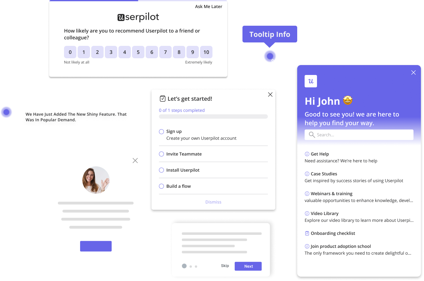
- Mobile carousels & slideouts: These built-in UI patterns help you guide users as they navigate through your app, with contextual messages. You can use them to target segments with low conversion rates to motivate them to engage more.
- In-app surveys: Use surveys inside your app to gauge user satisfaction and identify friction points. The feedback will provide valuable insights on improvements to increase feature adoption.
- Push notifications: You can send timely, personalized messages to bring users back to your mobile app. For example, you can retarget users who haven’t returned to your app after they signed up.
Book a demo to experience how you can use Userpilot to develop a better app user journey.
FAQ
What is a mobile app user journey?
A mobile app user journey is a storyline of how a prospective user discovers, installs, onboards, activates, pays, and stays loyal to your app. It includes every touchpoint and emotion that propels them forward or pushes them out.
What is the user flow of a mobile app?
A user flow is a single, task-oriented path. For example, Home → Search → Add to Cart → Pay. The flow typically focuses on step order and usability, and optimizes one goal, rather than the broader relationship captured in the user journey.
How can I track user activity on a mobile app?
Add a snippet via an SDK, like Userpilot Mobile, that triggers an event every time a user performs a crucial action (like completing a purchase). You can track these events through your analytics dashboard in real-time to see who did what, in what order, and where they dropped off.
How do you create a user journey map for an app?
Follow these steps to create an effective user journey map for your mobile app:
- Define your user personas.
- List the user journey stages.
- Place touchpoints under each stage.
- Outline each touchpoint with user actions, feelings, pain points, and opportunities.
- Attach relevant KPIs so every iteration shows a measurable impact.

